Buying a house then discovering it needs to be rebuilt is never a good thing. In this case, however, the unexpected realisation led to a great architectural outcome.
The Westmere home with waterfront views and beach access had been purchased by a family returning from living in Singapore. As their new home was in need of an interior refresh, they commissioned Marc Lithgow of Space Division to renovate it.
Then came the bad news: the house was leaking. The architect’s job became not about a renovation but about “staying for the journey, helping them to understand the inherent problems, and working through them together,” says Lithgow.
Five years later, a beautifully understated home, filled with luxurious detailing, is complete and certified as a passive house. The watertightness issues presented an opportunity for it to be rebuilt from the bottom up; the concrete basement and retaining walls were kept, but the rest was demolished and redesigned. The brief was to replicate the number of rooms, but to arrange them differently to make the most of the waterfront location and to work for the owners.
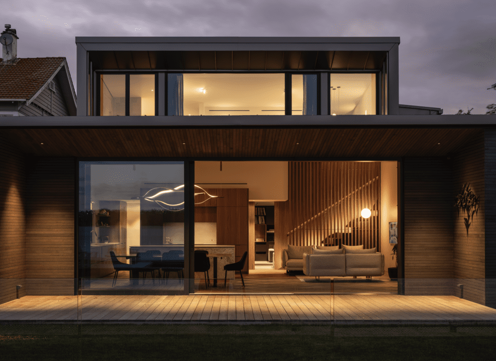
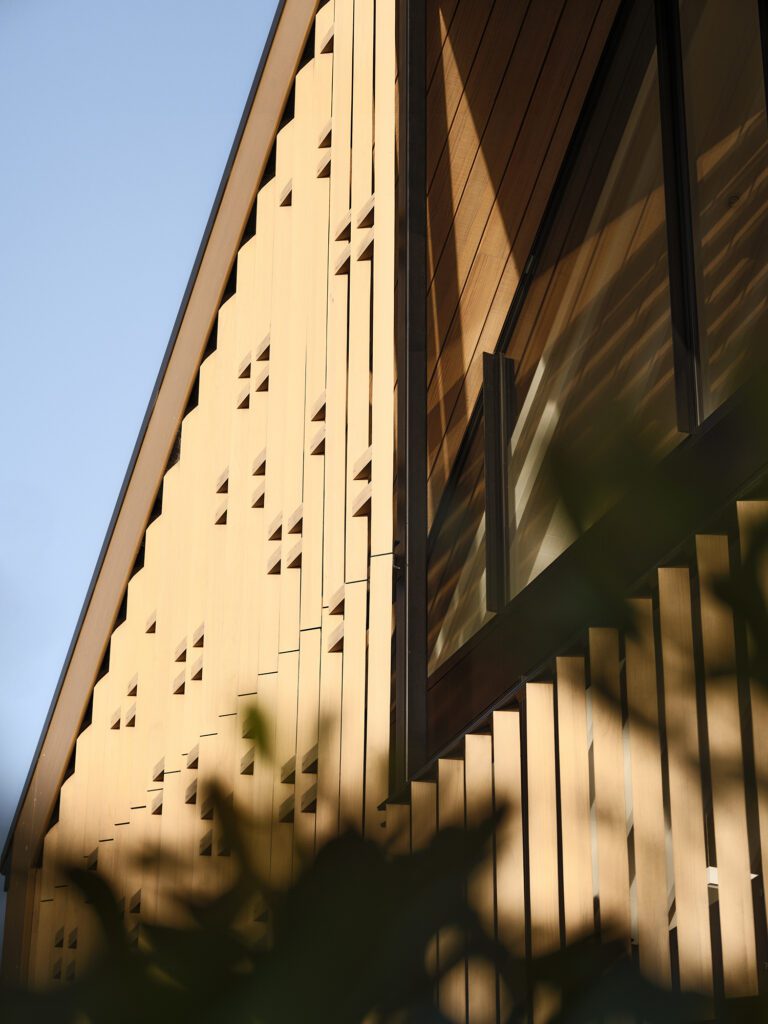
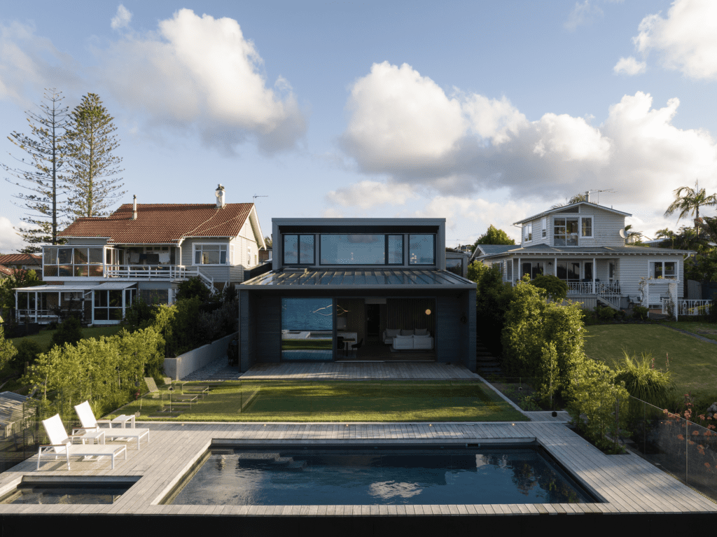
Sited at the end of a shared driveway dotted with a handful of dwellings from different eras, the house is a serene and refined destination that stretches across the width of the section. The façade whispers rather than shouts, with its concealed side entry and simple profile clad in Herman Pacific cedar. The narrow horizontal boards, which were stained mid-grey, “make the building feel slender and lend a bit more scale,” explains Lithgow. “It’s not a big building, and it has a quietness and a modesty to it.”
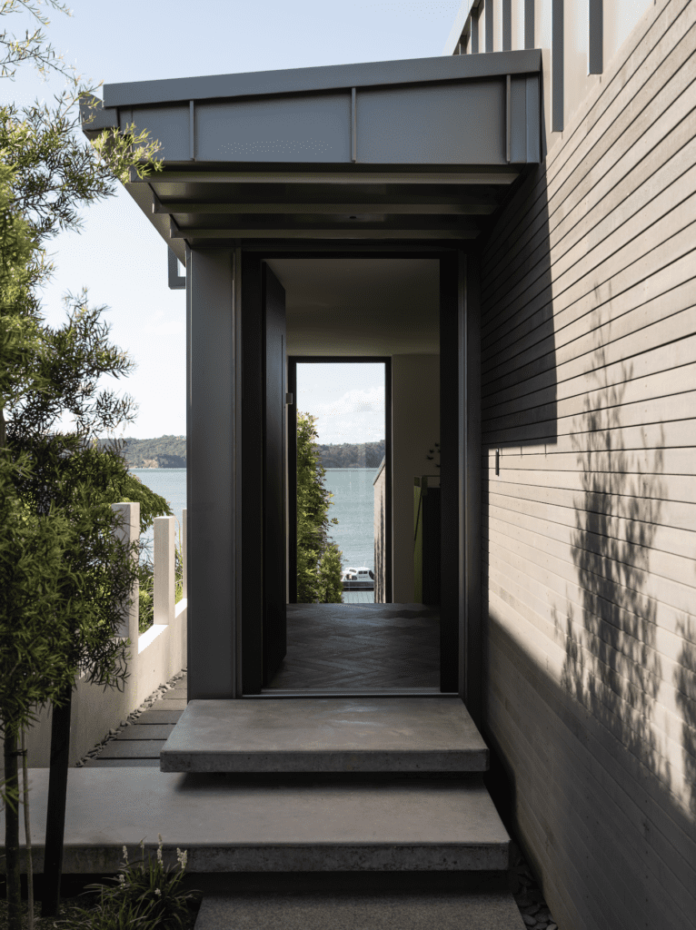
Peel back the vaulted front door — a passive house requirement to ensure airtightness — and a slim floor-to-ceiling window tells you that you’ve arrived at the water’s edge. VidaSpace herringbone floors lead from the entranceway down to what once was the basement, now a light-filled living area with incredible views.
“The old house had a tension: the mid floor was the living area, with no natural path to outside,” explains Lithgow. “Coming from apartment living in Singapore, the clients wanted to be able to get their feet on the grass.”
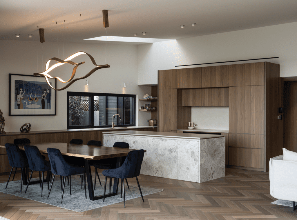
Here, the open-plan living area is oriented to the garden, pools, and harbour. The high-end detailing in the interior complements rather than competes with the view: a neutral palette includes walnut wood panelling and cabinetry, grey rugs and sofas, brass sinks, tapware, and inset handrails.
The kitchen island, clad in Tundra Light Grey, is an exercise in quiet luxury. Lithgow specified that the marble be leathered to create a textured feel.
Unusually, the front of the island concertinas away, to reveal stools and space to sit. “I love this island; it brings the pattern alive rather than being flat,” Lithgow says. “I love all of the texture in this house. That’s the expression of the design, and you can run your hands over the textures inevery room.”
The passive house–approved glazing and joinery imported from Europe peels back to expose the entire width of the living floor and to make the most of the view of the harbour and Chelsea sugar factory.
Lithgow created deep, cedar-lined eaves on the deck, to provide an al fresco area that is sheltered from weather. The design “deals with a bit of a shading element, while giving the family sky and height, so the horizontal line isn’t in their vision,” Lithgow tells us.
The pool and spa are set into the ground at the edge of the property, so as not to disrupt the vistas.
The less public, more utilitarian rooms are contained in the centre of this level, behind the open living area. The laundry houses the passive house system that replaces the home’s air every three hours and controls moisture levels. A guest powder room and another bathroom created for post-swim showers are also tucked away here.
A secret media room under the stairs is windowless, lined with speaker fabric, and has been acoustically designed by a theatre designer to produce high-quality sound for those watching movies or listening to records from the huge U-shaped sofa. Its door, in the ultimate nod to attention to detail, closes flush with the wood panelling on the walls, so that it doesn’t interrupt the aesthetics.
Upstairs, three bedrooms and two bathrooms fill the street-level storey. An office was added to the layout during a Covid lockdown. Special artworks and sculptures acquired on the clients’ travels adorn the hallways. The bedrooms are very quiet despite their proximity to the main road — another happy outcome of passive housing.
The primary suite is elevated from the rest of the floor, thanks to a handful of stairs. That elevation gives the room a gorgeous sea view. A large window with a low, deep sill enables the owners to see the sea from their bed.
In the primary ensuite, two striking Artedomus sinks in maroon Rosso Levanto marble take pride of place. They’re the only pops of colour; otherwise this floor is a continuation of what Lithgow describes as a “recessive palette”.
The architect intentionally split the public and private spaces of the home by levels. “The top is private and the downstairs is public,” he explains. “From the entranceway, there’s no reason for a visitor to go into the family’s private areas.”
The home won a Te Kāhui Whaihanga New Zealand Institute of Architects Auckland award last year, with the jury describing a dwelling that “is modest in appearance, yet with generous intent … this project is instructive in its combination of clean, contemporary design”.
Lithgow believes the success of the architecture is a testament to the time taken to get this home right. “We were here for such a long time that we really heard how they wanted to live.”
