There’s a gentle melody to this Coromandel holiday home, which was designed to entertain and accommodate anywhere from 2 to 30 people with ease. It is a place that effortlessly opens and closes — to the ocean, the light, and the sky.
Anchored to the dunes by a sculptural concrete form at ground level, the voluminous beach house spans a 500 square metre footprint. The programme is split at its centre by an open-air courtyard, which delineates the private spaces to the west and the public spaces to the east. Above, two boxes wrapped in vertical yellow cedar offer a gentle nod to the natural tones of the coast.
It’s an incredibly versatile series of spaces, thanks to an unlikely design team comprising New Zealand–based industrial designer Kane Lochhead of IDEA Studio and Byron Bay–based architectural designer Scott Jackson of Son Studio. It was a chance meeting with the client in the UK that led Kane on a path to collaborating with his childhood friend, Scott, to develop the concept.
The UK-based client had holidayed in the Whangamata area for many years, and aimed to create a place for his large family to come together when he visited New Zealand each summer. The brief was for a home that could comfortably house two or three people — or very large groups. It had to make the most of its beachfront site, and open and close to the ocean and the elements as desired. It also had to offer a degree of privacy to account for the population influx over the holiday periods in the otherwise sleepy coastal town.
With Kane’s background in designing and installing showstopping mechanical architectural installations, and Scott’s intuitive creativity and architectural knowledge, the pair made a strong design team. Utilising their complementary skill sets, the duo came up with a refined concept. The home runs west to east across the site, its west-facing side occupied by the private areas. To the east are the public entertaining areas and communal living spaces.
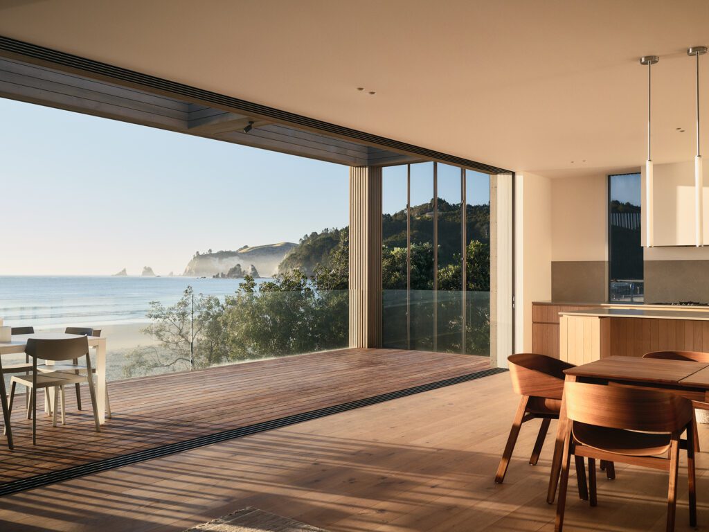
The main kitchen and living area occupies the upper level of the eastern volume. A covered verandah with three custom-designed operable roofs that completely retract, allowing the living space to be extended and contracted as desired, offers an unobstructed view to the sky when open. To each side are operable shutters, also clad in yellow cedar to create a unified exterior form when closed. Below, a second lounge and living area open to a second deck. Here, another custom-designed solution by Kane allows for the deck to fold back onto the house, protecting the glazing from salt spray when the house is unoccupied.
“Kane’s approach to the mechanical aspects drove a lot of the design in terms of making spaces operable in as many ways as possible,” Scott tells us. “We wanted to give as much prospect, and refuge, as possible.”
Refuge is created in the inner sanctum — the courtyard, a sheltered, private space that is open to the sky.
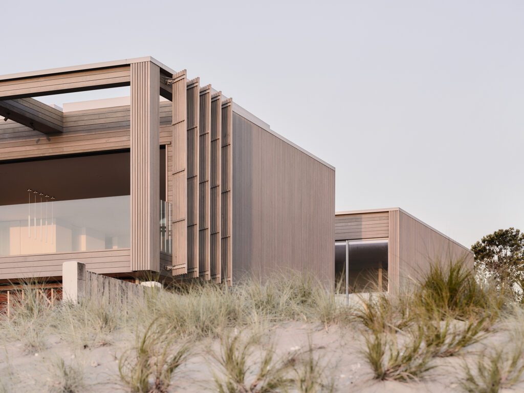
“The courtyard draws light into all the main living spaces. It is the threshold in the programming, separating the public from the private spaces, and a central place of retreat away from the public-facing beachfront decks and living areas.”
Pedestrian entry is by way of a large timber pivot door that breaks the robust concrete volume at ground level.
“The eye is immediately drawn through the dwelling and out to the ocean. A timber-clad spine guides you past the courtyard and a double-height space, anchored by a floating stair, towards the sea,” Scott says.
Kane says, “It’s such a stunning site. You have vistas of the sun rising over Mayor Island, the cliffs, and the beach. The brief was centred around capturing and connecting with these views. In the living area, you feel like you are almost on an island looking over the water.”
The use of natural concrete and timber allows the house to settle gracefully into the dunescape — the muted tones of the concrete echoing the grey sands of the dunes, the timber’s hues a nod to the natural grasses that cover them, and to the dramatic cliffs that frame the beach.
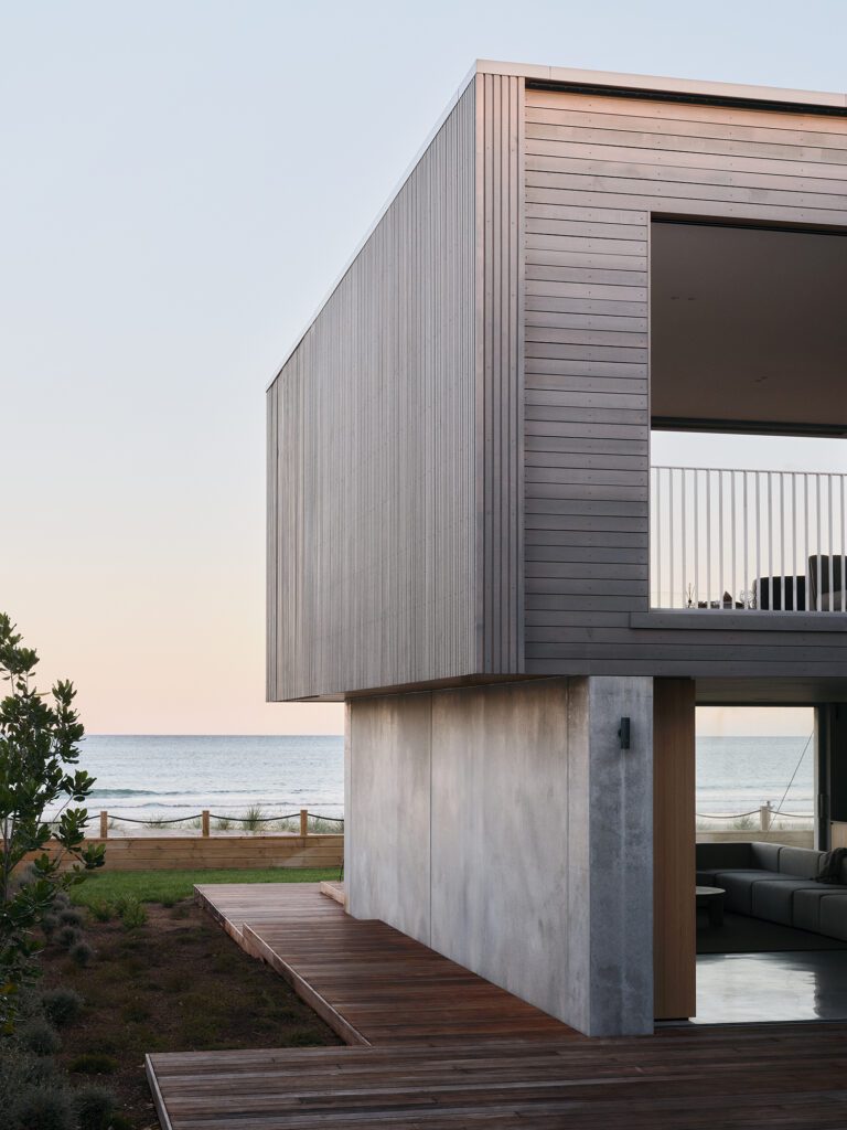
“I like the idea of buildings ageing gracefully. The materials convey a sense of permanence, but have a lovely depth to them. It meant there was no pressure to maintain the sense of the building being new; rather, the owners could embrace the passage of time and the depth and poetic quality of the materials as they age — something that gives the building a narrative and a heightened awareness of its age over time,” Scott tells us.
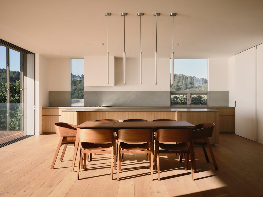
The kitchen is a large space designed for multiple groups to use concurrently. Vertical windows on either side of the workspace draw in the purple and orange light of the setting sun.
“It’s a really tactile space, with oak veneer panels and engineered stone benchtops.” Pendants from Snelling Studio hang above the island; underfoot is engineered European oak flooring.
“The design was centred around creating versatility; people can be cooking while others can wander in and grab a drink without disturbing each other.”
There’s a lovely quietness to this home; a dwelling that seems to emerge instinctively from the dunes. Inside, it’s a place of liveliness perfectly poised to expand and contract for all occasions, yet calming in its carefully crafted simplicity and repose.

