Karolina Brock and Joost Leeuwenburg recently formed the Auckland-based studio LeLa Architects. Their Swedish and Dutch heritage has proved a fitting match for the renovation of Karolina’s own Parnell flat. We spoke to Karolina about how her Scandinavian background influences her design.
Your full name: Karolina Brock
Where did you study architecture/when did you graduate?
Bachelor of Architecture at Unitec, graduated 2008.
Have you recently started LeLa?
Yes, LeLa Architects is almost two years old now. It’s a partnership between myself and my old uni friend Joost Leeuwenburg. We met at architecture school and both worked for other practices before we joined up to form LeLa Architects.
What were you doing before and is this one of your first projects?
Yes, this is one of our first projects as a practice. We have both worked for some really outstanding architecture studios in NZ doing residential and commercial projects, and Joost also worked for several years in Prague prior to LeLa.
Did you say your name was Swedish? Is that your background and do you think this home reflects that a little bit?
Yes, correct – my parents are both Swedish and immigrated to NZ in the 70s. I go and visit regularly and have strong connections to my extended family in Sweden. Joost was born in the Netherlands and moved to Waipu when he was six – his mum is a textile artist, so he grew up with really bold Dutch colours around him. I definitely think that certain sensibilities and aesthetics of our heritage filters though to our design thinking. So many Swedes live in apartments and spend a lot of time indoors, so their homes have to really deliver in terms of light, function and comfort. A humanist approach is important to me, a space should provide comfort, ease and beauty.
Tell me about the key pieces of furniture.
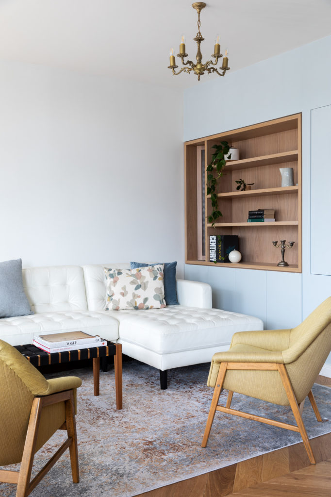
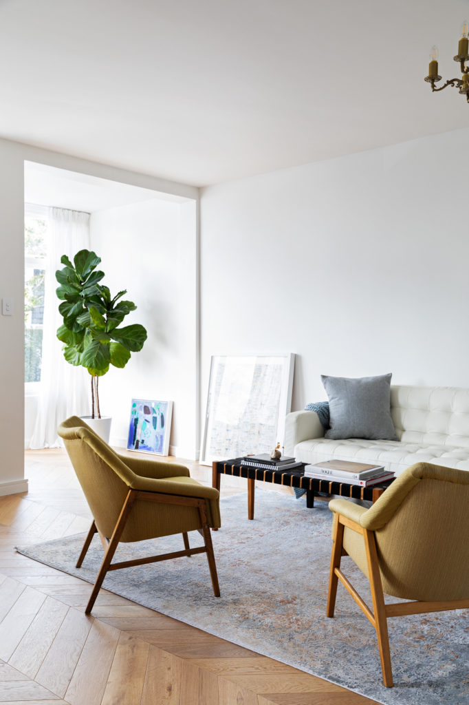
The bentwood chairs are vintage finds. The beautiful rug is from Forté. The mustard-green armchairs were my Farmor’s (grandmother’s). I had them sent over from Sweden when she passed away. They were designed and made by her brother Sven and have been recovered so many times over the years – it’s really nice to have ‘family’ in the room and in everyday use. I love how comfortable and compact they are, they have great lines but they don’t occupy a lot of ‘visual’ space. They leave the room feeling open, and that is so important in a smaller space.
What would you say the main techniques were that you used to make the small apartment feel more spacious?
When we bought it, it had its original 1967 layout over 65m2: a one-bedroom with a small separate kitchen, a tiny bathroom/laundry, quite a large bedroom and a big awkwardly shaped living room that was cut-off from light and outlook. The floor plan had a lot of what I call ‘slop’ in it – a lot of space that wasn’t really doing anything or working very hard… you could call it lazy space. I knew we could get a lot more function and joy out of it if we tightened up the floor plan in places, allowing us to loosen it in others, and pull in a lot more light from the northern end of the apartment.
We started by taking out all the non-structural walls except for a single bathroom wall to open the space up. The master bedroom was re-formed in the same location, but quite a bit smaller than the original. The bathroom was also enlarged ever so slightly by borrowing 150mm off the bedroom.
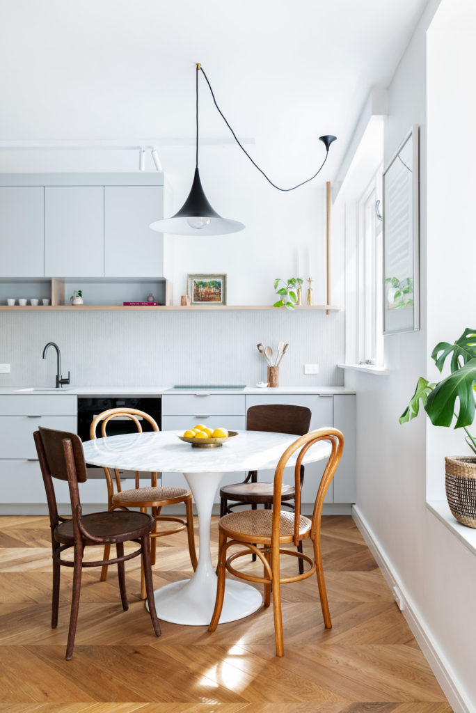
We changed the kitchen from a more traditional layout to a long single line of cabinetry that stretches 6.5m from the entry hall to the kitchen window, and also accommodates the laundry, coat cupboard and additional storage, pantry, integrated fridge etc. This meant the whole kitchen/living area felt really wide and spacious, and the outlook widened too. This re-shuffle actually allowed us to create an entirely new room with a double wardrobe that is designed to work as an office or a guest bedroom. It’s not a big room, but it’s really useful to have a separate room. I think the value of separation sometimes gets overlooked.
Techniques I used including opening up; getting rid of the separate kitchen meant that the light could penetrate deeper into the apartment and we could keep it for a longer portion of the day.
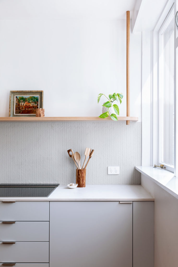
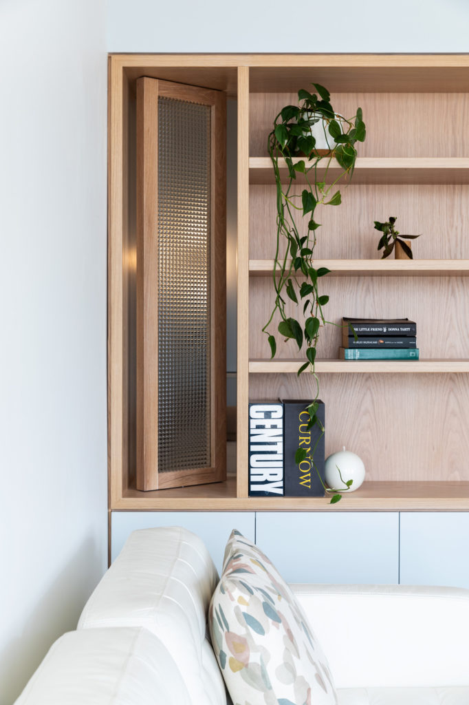
Integration: The cabinetry was a huge part of this project because it allows us to accommodate all the necessary parts of day-to-day life and open up the space, but it also accompanies you through the apartment from the moment you come through the front door. The starting point is of course function and utility, but beyond that we wanted the cabinetry to imbue warmth and elegance as well as a few unexpected little details to keep it alive and interesting – for example, the oak post that ‘suspends’ the shelving at the window end of the kitchen, is echoed by another floor to ceiling post in the shelves by the front door, which contains a hidden LED to subtly illuminate that area – the little interesting details are crucial and so fun to design.
Integrating the kitchen, laundry, storage, coat cupboard and hall table into a single 6.5m-long unit helped to simplify the space and reduce visual clutter. This bank of cabinetry starts in the entry hall with a built-in ‘hall side table’ of American white oak (Prime veneer) with a very light custom tint, that incorporates cupboards, shelves an engineered stone top and subtle integrated LED lighting.
The curves in the design reference a small curved cupboard that was in the original apartment but had unfortunately deteriorated too much for us to keep. The new ‘hall side table’ is the perfect place to throw your keys, hide your shoes and other everyday bits and pieces when you walk in the door. It’s a small gesture but it’s surprisingly useful and establishes a tone of unobtrusive sophistication. From there the floor to ceiling oak-faced cabinetry leads you down a generous hallway into the main living area where it becomes the kitchen and changes to a subtle grey-blue painted finish with oak accents. Because the kitchen shares the living space, it was important to us to integrate as many appliances as we could and keep it looking simple.
Borrowing light: We want light to come as deep as possible into the apartment from both sides. The effect that light at different times of the day and seasons has on the apartment is lovely to watch.
Separation: This is so important in a smaller space and goes hand in hand with opening things up. I think people have come to appreciate this more because of our times in lockdown. Having a separate workspace and being able to close it off when you are finished for the day or need to concentrate or take some time away from other members of the household, is invaluable.
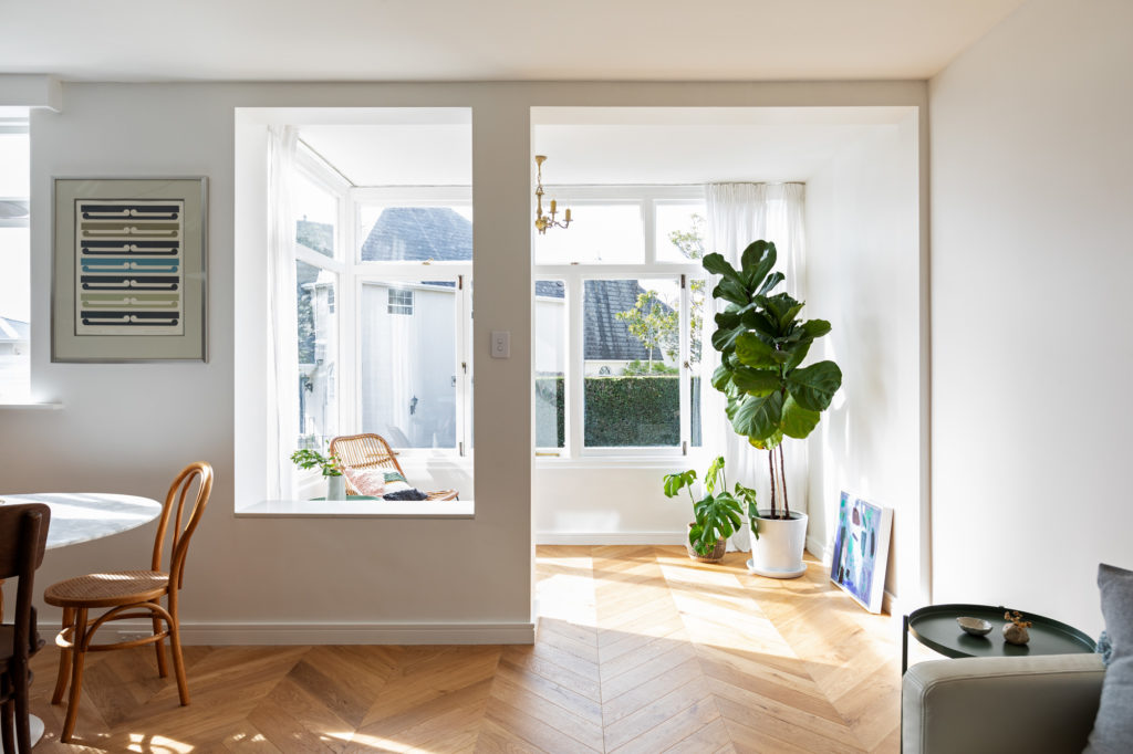
In this apartment, there is a sunny little conservatory that looks onto the street and is partially separated from the living area. Initially, we had wanted to open it up completely and make the living area bigger, but as it was structural we were forced to leave it in place, which I’m now so glad of. Even though it’s open to the living room – it is defined by a thick column and a low wall. Its just enough implied separation to make it feel like another room to go and enjoy a morning coffee or afternoon wine and say hi to neighbours out on the street, but at the same time it reads as being part of the living room and makes it feel more spacious
Kinks & alcoves: We have used quite a few ‘kinks’ in the walls in this apartment. They allow us to keep room sizes lean but still functional. We ‘kink-out’ to ‘borrow’ a bit of space for one room to fit a dresser, desk, or bathroom vanity and then on the reverse side – it also gives an ‘alcove’ to nest in a built-in bookcase or headboard. They save on dead space and make rooms ‘function bigger’ than they actually are.
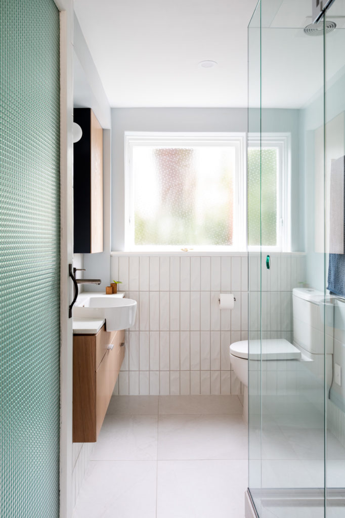
Translucency/materiality: Warm oak, subtle texture in the chevron parquet French oak floor; tiny matte glass herringbone mosaic tiles in the bathroom. Matte finishes everywhere to keep the light in the apartment very soft – nothing shiny. We borrow light as much as we can to keep the space feeling lively and open throughout the day. The bathroom gets a surprisingly nice south-west kind of light, and gets some lovely shafts of late afternoon, low-angle sun in winter. We installed a timber framed glass door to the bathroom and found a beautiful, one-off densely textured glass from India languishing in the back of a warehouse (the glass company had it for 20 years and they were contemplating throwing it away!) that we laminated up and installed in a recycled timber door frame. This gives just enough privacy- (it’s a 1.5 bedroom apartment after all!) to the bathroom, and lets the faceted soft light fall into the hall. We used the same vintage glass to use it in a custom made pivot window which I designed to be part of the built in book shelf in the living room – but it also allows additional light into the guest bedroom /office and as well.
The building: St Stephens Court is a wonderful slice of mid-century Parnell, built in 1957. It is functional red brick with a simple, modernist feel – not overly decorative but with lovely proportions, generous windows, wide apartments and a solid, timeless feel. We discovered that it had original mid-century glossy linoleum tiles throughout the whole apartment when we lifted the carpet.
The outlook from the apartment takes in a cluster of French-style townhouses, so that was one that cue we picked up on – a space with light and air but the solidity and reassurance of solid oak floors combined with the simple clean lines of contemporary cabinetry – almost as if you could be in a European pied-à-terre in Paris or Stockholm.
Images: Larnie Nicolson