Three enterprising youngsters throw in their desk jobs to design and build a house on a steep Whanganui hillside. Words by Nicole Stock. Photos by Paul McCredie.
It reads likes something Enid Blyton would have written, had she substituted curious and adventurous children for curious and adventurous 20-something architecture graduates. Throwing in their desk-bound jobs, these three enterprising youngsters designed a small, thrifty and clever house on a steep Whanganui hillside, then built it themselves. It’s a unique tale of architectural derring-do that could be a modern-day version of the Famous Five, their exploits recorded in a blog that documented design dilemmas, building disasters and triumphs, including slips, concrete pumps and new babies. Something for everyone.
The three Patch Work Architecture designers – Ben Mitchell-Anyon, Tim Gittos and Sally Ogle (along with Tim’s partner Caroline Robertson, who assisted with the build) – met while studying architecture at Victoria University in Wellington. Ben and Tim both went on to work in the office of Melling Morse Architects, a Wellington-based practice led by Allan Morse and the late Gerald Melling, and known for small, budget-conscious and sometimes offbeat houses. Sally worked for Studio Pacific Architecture in between stints travelling, while Caroline had her own practice, Paper Ink Architecture.
Frustrated by the disconnection between their office-bound design jobs and the act of building, Ben, Tim and Sally wanted to work on a project that they could direct and design themselves. Their architectural experience was one thing, but none had any building experience. So they pooled their money to buy a section with the intention of building a small, experimental house (they got building consent for their project just before legal changes that mean projects like this must be constructed by professional builders).
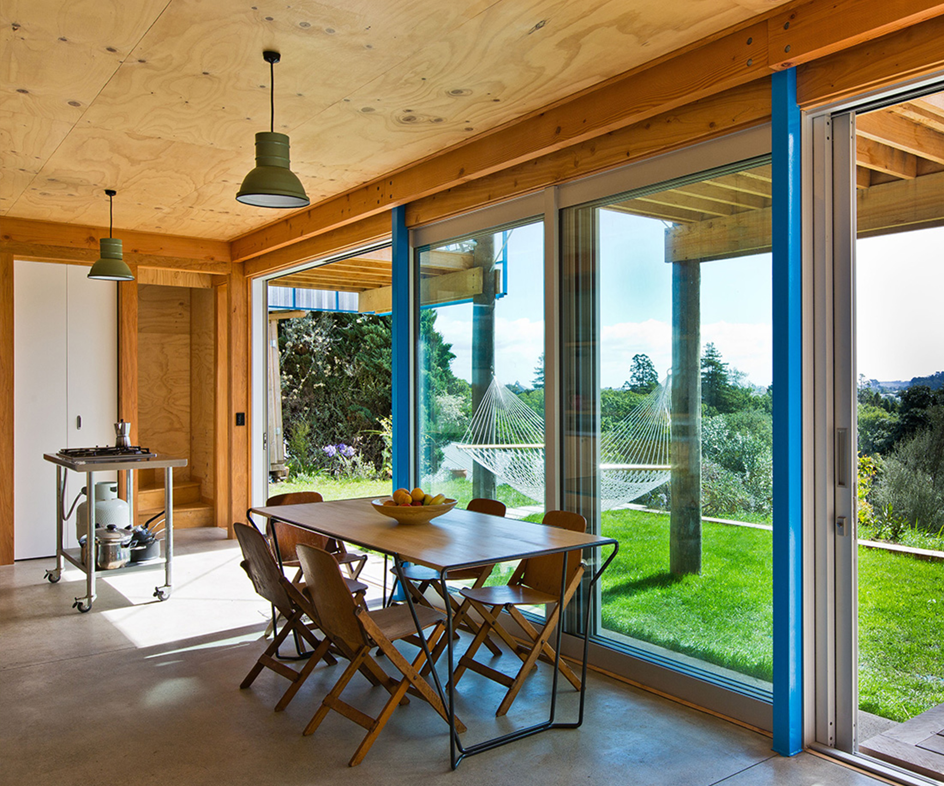
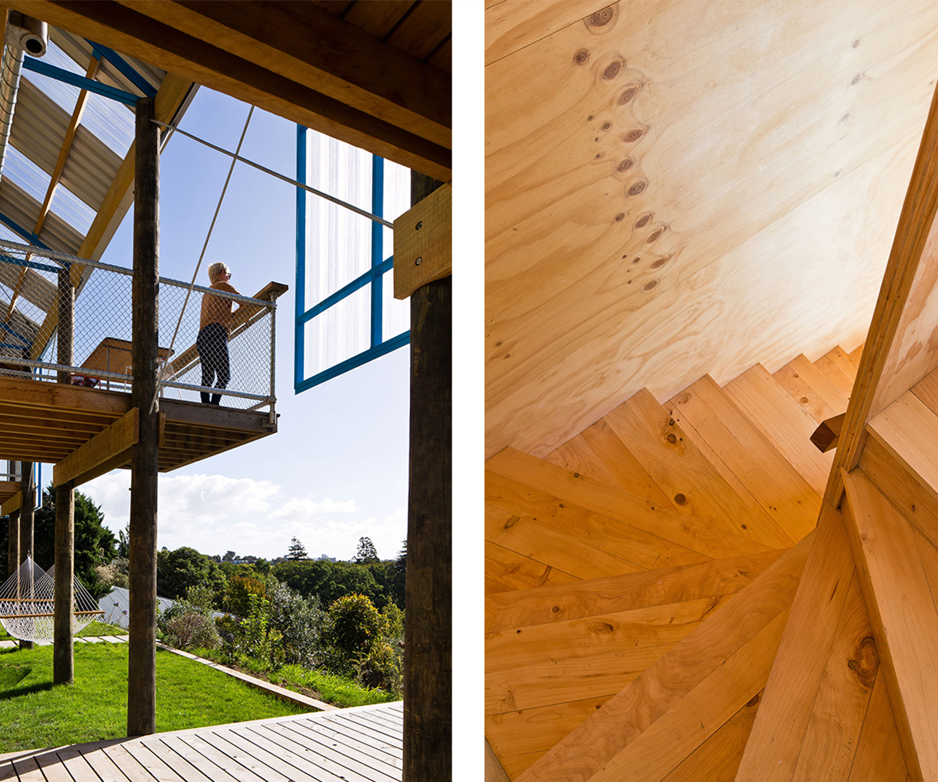
The price of land in Wellington was prohibitive, so they started scoping sites in Whanganui, where Ben grew up. The cheapest piece of property they could find on TradeMe cost $18,000: a steep but north-facing 607 square-metre slice of land across the river from the city centre. “You could add another zero [to that price] for a scrap of cliff-face in Wellington,” says Ben. “Also, Whanganui is a beautiful place – it has a river and a beach and is reasonably close to Wellington. And having family and friends in Whanganui helped a lot.” Sally agrees, mentioning that for about nine months their building site was powered by an extension cord poked through the neighbour’s window.
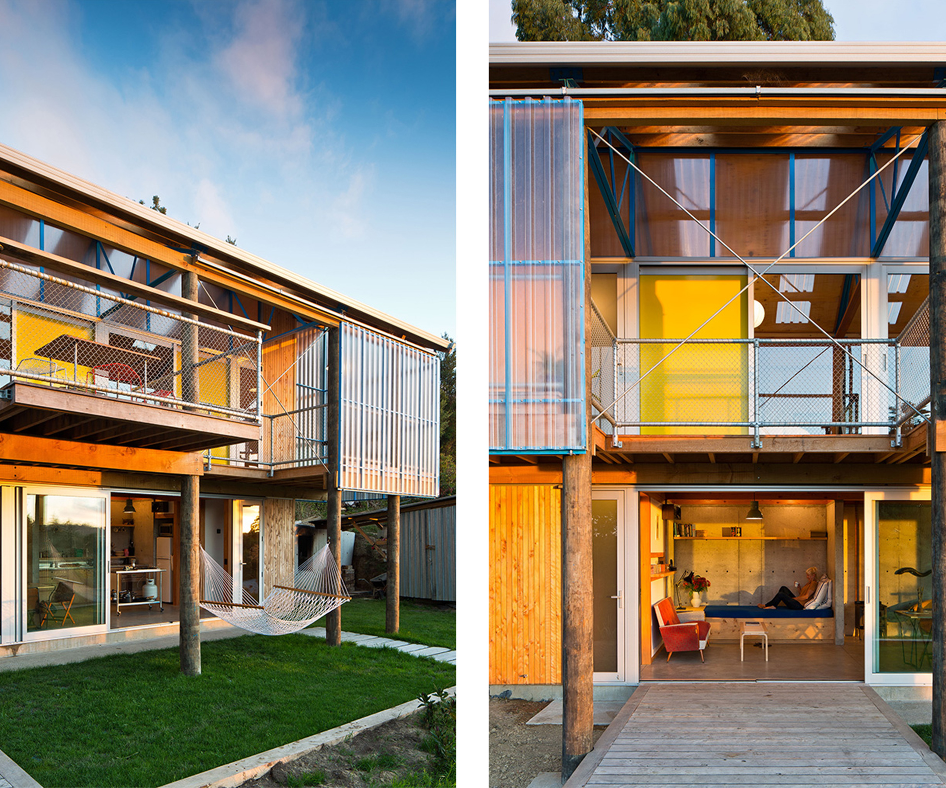
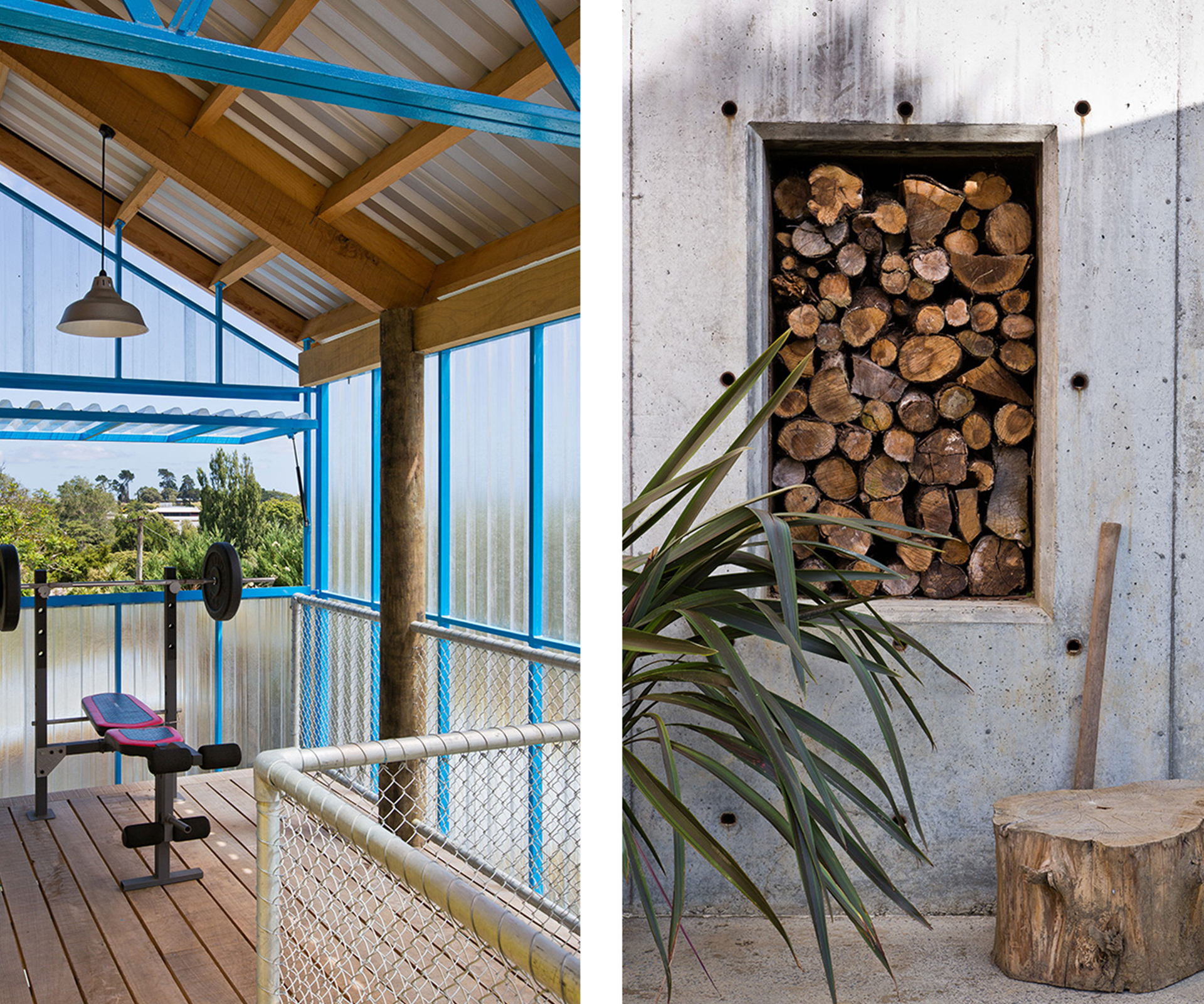
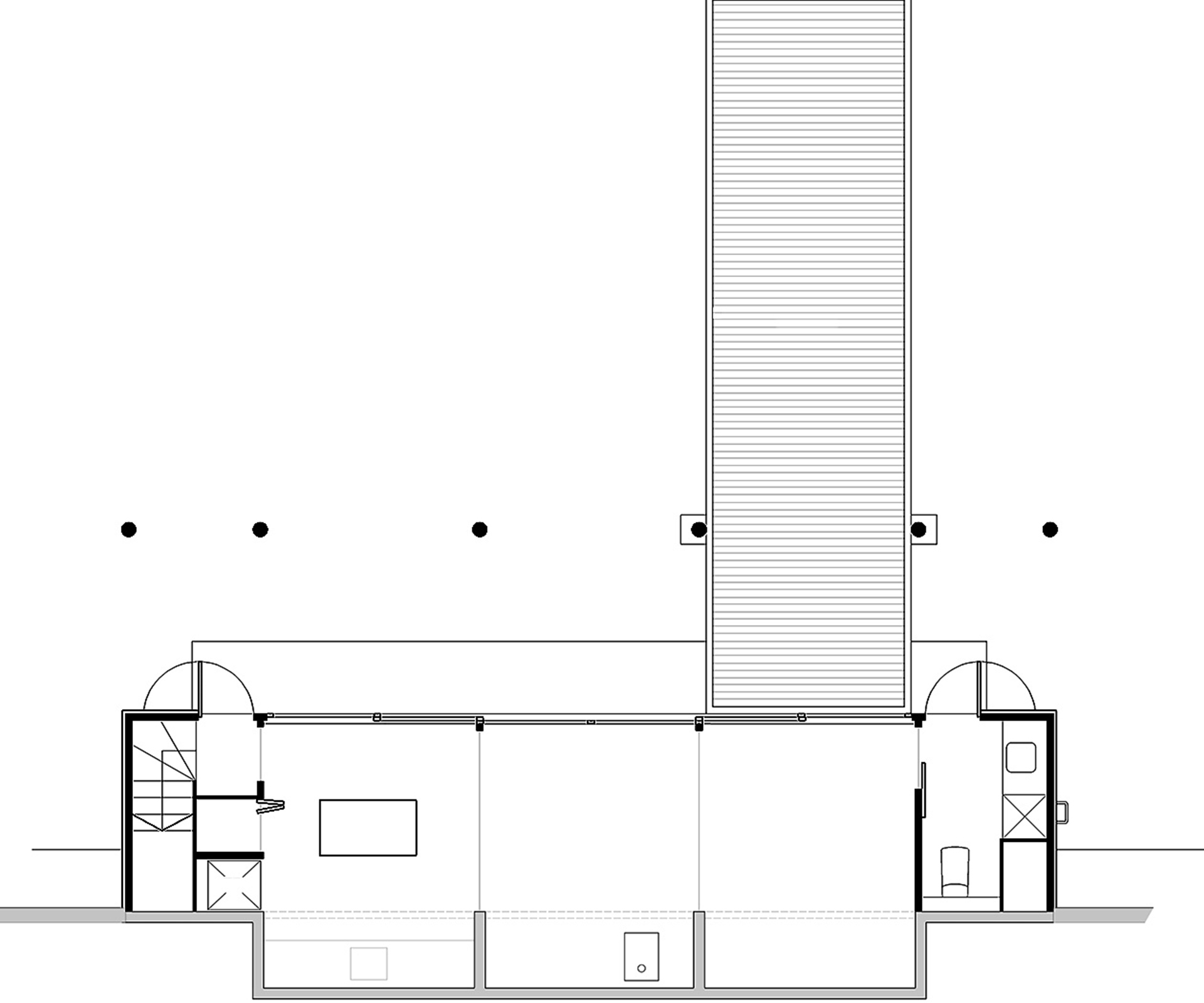
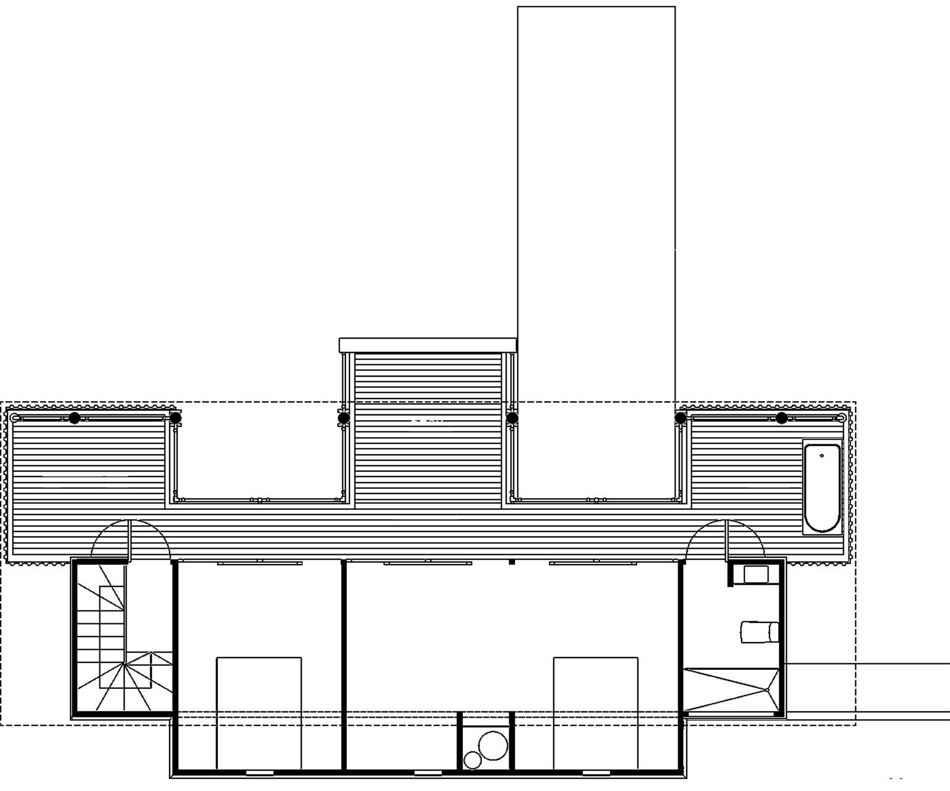
Luckily, the vertiginous site flattens out just enough at the top to allow for a narrow rectangular plot facing northwest. This was a major driver of the home’s design, as was a collection of rusty steel trusses the group purchased on TradeMe (and then spent a long time angle-grinding the rust off). The number and dimensions of these trusses defined the overall width and shape of the roof – an equilateral gable form with the highest point perching not in the middle of the rooms but to the edge, so that one half of the roof covers the internal spaces and the other half defines a covered open-air corridor upstairs.
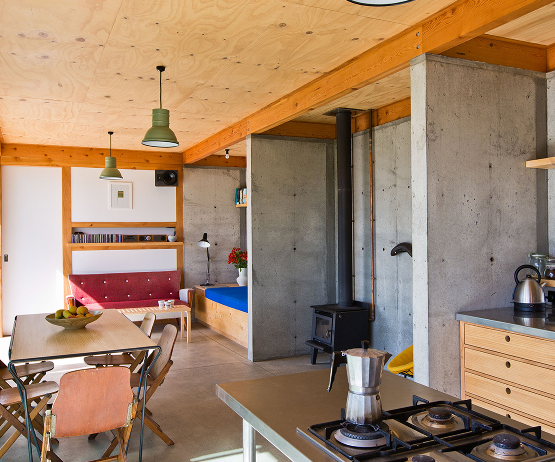
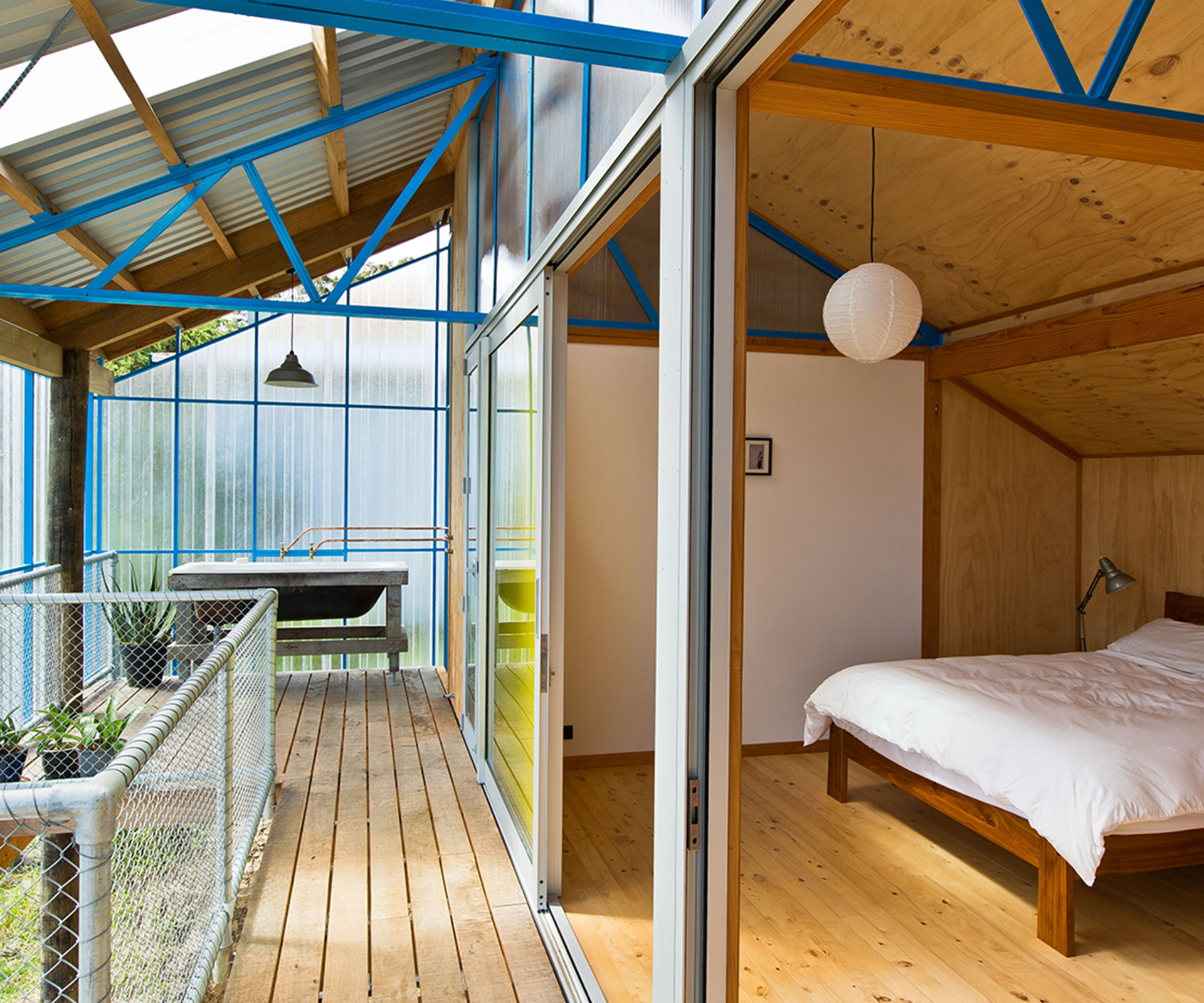
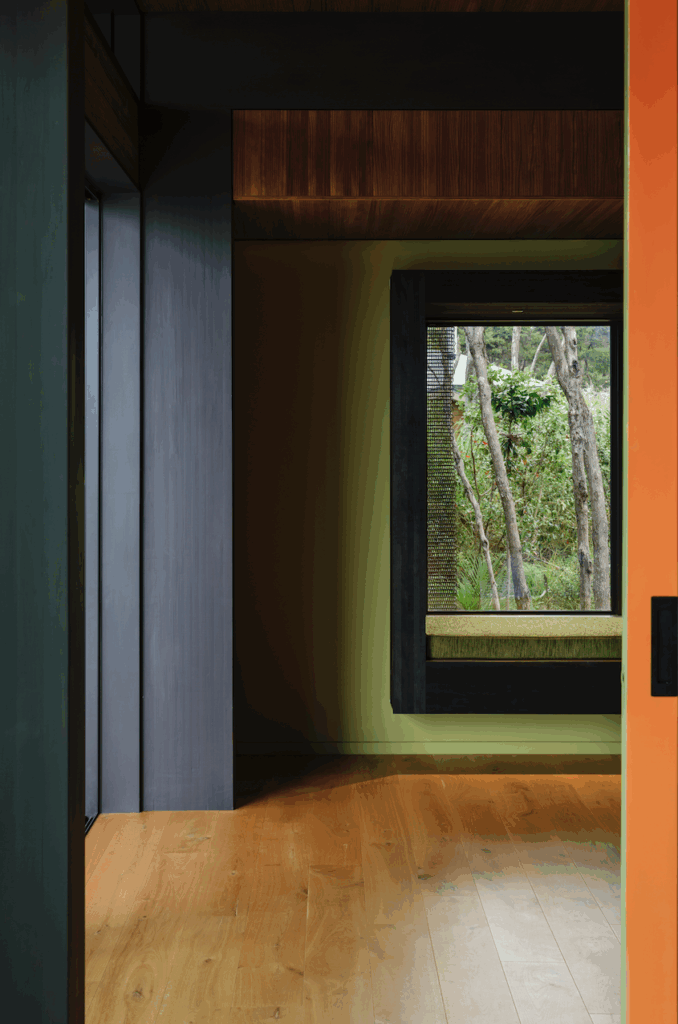
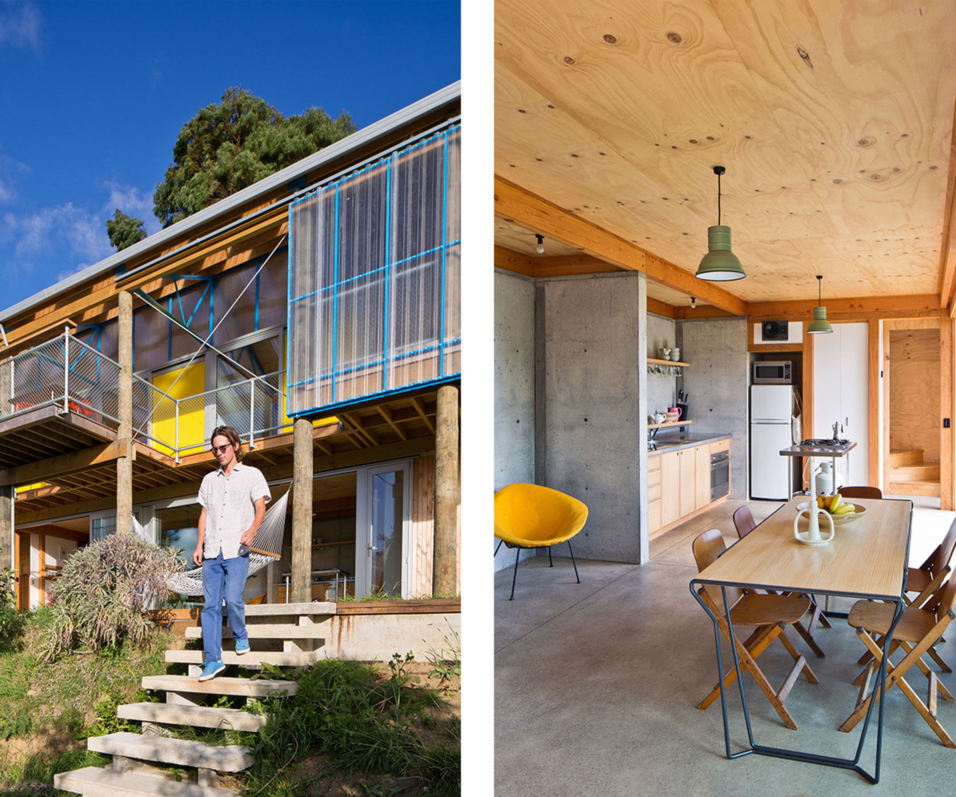
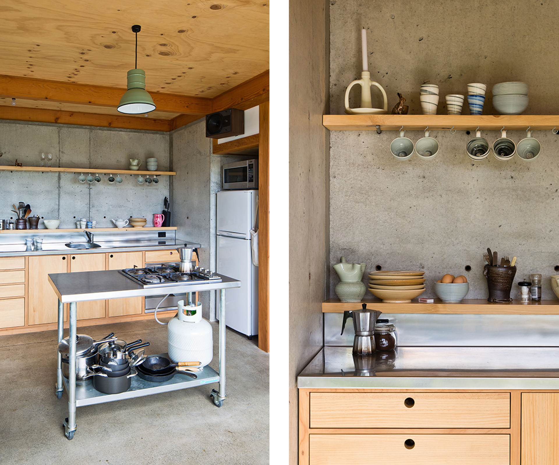
On the ground level, a cast in-situ concrete box embedded into the bank behind contains the living areas and kitchen. This is glazed along the front face to draw in as much light and heat as possible. The afternoon sun soaks into the thermal mass of the concrete, and this traditional passive-design technique means the house stays warm even when the temperature outside drops. On top of the concrete base rests a lightweight timber and polycarbonate box with two bedrooms and the main bathroom. The thin steel trusses, painted a vibrant blue, underscore this lightness, which the designers accentuated by separating the rooms with twin-wall polycarbonate panels.
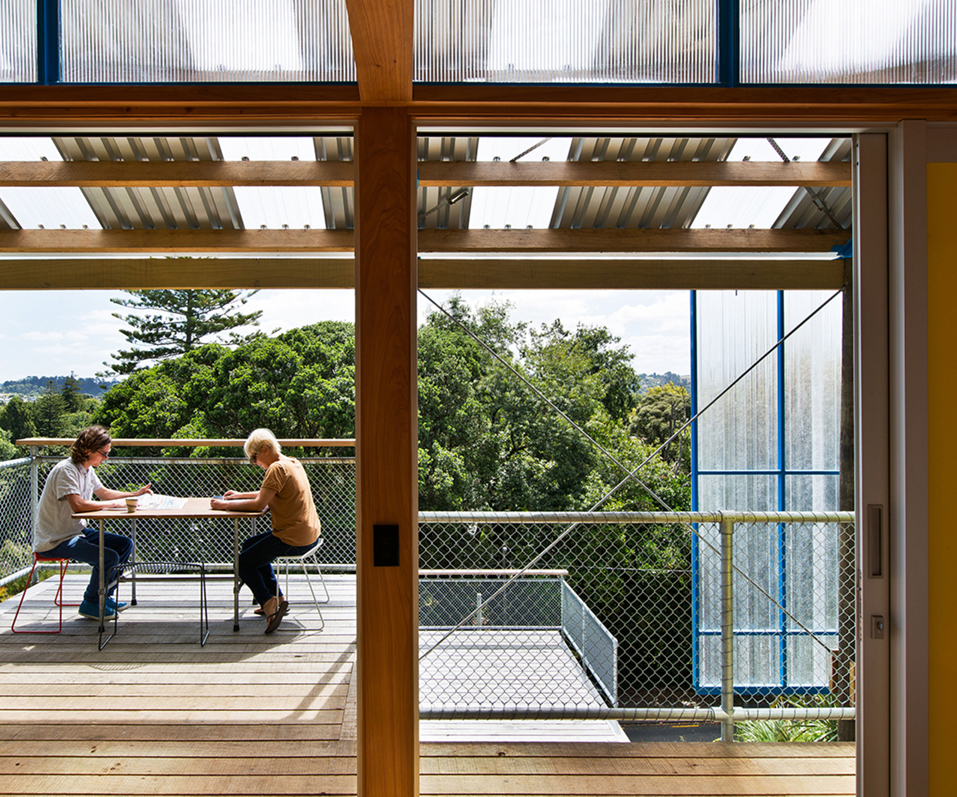
A perpendicular jetty-like deck protrudes out over the slope from the home’s ground floor, suspended by a series of thick tanalised poles (also purchased on TradeMe) that also reinforce the ground. While it seems like a seamless connect between structure and design, this came about through the big disaster of the build. On a particularly soggy New Year’s Eve, when all four of the friends were scattered around the country on holiday, their neighbour called to say he was watching the front of their section slide down the hill. “The slip took out all our planting and blocked the road. Our picnic table ended up in a pile of sludge at the bottom of the hill,” recalls Ben. “Worst New Year ever.” Luckily, they hadn’t started building the narrow tongue of deck yet, so they were able to integrate the retaining for the eroded cliff face with this.
Another surprise, though this one far more welcome, was that in the midst of the build, partners Tim and Caroline discovered they were pregnant. Sally laughs, “I think visitors to site were amused to see a very pregnant woman with a tool belt on! Caroline was working right up until 5pm on the day she went into labour.” It may sound like a near impossible feat, but Caroline explains that she was lucky not to feel sick. “I thought it might be tough to keep building – but physical work in pregnancy turned out to be great. I found sitting down at dinner harder than building a wall,” she says.
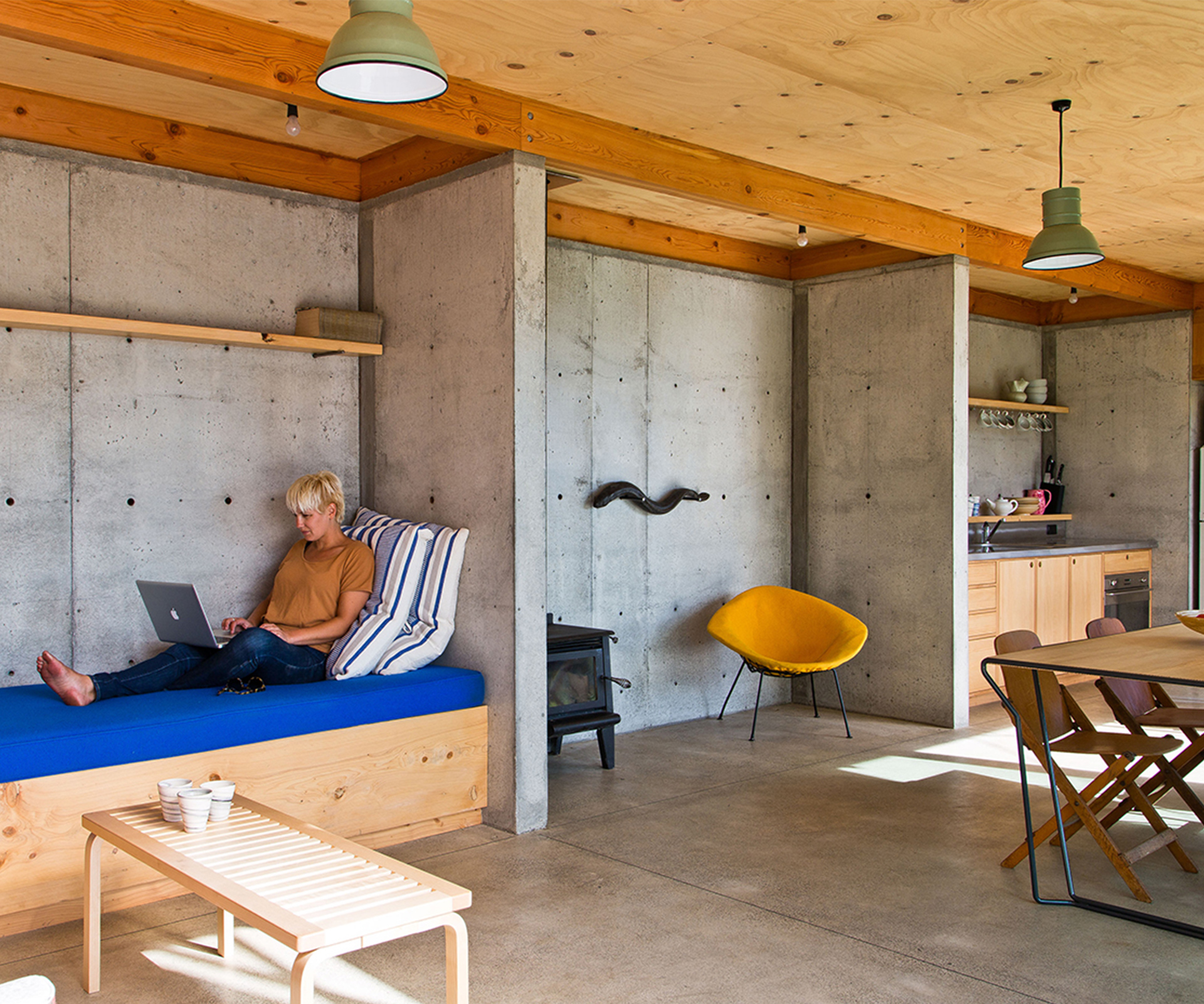
The planning, the anticipation, the pain, the frustration, the excitement – perhaps birth isn’t such a terrible metaphor for this little project. Indeed, this house is relatively tiny, but there is a steely maturity in the end result. “Every design decision we made was a balance between cost and architectural value,” explains Tim. The project’s small size was the most significant factor in keeping the cost down, but having more time than money, the group also scoured the internet for cheap materials and secondhand fittings. Most significantly, though, it’s the way they’ve used basic materials that shows the impact of considered design regardless of budget. We wait in anticipation for the next chapter. –Nicole Stock
Q&A with Ben Mitchell-Anyon, Sally Ogle, Caroline Robertson and Tim Gittos
HOME How long did the whole process take?
Ben Mitchell-Anyon The build took exactly one year.
Sally Ogle We’d owned the section for just over a year before we moved to Whanganui to start building. We’d camped there a fair bit, and done lots of planting.
HOME What have you learned throughout the process?
Sally Ogle I think we all learnt how cheaply we could live!
Caroline Robertson Staying in the house we had a chance to experience good design principles – double glazing and the thermal mass of the concrete floor works as well as we told people it would!
HOME What were some of the hardest experiences during the project?
Ben Mitchell-Anyon Physically, the hardest thing was probably wrestling with a blocked concrete pump hose up the muddy driveway in the rain for six hours.
Tim Gittos Dealing with the council was one of the most frustrating and disempowering experiences ever.
HOME Do you think this has made you better designers?
Ben Mitchell-Anyon Yes, I think so. On a technical level a better understanding of building practice and techniques surely improves the way you design and detail.
Sally Ogle I think it also means we should be able to communicate more clearly with builders and other tradespeople in the future, and not ask them to do the impossible.
Tim Gittos I hope so. For me it’s certainly reinforced the value of good design. You don’t need to use expensive materials or techniques to make something beautiful.
HOME Why’d you call the house the Dogbox?
Sally Ogle It’s part-homage to Melling Morse Architects, where Tim and Ben worked, and their naming conventions – a number of their projects are something-BOX. It was also because at times we were each in the dogbox with our respective partners. Obsessing over every step in the design and documentation of a house and then moving cities for a year can put some strain on relationships!
Patch Work Architecture wins Best Small Home at the 2017 Home of the Year awards
[jwp-video n=”1″]
Photography by: Paul McCredie.
[related_articles post1=”68169″ post2=”67356″]
