Aēsop’s first Wellington store takes design cues from its heritage location and neighbours

Aēsop’s first Wellington store features its signature understated style
Greek fabulist Aēsop knew how to tell a memorable story and the skincare brand that takes his name similarly makes a lasting impression.
The brand’s first Wellington store, designed by Rufus Knight, draws on the building’s own history. The result is a space that quietly celebrates the character of the neighbourhood it inhabits, says Aēsop’s retail architectural manager Denise Neri. The moral of the story? Be a good neighbour.
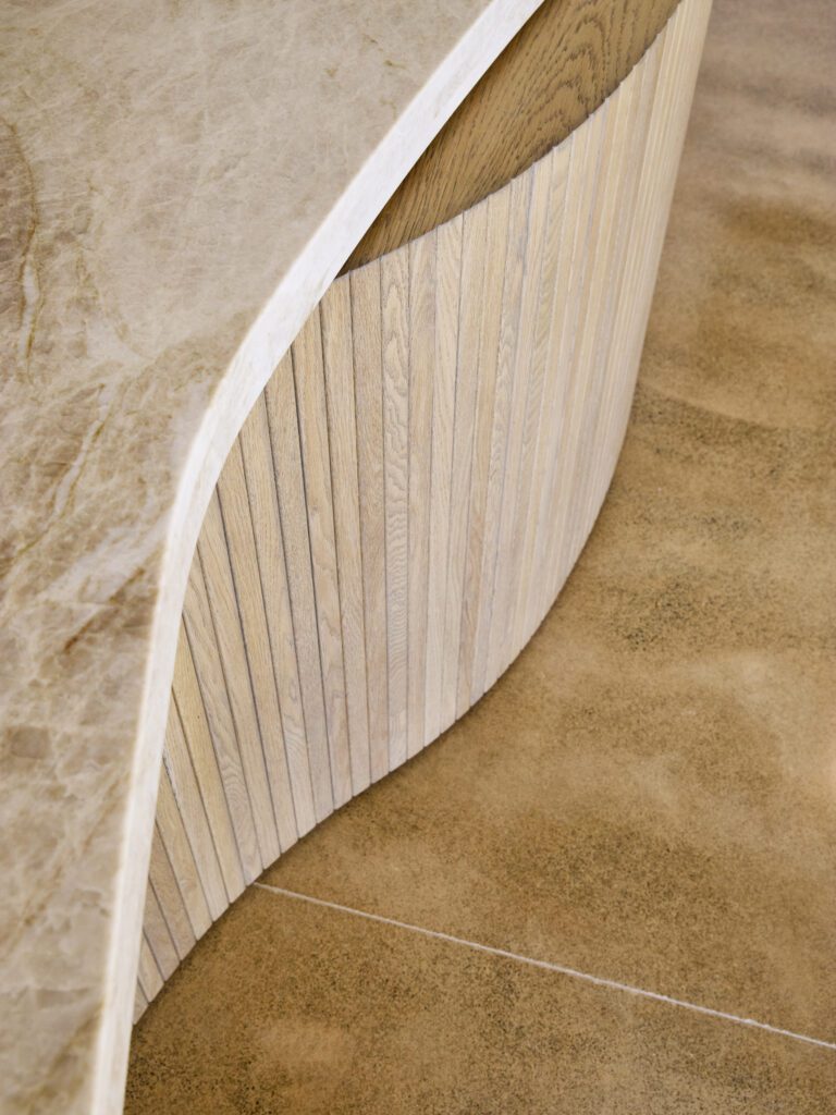
The store is located in Change House, which was built by the Brandon family in 1932, with a façade that incorporates art deco elements and the Chicago School. Recently added partitions to the inside corner of the building were removed, allowing original lines to speak for themselves. Textured cream walls and fruit-wood chairs with moss-green velvet add gentle layering. Knight also took inspiration from the period Dutch-style waterfront sheds nearby.
“The interior aims to reflect on the surrounding collage of European influences,” says Knight, “and reference the fluid yet tactile forms of the period in which Change House was built.”
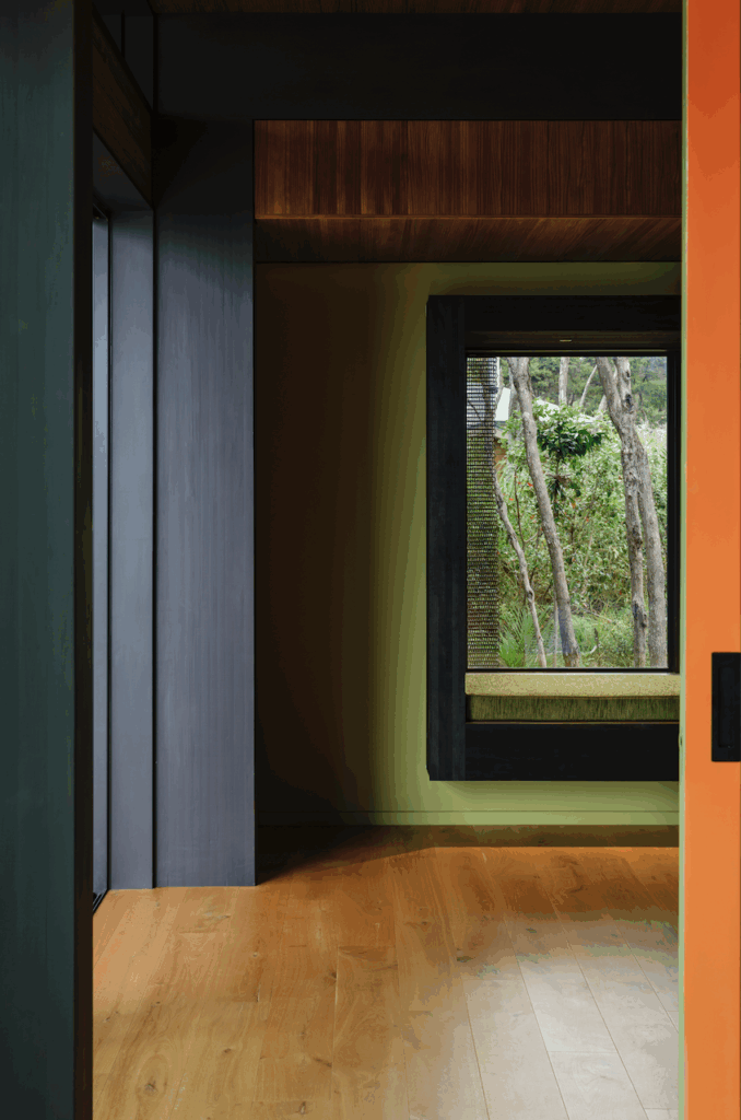
Neri describes Knight’s design as “simultaneously warm and minimal, with soft curving walls visually strengthened by the extensive use of dark timber – it’s elegant and understated”.
Aēsop Wellington
150 Featherston Street,
Wellington
aesop.com
Words by: Jessica-Belle Greer.
[related_articles post1=”81446″ post2=”81720″]


