Using standard materials and smart detailing, Sam Kebbell designs a house on the Kapiti Coast on the barest of budgets
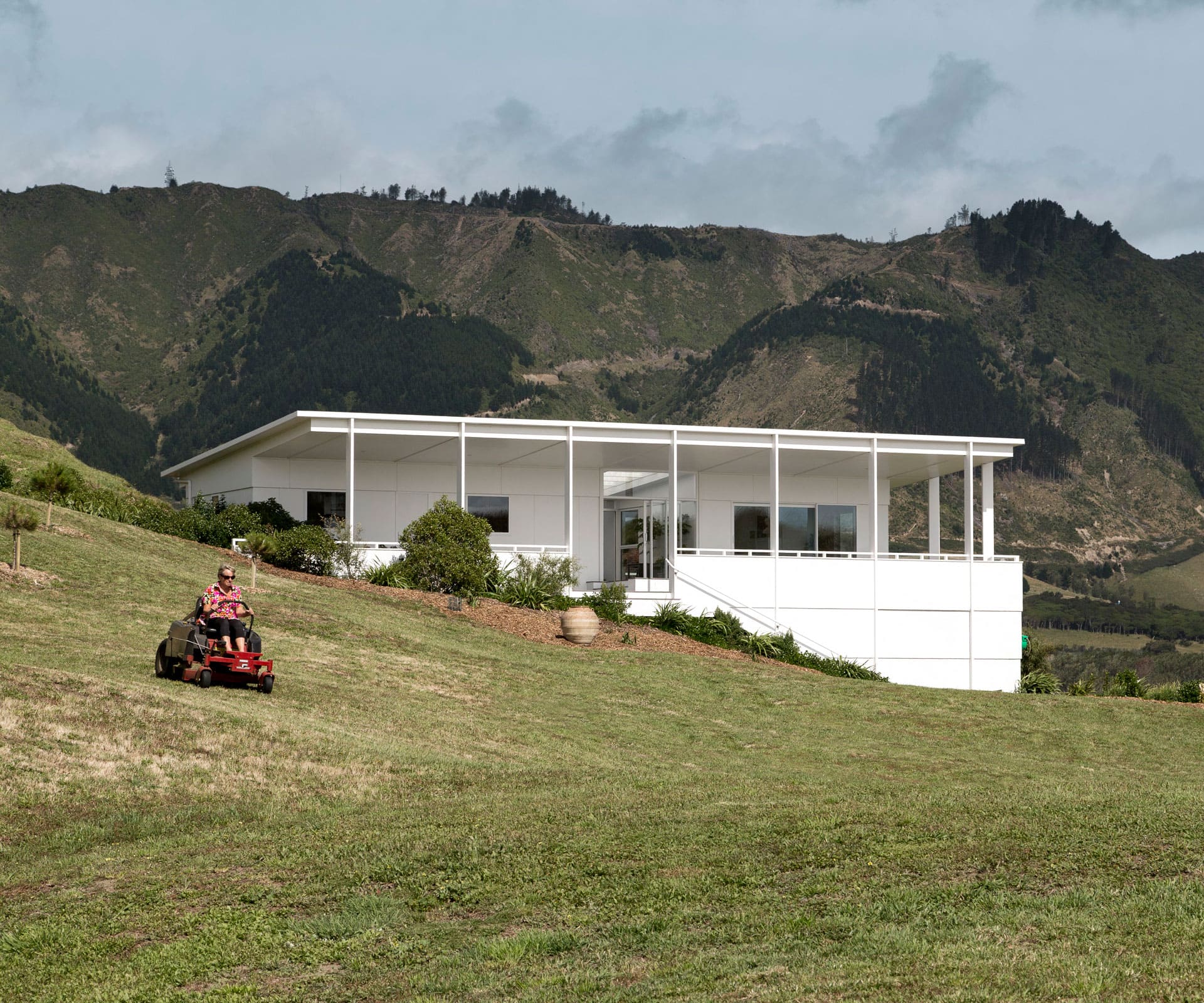
Aesthetic and budget find common ground in this Kapiti Coast home
Can you build an affordable, handsome home? The answer isn’t straightforward, but the ‘Quite Simple House’ by Wellington architect Sam Kebbell of Kebbell Daish comes pretty close. Designed for a couturier who had just moved back from London, the house was built on the slimmest of budgets by a contractor who usually works on group homes.
Kebbell navigated the financial constraints by using the Department of Building and Housing’s delightfully named ‘Simple House – Acceptable Solution’. The guide is recommended for smaller-scale projects that meet a set of criteria without requiring complex engineering or detailing. But a good building has to be about more than just budget – you also need the surprising and the delightful, and so Kebbell pushed and pulled the guidelines to come up with something more progressive.
To get to the two-bedroom house, an ordinary gravel driveway weaves its way through the dunes to an all-white house built from painted pine and fibre-cement panels, in a landscape of muted greens and dusty browns. The two-bedroom house is split between two wings, connected under one roof by an internal courtyard. Wide steps build up to a lofty verandah, which runs almost all the way around the outside, offering remarkable views of Kapiti.
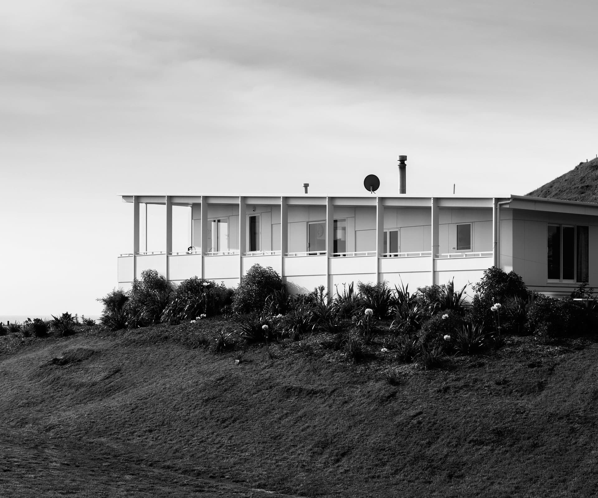
There’s a generosity of height, supported by the rhythm and strength of vertical timber columns – Kebbell set up a grid for the house using standard sheet sizes to save on waste and assist in the ease of building, but it also gives the house a rigorous sort of geometry.
In his research, Kebbell – who also teaches at Victoria University’s architecture school – explores the relationship between the ordinary and extraordinary, bridging the common with the rarefied. In short: how do you combine a cost-effective design with the more salubrious lure of looking good?
The elegantly exposed junction between the roof and timber columns is one answer. Resembling the ‘Farnsworth House’, a modernist home in Illinois by Mies van Der Rohe, where pillars lightly meet the roof, the detail still fits with the standard use of the NZ building code. “On one hand, we worked hard to create a strong form in the landscape, even a slightly monumental one,” says Kebbell. “On the other, we established a clear geometry and developed a consistent approach to detailing the exterior.”
Design aside, collaboration was an integral part of the build, with certain aspects of the project left to the hands-on client; the project was also designed to reduce the number of trades required to build it. The result is a house that works well on both levels – a practical model that suggests the illustrious dream of a well-designed, affordable home isn’t so unattainable after all.
Words by: Natalie Bradburn. Photography by: Paul McCredie.
[related_articles post1=”71372″ post2=”69804″]

