Richard Naish of RTA Studio won the Home of the Year 2015 with the design of a home for himself and his family in the Auckland suburb of Grey Lynn. In fact, this wasn’t his first stab at designing such a dwelling: the first home he designed for his family, just across Grey Lynn Park, was a finalist in our 2011 Home of the Year award. Here’s our story and video of the Naish-Hotere family’s first home from our Home of the Year 2011 coverage.
It is safe to assume that a large proportion of New Zealanders have lived in a bungalow. It is less safe to assume that they enjoyed it. For while these mass-produced old dwellings possess a certain romanticism, their failings are legion, most of them falling into the intensely felt categories of ‘cold’ and ‘damp’.
Richard Naish and his wife Andrea Hotere had lived in plenty of these houses but hadn’t necessarily had their fill: when they purchased the site in the Auckland suburb of Grey Lynn on which this home now stands they were quite prepared to keep the old bungalow that originally occupied it. “The initial plan was to gut the old bungalow and make it a large living area, then add a kids’ wing,” says Richard (the couple have three children, Jack, Alice, and Holly). Then they realised not only that the bungalow’s low ceiling height wouldn’t suit a large open-plan living space, but that it would cost only a bit more money to take full advantage of their double-size site by wrapping an all-new home around a generous courtyard. Confirmation they had made the right call came in the months that followed as Richard, co-founder of the Auckland architecture practice RTA Studio, stayed up nights in the bungalow’s study completing the working drawings for their new home. The house was so cold that winter that he wore his puffer jacket every night as he worked.
In these circumstances, you might expect a new home to be a reaction against the old bungalow’s inhospitability, but this is not the case. Sure, the new house Richard designed is warm and spatially generous in ways that most bungalows are not, but it is also a home that respectfully acknowledges its ancestry while confidently forging its own path. “I’m interested in demonstrating that you can create something that’s seriously modern and forward-looking that’s also contextual and sympathetic and right,” Richard says.
He already has a reputation for doing just this. RTA Studio is admired for designing buildings that manage to be modern and sensitive to the scale of their neighbourhoods at the same time, including the Ironbank building on Auckland’s Karangahape Road (which was awarded the New Zealand Architecture Medal in 2010), as well as a host of smaller buildings in other parts of the city. It is a difficult tightrope to walk – something about the idea of fitting in suggests inoffensive blandness, something to which Richard does not aspire. “I’m always trying to make a subtle reference to context because if it’s overplayed it looks obvious and clumsy,” he says.
When it came to designing his own family home, one of his first steps was to treat Andrea as a client. She wrote “a fairly trusting brief,” she remembers. “I wanted something that felt tranquil and peaceful, with spaces for us all to be together and also to do our own things. And I wanted walls to hang paintings on rather than entirely windows.”
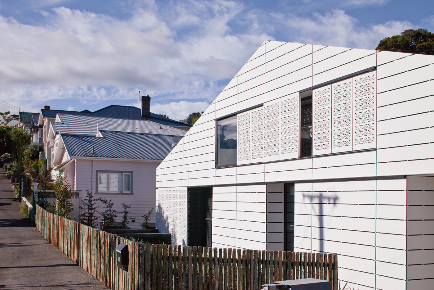
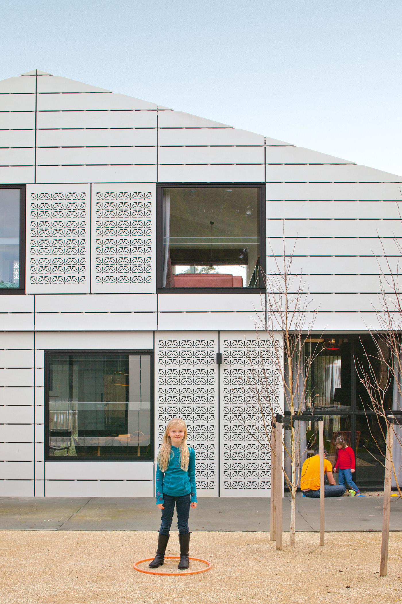
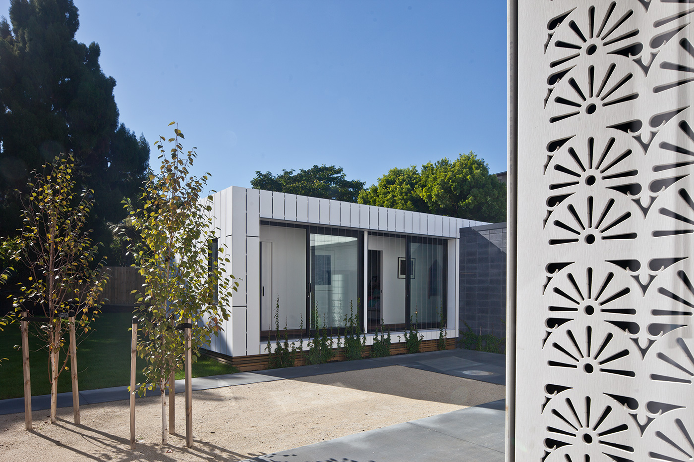
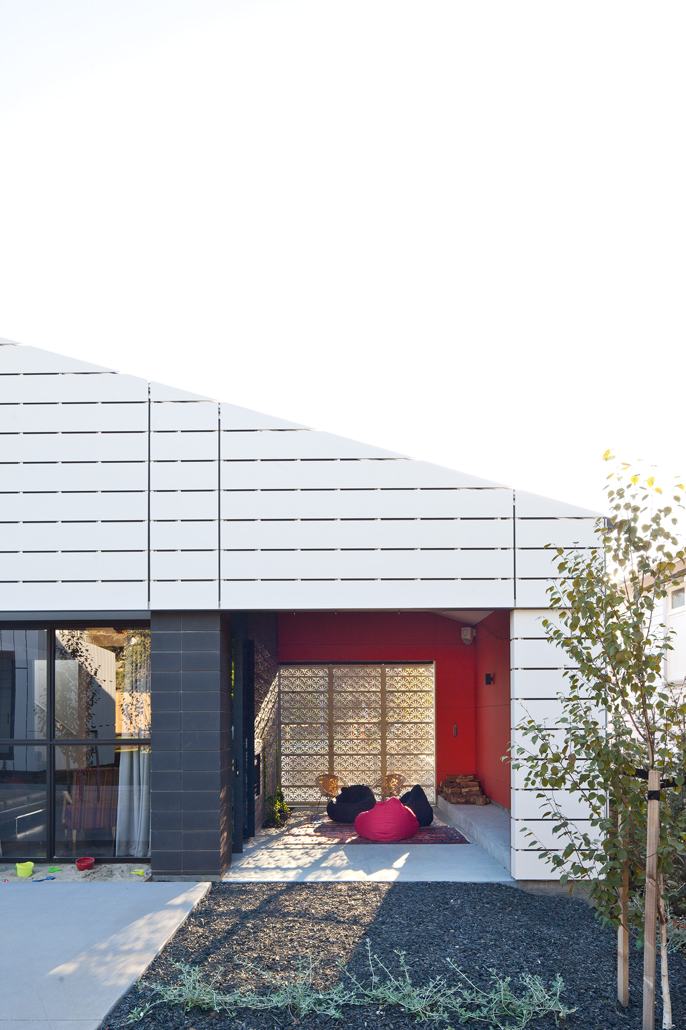
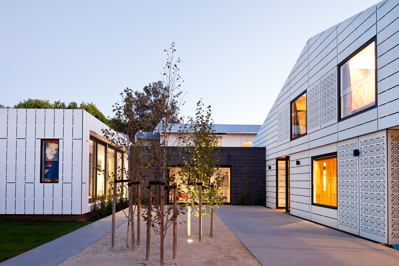
Richard’s design spreads the main wing of the house thinly along the edge of the site in the same relatively close proximity to the footpath as its neighbours, a gesture that, with a low fence made of recycled posts, maintains the rhythm and intimacy of the street. Yet there is no mistaking that this is a contemporary home: the roof pitch and its weatherboard cladding appear to be attempting to emulate the neighbours, but the long form and square windows look more like a child’s drawing of a house than the real thing. Screens made from laser-cut panels featuring an abstraction of a pattern borrowed from the fretwork of a nearby villa add unexpected decoration and a sense of intrigue about what might be going on inside.
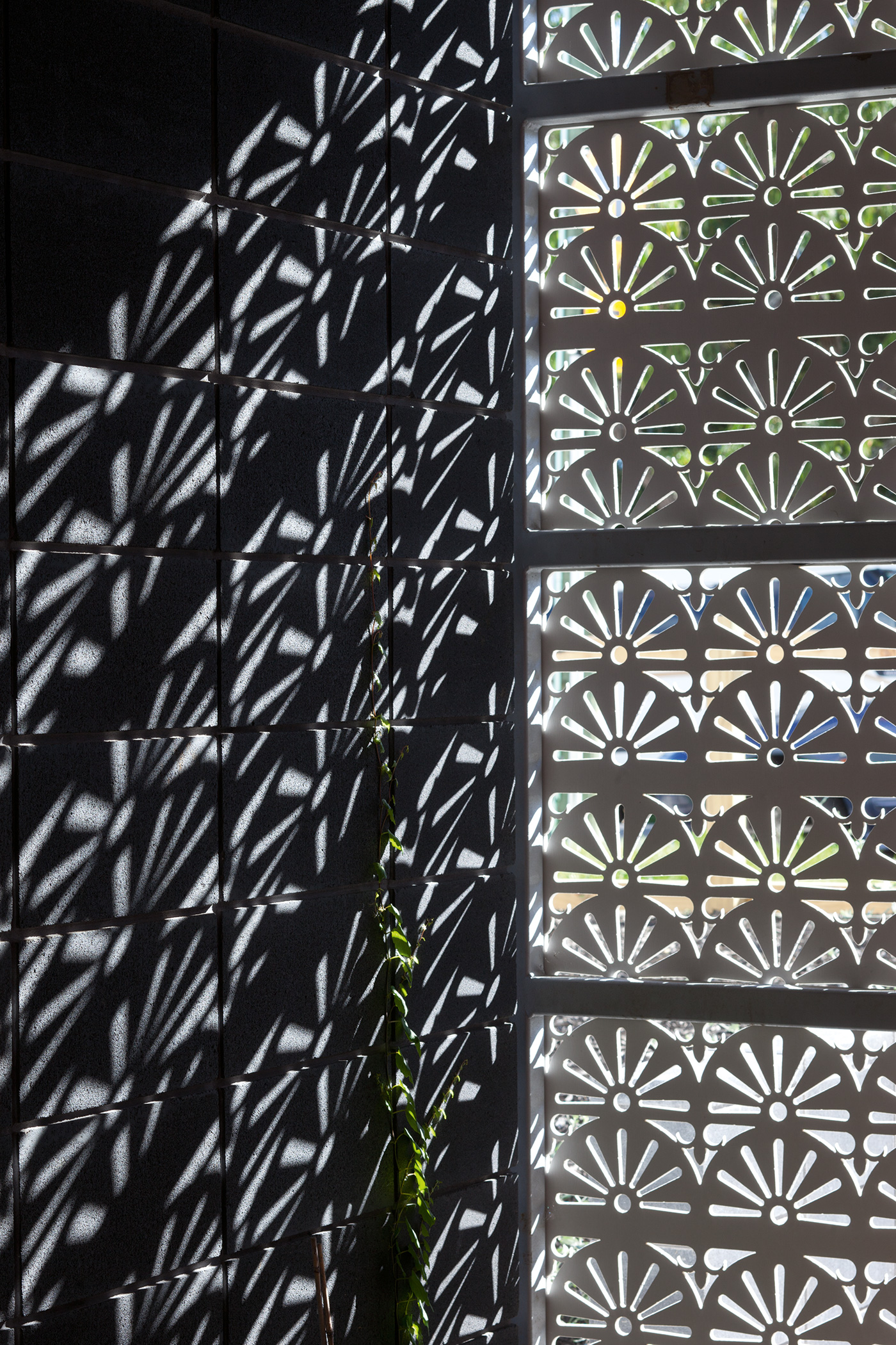
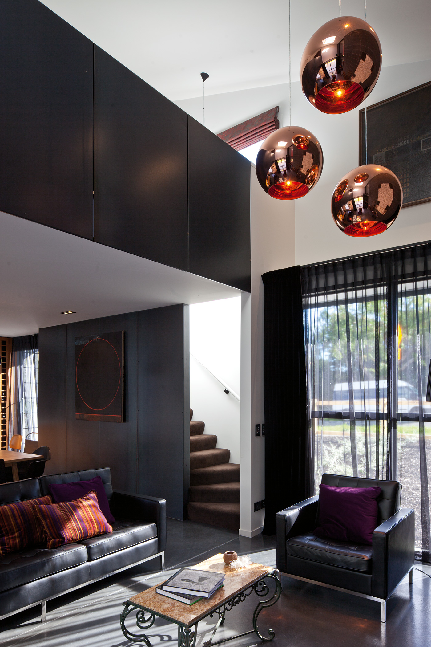
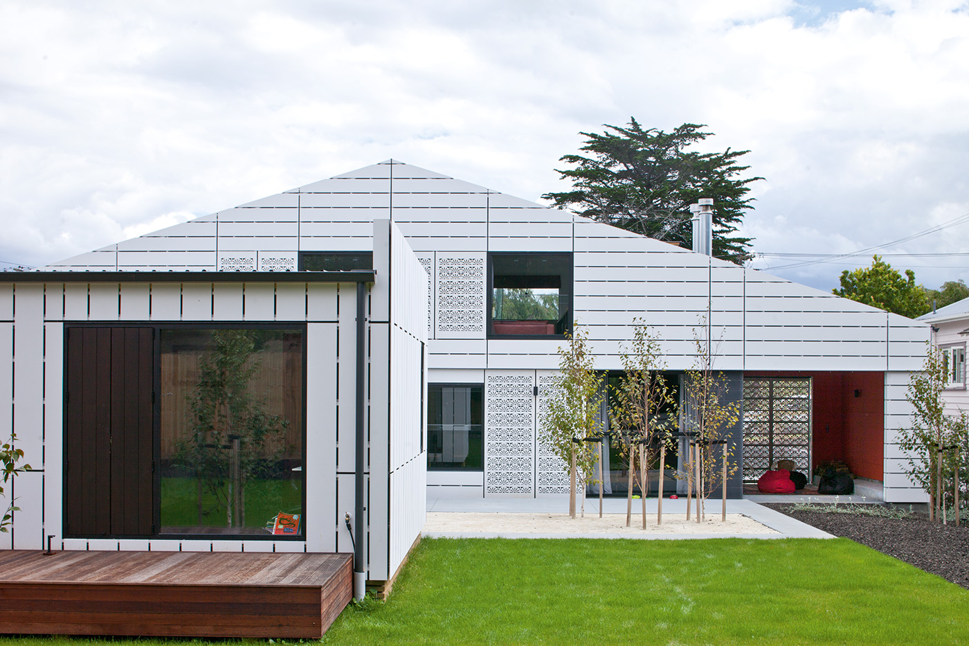
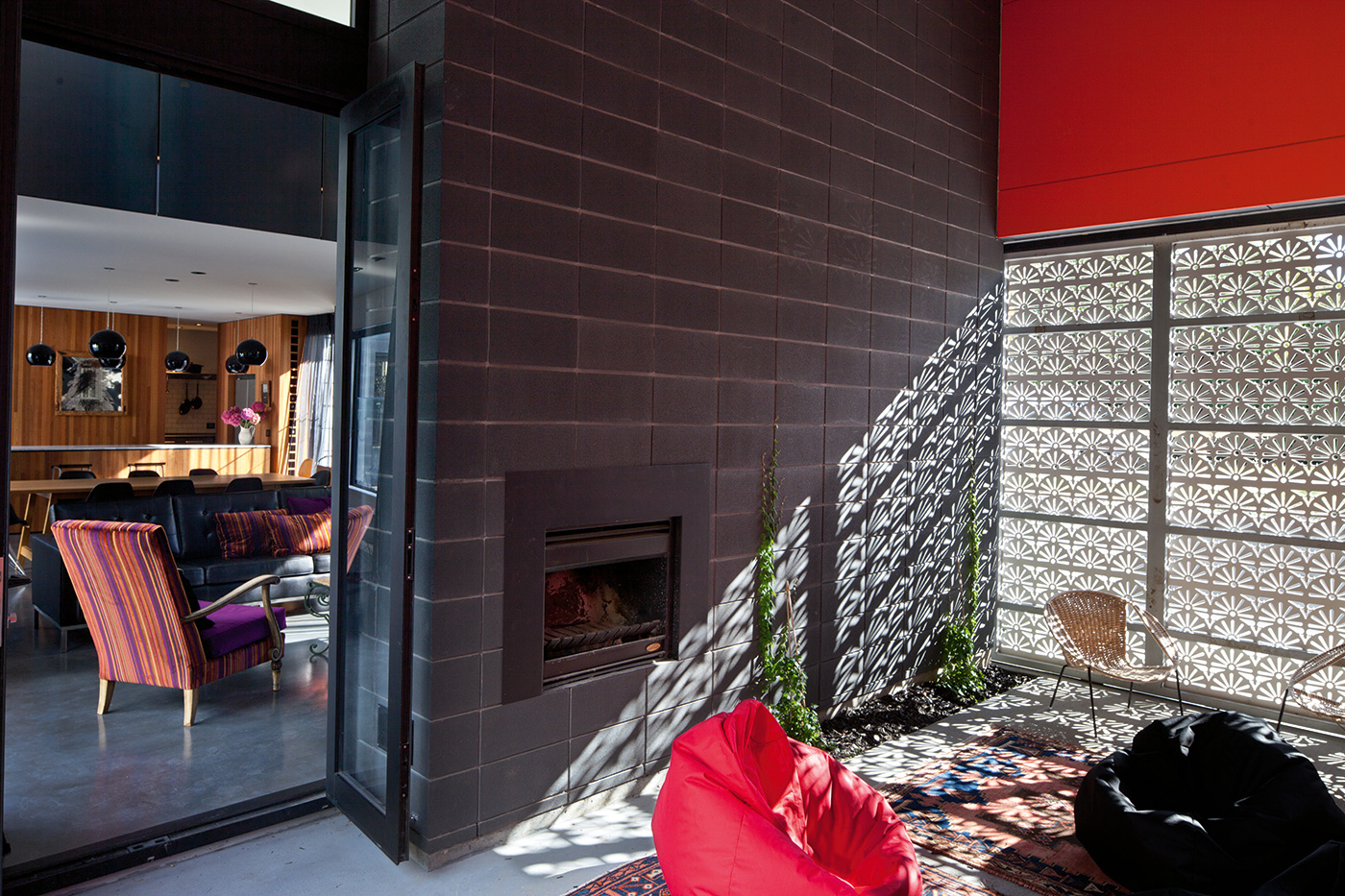
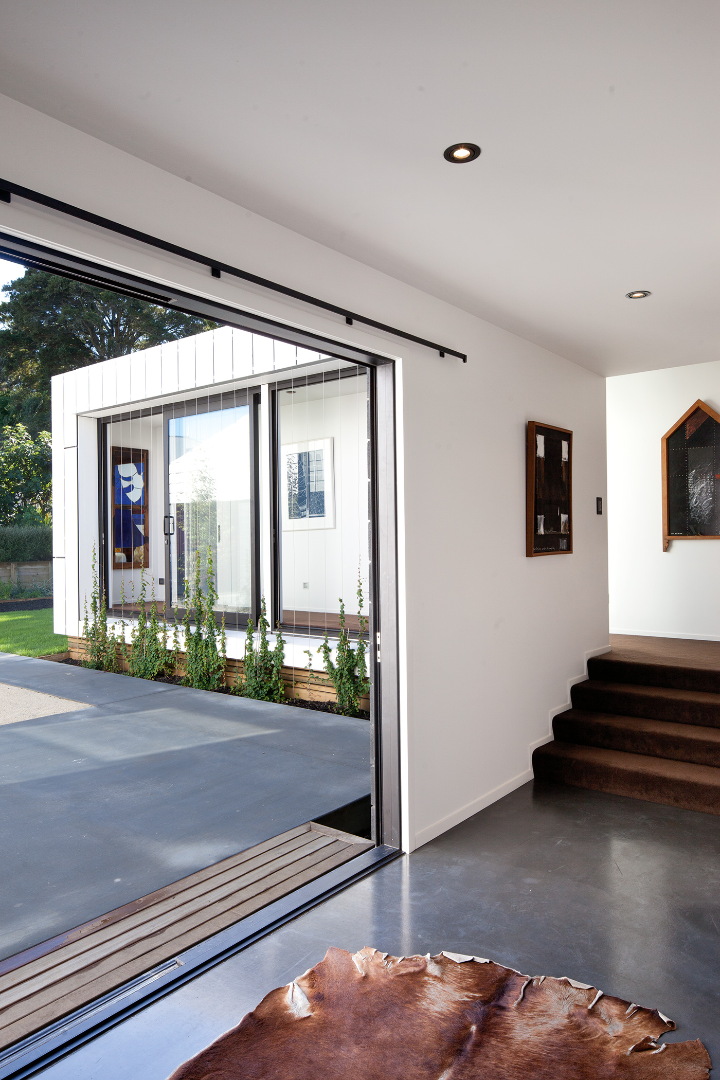
Indeed, the house is hiding secrets from the street, including a flat-roofed volume further back on the site containing bedrooms for Jack, Alice and Holly that is connected to the main part of the home by a living area and TV room that also opens onto the courtyard. Just off the main living area is a new take on the outdoor room, a space with a fireplace that is open to the courtyard and veiled from the street by one of the aforementioned perforated panels, whose patterns cast beautiful shadows on the wall in the afternoon light. (Richard has travelled extensively in the Middle East, where he was fascinated by the contrast of busy city streets and cool, tranquil courtyards).
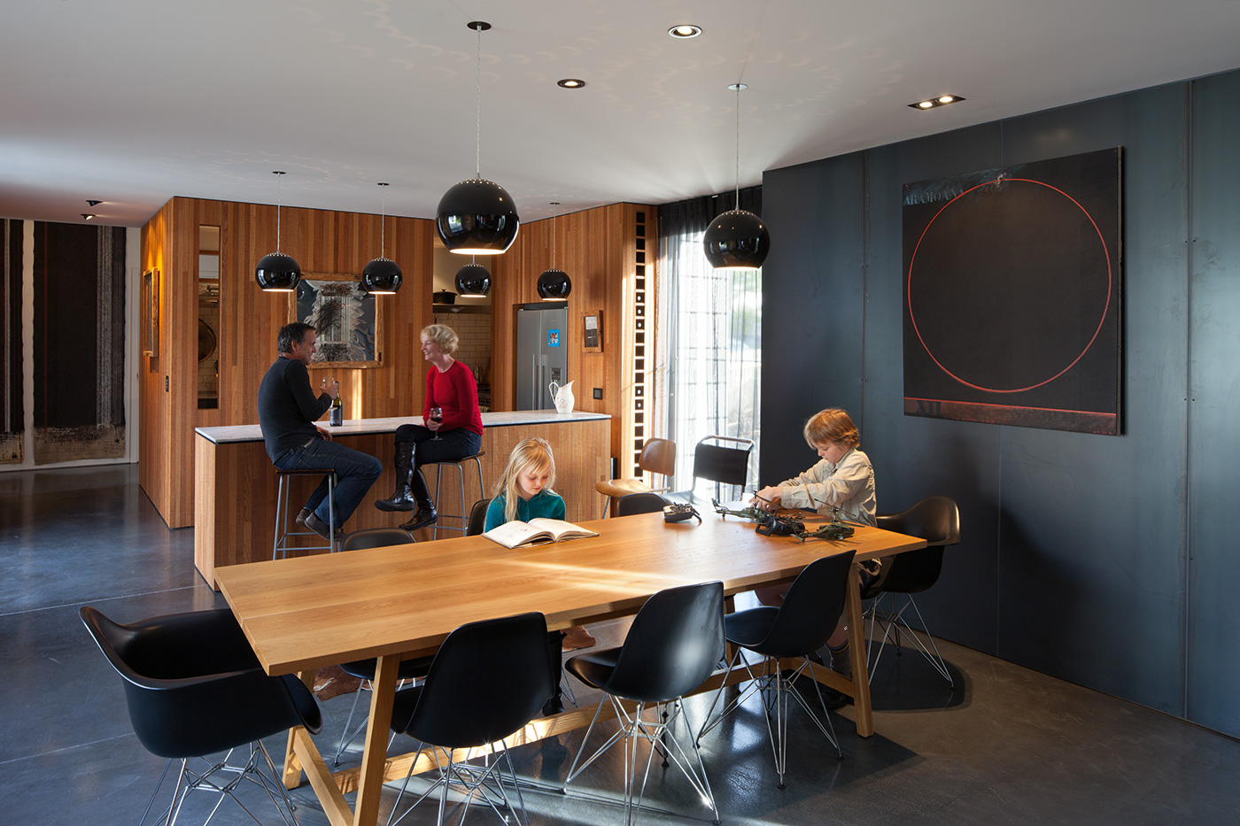
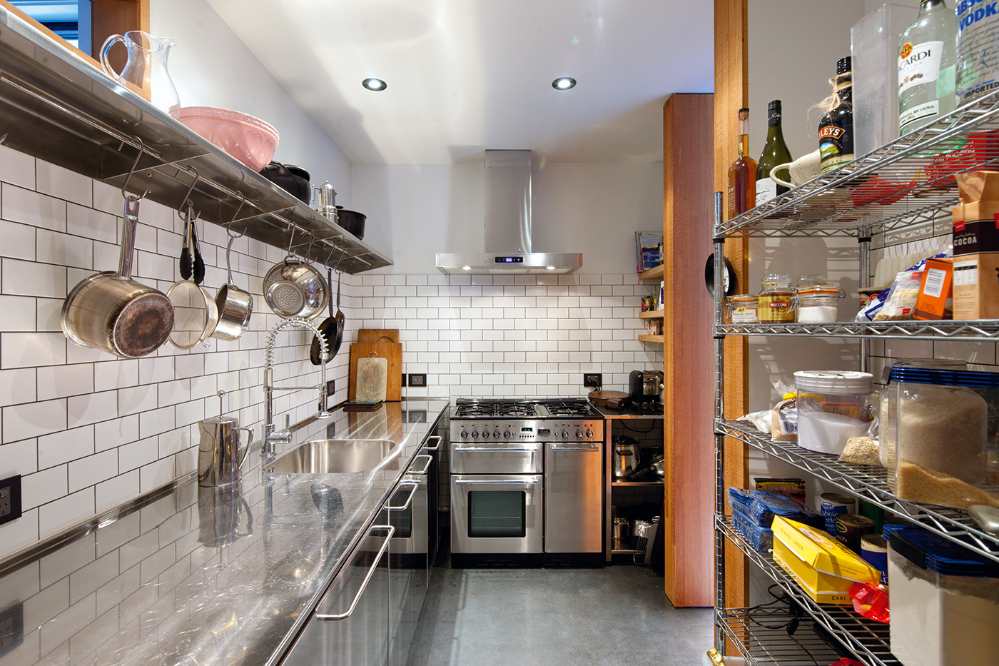
This game of revealing and concealing continues in the kitchen, which has an island bench in the open but most of its working space hidden behind a timber-clad wall. Richard confesses to being a messy cook, and appreciates the luxury of not having stacks of dishes visible from the dining table after the couple’s regular dinner parties. And upstairs is what Andrea calls a “luscious, grown-up retreat”: the couple’s bedroom and an adjacent mezzanine lounge separated from the living room downstairs, but not so much so that it feels isolated. Instead of a bungalow’s linear rooms-off-hall arrangement, this is a house of layers and complexity, a place designed for a family to grow into, somewhere to hold their collective memories without ever forgetting to look ahead, too. –Jeremy Hansen
