[jwp-video n=”1″]
An architect’s own sleek-but-simple holiday getaway
Evelyn McNamara‘s holiday home on Waiheke Island is something of a statement, and we’re not just talking about its bold black-and-white colour palette.
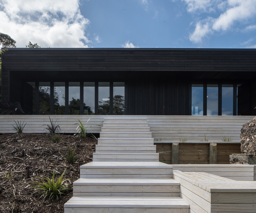
McNamara believes many New Zealand holiday homes have gotten a bit too big, abandoning their bach origins and forgetting a few things about summer simplicity. So she designed this 72-square-metre home to show that contemporary baches could be simple and sleek.
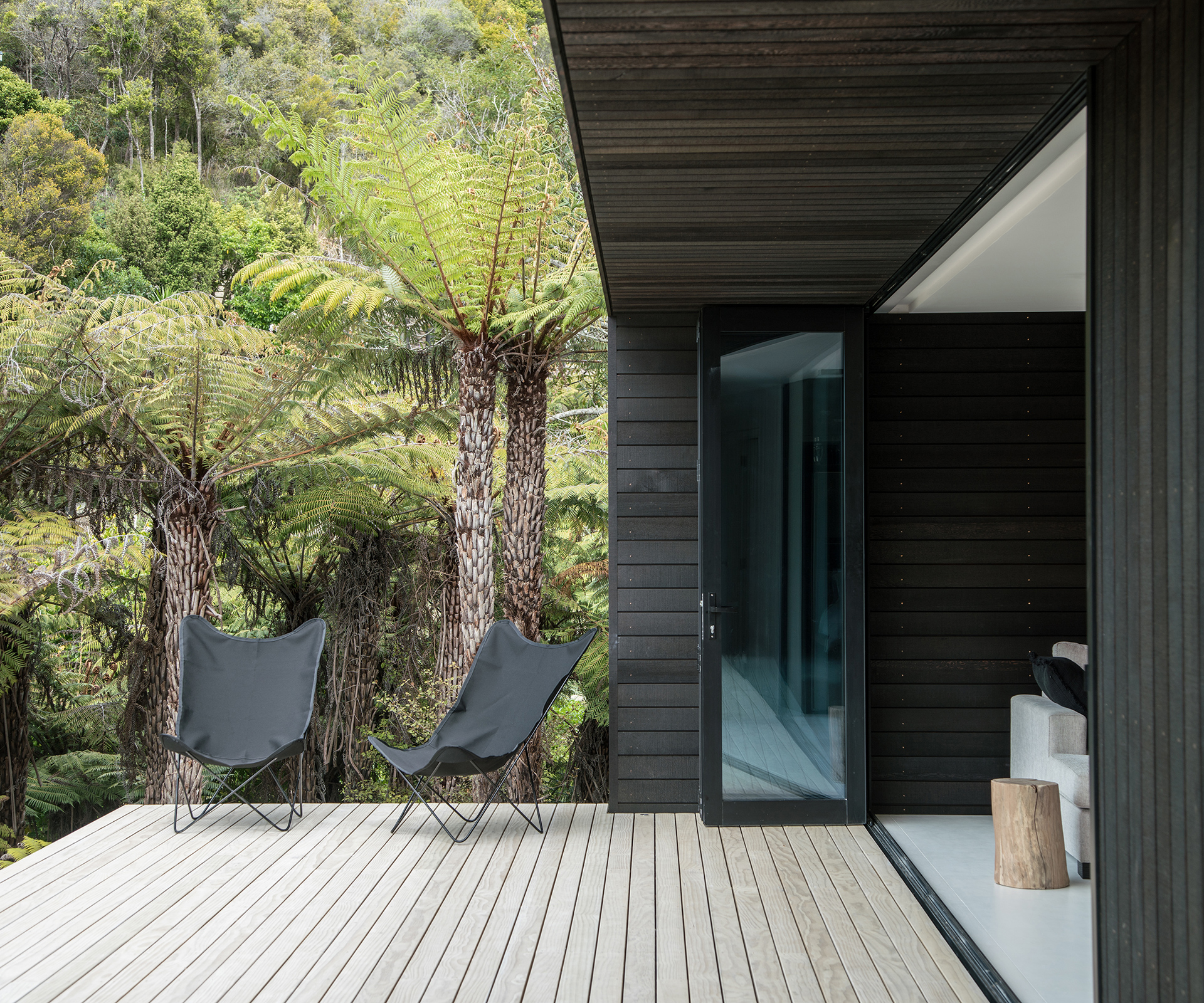
McNamara isn’t intending this home, located just a few minutes’ walk from Oneroa village, to be the only one of its kind. She set herself the challenge of designing a modular plan that could be easily located on a wide range of sites.
The idea is to make the design available as a cost-effective solution for clients, as the home needs little adaptation to make it suit different locations. That makes this house something of a prototype, as McNamara hopes that it is a winning formula that will end up popping up on sites all over New Zealand.
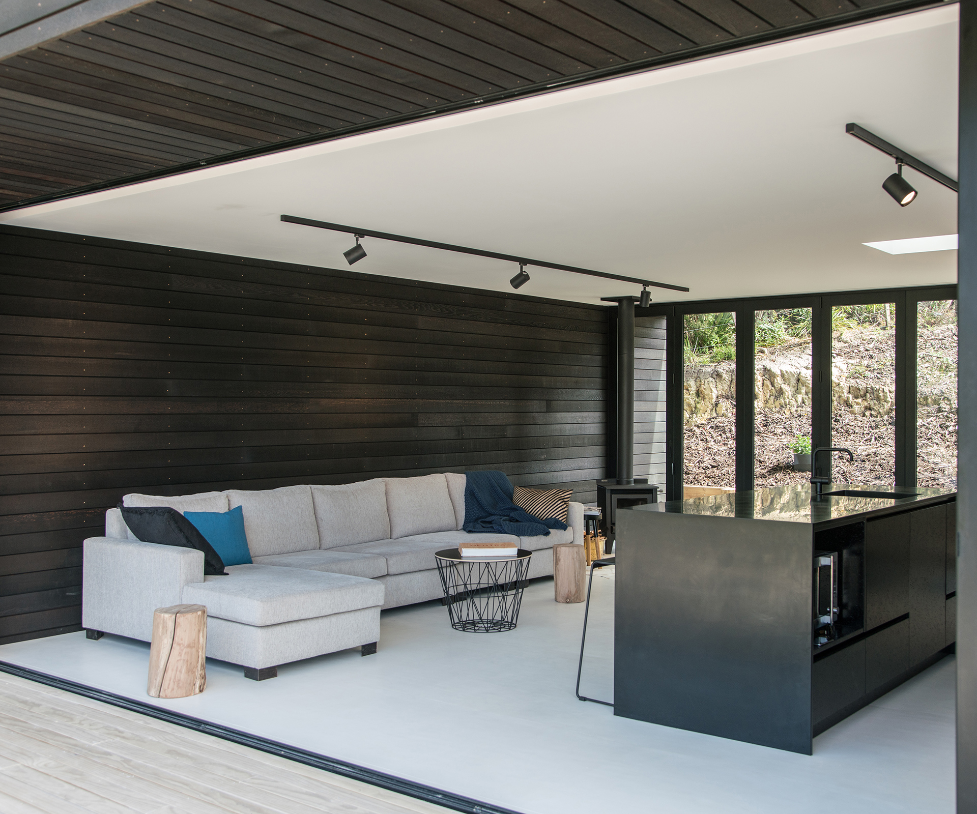
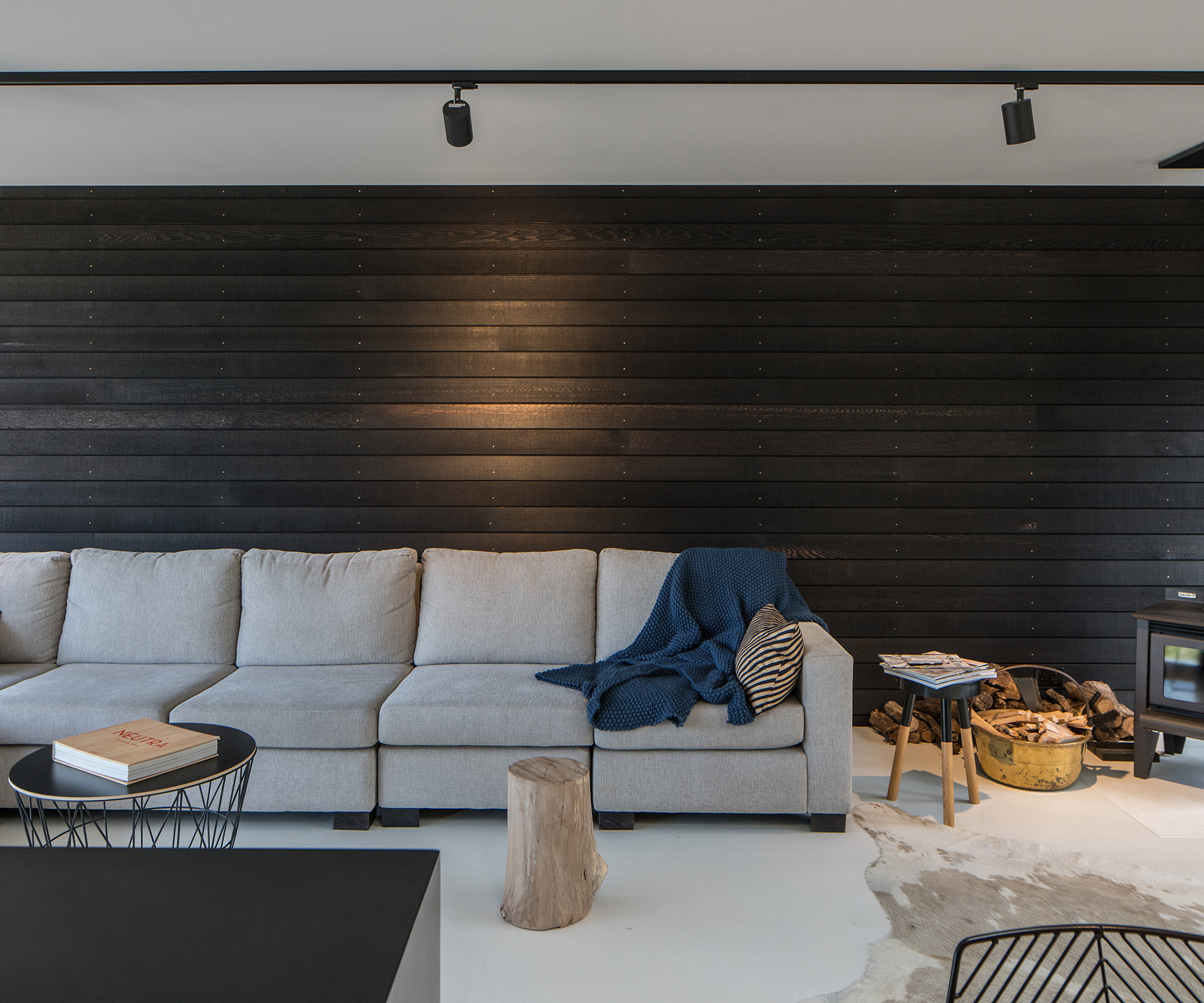
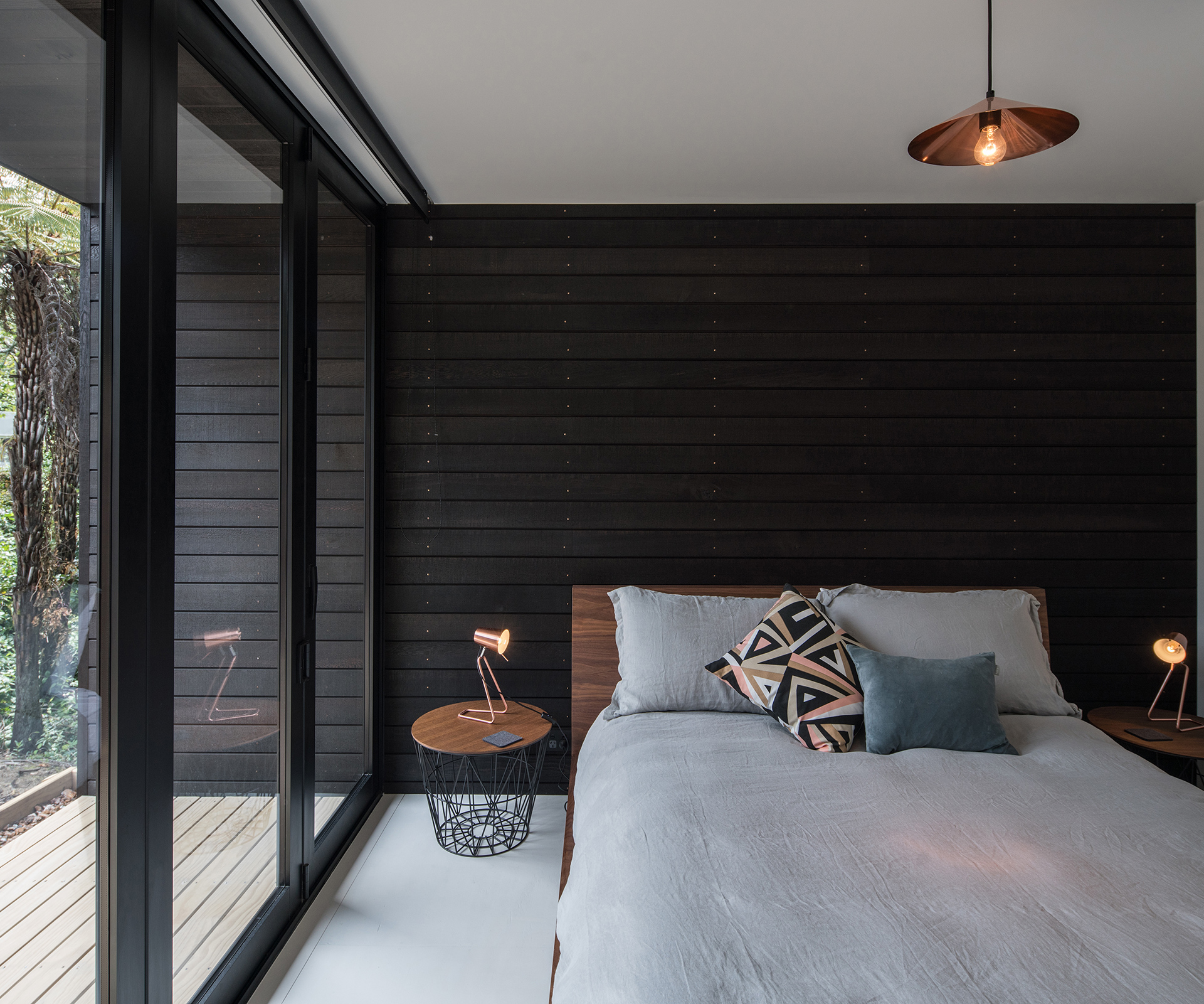
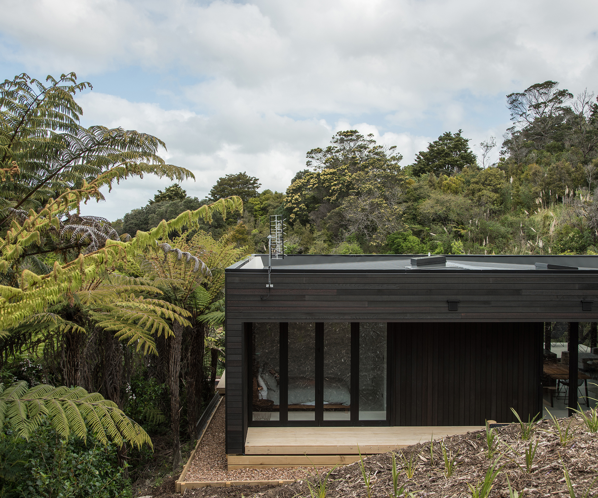
Simplicity was key in the design of the home, not only in the colour palette, but in the arrangement of rooms. The home’s dark cedar cladding also runs along the back wall of the bedrooms and open-plan living area.
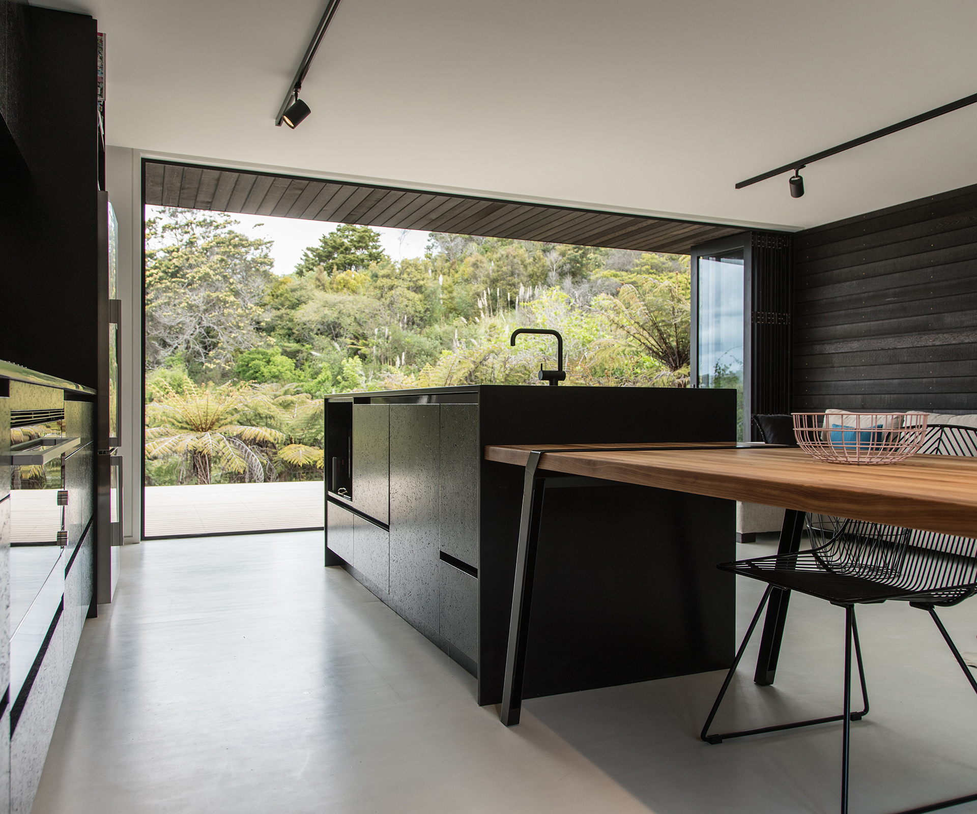
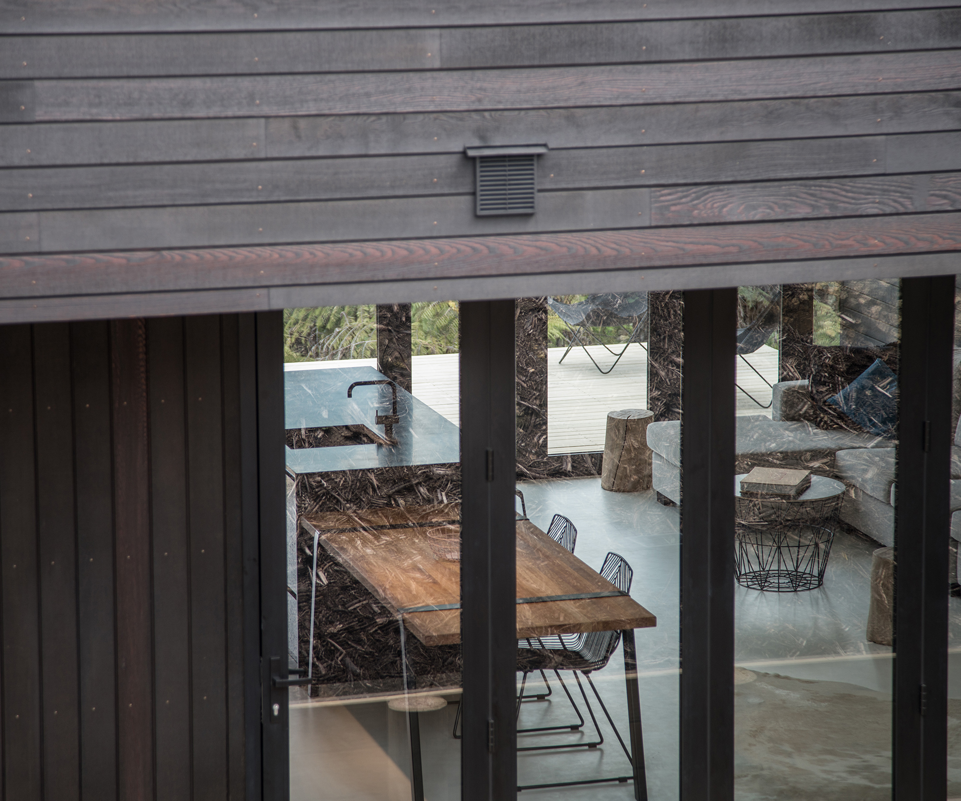
The symmetrical placement of glass bifolds doors by Altherm Window Systems on each side allows views to the south and draws sun in from the north. McNamara says she chose bifolds rather than sliders because she likes the way the vertical lines give the rooms a sense of enclosure and containment when the doors are closed. The bifolds stack neatly away at the edges of the deck when they’re open, making the living space feel like a real indoor-outdoor space.
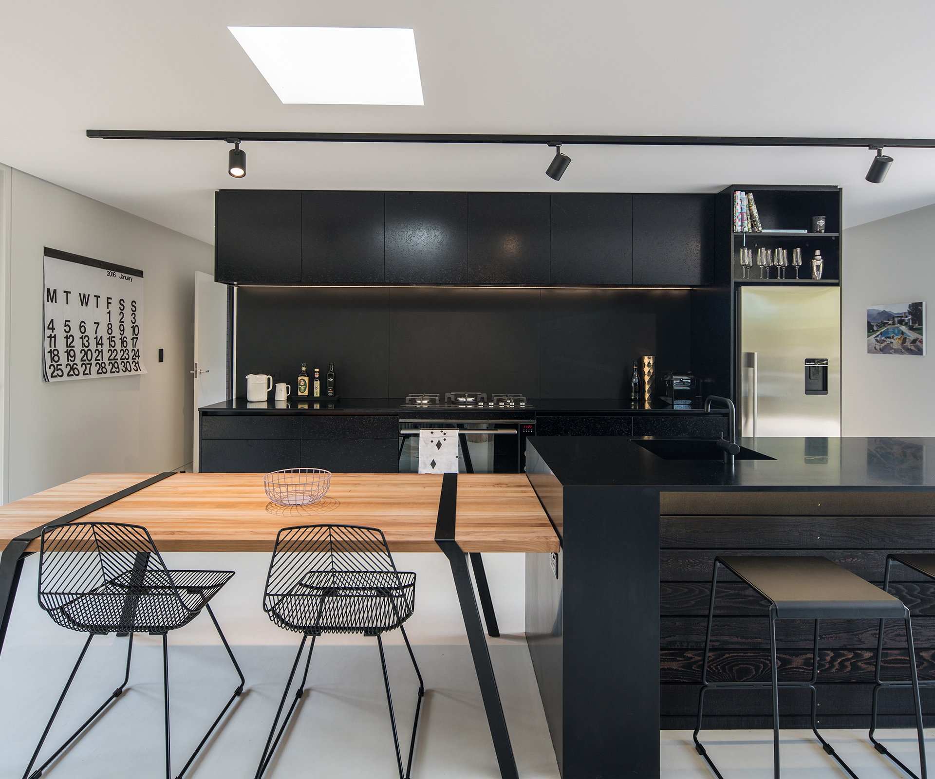
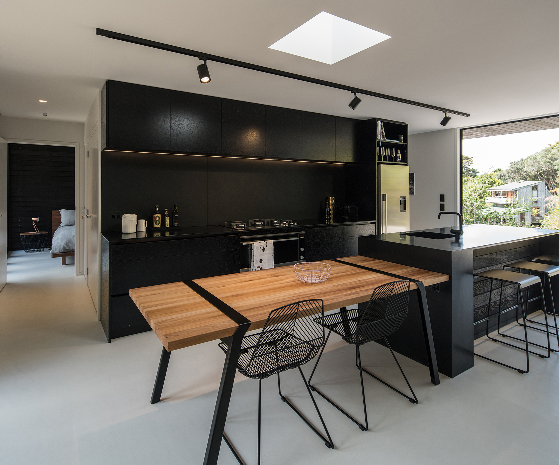
In the kitchen, McNamara chose black strandboard as a cost-effective cabinetry solution, while a ‘Pi’ table by Roderick Fry for Moaroom acts as an extension of the kitchen island and a movable dining table. She teamed black Corian benchtops with appliances by Fisher & Paykel. The floor is white-painted plywood.
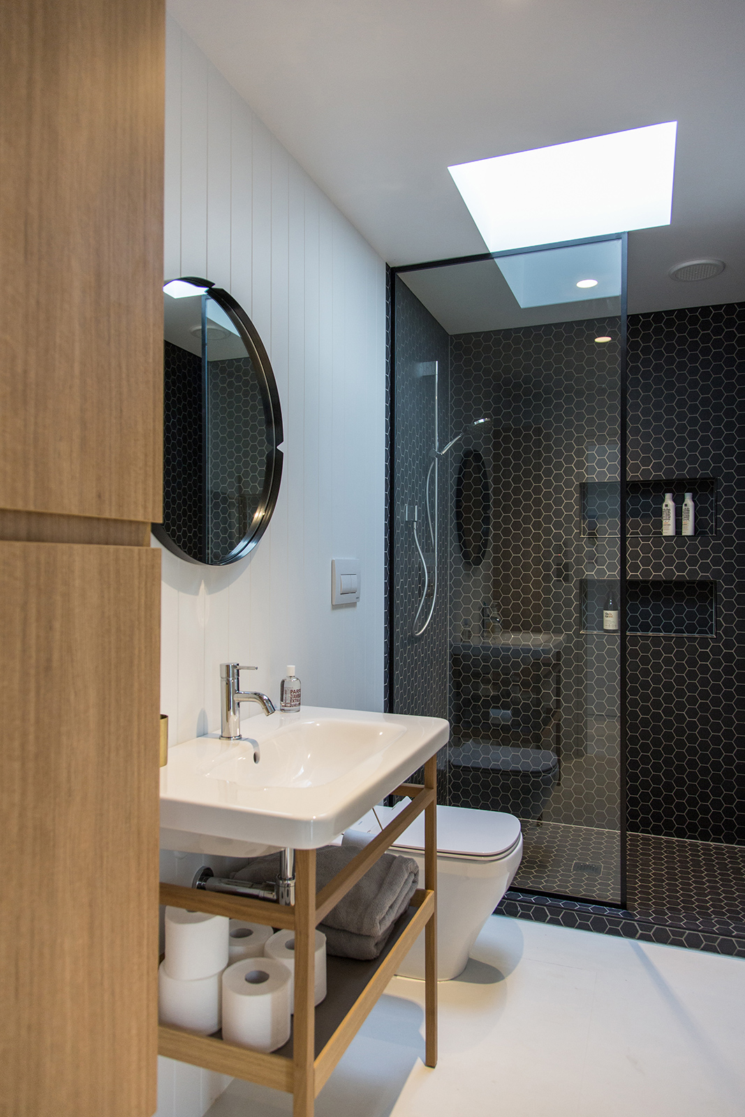
The home has its bathroom and laundry located in a central service core – another cost-efficient measure which means all the plumbing services are located close to each other). Because the bathroom doesn’t have an external window, McNamara installed an opening ThermalHEART skylight for light and ventilation. She kept the colour palette similarly simple in the bathroom, with dark tiles, timber cabinetry and white walls and floors.
The bedrooms are as simple as the rest of the house, with compact wardrobes, a dark cedar back wall and bifolds opening onto the deck.
McNamara intends to rent the home out as a holiday rental, but likes it so much she’s had trouble doing so since its completion in September. She’s holing up there for Christmas and New Year herself before putting it onto a holiday rentals website.
Photography by: Jeremy Toth.
