The luxury of space affords an elegant ensuite, as well as his-and-hers areas in this space designed by interior designer Sonja Hawkins
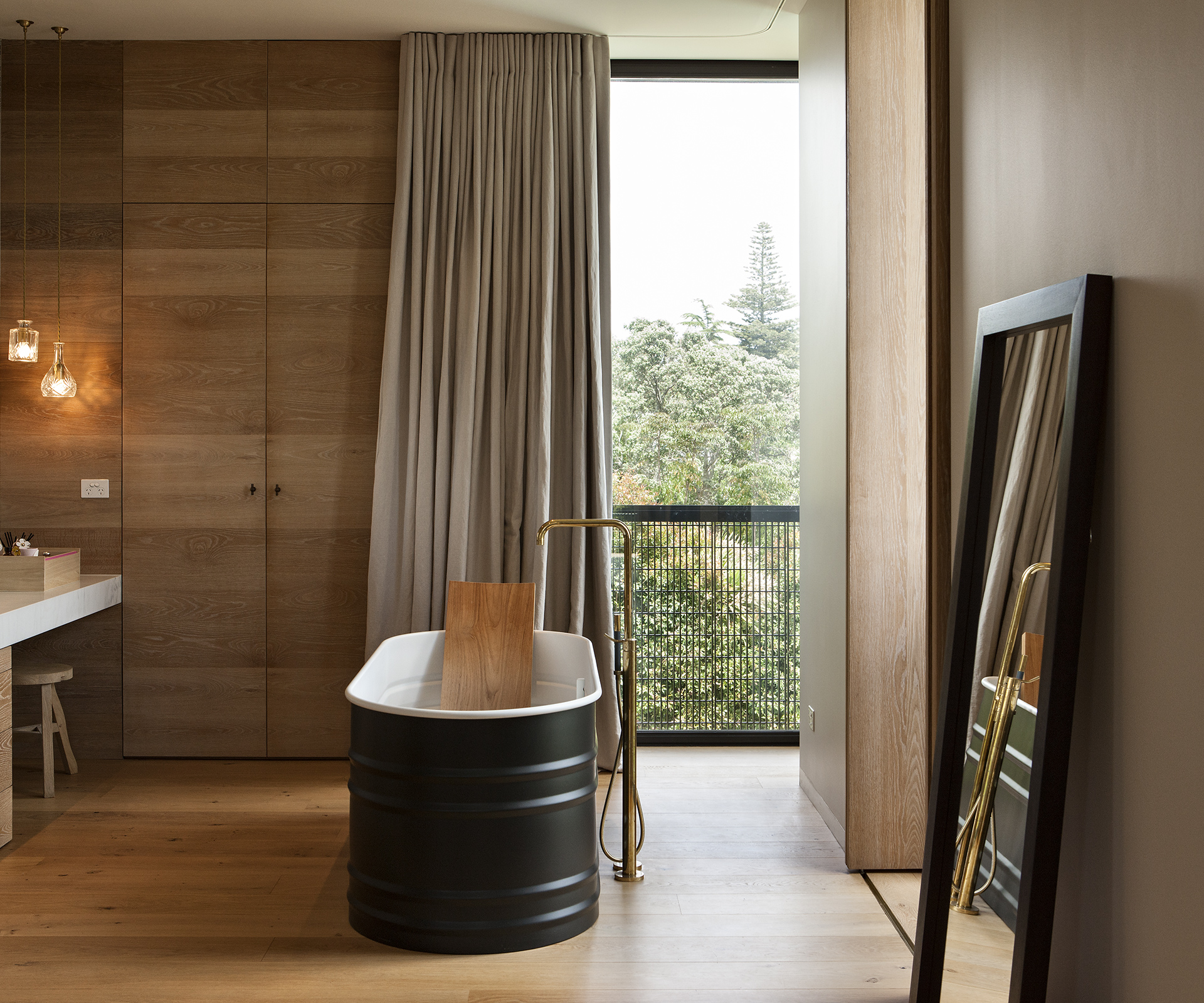
At a glance
Bathroom type Main ensuite
Designer Sonja Hawkins
Location Auckland
Brief Storage, space and an aesthetic to suit the home’s architecture. The bathroom was designed by interior designer Sonja Hawkins.

Q&A with interior designer Sonja Hawkins
Sonja, how was the process of designing your own ensuite and dressing room?
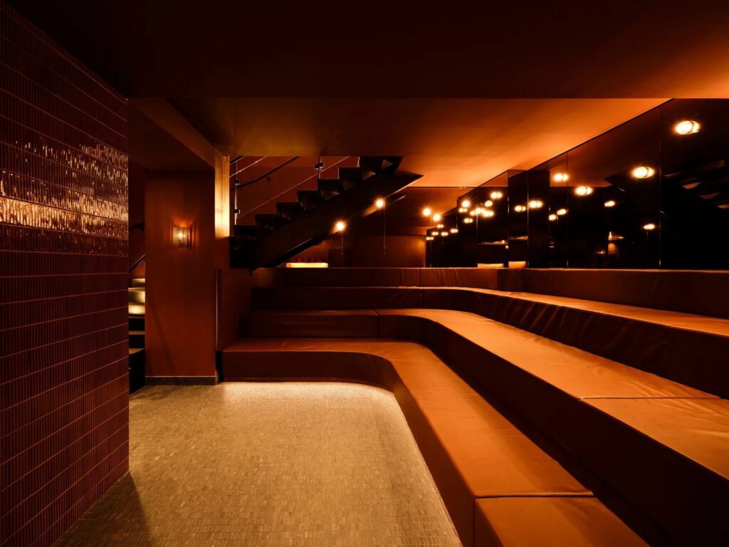
I try to think beyond the predictable and, being my own client, I didn’t have to ‘sell’ my ideas. A bathroom doesn’t have to be what is expected, but this can require the luxury of space. I usually start with a product or material I love and build from there. In this case it was the bath and the Bisazza mosaics, which were at the forefront of my mind when I designed the solid nib wall and wrapped them into the shower and toilet. I used different colours in each space for effect. I love the result.
What was the feel and aesthetic you wanted to achieve?
We have a beautiful symmetry at the end of the house, with three sets of French doors and corner windows, which I didn’t want to break up. In a sense it’s a loft style, being high above ground and open plan. I then used timber flooring to enhance that aesthetic.
Can you please talk us through your choice of materials?
They appear lovely and warm, rather than clinical. Was that important for you? I am of the anti-all-white school, which is too safe and cold. I also feel the cold, so a warm aesthetic was crucial. The timber flooring and wall panelling play a big role in this, then it’s the use of colour. I love natural materials, too, so stone often plays a part in my bathrooms and the Bisazza tiles are fantastic, adding texture to the overall space.
Talk us through the rationale of the standalone basin, which is in the dressing room and outside the bathroom proper:
I’ve essentially created ‘his’ and ‘her’ spaces, with shared amenities in the middle. The standalone basin, while for hand washing, is my husband’s shaving stand within his dressing room. On ‘her’ side I’ve created a modern take on the dressing table.
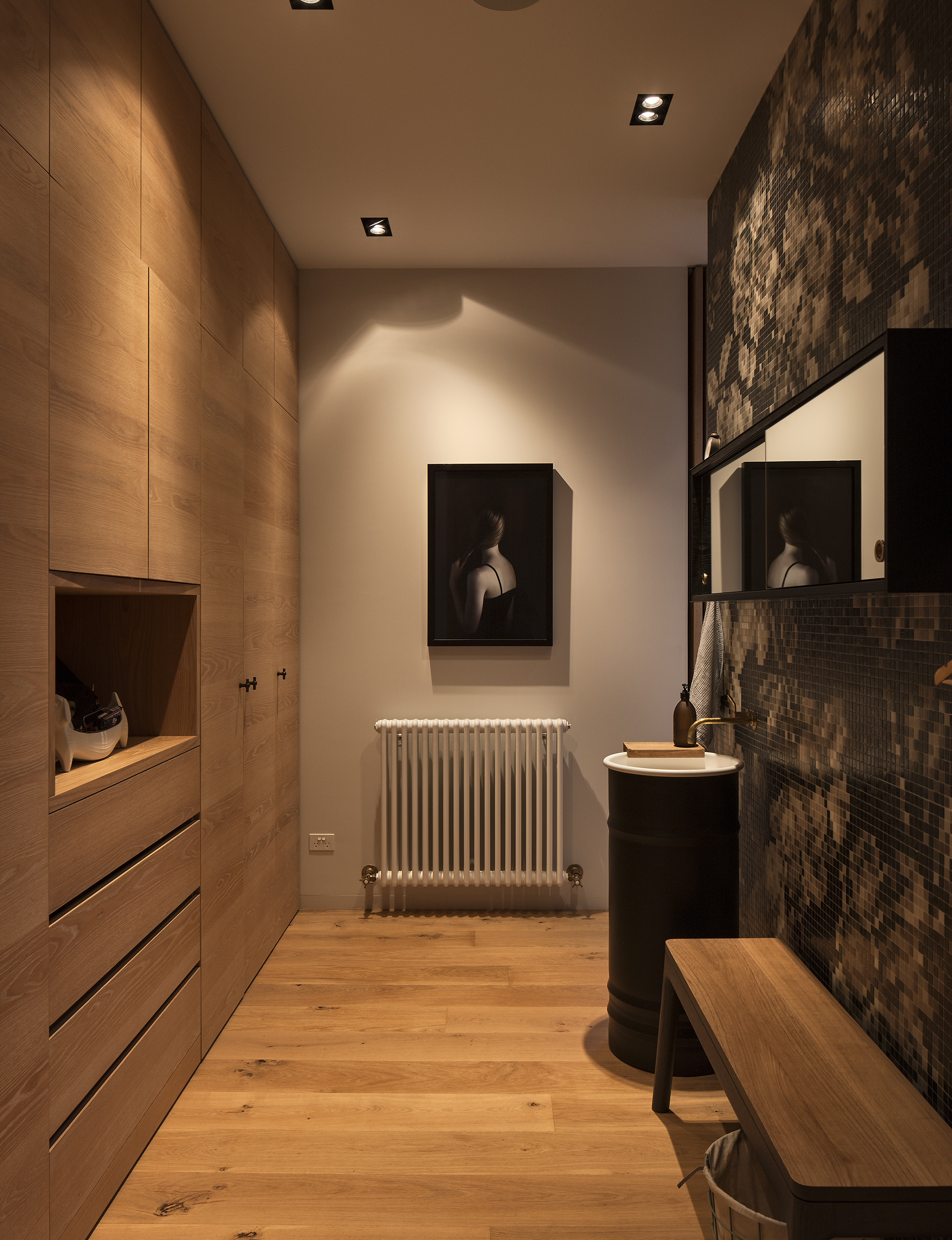
Get the look
Bath and basin ‘Vieques’ by Patricia Urquiola from Matisse. Curtains Prestige CMT Interiors. Flooring CTC Timber Floors. Lighting ‘Bell Decanterlight’ pendants by Lee Broom from ECC. Mirrors ‘Strap’ mirror by Hay Studios from Cult. Stone Trethewey Stone. Stool ‘Offcut’ stool by Tom Dixon from ECC. Tapware and bath spout ‘Vola’ by Arne Jacobsen from Metrix. Tiles Bisazza from Tile Space. Timber cabinetry Bremich Cabinetmakers. Towel rail Hawthorn Hill in brass from In Residence. Vanity Bremich Cabinetmakers. WC ‘Happy D’ by Duravit from Metrix. Artwork Photograph by Roberta Thornley from Tim Melville Gallery.
Photos by: Simon Devitt.
