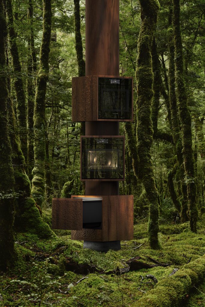
Peter Saxton and Delaney Dobson discuss how their ‘analogue’ kitchen by Cheshire Architects has changed how they live
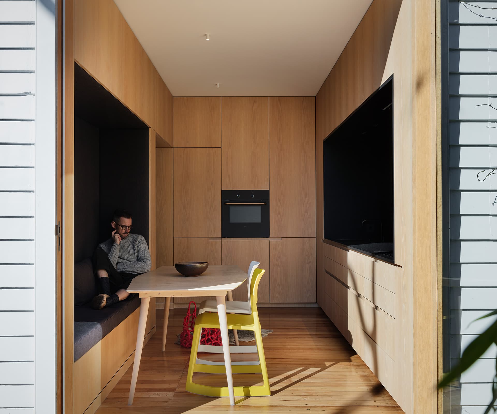
Peter— “It started with a very broad conversation with Nat [Cheshire] and Ian [Scott] about the types of spaces we responded to – a combination of natural light and materials used in intelligent ways that make you want to linger. Beyond that the brief was very open.
We have a small tract bungalow and spaces become even more important in a small house. Kitchens can be quite chaotic and visually noisy. We wanted something more analogue; a space that felt like a favourite piece of furniture – whether it was one of us on our own, or with friends.
We felt lucky to work with Nat and Ian, people of their calibre. They’ve created something quite exceptional; an extremely beautiful and restful space, but also one that’s highly functional. There’s a respect for detail that rewards on a continual basis.
The risk was that it would be cluttered and movement lines of people would be an interruption, but it’s the opposite. I enjoy cooking and everything is in easy reach.
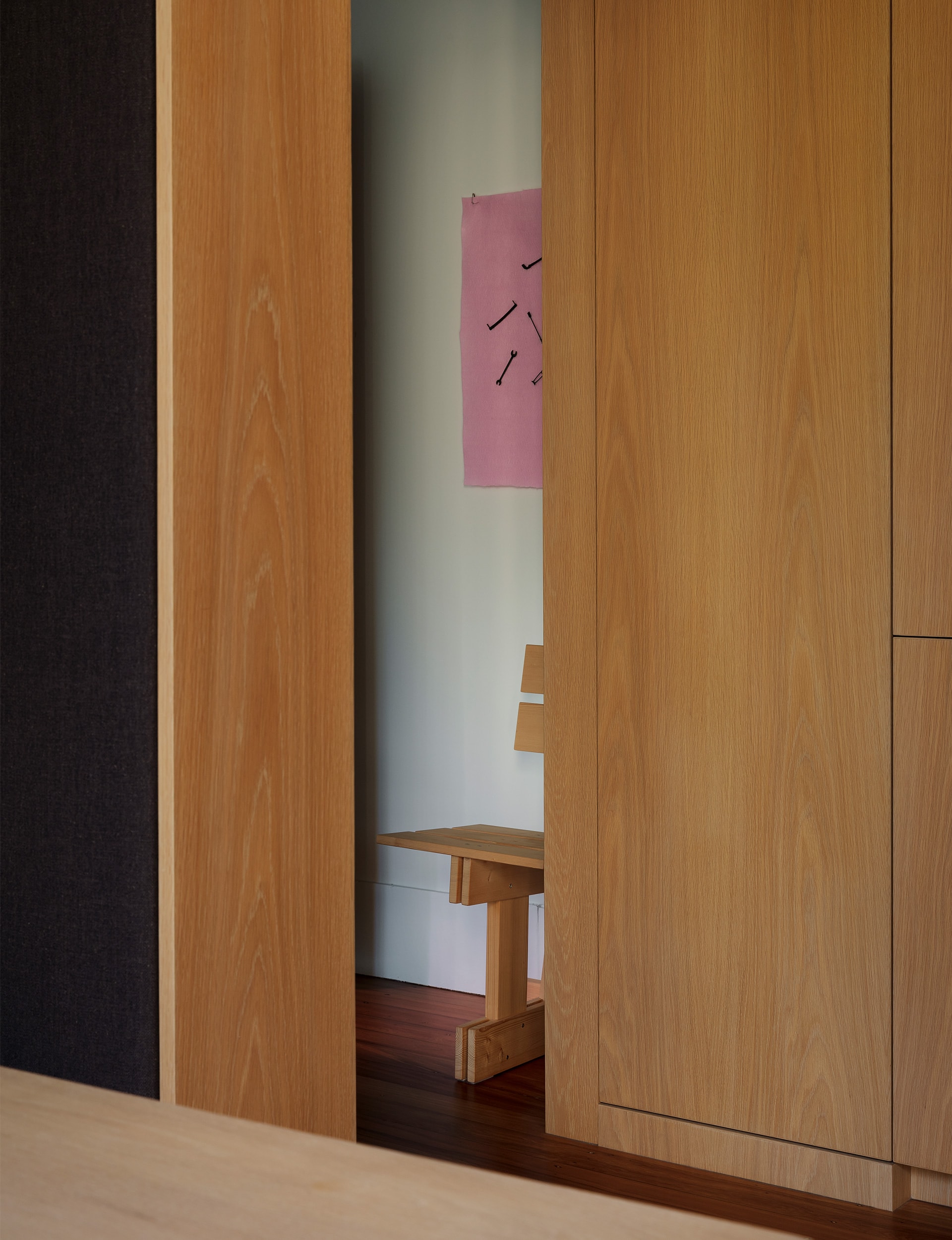
Being black, everything recedes and you don’t notice it’s a kitchen, which is a really nice reaction from people, and emphasises that it can serve multiple purposes – important in a small space.
A testament to Nat and Ian’s skill is that we lowered the ceiling and the walls came in, yet it feels like a larger space than before. We spent a lot of time talking about the quality of the space, rather than what we wanted it to look like. Living in a beautiful space where you perform daily rituals draws them out; it has become more than we imagined it could be.
In the day, the sun highlights different textures in the oak and stone. At night, it takes on a completely different character, with the big glass door reflecting the interior back at you.”
Delaney— “Peter and I have lived here for 18 years. It’s a very modest two-bedroom bungalow that we’ve slowly worked on. A friend suggested we get in touch with Nat Cheshire to do the kitchen. We loved his work, but were unsure if he’d be interested in doing such a small project. It’s a small house and we’re fine with living compact, so we didn’t feel the need to blow out the back of the house. We actually like rooms, they can be cosy and intimate, as opposed to everything being open plan. Nat and Ian seemed to like that idea, too.
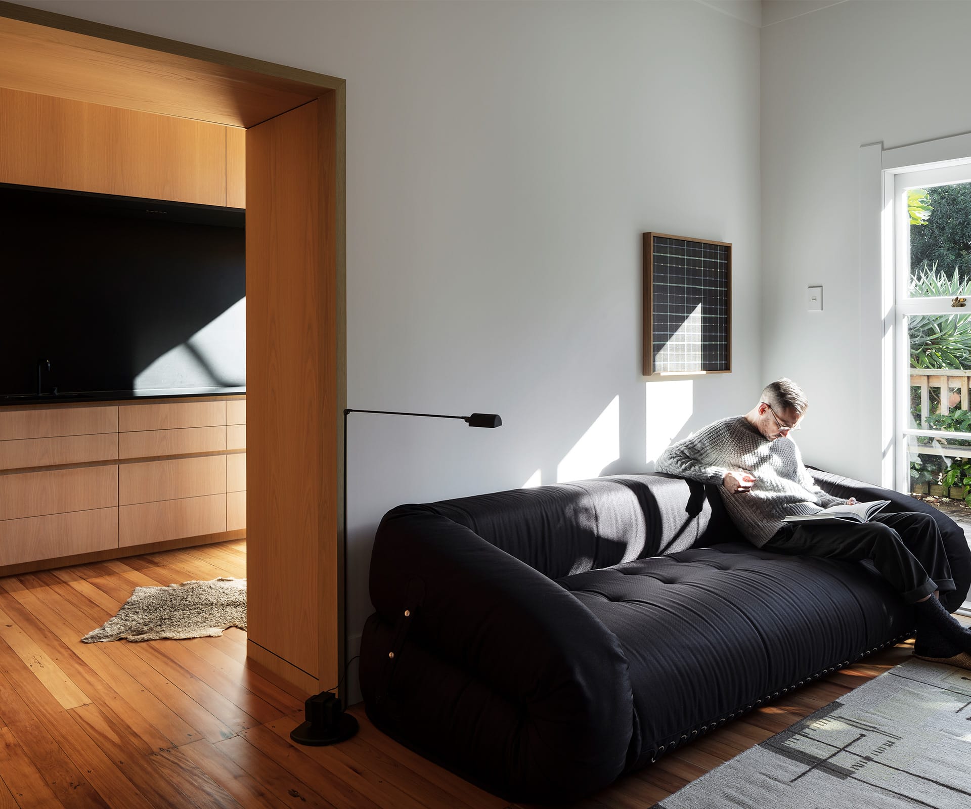
The lowered entry point creates a threshold as you move into this intimate, contained part of the house. While the rest of the house is still a bungalow, the kitchen is a little modern box – it has given us a whole other room in which we can just be; a calm space to relax. From the living room you get a little glimpse of stone and tap – it’s one of my favourite views.
We didn’t want a ‘kitcheny’ looking kitchen and the effect is that some people ask if it is a kitchen. We weren’t interested in state-of-the-art appliances and gadgets, more with materials. We’ve both travelled quite a lot to Japan and love compact spaces with lots of wood. Black stone seemed a good choice as it recedes; you can’t see the corners or edges. The cooktop is flush with the benchtop. The oven is quite analogue and doesn’t even have a timer, no flashing lights or beeps.
It’s our dining room and comfortably seats four – the most we’ve had is six. The big door opens out the back so we can take the table and more chairs outside if we need to. At night, from the outside looking in, the space looks like a glowing wooden box.”
Photography by: Sam Hartnett
[related_articles post1=”88106″ post2=”88858″]
