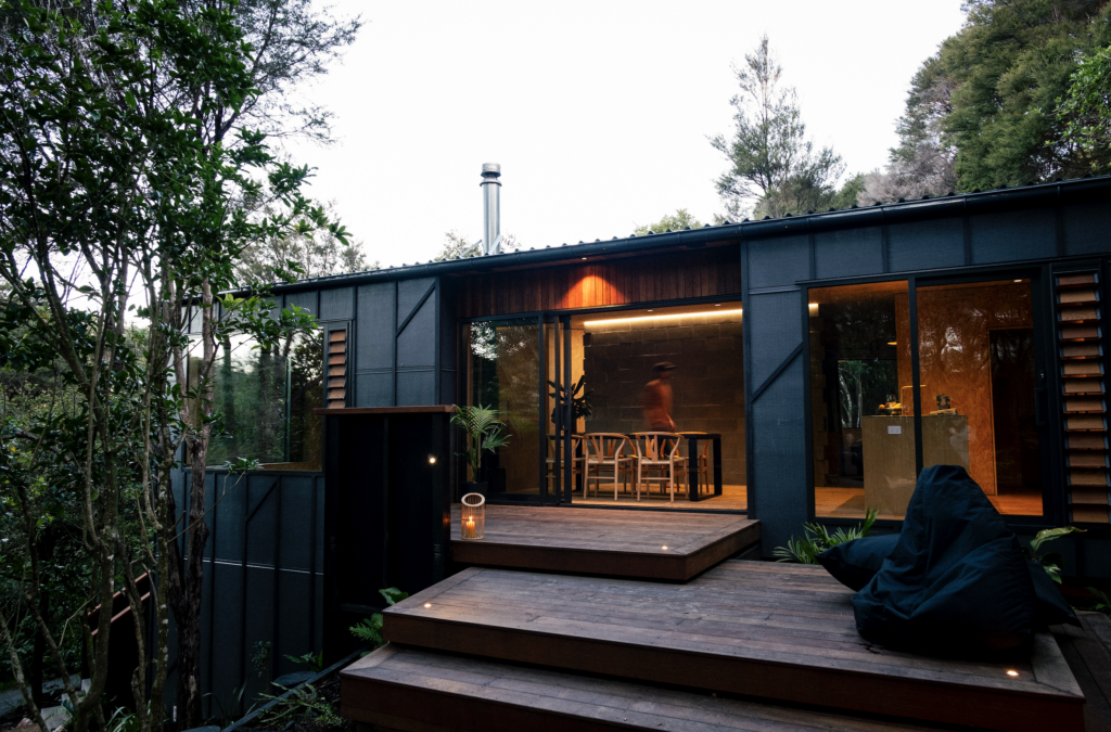
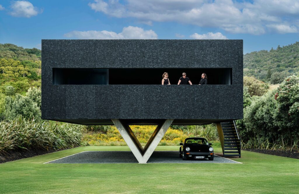
On a leafy site in the Waikato, Tane Cox crafts a subtle home for three generations.
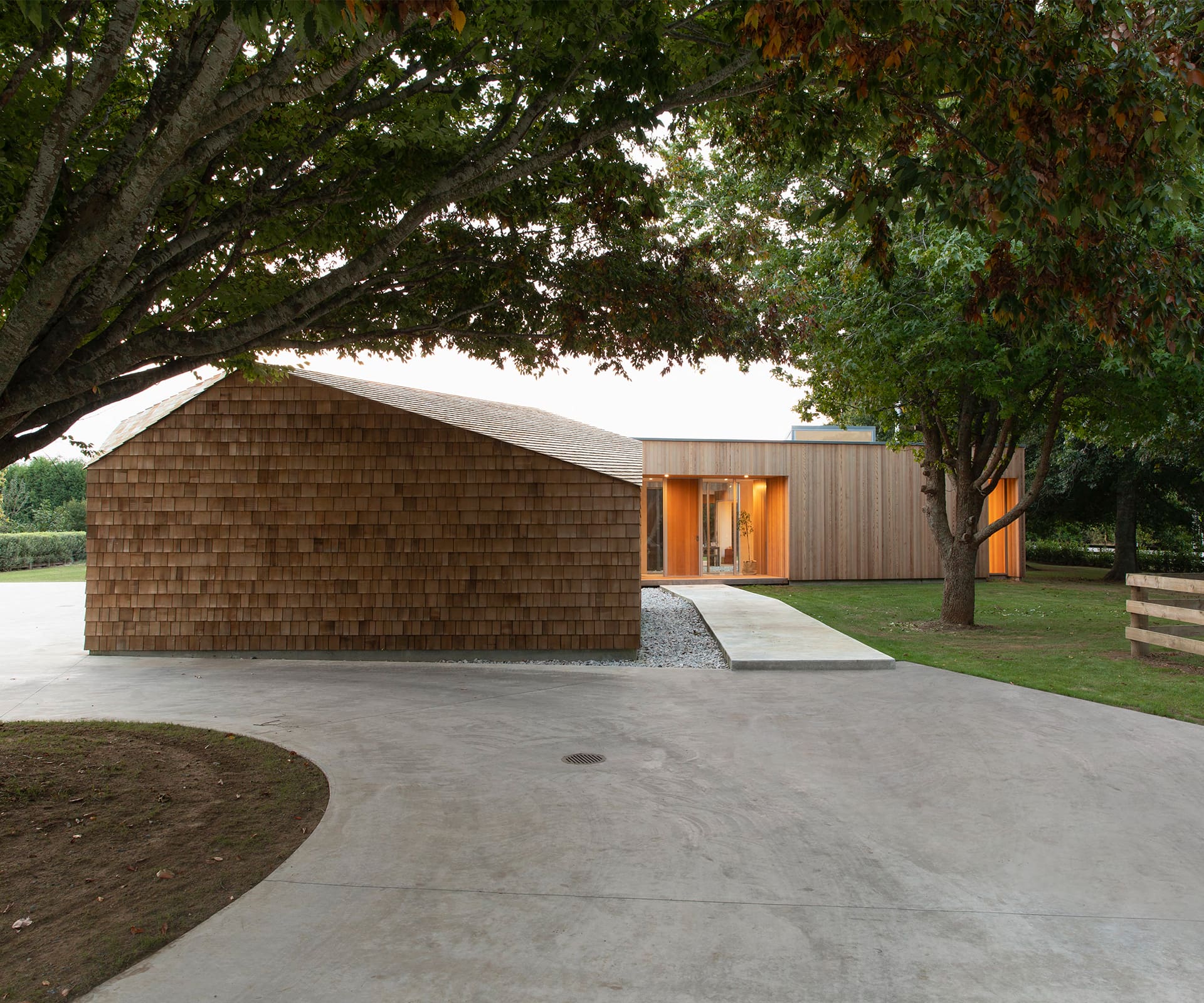
Q&A with Tane Cox of Red Architecture
How do you make people feel at home in such a large house?
A focus on connectivity and proxemics is key in larger spaces. Feeling at home is about feeling safe, secure and comfortable. Acceptable personal space is highly variable so it’s a juggle when the brief is for a large home. It’s easy to start to feel distant or exposed in a larger footprint. Visual connectivity can increase your perception of proximity to each other. Also, not being afraid to tighten or narrow spaces within a larger volume can help ensure there are more intimate spaces among the larger areas.
Talk us through how you managed connectivity within the house.
Arranging the programme around a central arrival point and incorporating a central garden allowed glazed areas that look across and inward. In addition to the internal passages, a large covered deck connects one side of the house to the other and promotes external circulation, creating an additional route or cross-link between the two main parts of the house. These combined ideas heighten connectivity and inform the layout to some degree.
You named the house ‘Shibui’ – tell us a bit more about the word.
It’s a fascinating word. My family has had a number of Japanese students stay with us over the years and I knew from talking with them that the Japanese vocabulary includes more adjectives or descriptive words than the English language, so I went hunting for a word to define our conceptual approach. Shibui is used to describe objects that appear to be simple overall, but also include subtle details, such as textures, that balance simplicity with complexity. It explains an aesthetic that’s difficult to easily convey in English, as its description almost contradicts itself within the meaning.
Were the established trees on the section a consideration in your design?
Yes, definitely, they were a major reason the clients fell in love with the spot, so considering them in the site layout was always a priority.
Which part of the house is your favourite?
I love the shingled utility pavilion. It has so much texture, and I love the balance it gives the main house.
See more of the home below
