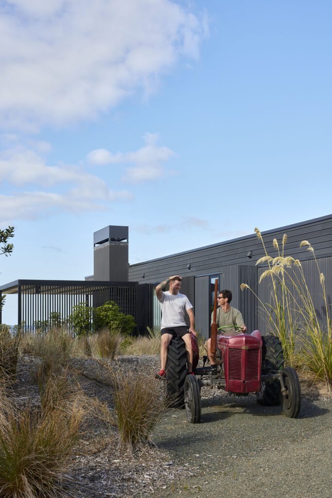
Architect Daniel Marshall discusses how he felt renovating this impressive home, originally designed by Robert Railley, not once, but twice
Q&A with Daniel Marshall of Daniel Marshall Architects
Your practice is not known for renovations. Why take on this one?
We engage in commissions based on the potential of the project and our relationship with the client. Although a clean slate can seem more attractive to an architect, sometimes existing limitations can force you to re-evaluate the design approach and reach more interesting outcomes. This project ticked all those boxes – the original house had fantastic potential, the clients were open to ideas and have wonderful style, and the spatial relationships of a 1970s house, with the scale of rooms, allowed me to explore different spatial processes. I do think we have to make the most of our existing housing stock; we have to invest good design in adapting our houses to the 21st century and hopefully beyond.
You’ve recently renovated some of the designs you completed earlier on in your career. How does that feel?
I rarely refuse to re-engage with one of my own designs; they are my babies and I relish the opportunity to spend more time with them. It gives you an opportunity to reflect on past design processes, sometimes with horror and sometimes delight; it’s pretty great to come back to a project I designed 15 to 20 years ago that still works well and seems contemporary. One of the responsibilities of a good architect is to avoid ‘fashionable responses’ and design specifically for function and place. The key quality of sustainability in architecture is longevity which relates, of course, to build and design quality. A well-designed and built existing structure can adapt to new demands and uses and continues to serve for a very long time.
[gallery_link num_photos=”8″ media=”http://homestolove.co.nz/wp-content/uploads/2019/02/StHeliersDanielMarshall_HOME_10.jpg” link=”/real-homes/home-tours/1970s-classic-luxurious-update” title=”See more of this home here”]
The home was designed in the 70s – what did architects of that era get right that we may have lost sight of?
I think there were a lot of things they got right. Primarily I think the spatial arrangement. A colleague suggested Claude Megson, Robert’s contemporary, created ‘explosive space’. A design language using more enclosed rooms, with changes in levels and heights, led to the experience of energetic and adventurous spaces, while still using relatively humble materials. Houses were generally smaller but made the most of every space.
What part of this renovation are you most proud?
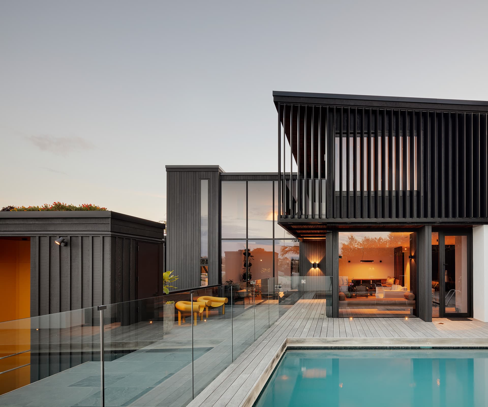
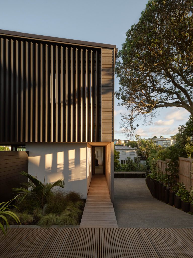
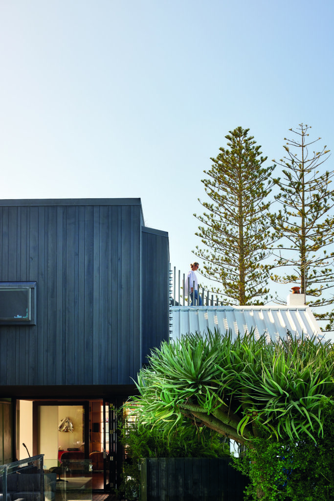
The brief called for a fair amount of additional function – guest accommodation for family and a main bedroom suite, which takes up a lot of room. By essentially adding a new level to the house at the top end of the site, I could engage with the proportions of the original without overcoming them. In many ways, as you approach the house, it looks like it always has done.
Scroll down to see more of the Saint Heliers renovation
