An architect and artist design a vivid, adaptable Awhitu Peninsula studio as a place to retreat and create.
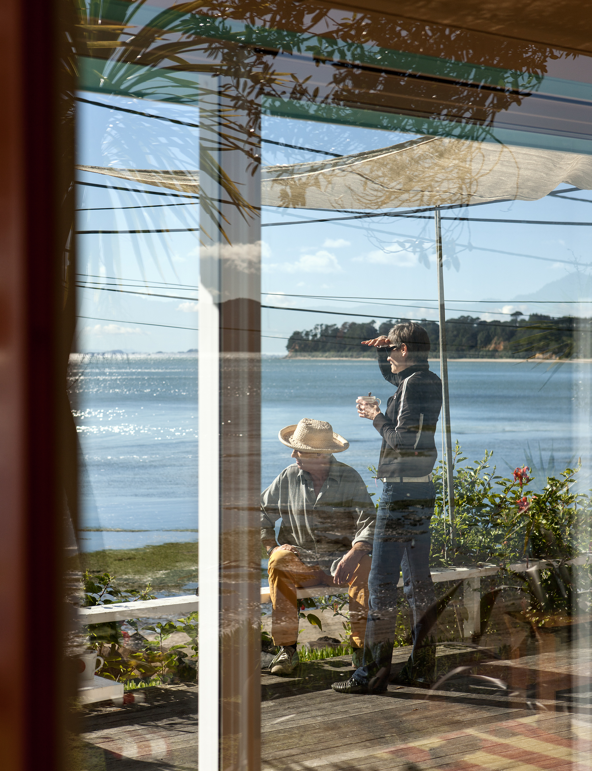
If you want to visit architect Pete Bossley and artist Miriam van Wezel at their Orua Bay bach on the Manukau Harbour, you need impeccable timing. With no access by road, you have to drive across the soft sand and treacherous rocks. Or walk. When I visit the couple on a stormy spring morning, we are interrupted, mid-coffee, by a rapidly rising tide. Looking down to the small waves approaching the driveway, Pete declares that we need to leave within 10 minutes or be stuck for another six hours.
“The best thing about this place is that you get locked in,” Miriam says as we quickly rinse our cups. “In between two little headlands, you can’t get easy access from either side. So even in the summer, when it’s busiest, people can’t get to you because of the tide so you always have that privacy.”
Dealing with the rhythms of nature is the blessing and curse of a traditional bach. And this one is so close to the bay that, at high tide, the water threatens the deck. The couple, who live and work in Auckland, have become expert at reading the tide charts, knowing when they have to leave home to be able to drive along the beach.
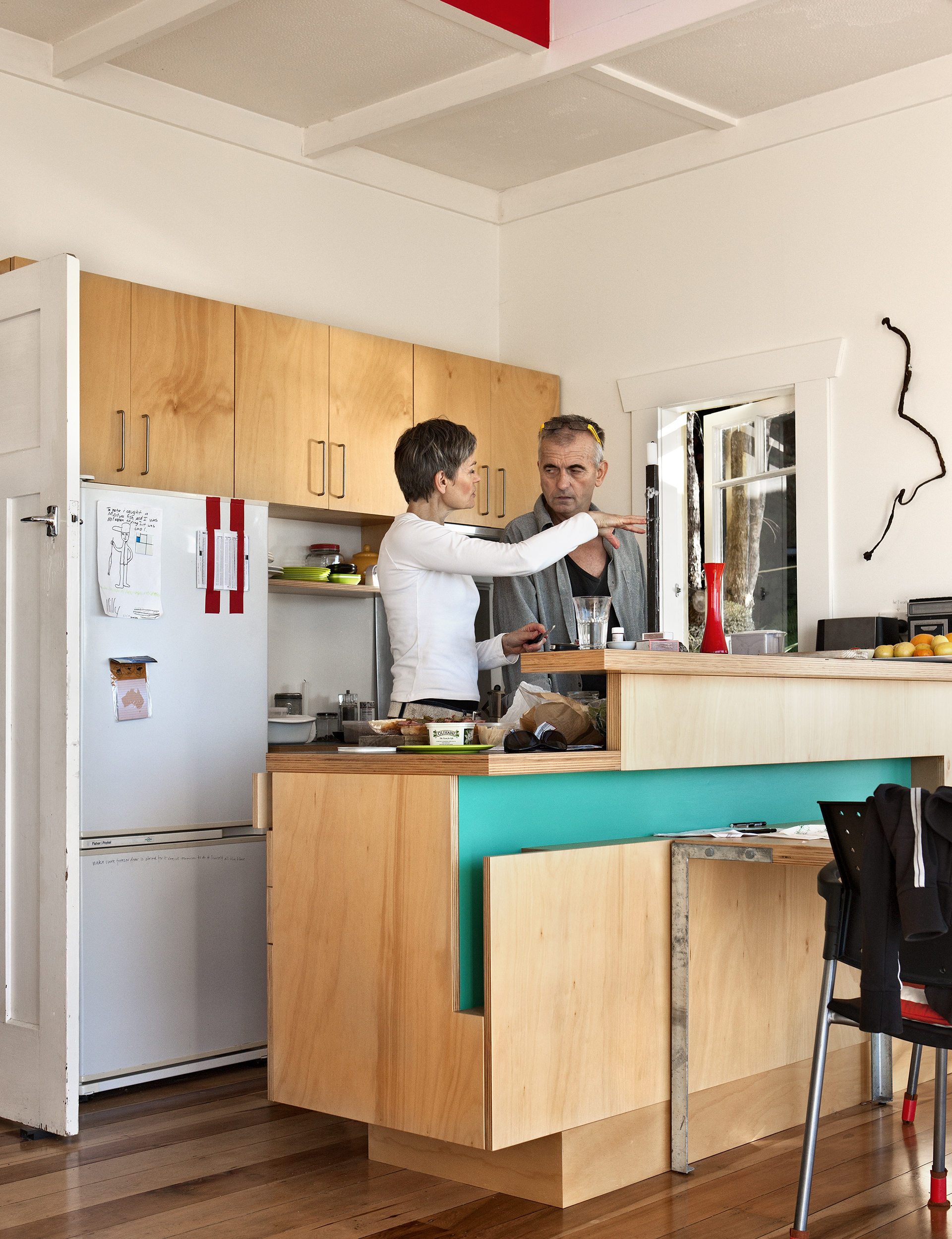
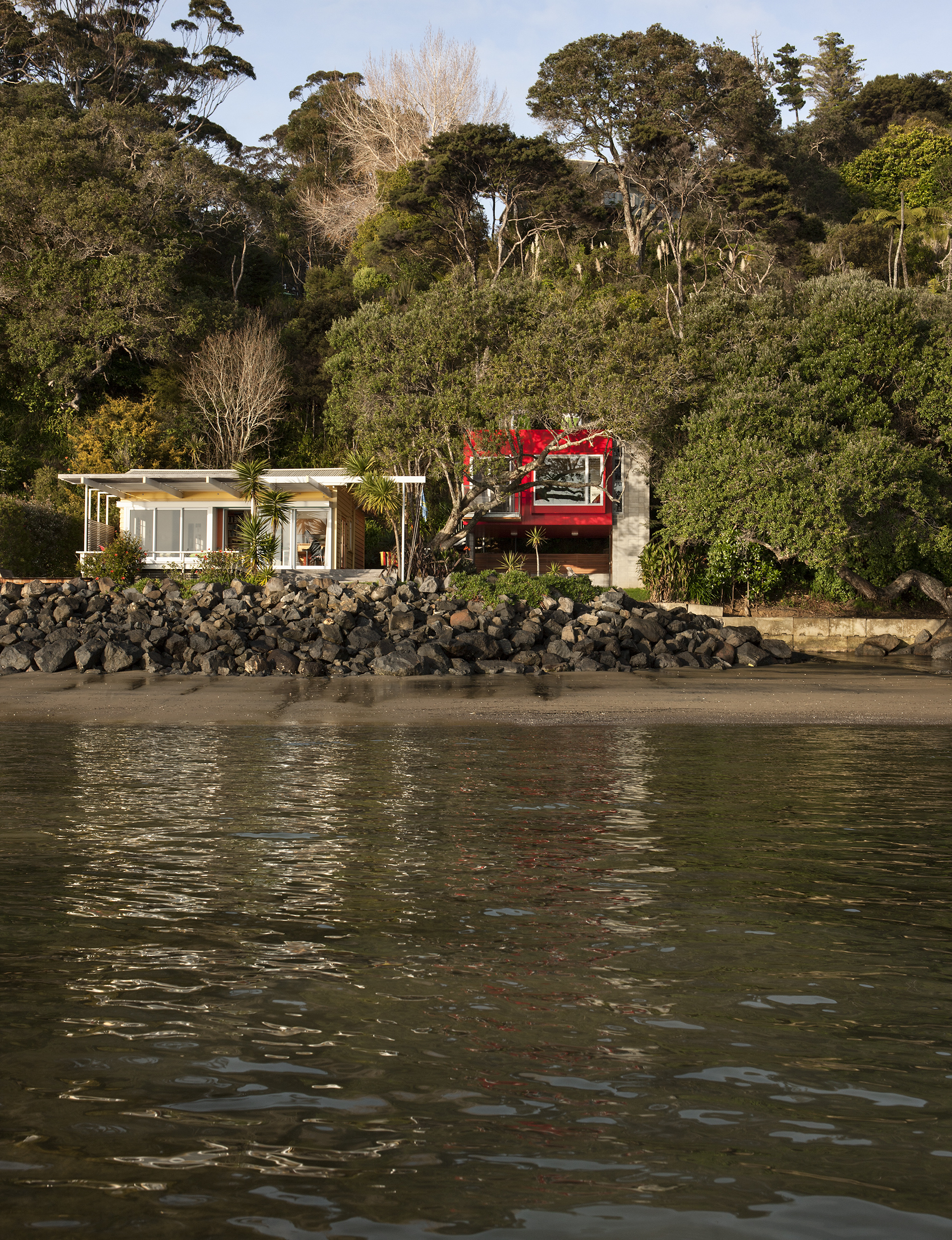
Pete and Miriam bought the 56-square-metre bach in 1997, then three tiny rooms, all brown outside and in. Ever since their second weekend there, when they took out the wall dividing the living room and kitchen, they have slowly and steadily renovated.
One year, a new deck. Another, just a coat of paint on a single wall. Two years ago, after a five-year design process, they added a separate 38-square metre structure as a second bedroom and studio, designing it collaboratively. “We work well together as designers,” Pete says. “I have ideas and say ‘This is pretty good’ and Mir will just say, ‘That’s a good start.’ We’re never in a hurry so it’s nice to just keep pushing ideas around.”
“I always think that Pete’s a hare and I’m a snail,” Miriam agrees. “But our house and the bach are products of that process because we take our time to think about it and we do change our minds.”
I ask about the difficulties of an architect and an artist collaborating on a building. “The hard part for every building is to find a good, strong, red-blooded idea that’s going to drive it,” Pete answers. “But once you find it, you keep referring to it all the way through. As you get finer and finer details, you keep referring to the big idea and see if what you’re proposing reinforces the idea or diminishes it.”
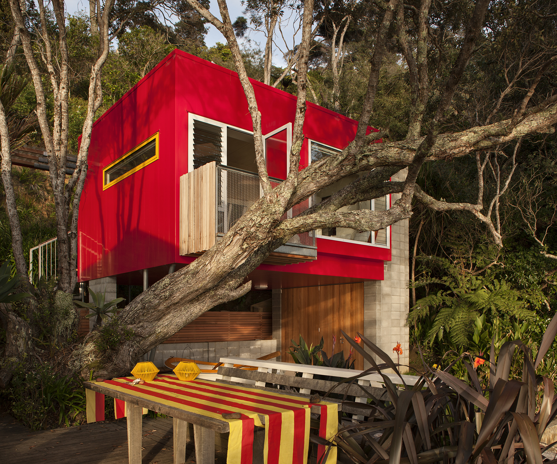
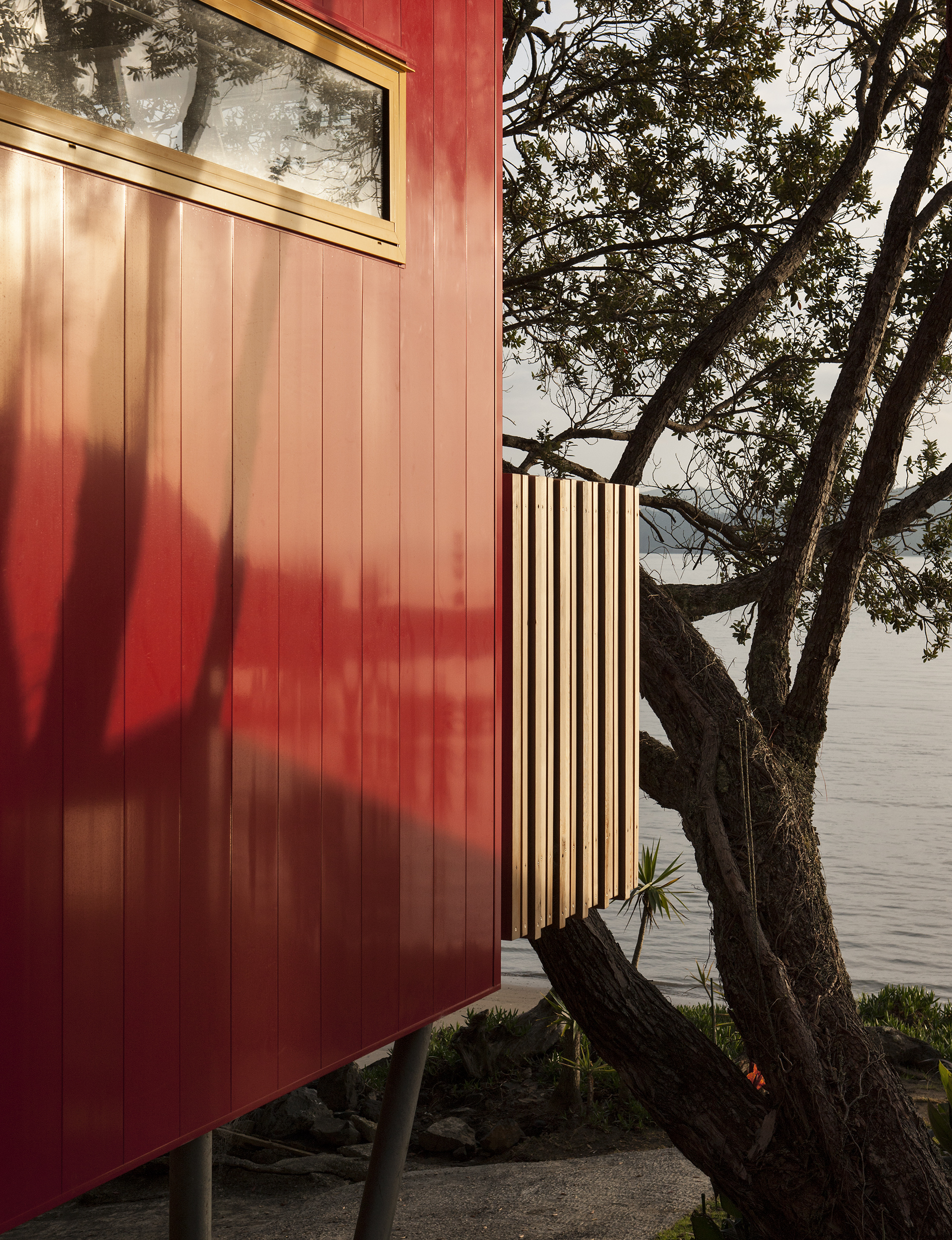
An early decision they agreed on was the colour. It had to be bright. “There’s a cluster of baches along the beach. They used to be really lovely colours,” Pete remembers. “They were blues, reds. Over the years they’ve become gentrified and are now green and grey and brown.” Pete’s favourite colour is yellow – the colour of the existing bach. That left Miriam’s favourite: red. Though bright colours are not permitted by the building codes, the pair was fortunate to find a council planner who saw the red as a reference to the pohutukawa trees that line the coast.
When Pete was telling an elderly woman where his bach was, she misheard him, thinking he was going on holiday not to Orua Bay, but Aruba. The name stuck. And when he bought an Aruban flag, he found that in addition to the blue of the Caribbean, it was yellow and red. A perfect coincidence.
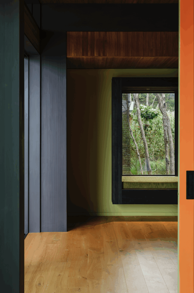
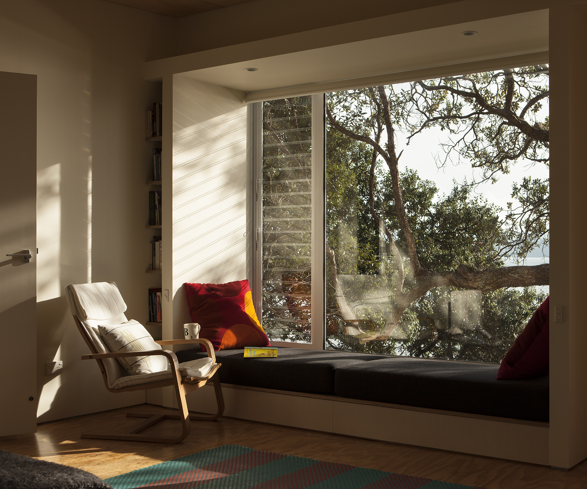
Wanting to preserve the integrity of the traditional bach, the couple was drawn to the option of a second, separate structure, rather than an extension to the existing building. The wonderfully petite sleepout, as they call it, is perched over the car port, hanging like a treehouse in a pohutukawa. It’s a simple and versatile loft, with a prominent window seat, a small balcony facing north to the bay, and a south-facing window looking out on a steep bank of native bush. Two turrets light the room like a pair of periscopes, one peering towards the morning sun, the other towards the afternoon.
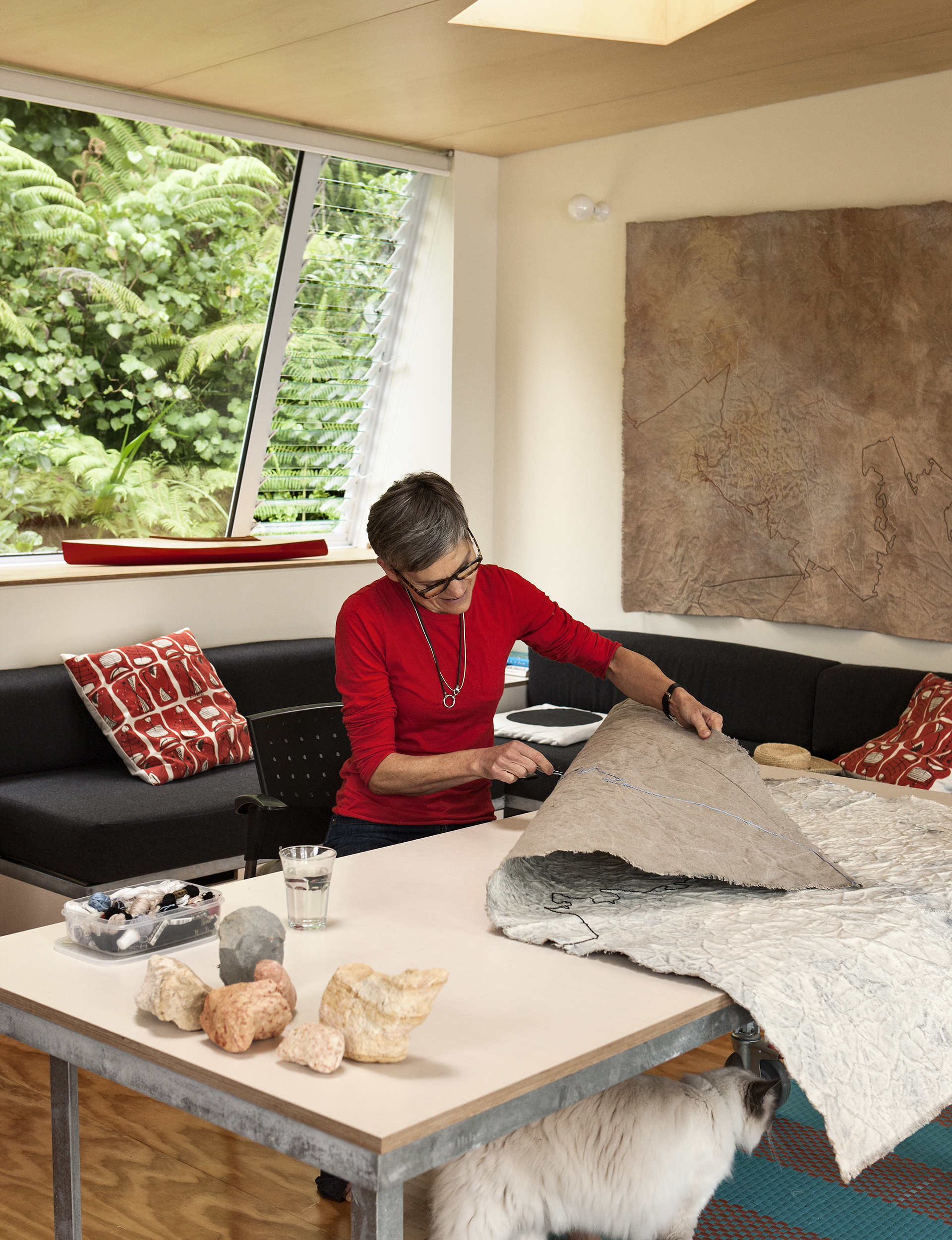
All the furniture is on wheels. The bed can be split into two couches. Desks can be in the centre of the room or rolled into the corners. “We wanted a room that could be used for all sorts of things,” Pete says.
“So it can be used as a bedroom or a sitting room for us, the kids, grandkids or guests. Or if we want to work there – and we can work anywhere – we can.”
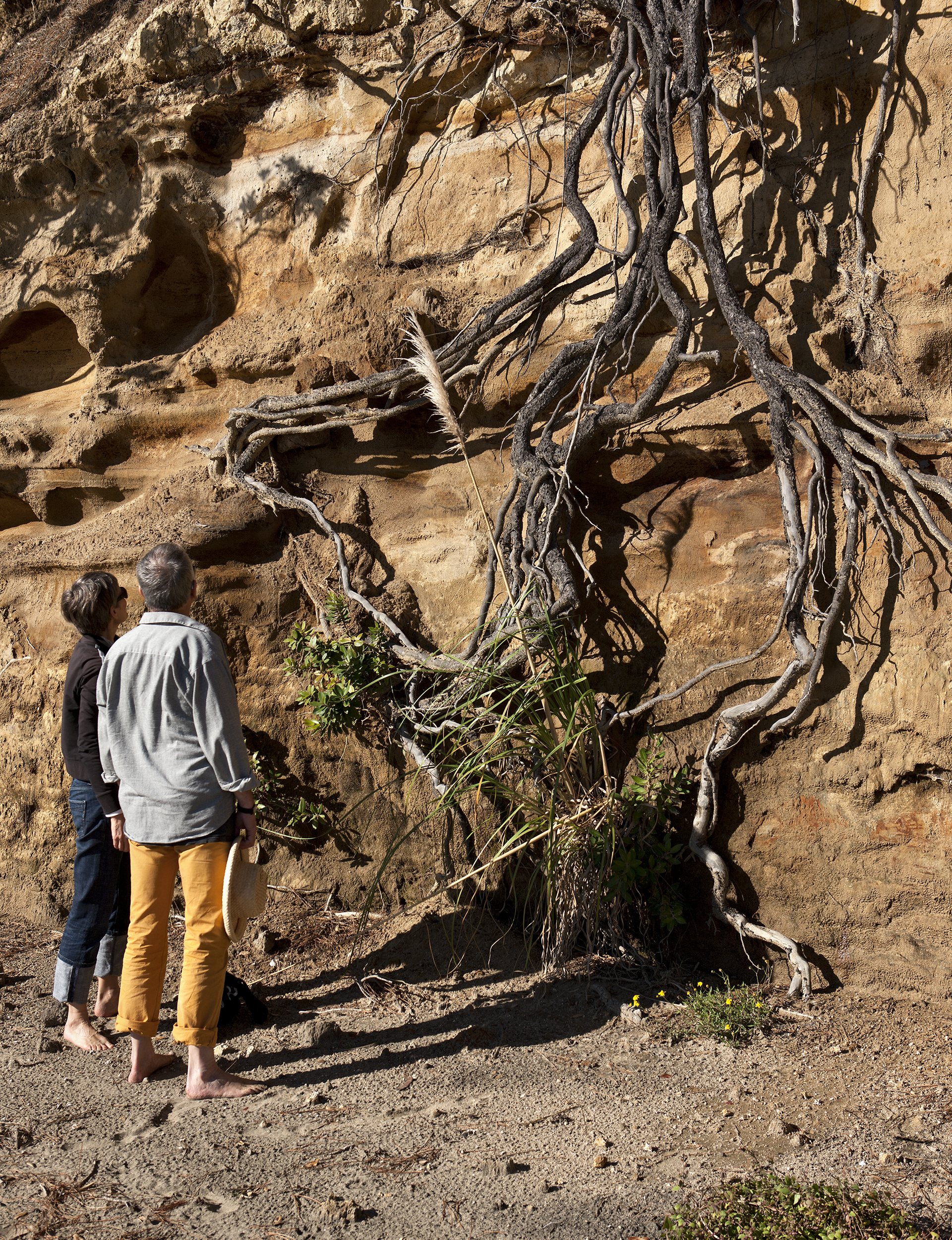
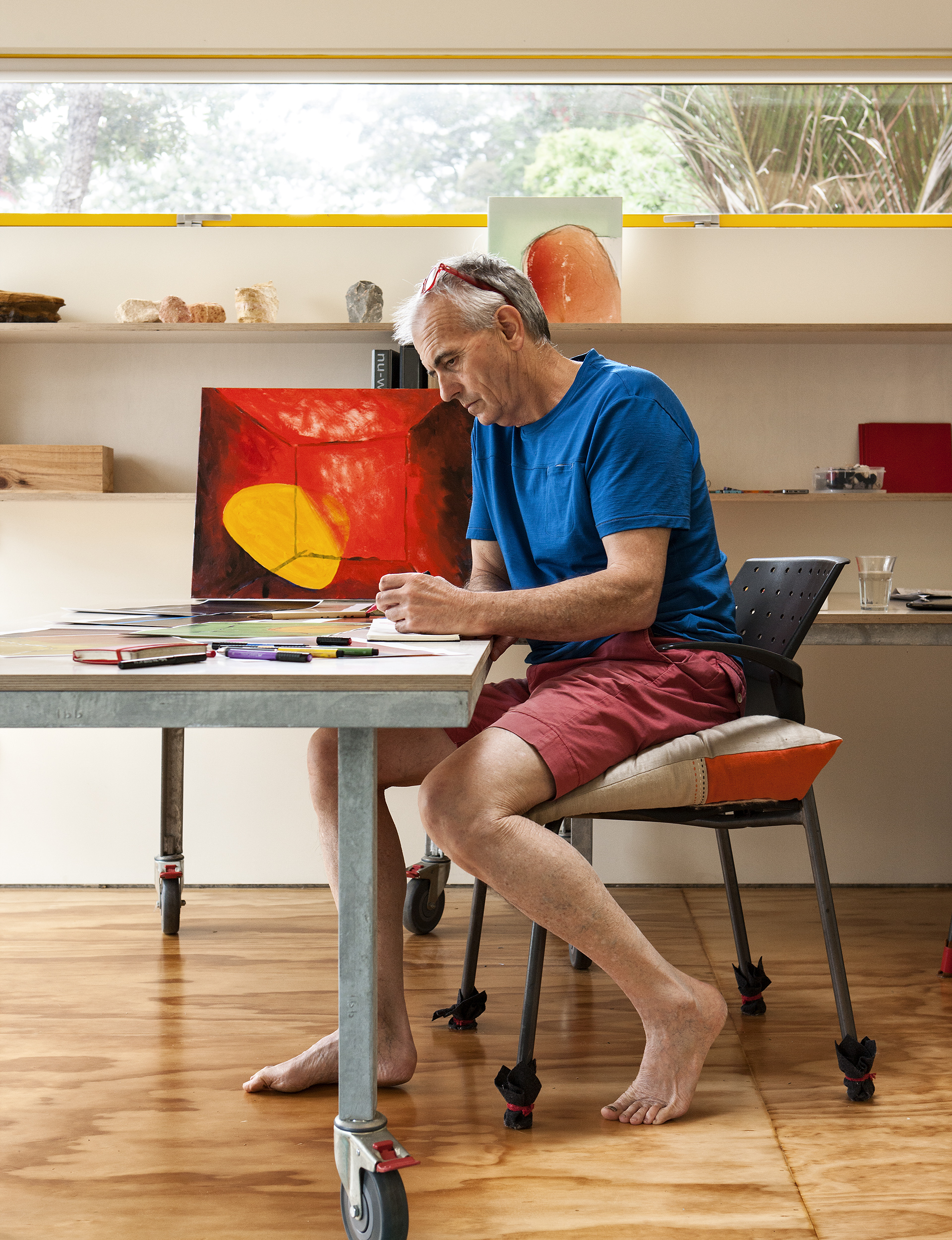
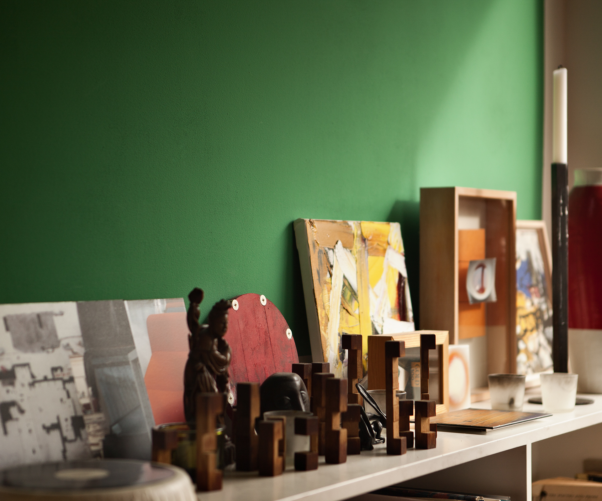
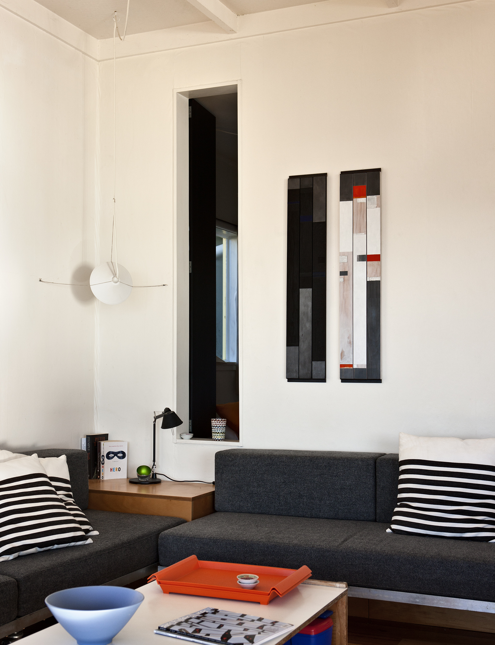
The ability to work in the space was crucial for the couple. At Orua Bay, Miriam’s abstract paintings are made using a palette of natural pigments she harvests from the clay cliff faces of the surrounding headlands. The canvases are broken by an erratic stitch tracing what looks like a map of the shoreline. Though they read cartographically, the lines aren’t literal. Miriam tells me they are more a “spiritual or psychological landscape than a representation of a landscape, although it’s very physical, material.”
Pete also paints – bright geometric abstractions on canvas – though mostly creates on his tablet. He calls them ‘tings’, “paintings without paint”. Some are digitally graphic. Others surprisingly painterly. He prints on small scale, collecting them in a sketchbook.
The pair gets most of their bach-based creative work done in summer, when they are there for extended periods. “You need to really settle in when you’re working,” Miriam says.
Words by: Henry Oliver. Photography by: Simon Devitt.
