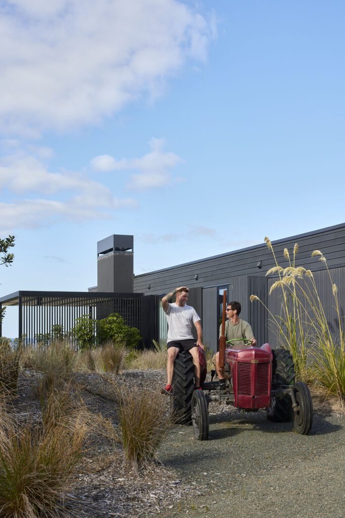
This house by the lake is an expression of both its alpine context and the stylistic DNA of its designers.
There are mere handfuls of architectural firms in New Zealand with a wide enough body of residential work to allow one to compare and contrast, find similarities, and try to ascertain the places where motifs are being pulled and stretched in search of some sort of musicality.
Auckland-based RTA Studio is one of these, and this 290m² house on the edge of Lake Wakatipu is one of those in which stylistics are strongly expressed in search of something highly individualistic yet entirely contextual.
Take, for instance, the series of gables.
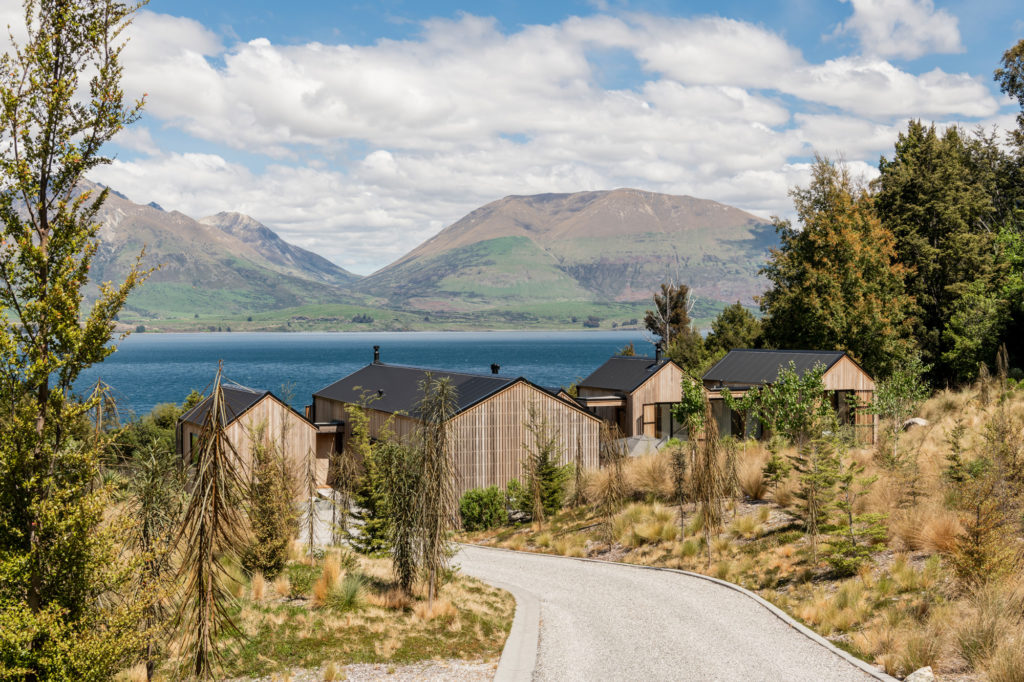
“We’ve been exploring the gable form for many years,” says RTA’s director Rich Naish — speaking of one of the many elements, exemplified in this house, that his firm has explored ardently. “It’s a vernacular form of Kiwi architecture, whether it be a boat shed, a farm shed, an old church in Northland, or a wharenui.”
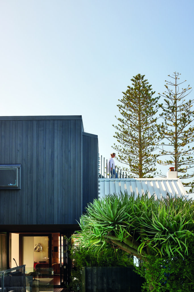
RTA’S E-Type House — winner of the 2015 Home of the Year Award — the Cardrona Hut, Little House in the Bay, and the Hapua House all seek, in different ways, to take the gable, break it apart, and put it back together in a concerted effort to find abstraction or explore the sculptural potentials of a fairly universal form.
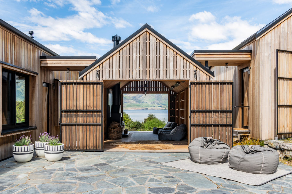
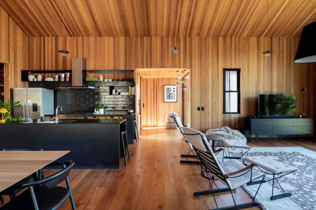
Likewise, there is the idea of interconnected pavilions separated by courtyards. Rather than a home made of a single, large volume, this one is composed of separate ones, which in turn allow for courtyards, for additional light penetration, and — much like in E-Type — the segmenting of the different functions and usages the house is there to serve.
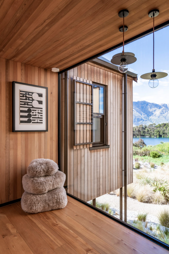
According to Rich, the main idea here was that if the entire family arrives, they just open up the bunk room, or the two guest rooms, and can just sort of roll along, depending on occupancy. Yet, if “only the two owners were visiting, they could use just two pavilions as a one bedroom apartment,” he explains. “There’s also an outdoor room so those three pavilions make it a perfect sort of place for just a couple.”
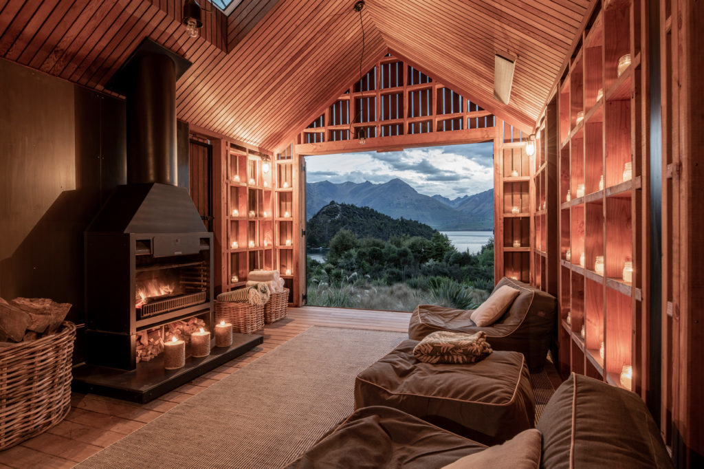
That ‘outdoor room’ is the most shed-like and even boasts — in a self-confessed, slightly tongue-in-cheek way — a ramp for a non-existent dinghy to be rolled down into the water. In this sitting room, from which to take in the inspiring views, the gap between each vertical board is approximately 20mm — not exactly insignificant given the temperature extremes so common in this area.
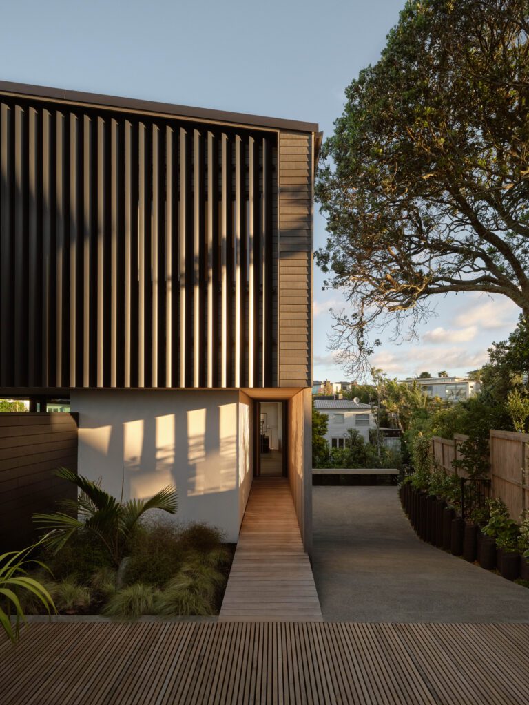
“There is a sort of a nostalgia to the hay barns and those rural forms, which just had slatted timber to let the air flow through so the hay could dry,” says Rich.
He explains that, instead of moisture control, the porosity here has two purposes: to allow its occupants a modulated connection to the elements — shade and a gentle breeze — and to get the lovely dappled light coming through during the day.
“At night-time, with all the candles going and the lights off, it turns into a bit of a lantern,” glowing by the lakeside. The breathing in of light during the day; the exhaling of it at dusk.
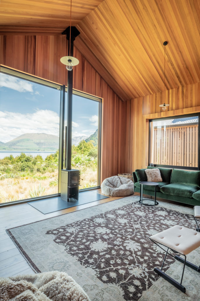
That connection with the surroundings is a strong, recurring preoccupation for RTA’s commercial and residential work; it was widely explored by Andrew Barrie’s early 2020 Objectspace exhibition — In Context: RTA Studio — in which the firm’s oeuvre and its locations were explored.
The expression of this house’s context — beyond the allusions to rural vernacular, beyond the interior materiality of nostalgia with a touch of contemporary rusticity — has also been strongly conveyed through orientation and landscaping.
“Planting has been selected to emulate the ecological structure of the surroundings and tie seamlessly into the existing vegetation,” according to Wraight and Associates, the landscape designers.
Endemic species such as alpine ferns, lancewoods, korokio, red and mountain beech, and toetoe were used to connect the house to the nearby DOC reserve, to stitch it to the lakeside views, and to make the structure appear as if floating gently above the lake.
Overall, Bobs Cove House is a lakeside house with undeniable depth, an expansion of themes that have followed RTA for decades, and a beautiful, nearly musical expression of place.
