We explore a home on the Coromandel Peninsula designed by Sophie Hamer, in which simple architecture becomes exceptional by its detailing.
This house began with a very down-to-earth brief for a humble, rural, forever home that would allow the owners to live on and with the land. The site is an idyllic piece of Sailors Grave on the Coromandel, nestled into the slope of a hillside.
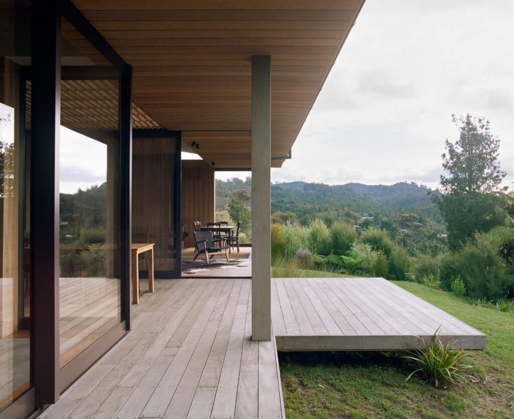
According to the brief, “The strong horizontal lines of the oversized external fascia boards direct the eye to the view across Te Karo Bay.”
“There are few houses here,” say owners Eric and Diane Thorne-George. “It’s a kiwi zone, and you can walk the beach for much of the year and be the only one there. It is a beautiful place, with elevated views across the ocean, [and] the house blending into, and encompassed by, regenerating bush.”
The abode also needed to be achieved within an affordable budget, and for the couple who call it home to be involved in the construction process alongside the builder, Sam Macaw, whom they have known for over two decades.
“This was [Sam’s] first build out on his own,” says Eric. “He is a craftsman.”
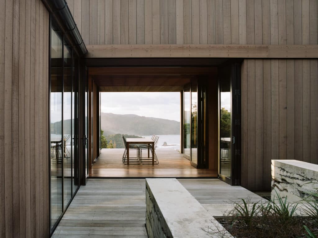
The design phase was helped by the fact that its Switzerland-based, New Zealand architect, Sophie Hamer, is part of the owners’ extended family and knew well how the couple liked to inhabit their previous house.
“I had a good understanding of their different ways of using it; of each of their favourite spaces, activities, and times of day,” says Sophie, who also comments on the style they feel comfortable with. “It wasn’t about putting something on the site that shouted, ‘I’m this amazing piece of architecture.’ It was really about a quiet, humble house from the outside, but then with layers of craft internally.”
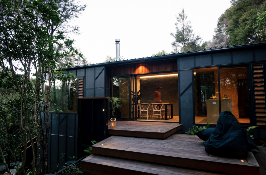
That simplicity with impeccable detailing is indeed what sets this home apart. On plan, it initially comes across as a simple L-shape housing a relatively small, two-bedroom home with the main bedroom and social spaces at the northern face and guest area and parking burrowed into the western hillside.
Yet, on closer inspection, the juncture of the L-shape reveals a delightful play between porosity and solidity. The north-east and smaller of the two ‘wings’ (main bedroom) appears more as an independent structure; an island connected to the other by a thin, glazed, tunnel-like hallway and surrounded by a verandah that can’t seem to make up its mind whether it belongs indoors or outdoors.
The ‘tunnel’ uses bifolding doors that open entirely, thus connecting the bush-clad end of the house to the sea-facing one and offering multiple spaces to escape or bask in, whatever the Coromandel climate might throw at its inhabitants.
“With the bifolding doors completely open, the courtyard, outdoor room, and front deck become a singular space,” says Sophie, “projecting through the centre of the house, connecting the bush, timber-lined interior, and ocean.”
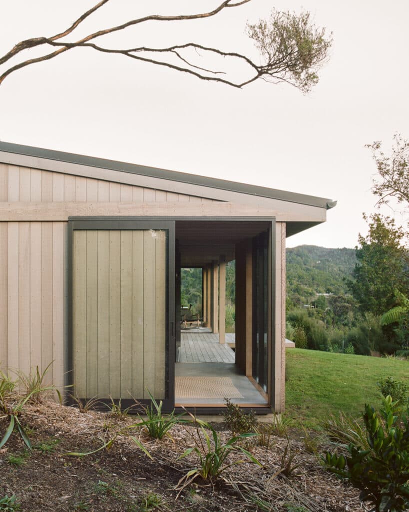
This idea of an ‘occupied veranda’ — as Sophie calls it — seems to create both a generous interior layout and a more selectively occupied exterior, with parts of the house acting as wind buffers in this flexible outdoor zone.
Apart from the bifolding doors, the glazing on the north is completely fixed. The designer eschewed the common practice of having sliding doors leading onto a deck, opting instead for pushing parts of the house all the way to the boundary and making the openings on the east to west axis.
“We kind of pushed out and occupied parts of that veranda with the house, but the materiality of it still runs through from east to west continuously. At the same time, we had to have a pitched roof so [the verandah idea] was a way of marrying that and allowing that exterior eave and soffit to kind of float into the building and create a space that, even though you’re not outside, makes you feel connected to what is going on out there.”
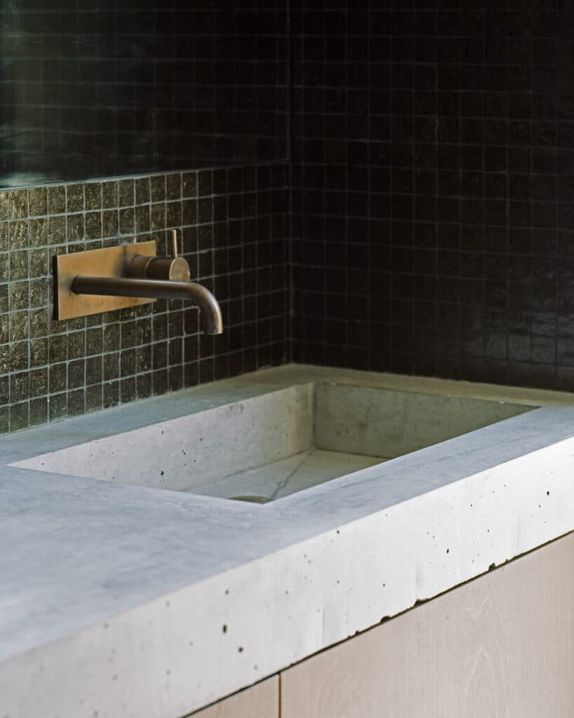
Another suggestion there is something special going on with this seemingly simple building is the exterior concrete work: brittle looking, raw, and painstakingly made by pouring layers of builder’s mix and cement, letting it fully dry, pouring the next layer, and so on.
“The idea was chosen from a range of landscaping concept photos Sophie sent to us,” says Eric. “We immediately responded to the raw, elemental nature of the walls and the scope for creating them by hand.”
Eric and Diane had already planned for a concrete kitchen bench, hearth, and bathroom basin, so the continuation of that materiality outside the house appealed to them.
“The walls were completed first, and we liked them so much that we decided to layer and hand pour the internal concrete structures as well, making them similar but less raw. We love the way it links inside to out.”
It was, however, not an easy task. After pouring well over 20 tons of concrete for this project, Eric jokingly says, “I never want to see another concrete mixer, ever again. It was my weekend work. I made the shutters one weekend but, when Sam saw my attempt, he said, ‘You are not building cow troughs in Vanuatu now,’” — referring to the owners’ former jobs as aid workers around the Pacific Islands, “so we built them again.”
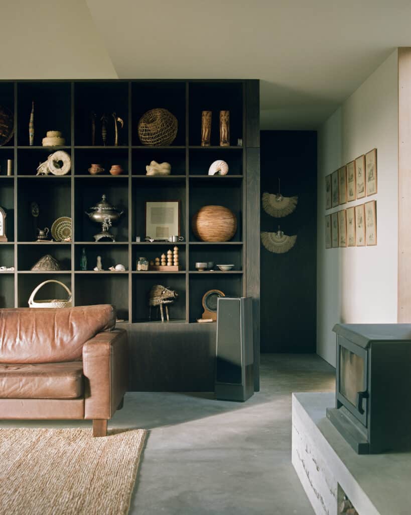
“That meticulous approach is also evident in the interior. The story of the material and colour palette there starts in the lounge, where family heirlooms and tribal artefacts collected by the homeowners during their many years living around the South Pacific are displayed on an in-built bookcase: a bird skull collection; a large set of buffalo horns; war clubs from Ambrym, a volcanic island in Vanuatu; blow darts from the men’s corner of the Suai market in Timor-Leste.
“When the mokopuna come,” says Eric, “they can pick a piece and I tell them a story, usually embellished, and at the end they can ask if the story was true or not.”
This magical room and its treasures were essential to the overall design.
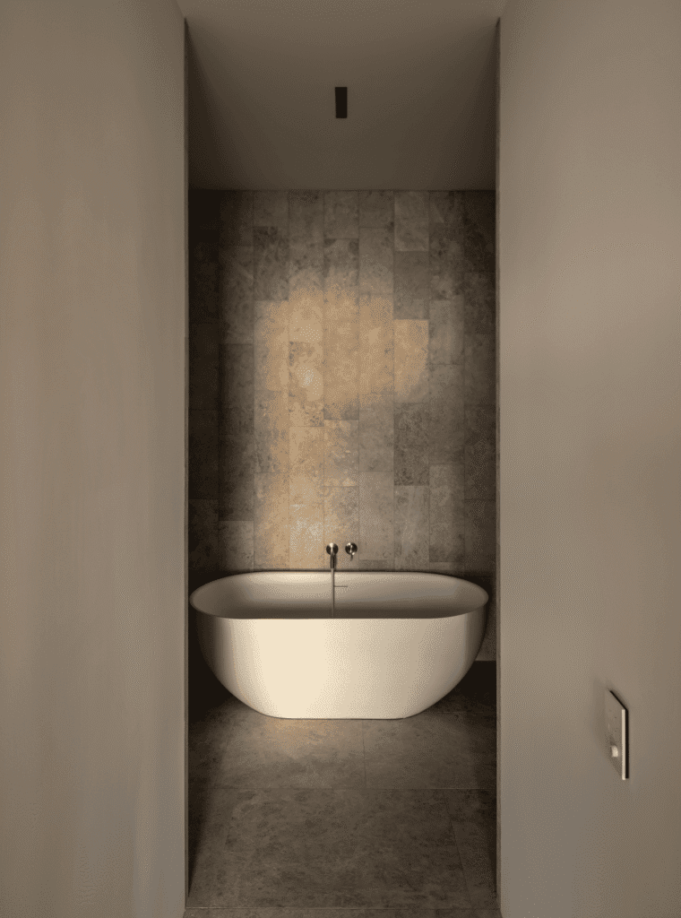
The dark stain used on the plywood bookcase was selected to complement the items here, and that, in turn, influenced colouration of the concrete — on floors, vanities, outdoor benches, and retaining walls — the tiling in the bathroom, the joinery, and the internal doors.
“The intention was to create a container to support their memory of these [objects] in the everyday,” says Sophie.
Eric explains, “I wanted a dark, cosy lounge — the war room — and for Diane it was light, warmth, and connection to the environment.”
Therefore, Sophie delivered a home where “the perimeter of the house [is] really light and then, within the kitchen/guest suite, it [feels] like a dark block set within it … By treating it as a block, it feels like it floats within the ocean outside.”
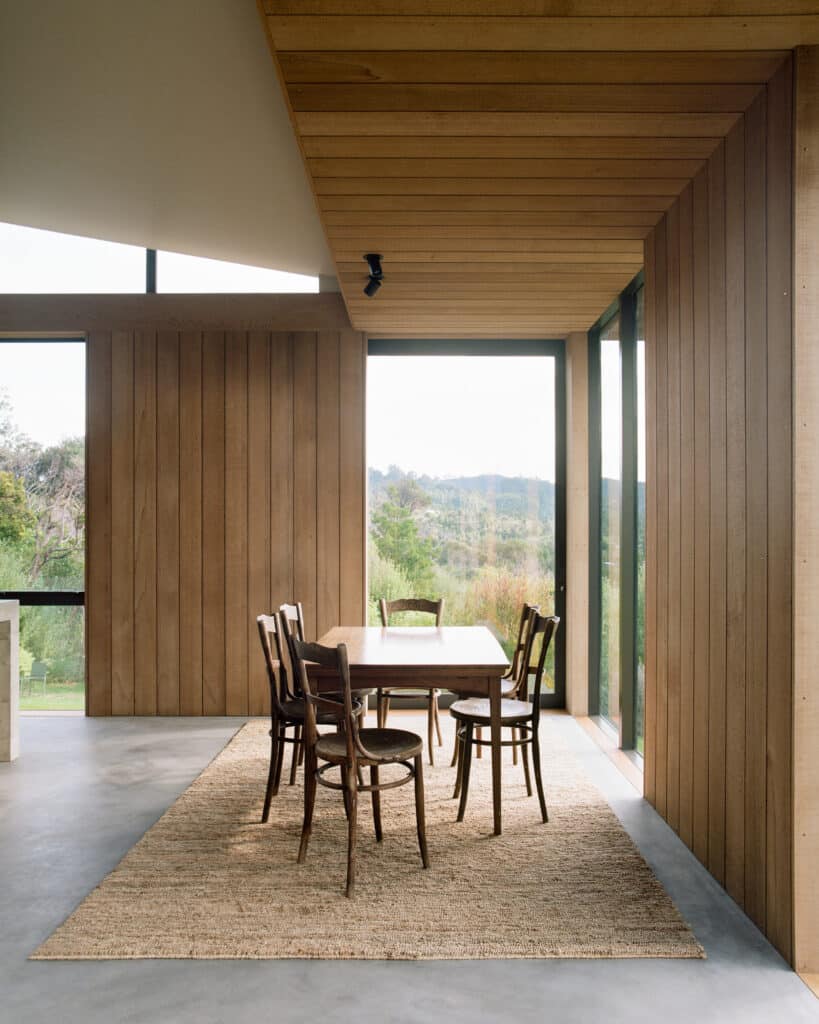
“At ‘House at Sailors Grave’, the clients talk of discovering new ways of using the space,” says Sophie, as an epilogue of sorts to the building of this house — a process she undertook remotely while in Europe — “from shifting a chair into a sunny corner on a winter morning, to loading the fire in winter, or waiting until the light and birdsong are perfect to take a morning shower with the outside door left ajar.
“They speak of which locations specific plants grow best in, of how even doing the laundry is beautiful, of curling up with a book in the spare bedroom, which doubles as a library. Often, through being lived in, a home deviates from the plans in ways the architect isn’t privy to.”
“The house is exactly how it looked in the concept drawings,” says Eric. “We had the finished product in picture form. What we didn’t anticipate is just how restful and restorative the carefully crafted spaces would actually feel, how functional the house would be with its options for connecting or closing off, or the way the house can respond to the seasons with winter warmth and summer shade and openness, that every room would hold its own pleasures and be linked to the outdoors, perfectly sitting within the environment. For us, Sophie totally nailed it. If we never go anywhere again, we would be perfectly content.”
