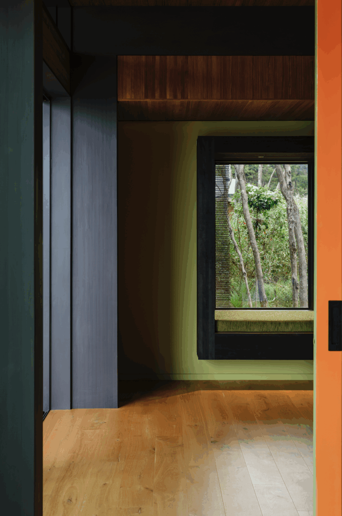
A stroll away from Waitematā Harbour, is Kristina Pickford’s heritage apartment. Here’s how she brought mid-century moments and timeless design to the space
Kristina Pickford reworks her classic 1920s apartment with timeless design
Strange layout and lowered ceilings aside, what attracted you to the place?
We wanted an apartment in the true centre of Auckland and a heritage building was our preferred option. We spent one weekend looking at various inner-city apartments and took no longer than five minutes in each, with the exception of this apartment. I loved the essential form of the space – the high ceilings, the modular arrangement of the concrete columns and beams and the northwest aspect. The steel windows were also appealing – the quality of light throughout is beautiful. The clincher was the long view over lower Queen Street, the Cloud, Shed 10 and out to the harbour beyond.
Tell us about renovating the apartment.
Logistically it was challenging. The location made it difficult for contractors – parking, removing materials, negotiating large items up five flights of stairs was testing. I loved the challenge of utilising every square inch of the 96 square metres to best effect. Before I started I listed virtually every item that needed a home and set about making sure the design was fit for purpose. Having sufficient space was a concern at the outset, but we have more than we need.
[gallery_link num_photos=”9″ media=”http://www.homestolove.co.nz/wp-content/uploads/2018/02/Waitematā1.jpg” link=”/inside-homes/home-features/heritage-apartment-ballantyne-house-auckland” title=”Discover more about this home here”]
Rather than built-in cabinetry for storage, you bought freestanding USM. Why?
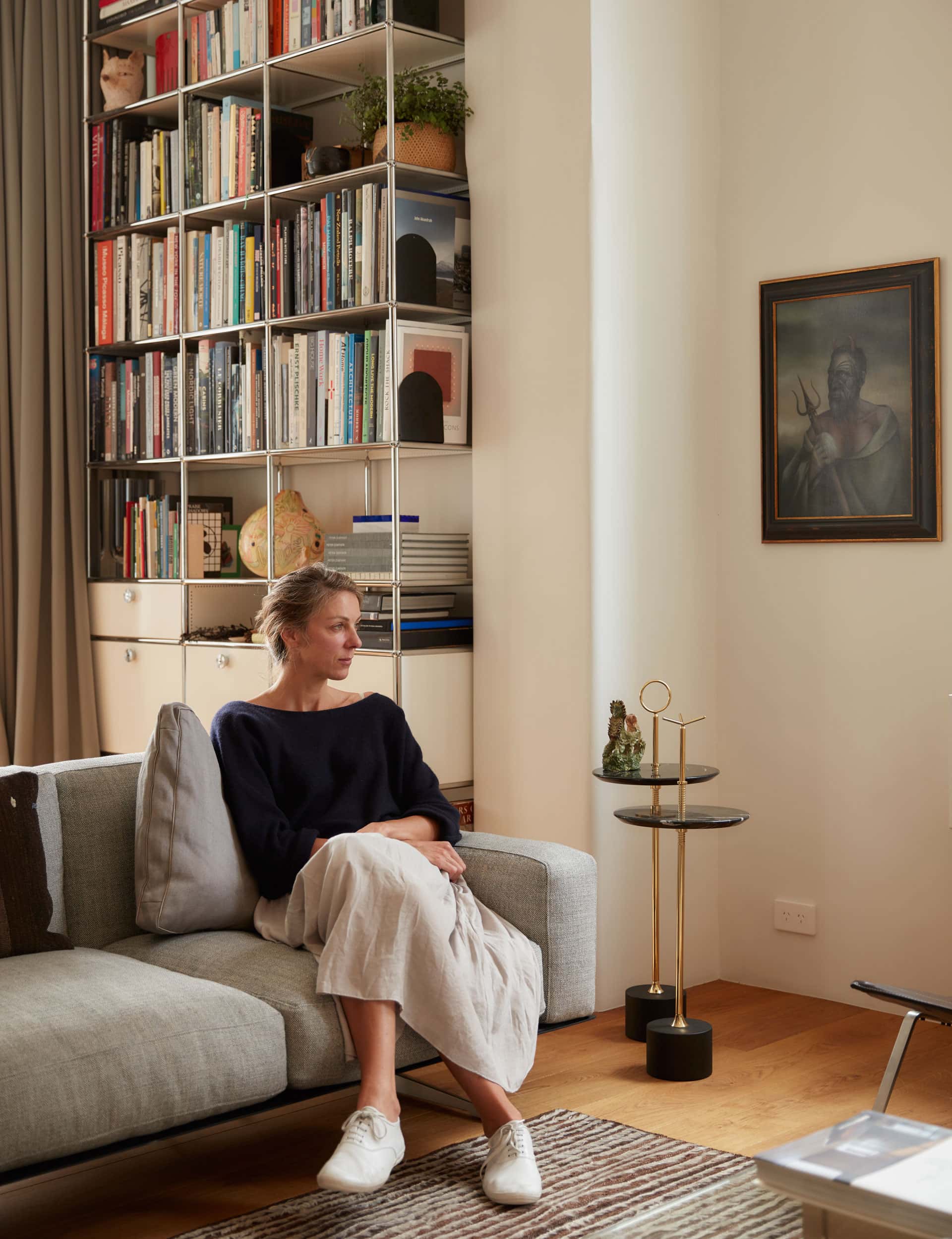
The majority of our storage is in the hallway – the kitchen units are backed with a bank of wardrobe storage. All additional storage is free-standing – the bedroom cabinet, the office desk and bookshelves are all USM Haller systems. I contemplated bespoke cabinetry but I’ve always liked USM. The modular character plays nicely with the standardised column and beam structure. It’s timeless and has an understated quality that works with our other mid-century and contemporary furniture. USM was first designed in the 1960s, so it expresses the rationality and functionality which prevailed in good design at that time.
You chose to have a wall of windows between the living area and bedroom rather than a solid wall. Why?
This was a decision I made very early on and was very confident about. The bedroom isn’t overly large so I knew allowing more light in would give the space a more generous feeling. The internal window is designed in such a way that valuable space isn’t lost – there’s a 900mm-high wall beneath the window for clothes storage on one side and a desk on the other.
