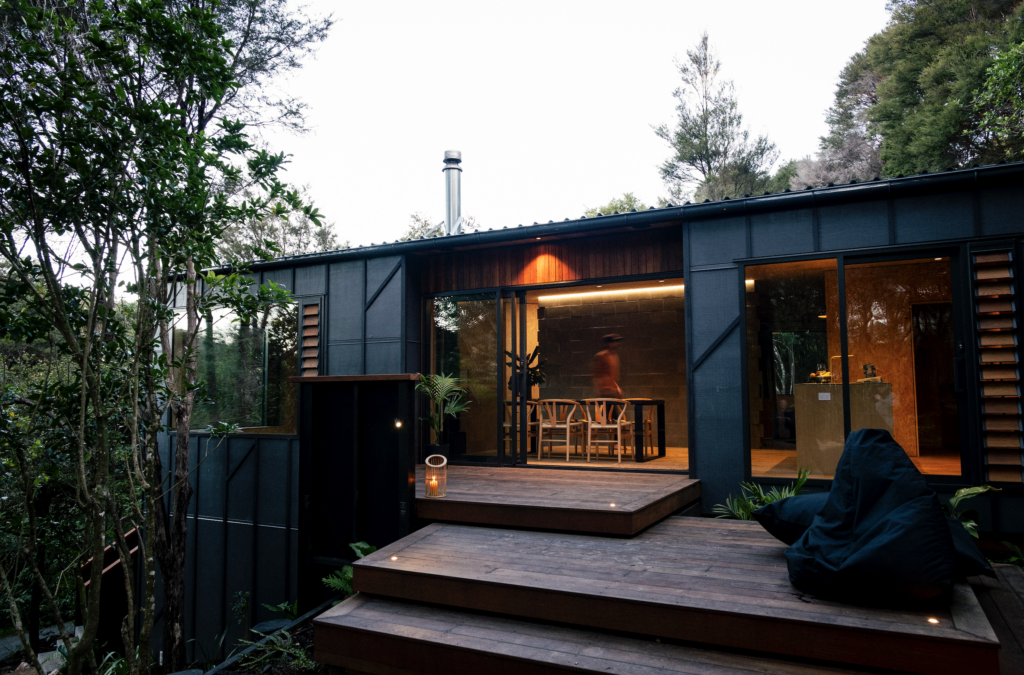
Architect Gerrad Hall updates a family bach from the ’80s on Auckland’s west coast by subtly weaving the same language through the design
The subtle renovation of this bach at Bethells Beach celebrates ’80s style
Project: Family bach
Architect: Gerrad Hall
Location: West Auckland
Brief: Extend an 80s bach to be in keeping with its retrospective era and location.
There’s no big reveal here. A humble beach home sits on a flat site on an unsealed shared-access road scattered with dwellings that have happened among the pōhutukawa. These accidental Kiwi-style buildings express a language the owners wanted to respect.
“Architecturally, you might describe it as quite a standard house,” says architect Gerrad Hall, of the renovation at Bethells Beach on Auckland’s west coast. “The challenge was to do something that spoke the same language as the original 80s home.”
Such a sensitive approach may not have happened early on in Hall’s career, when he was busy evolving his own style. Until he realised the limitations of this singular approach. “I had a sea change of trying to really listen and really think about how each project could evolve based on the brief and site and the possibilities,” he says.
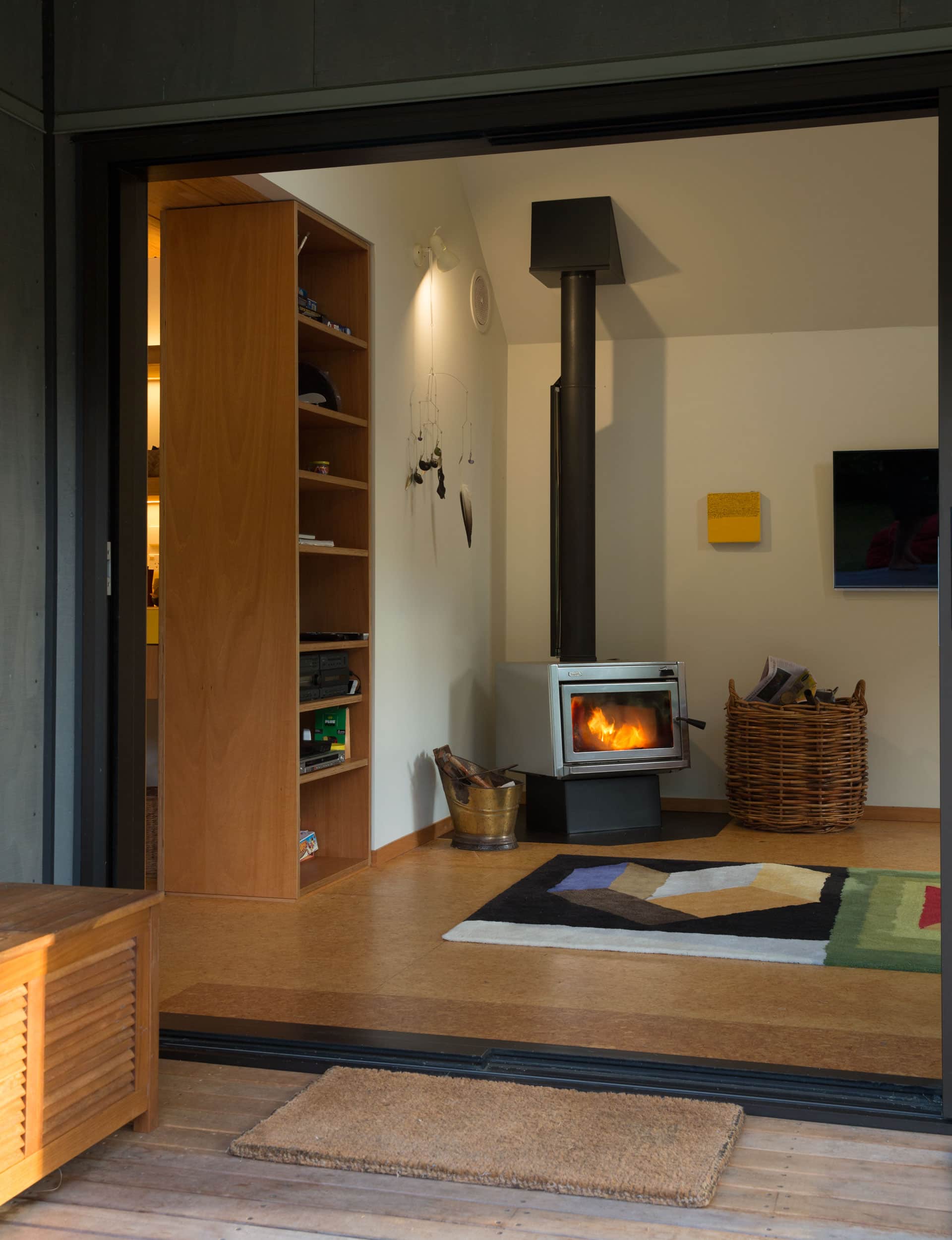
That level of listening means it’s hard to tell where the 80s genuinely begins and ends in this renovation. “My clients really liked the existing house – they liked its simplicity and humility: attributes that attracted them to Bethells, which is a little bit downbeat and a big jumble of work,” says Hall.
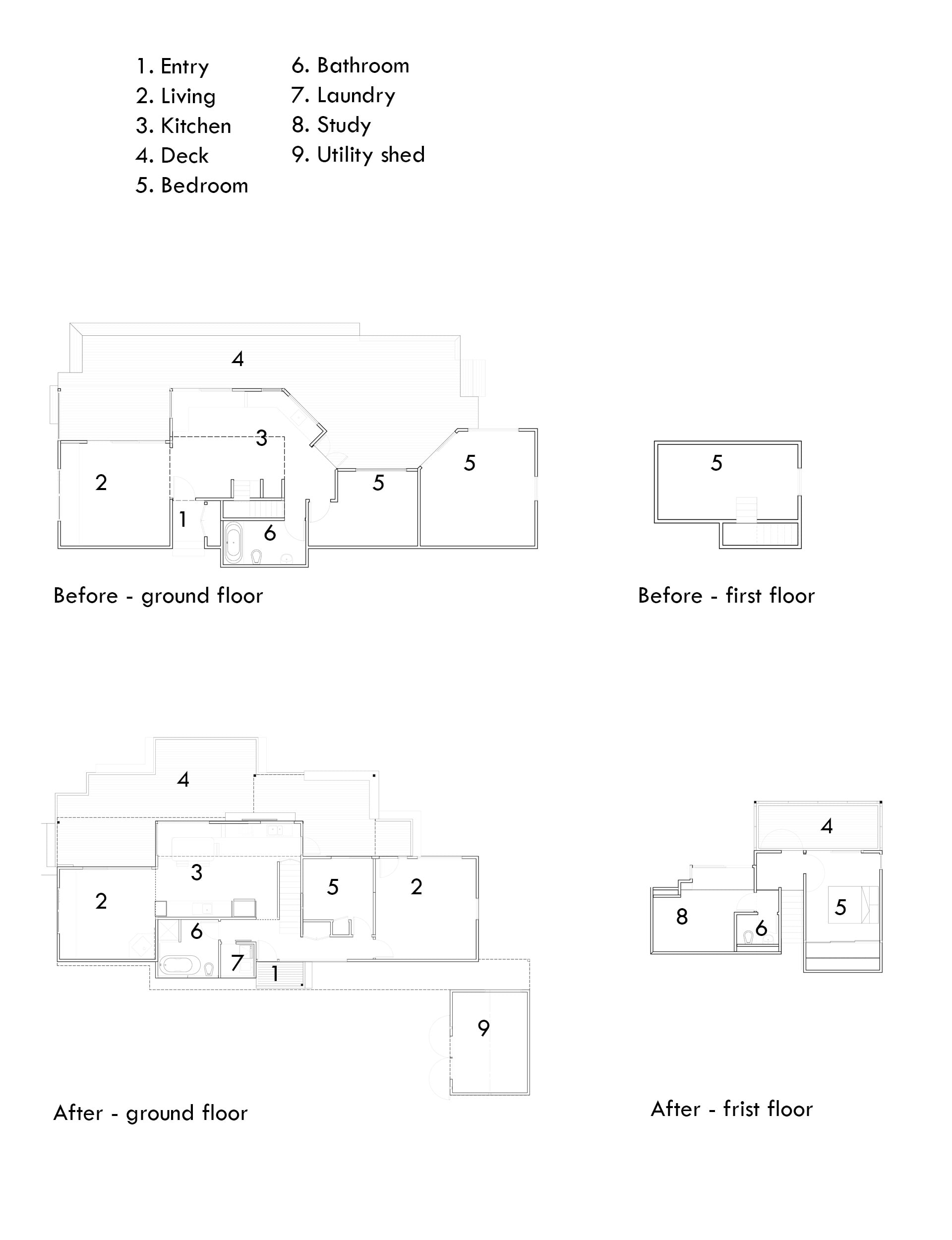
The owners, a doctor and an artist with two young children, didn’t want a flashy alteration, or something that came across as boasty – though they did want to resolve the external access across a deck to one of the bedrooms and the tiny, hot mezzanine upstairs. There’s nothing too glitzy in the result, which added 30 square metres of extra space, new decks and a utility shed.
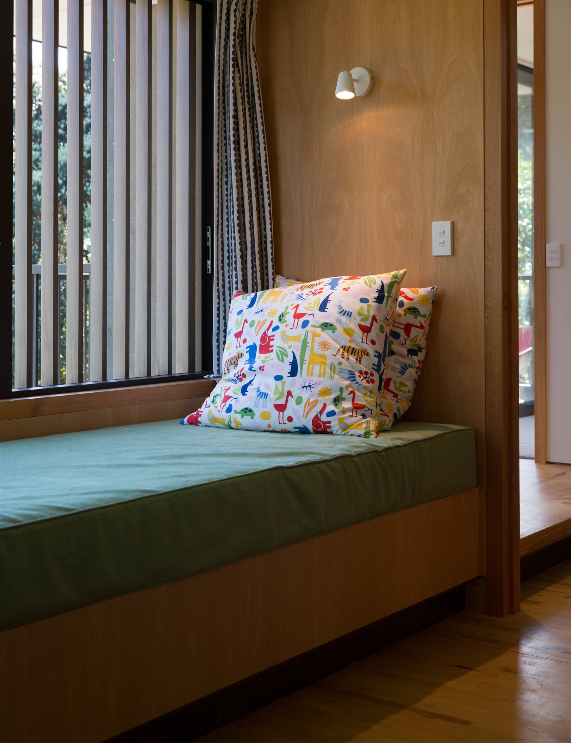
Downstairs, Hall cadged extra space by squaring off the back wall. He moved the front door, then created a proper entry and new hall leading to the bedrooms, bathroom, laundry, and kitchen/living areas. He also added a new stair leading upstairs – with period timber details, naturally – and extended the mezzanine to create a proper bedroom, bathroom and study.
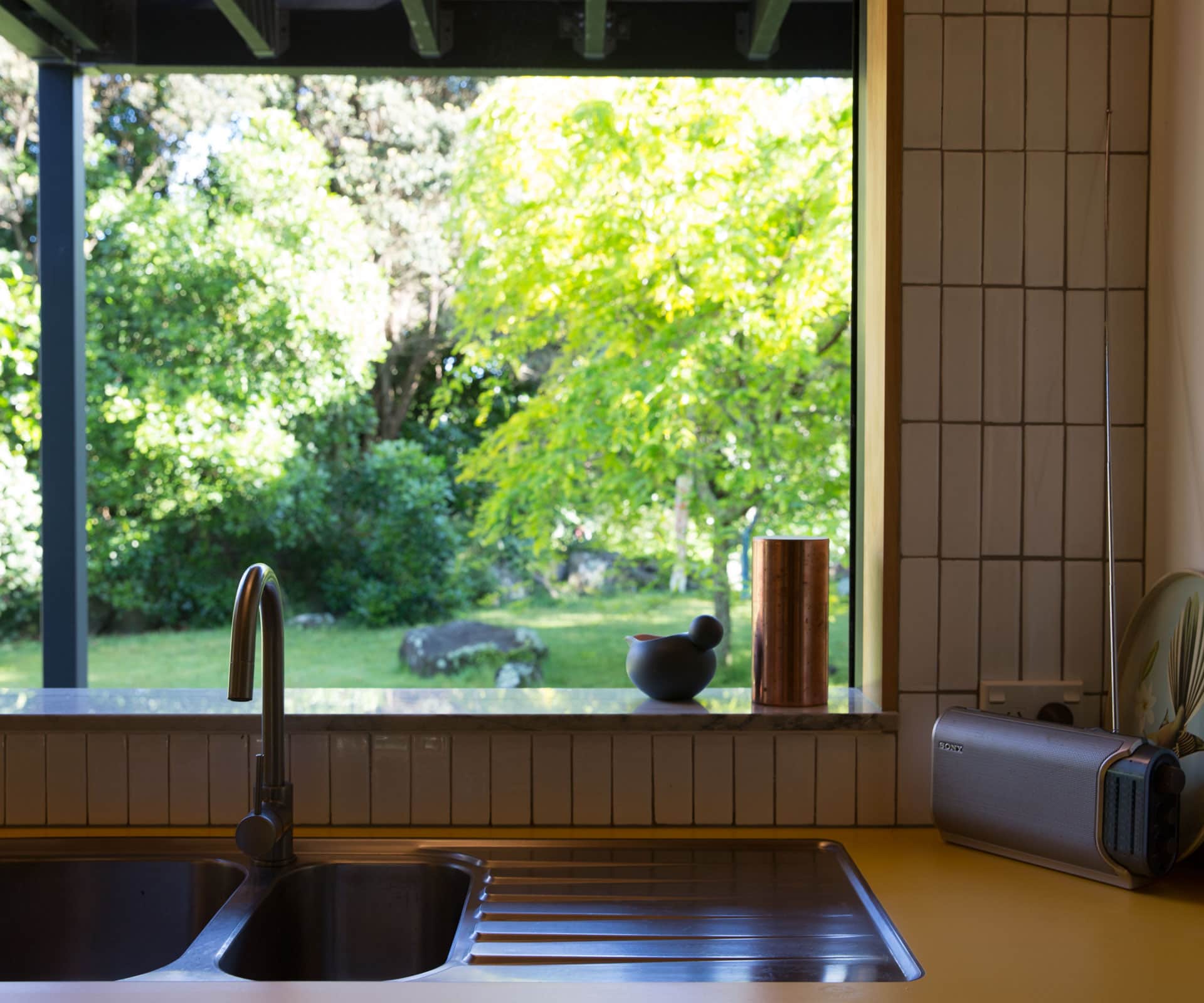
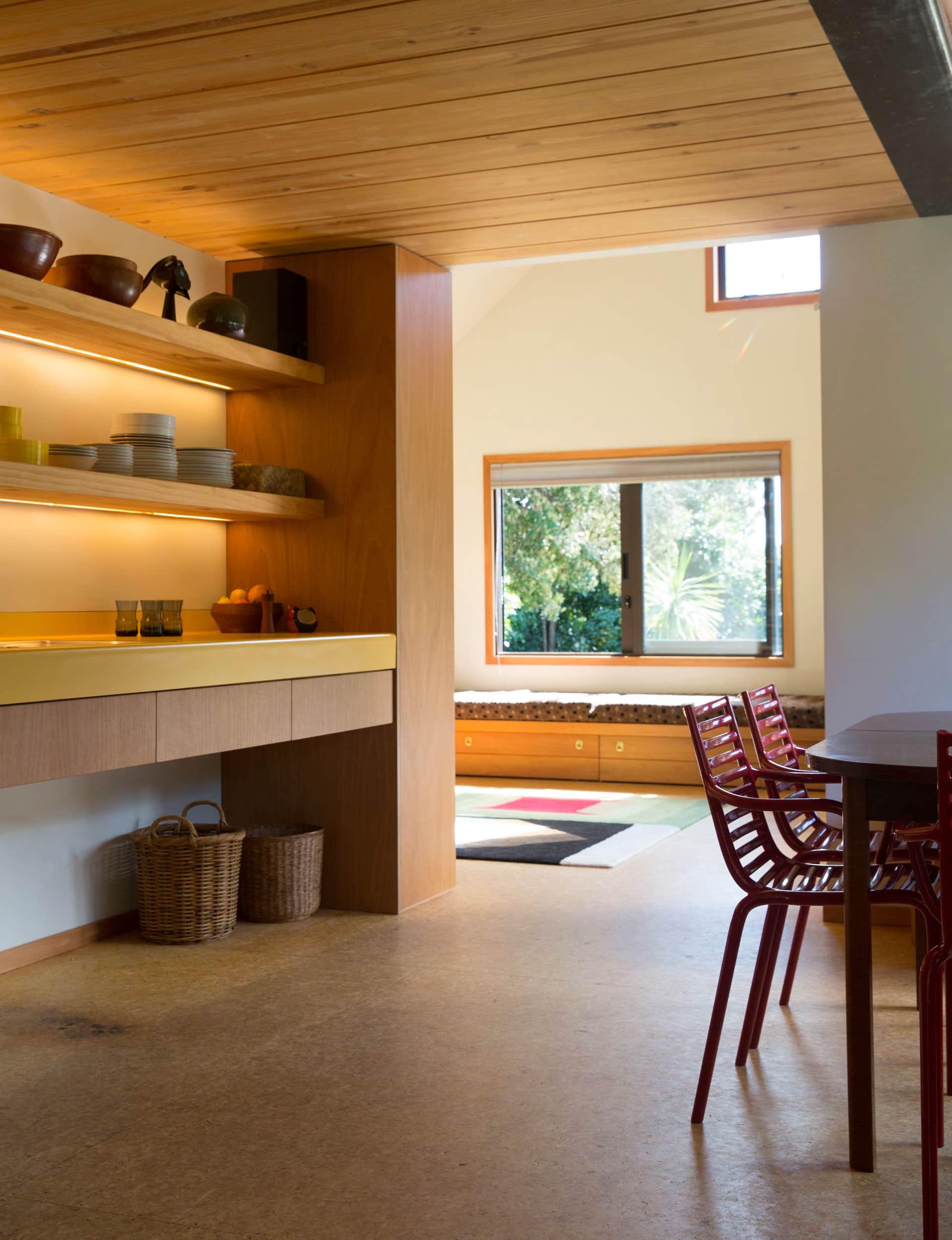
But it’s in the kitchen where it gets head-scratch interesting. Bright yellow Formica benchtops run along two walls and include a sink in each. It could be an original feature – but it’s not. Underfoot, the original Strandboard flooring reveals weathered patches and leads to a small, square lounge beneath a pitched, high stud.
The modest footprint of the living area is original. “It’s different from what you would normally do,” says Hall. “It throws you out of that typical formula that people can quite easily roll out. I like the idea that a smaller space can perhaps compress people together.”
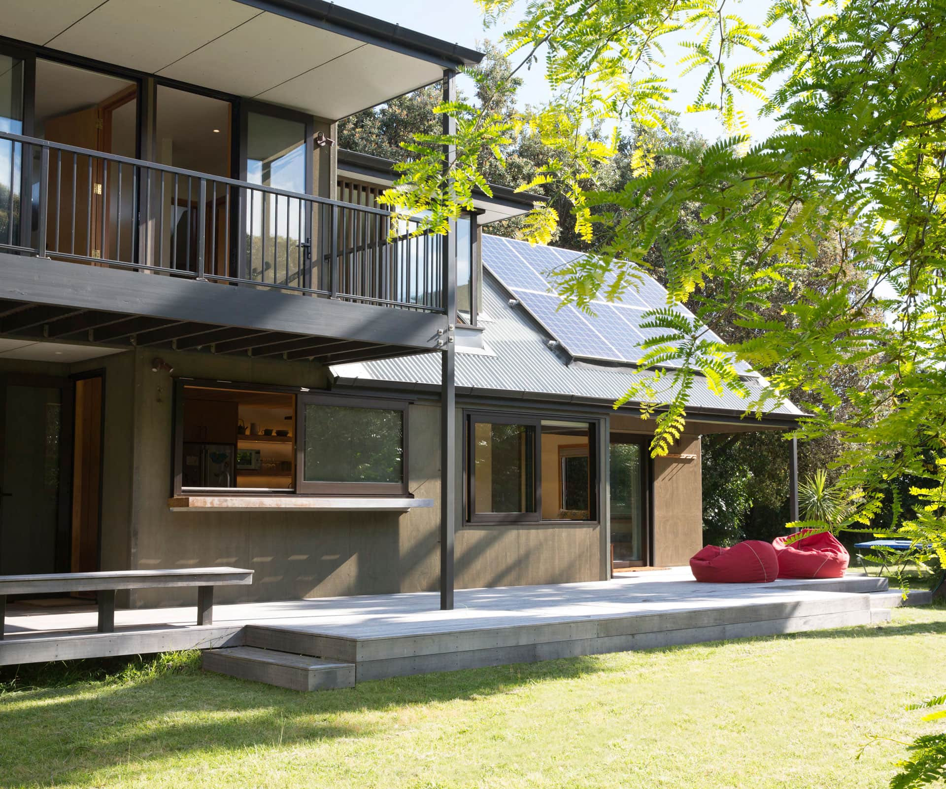
Stepping from the living room to the deck and lawn reveals the final significant addition – the deck upstairs. It provides another entertaining spot, as well as shade downstairs, and it sets the main bedroom back from the blistering summer sun.
From the front of the house, there’s no hint of this popped-up-and-out addition, but its profile is distinct at the back. “It looks like something from Torbay in the 80s,” says Hall. “Again, that was kind of the desire.”
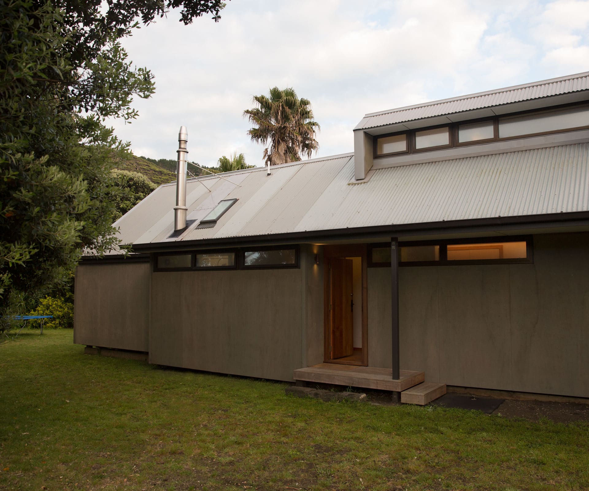
“We wanted to keep the bits of the house we really liked,” says one of the owners. “It was a building that clearly had a lot of thought put into it – although we didn’t agree with all the original conclusions.”
By engaging with the 80s and keeping or reusing as many of the original materials as possible, Hall has reached fresh conclusions. And with upgrades that include solar panels and quality double glazing, the house will endure into the decades ahead – long enough for the “holiday yellow” Formica benchtop to have its day in the sun once again.
Q&A with Gerrad Hall of Gerrad Hall Architects
How did the design pan out?
There were a few iterations to get the right feel. The challenge was listening and delving into what the clients wanted, engaging in the smaller scale and respecting the existing building. The form inevitably comes from the site and what the clients are telling you – you almost become a ‘method architect’.
How would you describe the quirks that arose from this renovation?
Weaving things into the existing structure gives some oddities, nooks and crannies that you would never design, but they become interesting features.
What’s the thinking behind the two kitchen sinks on opposite walls?
When you’re at the bach, meal preparation is often done by a number of people and requires different work stations. One bench has space underneath so when there are lots of people here they can put chilly bins under and out of the way. But, generally speaking, you don’t have the massive effect of a wraparound kitchen bench that possibly feels out-scaled to what else is happening in the house.
Words by: Jo Bates. Photography by: Tash Hopkins.
[related_articles post1=”51487″ post2=”78265″]
