The 2024 Green Home of the Year | Back House by Strachan Group Architects
Back House is just that; a little home that makes the most of a sunny spot in the backyard. It’s as unpretentious as it is clever. Equal measures of economy and sustainability form the basis for this well-thought-out minor dwelling for a family of three.
On a small slice of land in an unassuming street in Henderson in Auckland’s west, architect Roy Tebbutt of Strachan Group Architects designed this home for his brother and sister-in-law, Jeff and Lydia Tebbutt, and their young daughter.
“There’s nothing fancy about this home. It’s done well, without the fuss,” he tells us of the space that covers a footprint of just 65 square metres. “It’s compact, efficient, and delightfully detailed, with everything a home needs.”
The idea was born when the trio started discussing the best ways to make use of land, something Jeff and Lydia had in abundance in their backyard, an awkward but sunny corner of which was under-utilised.
From there, the concept evolved organically. There was no formal brief, and the process was as collaborative as they come.
“Lydia and I had a high level of trust in Roy’s ability to consider the constraints and opportunities of the site. I think we threw around words like ‘glorified bach’; we envisioned something a bit of a step up from a bach but with a similar feel,” Jeff says.
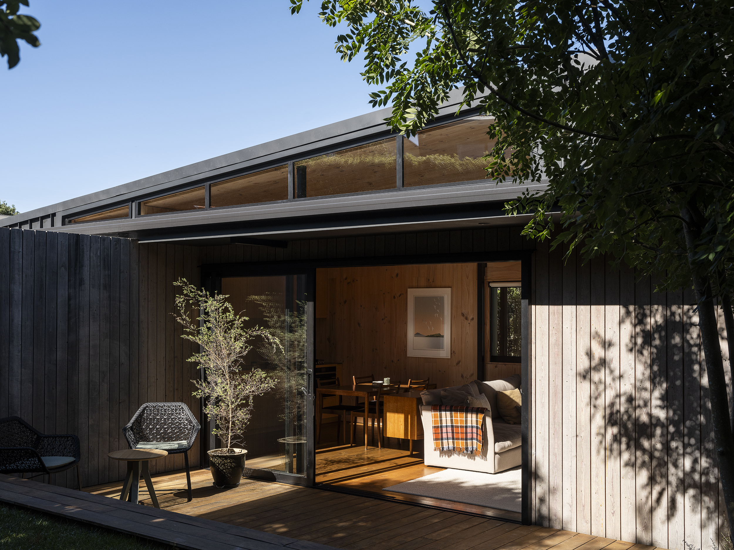
Creating a level entry was considered early on, as were light and orientation, and connection between home and landscape, each of which has been modulated in turn with an expert touch.
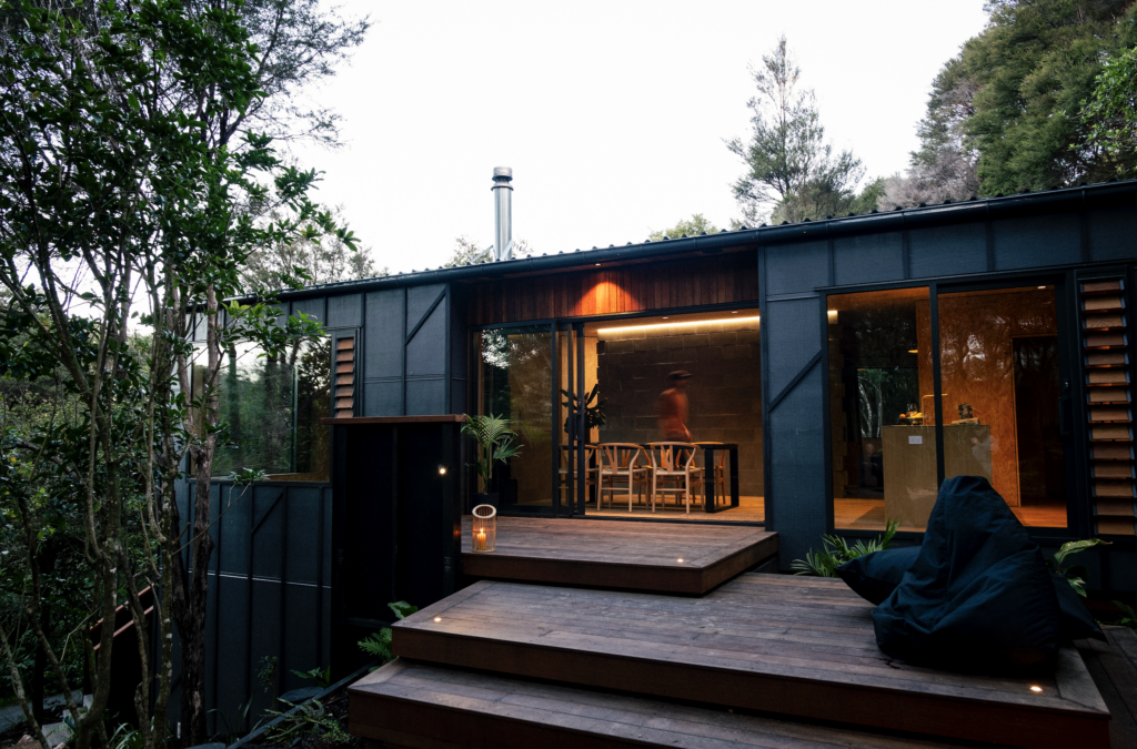
Running south to north, the home is perched on poles, creating the sense of floating above the land to the west and north. The experience changes dynamically to the east, where the garden is dug into the hillside, creating a sense of grounding and a profound connection to the immediate leafy surrounds.
“We kept the form-making very simple. Rectilinear planning places service spaces and sleeping areas along the hallway. The plan then narrows to the north to a single-width space that stacks the kitchen, dining, and living areas. The roof here reaches up to the north, with clerestory glazing on three sides allowing morning, midday, and then afternoon sun to fall across the living spaces,” Roy explains. “It’s a passive solar design without the thermal store.”
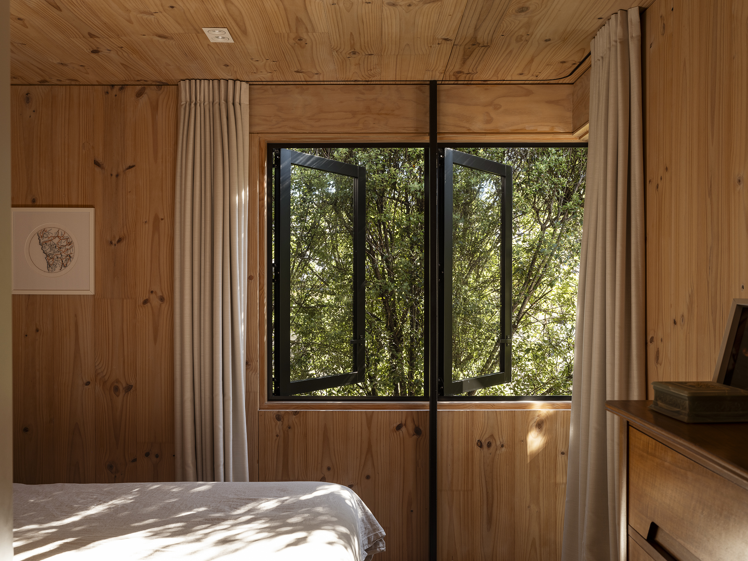
Windows peel away to the north and west, leaving an open corner and welcoming the breeze.
“We knew from the beginning that you would have that sense of floating up there so, by having a relatively high windowsill and the ability to slide that corner away, you’re able to connect directly with the greenery.”
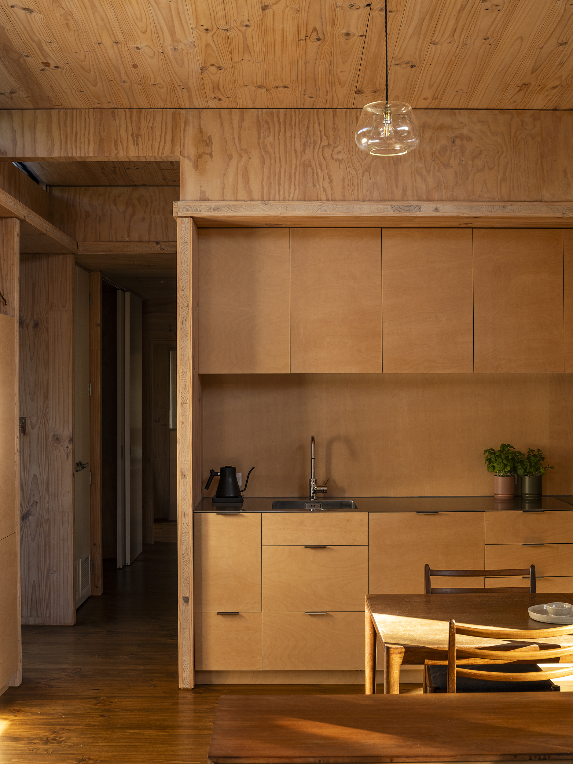
The small footprint belies the sense of spaciousness, particularly at the northern end of the house, where there is a striking dynamism of light and texture.
As Jeff tells us, “In this room, even when you lie on the couch, you’re looking up and out at the trees, the sky, and the clouds. The sliding doors create another easy connection to the deck and green spaces.”
Mulling over ways to create cost efficiencies and reduce the environmental footprint of the building, Roy and Jeff landed on cross-laminated timber (CLT) construction.
“Initially, the plan was for our father to build the house. Unfortunately, he sustained a shoulder injury and, in the end, was unable to, but part of the decision with CLT was based around the speed of construction compared to traditional building methodologies, which would mean a year or so on site compared to being able to erect it very quickly. The CLT became the structure, part of the insulation, and formed the floors, walls, and ceilings.”
The use of this singular material creates a captivating simplicity.
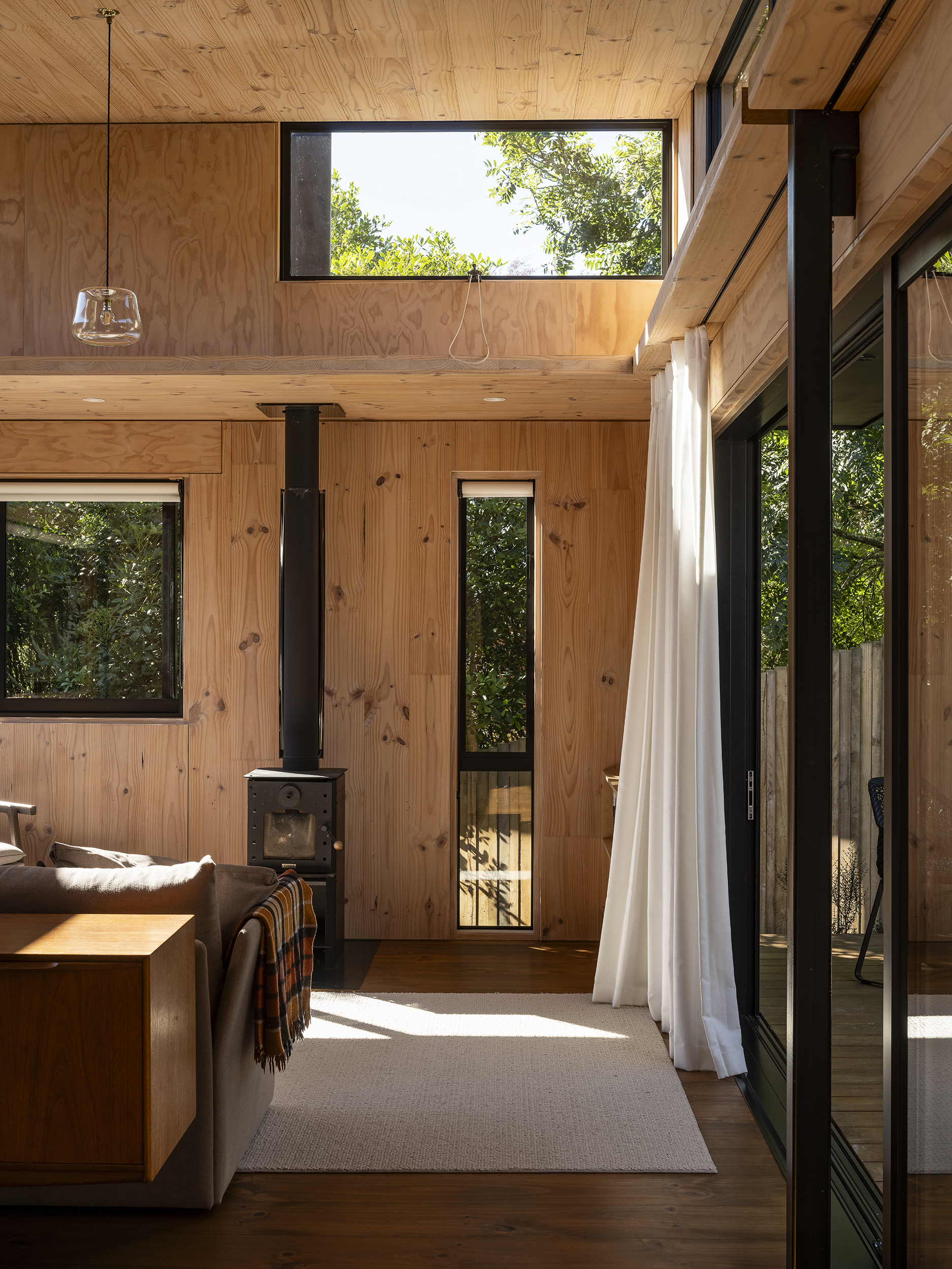
“The reduction of materials has a lovely impact on the aesthetic. There are no added linings or finishes applied, which creates a simple, robust home,” Roy says. “You also get a beautiful quality of light and feeling in the space.”
In contrast to the raking ceiling of the living area, the bedrooms both have a flat ceiling — a move taken with the intention to use only what was needed, and equally to create a sense of enclosure and retreat in these rooms.
At first glimpse of this house down the drive, there’s little given away. An abstract closed form presents itself quietly. On this south-facing elevation, the only break to the vertical timber cladding is a small slot window, offering a hint of the room within.
“A simple access deck folds down the side of the house and opens to a separate entry foyer,” Roy tells us.
Step inside, and it instantly becomes clear that this is a well-planned series of spaces, with the foyer, laundry, and bathroom all forming part of the ‘hallway’ space — an area that was never going to function only as a circulation area.
“Using less of everything is always the most sustainable thing to do, and in this case it was important that the space we had was maximised,” Roy explains.
Here, Roy’s done that and much more. He has created a home that has marked the beginning of an ongoing journey for its inhabitants.
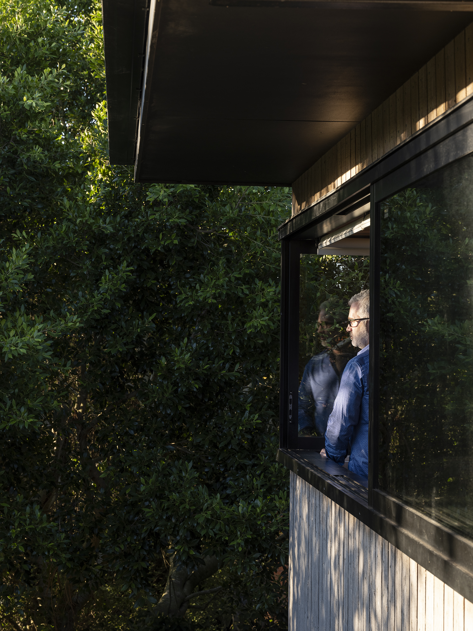
“As a family, we’re very much interested in the difference we can make as individuals to minimise our impact on the environment,” Jeff says. “Living in this house has been really good for us in terms of realising that you don’t need large spaces for a home to feel spacious. It’s made us realise that you just need to be really intentional about what you want to have in your house and what you actually need. We feel very privileged to live here, and proud of the work Roy has done. It’s a lovely mix of dynamic spaces.”
Next on the agenda for this house is rainwater harvesting, more permeable surfaces around both the homes on the property, and a further foray into the already extensive native planting that abounds here.
When we visited Back House, Jeff and Lydia were away with their three-year-old daughter enjoying a beach holiday.
Jeff tells us, “When we walked back in the door, our daughter said, ‘Our home is beautiful’. It is. It’s an incredibly liveable house. It has a really calm, serene vibe.”
This little abode exists in direct contrast to the surrounding 1970s and 1980s housing stock that defines the area. It has a joyful modernity about it, full of thought-provoking ideas. As Roy puts it, “This is a small home with a big heart.” We couldn’t agree more.
Words: Clare Chapman
Images: David Straight
Judges’ Citation
Not all green design requires certification schemes, nor the purchase of expensive equipment and materials from the other side of the world. Sometimes, all that is required is a return to the fundamentals of architecture: careful consideration of orientation, and strategic placement of openings to ensure optimal solar gain and passive ventilation.
With its intelligent timber construction, no demolishing of an existing house to build this one, and the understanding that living in a tiny space inherently has less embodied carbon, this simple, small project with strong architectural fundamentals exemplifies efficiency without compromising on elegance or utility.

