There is simply no excuse for a basic bathroom. These five from Patterson Associates, Assembly Architects, Herbst and Wendy Shacklock run the gamut from intimate, dark spaces to light and bright renovations – inspiration for every style and budget.
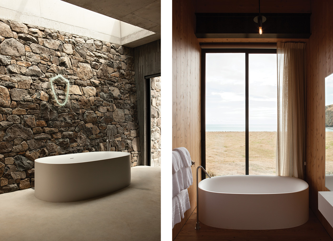
1. Shelter from the norm – Seascape House, Banks Peninsula, Patterson Associates
HOME Your first diagrams for this house consisted of “a bed and a fire and a cave to fit them in”. How does the bathroom fit with that program?
Davor Popadich We wanted the bed and bath to look directly onto the rocky ocean outcrop, sheltered in the cave.
HOME The rest of the house has sweeping views, yet this room is hunkered against the rock wall – how did you include the view?
Davor Popadich A narrow glass opening leads onto the spa terrace and provides the view and light to the bathroom. The bath itself, basin and WC behind are positioned in such a way to allow for an outlook.
HOME This house is all about the experience – it’s a retreat rather than a home and it’s about enjoying nature, the sea and its raging storms. How does the bathroom manifest that?
Davor Popadich It builds upon this experience while providing a greater degree of privacy and intimacy. The cave-like environment adds to the feeling of shelter, yet the light and view allow connection with the outdoors.
HOME You’ve long worked with stacked stone walls. What is it about them that appeals?
Davor Popadich We strive to make our buildings connected to their local environment and economy by using as many locally sourced products and craftspeople as possible. The stone requires a lot of effort to be laid but its beauty, richness of texture and the stonemason’s pride are well worth the effort.
Design details
Bath Boffi.
Tapware Boffi spout.
Rock wall Built by Brayden Sullivan with stone from the property’s quarry.
Floors Local bluestone tiles and concrete.
Artwork The piece above the bath is ‘Solstice Lei I’ by Emily Sidell.
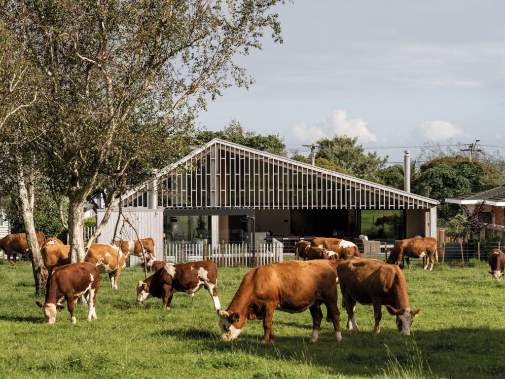
2. View to thrill – Scrubby Bay Farmhouse, Banks Peninsula, Patterson Associates
HOME The property is a contemporary interpretation of a classic New Zealand farmhouse. How did that affect your design of the bathroom?
Davor Popadich We wanted the experience to be authentic and genuine. The gable form extends into the bathroom as well as the macrocarpa timber lining and flooring.
HOME It’s not huge and the fittings aren’t showy. How did you make the space feel special?
Davor Popadich Ample natural light and the home’s volume and materiality add to the overall experience, as well as the ability to open the sliding door for the view and fresh air. Big timber shutters allow for privacy and intimacy when needed.
HOME How different is it designing bathrooms in a house that is intended only for occasional occupancy?
Davor Popadich No different. Bathrooms can and should be beautiful and practical regardless of frequency of use, size, budget and location.
Design details
Bath, tapware and mirror All by Boffi.
Cabinetry Macrocarpa crafted by Alsop Joinery.
Flooring Oak and local bluestone tiles.
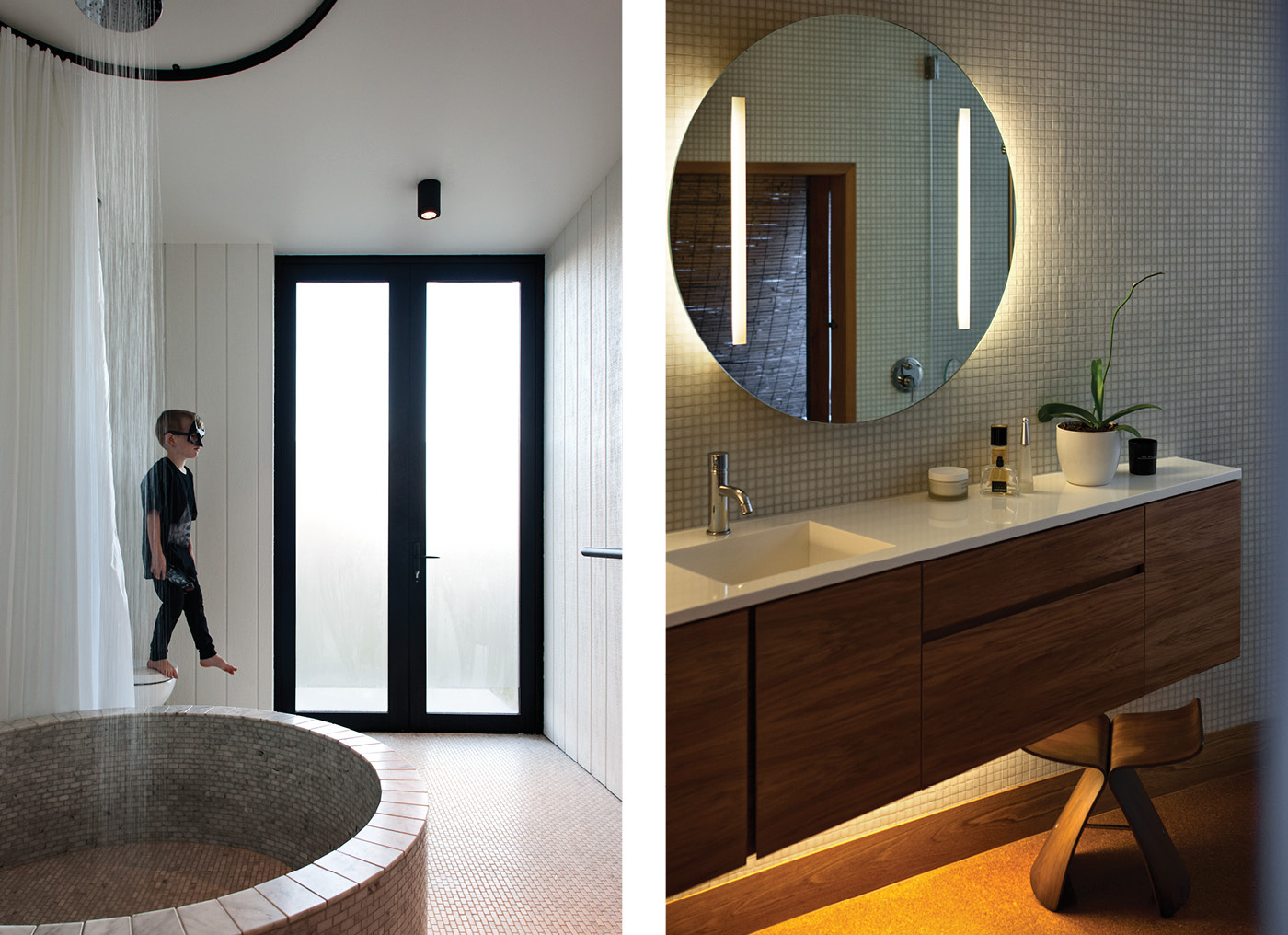
3. Enduring edge – Wright Family House, Arrowtown, Assembly Architects
HOME This might be the family bathroom but it’s still special. How did you achieve that?
Louise Wright It is a simple, spacious and practical room. Most things play a dual function – the bath is also the shower, the shower curtain shields the toilet, the bathroom is also the laundry. The shape and form of the bath is interesting – we like the geometry of the circle in the room – and the monochromatic materials are really textured, but simple. The floor and bath are all tiled in the same material, a rumbled Carrara marble.
HOME Showers over baths are notorious for getting water everywhere. Is this one better?
Louise Wright The curtain falls from the ceiling to the base of the shower, which is much larger than a regular bath. With the curtain wrapped around it creates a lovely space – the light is softly diffused and it is private, quite a contrast to a tile and glass shower. Not a drop of water gets out. On the other hand, when it is used as a bath with six kids in there…
HOME The connection to the outdoors is a nice touch – how does this work in practice?
Louise Wright The family bathroom is also the laundry and a sort of back door and mud room. The doors open out to the reserve and to our side yard – the clothesline, the compost. The glazed doors are partially obscured for privacy, but we can still see out to the mountains and sky. The view is to the peaks in the west and the sunset.
Design details
Bath Converted concrete drain raiser.
Tiles floor and bath in rumbled Carrara marble from Penguin Ceramics, bath top in honed Carrara marble from Che Stile.
Showerhead Progetto ‘Flow’ rainhead from Edward Gibbon Plumbing Plus.
Lighting ‘Metro’ LED ceiling light and ‘Plan’ LED recessed wall lights from Lighting Plus.
Wall cladding and paint Shadowclad groove in ‘Quarter Merino’ Spacecote by Resene.
Curtain rail Custom MacTrac Pro powdercoated curtain track Shower curtain by Catherine David Design.
4. A step in time – Heke Street House, Auckland, Herbst Architects
HOME The bathroom is the only room you’ve changed – why did you pick this one?
Lance Herbst The Butynol roof over the bathroom wore out and developed a slow leak. To repair it we had to remove the entire ceiling, parts of the wall lining and parts of the floor, so we took the opportunity to renovate the room.
HOME How much did you incorporate Mitchell & Stout’s original design?
Lance Herbst We didn’t change that much. The bath and stainless steel shower base are original and unchanged and the position of the vanity, toilet and bidet are also the same. The language of materials was isolated to the bathroom itself and didn’t appear anywhere else in the house – brightly coloured vinyl on the floor and brightly coloured melamine to the vanity, bath surround and medicine cabinet as well as bright blue wall tiles in the shower. So we decided to bring the bathroom into line with the rest of the house – vanity and wall-hung cupboards made of tawa veneer, the floor in cork, which is very similar in appearance to the particleboard flooring found in the rest of the house. We then introduced a white mosaic on the walls and bath surround, which is in keeping with the white painted walls and ceiling of the original bathroom.
Design details
Tiles Bisazza glass mosaics in white.
Tapware Cox by Paini.
Cabinetry Tawa vanity and veneer boards by Johannes Erren Cabinetmakers with a Corian top.
Mirror Custom made with silvering sandblasted off the back where the strip lights are fixed.
Lighting Concealed strip lighting under the vanity.
Flooring The original particleboard was deteriorating and has been replaced with ply overlaid with cork.
Stool ‘Butterfly’ stool by Sori Yanagi for Vitra.
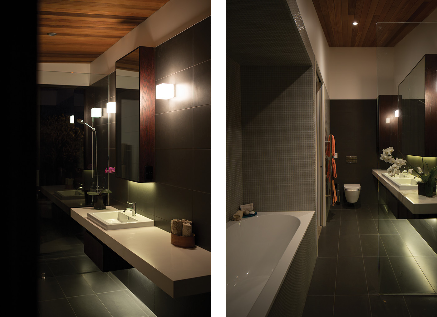
5. Sense of drama – Te Kohanga House, Waiheke Island, Wendy Shacklock
HOME Te Kohanga is a house that offers both an amazing view and a sense of containment because of its exposed position. How did you incorporate these elements into the bathroom?
Wendy Shacklock Both bathrooms in the house are 4.5 metres long, with one end (the shower) all glass looking out to the view, and sliding door access to the outside – it’s great if you’ve had a swim at the bottom of the cliff. The rooms offer both containment and connection. They have been finished to enhance the unique experience of the house as a whole – they have the same folded cedar ceiling, for instance. The floor and walls are in honed stone tiles – they subtly pick up tones from the site but have a very sophisticated, luxurious finish.
HOME There is a moodiness, almost a darkness here – how did you balance practical concerns with that sense of drama?
Wendy Shacklock The lighting can be moody or it can be functional – I really dislike brightly lit bathrooms when I’m getting ready for bed. The daylight is very good and the mirrors angle to allow light to your face.
Design details
Bath Villeroy & Boch.
Tapware Vola Sink and toilet Duravit.
Tiles Floor and walls in honed stoned from European Ceramics; white mosaics surround the bath.
Lighting All from Inlite Ceiling cedar.
Cabinetry American Oak and Trendstone.
