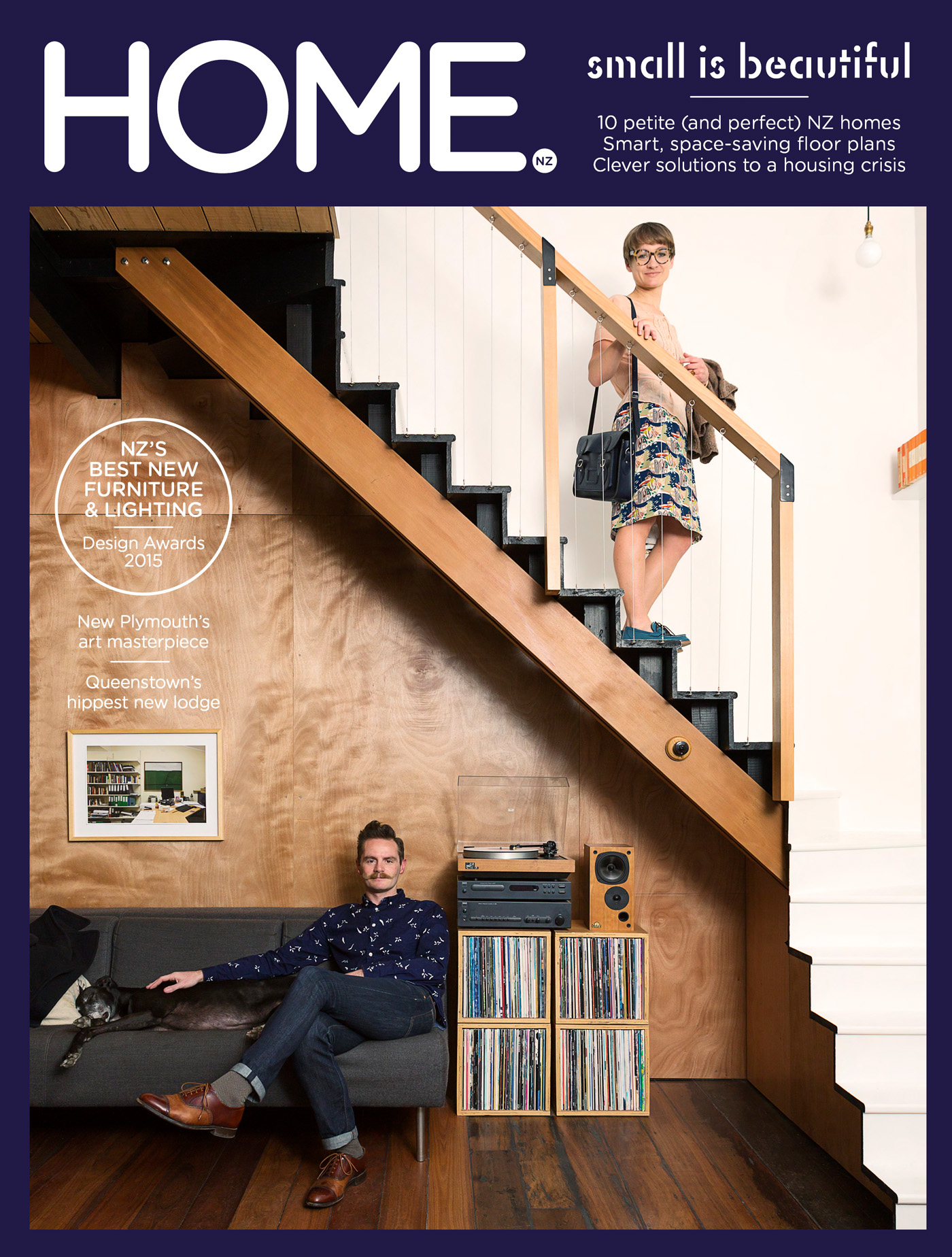
Ben Daly worked as an architect until deciding to go it alone, chucking in his job to take on the design and build of the Wellington apartment interior that he shares with his wife Dulia, and which stars on the cover of our new issue. Here, Ben talks about the techniques he used to get the most out of their 66-square-metre space.
HOME You’ve created a fantastic 66-square-metre space for yourself and Dulia. Did either of you crave more space, or was this enough?
BEN DALY There’s something comforting about small spaces. Maybe it comes from when you’re young and the idea of building a hideout, or holidays in small baches. I think there is something magical about being in this kind of space and being able to understand its volume as a whole – it’s something everyone can comprehend. You get lost in bigger spaces and there is a level of disconnect. A small space has the power to reduce things to a very simple concept. It then becomes important as to how you use the space and interact with its volume, textures and light. Any more space for us would have been completely unnecessary.
HOME What key aspects make the design work effectively in this small footprint?
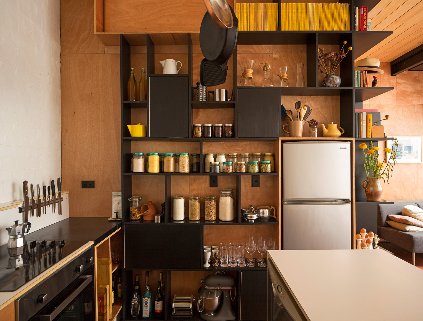
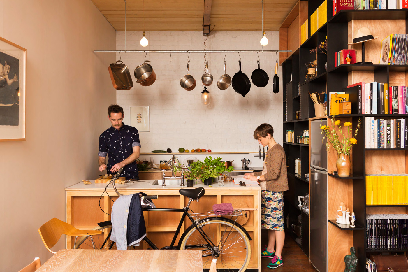
BEN DALY One of the main goals is to make people feel a certain level of joy when they are in a space, regardless of size – it’s somewhere you want to be in, that entertains and inspires you. No matter where you are, you get a greater sense of volume. Opening up and freeing the space was always going to be important. Whether it is that you’re downstairs and the double-height space to the front of the apartment suggests something greater above you with the light that floods down, to when you are upstairs in the main bedroom you have no full-height wall in front of you and can read the volume beyond. With this space it was also important to keep the language of the architecture simple. Further to this, everything that went into the space had to also serve another purpose. The idea of the shelves was to free up the main downstairs area. Likewise, the kitchen joinery also doubles as storage on its fronting side to the dining area, as does the landing for the first part of the staircase, which is entirely storage. This all helps in making the space feel larger than it actually is. Also it makes people interact more with the volume.
HOME You trained as an architect, but you left your architecture job to design and build the interior of your apartment yourself. Now you’re doing your own projects, do you feel freed up?
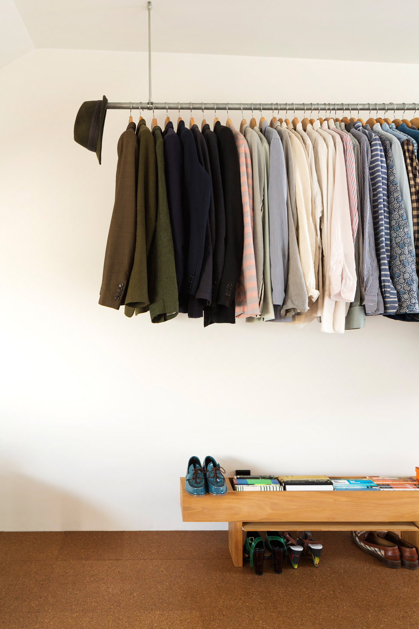
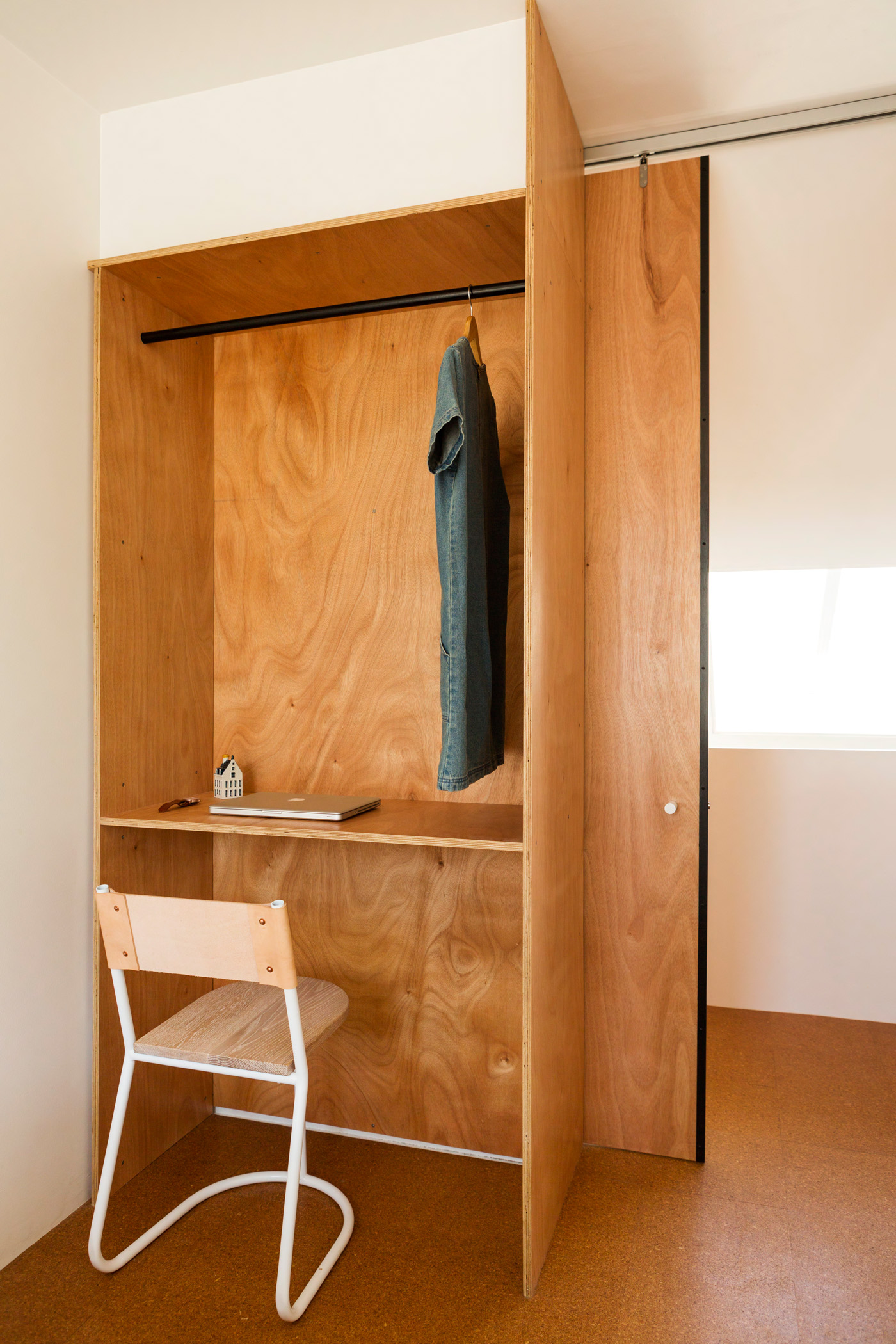
BEN DALY Certainly a lot more freed up. For me architecture can be a bit too clinical, and I always wanted to free it and myself up more. Undertaking this project was about wanting to engage with architecture, to give it more soul, it should be about the art of building. It’s important that every part of the process is considered and questioned. Why do we do this? Can we do it differently, or do it ourselves? Detail was important to me because people interact with the everyday, the handles and what you pull or push. It’s not about the precision of building but simplicity. I want people to enjoy interacting within space, much like if it was a piece of art or to touch it. In fact this is one of the things I enjoy the most: if someone touches an object you know you have done something right.
