Monastic yet welcoming, this small home in Christchurch by Braden Harford, of Maguire and Harford Architects, shows the power of contained design
[jwp-video n=”1″]
A compact concrete house is named New Zealand’s Best Small Home
There’s not much art on the walls of Braden Harford’s home, and what there is has had to “fight” to get in, says the owner-architect – although the metaphor seems altogether too rowdy for this serene, 85-square-metre townhouse.
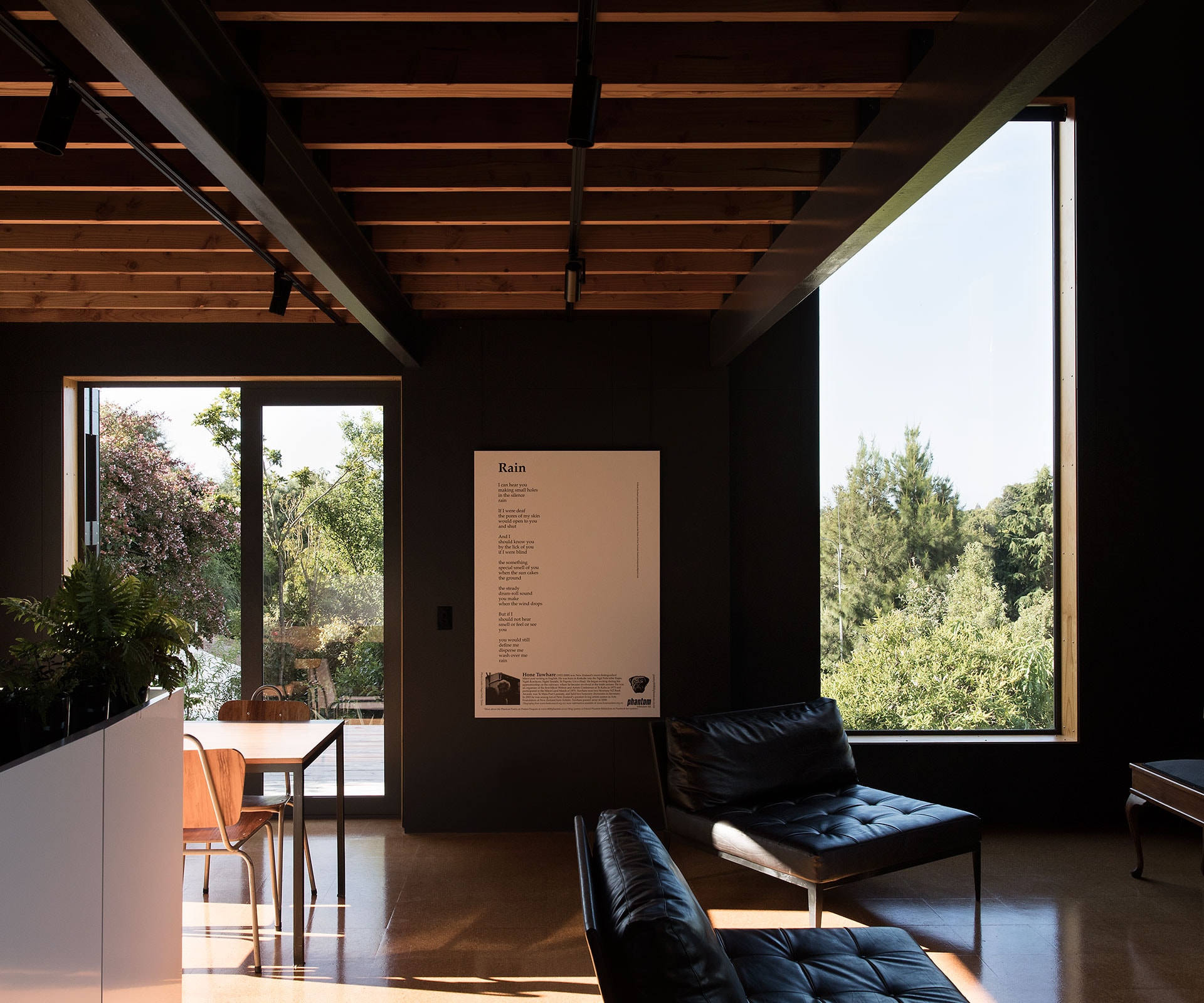
Set on the lower slopes of Christchurch’s Cashmere Hills overlooking Bowenvale Valley, from the street it presents as a small tower of concrete block, the starkness broken by a steep monopitch roofline and a handful of irregularly placed windows of varying sizes. The largest windows are close to three-and-a-half metres. Framed by timber-lined reveals, they catch the valley and city views so perfectly that you struggle to find an argument for hanging a single painting; they also pull in more than enough light to make the cork floors glow. Set against double-height, near-black walls, the effect is almost monastic – in the contemplative, rather than ascetic sense.

“I wanted it to be a retreat, to be able to come here and escape,” says Harford. A partner in the five-year-old Christchurch practice Maguire and Harford, the architect won a 2017 regional NZIA Small Project award for the house; the first that he’s designed for himself. Initially, he intended to buy half of the cross-leased section, once home to two quake-struck townhouses, and build something modest. Even after buying the entire site, he stuck to the plan – partly because of budget, but also out of conviction.
“As an architect, most people come to you saying: ‘We want this many bedrooms and as much space as possible’. I wanted to keep it more refined. And when the budget brought it down [in scope], I was reasonably happy. It meant I had to distil my ideas to find out exactly what was most important.”

Harford sized and placed windows to optimise light from the north and east, and to minimise heat loss on the southern side, where the valley loses the sun early. Those wide timber reveals, meanwhile, are a clue to the extra-thick I-beam timber framing, while above-code blown-in insulation keeps the house so warm it barely requires heating, except during overcast winter weeks.
For a small place, it doesn’t feel at all pinched. Those outsized windows help, one with a view directly north to Latimer Square, the other positioned for a valley view, with a copybook cabbage tree in the foreground. His other trick was to create a double-height void above the living space, with a mezzanine for the bedroom, bathroom and spare room.

In a similar vein, the kitchen island reads more as an object than an installation, its workings hidden behind a faceted white frontage, raised slightly from the floor.
The house is sparsely furnished, and, like the art, you suspect everything here has had to argue a case for inclusion. The architect’s childhood desk, which is set up in an alcove near the front door, made the cut. As did the compact piano in the living room. “It fills the space nicely,” says Harford, of the sound made by the piano that belonged to Warwick, his late jazz-pianist grandfather. Harford studied piano as a child and is now re-learning how to play the instrument.

Apart from acoustic ceiling panels, there’s little here to absorb noise. None of the timber joists and steel girders that support the mezzanine are enclosed. It’s another gambit to give the impression of space.
By not defining the ceiling line, he’s also squeezed more height for the kitchen and dining area. “You get to read the building, to see how it’s made,” he says of the exposed structure, which includes MDF panels for the internal walls. “It’s something I’m doing more and more in my architecture for other people, and I wanted to see how much of it I could achieve in my own place.”

Harford has designed the upstairs to be as airy as possible, using non-full height walls and sliding doors for the guest room and his bedroom. “In a way, it was a bit of an experiment in how open I could keep things, while maintaining a degree of privacy when I’d want it – say if a friend was staying. I tend to think of the doors as screens rather than as closing off the space.”
The experience of designing his own home has been “amazingly” satisfying, he says. Eventually, he’ll design a similar but slightly larger townhouse for the subdivided section, possibly to live in if personal circumstances change.
Hard to imagine leaving this place, though: “The night before I moved in I was cleaning and it immediately felt like home,” says Harford. “And it continues to do so. It’s not wearing out on me.”

Words by: Matt Philp. Photography by: David Straight.
[related_articles post1=”79051″ post2=”78711″]

