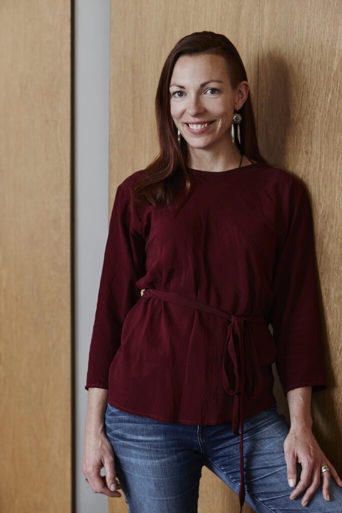
Just as a coloured logo has to work in black and white, so a three-dimensional product has to work in two dimensions first. We speak to graphic designer turned product designer, Kate Slavin, about her experience in moving from two dimensions to three, and the intricacies of designing a product to outlive our generation — and the next.
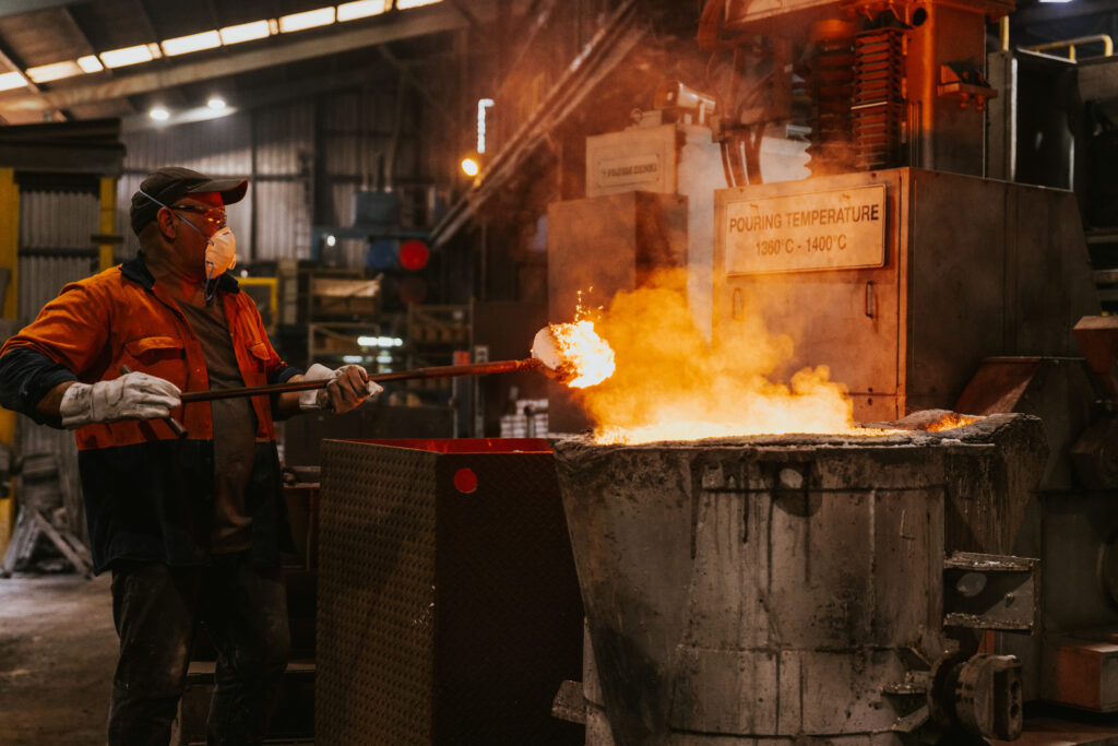
In 2019, three former advertising executives decided it was time to explore something new. Each had a different skill set and the three had a common aim: to develop a product and brand that turned its back on consumerism and throw-away culture — one that would bring people together and drive community through the sharing of stories and the preparation of food.
“Some of the best ideas happen in the kitchen, don’t you find?” says Kate Slavin, co-founder of Ironclad Pan Co. “It always seems to be the way that people gather in the kitchen and that’s where the best conversations are had.”
It’s fitting, then, that it was in the kitchen that the idea for Ironclad was formed. “We were chatting away and I was using a cast-iron pan that had been passed down from family. I just thought: why not this?” Kate explains.
It began as a side hustle and quickly became the main act for Kate, as she worked through the process of translating her years of experience in graphic design and art direction into product design.
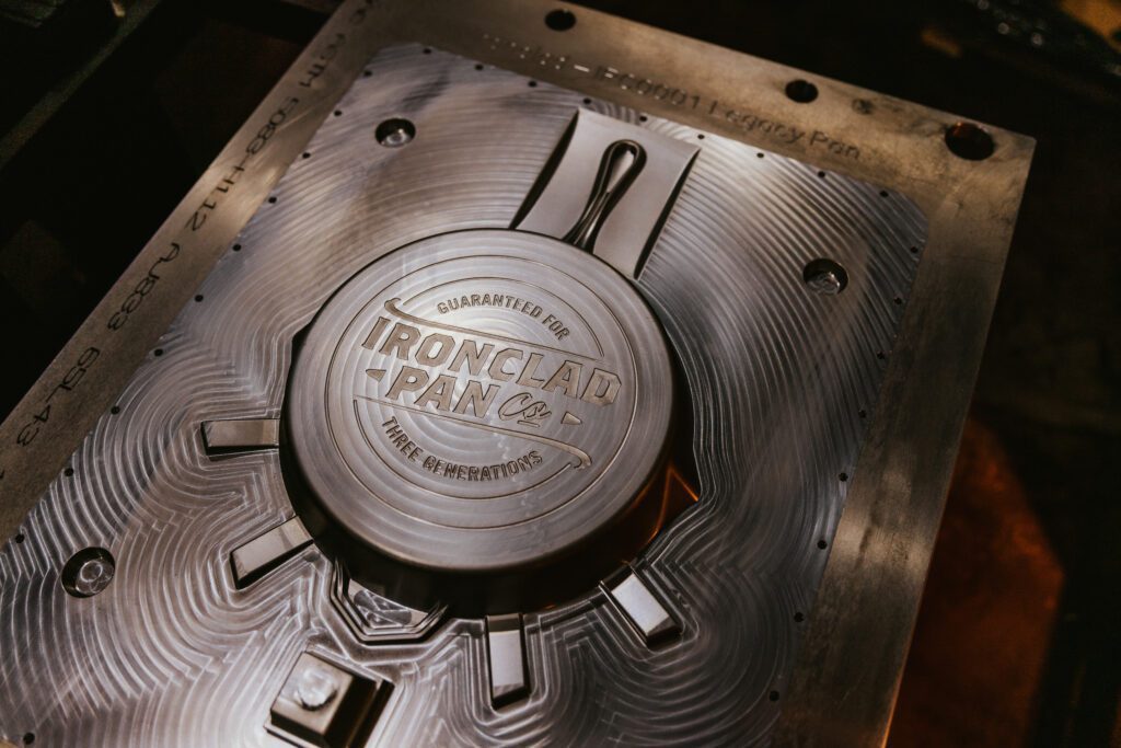
Always inspired by simplicity, Kate notes objects such as the Eames chair and Philippe Starck’s lemon squeezer as those that provided her with initial inspiration for the cast-iron cookware range.
“There’s something about the fundamental simplification of forms and clean lines that has always appealed to me. I really dislike the idea of fussy objects, and am always drawn to clean, minimal, and functional design — it’s these objects that stand the test of time.”
When it came to designing in cast iron, the challenge was vast: from the intricacies of the material and how it is poured to the way it behaves and how it is used for cooking — for example, the grill design.
“The shapes of the ridges on the grill are asymmetrical, almost mountain like, which was a feature I developed in conjunction with chefs. It’s about the way the food caramelises where it hits the touchpoints on the grill, allowing the juices to run off in a certain way and the steam to move around the food.”
These intricacies of design are evident in every piece in the Ironclad collection; each detail considered, simplified, and highly functional. The Ironclad Dutch Oven was carefully designed for multiple uses, from its deliberate oval shape, which increases interior capacity, to the intricacies of the handles on the oven and lid; the lid itself can be used separately as a skillet. Turn the dutch oven upside down, and it becomes the perfect bread oven. Outdoors, it can be used on the barbecue or open fire, or the body can be filled with coals with the lid used as a cooktop.
“I think the beauty of cast iron is the way it ages,” Kate comments. “At first it is silver, then, after some use, it turns to a bronze colour, and ultimately ends up black. The more it is used, the smoother the surface gets. Water just beads off it. But it’s also about its permanence; these are pieces designed to be handed down the generations.”
