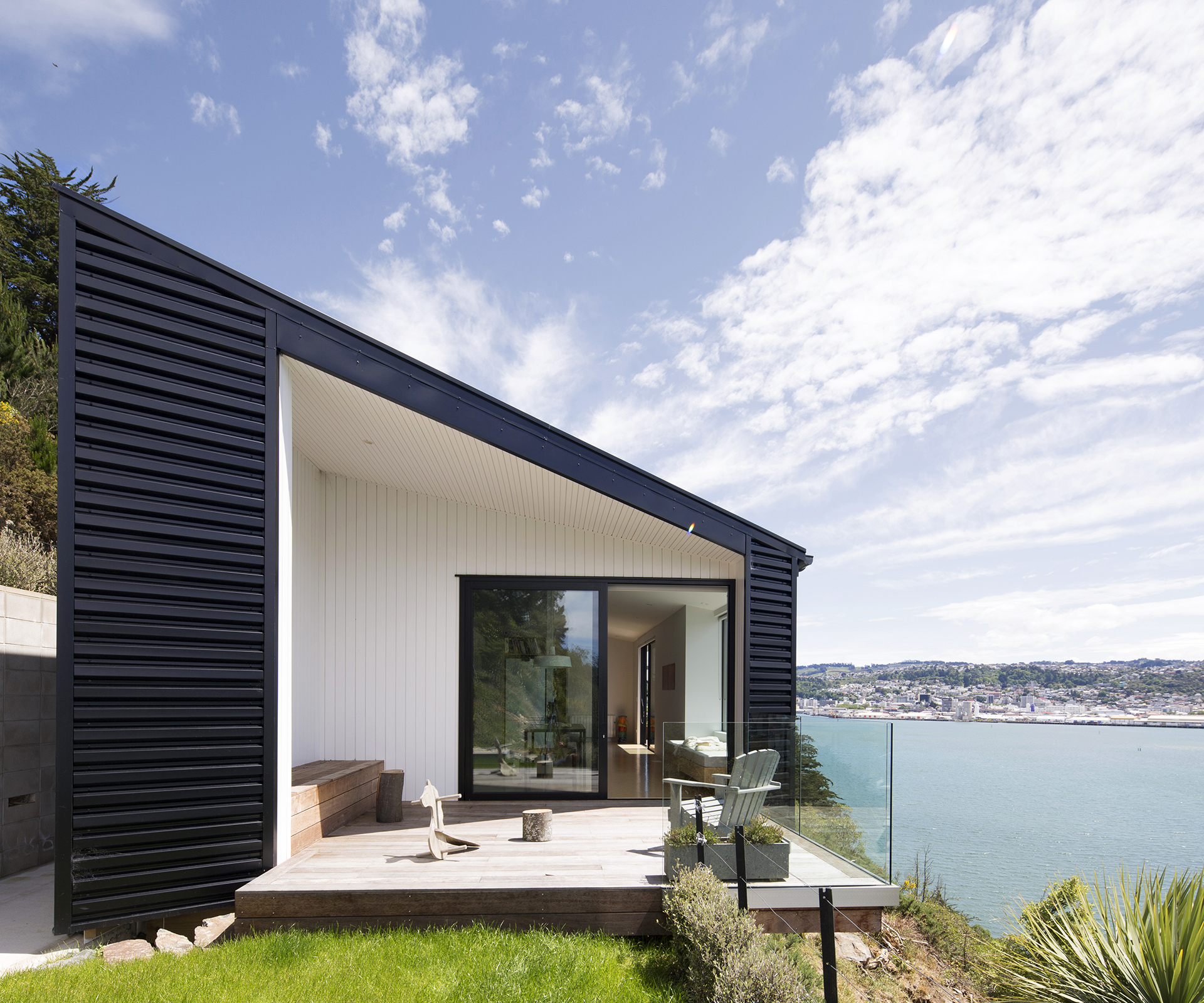
This economically sized, linear home by Kerr Ritchie Architects hugs the Dunedin cliff side, maximising the sunlight
Q&A with Pete Ritchie and Bronwen Kerr of Kerr Ritchie Architects
What were the three most important design decisions you made on the home?
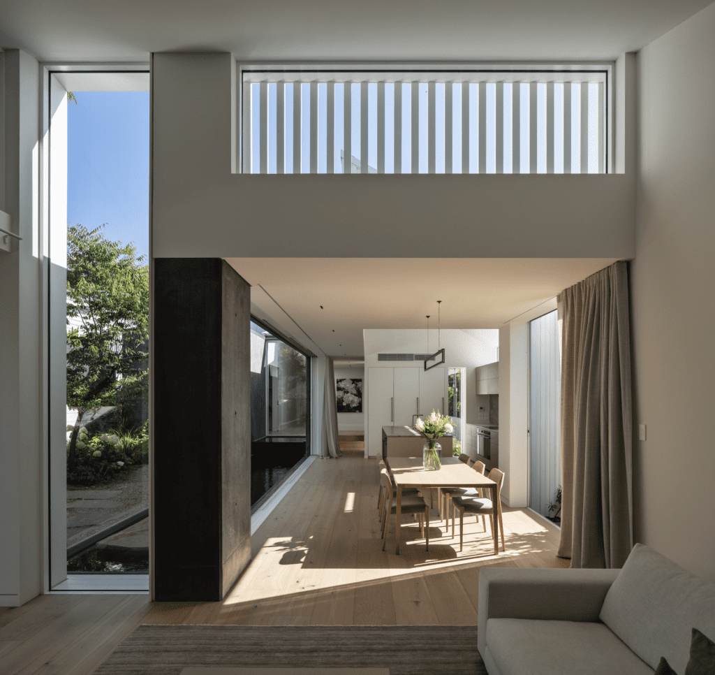
Pete Ritchie: The decision to make a linear form that hung off the hillside to maximise the Dunedin sun and reduce the height of the substructure was one. It was the only logical thing cost-wise, but that didn’t stop us exploring ideas of peeling part of the house away from the slope. We’re also glad we created the split level in the home to add spatial variety and height to the living areas. And we like the way the east end of the house tapers to face towards the heads of the harbour.
How did you retain a relationship with the land on this steep site?
Bronwen Kerr: The entrance ramp to the house is a slot between the house and a right-of-way [to a neighbouring property] that stretches from the garage to the entrance almost a storey below. This also acts structurally, anchoring the house into the hillside. We explored steps down from the front deck, but it is so steep it was impossible. The only way was to link at the east end. The ability to wander out onto the lawn from the deck enhances the sense of connection with the property.
The home is economical in size compared to many contemporary homes (or indeed the ballooning average New Zealand house size). What did you enjoy about designing at this scale?
Bronwen Kerr: We love designing at this scale. It is a treat, and a challenge, to design a house with one bathroom and to think about how each square metre is going to be used effectively.
