Jose Gutierrez responds to a call for a sunken lounge with a clever design that fits the needs of a young family and their friends
The brief
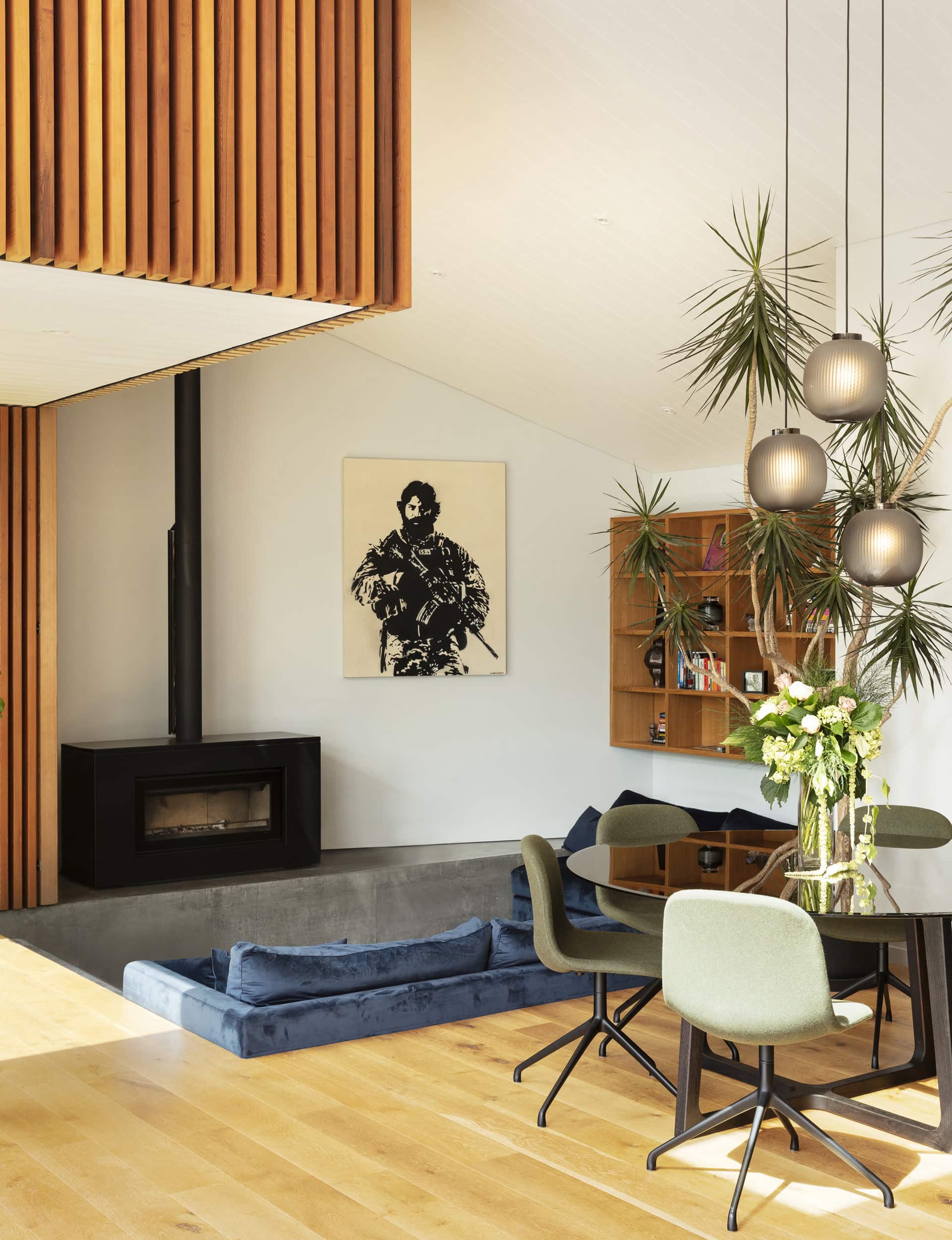
Justin Mowday— Before the house was renovated, if you were at home during the day you had to have the lights on in every room. Soph, who was pregnant at the time, wanted lots of natural light and for it to feel open.
Sophie Mowday— We originally said to Jose we wanted lots of natural light and high ceilings because we had been living with the opposite. But there was always the risk of having a big cavernous space.
Justin— I wanted to be open to Jose’s ideas, was desperate to be a good client, and not chop and change our minds – all the things that can be hard to deal with. During the process, every time we were unsure about something and made a suggestion, they’d come back to us with a way better idea, something we couldn’t think of ourselves.
The design idea
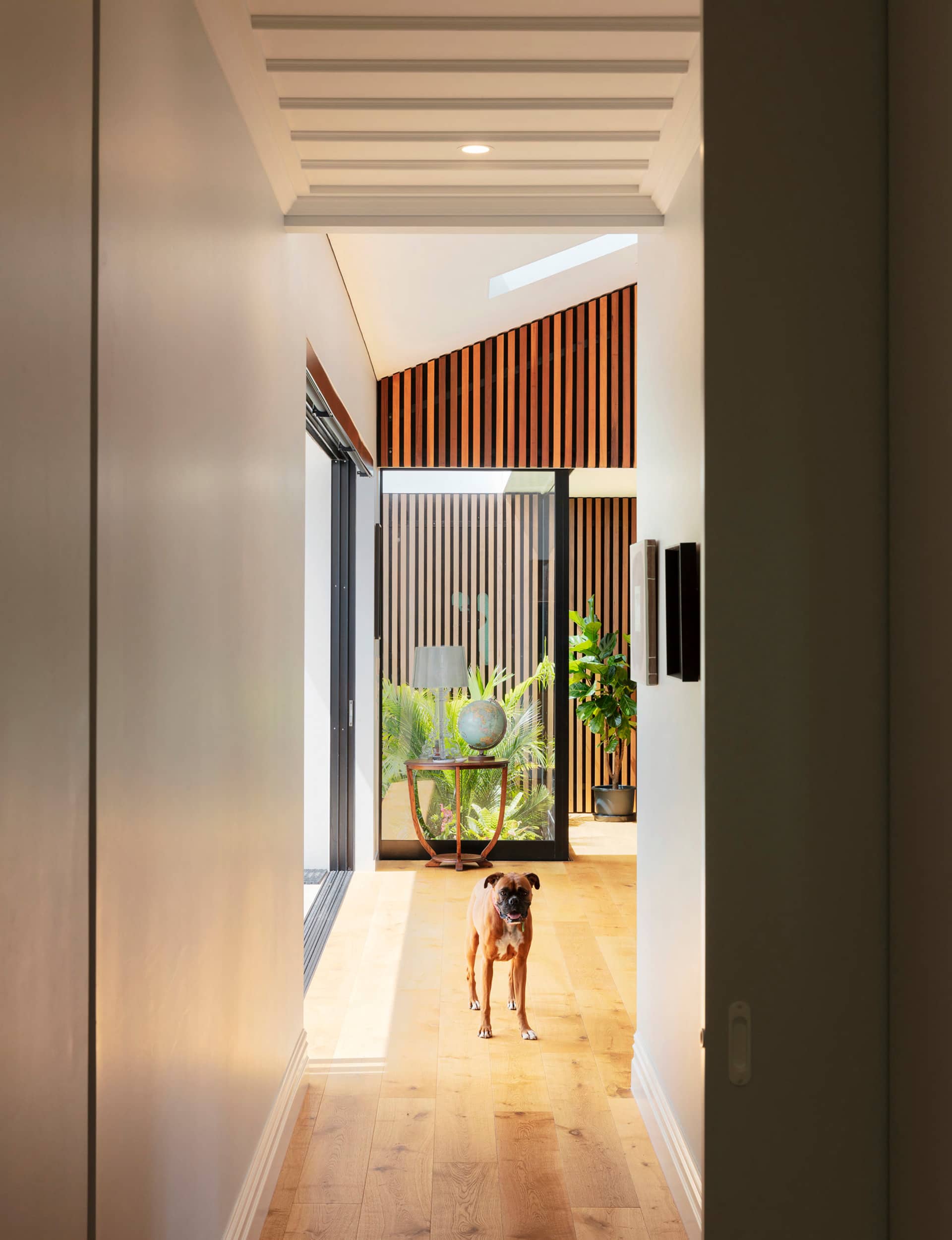
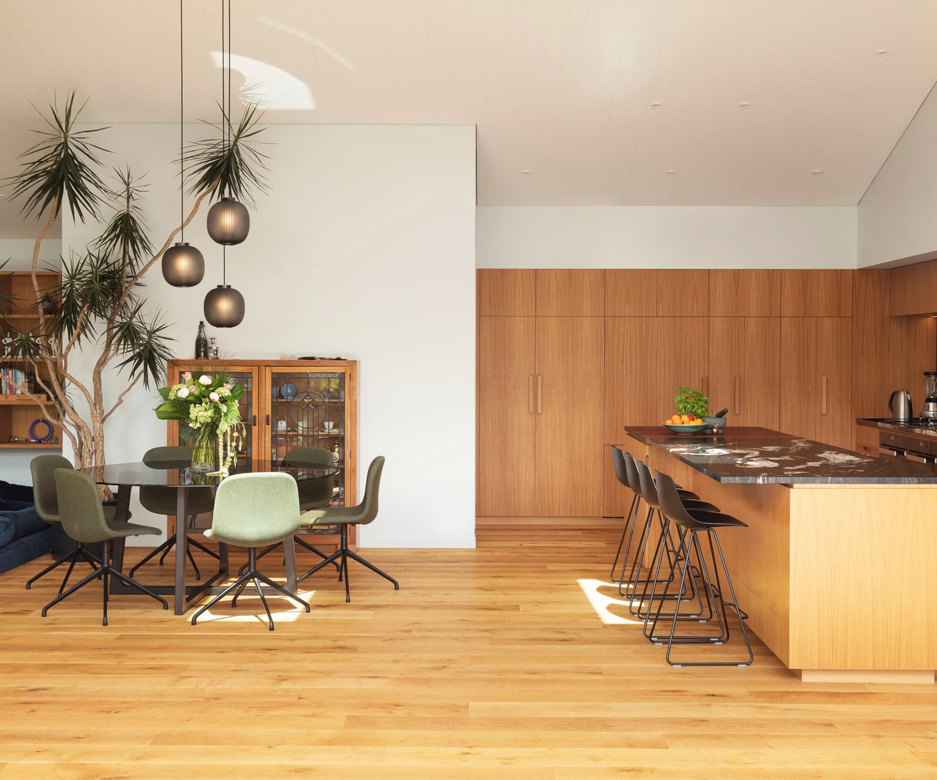
Jose Gutierrez— The idea was to create a bigger living space, but the last thing you want to do is create a generic, open-plan warehouse. Our response was to almost bring the architecture inside – the intention of the cedar insertion is to carve out spaces, break up the volume and make it more interesting. As you walk through, you get an experience – you see through the hallway, you are drawn into the living area and sit down to look back through the picture window to the garden. Light streams through the glazing and cedar battens above, which plays with the solidity. Without it being all about that intervention, it does make for a more interesting place to live, in a subtle way.
The sunken lounge
Justin— One of the really great things is the graphic lines of light that come through the battens and into the sunken lounge – I had always wanted one and we put it on the list at the beginning.
Jose— Our thinking was to include the sunken lounge in the bigger picture, rather than make it a token gesture. I think we’ve achieved that – the way the family uses it ticks a lot of boxes.
Justin— On a winter’s evening, it’s where you want to be. It draws you in. It’s only two steps down into the lounge but it instantly feels like a good place to be. Dalia, our two-year-old, loves it down there.
Sophie— It has ended up being a bit of a baby pit, which is not what Justin intended. If my friends with babies or toddlers come over, they are all in there playing.
Using the space
Justin— We’ll have family nights where we all cuddle up on the sofa and watch a movie. On other nights, our older kids, Lila Rouge (14) and Rocco (12), will be down there with their friends and a mattress on the floor for a proper slumber party. So it works for all those situations.
Sophie— We love having people over, and hosting was one of the reasons for designing the new living space. A while ago, Justin had 30 or 40 people over from work for dinner and it worked.
Justin— It was amazing. People found different spaces – there was a group sitting down by the fire talking, some were at the table, others were at the kitchen bench. Everyone found their part of the house.
Kitchen design
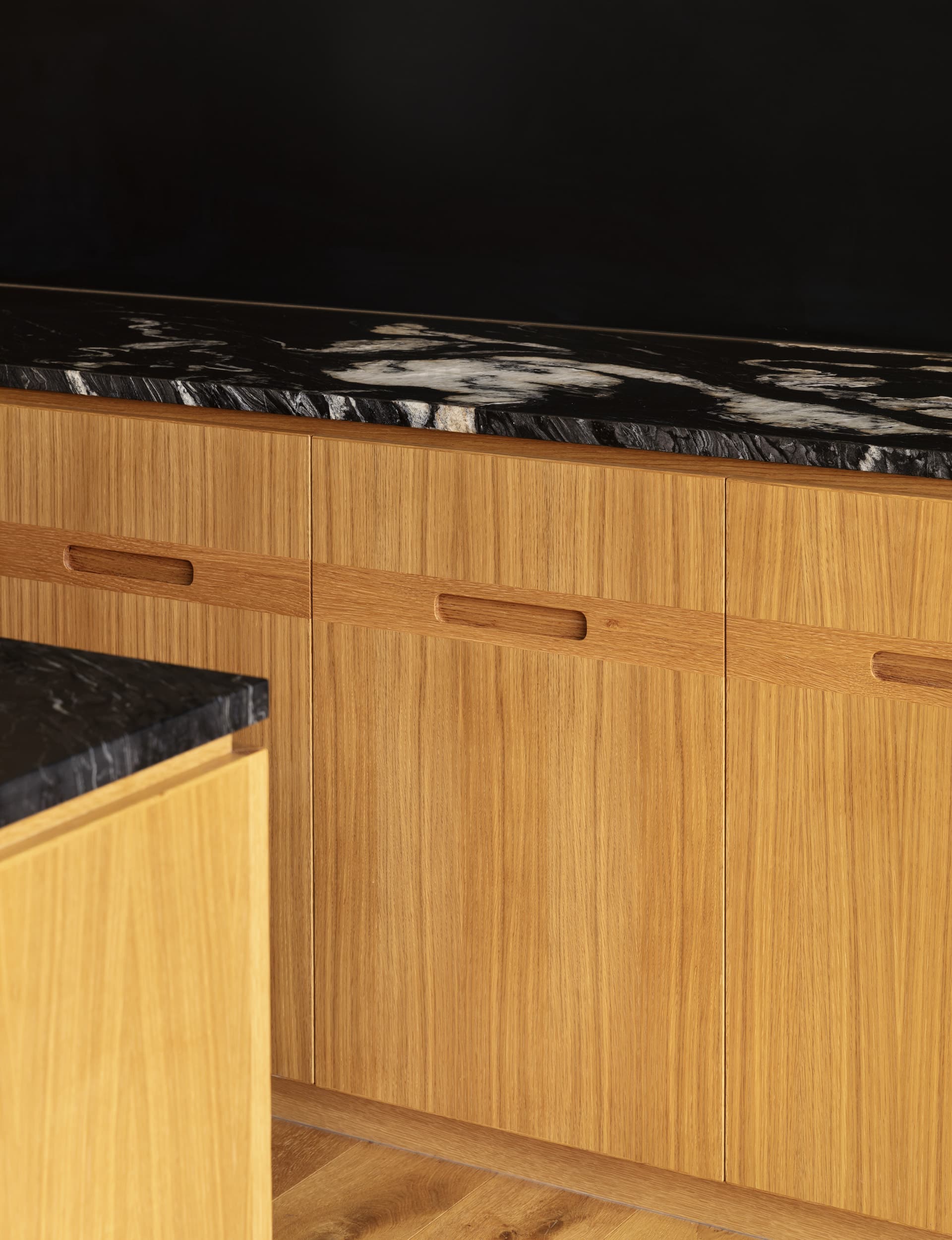
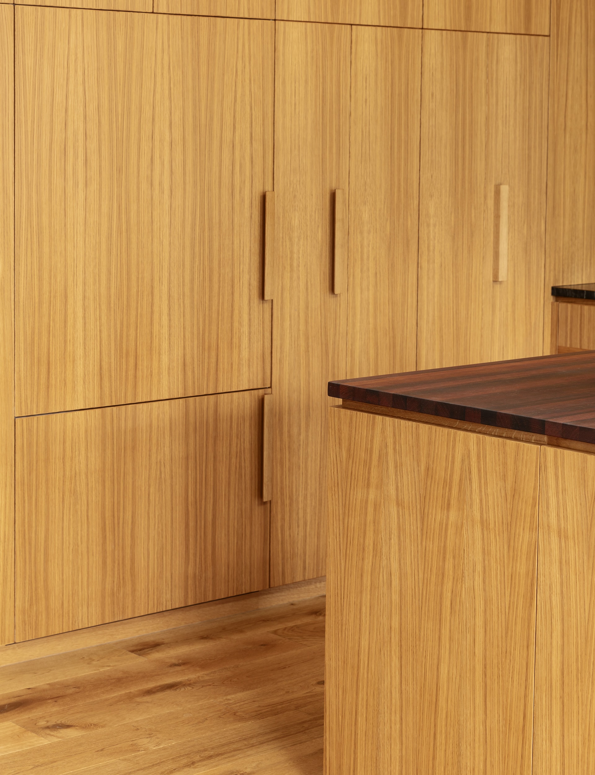
Jose— The kitchen is a piece of art but works functionally so it’s very real in that sense. There are big dimensions in quite a small space – the kitchen bench is more than five metres but it doesn’t feel out of scale.
Justin— The proportions work so well for us as a family, all four of us can be in the kitchen doing things and getting past each other, while the baby sits in her chair.
Sophie— It’s designed for our family, our tastes and how we like to live.
Photography by: Sam Hartnett.
[related_articles post1=”104956″ post2=”99459″]
