Design geek alert! Our new ‘Global Villages’ issue (on newsstands from August 4 to October 5 2015) is guest-edited by Karen Walker, and we’ve also taken the chance to freshen up our look.
For a start, the cover features not our customary single image, but a range of shots from inside the magazine, as well as a spot-UV-ed square at its centre announcing the issue’s title.
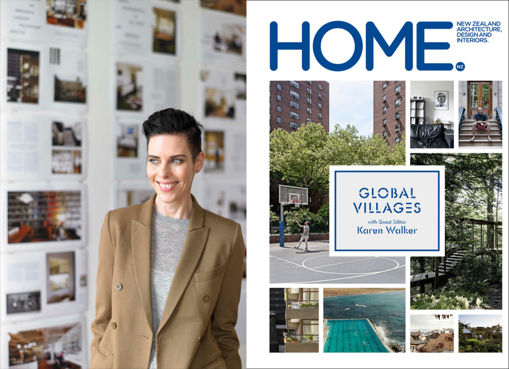
Here, HOME editor Jeremy Hansen talks to art director Arch MacDonnell of Inhouse (who oversees every issue of HOME) on the tweaks in our latest issue.
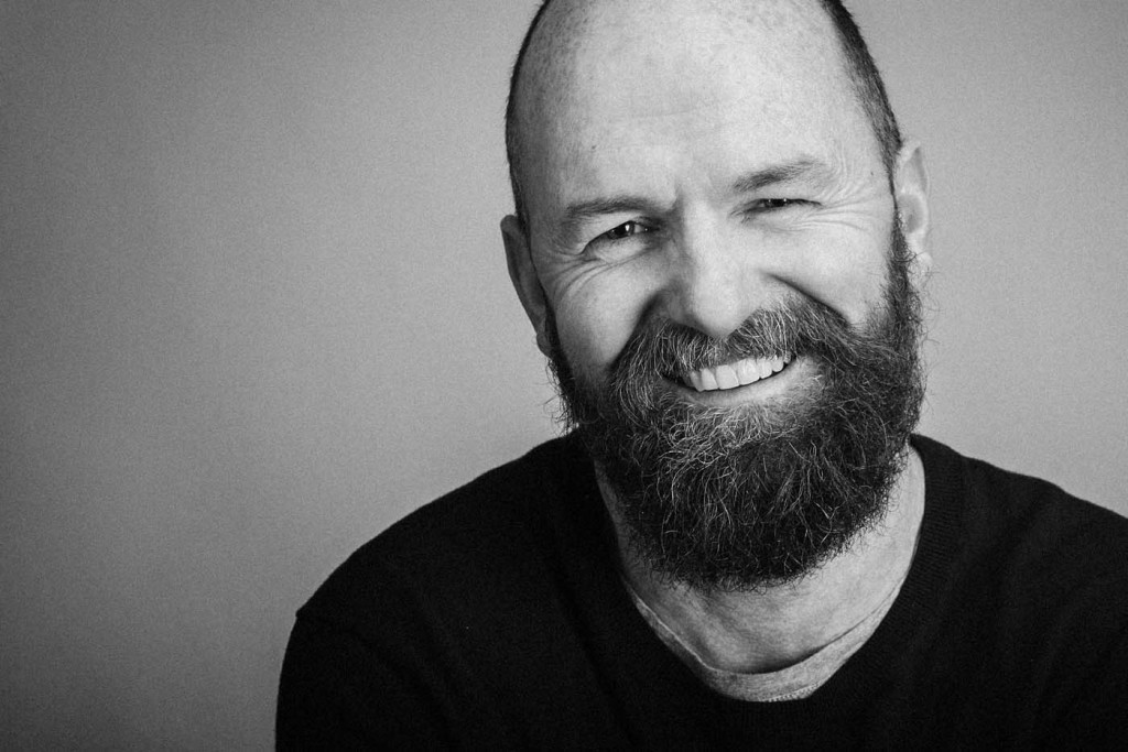
Jeremy Hansen This issue looks different. What have you changed and why?
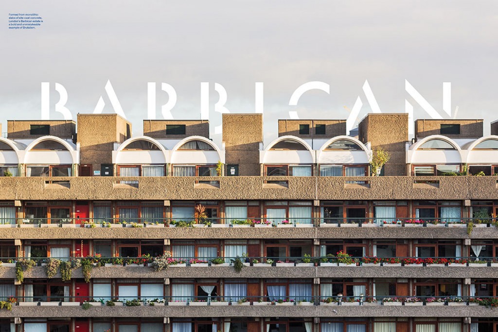
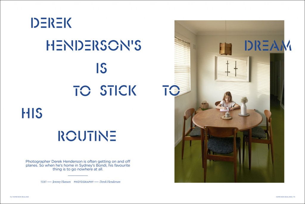
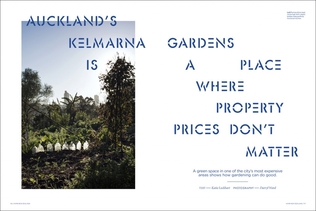
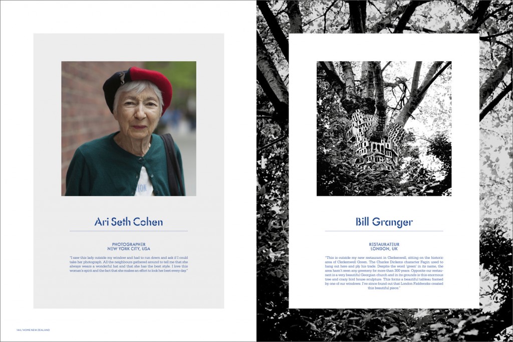
Arch MacDonnell Because this is a special issue with Karen Walker as guest editor, we thought the ‘Global Villages’ theme was a good chance to deploy a different layout strategy. We opted for image-led double-page spreads to mark the dramatic shifts in location in cinematic style through the issue.
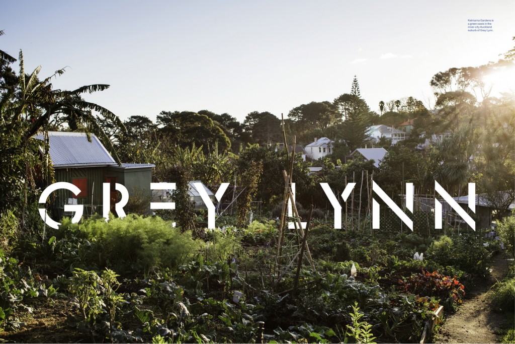
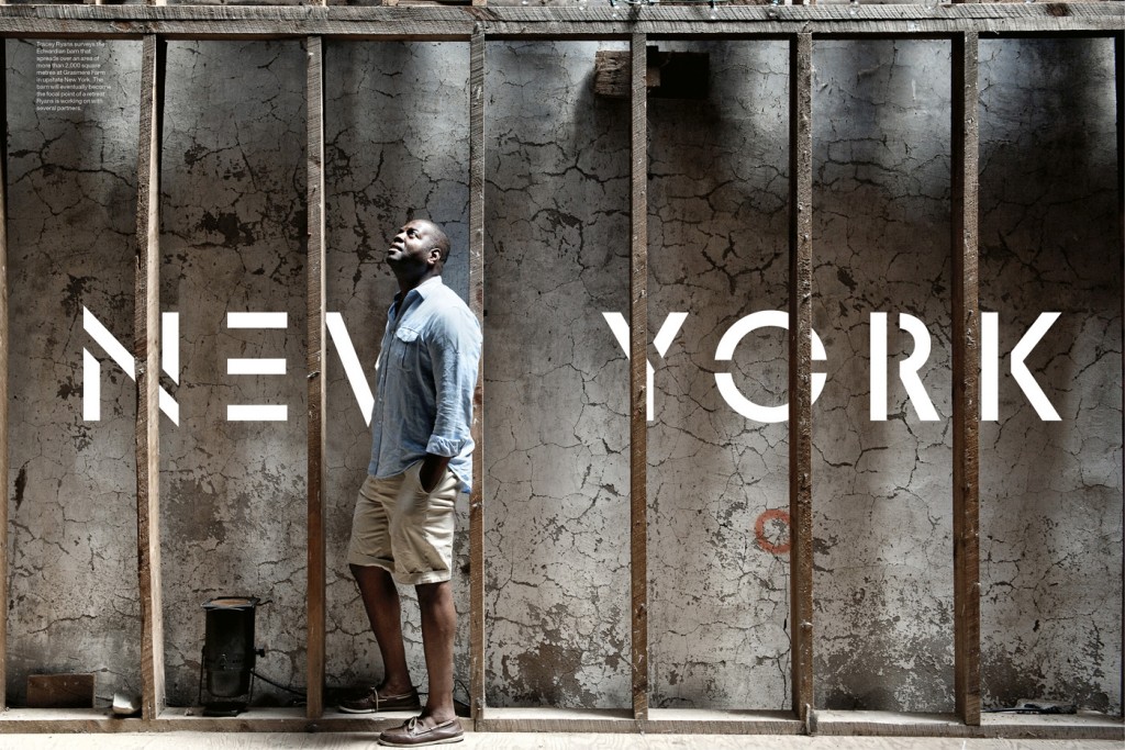
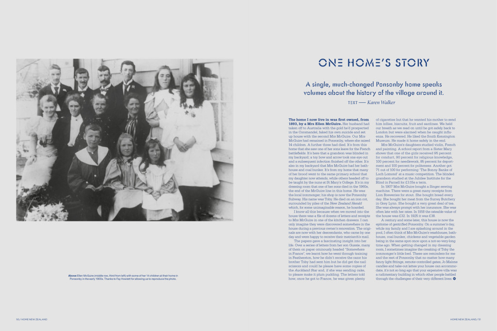
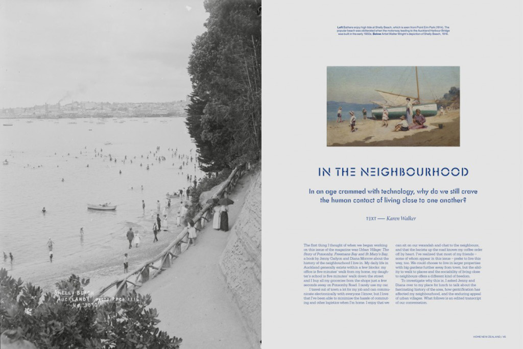
Jeremy Hansen Our guest editor Karen Walker starts her section of the magazine with an interview about Ponsonby’s history accompanied by archival images, quite a different mood to the other parts of the issue.
Arch MacDonnell We decided to tackle this section by making the design more formal and book-like, with a grey wash on the pages helping frame these beautiful nostalgic images of the neighbourhood. It’s a nice gentle introduction to the much more contemporary images that follow it, and I think this duality works really well in the magazine.
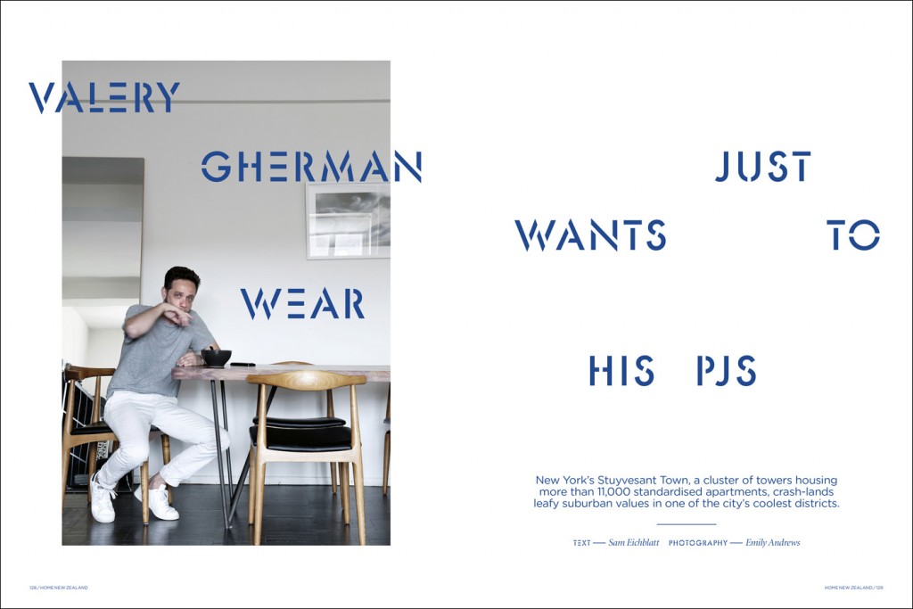
Jeremy Hansen The headline font is new too, isn’t it?
Arch MacDonnell We’ve used Futura Stencil as a headline font and full sentences as headlines rather than two or three words as we normally do. We also loosened the way we arrange images on the page: sometimes they overlap or nestle at the edges of a spread. Finally, we had some fantastic photographs to work with, so we ran long with some of the layouts to allow ourselves plenty of space to tell the story of, for example, the curiousity of Stuyvesant Town, the big urban village in downtown Manhattan.
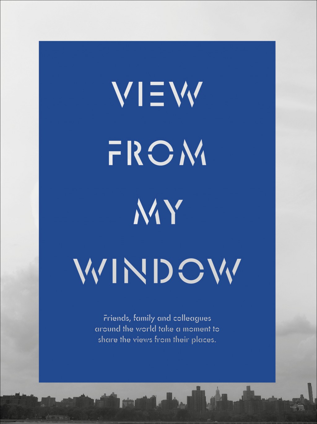
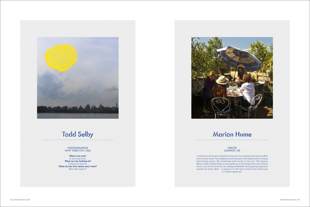
Jeremy Hansen To emphasise the issue’s theme’s of connectedness, Karen came up with the idea of a ‘View from my Window’ section at the back of the magazine. How did you create the design for this?
Arch MacDonnell We needed a strong framing device to hold the wide variety of shots, some of which were shot by professionals on SLR cameras and others which were iPhone snapshots of views out people’s windows. Some frames repeat parts of the images, and others are solid colour, which I think lends unity to what’s turned out to be a really interesting section of the issue.
Jeremy Hansen What else are you working on at the moment?
Arch MacDonnell We are working on a new book with artist John Reynolds, a barbecue cookbook with Josh Emett, a series of wine labels for a Waipara winery and a branding/packaging project for drikolor, a revolutionary new paint product in a dry powder form.
