This traditional villa in Herne Bay underwent a significant extension (by Ponting Fitzgerald), and the kitchen acts as a pivotal space between the outdoors and the interior social spaces.
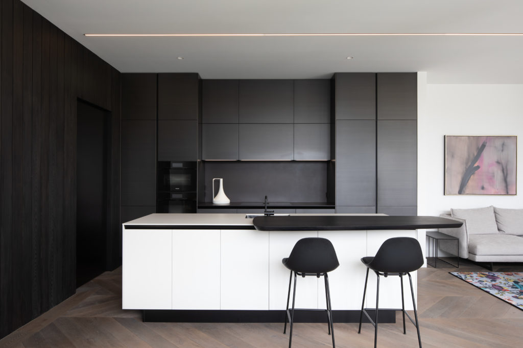
To ensure a smooth transition between all the spaces that radiate from here, Studio Italia’s in-house kitchen designer, Marketa Ramage, was tasked with imagining a space that took into consideration the old and the new, the light and the dark aspects of this highly respectful expansion.
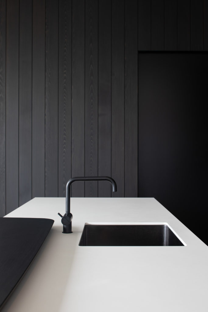
“The client came to us and they mainly wanted a dark kitchen,” says Marketa, “dark grey finishes: basically something moody.” Given that the extension was quite contemporary, she felt there should be two finishes — representing the old and new — working in tandem. The result is a kitchen with an apparent love of high contrast and textural materials. Black elm, horizontal grain-matched metal lacquer, light cabinetry finish with black negative details.
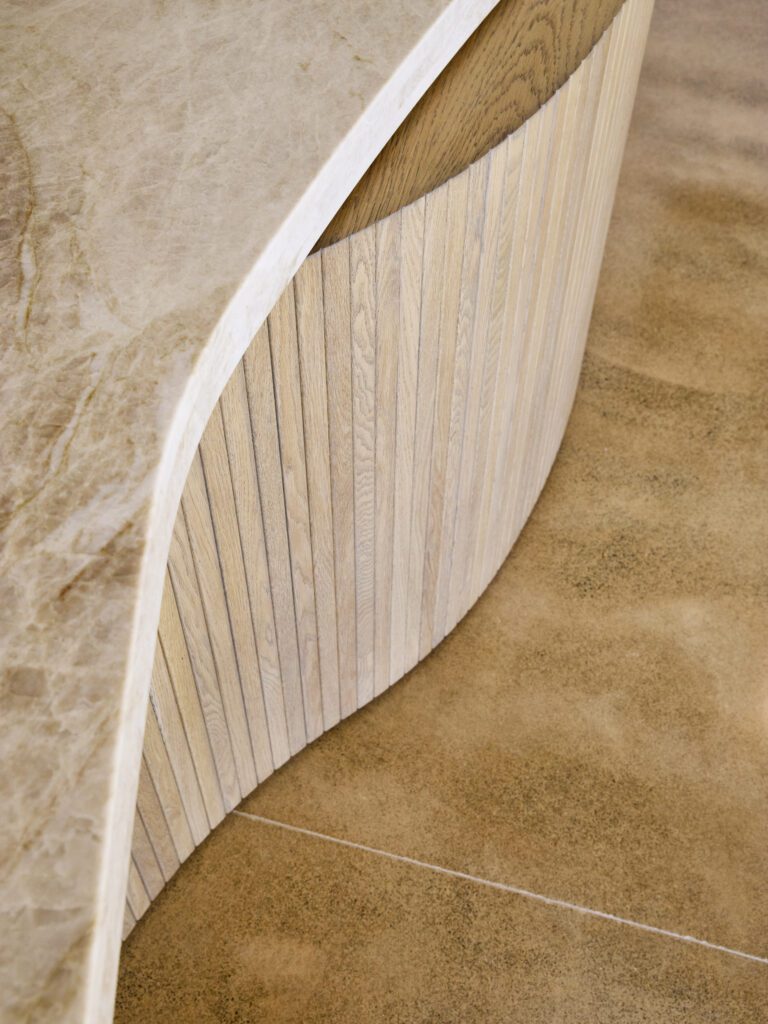
The brief also called for a breakfast bar but, instead of including the traditional rectangular addition, Marketa opted for something slightly more organically shaped: The Sydney, an island peninsula by Poliform. “It created a softer transition between the kitchen and the living and dining room, adding elegance with its interesting shape and welcoming you to the living spaces,” adds the designer. “I really loved the simplicity of the kitchen, and that organic shape of the peninsula fitted the space like a glove!”
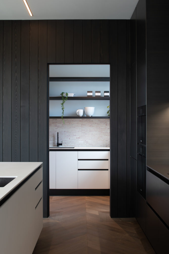
The kitchen has the most minimal design: the Twelve collection designed by Poliform in collaboration with renowned Italian architect Carlo Colombo. Named after its 12mm doors and counters, this kitchen is characterised by the absence of handles and a certain asymmetry which adds curiosity and tension.
“We used floor-to-ceiling cabinetry that blends in with the black-stained cedar wall paneling,” continues Marketa who has been very impressed by the horizontal brush in the bronze metal-lacquer finish, which adds depth and texture to an otherwise minimalist space. When opened, the light-toned scullery mirrors the finish of the kitchen island, while fully integrated fridges and dishwasher keep the design in perfect balance.
