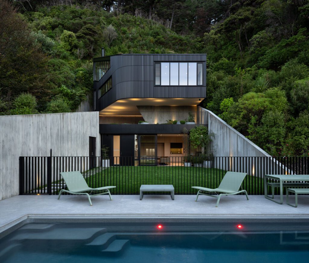
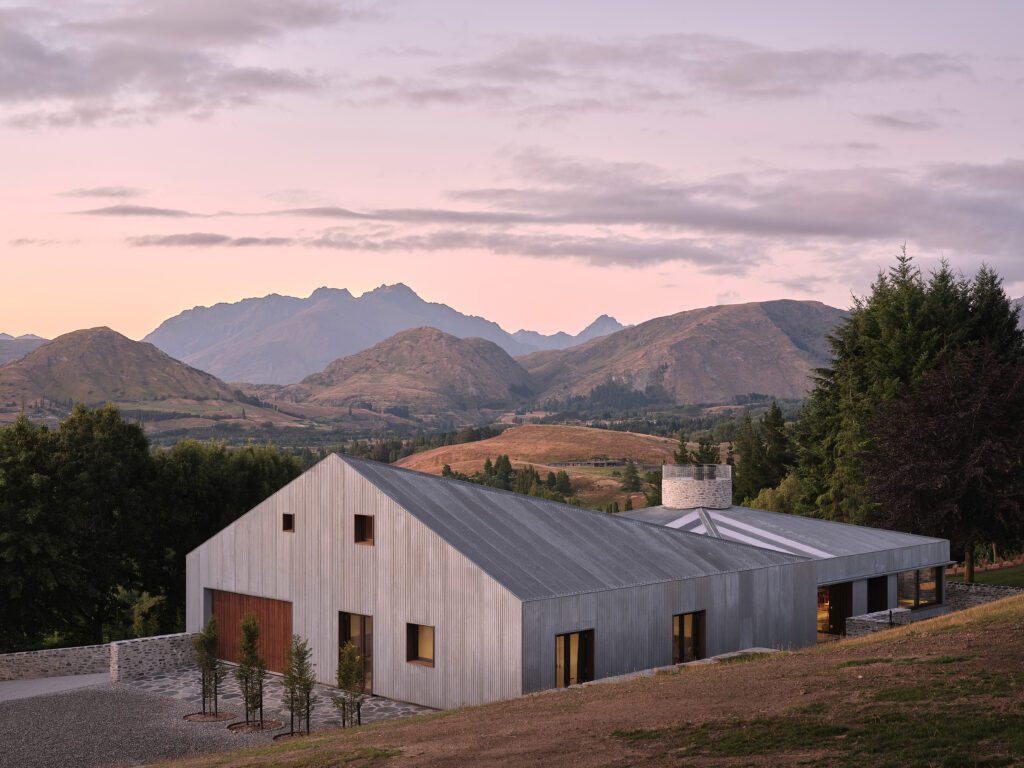
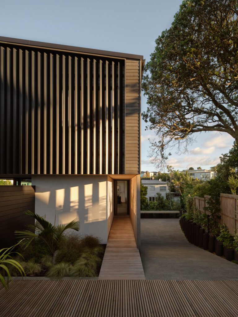
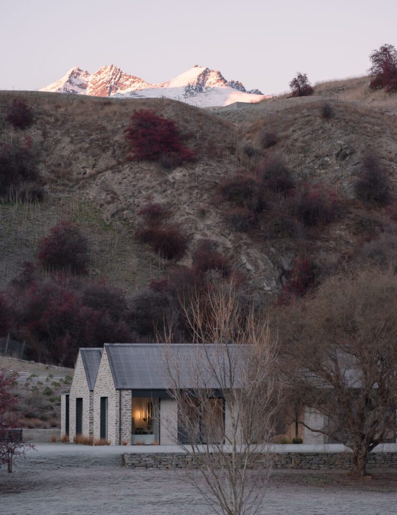
From apartments in Wellington to rustic homes on the Coromandel, to luxurious harbourside abodes in Auckland. How do you choose a Home of the Year?
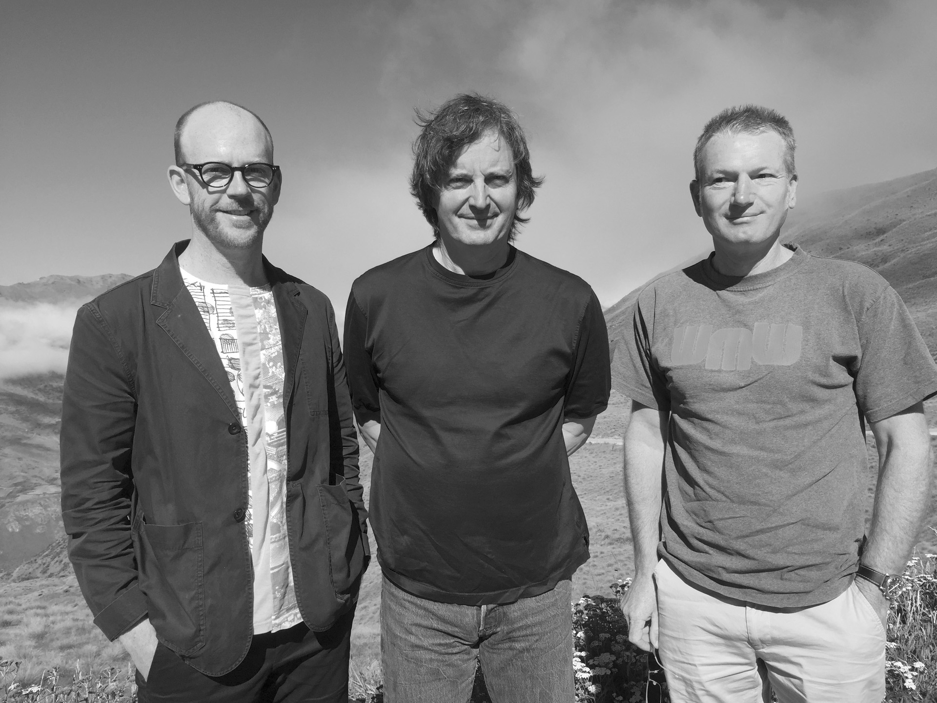
This year HOME magazine’s Home of the Year award is celebrating its 21st anniversary (the award is sponsored by Altherm Window Systems). It’s never easy to choose a winner and the finalists in the award. Each year the process works like this: the magazine calls for entries from around the country in the form of photographs, plans and written statements. Those entries are then examined by a jury made up of HOME editor Jeremy Hansen, an international architect, and a New Zealand architect. The jury selects a shortlist of homes to visit.
This year the jury, which included Seattle-based architect Tom Kundig and Stuart Gardyne of Wellington’s Architecture +, visited 11 homes from Auckland to Queenstown over a week in late January. There are no written criteria for selecting the Home of the Year. Instead, the jury spends its time on the road assessing each project against its competitors. The great diversity of projects makes for lively discussion: how can you compare a big-budget Auckland home with a small home in Queenstown, for example? In the end, it comes down to a few key questions. Does a project meet or exceed its original aims, and work for its owners? Are the buildings well-resolved? Do they feel good to be in, and why? What do they say about the ways we can live in New Zealand now?
The international member of the Home of the Year 2016 jury was Seattle architect Tom Kundig. HOME editor Jeremy Hansen spoke to him at the end of the judging journey about the process, the winning home, and the other finalists.
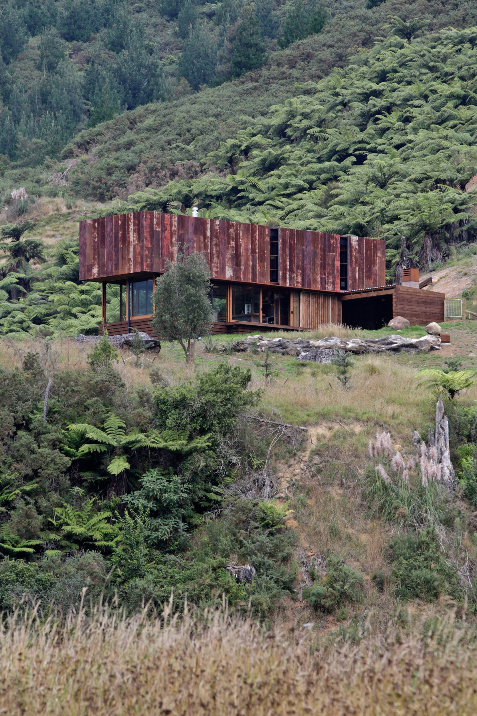
Jeremy Hansen Let’s start with the winning house by Herbst Architects. What made it stand out from this strong field of contenders?
Tom Kundig Well firstly, I was nervous about choosing it as the winner, because I was worried everyone would think we’d selected it for its use of rusticated materials like I’ve favoured in some of my projects. So I want to assure everyone that we examined the building extra carefully because of this! It is really a fantastic house on all levels. It’s a very simple house that sits correctly in the landscape. It stands on its site in this diminutive but emphatic way, and makes a statement without being large or flamboyantly geometric. It makes its appearance as you peek around curves or see it through trees. That’s really important for the way the building is experienced by people.
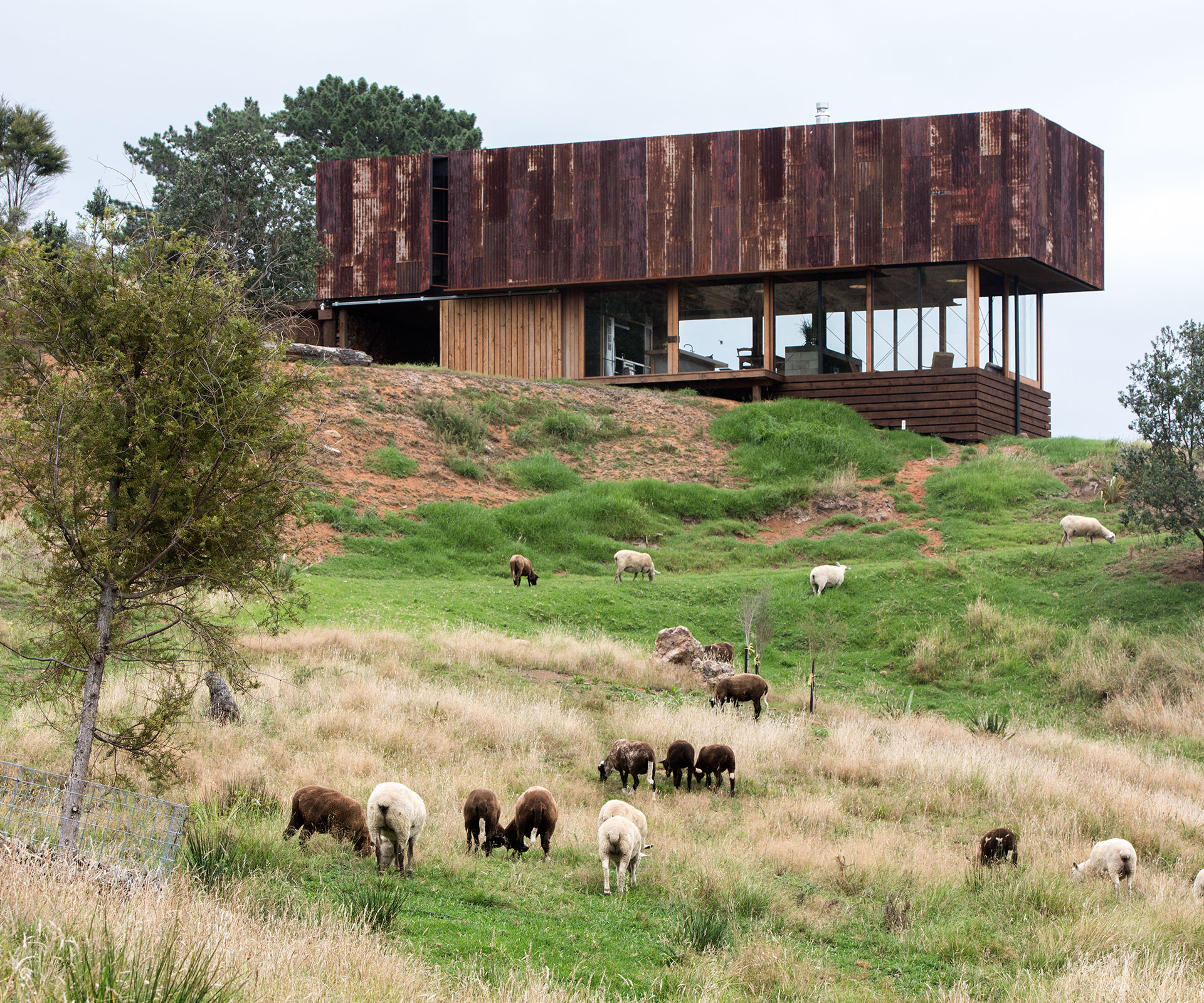
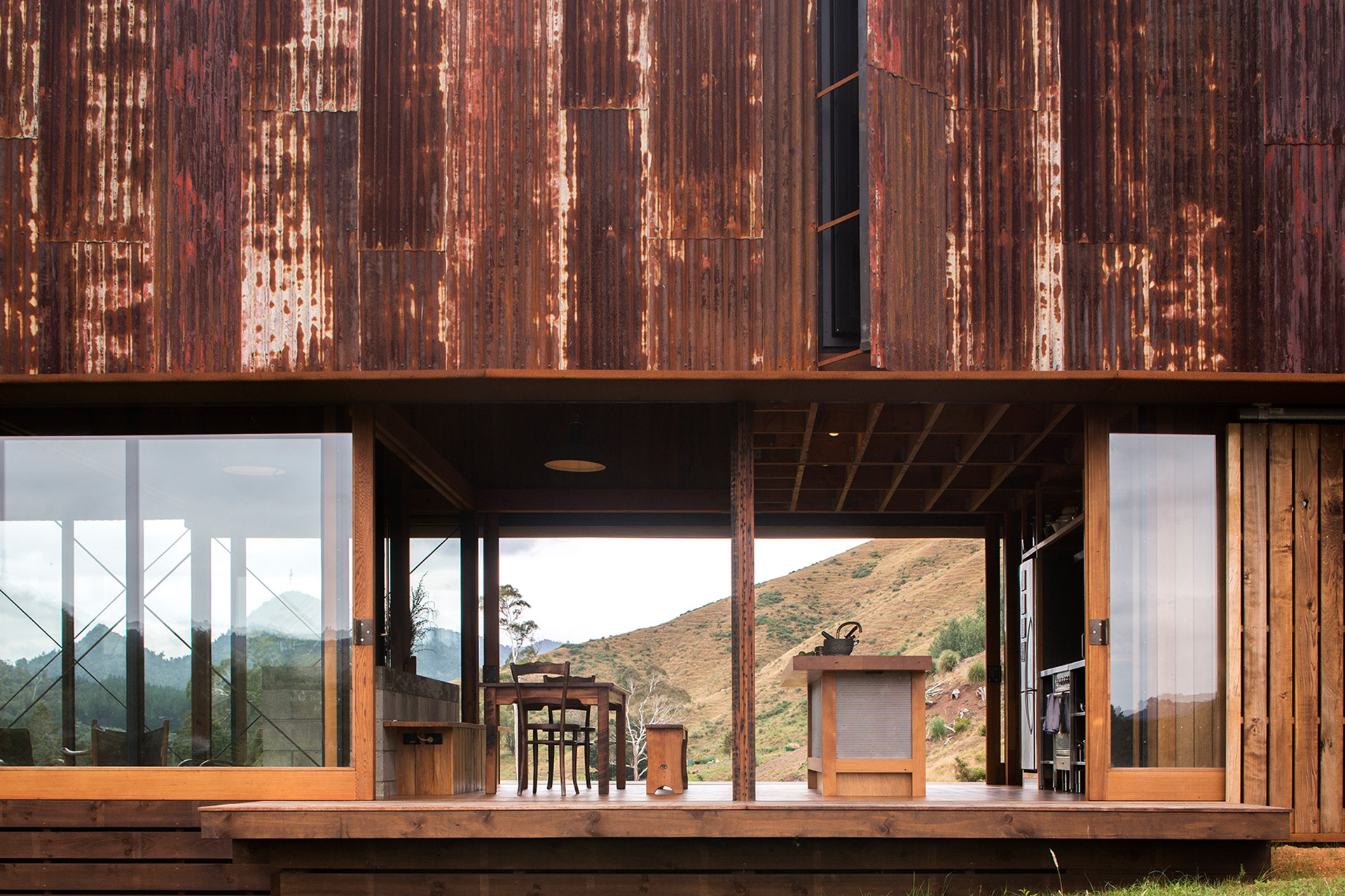
TK The move of putting the box clad in rusty recycled iron on top was fascinating. That’s a move that would not be intuitive starting out on the project, but in fact it strengthens the experience of the valley. It takes away the view from the private part of the house and opens it at the public part of the house, so it’s a very interesting dialogue between public and private. Upstairs from the bedrooms there are very small, discreet, private vignette views down to the valley, then you come down to the main level and it opens up, and the space doesn’t let you down at all. Being in the living space under that high ceiling is fascinating because it opens up the view horizontally down the valley, and there’s a power in that gesture that would be lost if that upper volume was punctuated with high windows.
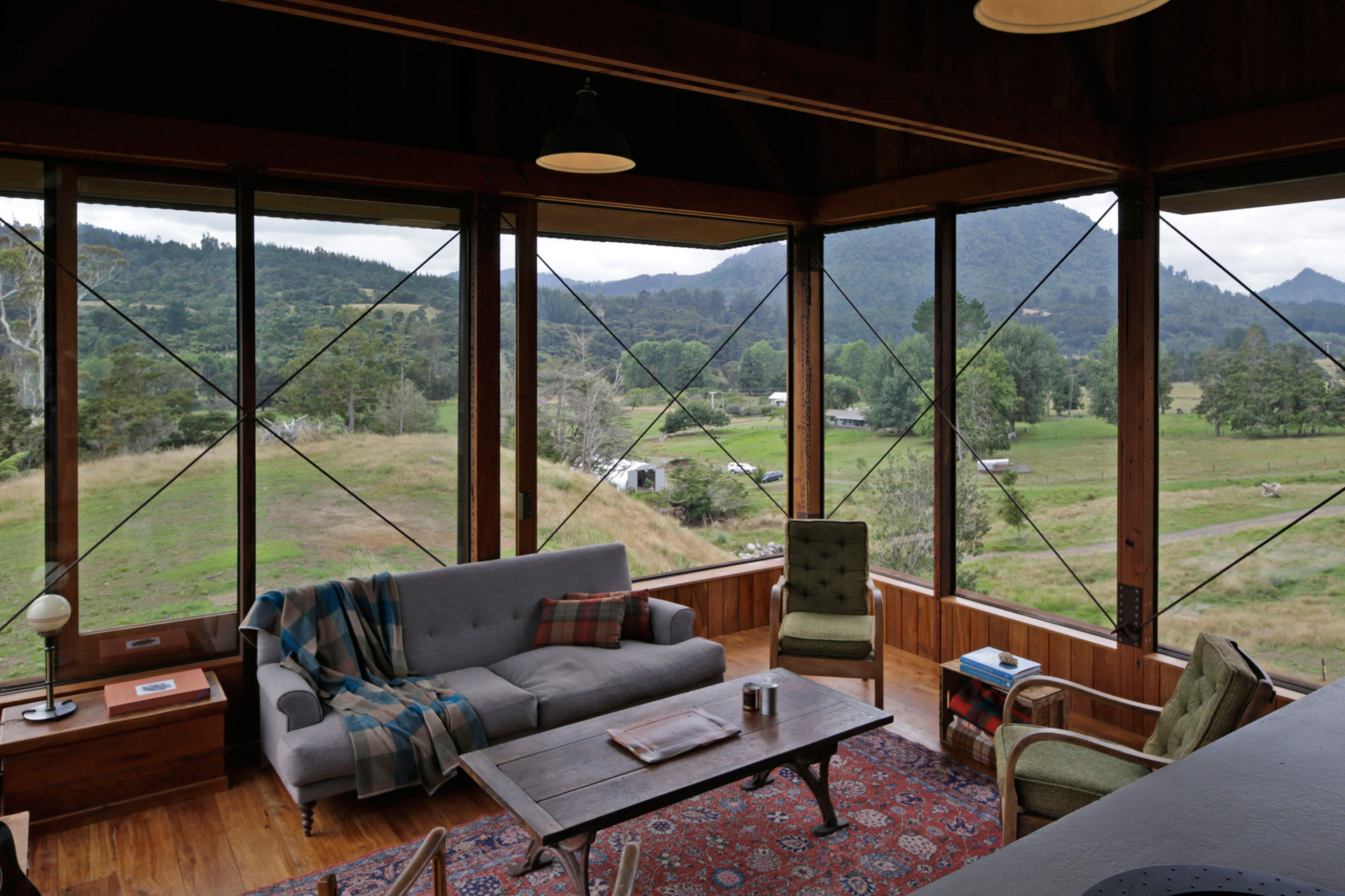
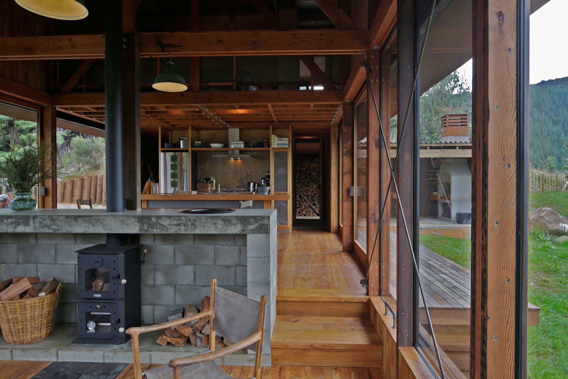
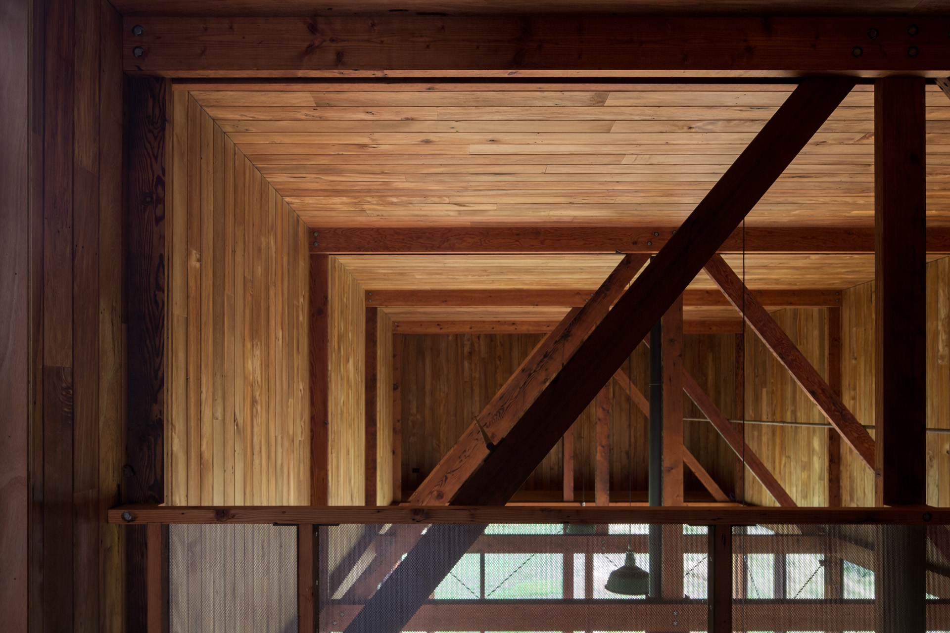
TK The clients were really involved in the project – they went out and harvested some of the recycled materials, which adds energy and spirit. Buildings like this don’t happen without that sort of commitment. The architects responded with a design that was totally appropriate for these clients. The fit and finish was very much in the spirit of the homeowners – it really felt appropriate to this area of farms, but in a modern language. It felt comfortable inside and out. The clients are only just beginning to experience the house but it’s already an important part of their lives, and it might even change their lives because it’s so consistent with what they imagined their lifestyle would be – planting trees, raising animals, working their dogs, organising work projects from home. That’s important because it means the architecture works at a very human level, which is ultimately what residential architecture is about, and it does it in a very artistic way on all levels.
[jwp-video n=”1″]
JH Let’s talk about the finalists, a really diverse bunch. The first house we visited was by Andrea Bell and Andrew Kissell, their family home in a light-industrial part of Auckland.
TK I knew that this was going to be a good project to visit and I was not disappointed at all. I think it works on so many levels that are important to the future of architecture, which is to find those forgotten places that are relatively close to the CBD that people don’t consider residential neighbourhoods and densify the city. At a social level, I thought the building was terrific.
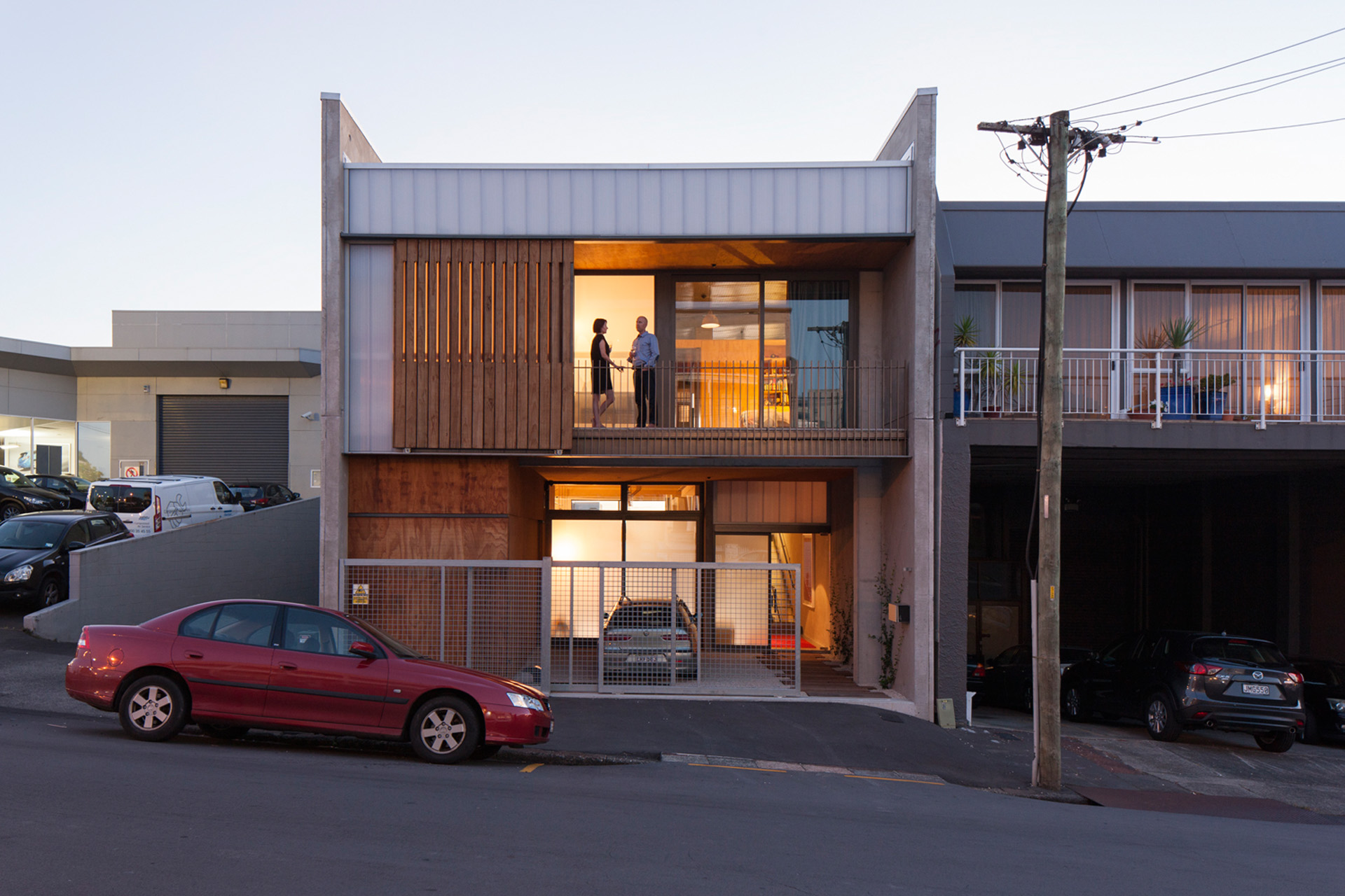
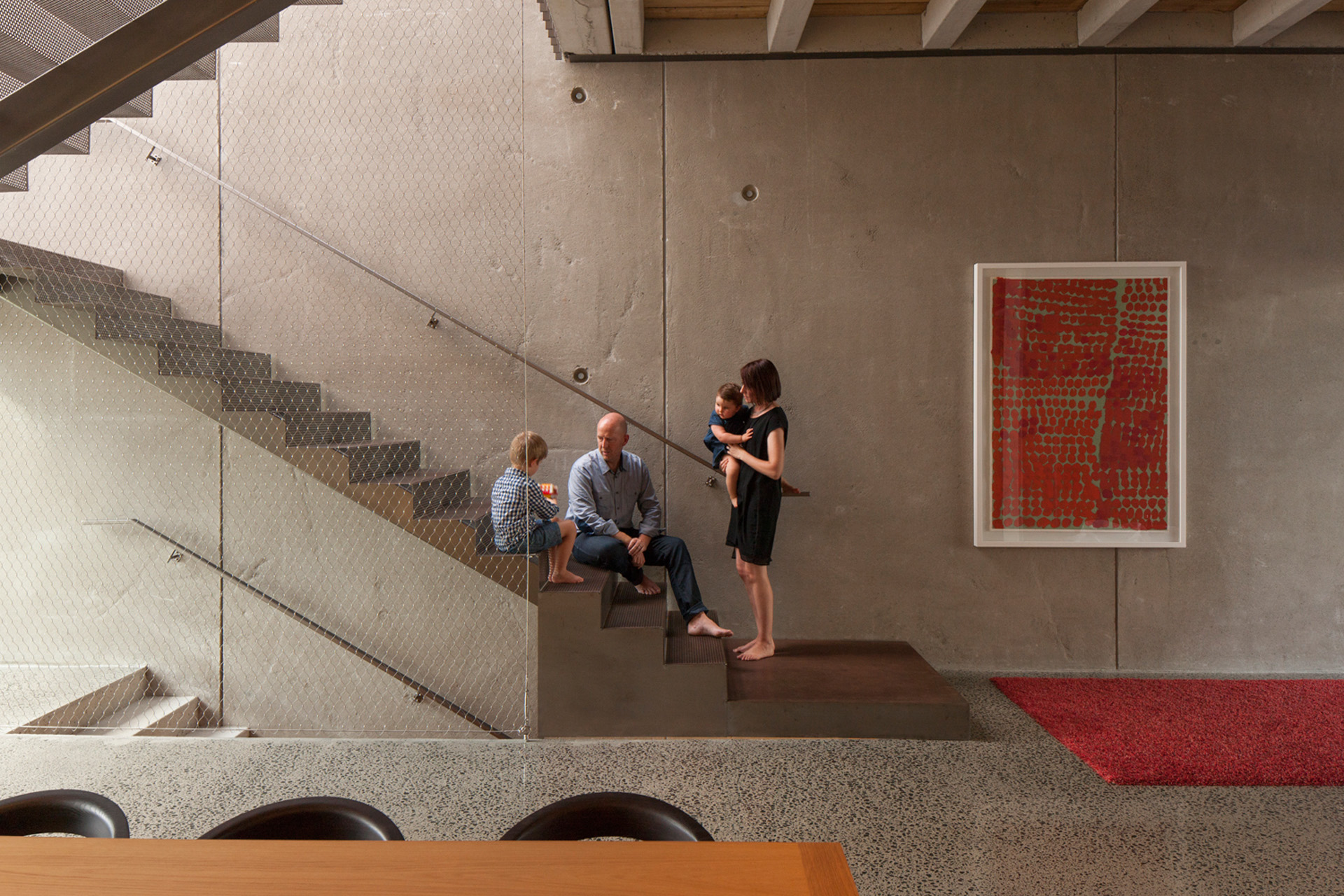
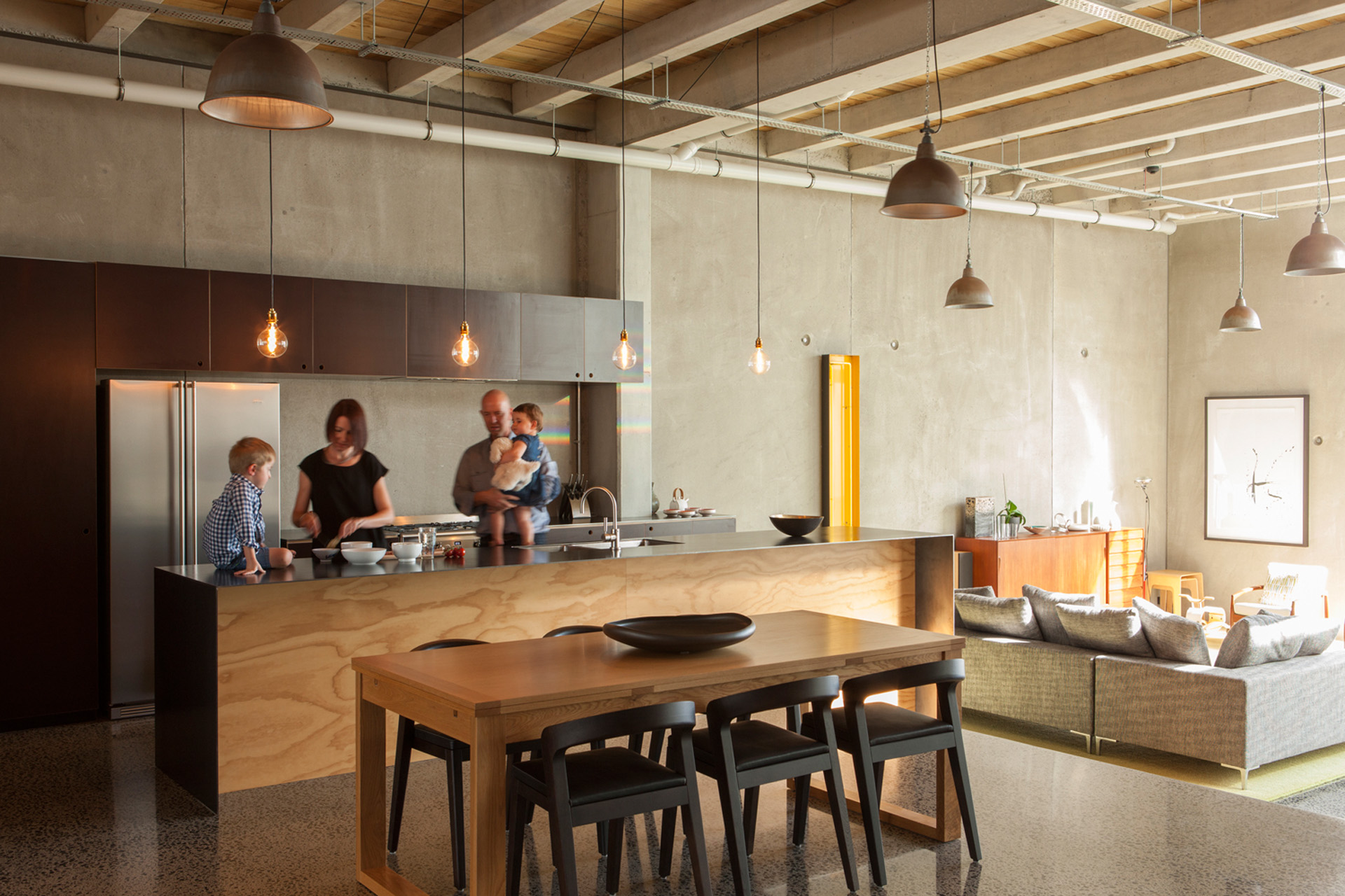
TK There was a very skilled flow which is always important to a residential project. How does a family use this place, and do they flow through the building? How does the floor plan work between the public realm of the street and the private realm of the garden? At a conceptual level, it was very strong. Volumetric proportions were very skilfully done, the management of openness and privacy as you went through the building. All in all, I thought it was a terrific project.
[jwp-video n=”2″]
JH The home designed by Stevens Lawson Architects isn’t nearly as urban, but it’s still constrained by a very narrow site. What did you respond to most strongly in this house?
TK This was a very interesting project. It reminded me of the Eel Houses of Kyoto – a series of buildings stretched down a long and narrow property, defining inner courtyards and light wells as you proceed from the street to the private garden.
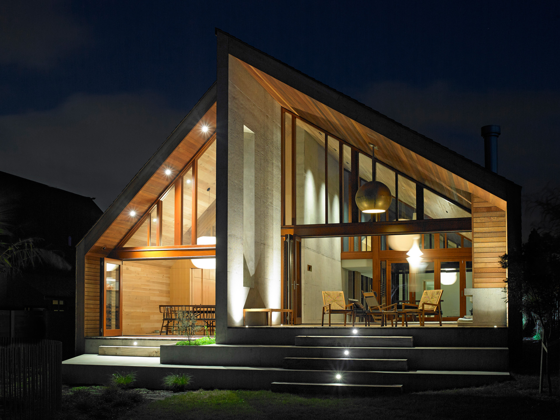
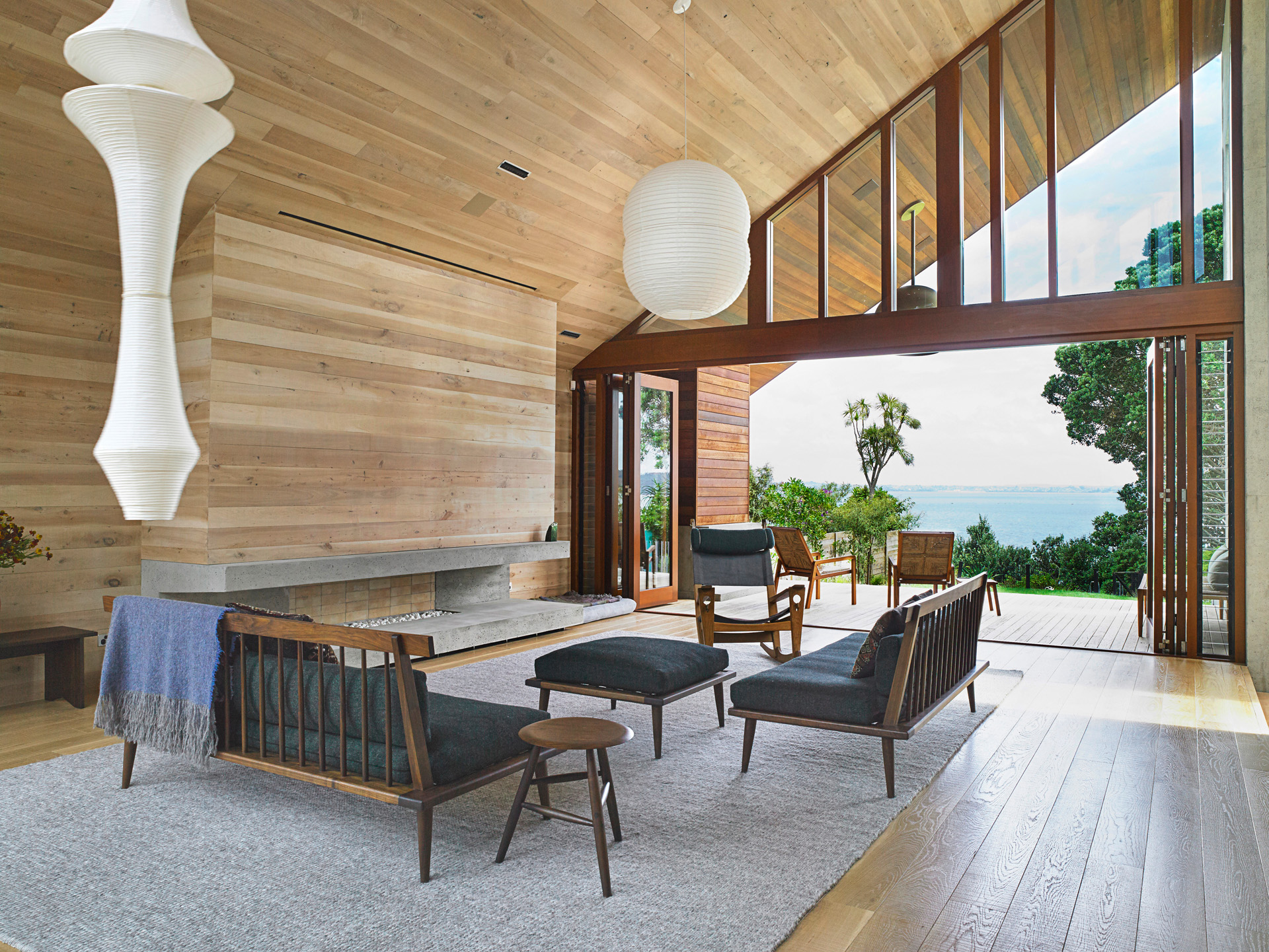
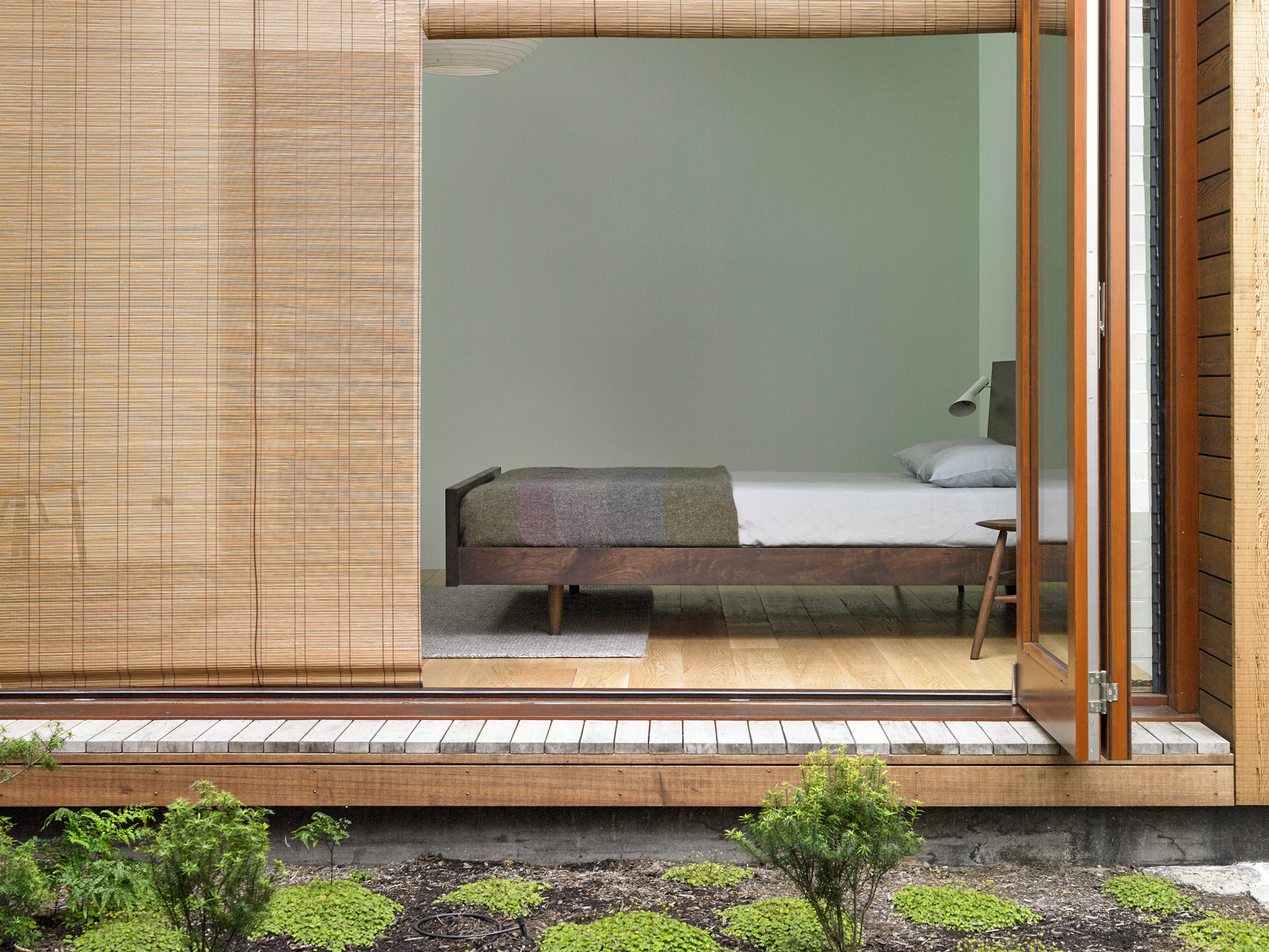
TK It was skilfully done, beautifully manipulated, a house you could imagine living in as a single person or as a couple or a family. It was very peaceful, very meditative, and I thought it worked on all levels. A very successful project.
[jwp-video n=”3″]
JH The Villameter by Anthony Hoete also faced different constraints – heritage restrictions and vociferous opposition.
TK I loved this house. We didn’t meet the architect, but we met the clients, and I could immediately recognise that this was an architect that listened to his clients. And it was a difficult project for them, a difficult bureaucratic process, so I have some deep sympathy.
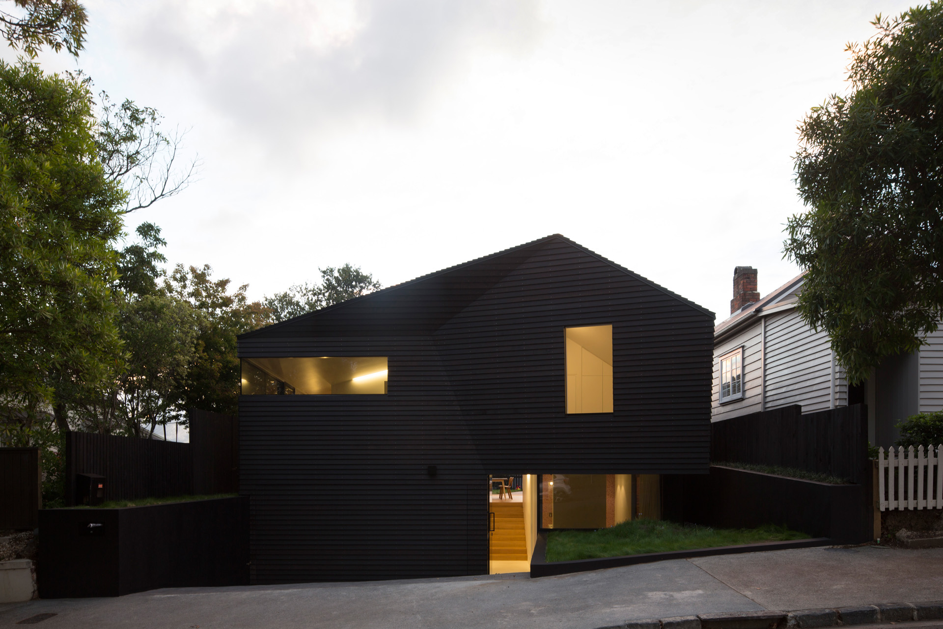
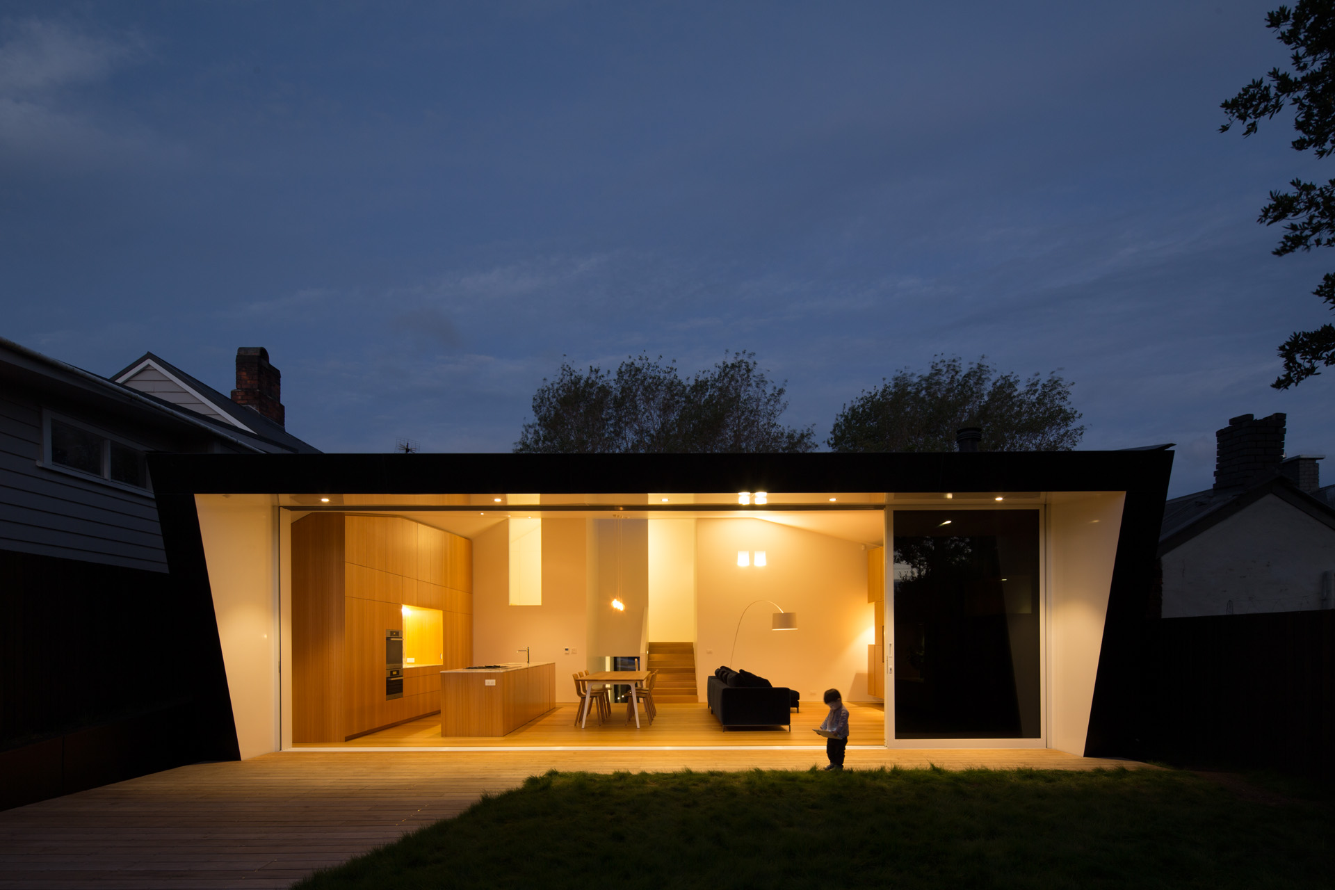
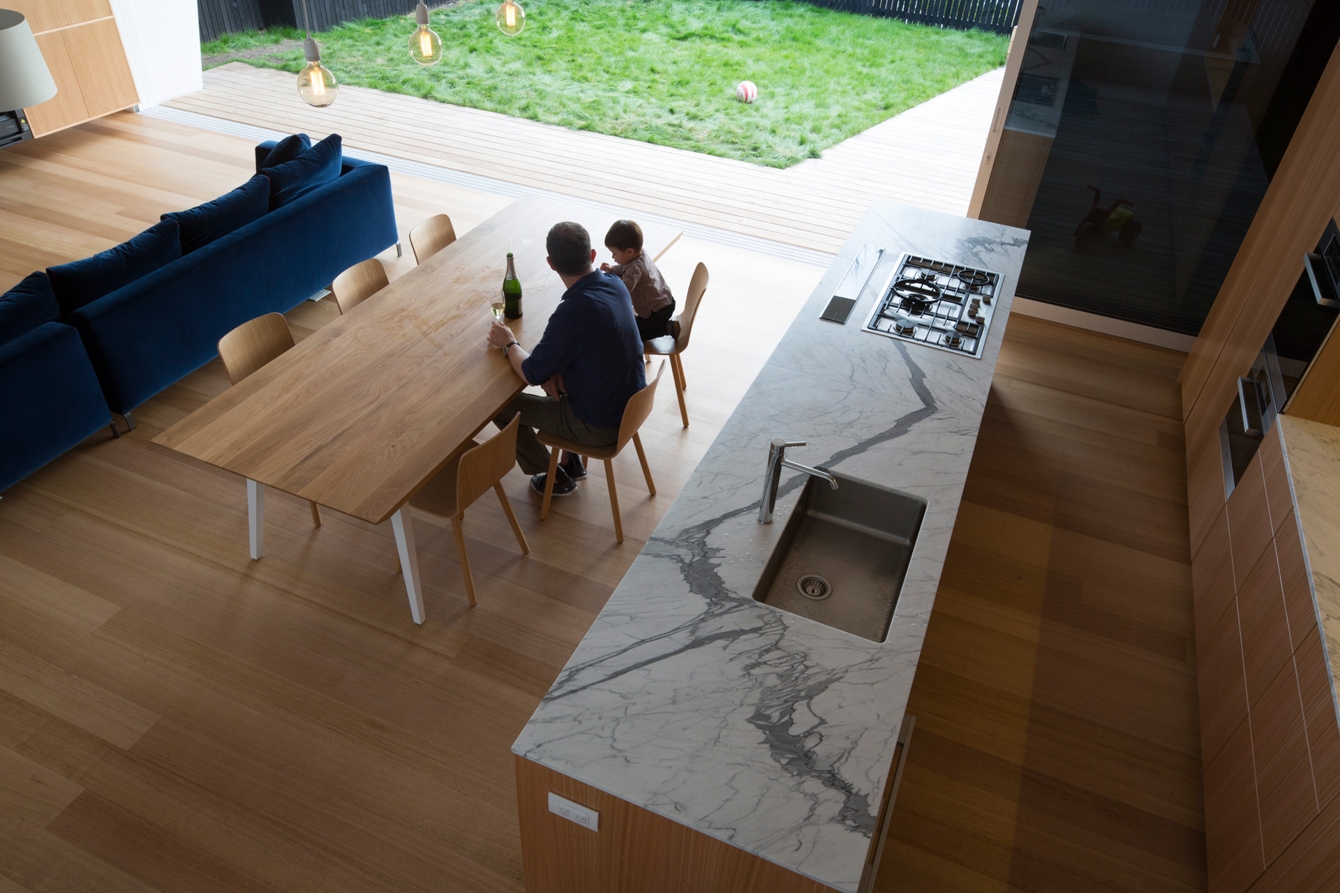
TK I thought the architect delivered a building in the spirit of the neighbourhood, and the perseverance and strength of the clients to get it built is worth noting. I felt it was a terrific example of how clients can influence the architecture and how an architect can sympathetically design a building to that influence.
[jwp-video n=”4″]
JH In Wellington, we visited the Zavos Corner Apartments, a multi-unit project by Parsonson Architects.
TK I think this is an important project because it’s a multi-unit project in a town that’s filling in some of the less-dense areas with more density. I’m going to be supportive of any project which looks at densifying an area, but doing so in a sensitive way is particularly difficult in a historic neighbourhood.
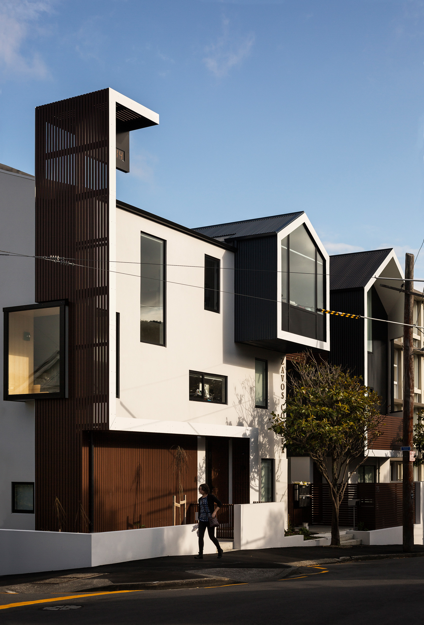

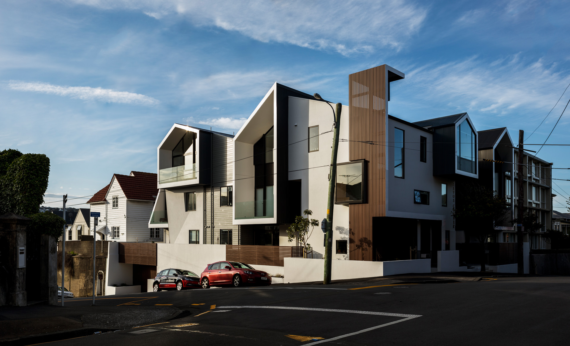
TK Those are the issues we’re all looking at – how do you change the density of a beloved neighbourhood for a current sort of population condition? There’s no way we can ignore it. The only place for the city to grow would be out, and I think that’s in the wrong direction. So we explore the idea of densifying a neighbourhood in a way that’s sensitive to the existing fabric. I think this project explores that idea, tests that idea and does it in a way that’s not just a series of row houses. Instead, what we have here is more of a Rubik’s Cube where the rooms not only shape an interior courtyard but they shape it in a way that develops a different floor plan for every unit. That’s difficult to do architecturally, but it makes it really interesting for the residents. Each of their apartments is different from their neighbours’, but they can still feel part of a little community of apartment units.
[jwp-video n=”5″]
JH Then we headed south to Queenstown, where we visited a house by Anna-Marie Chin.
TK This was skilfully done. This is clearly an architect working at the top level. Not only was it a good response to the client’s brief – who in this case spends a lot of time on a boat and imagined the house as a very efficient boat-like layout – but it is a piece of architecture that unfolds effectively to the landscape.
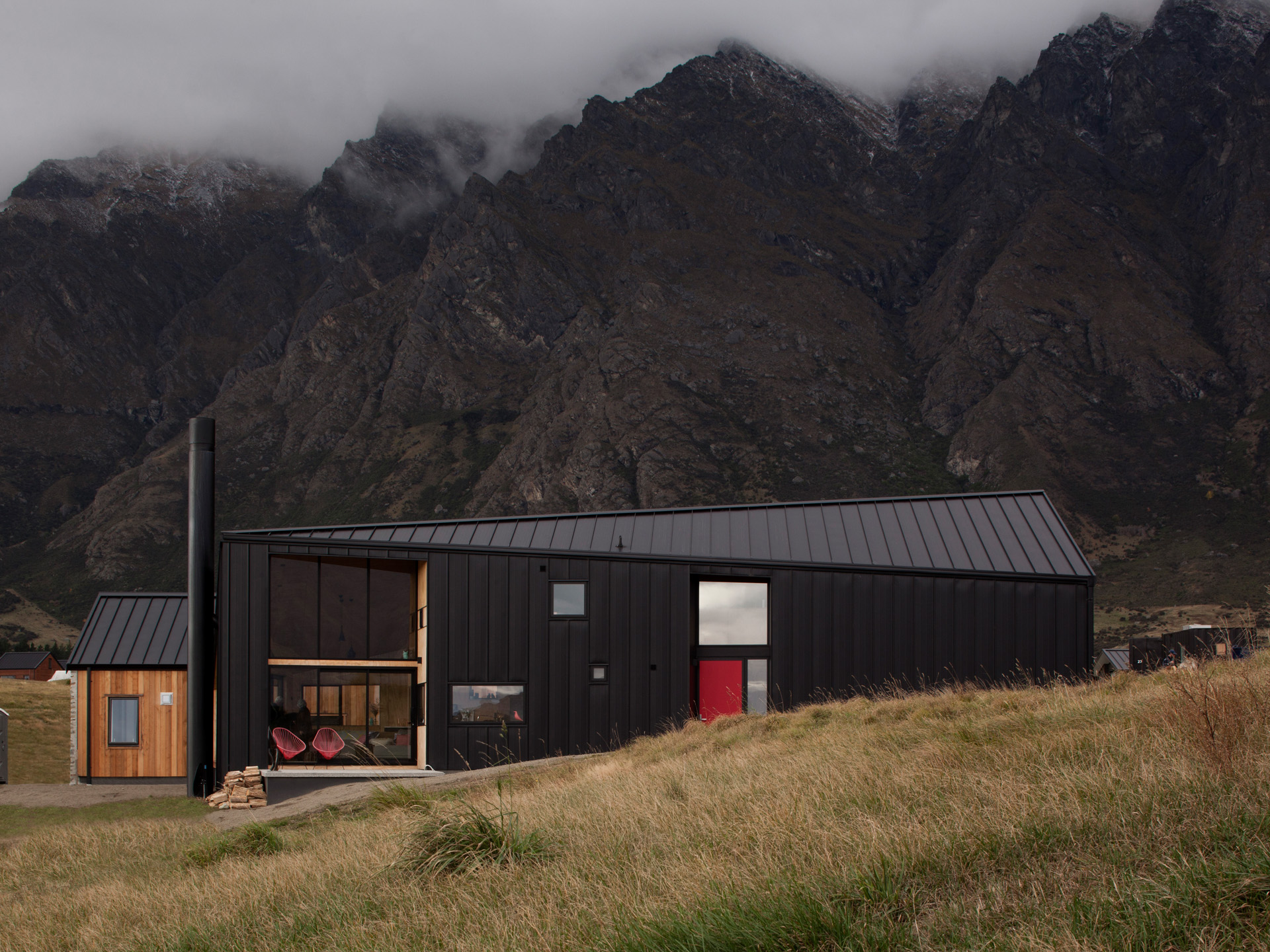
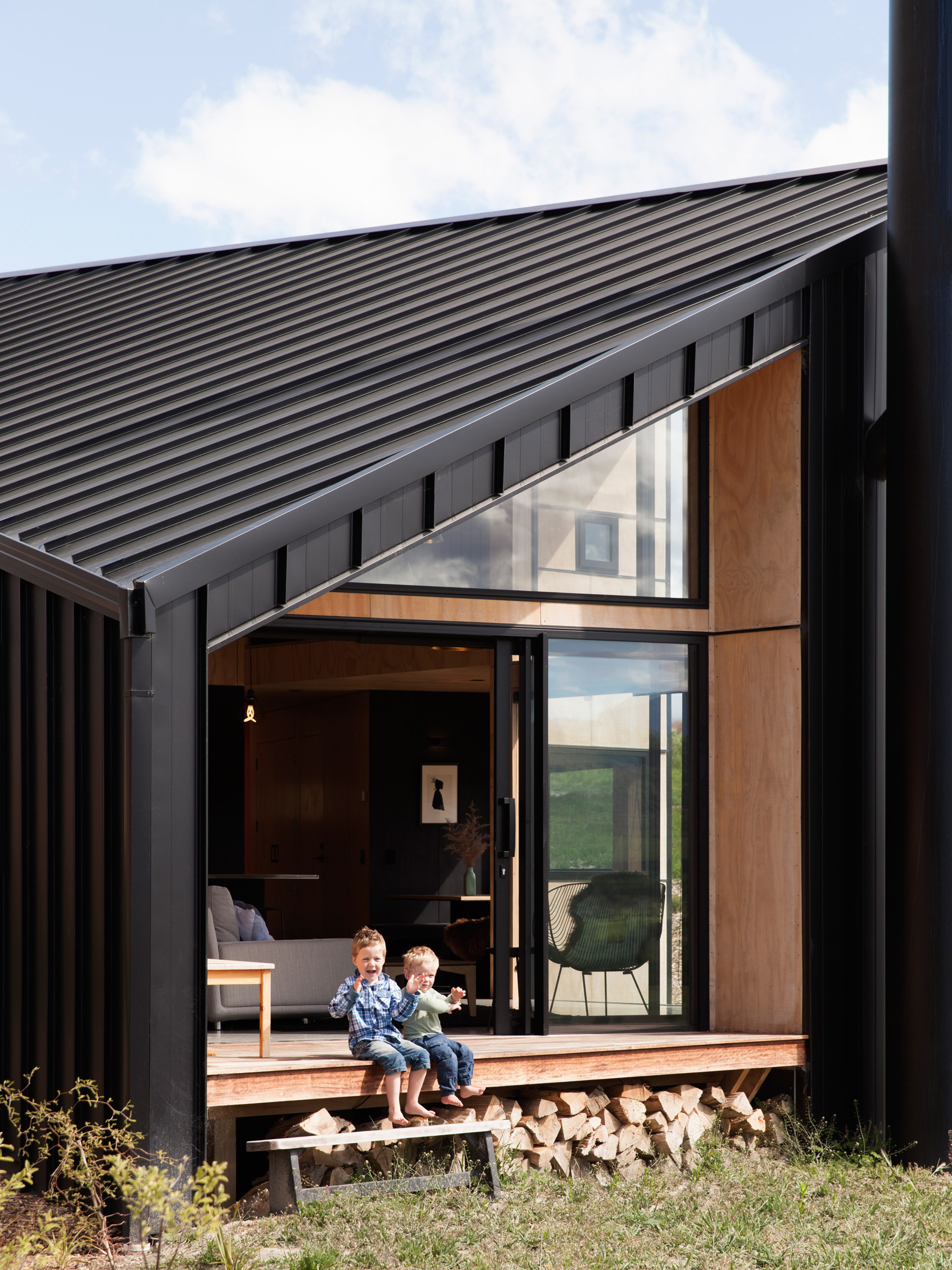
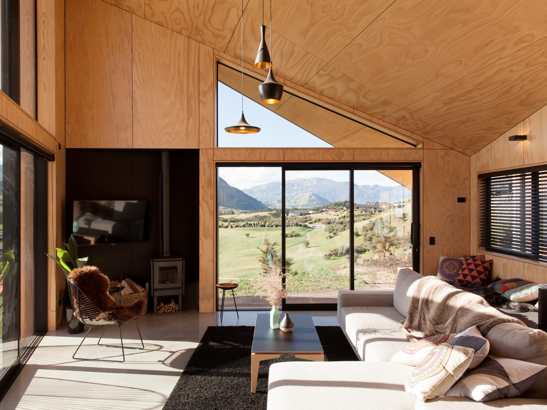
TK In a suburban subdivision, it skilfully shapes views without revealing the neighbours. A series of larger conceptual moves led to a series of smaller, more difficult relationships inside the building and they were all beautifully resolved: how you moved through the building, how you experienced the building, how you stayed in certain parts. For me it was a learning experience because I was able to see how successfully you could manipulate a variety of spaces in a geometry that responded to its environment in such a successful way.
[jwp-video n=”6″]

