Best known for synthesising and reimagining the humble bach, Herbst Architects has modified its style for this impressive city home on Auckland’s North Shore.
In the suburb of Hauraki on the Devonport Peninsula, there used to be an old house down a long driveway, crammed a little onto a corner of its rectangular site. Although its relationship to the outdoors was limited — most of it was decking — it had its merits: some view shafts to the sea that divides the mainland from Rangitoto Island; a comforting vista from the kitchen onto the garden.
For a while, its owners considered the possibility of bringing the old lady into a more modern era of comfort and compliance. However, they said their investigations into doing some basic alterations “didn’t amount to much”.
“So they got us in and said, ‘What about tackling this as a new build?’” recalls Nicola Herbst, whose firm was eventually engaged to reimagine this slice of beach-adjacent suburbia.
In terms of context, the site occupies one of those typical streets on Auckland’s North Shore, where established trees share birthdays with some of the nearby homes. The street’s vocabulary here is mixed, a sort of patois that blends beachiness with hyper eclecticism: brick and tile houses, ‘leaky building’ aesthetic, apartments, and half-forgotten rentals all commune with the highly designed and the ostentatious. Although the buildings are tightly packed, the street retains a proud ‘leafiness’, a manicured vibe underpinned by exorbitant real estate prices that reflect the suburb’s ease of access to the sea, the city centre, and the shopping and dining strips of Milford, Takapuna, Belmont, and Devonport.
Privacy was an issue here. During the building of this home, another house popped up beside it, and the architects were conscious of a row of apartment units that directly overlooked the site.
“That was an important factor in our thinking,” explains Herbst. “Luckily, north was mainly in the direction of the view, which meant that facing forward was the sensible thing to do.”
The key was stretching the plan in a way that the whole building could appreciate the views and take in the light while putting its back to the neighbours without affecting their own enjoyment of nature.
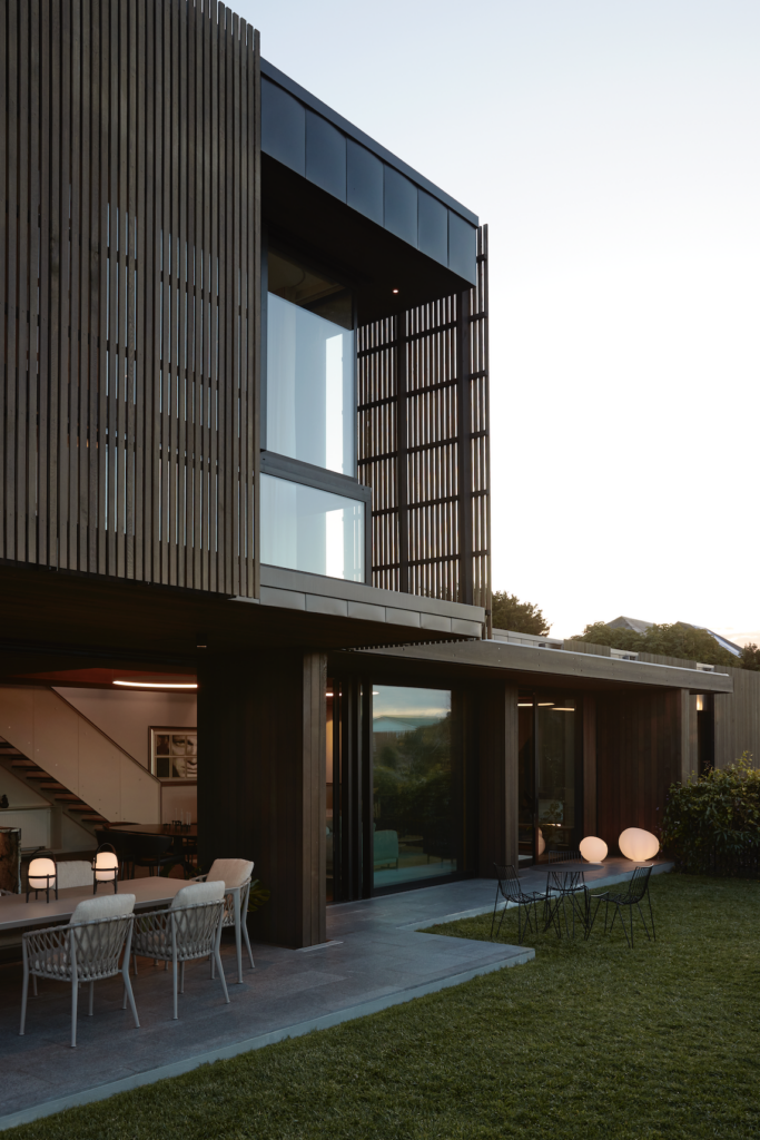
This manoeuvring dictated the massing of the building, starting with a lower level burrowed into the site through to a third one that houses the main bedroom. The plan is loosely L-shaped, with bits protruding and cantilevering — like a polite contortionist — ensuring the neighbours retain a view of the sea beyond and the home’s occupants can benefit from the shade and shelter provided by this stacking.
Herbst says, “We kept the apertures at the back to an absolute minimum size for a good cross-ventilation and movement in from the kind of backyard because of the privacy issues.”
The view from the kitchen to the garden needed to be retained while light and connection to the sea were maximised.
“To get out and up into the light, we needed to travel up one floor,” explains the architect, so, instead of decking — which can be somewhat insubstantial — we “raised an earth terrace to give that relationship. We lifted the ground plane to make a proper positive connection between the main living level and the site.”
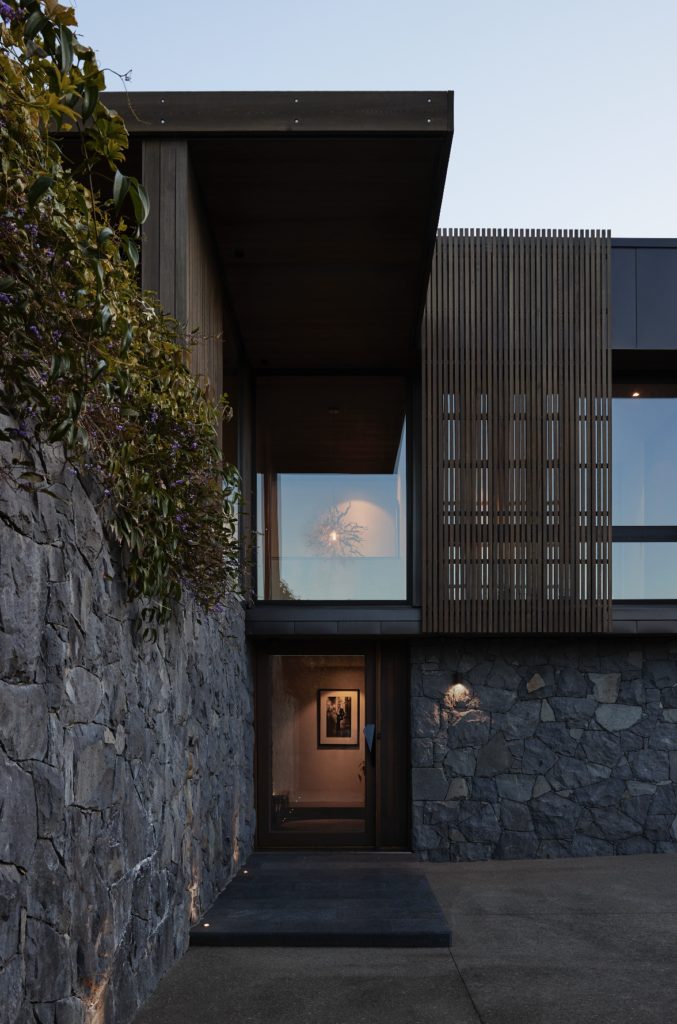
There was also the need to retain an old tree on the property. Therefore, arrival by vehicle requires pivoting around it and being deposited in front of the somewhat sculptural construction that has its heart strongly set on modernism.
The façade has been imprinted with the Herbsts’ instantly recognisable signature. However, the fact that it is a city dwelling, rather than their usual beach projects, required a different sensitivity and approach to materiality.
Externally, the stone-filled gabions the Herbst have made famous in their bach designs — at Oruawharo Bay, Kaipara Harbour, Waimauku, Whangarei Heads — have been supplanted by a stone wall of stacked honeycomb bluestone.
“This might have actually been the first time we did a kind of formal stone cladding,” ponders Nicola, agreeing that it is a variation of their gabions, which she defines as “more notional” in comparison with this one, which “has a level of permanence and the level of formality”.
Perched above this solid mass is a more delicate affair of timber boxes, with another of the Herbsts’ recognisable features: timber slat screens.
“It provides a kind of a pinwheel effect,” says Nicola, “where we dissolve the cedar into something light so it emits light inside but it gives you that veil of privacy.”
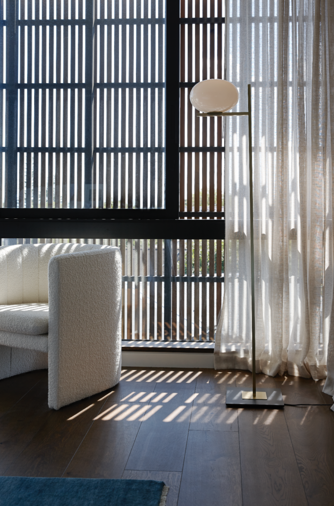
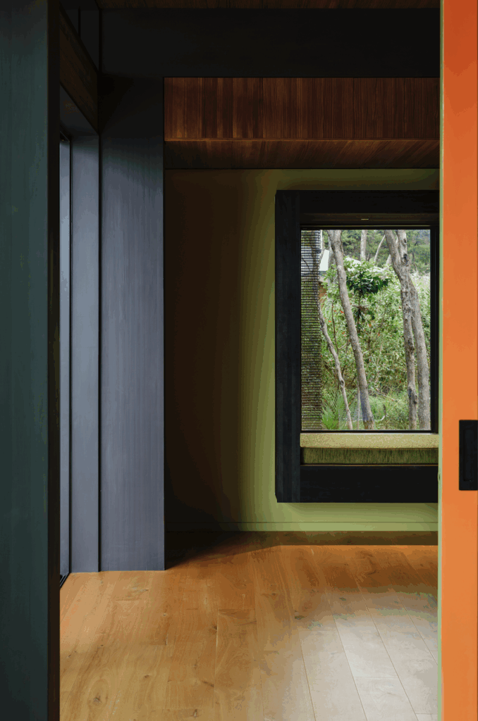
On the other side of this finned veil there is a significant gap before the glazing and the rooms beyond. The architect refers to this buffer zone as a play on Japanese engawa — a traditional space that filters the outside to the indoors. Unlike engawa, however, this one is not a traffic zone or a verandah.
“It acts as a kind of extra layer, as it’s important for us not to have that blunt connection between inside and outside,” she adds.
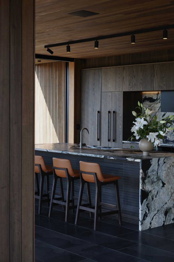
Internally, the home’s private spaces are flushed against the north while a set of white, epoxy-coated stairs defines the neighbour-facing end. The ground floor includes garaging and laundry room as well as a lift. The first floor is an open-plan social space defined by an incredibly detailed kitchen of dark timber — a combination of American oak and cedar — on the DBJ-manufactured cabinetry.
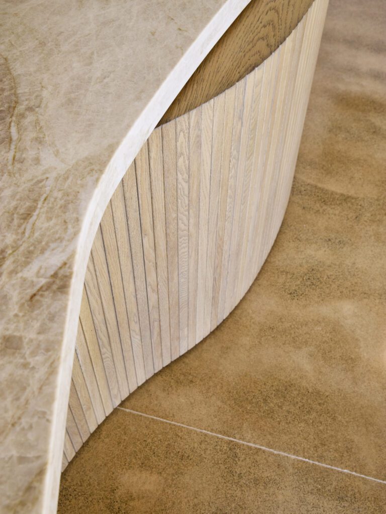
The sculptural island includes a horizontally tiled, top-lit frontage that culminates in a stunning curvature as it flows onto the floor. The hero here — and throughout the house — is a Copacabana stone top: a dramatic, black-and-white Brazilian granite that is deep, moody, and full of detail.
“The owner, amongst other things, is a geologist, and he chose the stone, which is very lively and very beautiful…. It’s got a lot of character,” says Nicola.
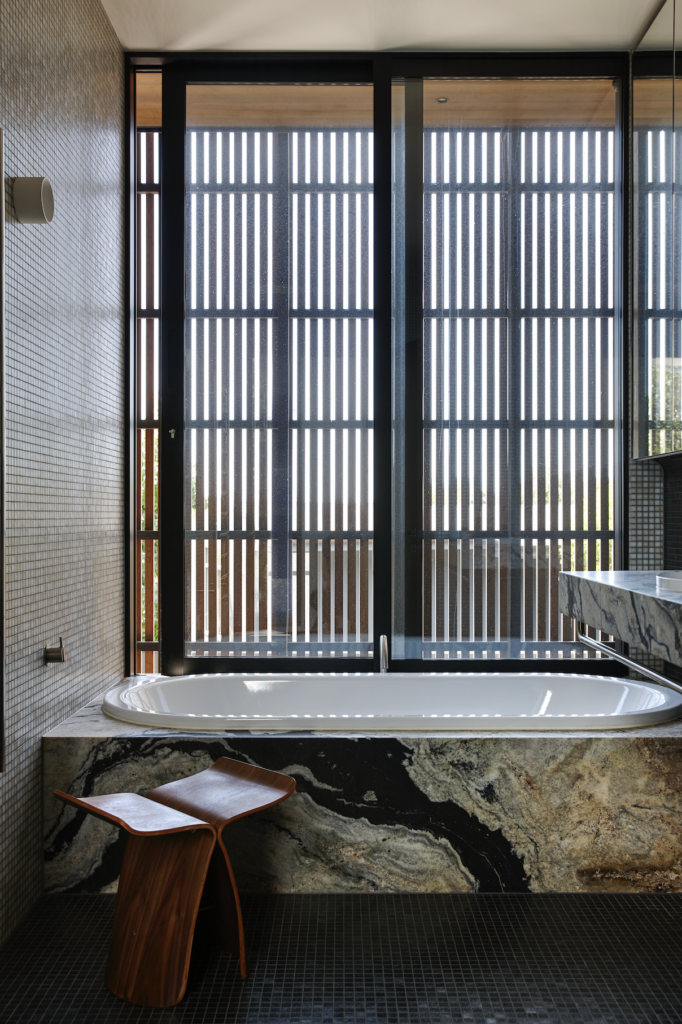
The top floor, which the architects wanted to keep as “polite” as possible, houses only the main bedroom with its en suite, and is oriented outwards, toward the sea, providing the short horizontal of the L-shaped plan.
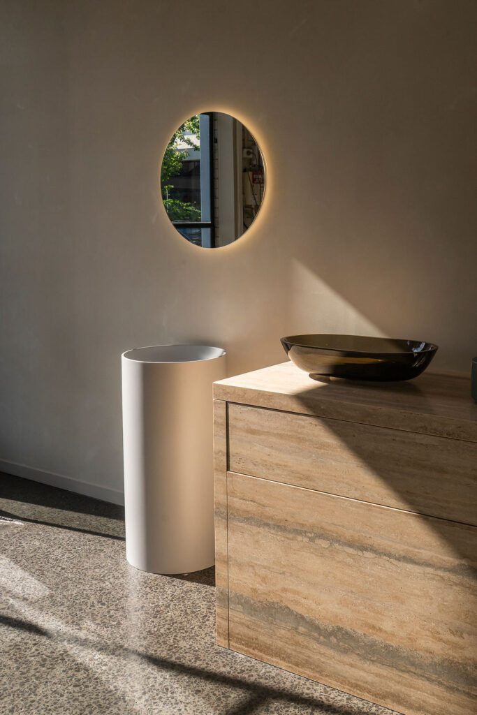
The detailing throughout the house is testament to the care given to its design. The front door has an origami-like handle. There are tiltable, timber openings above the first floor bedroom doors in what Nicola calls “an old, modernist way of handling” the problem of ventilation. There is a mirror that seamlessly blends into a frosted window in the bathroom. The Copacabana comes and goes in waves while, in a more subdued fashion, the cabinetry is both bold in its colouration yet subtle and classical in some of its detailing. Meanwhile, the contribution of Scott Zegers Design — plush furniture in strong circular motifs and textures — adds extra softness to the interior.
This home has touches of a modernism that is part tropical, part continental, yet, like the highly recognisable Herbst baches that helped inform its vocabulary, is a sophisticated incursion by the architects into a Pacifica modernism very much of their own invention.

