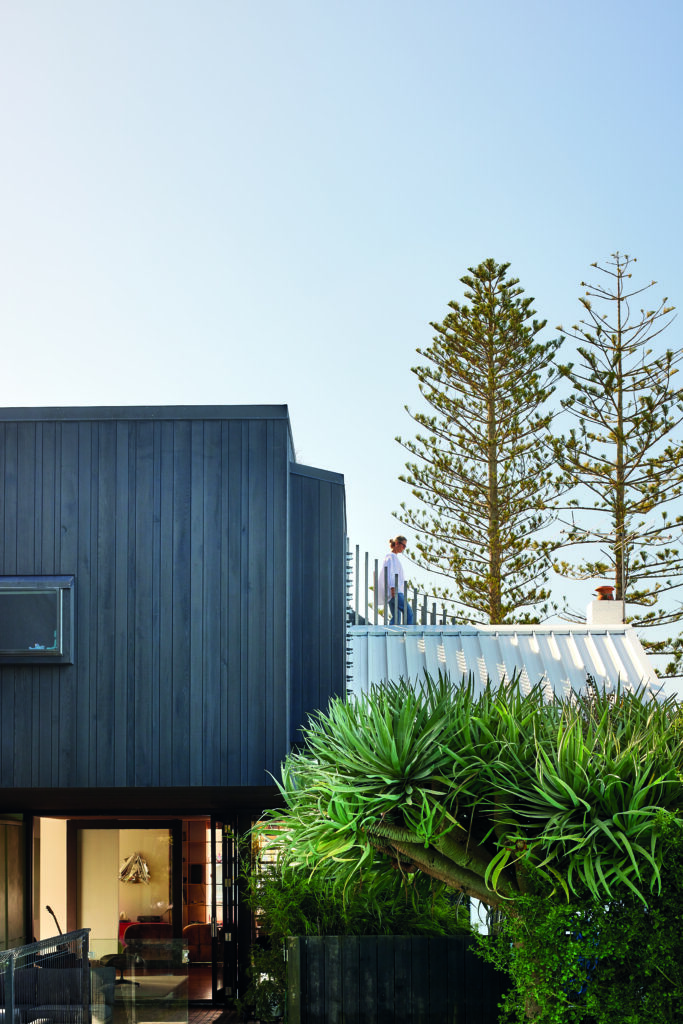
When building a home above Lake Wakatipu, how does one design an interior that complements and celebrates the inspiring views? Trinity Design discusses how they accomplished this at Queenstown’s Closeburn Lodge.
HOME: What was your involvement in the Closeburn Lodge project?
Trinity Design: We worked closely with the clients, architect and Triple Star Construction to select all of the finishes and fittings throughout the home. This required a high-level of technical knowledge to ensure that the level of detail was met. Trinity provided all of the CAD detailed design drawings for cabinetry, wall elevations (where needed) and the bathrooms. We also selected and sourced all the furniture and accessories and managed the procurement and staging for the Australia-based owners. We really were the conduit between all other contractors to ensure clear communication on the interior direction.
H: At what stage were you brought in and what was your original brief?
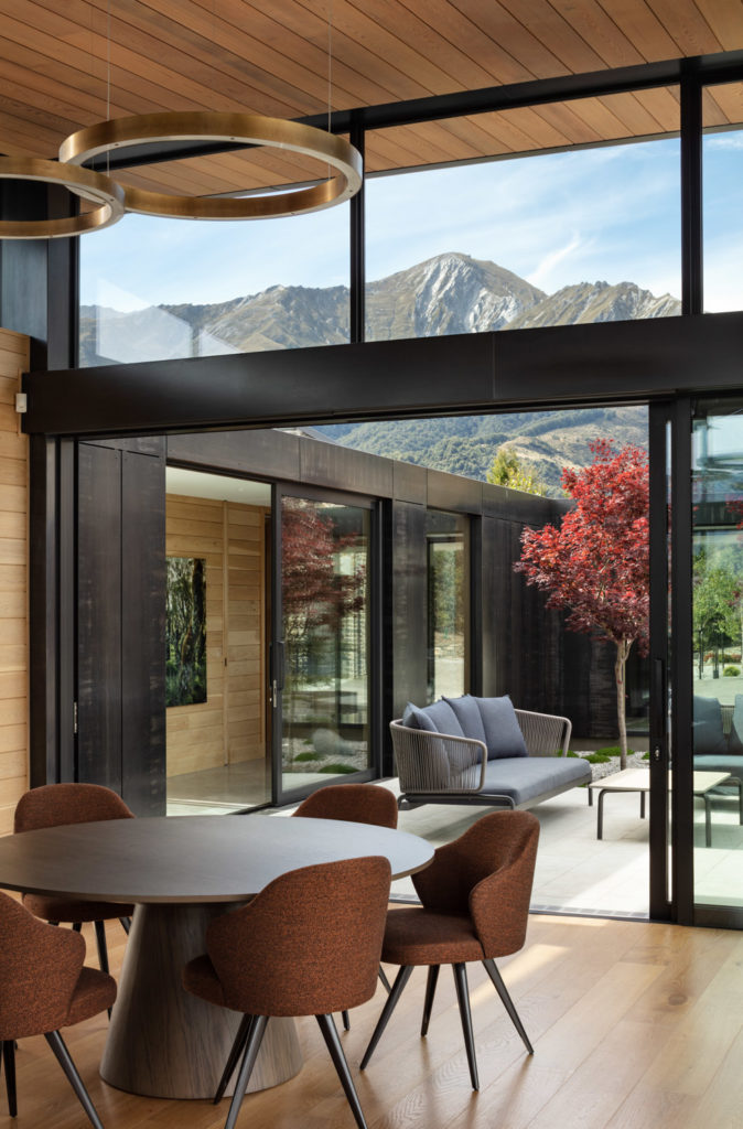
TD: We were brought in just after construction had started which is later than usual. Our brief was to create a sophisticated, but understated home for our clients and their extended family to use as their holiday home. Although they will have friends stay, this is more of a personal space and we really wanted to make use of the view shafts which are numerous and offer different aspects depending on where you are in the house. This influenced furniture layouts and pieces that were selected. Our clients appreciate quality so there was a mix of international designed furniture as well as custom-made from a number of NZ artisan manufacturers.
H: Were you mostly working with the architect or directly with the client?
TD: Initially we worked with the architect to understand the architectural brief and exterior materiality however we worked directly with the client for the majority of the project.
H: You had to furnish this house in its entirety: how did you ensure the owner’s personality is reflected in your choices?
TD: For all of our projects we are very mindful that the houses we are designing are for our clients, not us, so it is really important to get a full brief from them before we commence our design. By seeing imagery of the design style they are drawn to and asking the right questions we are able to propose pieces to create the whole. We did also have the opportunity to visit showrooms with them to look at specific pieces which you don’t always get to do with offshore clients.
H: How do you ensure a dialogue between the interior and the architectural envelope in a house with such strong gestures?
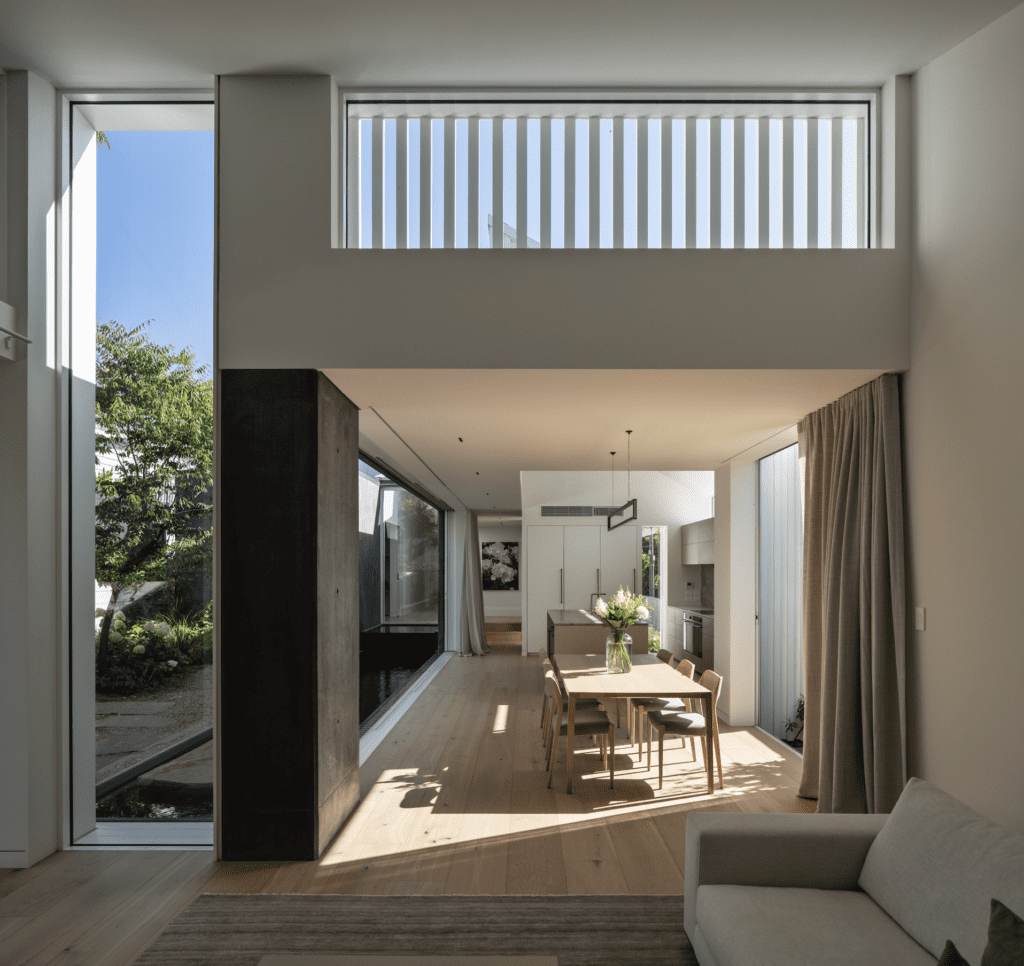
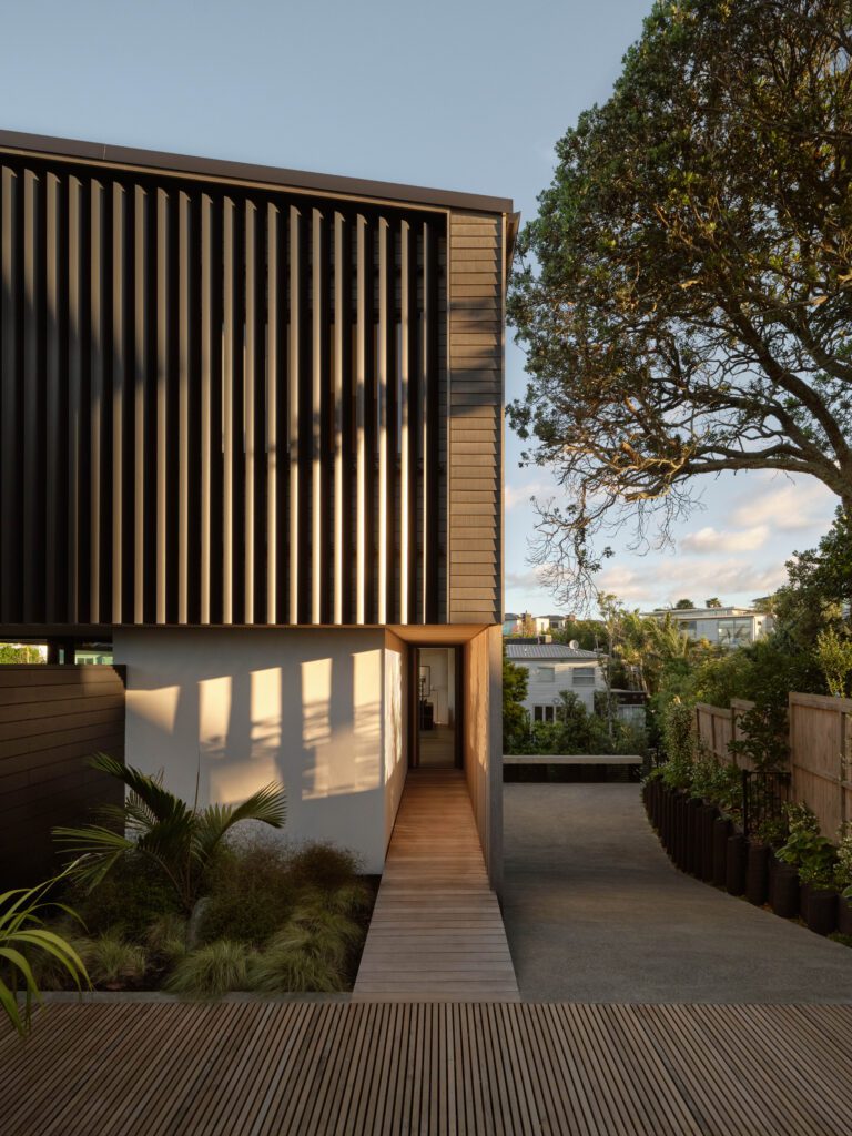
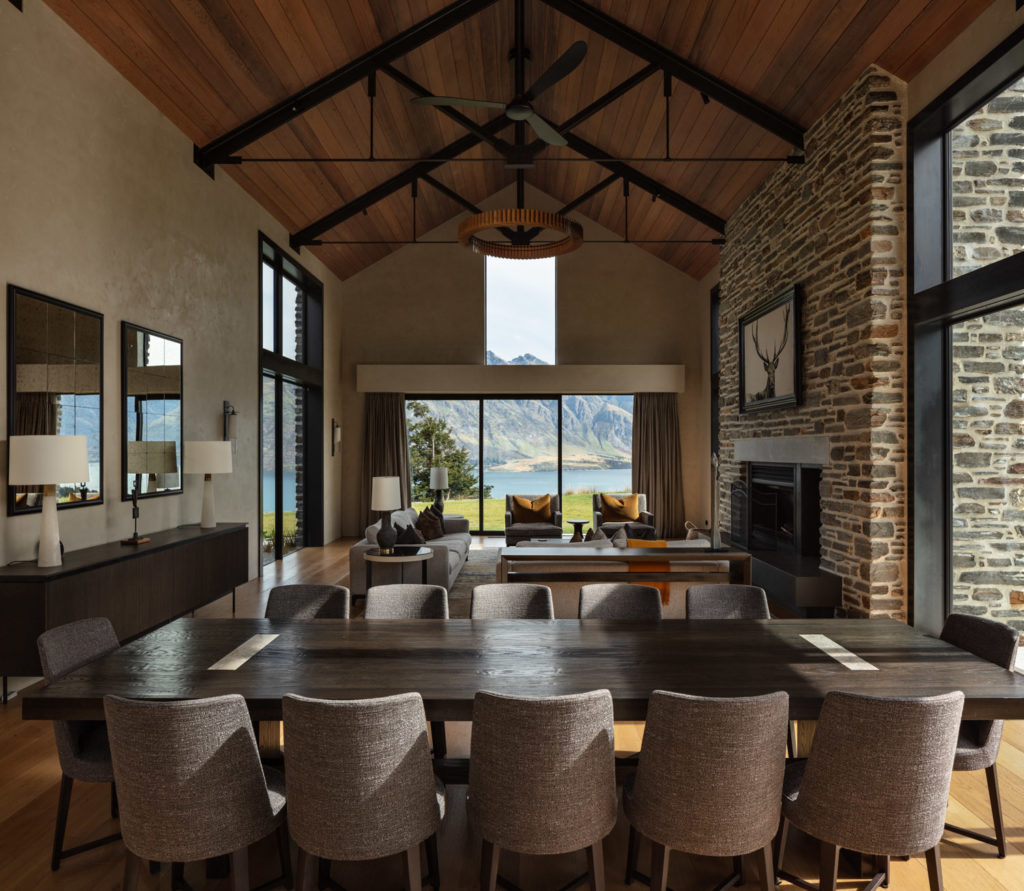
TD: Mason & Wales had specified beautiful natural materials for the exterior which were also brought into the interior creating a seamless connection. As the clients were interested in using finishes such as natural stone, steel and timber within the interior it allowed us to create the seamless integration of the building and connection to the outside spaces as well.
H: There is also a very impressive outdoor: does the interior in any way respond to those lake views, mountain ranges and nature?
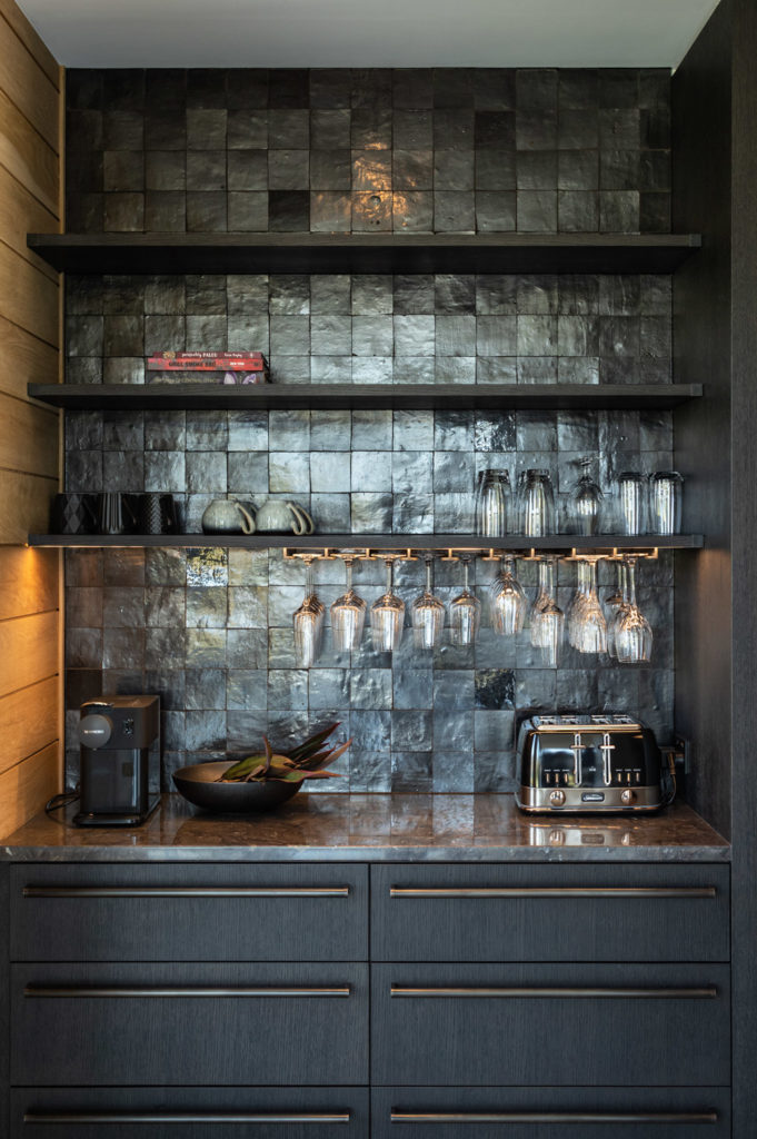
TD: Yes, I think you can see that in the materials that have been selected from natural stone flooring and stone in the bathrooms, the use of oak flooring, wall paneling and cabinetry, aged iron tapware, black steel and layers of colour in the furnishings that have been selected from the changing hues of the lake and mountain aspect.
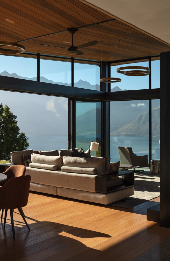
H: This house is a mix of traditional barns with a more contemporary steel and glass design. Did that in any way influence your interior choices?
TD: The traditional barns are where the bedrooms were located so we used softer materials and tones and added layers with curtains and loop pile carpet. The contemporary areas are where the main living and kitchen and dining were located and where we chose more architectural and robust materials.
H: Anything that you are particularly pleased with?
TD: When you finish a home such as this it is hard to say that any one aspect was the main contributor. Mason & Wales designed a beautiful building and the position on the site was extremely clever. Triple Star’s workmanship is second to none and we were very impressed with their knowledge and care throughout this project. Our clients also were very open, communicative and trusting. We were very clear on the direction from the outset and everyone worked collaboratively as a team and I think the result speaks to that.
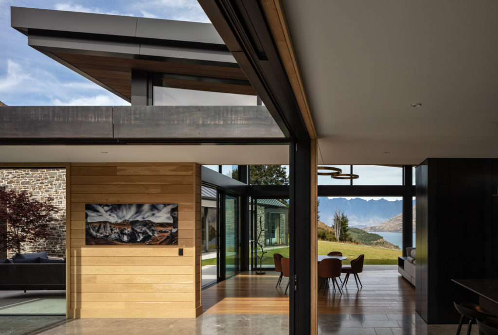
H: Walk us through some of your favourite, off-the-rack pieces and why do you think they work particularly well?
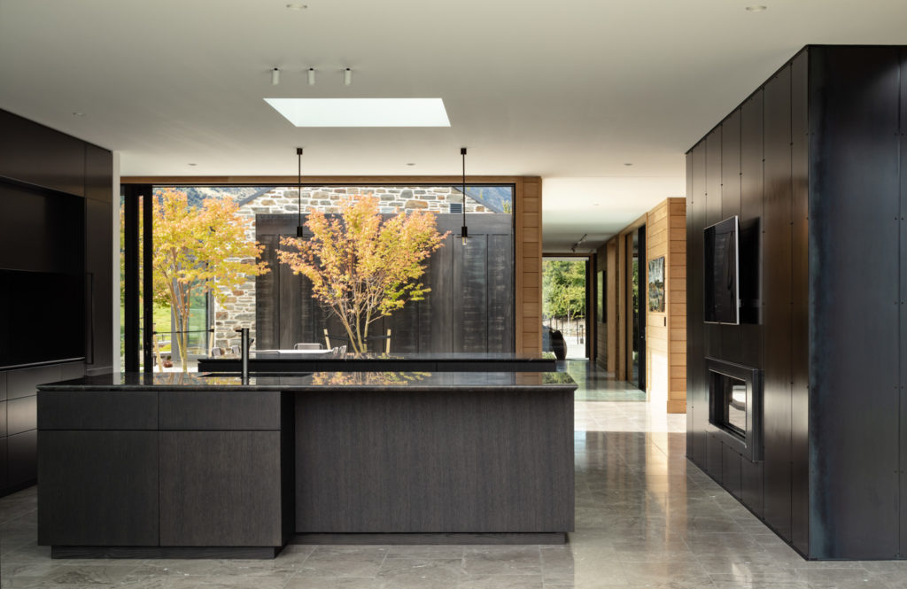
TD: The pared back, blackened steel pendant lights over the kitchen island, supplied by Inlite compliment the kitchen finishes whilst not hindering the stunning view to the lake. The Leslie dining chairs in the butterfly room (from ECC) covered in Articolo Douglas colour Ruggine, bring in the autumn seasonal tones and deciduous trees seen through property. The Fantini tapware, supplied by Plumbline, was used in the master ensuite, and in the gunmetal finish sits beautifully with the natural stone tiles.
H: How does this project fit with the rest of Trinity’s work. Do you feel it is a continuation of some themes you have worked with in the past or is it a departure?
TD: We work with a wide variety of home styles, in various locations with clients who all have their own style and preferences. Our ethos is to design for the client, building and location. Trinity doesn’t have its own style therefore our adaptability is the strength that we bring to each project. It’s the variety that inspires and challenges us. What doesn’t change is the process, documentation and support that we bring to each project.
H: What is your firm working on now that makes you excited?
TD: We are very privileged to be working on some beautiful new build projects around the country at present and many of them for offshore clients. As an example we have a lodge and private residence on Lake Taupo, two stunning properties in Queenstown and another two in the Hawkes Bay as well as a large modern home on Paratai Drive. All are quite different and the team is excited to be working on these.
Images: Simon Devitt
