Between harbour and hills, this large, low-slung Wellington home is an intriguing but perfectly suited addition to its Eastbourne street.
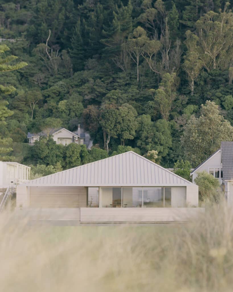
Capturing the essence of its coastal site, the exterior of this house is an amalgamation of sandy tones — contemporary and alluring — while its form echoes the more traditional vernacular of the streetscape.
A stretched hipped roof creates the low-slung form, which, despite the building’s sizable volume, allows it to settle into the site without feeling conspicuous in a street mostly dominated by hipped and gabled roofs.
For architect Thomas Seear-Budd, the vision was clear from the outset: a home of distilled detailing, minimal finishes, and attention to craft that would deliver a stillness and sense of calm, and a building that would be highly connected to the water and wider geographical area in tone.
“It wasn’t until we visited the site that we realised how special it was. There’s only a handful of streets like this in Wellington where you have sites at the water’s edge with native bush-covered hills behind,” Thomas tells us.
“The clients wanted it to be a home but encapsulate the feeling of a beach house in that they wanted it to feel informal, not too precious. It had to be a place you could walk through with bare feet, sandy from the beach.”
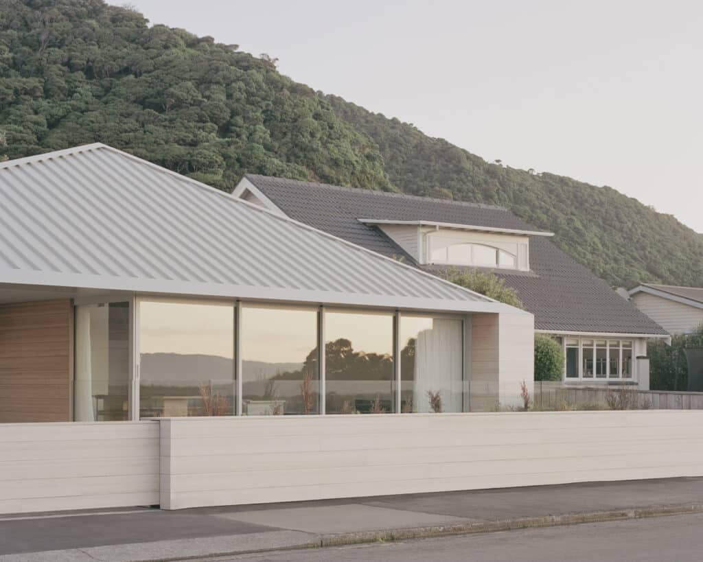
From the street, the house feels unified, compressed. There’s a sense of intrigue to this elevation, which is muted in tone, slightly alien, yet feels appropriate in its form with every detail perfectly considered to achieve a cohesive and unbroken whole — all spouting, downpipes, and flashings are concealed to create a crisp, refined aesthetic.
The entrance choreography takes the visitor away from the view, up a small set of stairs, and into a dim, cave-like area that immediately appeals to the senses with the distinctive sweet scent of its macrocarpa lining, before turning 180 degrees to face the view again and moving into the main volume of the living space, where there is a sense of it being carved out and open, airy and voluminous.
There’s a feeling of theatricality here in the overt simplicity of the spaces. As a collection of moments, the three volumes that make up this home combine artfully to form a cohesive and seamless family dwelling, calming in its unity.
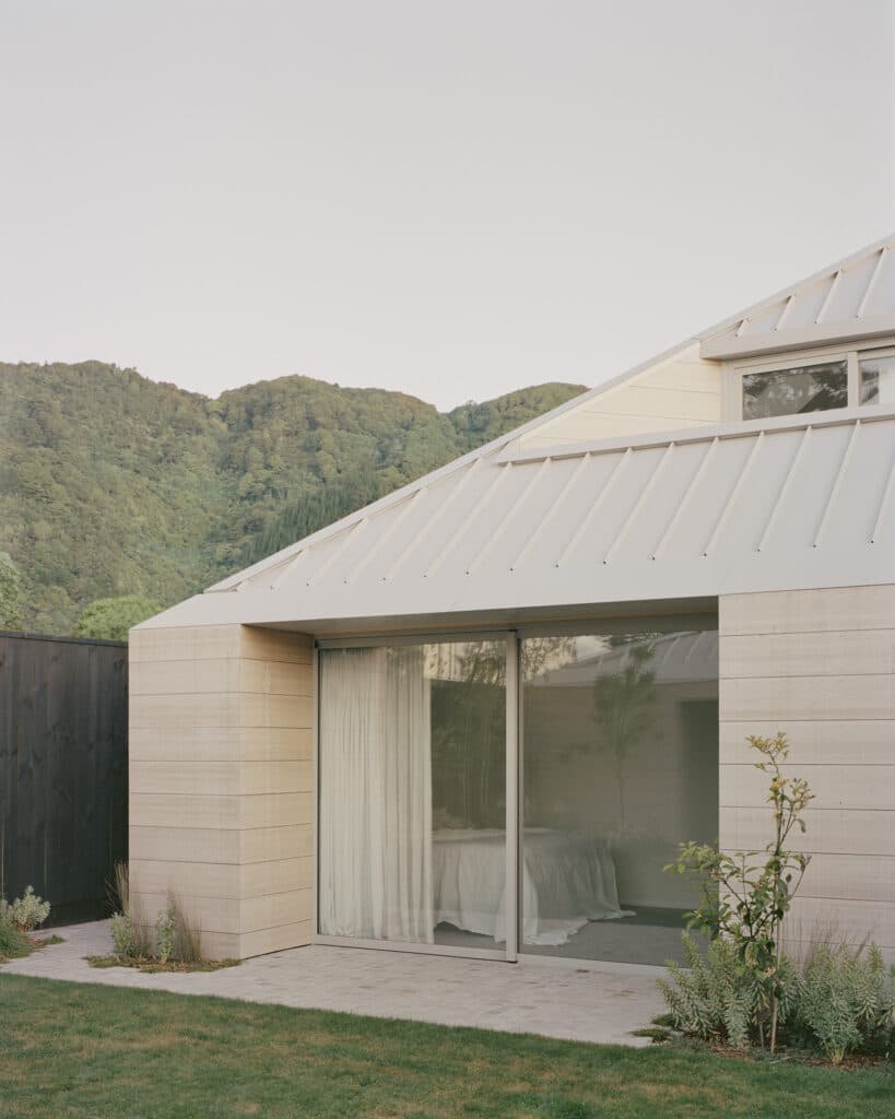
Two pavilions, one behind the other, are connected by a low, glazed exterior walkway that punctures the street-facing living pavilion, allowing for sight-lines from the rear of the house through the front pavilion and out to the water.
In the upper level of the rear pavilion, the form has a “bite out of it” as Thomas describes it, creating a terrace that exists within the roofline. Together, the three forms move between exposed and sheltered, private and public.
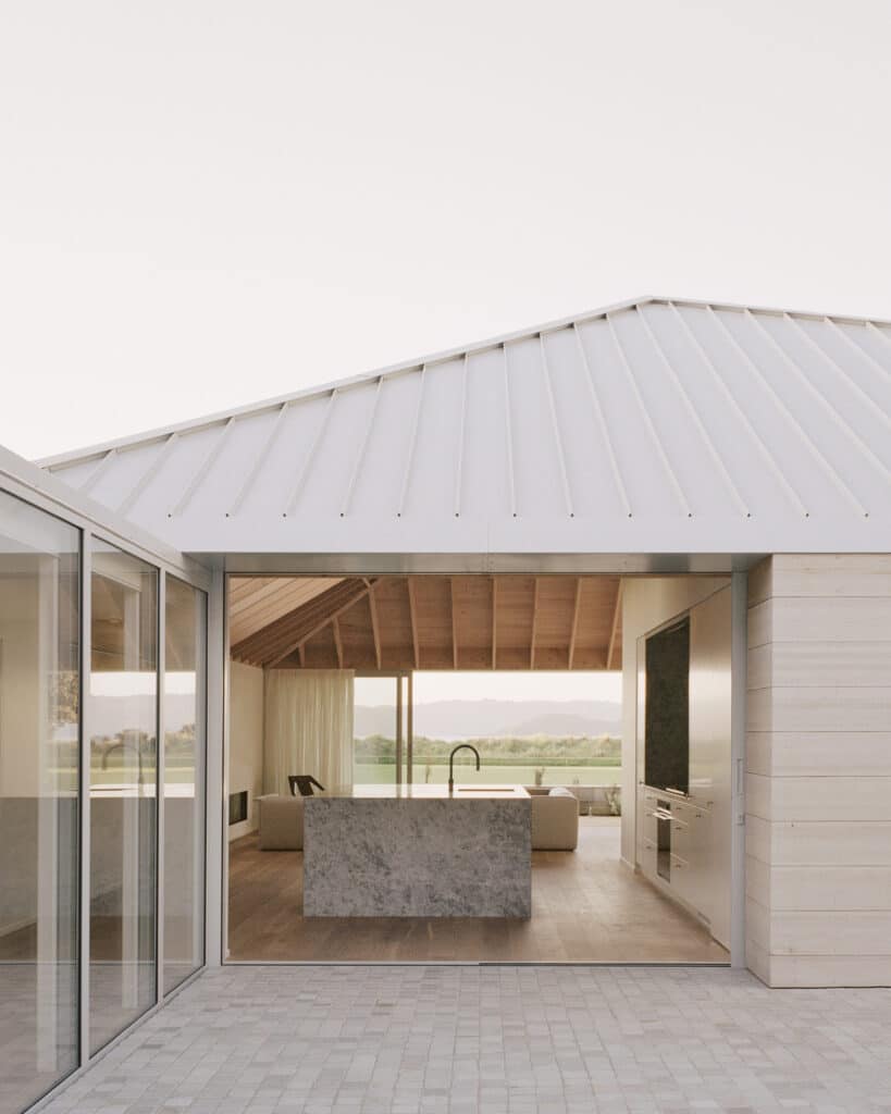
A central courtyard connects the three with extensive greenery; in the centre, tumbled granite cobblestones in a grid-like pattern are not directional because of their square shape, creating a sense of grounding, while carefully considered planting at their edges allows them to blend organically into the gardens, designed by Xanthe White.
In contrast to the grey, sandy tones of the exterior, the interior is defined by its warmth. “It is conceived almost like a piece of driftwood, which, when you cut in half, you get that raw timber exposed and the warmth and scent of it,” Thomas explains.
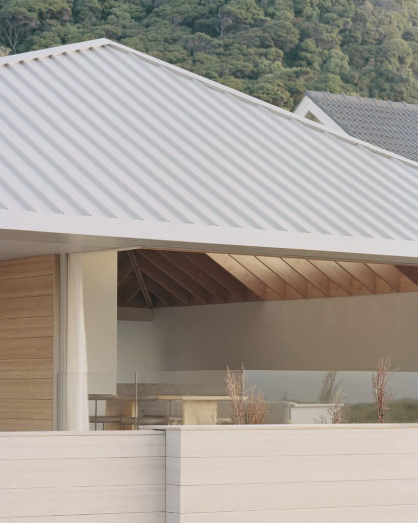
Interior materiality is subdued, reflecting the desire to create a sense of stillness. In tone, the materials are pared back and anchored by the warmth of macrocarpa ceilings, which become the hero, and behind which all other materials fall away into the background.
“We wanted to use local materials where we could, so the exterior is a New Zealand–grown pine, and the macrocarpa is also New Zealand grown and was milled locally. Macrocarpa was chosen for its stability — the hipped beams are 9m long — and for its beautiful scent,” Thomas says.
Band-sawn oak floors echo the hues of the macrocarpa. They’re textured and hardwearing and “don’t feel polished or precious”, much like the roughly textured exterior pine. The kitchen is anchored by the use of a grey limestone, which is echoed in the bathrooms.
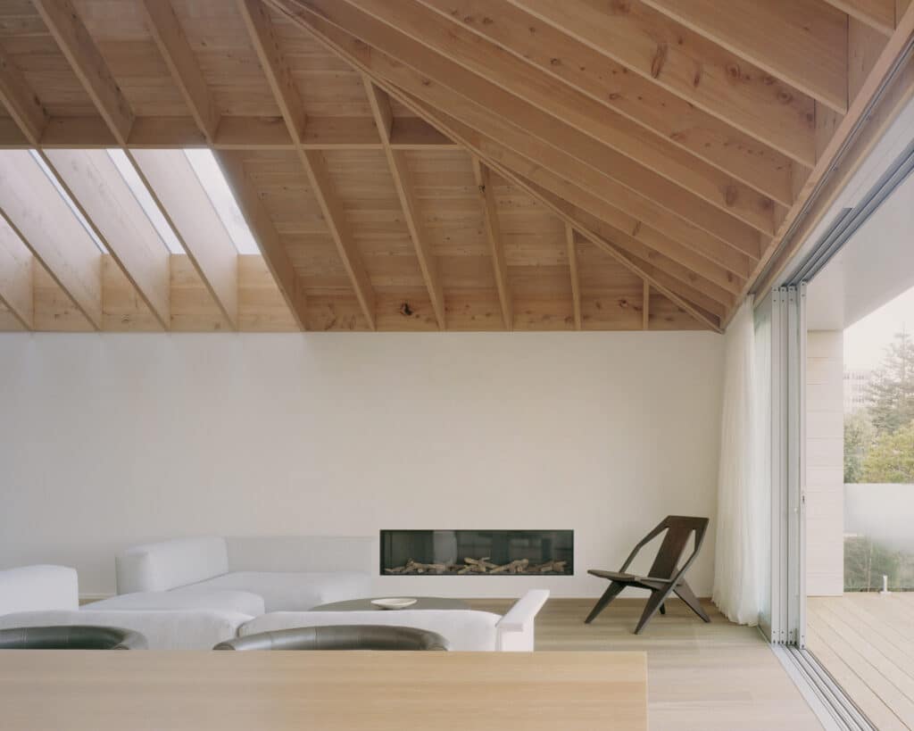
Overhead, skylights break up the macrocarpa and draw light in from above, while giving depth to the beams and an added sense of volume. At night, the ceilings disappear into shadow, with lighting intentionally limited and at human level.
“By limiting the overhead lighting, you end up with a sense of the volume without being able to see it. In the morning, the sun streams through the courtyard and into the living area and kitchen through the rear glazing and skylights.”
This is a home of beautiful simplicity that feels as relaxed as it does refined. There’s a certain repose here, a clarity of place and purpose achieved with an artful response to site and brief, and an elegant tonality and materiality.
