This creative Wellington couple traded in their family home and downsized to a contemporary cottage featuring simple geometry and pared back style
[jwp-video n=”1″]
A compact Wellington home gets back to basics with its pared back style
What’s a couple to do when they find themselves in an empty nest? If you’re Barbara Fill and Nick Dryden, you sell the family home, cobbled together 34 years ago from recycled materials, to your eldest son Zen, before moving three doors down and demolishing a worker’s cottage, one of four built from Dutch kitsets by the blokes who went on to start Lockwood Group.
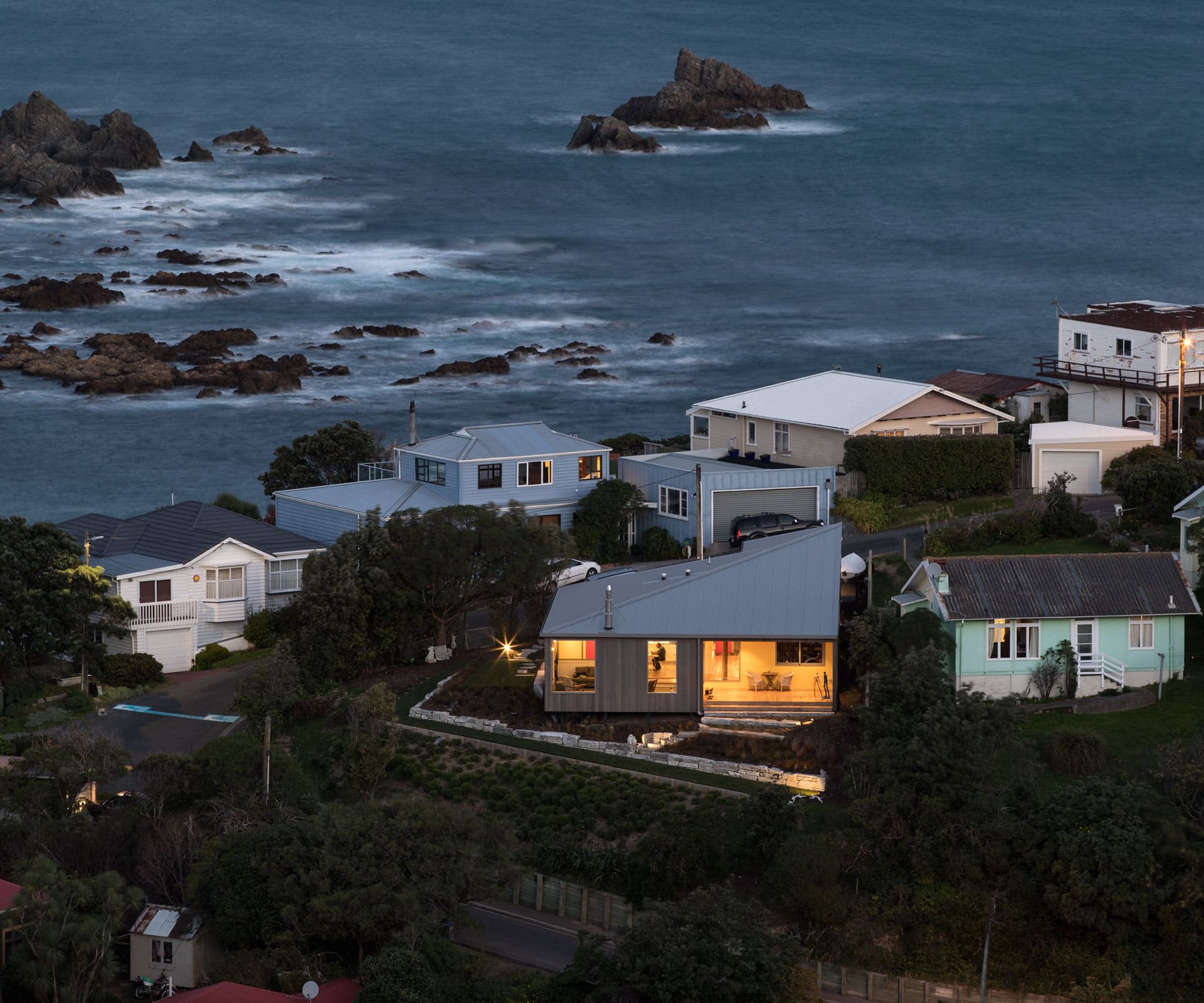
“Nick and Barbara owned all the cottages, which were on one title and originally used to house council workers,” says architect Tim Lovell who, together with business partner Ana O’Connell of Lo’CA Architects, was called on to create a contemporary two-bedroom home for Fill, a historian, and Dryden, a sculptor and former film-set builder.
The Wellington couple had a defined design sensibility: they wanted a home with a strong contextual link to the hilly, sloping section, that worked with, rather than against, the weather conditions, and which accommodated their art collection.
Their previous home was 60 stairs up from the road and on several levels, dominated by dark native timber. “This house is a reaction to that,” says Lovell. “They wanted something simple, accessible and low maintenance so that they could pursue new interests.”
The result is a solid, 124-square-metre weathered cedar box, which O’Connell refers to as a “deconstructed sculptural state house”. The architects were heavily influenced by the scale and size of the 1906 S. Hurst Seager and Cecil Wood state house in Petone, which Fill had written a book about. It featured simple geometry and sloping ceilings.
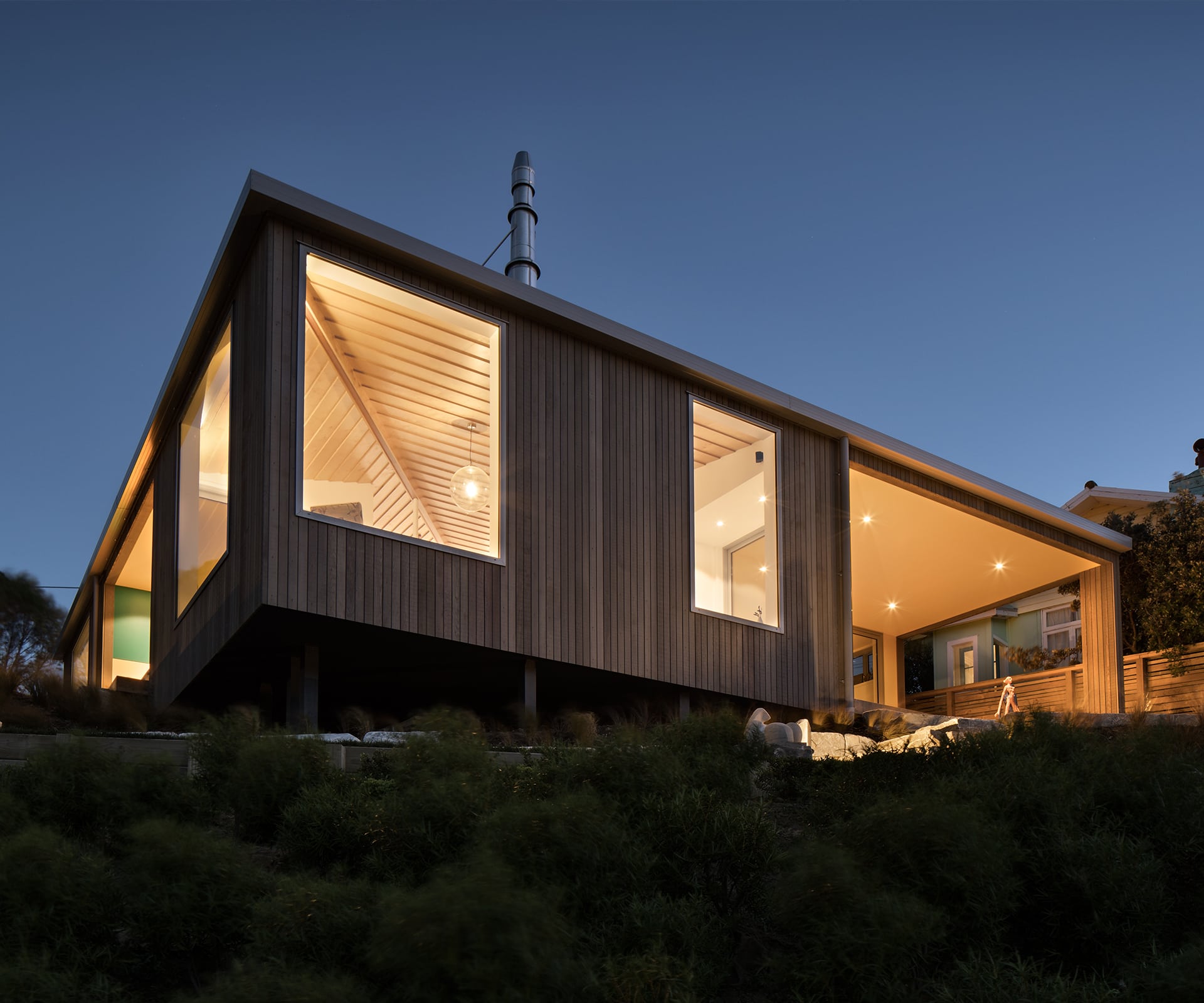
“We explored a pared-back, compact house, an artful stripping back to the basics,” says O’Connell. This has been achieved by skewing the gabled state-house roof and positioning the ridge on the diagonal, creating “a low-slung dynamic form that follows the natural sloping ground levels around the house”.
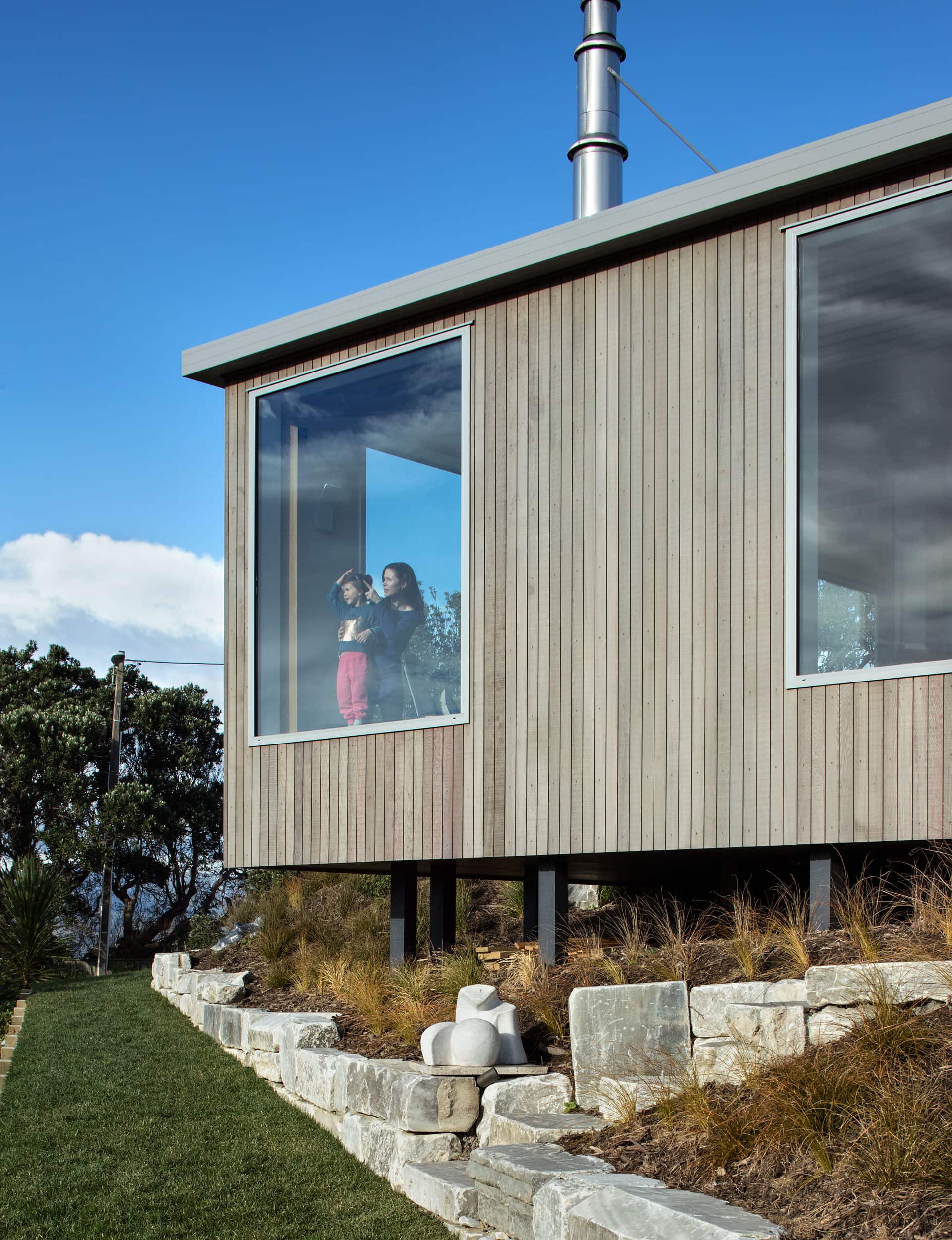
Constructed from fibre-cement panels, powder-coated aluminium windows and cedar cladding designed to “grey off like a piece of weathered driftwood”, the house overhangs the north-eastern corner of the section, appearing to ‘float’ over the garden like the bow of a ship.
The maritime reference is intentional: not only does the house align with the coastal Island Bay environment, but it also resonates with Dryden, a former commercial fisherman and keen sailor. (The asymmetric roof, with its birch-ply panelled lining, follows his much-loved rowboat.)
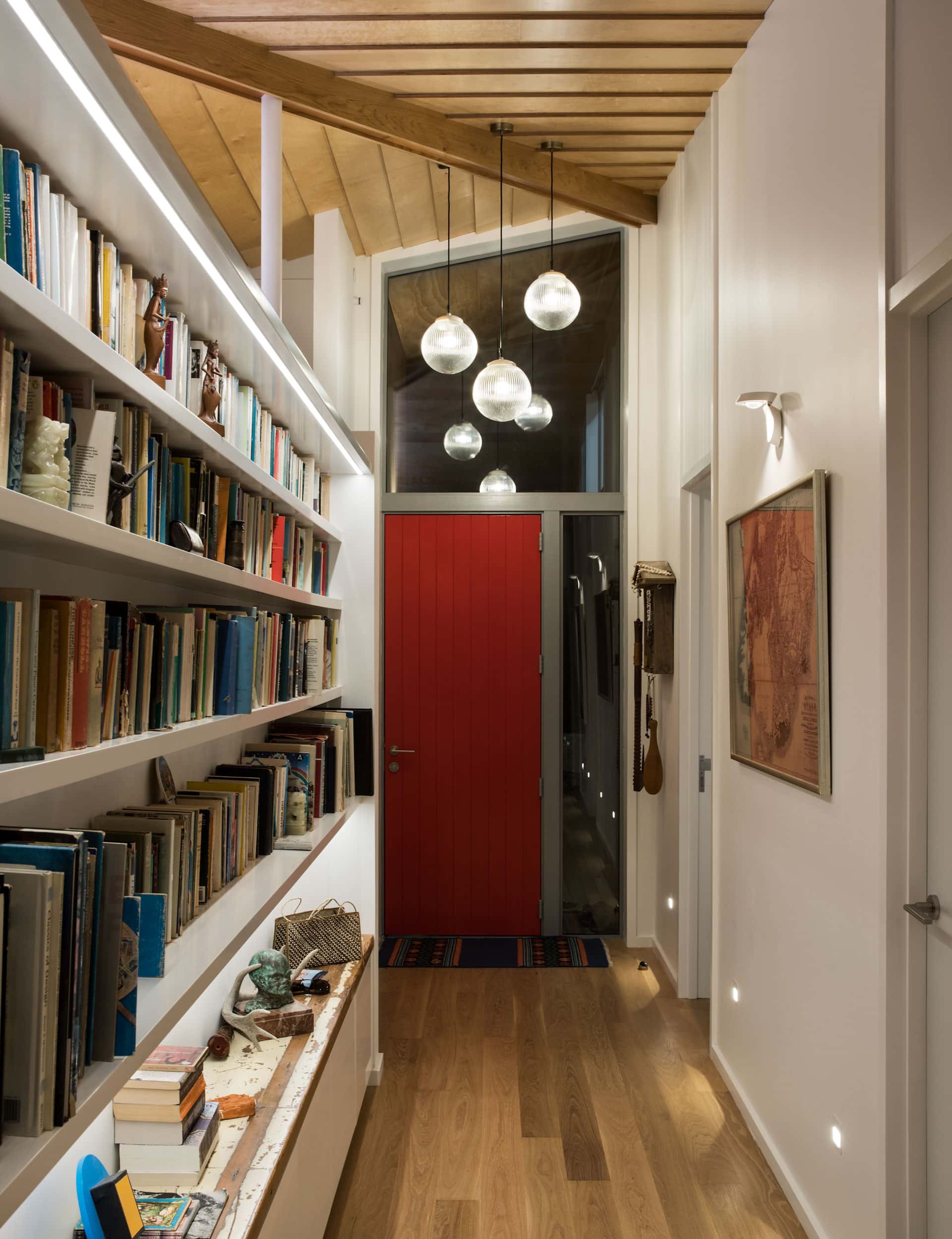
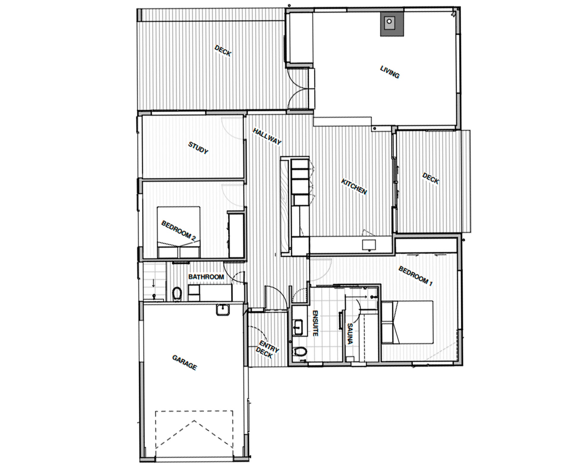
The house is organised around two key elements: the spaces created by two recessed decks and a long hall flanked with bookcases and recessed storage. As Lovell notes, the hall is a central organising element in the traditional state-house plan: it’s used to full effect here with a soaring asymmetric ceiling and a part-height wall of shelving containing books and art, protected from the harsh sun but allowing light to spill over from the living areas.
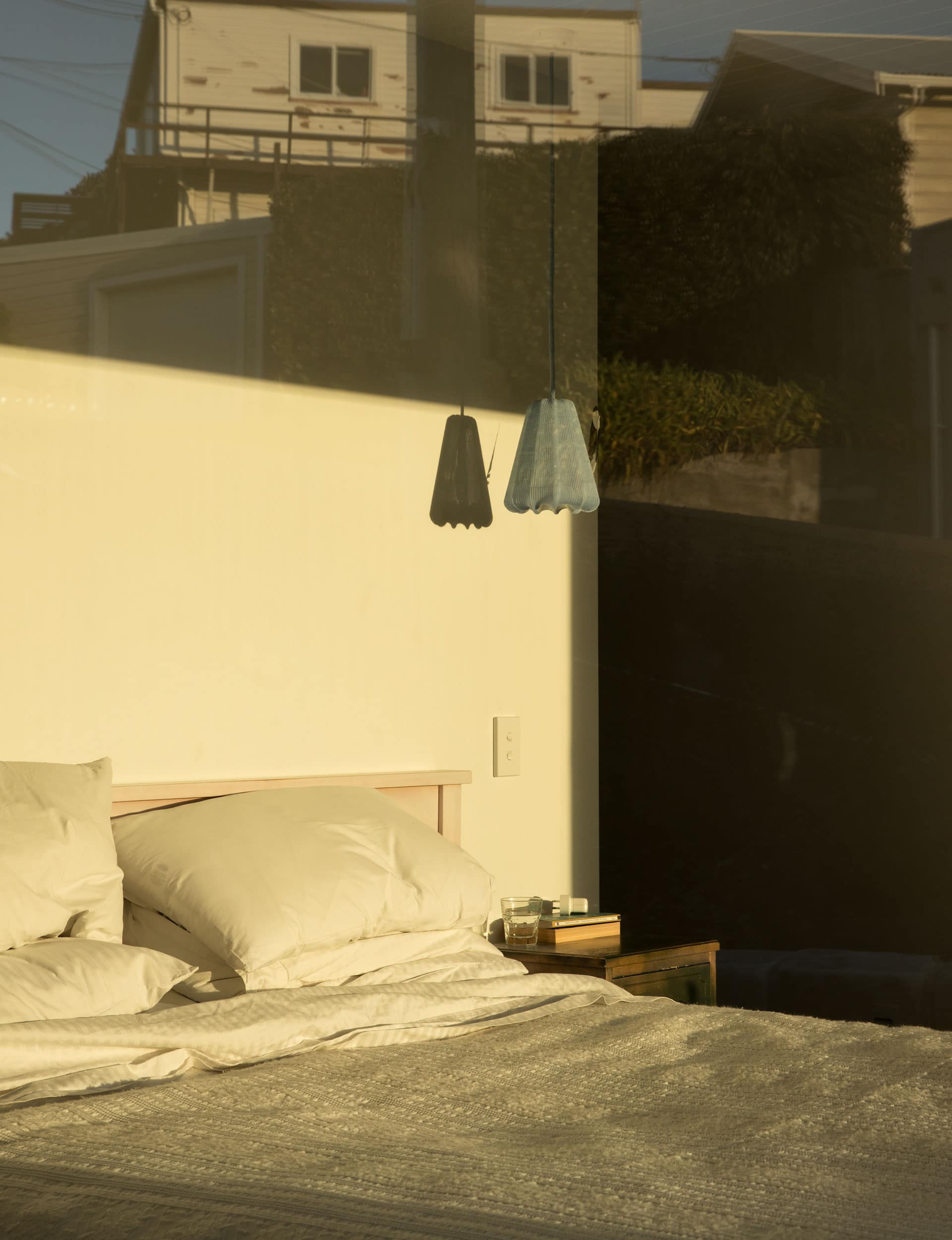
Leading off the hall are two bedrooms, an ensuite with sauna, an office, a small bathroom and laundry. At the end, you hook a right around the end of the wall and out into a generous living space located under a high central clinker ceiling, where spaces are divided by level changes. This imparts a feeling of generosity to the house, while keeping the plan compact.
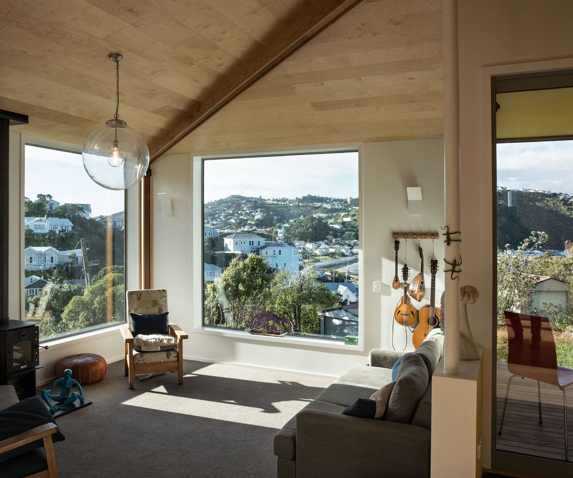
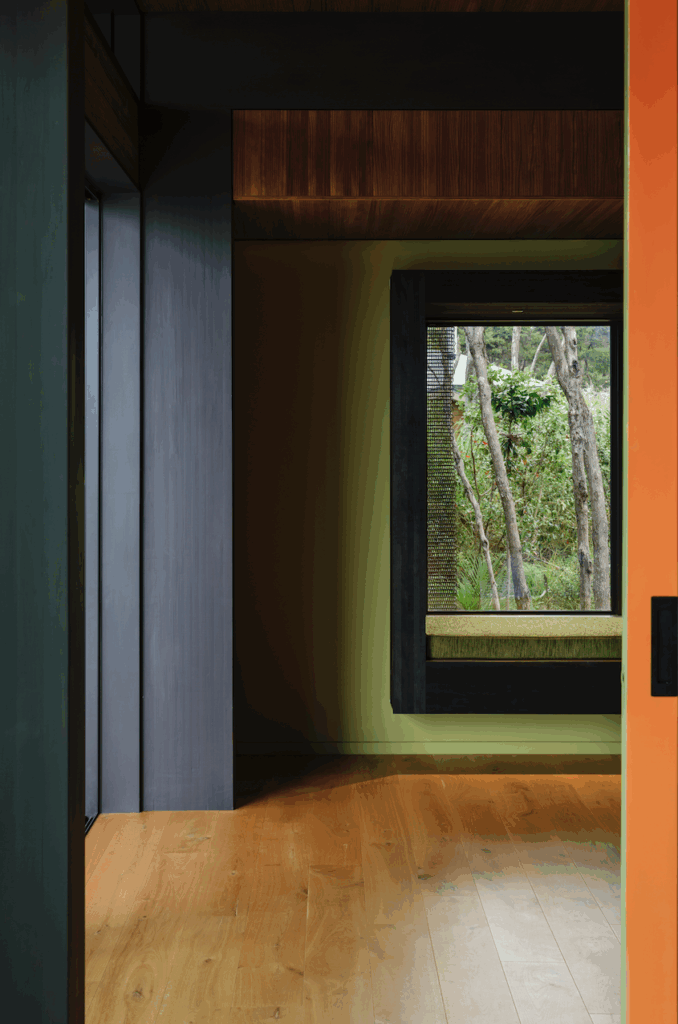
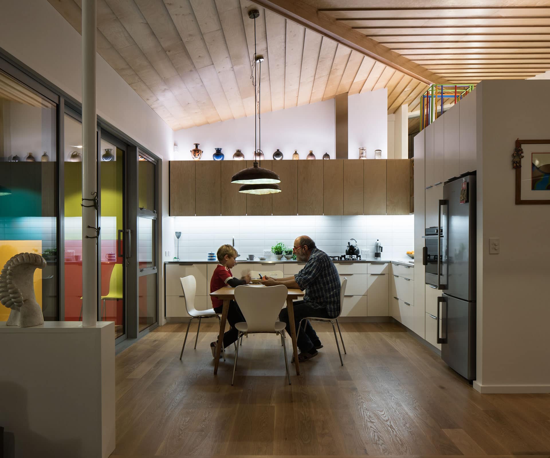
Two slender, exposed steel posts, one above the kitchen joinery and another between the living and dining rooms, permit a smaller ridge-beam. “The house isn’t about exposing or celebrating structure but more about a sculptural textured form,” says O’Connell. American-oak floors, birch-ply panelling and cabinetry add to a feeling of lightness.
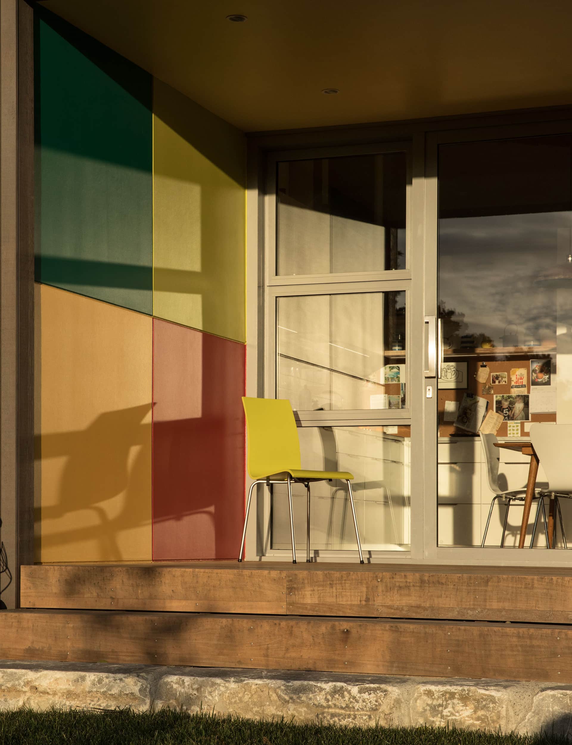
Two recessed decks tucked into eaves on the northern and eastern sides of the house come into play when dealing with those pesky Wellington northerlies. Just off the kitchen, the deck is so sheltered that the sliding kitchen doors can be left open in all weather. Off the living room, meanwhile, a second alcove is sheltered from the south-easterlies and enjoys late afternoon sun.
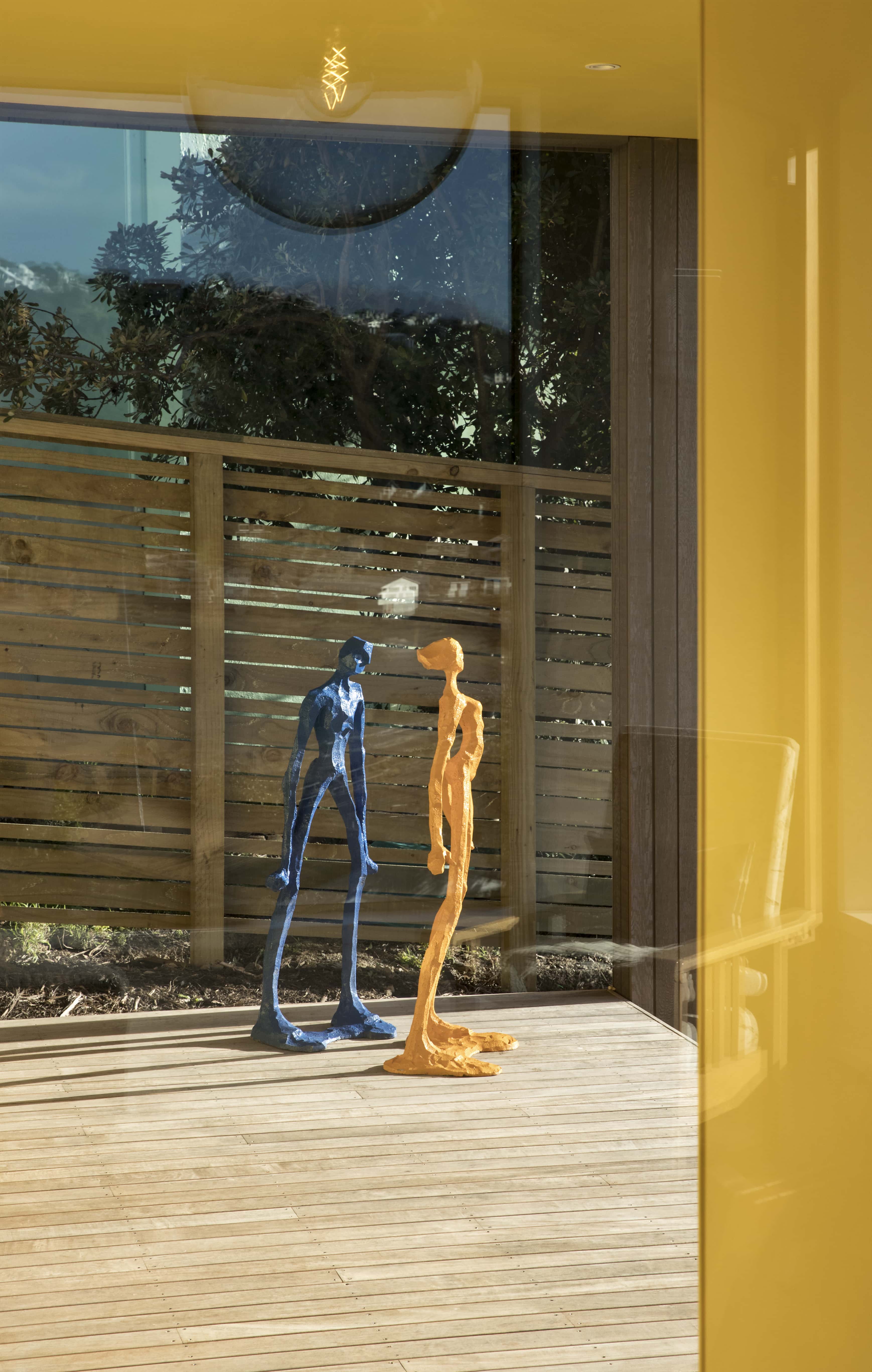
The owners’ art collection also played a part in the design of the home. The architects designed a space specifically for Dryden’s sculpture ‘The Wind Eater’, carved from a reclaimed hunk of totara and now living in front of an over-sized window at the far end of the entrance hall.
Outside, the brightly coloured blocks adorning the walls of the kitchen alcove were inspired by a Michael Smither painting, ‘Song of the Bellbird’, which hangs in the living room. “Michael is a friend of the owners and when they asked if they could reproduce his painting on the alcove wall he was thrilled,” says Lovell. “It’s become something of a talking point – at night it’s lit and visible from across the area, which the local residents love.”
[gallery_link num_photos=”14″ media=”https://www.homemagazine.nz/wp-content/uploads/2017/08/WellingtonSmallHome5.jpg” link=”/real-homes/home-tours/this-home-was-designed-to-work-with-wellingtons-ferocious-winds” title=”See more of the home here”]
Landscaping duties fell to the couple’s landscape-architect son Yanos, who lives in Sydney. He stepped the section to create areas of interest, including a flat, narrow strip of lawn. More than 200 large marble slabs, many of which are inscribed with poems and were part of Dryden’s 2005 exhibition about demolished Wellington buildings, were given a new life as paving stones and retaining walls. The slabs come from the former Maritime House on Wellington’s Customhouse Quay, sourced from the same Golden Bay quarry that supplied marble to Parliament.
Although it’s new, the house snuggles comfortably into the Island Bay hillside, entirely at home among the humble worker’s cottages. Downsizing rarely looks this good.
Words by: Sharon Stephenson. Photography by: Simon Devitt.
[related_articles post1=”68887″ post2=”71419″]

