We return to the container-inspired home by Architecture Workshop that was the runner up for Home of the Year over 15 years ago
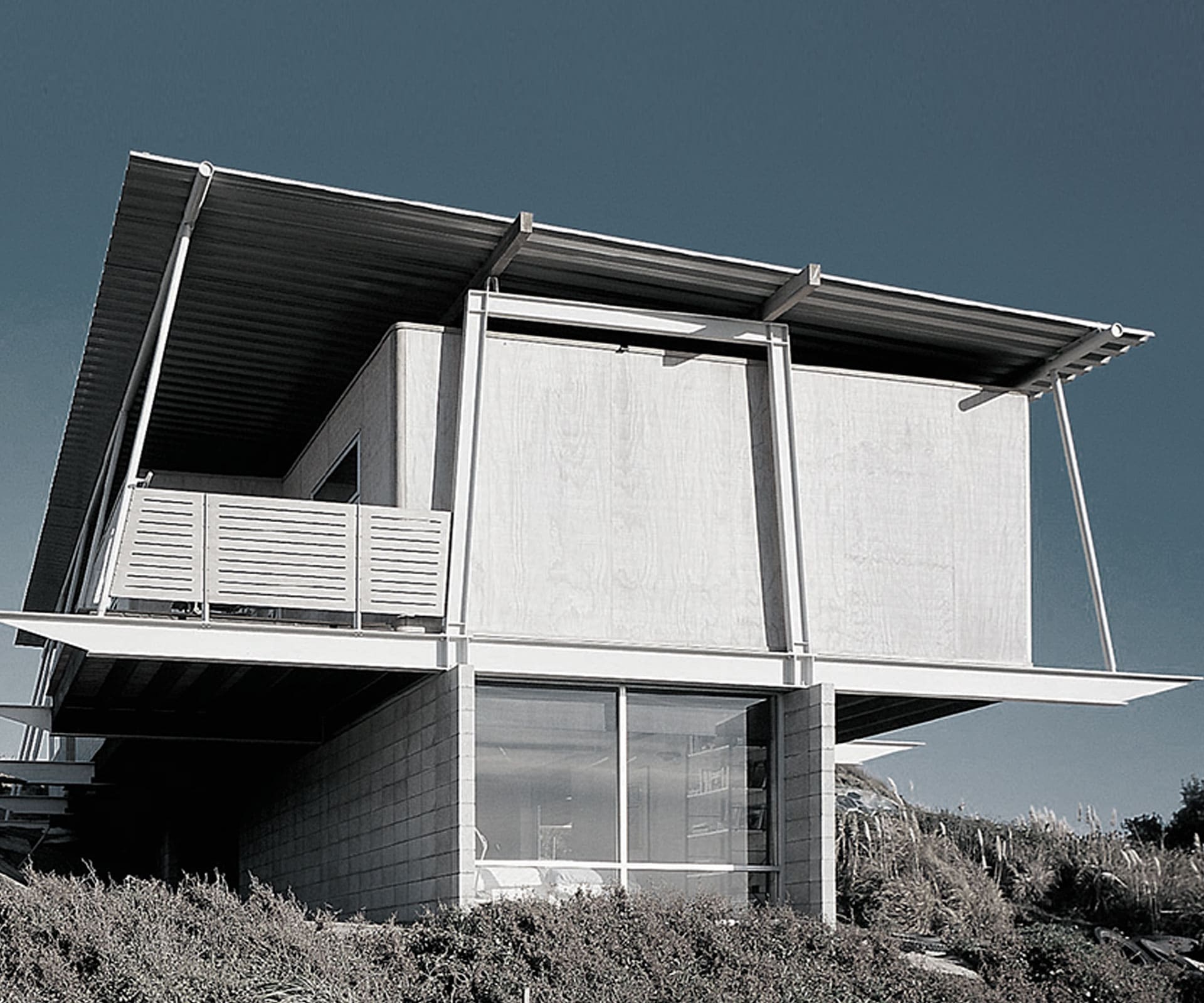
A compact, container-inspired home in the Peka Peka dunes
National suffered its worst-ever election defeat. Hip-hop artist Che Fu took home album of the year at the New Zealand music awards. The Euro was officially introduced into Eurozone countries. And a house in Remuera by Nicholas Stevens, yet to join forces with Gary Lawson, was named the 2002 Home of the Year.
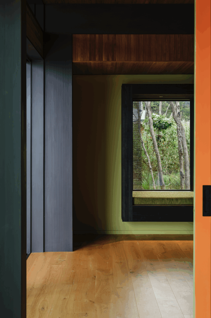
The finalists included a house in the sand dunes at Peka Peka, north of Wellington, by Architecture Workshop’s Chris Kelly. The owners had lived on the site in a shipping container for a few years, and wanted to keep that elemental connection to the dune environment, so the house featured two pods on an upstairs deck – one for living, and one for a bedroom.
“Sarah and John, the original owners, felt the simplicity of container living was more nuanced in the house design,” says Kelly now, “though it still had that direct environmental connection – especially crossing to the pod bedroom in a storm!”
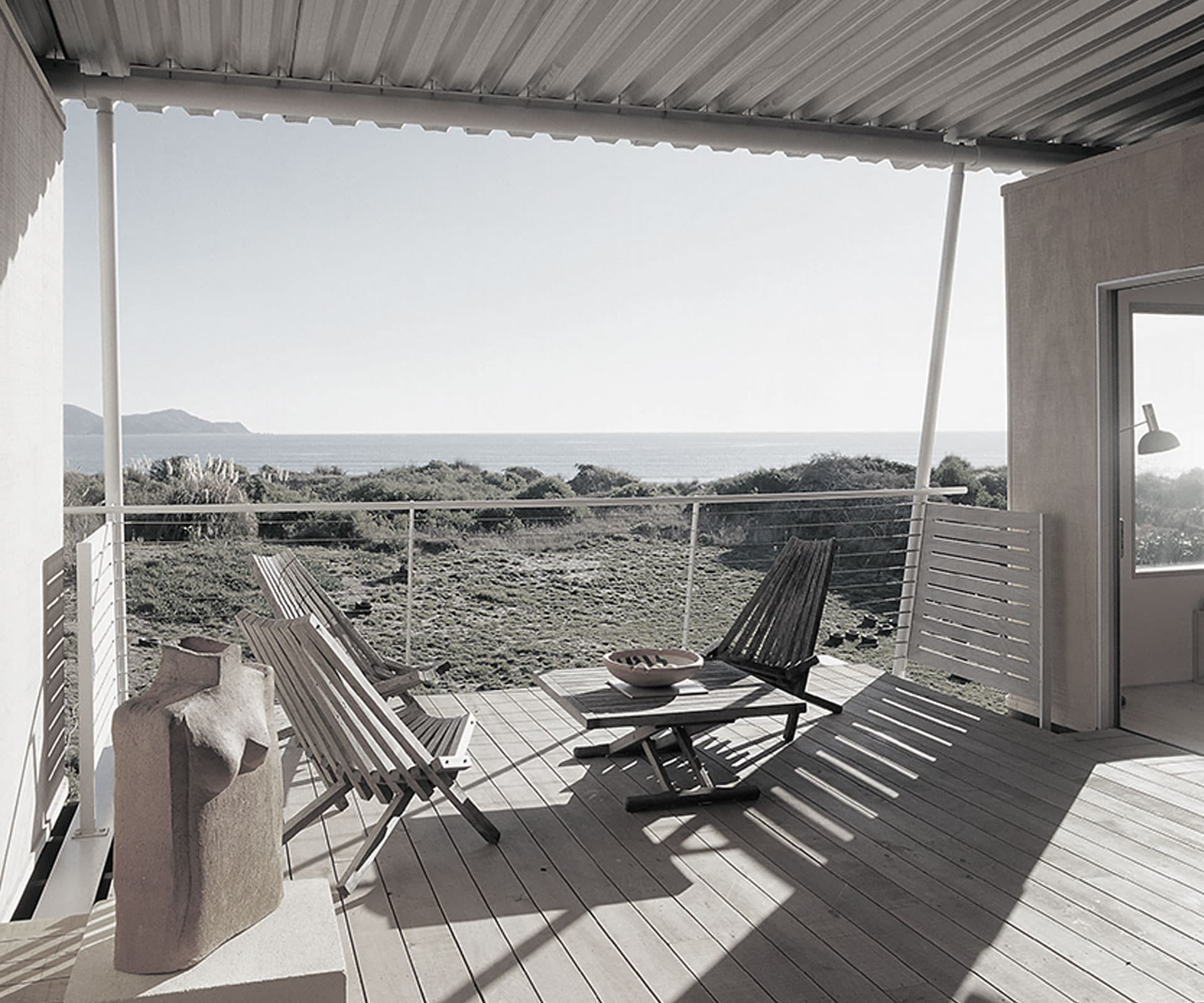
The dunes are an important part of the experience of the house – how did you integrate them into the design?
In the initial idea, the frames that hold the roof and the pods were positioned on the dunes so you could look out over the top – like a lifeguard lookout. In the final construction, this was replaced by a block wall base to enclose a separate bedroom and bathroom downstairs.
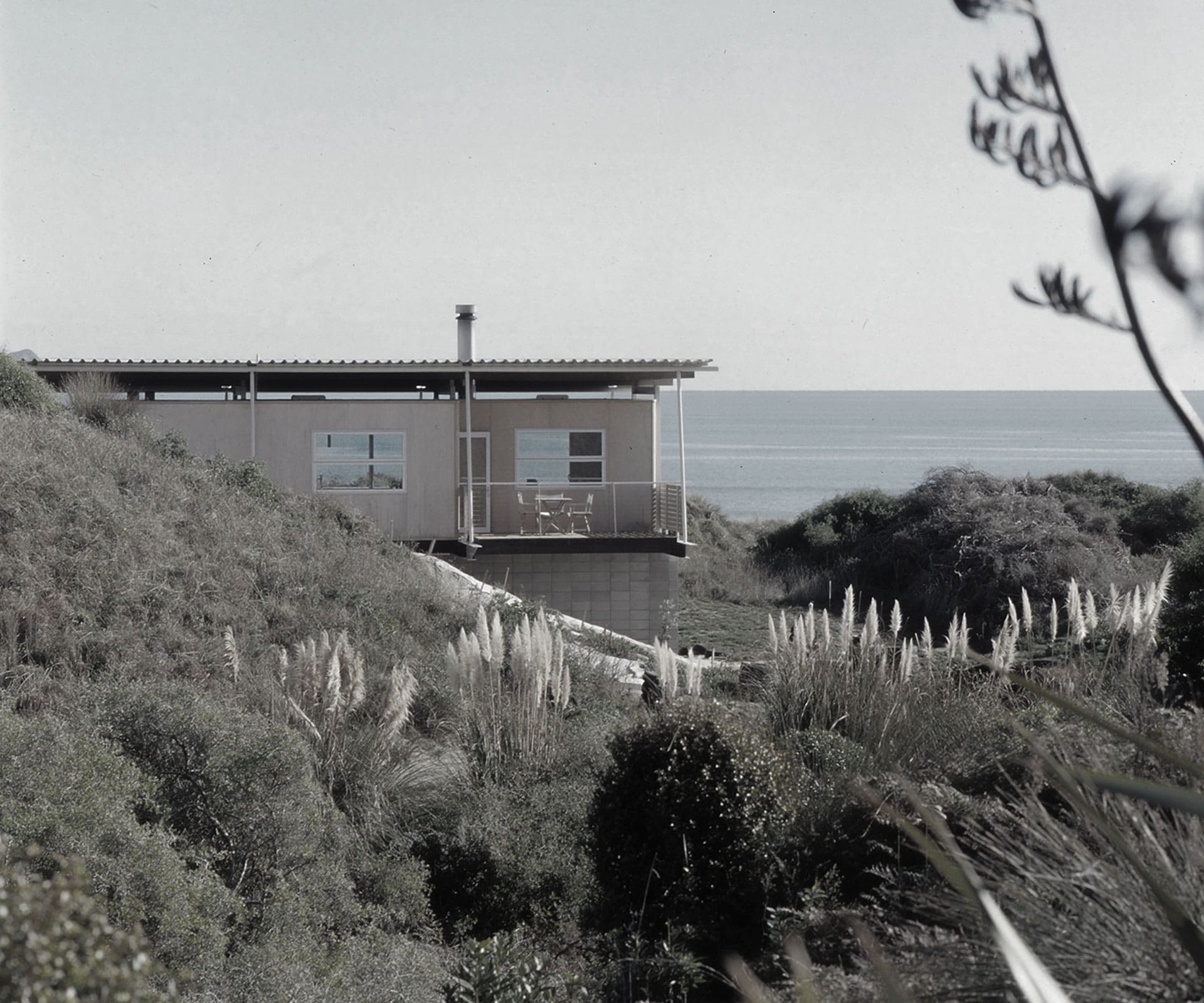
It was a particularly clear-eyed idea for brave clients. Did you take anything from it into future designs?
As a practice we have always explored ‘pulling the pieces apart’. It helps to separate materials and make details more legible. In this case, rather than transition directly between inside and outside through the width of a wall, we tried to extend this experience. You can see similar ideas in other projects of the time and since.
Peka Peka is a tough environment. How did the design deal with that?
It’s an extreme marine environment, especially when the nor’wester starts to howl. The materials were left raw, and we used a deep aluminium profile for the roof so it would weather on both sides – helped of course by regular fresh-water hosing.
Former editor Claire McCall is now a freelance writer and editor who still contributes to this magazine. She toured the country with judges Simon Carnachan and Sydney-based Ian Moore.
Judging the awards was my favourite time of year. Dashing around the country in the company of architects gave me a much greater understanding of the subtle layers of thought behind architectural ideas. It’s one thing to see photographs of a home or study a plan, quite another to experience it. When architects get the spatial mastery right, it’s rather magical. Spending time immersed in discussion about what were undoubtedly New Zealand’s best-designed contemporary houses was inspirational, as well as seriously good fun.
I started to realise how much of an architect’s own character and sensibilities were woven into the homes. It becomes real, rather than just a concept you pay lip service to. After several years working as editor, I swear I could, given some time to explore a house, make a stab at who had designed it – and mostly be right.
Nic Stevens has a quietly contemplative style that was evident in the winning home, newcomer Andrew Lister (married to film maker Niki Caro) delivered a well-choreographed street-smart design for his glass-artist client, and Thom Craig’s Christchurch entry (two minimalist forms of superb clarity) was as sharply executed as his dress sense.
Finally, only the late Gerald Melling could dream up Wellington’s Skybox. He was an architectural poet with dry humour and a healthy disrespect for convention and authority. Having coffee with him and Allan Morse, as Allan analysed my star sign and Gerald’s face settled into a knowing half smile, is one of those unforgettable little moments that I will always treasure.
[related_articles post1=”3371″ post2=”68221″]

