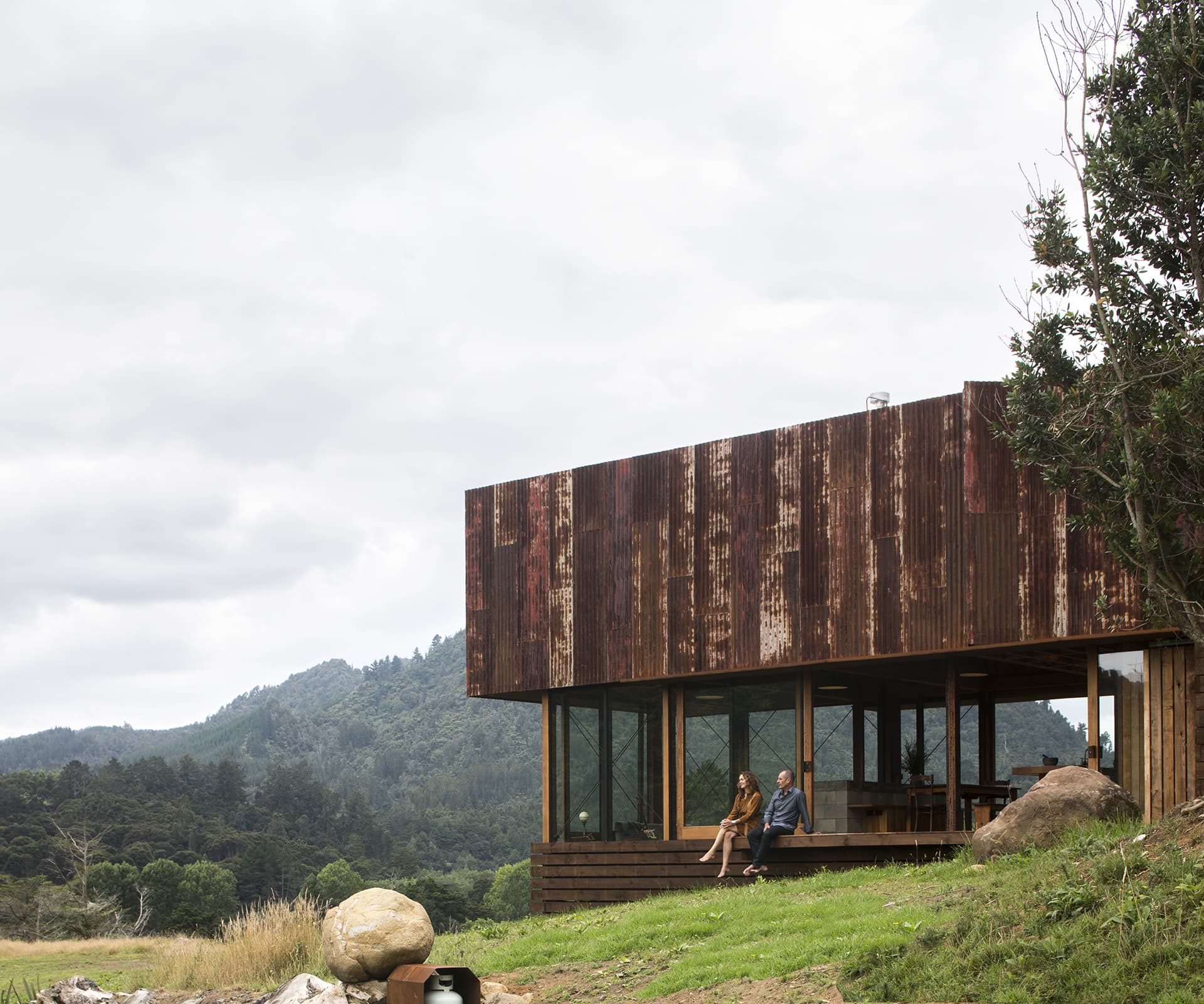
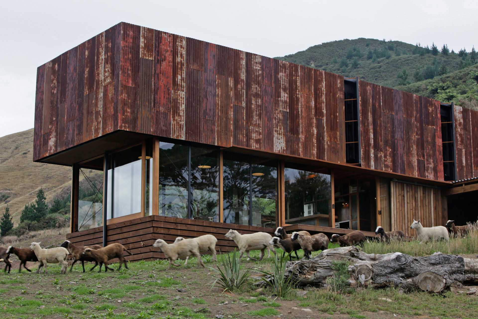
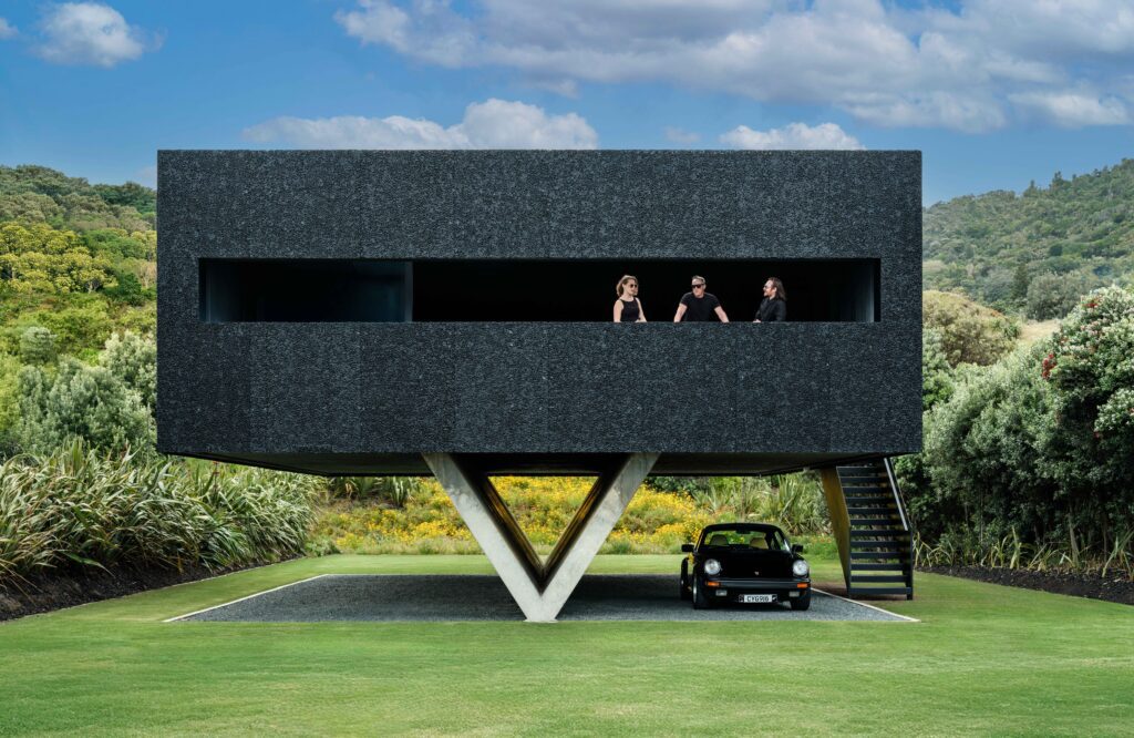
Tucked away in a valley on the Coromandel Peninsula, the 2016 Home of the Year by Herbst Architects combines rusty allusions to local farm buildings with a proudly contemporary form.
[jwp-video n=”1″]
Coromandel corrugated iron home breaks with convention
In some ways, it was an unusual brief. It asked for “humble and basic” home and expressed a desire for bunker-like solidity. Its location, on a small farm in a valley on the Coromandel Peninsula, meant it required a woodshed and a place for wet raincoats and muddy boots. The brief expressed enthusiasm for the interiors of old shearing sheds and materials that were “cracked, rusted, scratched, bashed”.
The owners, a couple who work in the film industry and retreat to the Coromandel for long periods between projects to plant trees and vegetables and tend their animals, wanted one main bedroom and a small additional one for guests. Their brief to architects Lance and Nicola Herbst had photographs, including one of a large windowless shed clad entirely in rusted corrugated iron, and two interior shots of a simple timber bach that the Herbsts had designed years earlier.
The bach in those photographs was located on Great Barrier Island; its earthy simplicity was one of the reasons the owners of the home on these pages approached the Herbsts. But this new project wasn’t a case of the Herbsts ordering up more of the same.
The husband-and-wife team have become well-known for their mastery of lightweight timber baches, assemblages of feathery, diffuse, intricate structures intent on dissolving the boundaries between inside and out. This home is an entirely different proposition: a solid, resolute, blunt-edged form that could be described as agrarian brutalism.
The stark contrast to the Herbsts’ previous work is entirely deliberate and marks the beginning of a period of “active disruption” of their customary approach to designing homes. “We just felt the need to come at things from a slightly different angle,” Lance says.
They’ve made a great start. The Home of the Year 2016 is one of those rare buildings that make you catch your breath when you see it, either in photographs or in the distance as you round a corner on the winding valley road that offers a first glimpse. It combines graphic impact with down-to-earth practicality, a big architectural gesture with low-impact modesty.
[quote title=”The home is a big architectural gesture…” green=”true” text=”It looks simultaneously ancient and contemporary.” marks=”true”]
It looks simultaneously ancient and contemporary. It proves how thoughtful architecture can enhance a beautiful landscape and the sense of connection to it. The owners mention a recent evening when they hunkered down in the living room and watched a lightning storm rage up the valley around them. “It’s a visceral house,” one of its owners says. “You can experience nature on a really visceral level. We love being on the land, and the house doesn’t shut us away from it.”
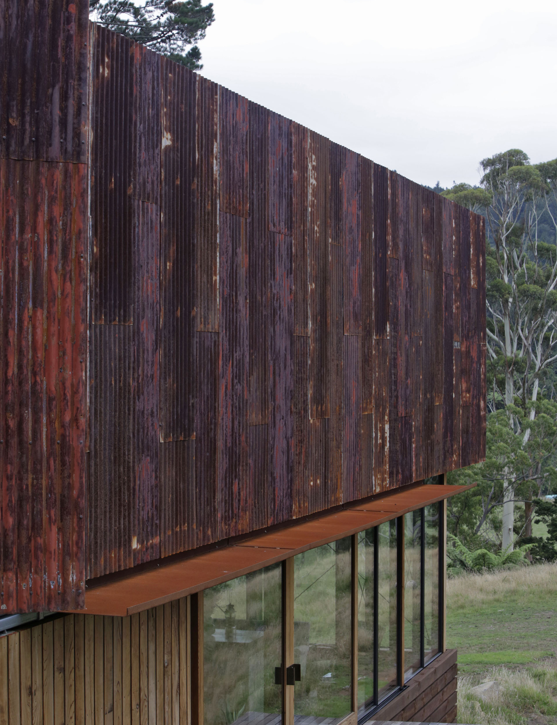
The dramatic gesture of that upper-level skin of recycled rusty corrugated iron was inspired partly by the owners’ brief, and also by a clutch of ancient farm sheds a little further down the valley. Of course, many New Zealand buildings have emulated these vernacular forms, but the Herbsts eschewed the conventional gabled-roof tribute and took a more oblique approach. They noticed how the absence of windows in the old sheds helped them acquire an abstract sculptural power and applied this approach to the home, levitating the rusty skin above the main living floor and refusing to puncture it with windows.
To do so would have reduced this mysterious skin to domestic scale, adding an element of banality to something beautiful. Instead, thin slits in the iron allow narrow linear views down the valley from the top floor, while the main bedroom and bathroom upstairs open to the rear of the property through full-length sliding doors. It may seem perverse to block valley views from the top floor, but the home’s interior doesn’t feel as if it lacks them.
[related_articles post1=”44283″ post2=”44157″]
At the top of the long driveway, the 115-square-metre home starts out anchored to the earth: the ridgeline was cut and replaced by a retaining wall that backs the lower level. The deliberately casual ground-floor entry is a covered, open-air space with a beautiful floor of sawn pine logs and serves as a wood store, a place to hang coats and boots, and somewhere for the dogs to shelter. At one end of it, an outdoor fire doubles as a barbecue and offers a place to sit and admire the view.
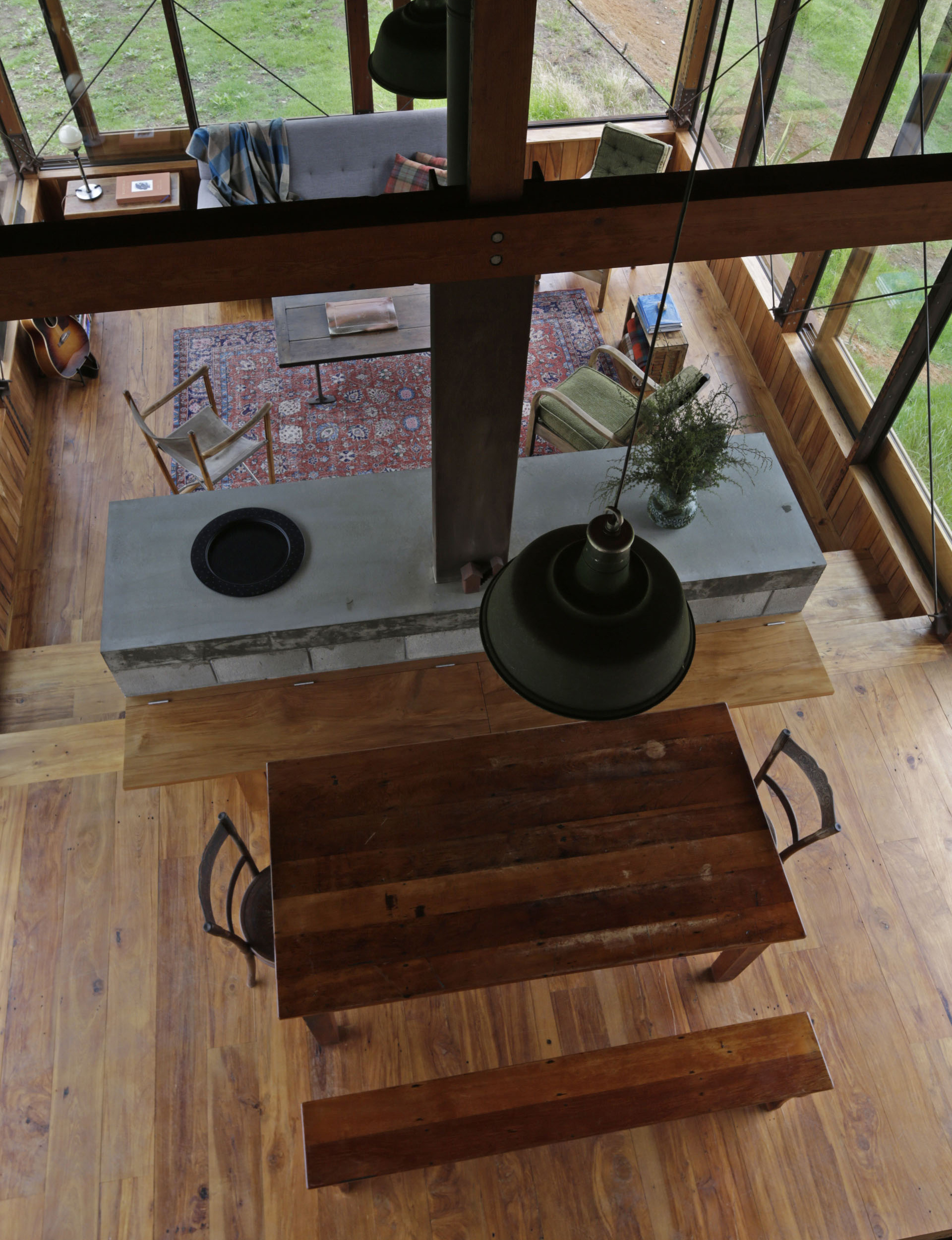
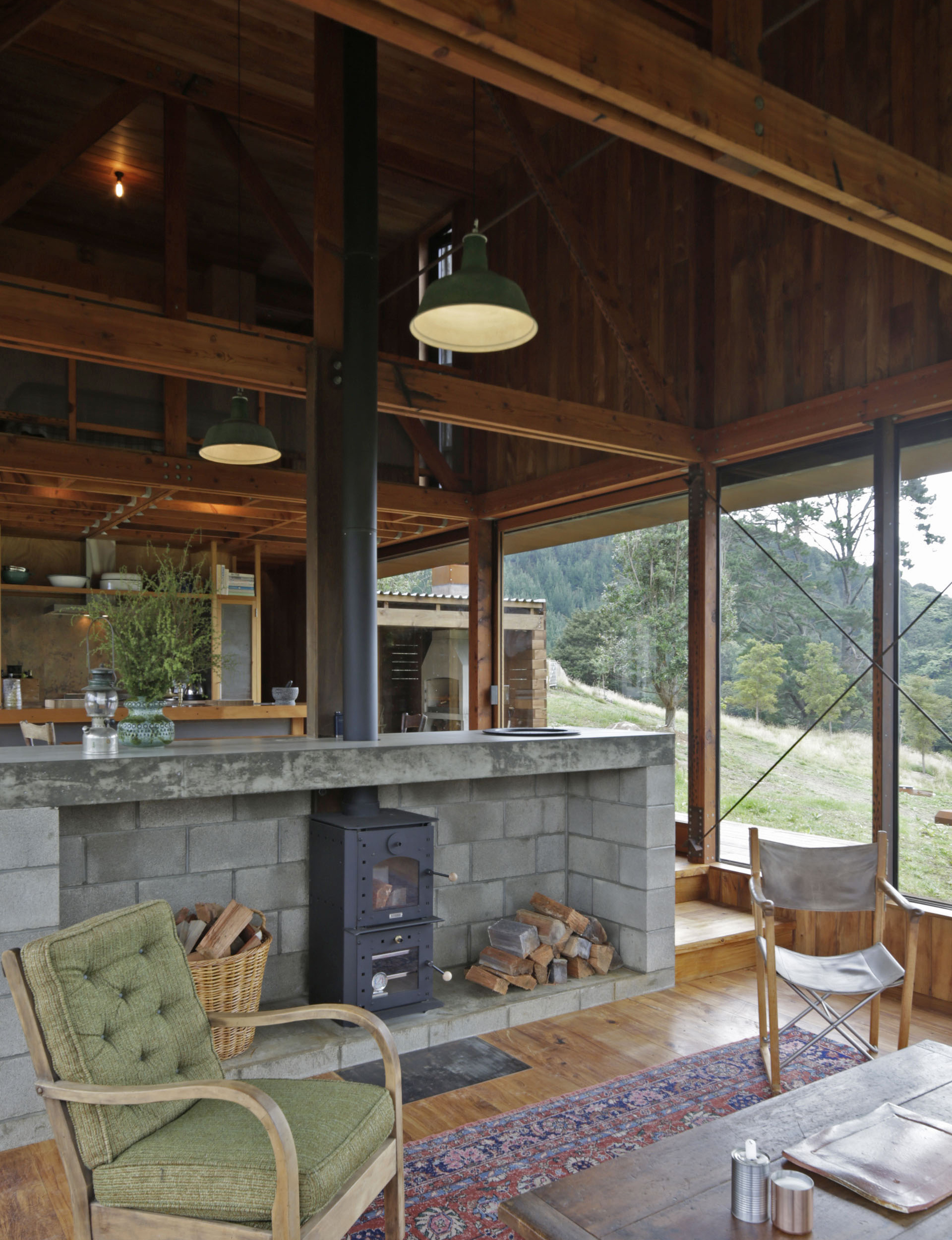
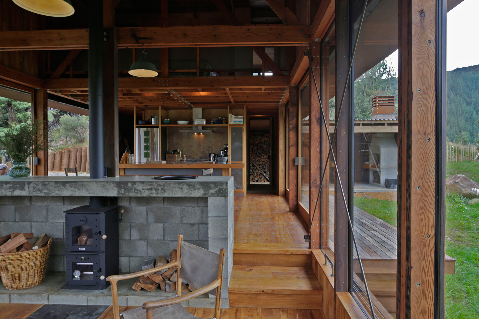
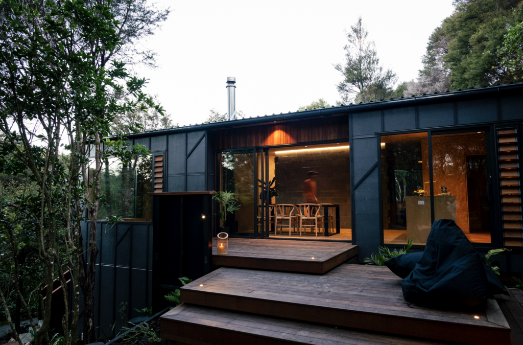
Inside, a service pod holds a little bathroom and the stairwell on one side and a pantry and laundry on the other. The kitchen and dining space are a simple linear arrangement of bench, island and table, with cabinetry made from industrial materials by Kirsty Winter. Doors on both sides of the kitchen and dining area open to small decks. The sitting room is two steps lower, where the view is cropped into a horizontal 270-degree panorama up and down the valley. “It became very apparent early on to crop the foreground and sky so you get that intensification of the panorama,” Lance says.
[quote title=”” green=”true” text=”Because of the weight of the box, which levitates above the glass pavilion below, you’ve got an intimate and enclosed sense of comfort.” marks=”true”]
Looming high above is the hollowed-out interior of that rusty iron skin, criss-crossed by Oregon beams and lined in recycled rimu. The Herbsts have long talked about the need for every home to have a secure space with a solid wall to shield your back while you enjoy the primal pleasures of a blazing fire.
Here, though, their aim was to create that feeling not with a solid wall – the sitting room is surrounded by windows – but by utilising the mass of the ceiling volume hovering above. “Because of the weight of the box, which levitates above the glass pavilion below, you’ve got an intimate and enclosed sense of comfort,” Nicola says.
[jwp-video n=”2″]
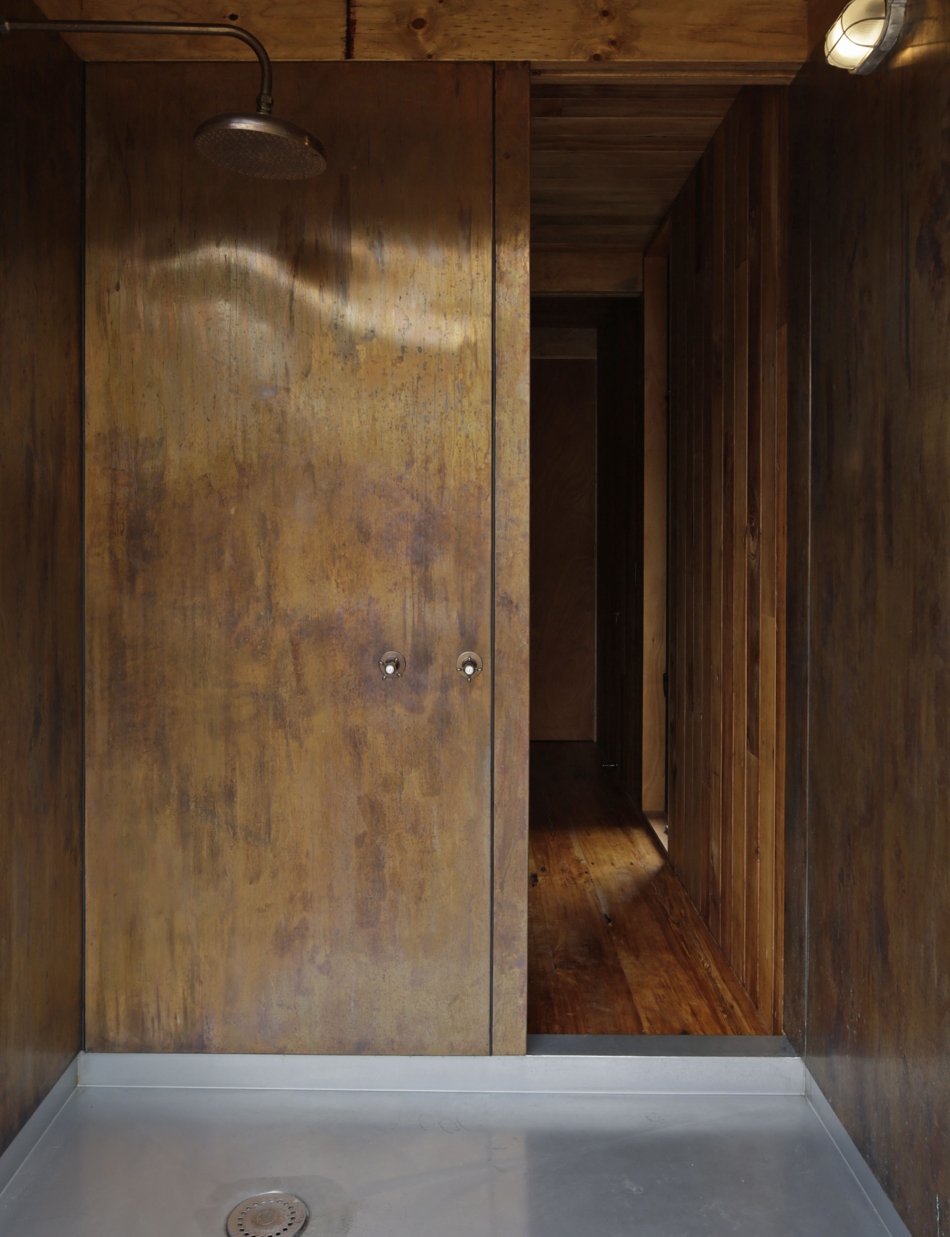
The home is full of rustic, muscular details. A large concrete fireplace anchors the sitting space and rises to form a backrest for the bench beside the dining table. Doorhandles, taps, coat hooks, bathroom basins and many other elements were sourced secondhand. The kitchen splashback and the shower are lined with copper panels that were deliberately aged by artist Louise Purvis. The valley is sometimes blasted by strong winds, so rusted, criss-crossed steel bracing reinforces the living room windows.
The corrugated iron on the exterior was sourced from a building in Thames and carefully removed by a contractor, then aged by builders Doug Fleming and Paul Oxford for use on the new home. About 60 percent of the home’s materials are recycled, and new ones were treated so they acquired a patina of age. The overall effect is suitably bucolic, with an authenticity that means it never feels like it’s striving for a particular style.
Much of the Herbsts’ earlier work is notable for its attention to the smallest details. The home they designed at Piha that won this magazine’s Home of the Year award in 2012, for example, is highly crafted, with patterned timber screens and intricately detailed cedar. The home on these pages, while beautifully built, doesn’t have the same aspirations.
Lance recounts a conversation with the Indian architect Bijoy Jain of Studio Mumbai about “the tyranny of craft”, and how an obsessive focus on refined details can obscure the search for what Lance calls “the poetry of buildings, and their presence in the landscape in a positive way”.
This home represents an exciting sort of liberation for the Herbsts. “The more we’re asked to do different building typologies, the more we feel free to use different modes of expression,” Lance says. If strong, poetic buildings like this are the result, then we can’t wait to see more of them.
Words by: Jeremy Hansen
Photography by: Patrick Reynolds
[related_articles post1=”1367″ post2=”45999″]
