A family-centric, semi-courtyard home with an internal, slow, staggered reveal takes pride in its privacy and as an entertainment mecca.
Among the hordes of documents that needed to be created, triple checked, and duly filed during the design and build of this house, there are two little wish lists written on school stationery.
The first — perfectly double-spaced, big letters conscientiously written with a blue highlighter — begins: “Dear architect, I would like this in my new house,” followed by an impeccable show of good manners: “please if you can.”
The second one: blue-lined paper on an A6, staple-bound notebook, has been annotated with a well-sharpened pencil. Some corrections are still visible: “I win like,” has been changed to, “I would like,” and numbers 11 and 12 on the list have been crossed out, boldly relieving the architect of any further obligations.
These little-client requests go from the understandable: “I would like a shelf in a wall,” and “a wall painted green,” through to the slightly more ambitious: rugby, netball, basketball, soccer, cricket fields, a home theatre, and a dancing area in a four-storeyed house. Then, there are also the truly whimsical: “I would place play kitchen inside fridge” — ice-hotel magnate in the making? — and, according to the lead architect, Brad Bonnington of Bull O’Sullivan Architecture: “diving boards from certain elements of the house into the pool!” (not likely to choose a career in resource consenting).
“It was [done] to get everyone engaged from the outset,” says Brad of the impetus for the lists his office tends to request from anyone likely to live in any new house of the company’s design, “and have a real, family-driven process.”
And yes, one gets the feeling that this, the ‘family’ component of the pre-design process — its dynamics, spatial predilections, and individual personalities — went on to influence a great deal of how this St Heliers home was conceived.
“When we summarised what we took out from the brief … based on the clients’ background, it was around entertaining and privacy and a layered approach,” says Brad, “which meant that if you were entertaining in one area, the kids could have their own space.”
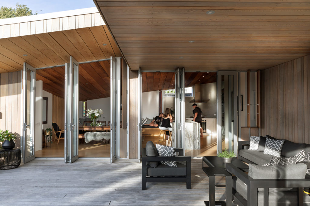
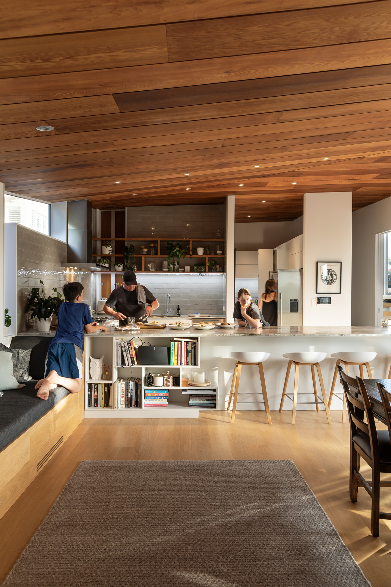
Since the grown-ups here are quite involved in the food and hospitality sector, the kitchen and areas to entertain were crucial.
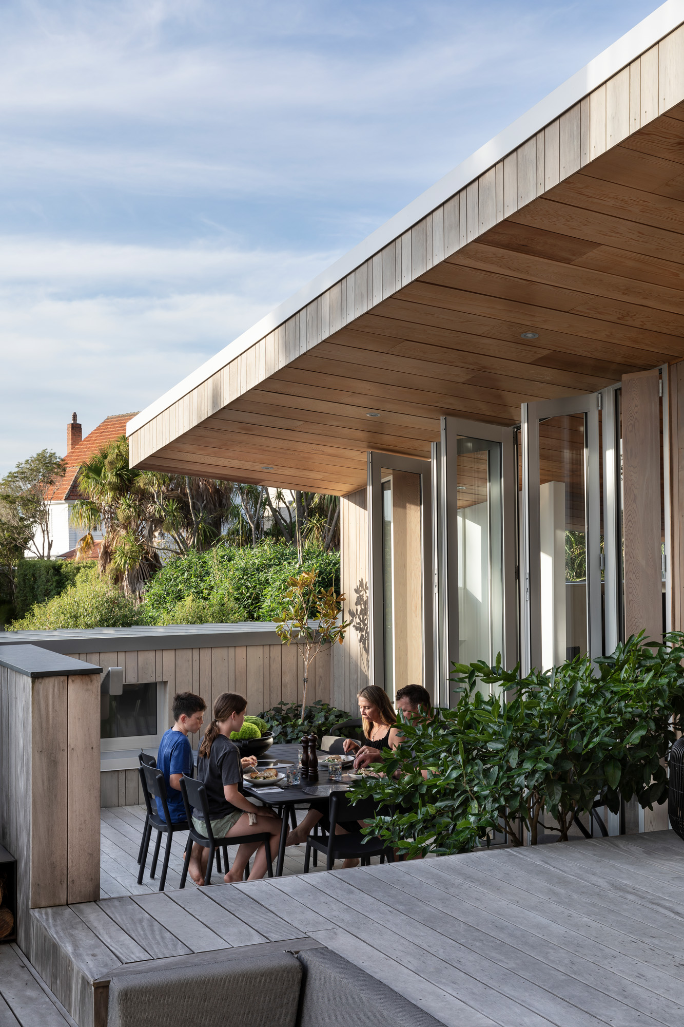
“Through the process, we got sent this picture of a pizza oven,” says Brad, referring to a ‘Large Oven’ from The Kiwi Outdoor, which, due to its size and design, became a central component of the external courtyard design. “Lots of questions were [asked] around how we put that oven into an entertainment area. In doing that, we placed it around a sunken seating area, recessed into the deck, with all that access from the kitchen and main dining.”
This courtyard was placed smack in the centre of the site, with the kitchen and dining areas bordering it on two sides, while the other two are composed of kids’ bedrooms and a swimming pool.
Since the house occupies a sloping site, with neighbours directly to the east and west, the architects knew that, to maximise light and ensure privacy, they needed to follow the land’s down-slope contours, flushing social spaces against the highest, western boundary.
“It is quite a steep site from street-side down [towards the north] and with both neighbours quite close,” says Brad, “so we didn’t want to breach any height relation to boundary. We staggered the home down the site and, in the process, allowed light to filter into each of the lower spaces.”
This division also ensured that both the big, interior kitchen and the outdoor oven had plenty of sight lines from all social spaces — guaranteeing a convivial cooking experience.
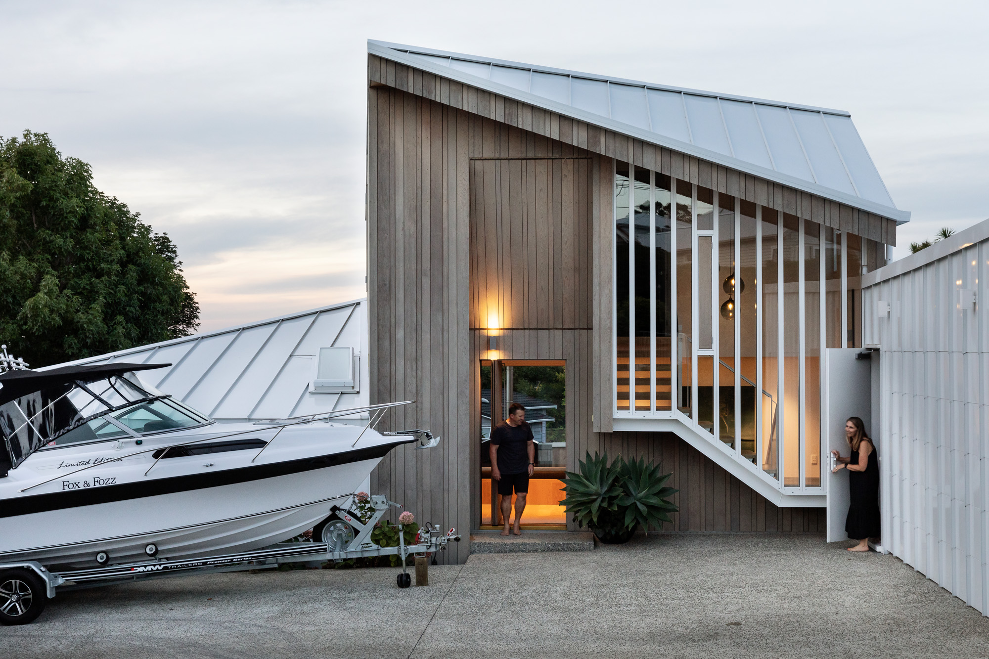
The street-side facade and the eastern boundary were used as privacy buffer zones. The former is composed of three distinct forms: a garage and the exterior roofline of the pool house — both wrapped in standing seam, in white to match the dominant palette of the street — plus a central, double-height entrance, which, like the rest of the house, is clad in random-width cedar (from JSC Timber Merchants) that wraps into the soffit.
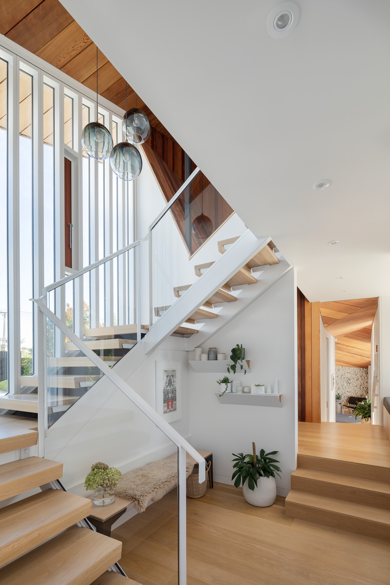
An internal staircase has been cantilevered here, its aluminium and glass skeleton rupturing through the timber yet still looking congruent by the verticality of its white shutters. The only glimpse one gets of the interior, from this angle, is that of a simple internal staircase with a few dark pendants dangling from above.
There is an inherent beauty to the sharply folded rooflines here: part paper plane, part relaxed bach, yet reminiscent of good old-fashioned architectural models, which allowed all involved to prototype and experiment with angles and a touch of sculpture.
“We did a lot of physical modelling,” says Brad, “first a general concept one then a 1:50 model to figure out structure rather than form.”
From this process came a simple but interesting gesture: “Instead of recessing the front door, or keeping it on the same line as the facade … it was a nice gesture to pop it up” — a gently inclined plane runs from roofline to front door. Inside, the Bull O’Sullivan signature, timber-clad ceiling follows that same external contour above the door in a shape and slope that has tactility to boot.
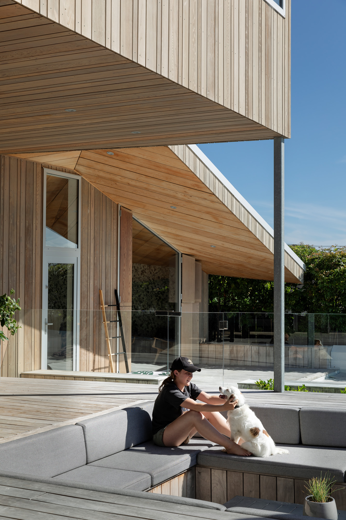
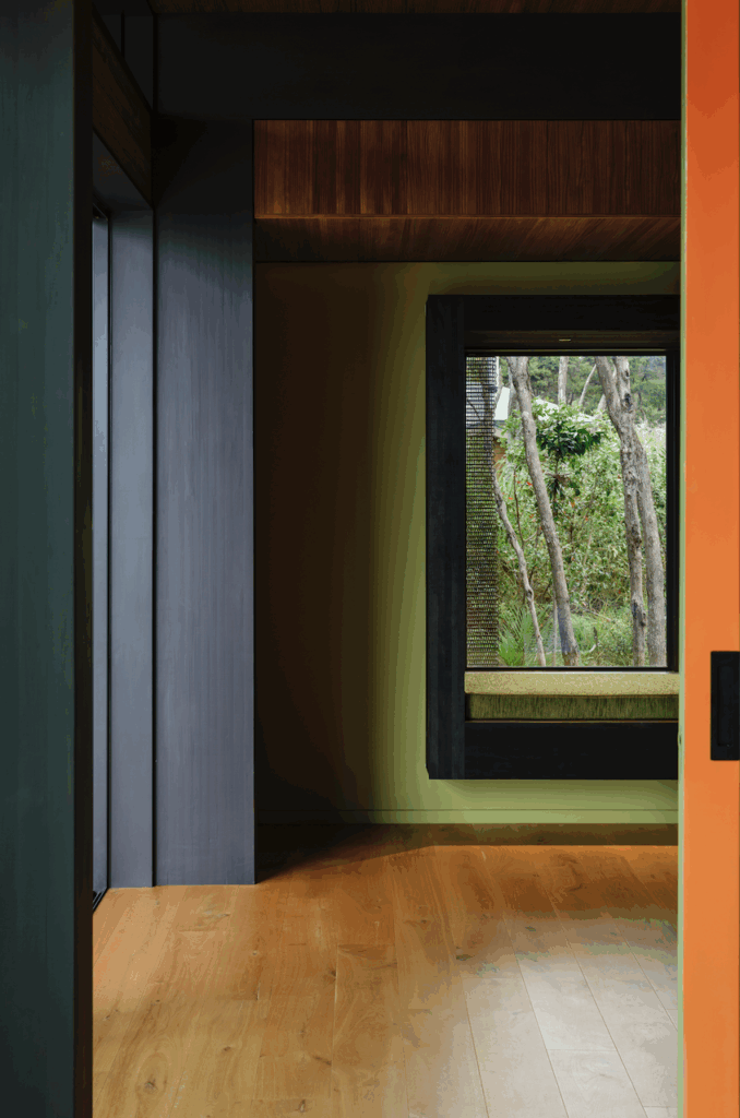
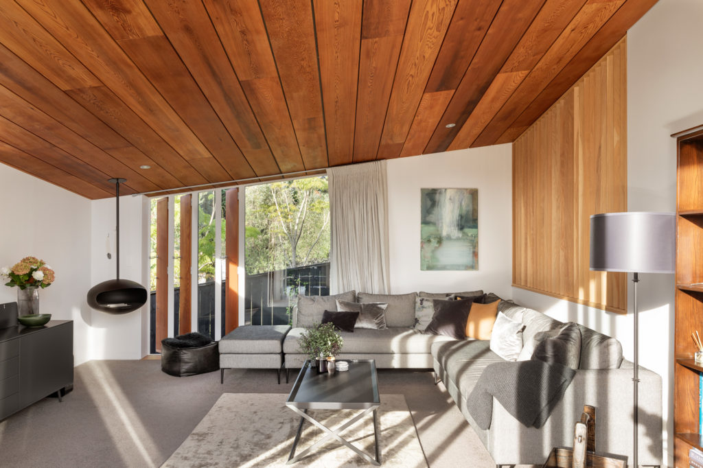
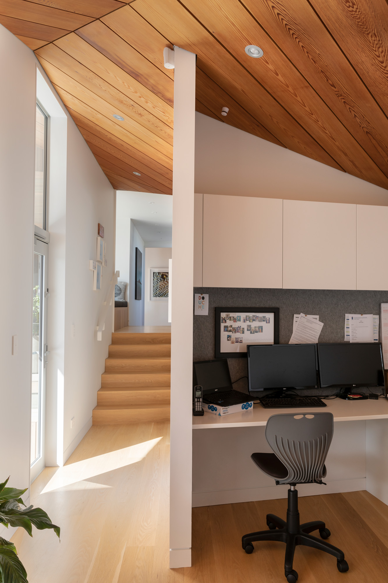
That privacy imperative so apparent at the front of the property also means that, once a guest goes past the threshold, the house unveils in a slow but somewhat dramatic reveal. Should you choose to go upstairs — in a fairly compressed space — you’ll find only the main bedroom (37 square metres) and its corresponding sea, city, and Rangitoto views. Should you go deeper, there is a window with an inbuilt seat and the inviting and unexpected central courtyard.
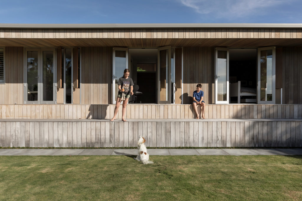
Lower down the property, kitchen and living are staggered in the same downward steps; at the lower portion of the property is the children’s wing. They did get their movie-watching room in the end. Outside their large glazed doors is an amphitheatre-styled seat and deck structure bordering “their play area — a large green space [and] the last few times I have been there,” says Brad, “there has been a large cricket [batting] net.”
A set of stairs leads to one of many landings that are used as impromptu dining spaces, for table tennis decks, and, one can imagine, as perfect stage sets for hide and seek or even dancing. This is followed by the swimming pool — sans rooftop diving boards — then back to the circularity of the courtyard and the recurring gestures of family life.
As for the in-fridge play kitchen? That might take a little more convincing of both the parental and architectural powers that be.
