HOME and Fisher and Paykel’s annual Design Awards shine the spotlight on New Zealand’s best new designs. We reveal the winner and finalists for 2017
[jwp-video n=”1″]
Design Awards 2017 winner
‘Newton’ espresso
By Hayden Maunsell and Alan Neilson
What started as a conversation between a designer and engineer has resulted in a stripped-back, sculptural manual coffee press developed with the New Zealand home and bach in mind. Former mechanical engineer turned designer, 31-year-old Hawke’s Bay-based Hayden Maunsell worked with Alan Neilson, a toolmaker by trade, craftsman and engineer, to support his passion for coffee and express his desire for quality design.
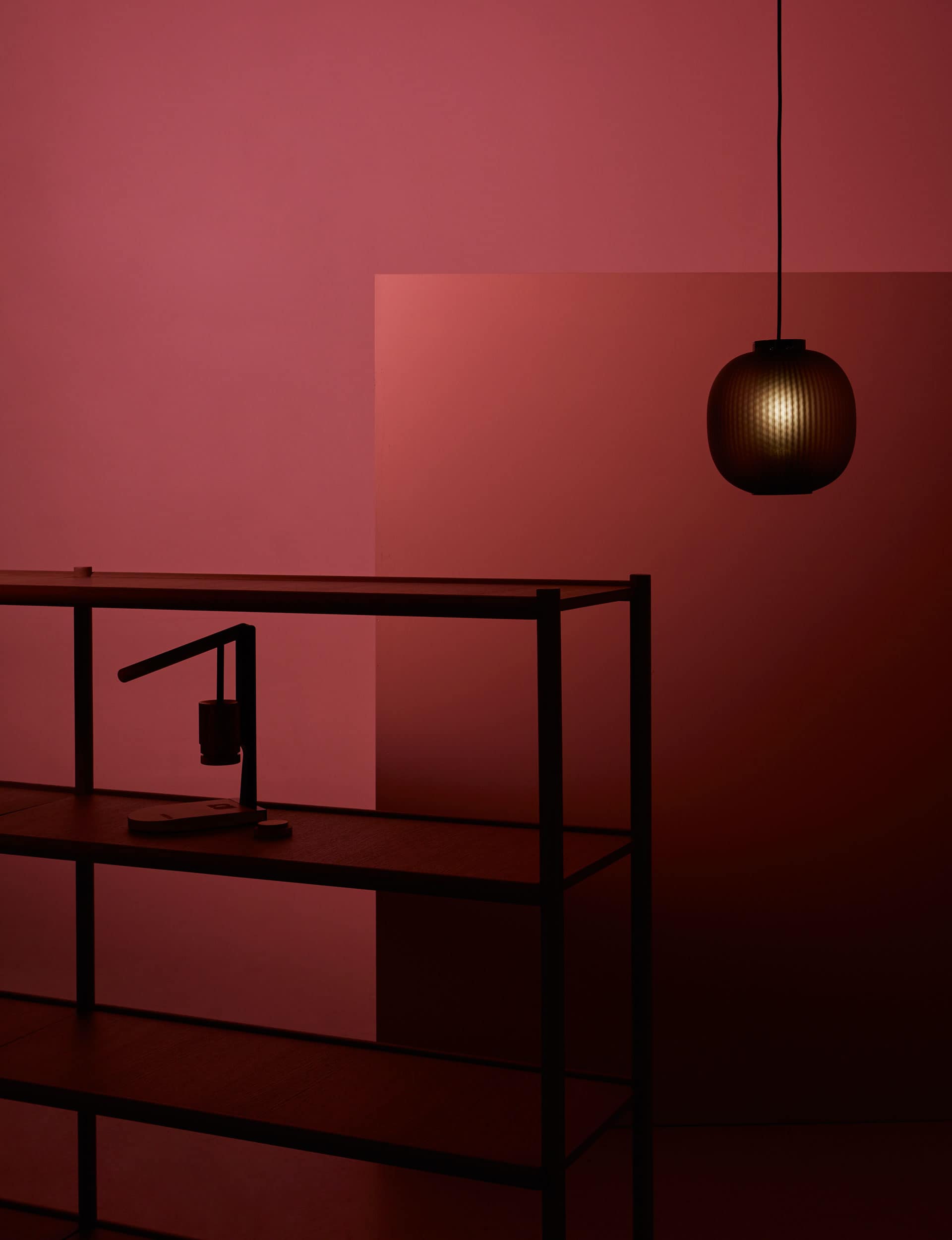
“The aesthetic is free from visual disturbances and surface decoration with visual cues that clearly and simply communicate what the Newton does and how it’s used,” says Maunsell of the benchtop press that’s also wall-mountable and easily transported. “We’ve achieved this through an honest combination of materials, texture, colour and form.”
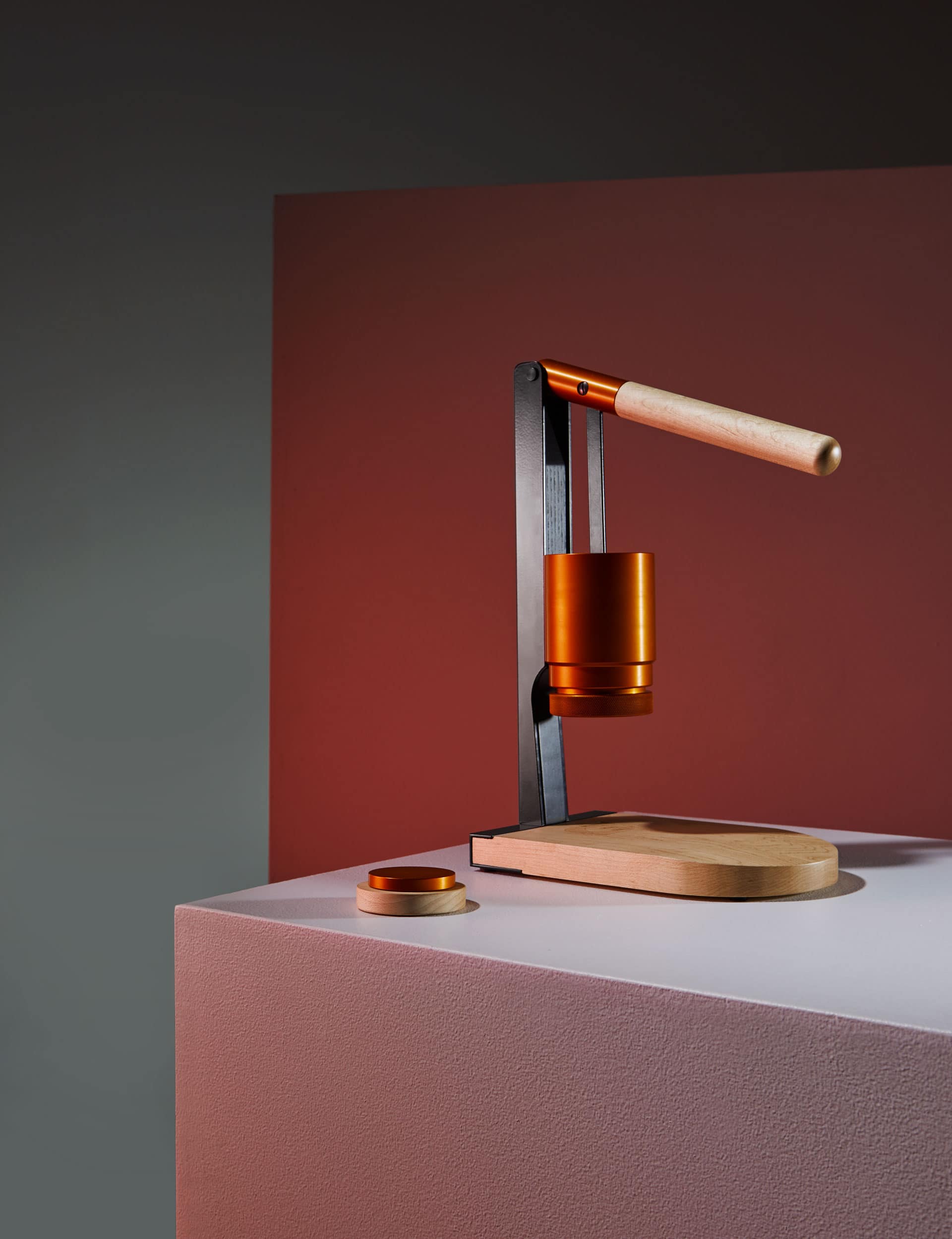
The design was resolved after many prototypes that refined the marriage of handcraft with CNC production. “Everything I’ve designed to date has been for a student project,” says Maunsell. “The ‘Newton’ is the first design without the politics of academic institutions getting in the way.”
$580
newtonespresso.co.nz
Design Awards 2017 finalists
‘Circus’ light
By Scott Bridgens, Simon James and Francesca Cutfield for Resident
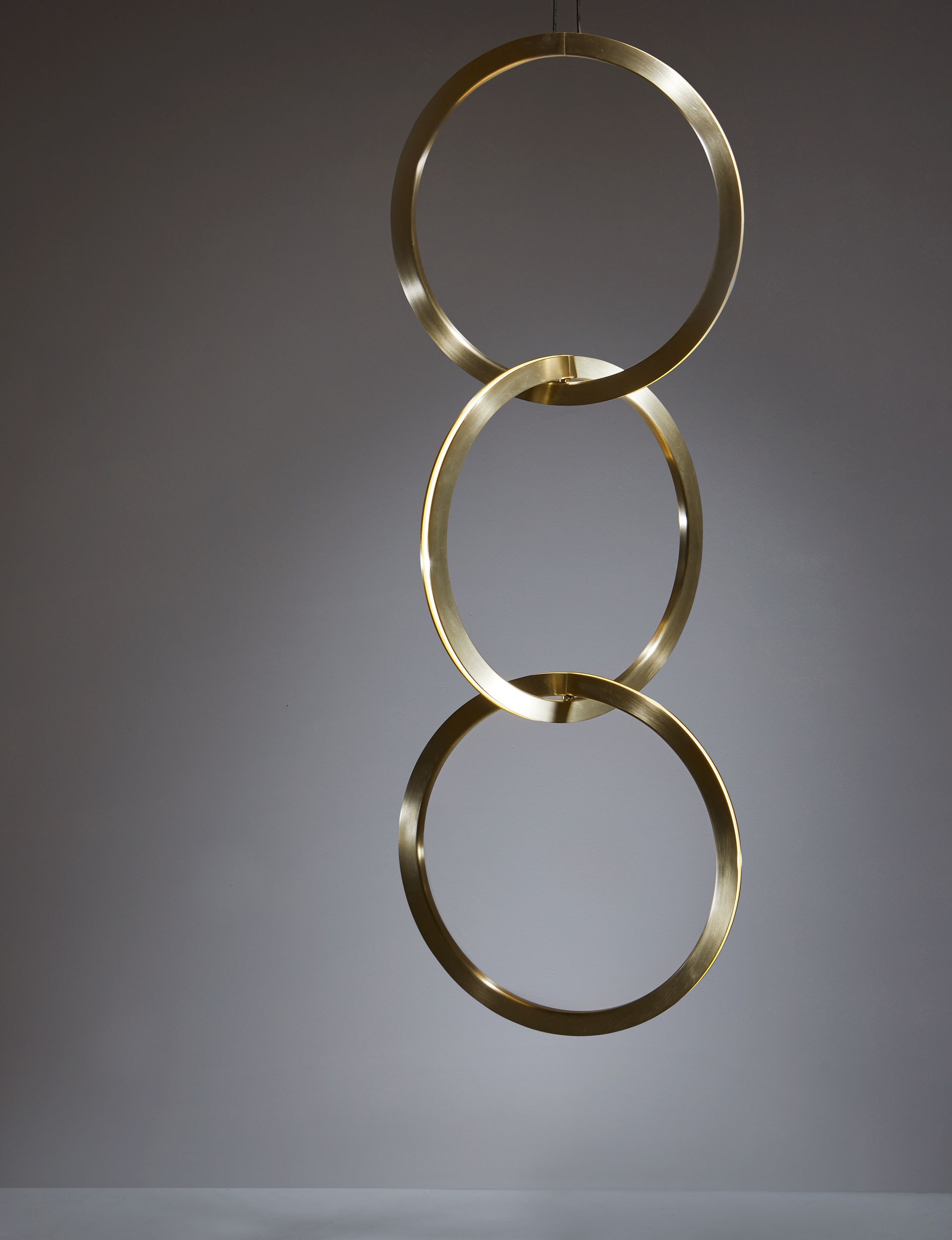
“‘Circus’ is a remarkable system of interconnected rings that can be arranged in sequence to create a striking vertical decoration,” says Simon James. The design evolved from exploring new opportunities afforded by LED lighting, in particular the safe sharing of a low-voltage power supply between objects.
“We consider the ability to use a plug-and-play system to build lights of different scales to suit different spaces as revolutionary. It gives the user a fundamentally new product option – they’ve never had such freedom.”
Each brass ring projects an elegantly diffused LED light outwards to a 360-degree plane. The theatrical system applies to commercial and residential environments and its two sizes (500mm and 750mm) can be combined.
From $4700
simonjamesdesign.com
‘JWB’ armchair
By John Dinsdale and Gary Backhouse
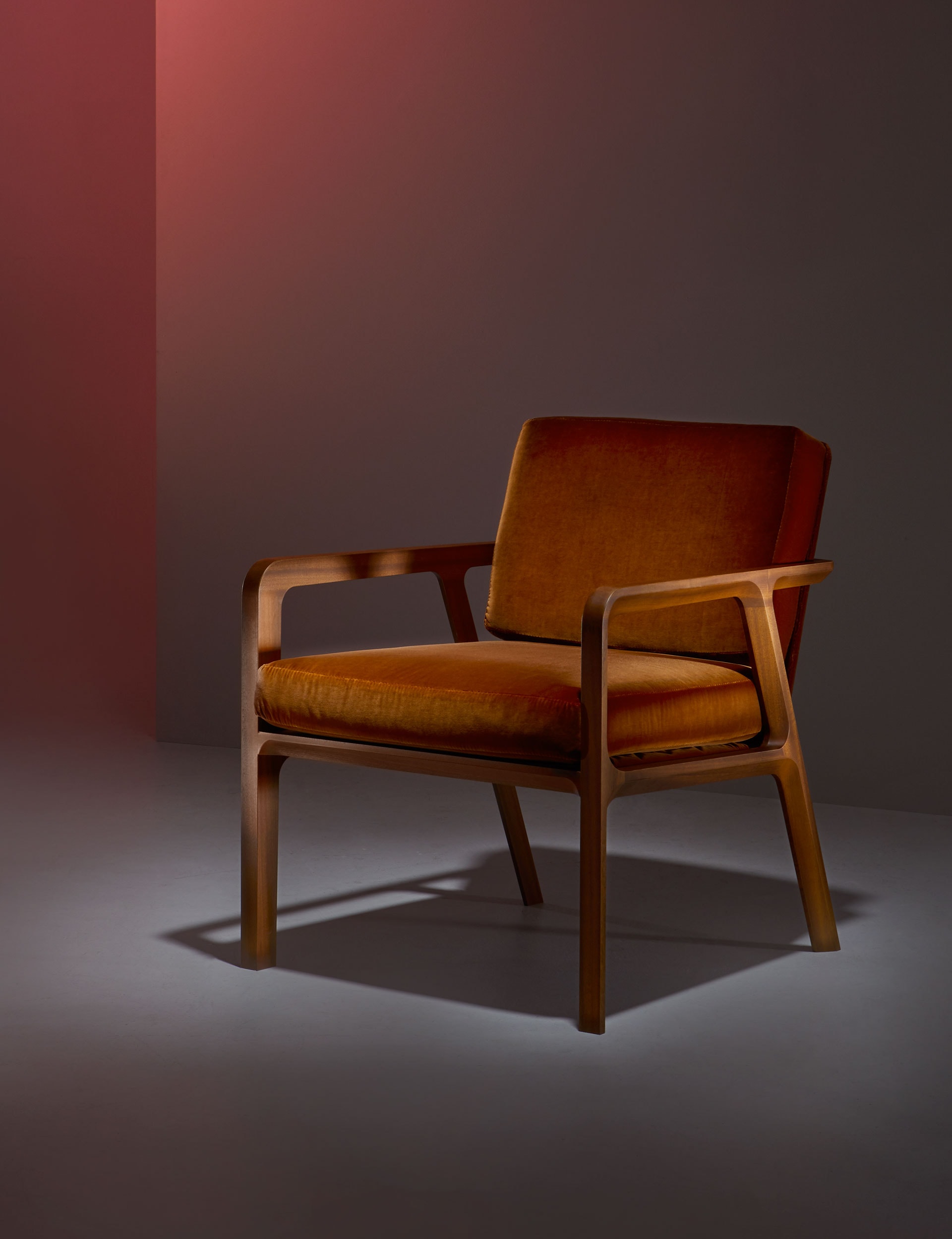
The ‘JWB’ armchair pays homage to the legacy of Backhouse founder Joe Backhouse, the longevity of his designs and his love of timber. “We wanted to reference the aesthetic of the furniture Joe created, without directly recreating the previous mid-20th century designs,” says Gary Backhouse, Joe’s son.
‘JWB’ is a modern timber chair, rich in heritage but made with modern machinery. “Joe loved timber, especially mahogany, rosewood and teak, so it was an obvious choice to use solid timber, including ash, oak and sapele mahogany,” says Gary. “It’s about honesty and integrity in design. Dad would have approved.”
$2700
backhousenz.com
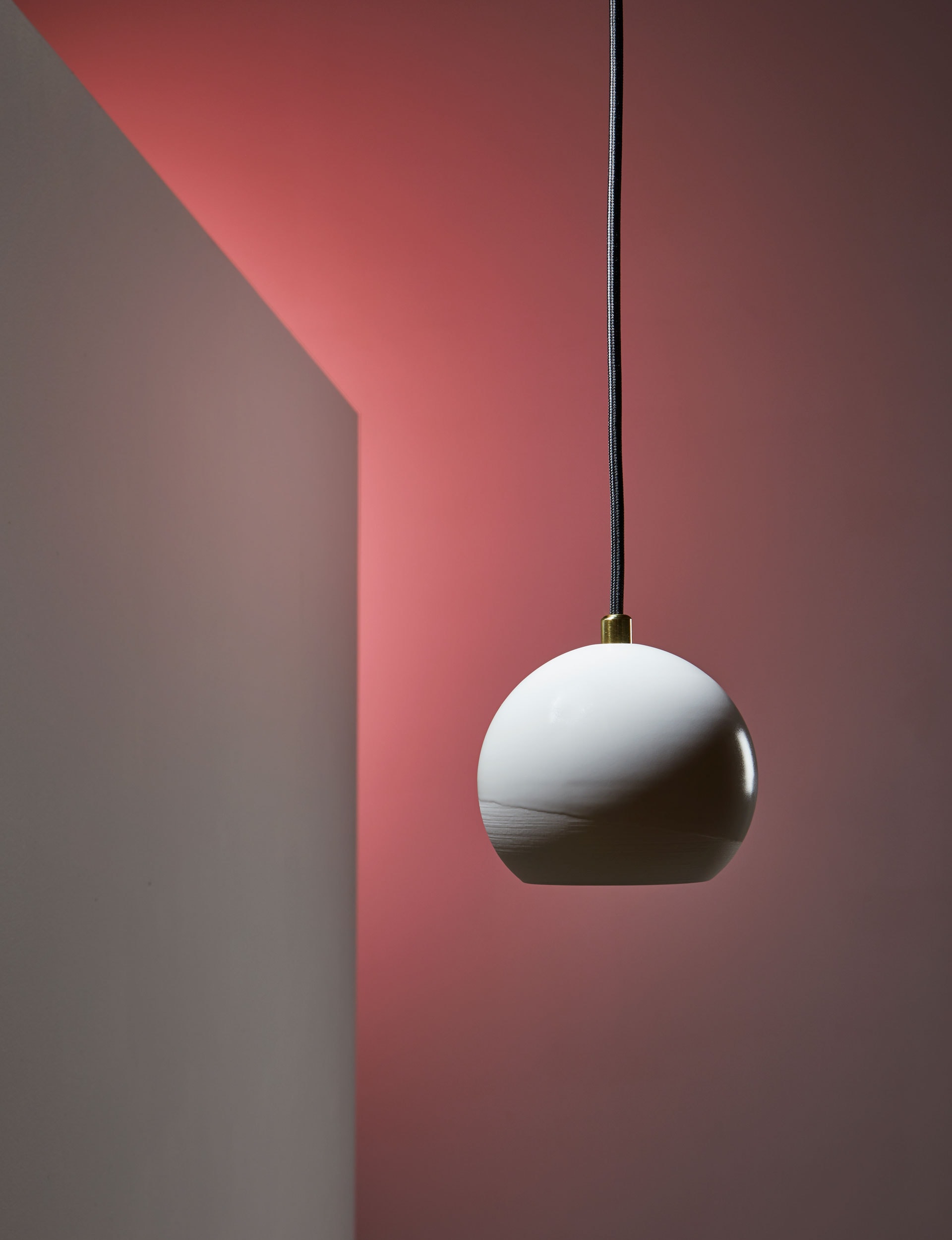
‘Pure’ light for Phōs
By Sarah Backler
Tauranga-based Sarah Backler is an industrial designer by background, but has recently shifted her focus to designing and creating hand-cast porcelain objects. “Porcelain is a wonderful material to work with – delicate, yet strong and beautifully translucent. Combining porcelain with a light source seemed a natural direction.” Backler hand casts each ‘Pure’ light; its nuanced details are revealed with a soft, ambient glow.
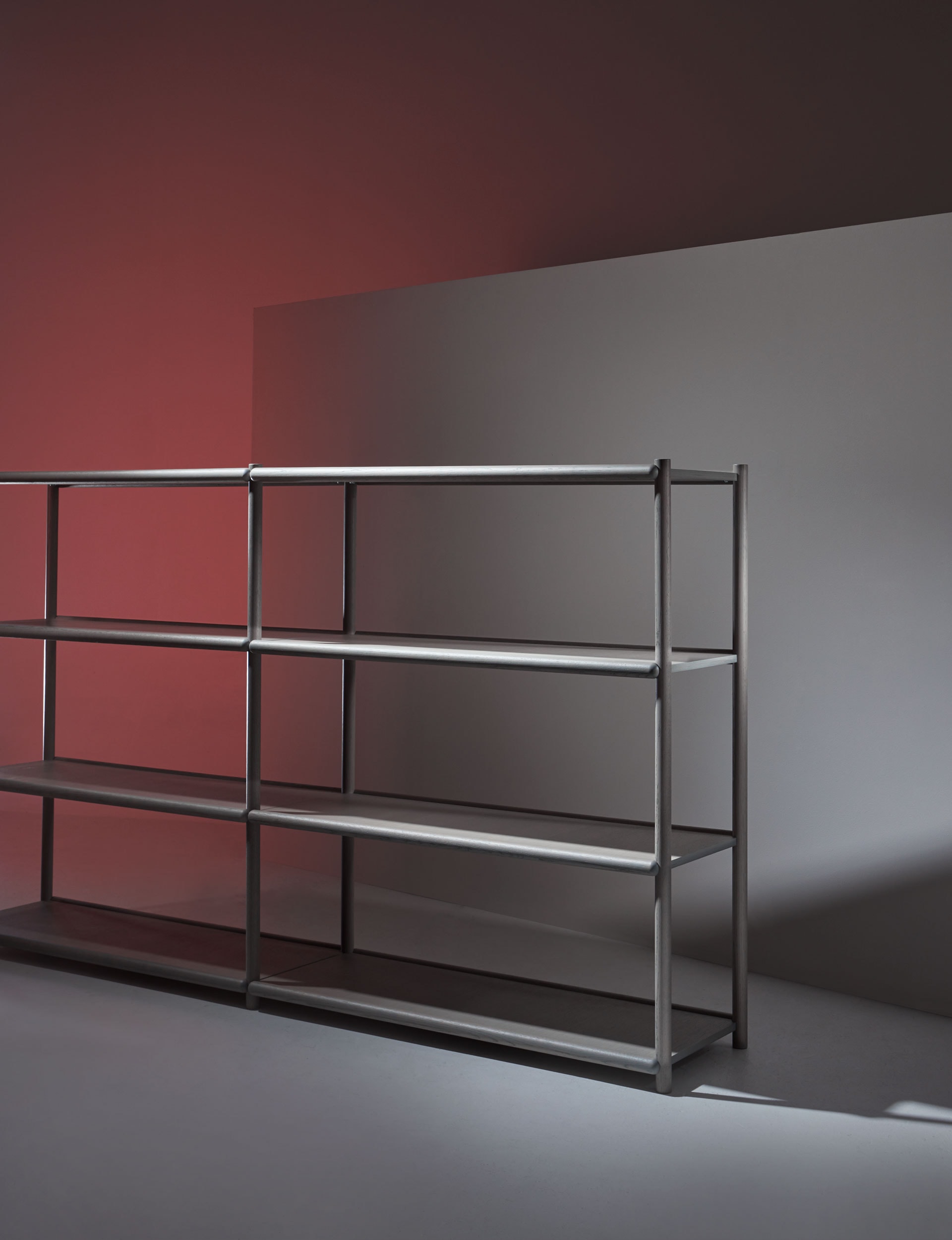
‘Raft’ shelf
By Tim Webber
‘Raft’ is the latest addition to Tim Webber’s range of approximately 40 pieces of furniture, lighting and accessories, which are designed and manufactured in New Zealand and overseas for residential and commercial markets. ‘Raft’ strives for a pared-back aesthetic, free from unnecessary structures or components. “I’ve endeavoured to create a product where the simplicity draws people in for a closer look, which reveals elegant connection and structural details,” says Webber. Instead of placing bracing beneath the shelves, oak dowels are used for rigidity.
From $1850
timwebberdesign.com
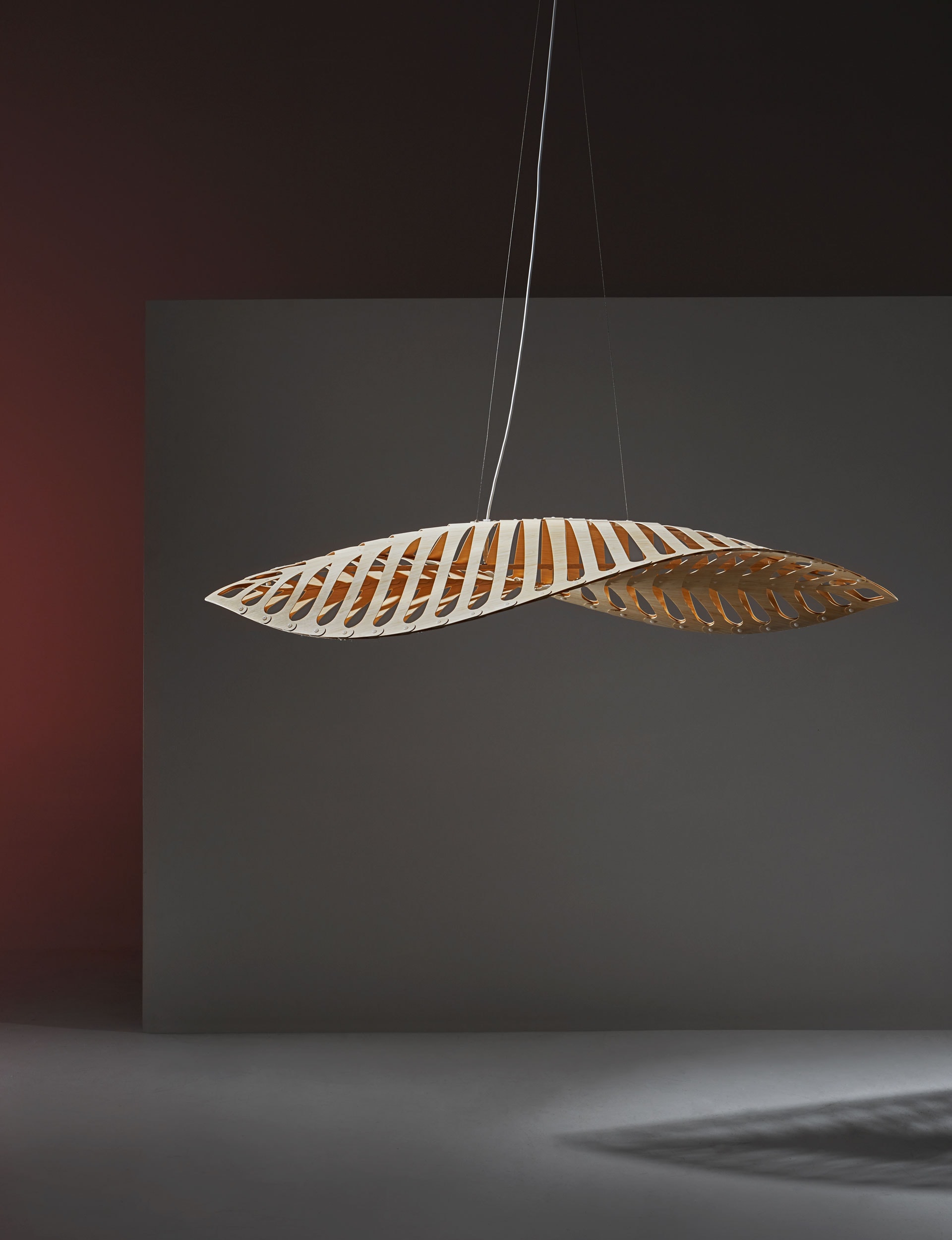
‘Navicula’ light
By David Trubridge
At first glance, the inspiration for Navicula is clear – the ocean. The latest lighting design by David Trubridge takes its form from diatoms: the foundation of the ocean’s food chain. Through photosynthesis, they liberate oxygen and remove more carbon from the atmosphere than anything else, including tropical rainforests. The CNC-cut bamboo plywood light is a timely release.
The flowing sculptural piece is illuminated by LED pin-points that cast magical patterns. It is shipped flat and assembled with push-in nylon clips.
$3623
davidtrubridge.com
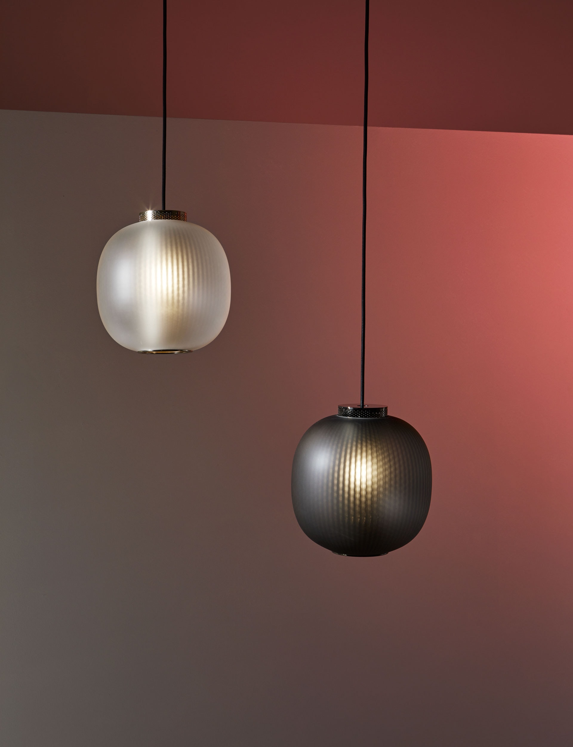
‘Bloom’ pendant
By Tim Rundle for Resident
‘Bloom’ evolved from a discussion about introducing an accessible but beautiful light to the tightly edited Resident lighting collection. It needed to be commercially viable to use in multiples, yet with an aesthetic that instantly creates an emotional response. The form is inspired by paper lanterns and combines a finely perforated mesh core and frosted blown glass to project a soft-focus texture on the shade’s interior. By contrast, ‘Bloom’ projects an unobstructed pool of light onto the space below.
$590
simonjamesdesign.com
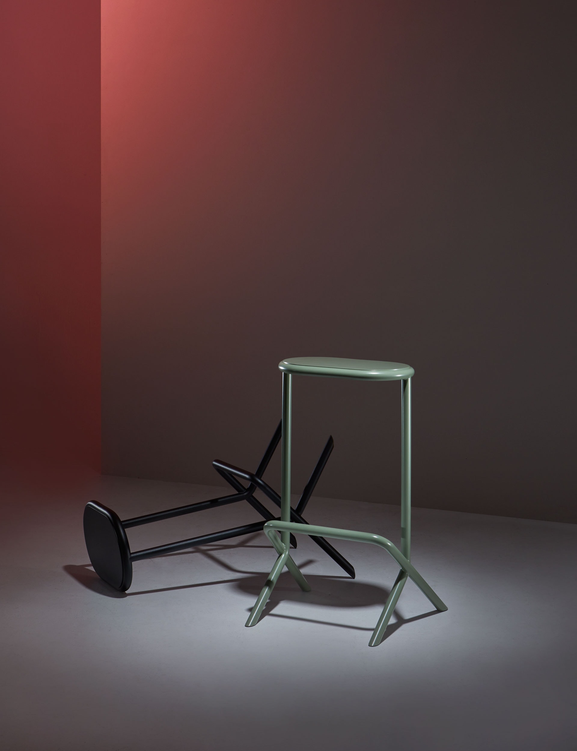
‘Platform’ stool
By David Moreland
David Moreland’s response to an everyday product combines practical sensibilities with a distinctive profile. The ‘Platform’ stool is 685mm high, placing it between standard dimensions to suit a range of people. The footrest is well-placed for shorter people; taller people can place one foot on the ground and the other on the footrest, or simply perch. ‘Platform’ balances proportion and precision with the leg silhouette showcased from every angle. “There’s a real sense of symmetry,” says Moreland. “The side profile exemplifies this with almost perfect balance, subtly dissected by the footrest.”
The judge
Q&A with Mark Elmore, general manager of design at Fisher & Paykel
What do you look for in a design?
Simplicity, beauty, enduring quality and an element of delight in use.
Looking over the finalists in this year’s awards, what ties them together?
There’s an element of design that’s fit for purpose, but also engaging and interesting to live with. They are all really suited to the type of manufacturing we can successfully achieve in New Zealand.
Why did the ‘Newton’ win? In a world full of technology and complexity with coffee makers, this is a purist design that’s stripped back to its functional elements. Everything that’s there is of a high quality and with beautiful details. It’s fun to look at and interact with.
What were your other favourites?
I like the ‘Circus’ light by Resident – it’s a great combination of clever technology and beautiful material. I also like the ‘Bloom’ pendant by Tim Rundle; a wonderful light effect with a very simple idea.
Why is it important to celebrate New Zealand design like this?
There’s a growing confidence in New Zealand design on the global stage – our design is highly awarded in other countries. It’s important to share and celebrate the great work that’s done all around us.
[related_articles post1=”76360″ post2=”75932″]

