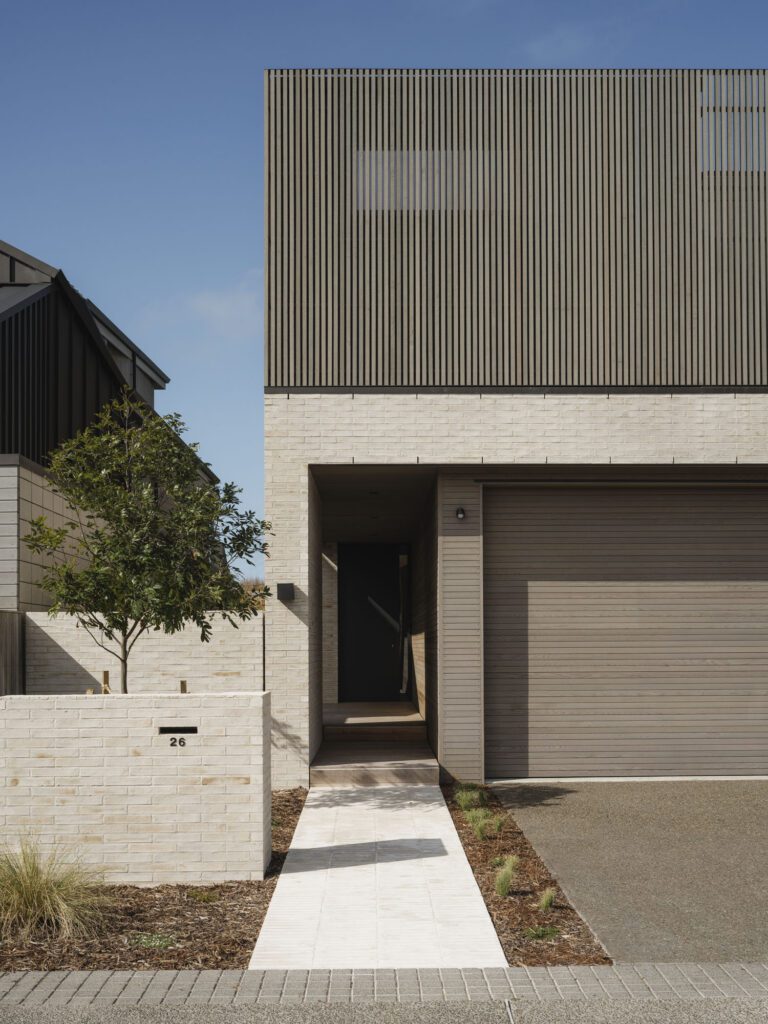
Architecture firm Glamuzina Paterson created a striking home in Matakana. Dominic Glamuzina discusses what the design process was like
[jwp-video n=”1″]
Q&A with architect Dominic Glamuzina
What are your thoughts on the tender process to secure an architect?
It’s similar to an advertising pitch. Your approach to a project changes when you have a competitor, it’s more about selling a tactic than a finished proposal and making assumptions about the intentions of your competitor. I think, in the end, we produced a design that showed how the clients could inhabit and frame the site.
How did your design respond to Mike’s hobby for cooking?
This part of the brief sent us in an interesting direction as we took the idea and attempted to push it as far as we could. We designed a garden wall armature that extended from the kitchen out into the landscape, loosely ordering all of the components of food production in a sequence that ends in a small covered folly away from the house. Unfortunately, this didn’t make it into the final design, but it generated ideas that were incorporated, with the kitchen becoming almost commercial in scale.
[gallery_link num_photos=”1″ media=”https://homemagazine.nz/wp-content/uploads/2017/05/matakanahouse.jpg” link=”/inside-homes/home-features/matakana-retreat-reimagines-rural-living” title=”Read the full story here”]
Why and how does the design differ from the original?
The original design proposed a deep roof structure which ordered the spaces of the house around courtyards and bedroom wings. The final design used an asymmetric hip roof to order the scale of the spaces, with small level changes and armatures from the original design. We also changed from using brick as a ‘weighted’ material, to looking at a way we could find weight and depth with oversized timber board-and-batten cladding.
What do you think is most successful about the retreat?
The snug is an aberration in the design, a dark sunken space that contrasts with the more outward looking rooms. It’s a textured space which culminates in a small porch mirroring the fold in the exterior façade This provides a small protected exterior room that relates back to the snug through a small slither window at its edge.
The complex geometry of the skylights was tricky for you and the builders. What was the thinking behind their design?
We wanted to find a way to give a hierarchy to the circulation in the plan. The skylights become small explosions of surface and light at points within the deep plan which articulate intersections and material conditions to highlight the axial corridors.


