The brief was to create a contemporary addition to a traditional villa for a young family
“The clients were up for something refined and highly detailed,” says AJ Sutton. “There was a reasonable brief and a few images – they wanted something modern and open plan, which on that site really means a box on the back.”
As simple as the concept seems, this project is rammed with detail; a balancing act as budget rubbed up against the desire to add something special to the three-bedroom home, while making it more liveable for a couple with two young boys.
“We developed the brief through a collaborative approach, which is really important to get clients on board,” says Sutton. “Then there’s a natural evolution through the design phase; even when we are on site there can be a few client-driven changes.”
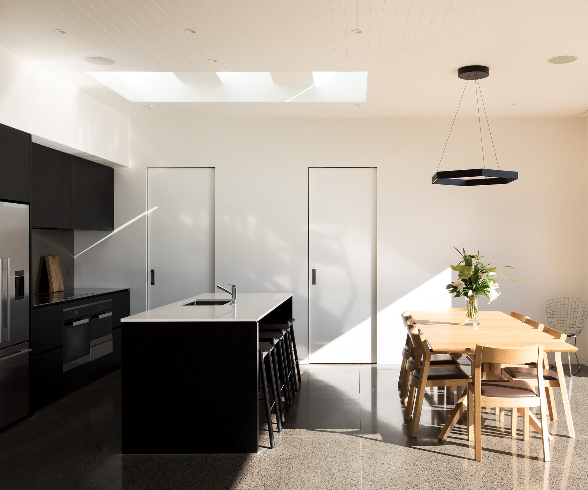
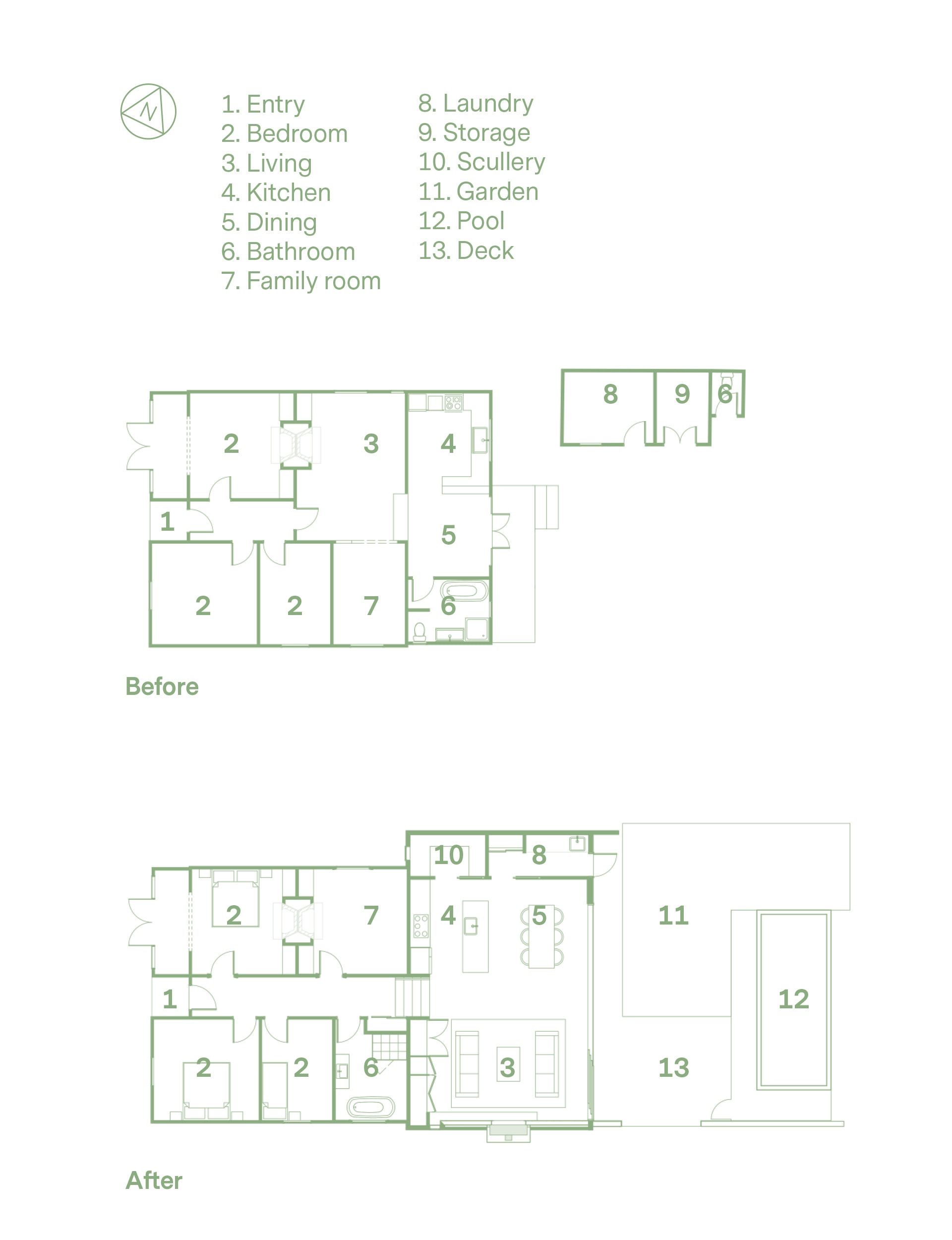
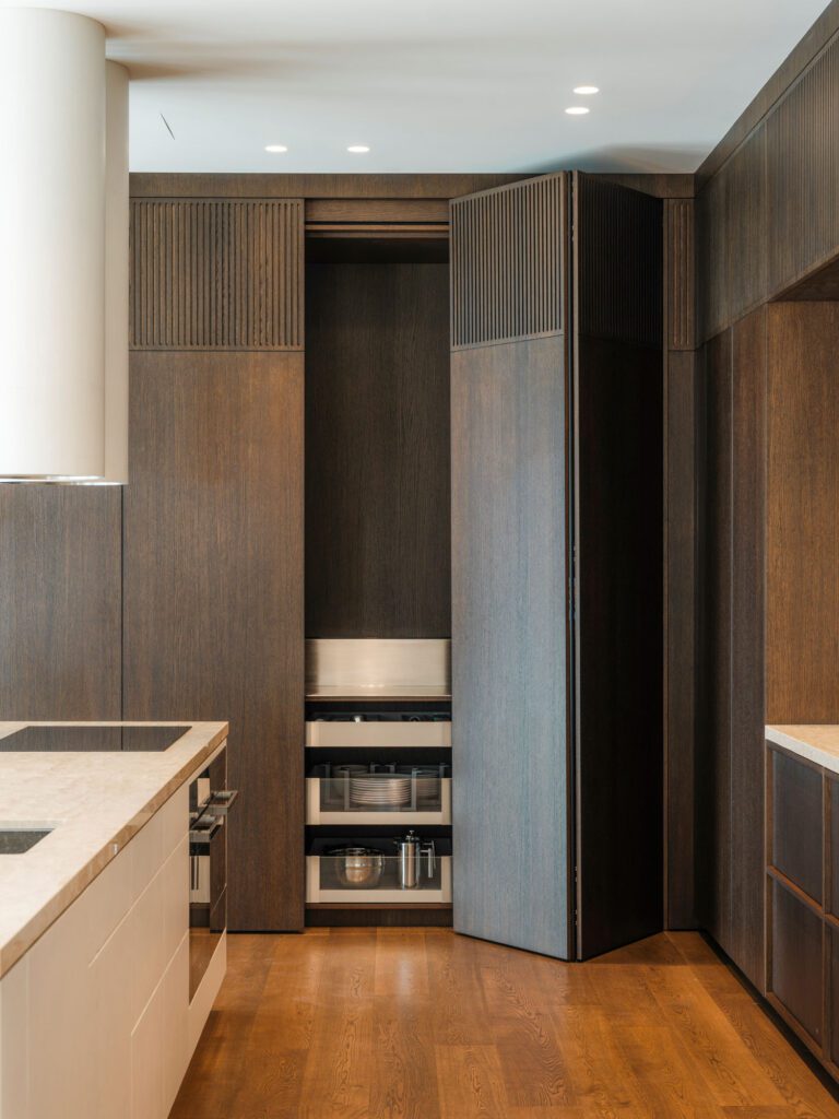
The easy part was knocking off the narrow lean-to with its small kitchen, bathroom, dining area and deck, then levelling the site. The clean slate made way for the box insertion which contains the open-plan kitchen, dining and living area. The wall of cabinetry in the living area conceals desks for the boys to do their homework. Sliding doors hide a scullery and laundry. Space is used efficiently in the 65-square-metre addition, which is accessed down steps from the old villa’s prescriptive central corridor. From the levelled site, the step across the threshold to the lawn and pool is seamless.
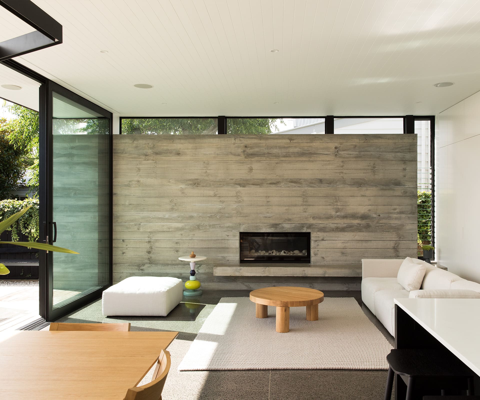
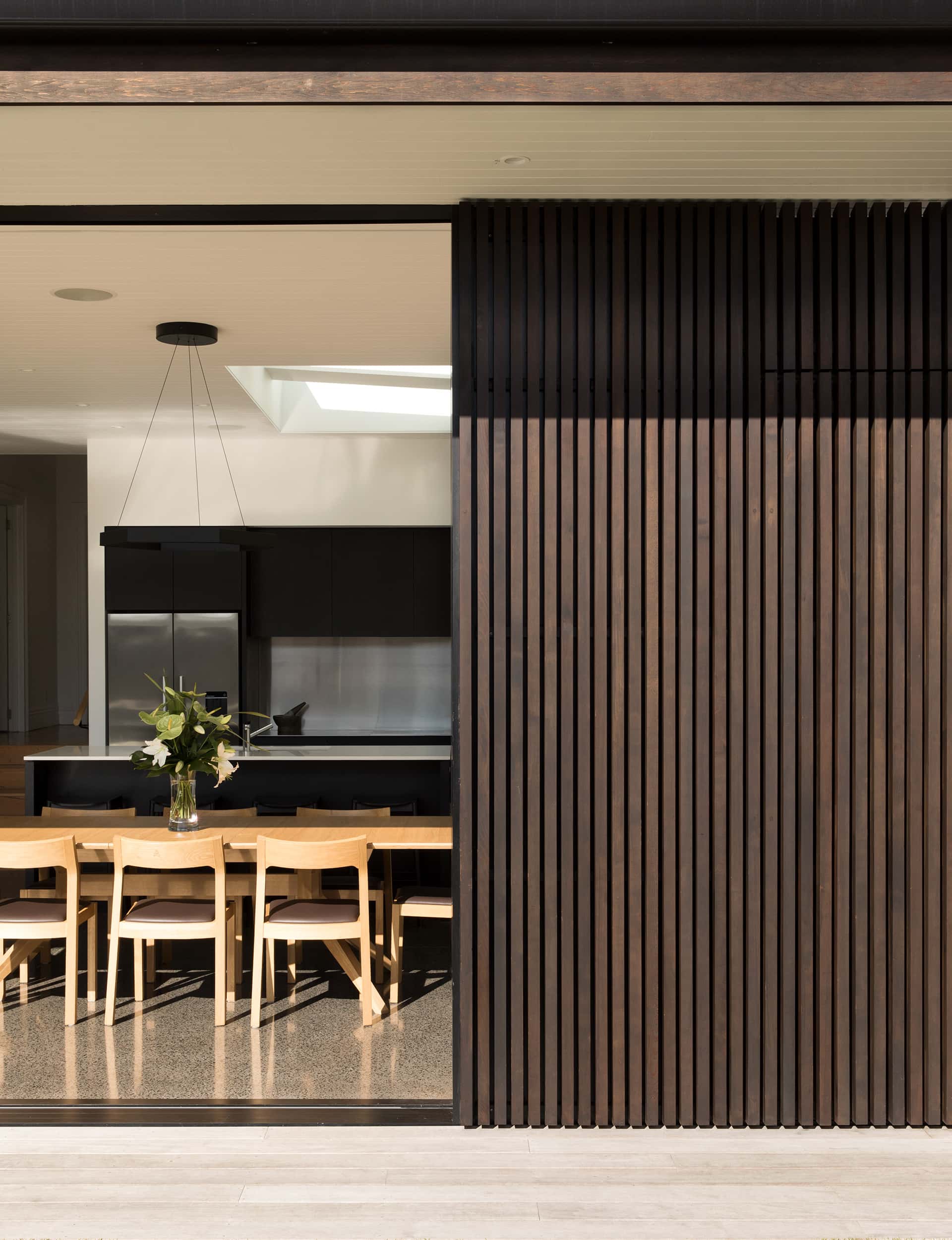
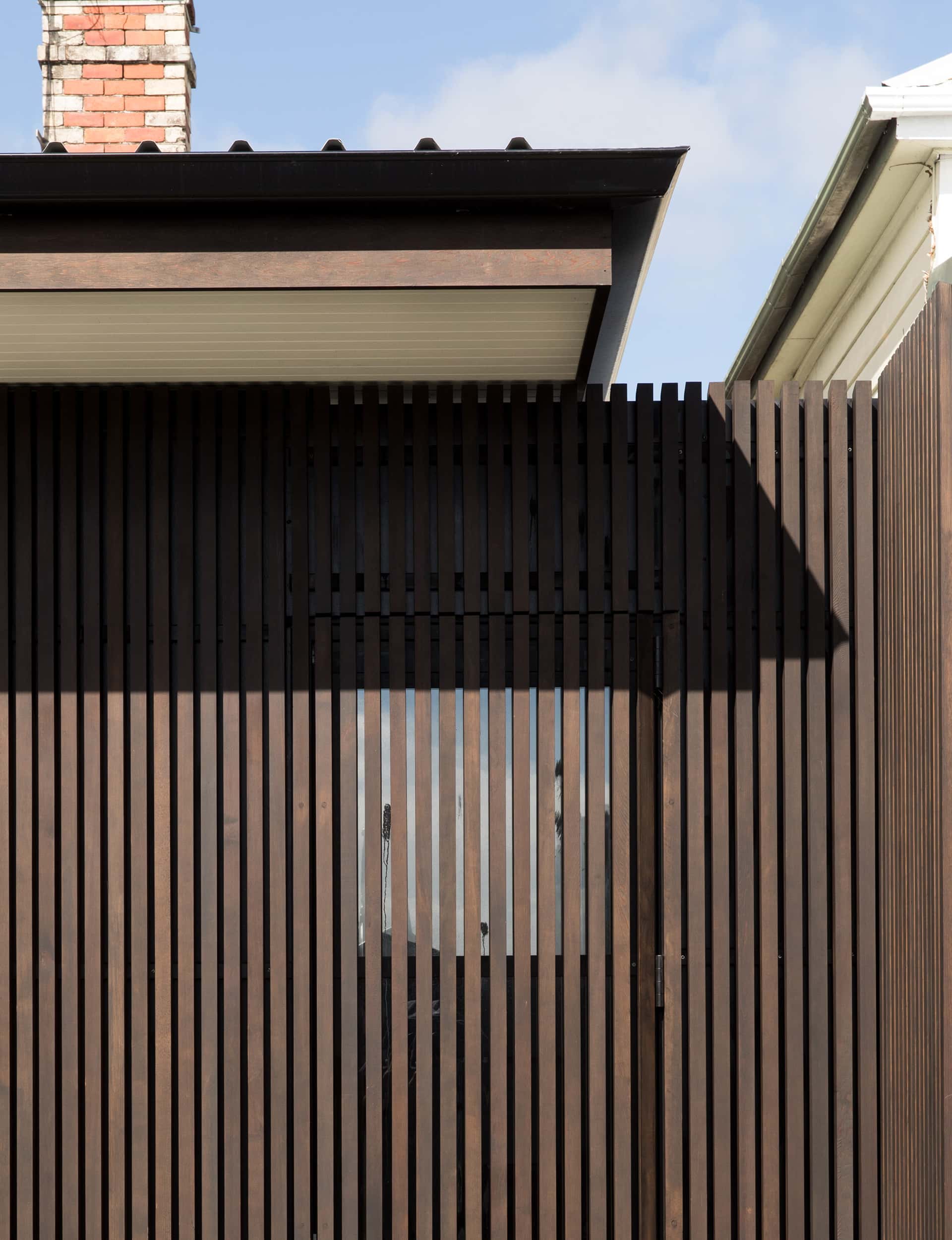
The hard work came in thinking outside the square, but within a box – crafting interest within a limited space. Materials, window and door openings, and the interior-to-exterior treatment all went under the microscope. “We put a lot of thought into the concrete walls and full-height doors and how the boundary is blurred as it extends from inside to outside,” says Sutton. “It’s not a large internal space but with strong connection to the exterior, you are playing with that trick of it feeling larger.”
As the project developed, the collaborative approach continued, with the clients driving the board-form, in-situ internal concrete wall. “A significant cost but an awesome feature,” says Sutton.
In his ideal world, the clerestory above the wall would be seamless, but structure dictated steel roof supports. But the budget did stretch to include a tongue-and-groove ceiling, with a recessed curtain rail for future use.
The addition has elegance and practicalities for a young family – with kids in the pool, their parents can easily keep an eye on them from inside the house. (And it’d be hard to escape a watchful eye over the homework.)
The heavily insulated concrete provides thermal mass. The concrete wall has a traditional timber-framed, insulated exterior wall, yet draws sun through the glass doors. In summer, the generous overhang on the eave shelters the interior from the sun, and there’s ventilation through sliding doors, louvres and the kitchen skylight. (The slightly elevated site is close to the harbour, which encourages the sea breeze throughout summer.)
The creaky lean-to is long forgotten in this contemporary addition – creating a home that greets all seasons.
Words by: Jo Bates. Photography by: David Straight
[related_articles post1=”88129″ post2=”88138″]
