There’s anarchy in Avondale and it looks a lot like Eames, it sounds a bit like Joey Ramone, and it has its heart set on placemaking.
“The building of a house is a bit of a punk thing to do,” says Callum Dowie, the architectural graduate who, along with his partner Jessica Rose, designed and built this, their family home in Auckland’s Avondale.
“The Ramones weren’t a very good band,” he continues the analogy, “so lots of people saw them playing and said: ‘Hey, I can do that! I don’t have to be a brilliant musician to be in a band that entertains a lot of people!’ So, the act of us building this house could be inspiring to others and be a little punk!”
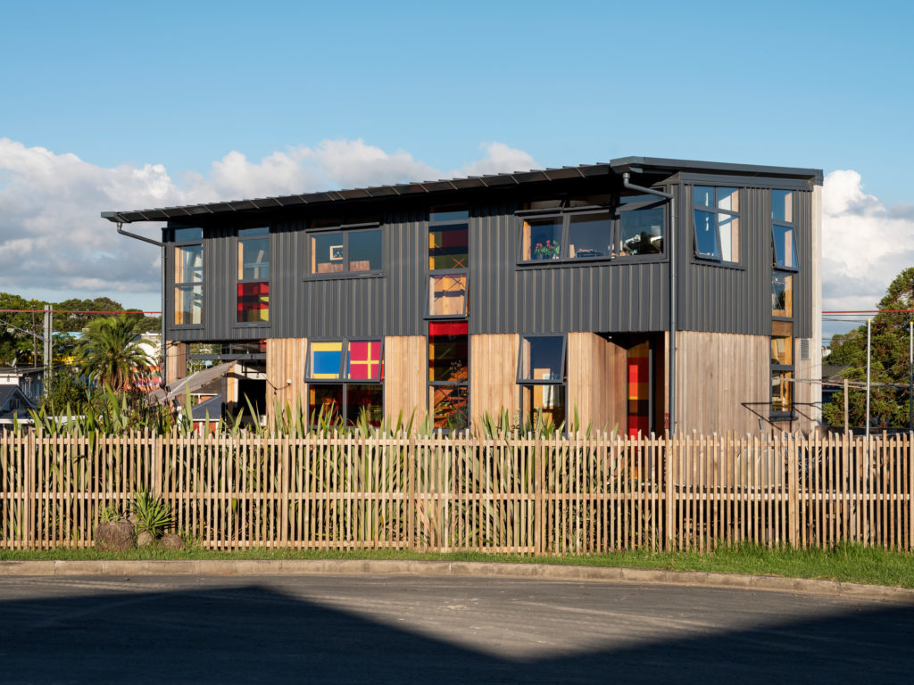
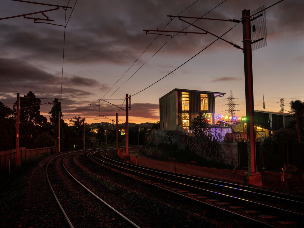
The two-storey home sits at the end of a dead-end street that borders a railroad track and is soon expected to have an access lane into Auckland’s main cycleway. It stands tall, and the disarmingly low fence makes it even more of an attention-getter in this context of privacy-seeking, weatherboard-clad villas and ’90s cookie-cutter houses.
Its facade is a mixture of Dimondek profiled metal — with Colorsteel finish — and western red cedar in three-board widths to give it a striated finish. Its metal windows, cladding, and roof are all in New Denim Blue — “There’s enough black and charcoal houses out there already,” according to Callum.
Its exterior is so colourful, and in some ways imposing, that many a pedestrian, courier, and neighbour have let themselves in to ask if it is a public library or some other sort of civic space.
That ambiguity is not accidental. Jessica is an elected, local board member with significant experience in placemaking and community building, and Callum claims Jane Jacobs — the progressive North American urbanist with a passion for human-centred cities — as his influence.
The house was meant to attract attention, to seem welcoming to strangers, and to invite conversation about some of the topics the couple inside care about, and which are exemplified by the house itself.
“Sustainability and living lightly, and how your house operates within that wider context. Cycling, water reticulation systems, passive heating, low-energy needs, food production, community engagement … placemaking. These are some of the themes that go into the house,” says Jessica. “That is why we have a fence that is only mid-height — so we can have these conversations with people.”
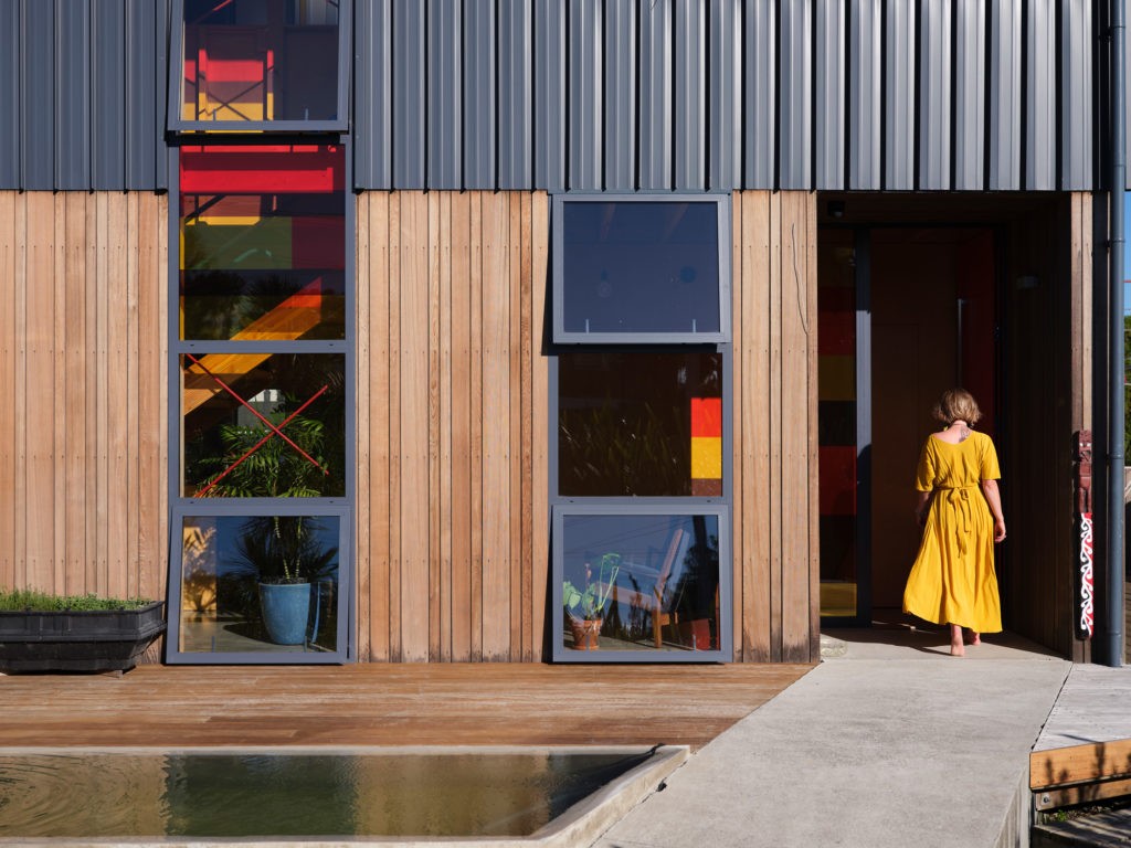
This has resulted in a home that is approachable and visible and a street where, according to its owners, there is more interaction and community.
A house is also a private affair, and the design of this particular one embodies many of the interests of its inhabitants.
“Sailing, bicycles, movies, pop culture, board games, and gardening,” says Jessica, while also describing a huge interest in modernism.
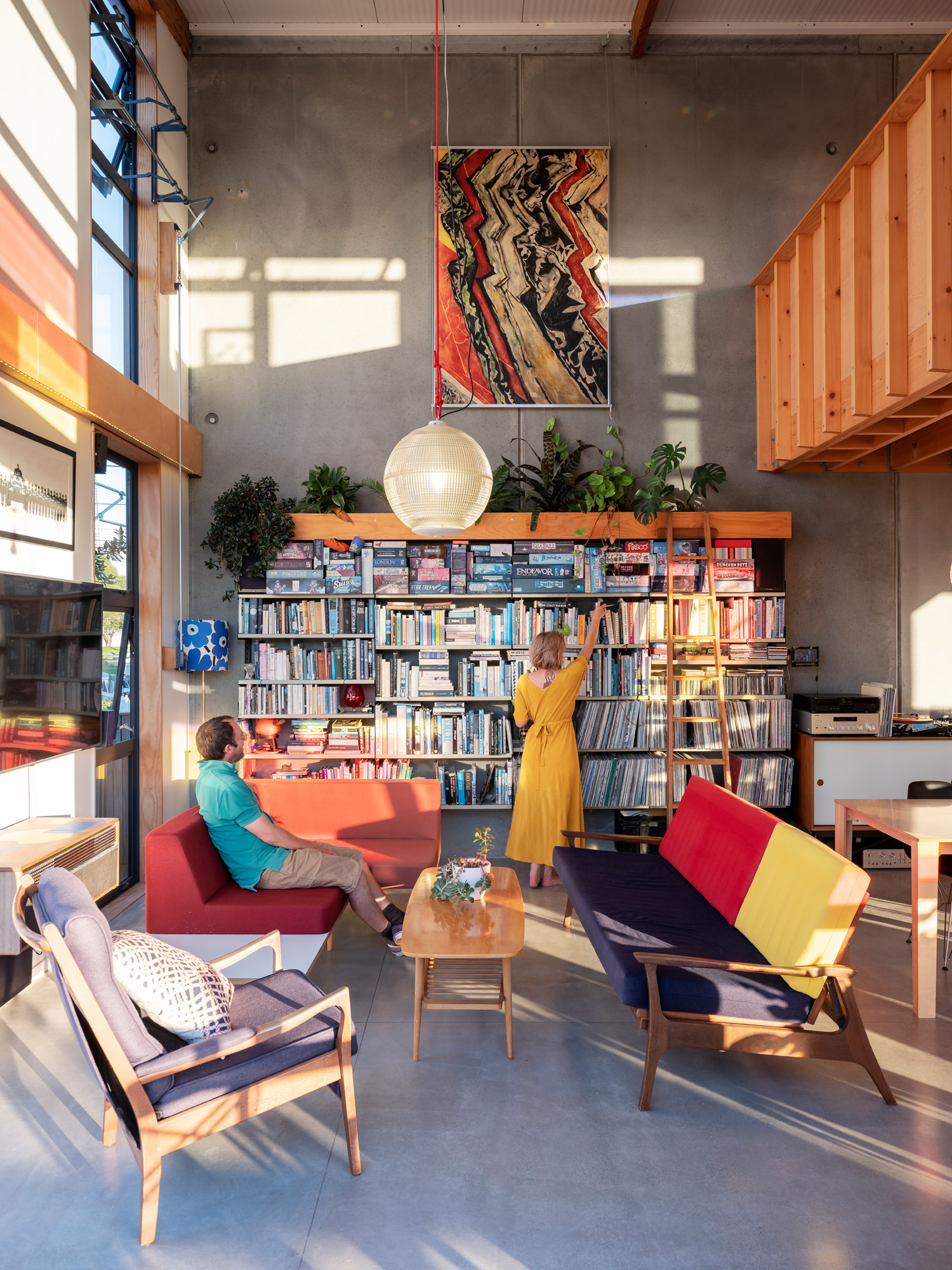
From the outside, it is apparent that this structure is heavily influenced by the 1940s California Case Study home of industrial designers Charles and Ray Eames. “It is a poor rip-off of the Eames house, if you want!” confesses Callum.
First, there is the concrete wall. The precast Thermomass insulated panel is eight metres high; the lower two metres is below the floor level — dug into the ground — and retains the base of the house. Whereas the Eames built a similar one to control the hill at the back of their site, Jessica and Callum did so to dampen the noise of Auckland’s suburban trains, which flow intermittently a few metres away from the boundary line.
In the late ’40s, the Eames House was responding to the scarcity of materials after World War II by repurposing materials, using easily available ones, prefabricating, and recycling. In a sign of the Anthropocene times, this home’s material response was more one of sustainability, cost efficiency, and experimentation.
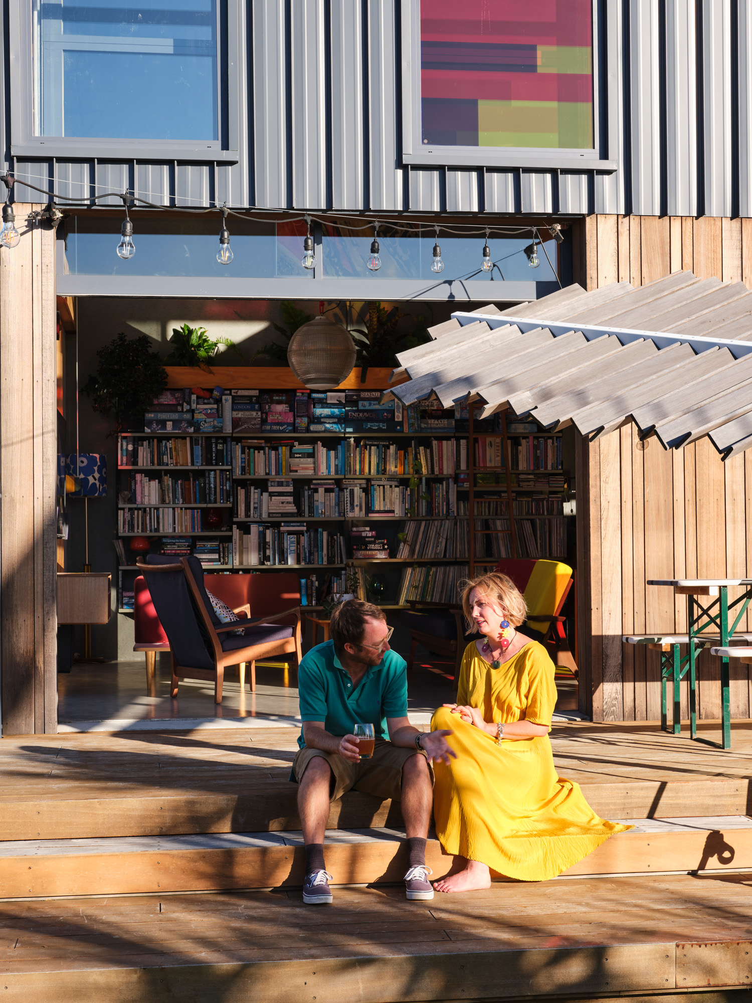
“Sustainability and cost efficiency were a response to the very real constraints of our finances and also to the urgent need to demonstrate climate action and resilience,” Callum says.
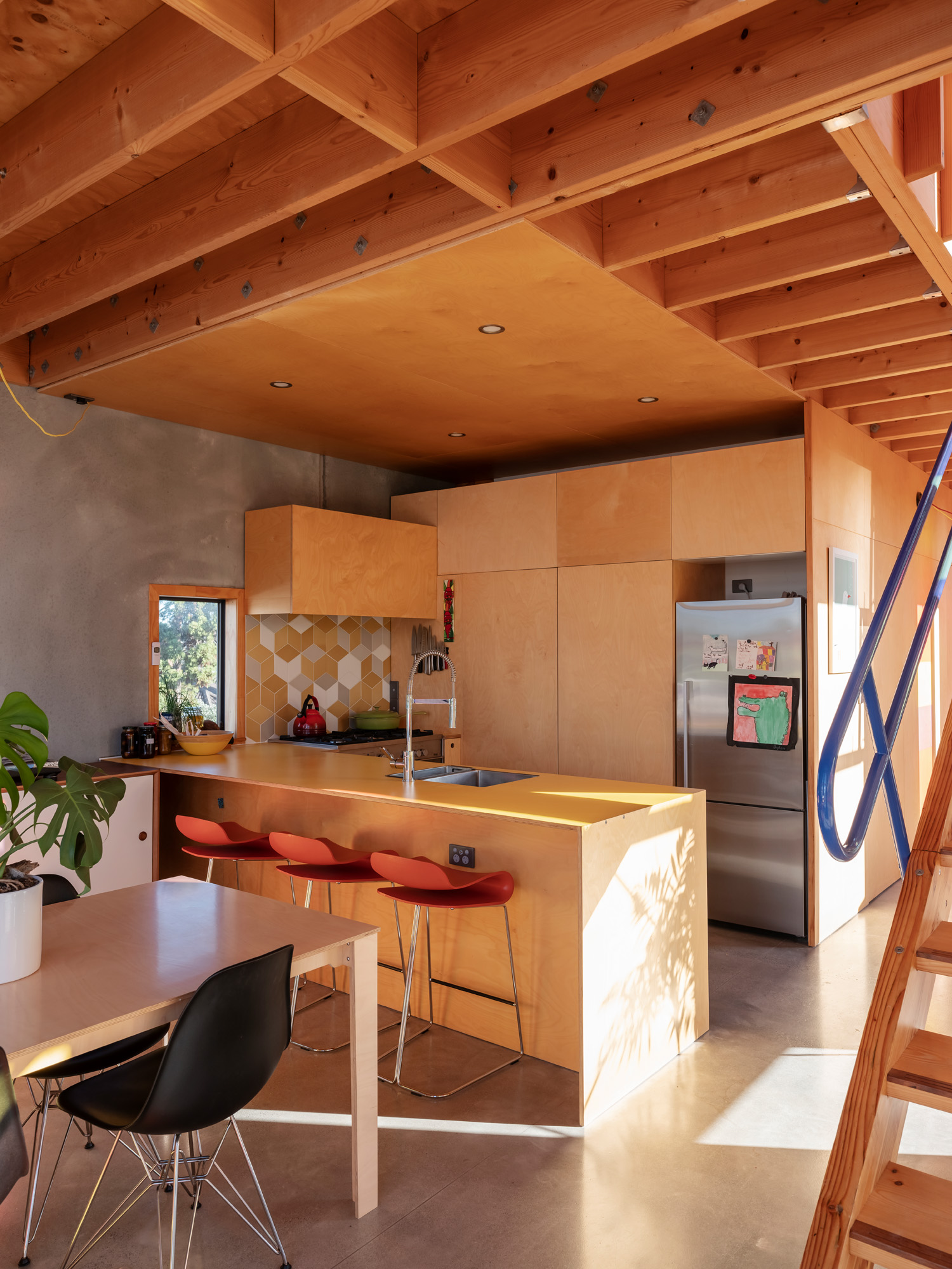
The experimentation bit came in part via glue-laminated (Glulam) timber framing.
“I’d wanted to use Glulam in several of my school designs,” says Callum who, in his day job, is an architectural graduate at Jasmax with several school campuses under his belt, “but they always came out more technical/expensive than steel. Using them in my house was a way to upskill and become more authoritative in their use on projects.
“The move to timber primary frame and insulated precast was an intentional shift toward innovation in sustainability from the [Eames’] Case Study model, where it was fine to just air-condition the shit out of the house until it was habitable. The result of super-insulated roof and walls, with lots of thermal mass, has proved to work just as it should. Orientation has a big part in this, too, of course, but having a warm dry home with virtually no heating is a treat after lives lived in typical Auckland mouldy villas and bungalows.”
Then, much like in the Eames house, there are those colours. Jessica and Callum used a palette of reds and yellows on the window treatments and shades both because of a visit to Utrecht, where they toured the classic De Stijl house (Rietveld Schröder house) with its Mondrian-like colour blocks, and also because they wanted to put the alphabetic sailing flags representing each of their last names.
“One is D and the other one is for R; one for Dowie and one for Rose. Made from cuts of packing sheets,” says Jessica, pointing at removable window shades.
Also, much like the Eames house, this house is versatile and can expand, get new windows, or be entirely reconfigured without it affecting anything structural. The Glulam frame and concrete wall are doing most of the support; therefore “all other walls could be moved or removed if required. The whole thing could be glazed or enclosed, and all internal walls could be changed,” according to Callum.
The staircase — made from leftovers from the Glulam framing — could be removed “and the space fitted for a platform lift should future needs be incompatible with stair climbing. [The house is] future-proofed for less mobile inhabitants.”
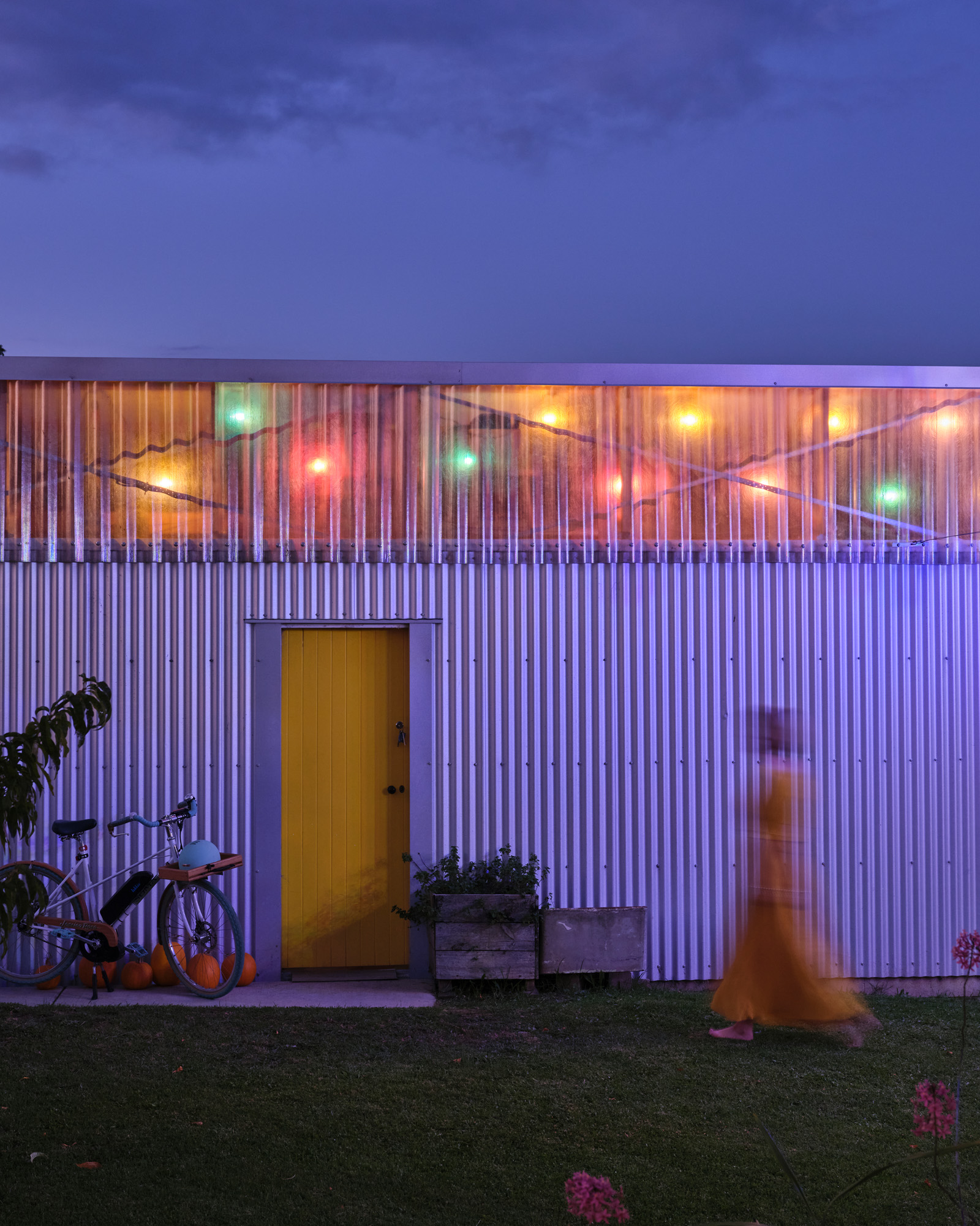
On the walk out of the property, one notices chickens roosting around and on the deck, and a pile of freshly harvested pumpkins drying in the late summer sun. There is also a wooden skateboard ramp tied to the front fence; some sort of communal asset made by Callum after noticing a skateboard dad with his two daughters coming to the cul-de-sac for lockdown exercise.
So, yes, the house is indeed a little bit punk. It is slightly off grid, and a touch rough around the edges. It is highly individualistic and personalised; it has swagger and a touch of effrontery — yet it is also friendly and full of ideas. The Eames — and Joey Ramone — would most likely approve.
Words Federico Monsalve
Photography Sam Hartnett


