Inviting autumnal hues this season gravitate around an earthen palette, a tonal melody that gives rise to spaces of tranquillity.
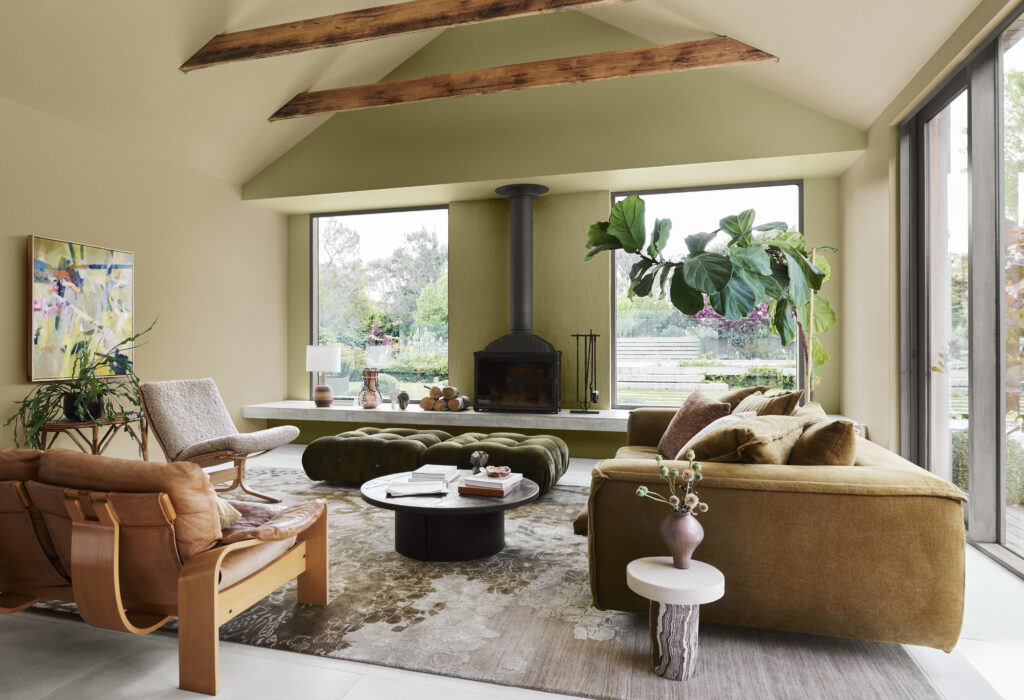
Warm neutrals and muted yellow-greens from the Dulux Connect palette are the hero this season, creating a calm aesthetic perfect for entertaining as the weather cools.
“The Dulux Connect palette is filled with beautiful earth-based neutrals that are so easy to live in,” Dulux’s Davina Harper tells us. “They speak to our growing passion for craftsmanship, sustainability and living more simply, and create the relaxed and cocooning feeling we crave from our homes in the autumn months. They are also extremely versatile and work with a variety of architectural styles, adding warmth and colour to contemporary interiors or enhancing the character of period homes.”
Dulux colour forecaster and stylist Bree Leech utilised tones from Connect to transform an open-plan lounge and dining area into an autumnal haven. “This lounge is flooded with natural light and surrounded by gorgeous garden vistas. Exposed timber beams, cathedral ceilings and stone-look tiled floors gave this beautiful open plan room a ‘chic farmhouse’ vibe. While the original white was beautiful and simple – we wanted to show how introducing just two colours into a large room like this can bring warmth and cosiness,” Bree explains.
“The room’s generous proportions and high ceilings called for slightly deeper colours – in this case, a beautiful muted yellow-green and a soft wheat hue unites the interior with the lush garden outside seen through generous picture windows and sliding glass doors,” she says.
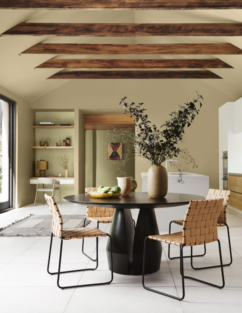
“We wanted to make this a space perfect for gathering with the fireplace at its heart, so, we painted the main walls and ceiling in Dulux Pataua Beach, a lovely creamy honey hue, to tie in with the timber beams and offset the stone look floor tiles. We then used a slightly richer colour on the fireplace wall (Dulux St Bathans) to make the fireplace the clear focal point.
“Using two warm earthy colours and running them from floor to ceiling, like we’ve done here, wraps the room in warmth. We carried these colours through to the adjoining dining room, where you can also see Dulux Gentle Annie through the opening that leads to the home’s main entrance and featured behind the shelves in the study nook.
“When it came to the furniture and accessories, we mixed different styles and eras to make the lounge feel relaxed and characterful. Beautifully worn vintage pieces, such as a ‘70s leather sofa and slate coffee table, sit comfortably alongside newer future family heirlooms, such as classic Camaleonda upholstered ottomans and a deep-seated, contemporary sofa in a tobacco linen.”
Upstairs, the mezzanine is home to the main bedroom, which is tucked beneath the apex of the roof above the kitchen. One of the children’s bedrooms also makes the most of the lofty space beneath the higher end of the roofline, with a compact mezzanine for the bed that is accessed via a ladder. Spanning a compact footprint of just 100m 2, the house feels much larger than it is owing to the extensive covered decking. The nature of the plan meant that the decking became a key circulation route, with access from the two lower bedrooms via the deck into the main living area and kitchen.
Stylist Bree Leech
Images Lisa Cohen
