Dulux has partnered with artists Kris Sowersby, Sarah Maxey and Elliot Collins to celebrate the Dulux Colours of New Zealand®. All three artists work with text and language in some way in their work, yet each comes from different disciplines and traditions. Kris Sowersby is a type designer, Sarah Maxey is a designer and illustrator, while painter Elliot Collins creates works with his own poetic texts. Each artist has used the Dulux Colours of New Zealand® range as inspiration for a series of limited edition artworks that feature on the cover of the new Dulux fandecks. We’ll explain more about their work in this post, but you can also check it out in this clip:
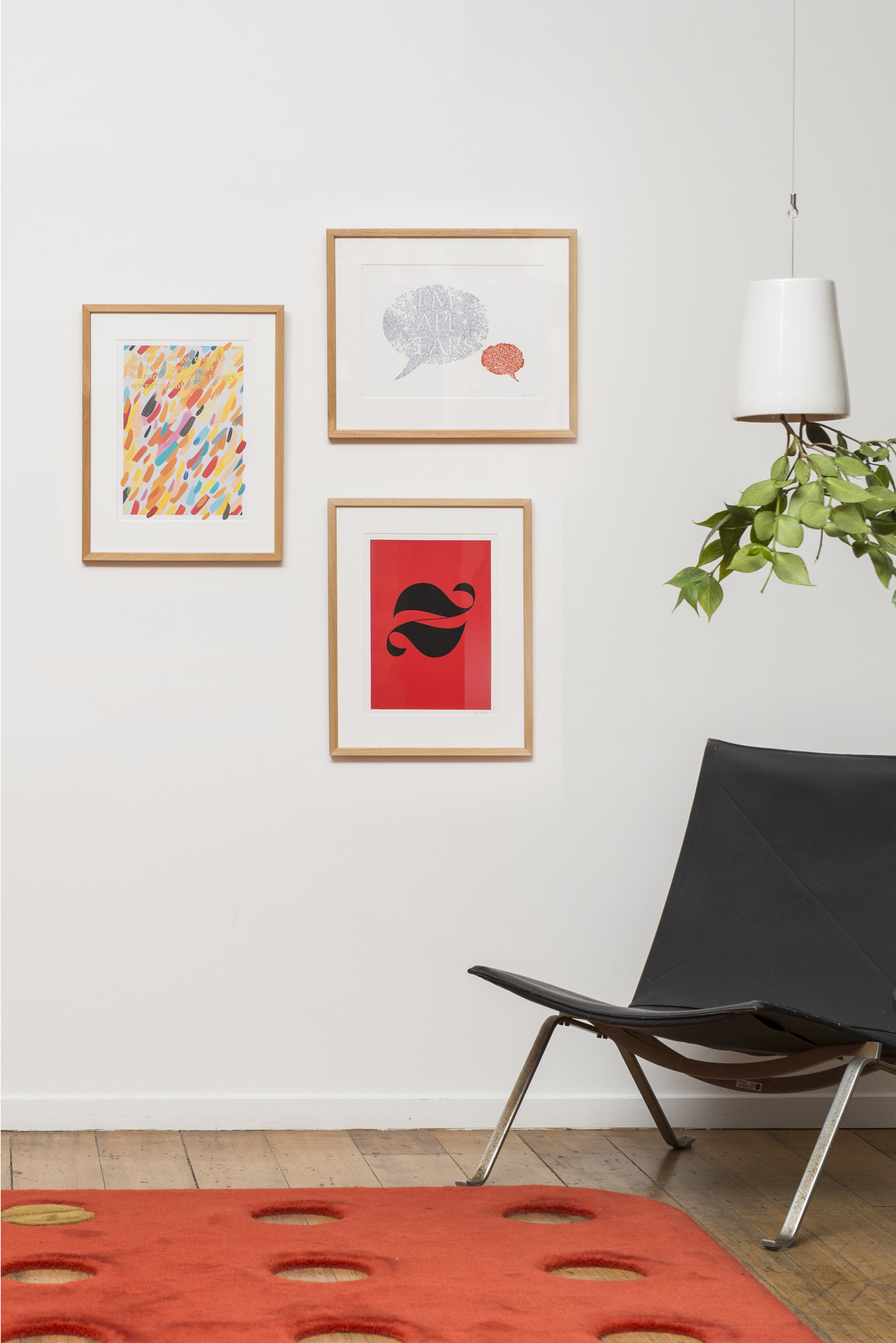
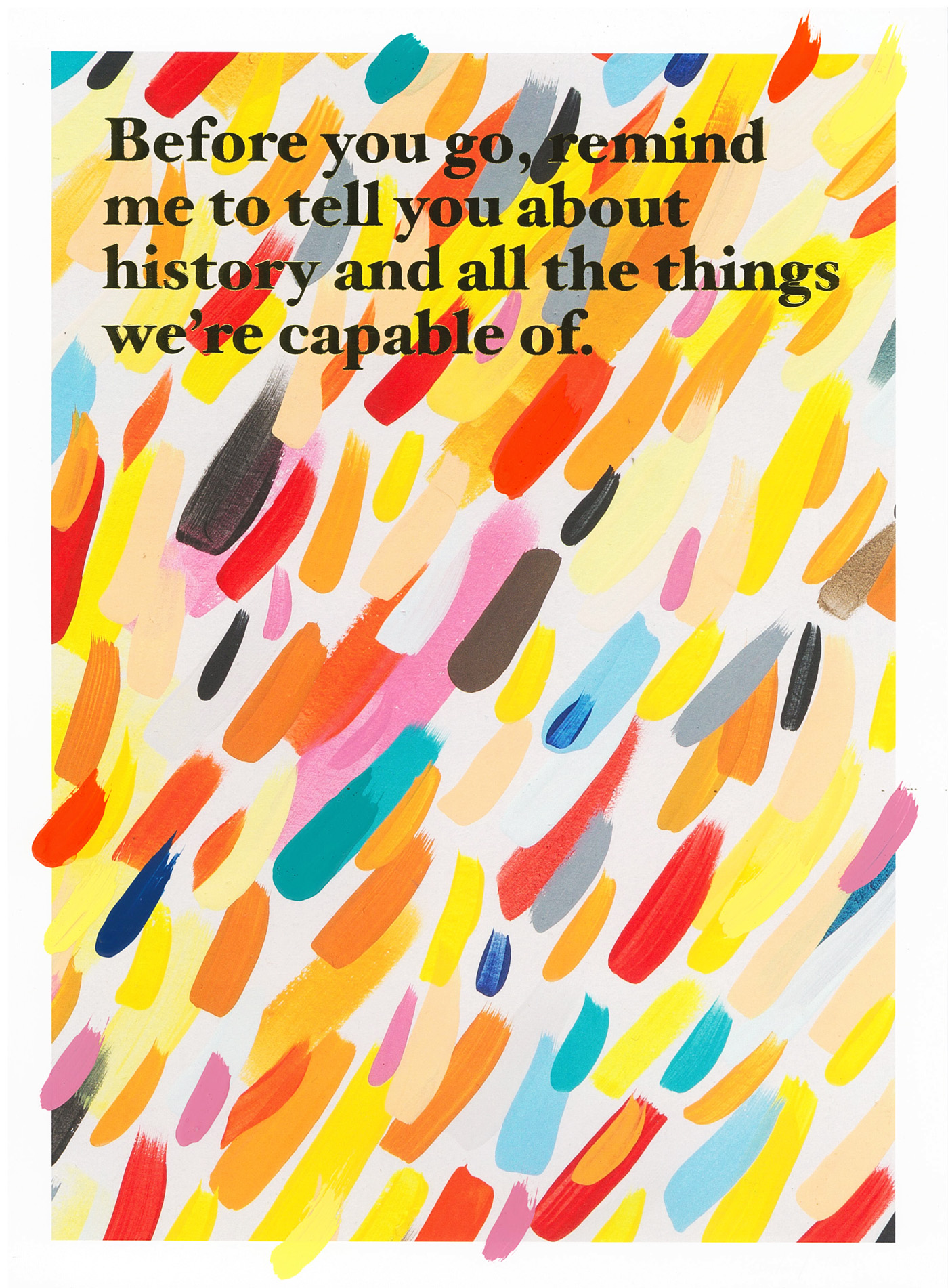
Elliot Collins is a poetic painter who operates in what he describes as a “world of free associations”, frequently using words to “visualise the stuff of thoughts”. Elliot’s texts are almost entirely his own words. Drawn from a kind of visual diary, they have to prove themselves “paint worthy” and have usually been around for several years before they make it in to one of his paintings. ‘Before you go’ is an uplifting piece that uses a variety of vibrant colours from the Dulux Colours of New Zealand® range, finished in gold-foiled text.

Sarah Maxey is a graphic artist, typographic illustrator and book designer. Her distinctive work has graced publications worldwide, including the New York Times and numerous literary books. In 2011 she was awarded the Purple Pin at the Best Awards, the highest graphic design accolade in New Zealand. Sarah’s work explores both colour and language. Her artwork, ‘I’m All Ears’, depicts what she describes as “a conversation between a big person and a little person”. It was created using letterpress inks colour-matched to Dulux Port Hills and Poor Knights from the Dulux Colours of New Zealand® range.

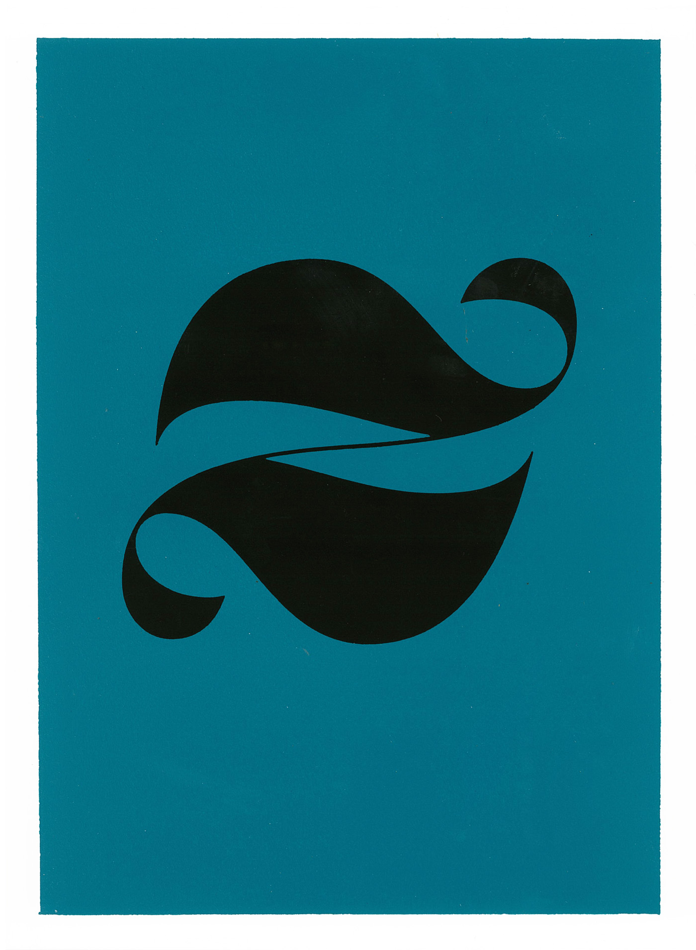
Kris Sowersby is a type designer based in Wellington. His typefaces are used by designers and art directors worldwide and can been seen in a vast array of applications from New York magazine to the Vine app. Sowersby’s typefaces combine historical knowledge with rigorous contemporary workmanship and finish. To create this artwork, Kris has used the letter ‘z’ (a letter synonymous with New Zealand) from his recent typeface, ‘Domaine’. The letterform has been foiled on to handmade brush-outs using four new Dulux Colours of New Zealand® – Dulux Big Lagoon, Colombo Street, Lochiel and Manaia.
