Dulux’s Colour Forecast 2016 takes us to unexpected places.
Our colour appetites are constantly shifting, affected by seasons, broad cultural influences, and deeply personal moments that could be inspired by the botanical world, a memorable artwork, or everyday colour combinations that generate a peculiar and unforgettable alchemy.
Bree Leech is a trend forecaster with two decades of experience in the design industry. She collaborates with Dulux to create colour forecasts; her job is to weave multiple influences into a coherent set of predictions of what colours we’ll be adoring and absorbing in the next year.
“It’s quite an instinctual process,” she says of developing Dulux Colour Forecast 2016.
[jwp-video n=”1″]
The following pages reveal what her instincts are telling us about colour for the year ahead. She’s grouped these developments into four key themes.
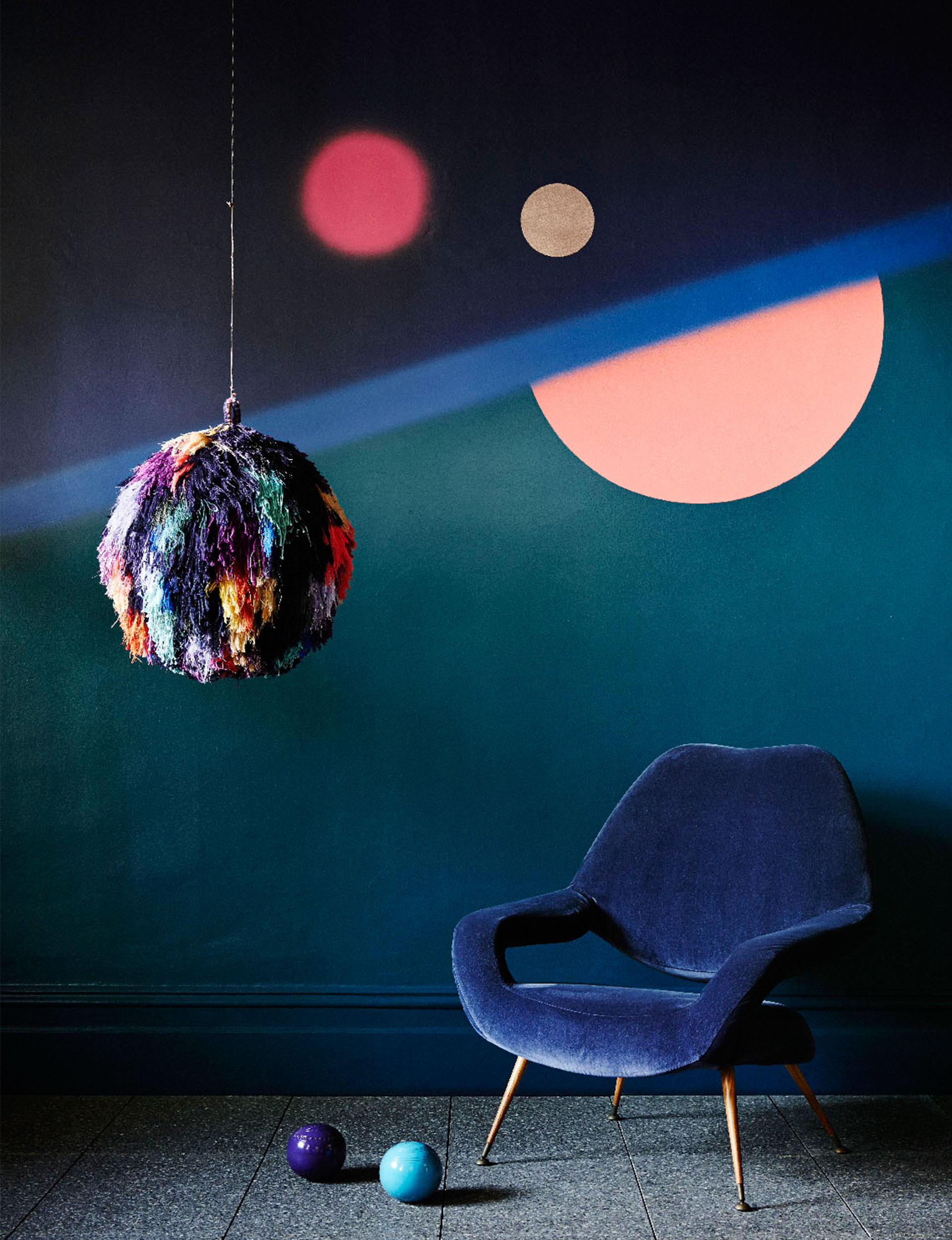
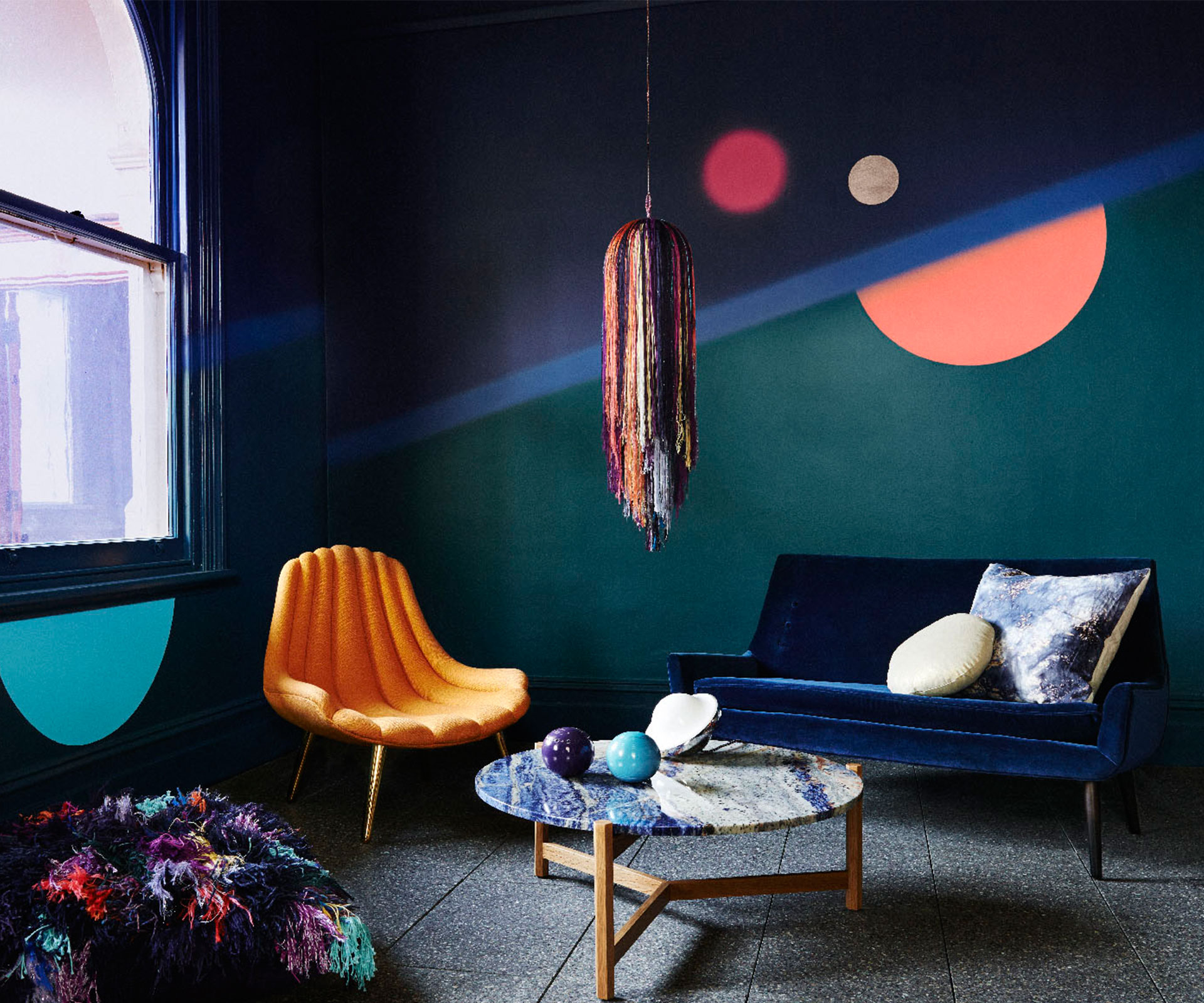
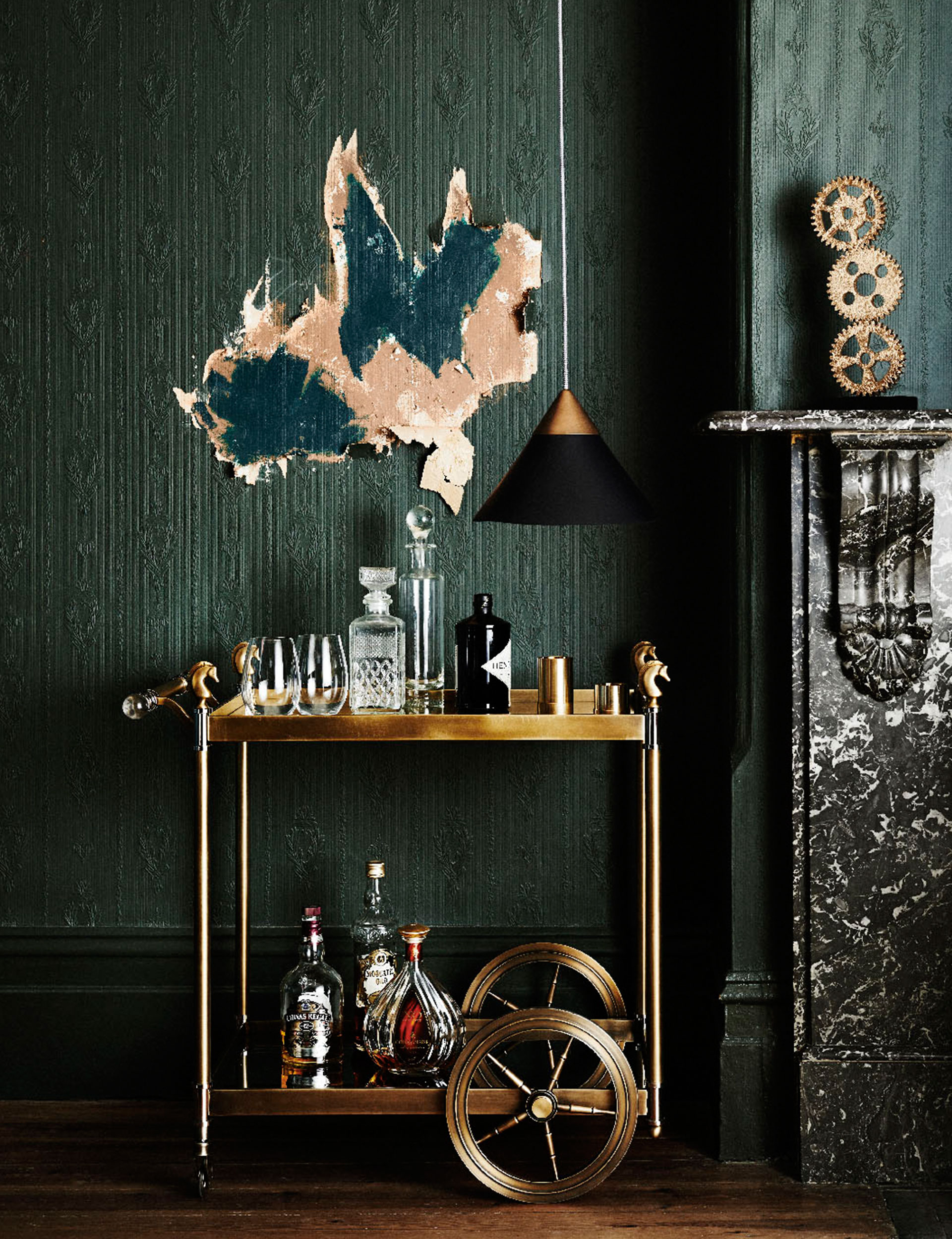
Infinite Worlds
“Infinite Worlds is about infinite space and deep oceans, our fascination with unexplored territories,” Leech says.
“There’s a real interest in mysterious deep-sea creatures with phosphorescent colours against deep inky blues: think of pinks and corals and space-age metallics against dark backdrops. The colours of nebulas and exploding stars came to mind as we were developing this high-contrast palette. We were also thinking about the boldness of the 70s, with David Bowie and Ziggy Stardust, the gleeful celebration and confidence of those colour contrasts. These influences are coming through in fashion a lot, too.”
Featured:
Dulux Russell
Dulux Night Life
Dulux Double Cove
Dulux Napie
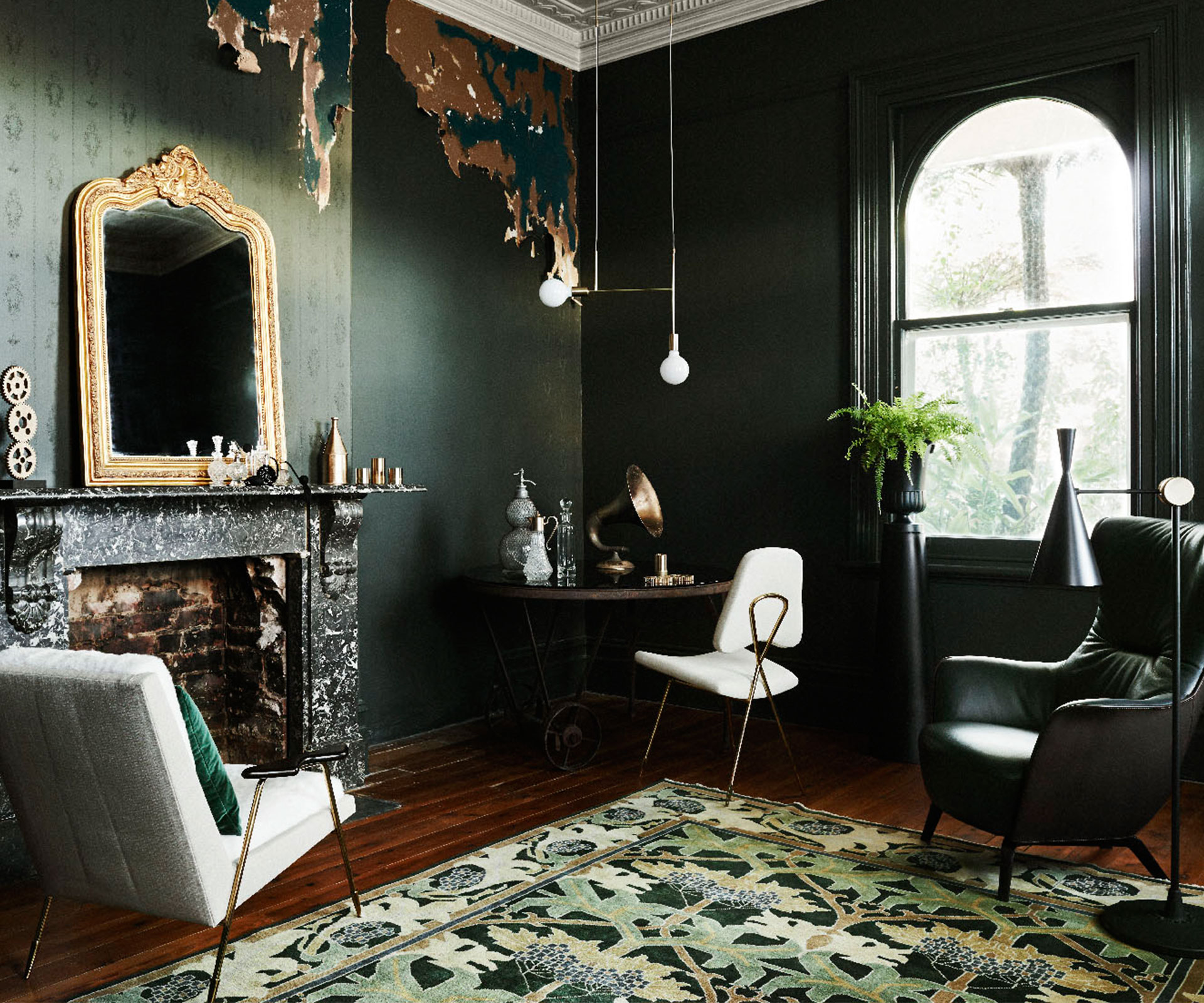
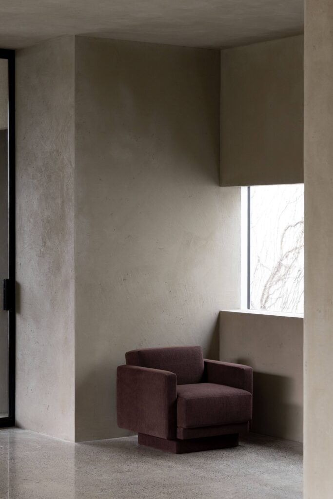
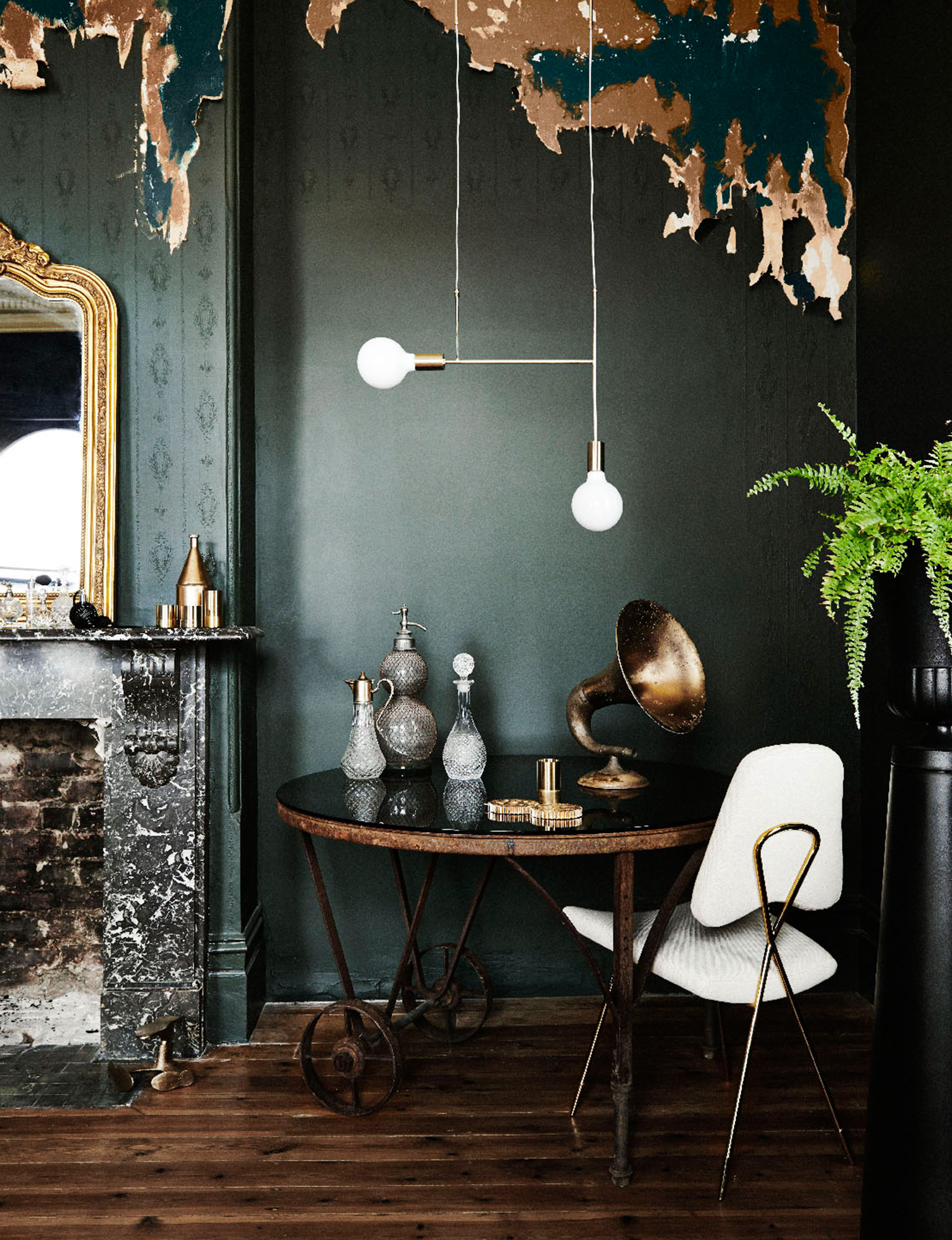
Future Past
“Steampunk is an influence which started a number of years ago and it has surfaced again in the Future Past palette,” says Leech.
“This is a slightly newer look with multiple references, a new version of the old. I’m seeing a very classical influence here as well, with deep colours being used on walls, which feels very much now. These are heritage shades but people don’t immediately recognise them that way when they’re used in a modern context. Brown will be a big influencer next year, along with burgundy and green, while mustard and primrose tones modernise the palette. You see crumbling old buildings with modern pieces set against them and they look fantastic, which was a big influence on our thinking here.”
Featured:
Dulux Punga Cove
Dulux Miramar
Dulux Loose Leather
Dulux Emerald Forest
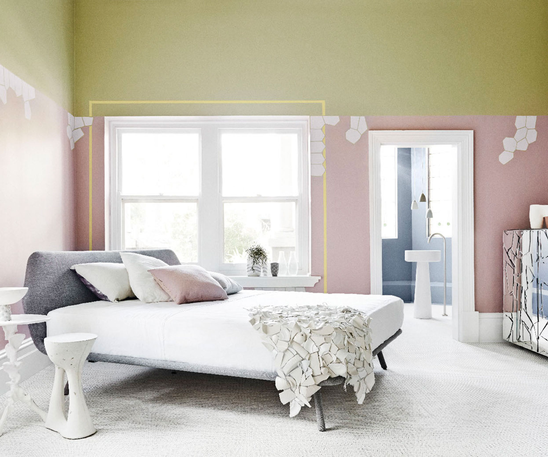
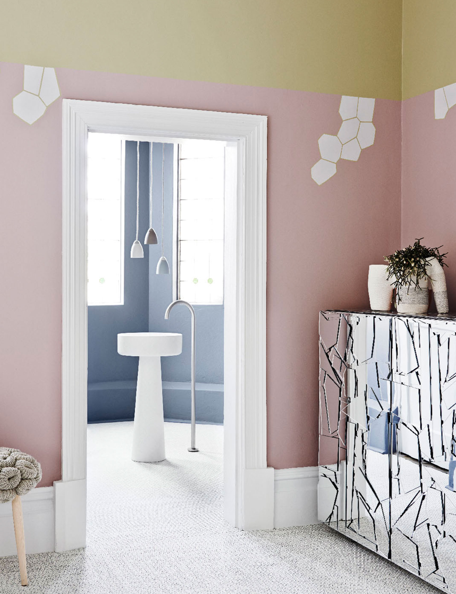
Bio Fragility
“We’ve been seeing lots of soft pastel colours coming through,” says Leech,
“so we had to look forward and work out what would be influencing them in the next 12 months. We find designers are almost looking to nature to collaborate with them. They create something and leave the rest to nature so they may end up with an imperfect result, and that idealisation of imperfection is being incorporated into interiors. It’s about taking our colour cues from nature and living matter such as flesh tones, lichen, moss and stone, and introducing what we call prickly elements such as cracked surfaces of parched earth, exotic textures in an otherwise soft landscape. It’s about the fragility of nature and how that’s being reflected in design.”
Featured:
Dulux Matamata
Dulux Lilac Suede
Dulux Purebred
Dulux Manorburn Half
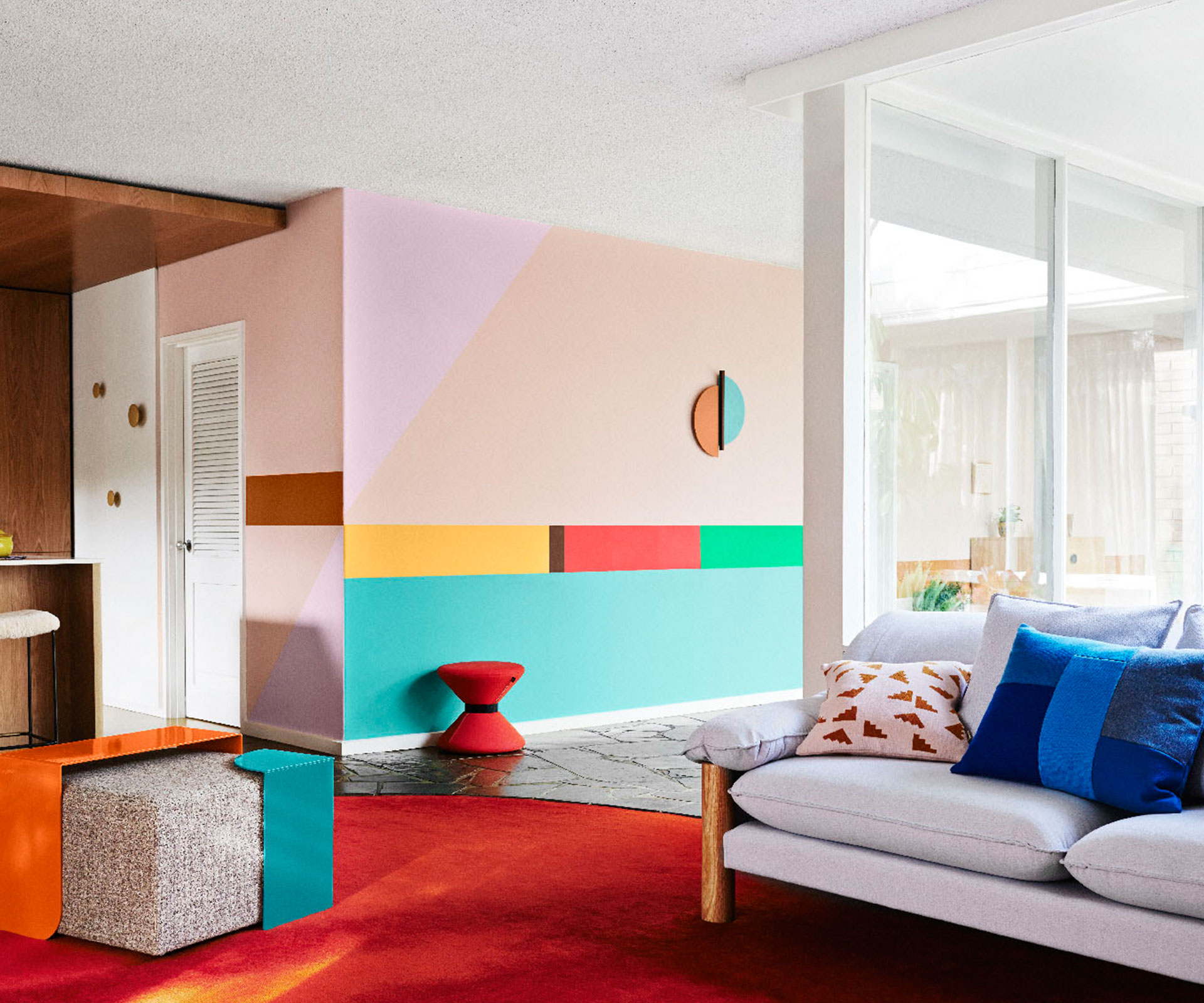
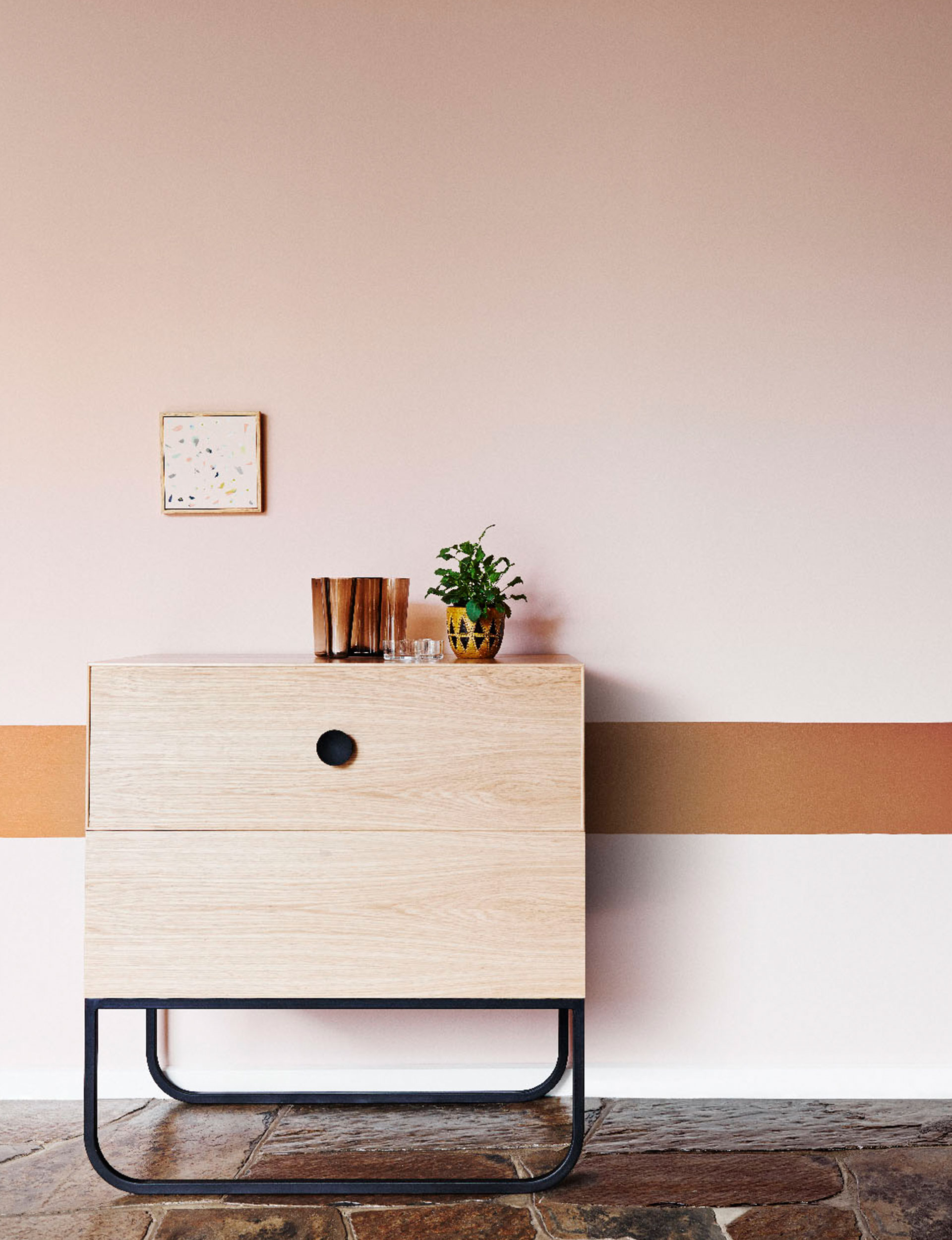
Retro Remix
“The Retro Remix palette is influenced by the postmodern era, and carries on the influences of the Memphis style that began to emerge last year,” Leech says.
“It’s about remixing the 60s, 70s and 80s and getting a new result: it’s not retro as you know it, it’s a remixed version. It doesn’t take itself too seriously, as the colours are very happy, optimistic and energetic, with acid brights clashing with faded, muddied colours such as browns and olive greens. It also embraces the idea of those patterns being used on the walls, with people exploring how they can use masking techniques to create them. I love seeing unexpected new combinations and thinking, ‘that really works’. People have been obsessed with whites and neutrals, but I do believe we’re gaining confidence in using colour again.”
Featured:
Dulux Titi Islands
Dulux Colombo Street
Dulux Mt Victoria
Dulux Piglet