Architect Matt Brew spent the last 10 years designing Eastern Beach House, taking inspiration from a French modernist concrete priory designed many decades prior by Le Corbusier.
Once the exterior palette of grey timber and concrete was conceived, Brew turned to interior designers Gerry Hetet and Anna Hill (of Buchan Group at the time of design, now Principal of Interiors at Jasmax) to collaborate on the interior detailing.
We spoke to the pair about this striking suburban beachfront design.
HOME: Tell us about the collaborative process with the architect and owners when designing the interiors of this home. Did you have a specific brief for the project?
Gerry Hetet: Matt Brew had been working on this project for many years before I was brought in to add some of the finishing elements. It was a great experience working with Matt as he has such an obsession with the details. The brief was for it to feel like a luxury resort for the owners’ children when they wanted to escape the city.
Anna Hill: I came into the project quite late in the piece, so it was important to understand the architectural vision prior to commencing works. I worked closely with the client and architect to understand the design direction, material palette and spatial planning to help influence the interior concept. It was important to have the client’s personality integrated within the space. Drawn out from the briefing process was an emphasis on natural, modern and simplistic forms, alongside determining the client’s favourite colour, sage green.
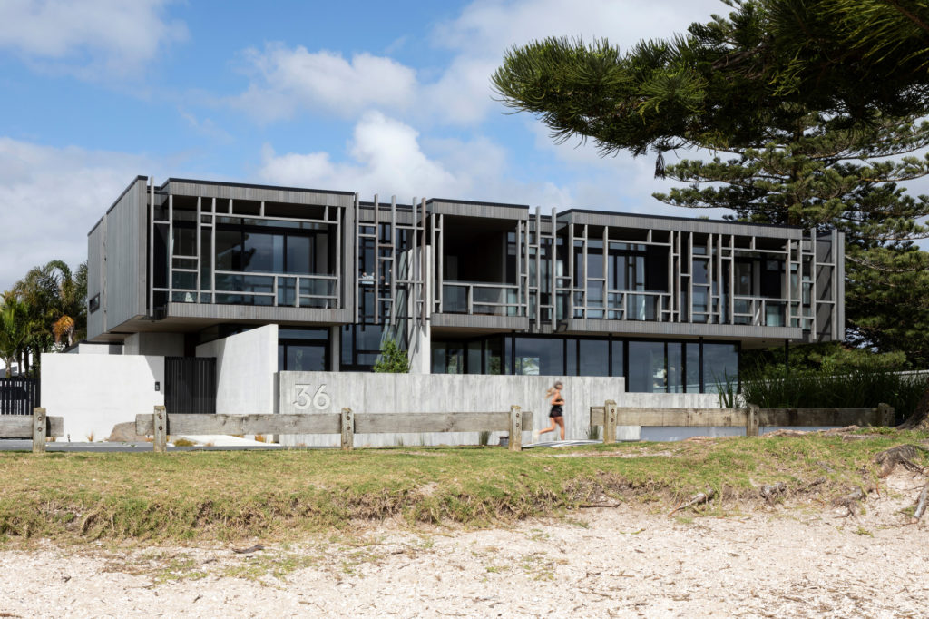
H: Matt Brew has said he took inspiration from Le Corbusier with his palette of grey timber, concrete and patterned facade panelling. Tell us how these materials influenced your decisions for the interior design.
GH: Drawing on this inspiration from Le Corbusier, the Terra Vein Travertine, a major component of the home, was selected. The facade was repeated in the fireplace, and some of the materials from the exterior were introduced through the interior.
AH: The natural palette set alongside the open light-flooded spaces formed a sleek backdrop to begin to add soft touches of colour, texture and form. The introduction of the selected soft finishes and curved fixtures began to balance the hard tactile surfaces and create a homely environment.
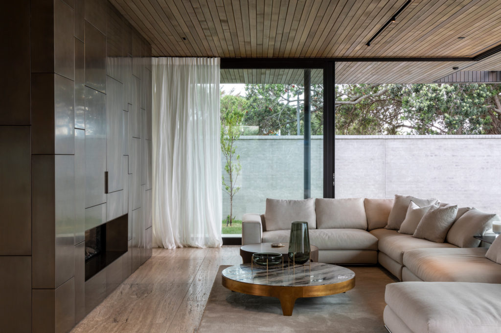
H: This home is made up of only a few material elements; concrete, cedar, steel and bronze glazing. How do the soft furnishings, lighting, colour and textural elements of the interior work together with this aesthetic?
GH: I worked really closely with Kate Johnson from Artedomus to find the travertine to add some dimension and pattern to the space, the oversized tiles appear like slabs, while the brushed finish gives a beautiful texture to the surface. I envisaged a simple linen curtain, inspired by Mies Van Der Rohe’s Farnsworth House, for privacy on the lower level and for some softness. The minimal palette was warmed up by the aged-brass cladding and various other metal elements throughout the home.
AH: It was important to not distract the eye from the raw beauty of the architecture. The soft furnishings are designed to blend into the space, to support and highlight the architectural design. The furniture was where some more personality could be introduced and start to overlay the client’s personality within the space. Subtle hints of green can be found throughout, creating personalized moments as you journey throughout each space.
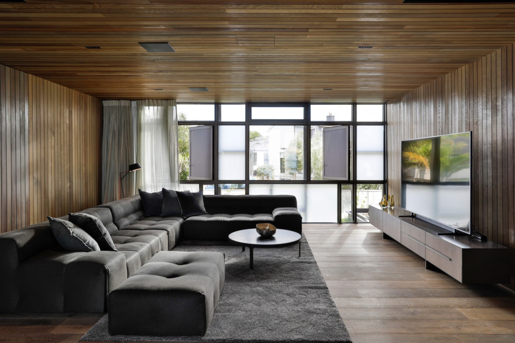
H: What are your favourite moments in this home?
GH: I really enjoy the rawness of the precast concrete, especially where it meets the timber. The Flos Running Magnet Track light system lining up precisely with the timber sarking is a testament to the builder!
AH: My favourite moment in the home would have to be the living space. The bronze bar and entertainment unit slice through the living space creating a beautiful balance between both spaces, connecting the two yet providing a sense of division. Within this space, my favourite piece of furniture – the Ritzwell Marcel chair. Beautifully crafted by designers who truly understand wood and its characteristics, the sleek line up the rear of the leg through to the back enfolds you in gentle elegance, sympathetic to the language of the architecture.
Read the full feature of this project in the December/January 2022 issue of HOME
