Eugénie’s beautifully crafted Auckland store

After moving on from the world of advertising, Elizabeth Wilson retrained in fashion, and worked a stint for Karen Walker. Wilson is now carving her own path in the industry with her new shop Eugénie in Auckland.

Here, the designer describes how the interiors complement her style, and the advantages of having a bricks-and-mortar shop as well as an online presence.
Eugénie - Auckland. Photograph by David Straight.
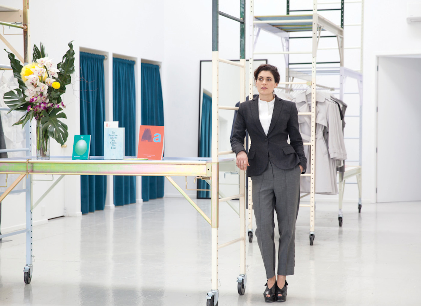
Eugénie designer Elizabeth Wilson in her new shop. Photograph by David Straight.


HOME Tell us about Eugénie’s clothes, and how these values are reflected in the store’s interiors.
Elizabeth Wilson, Eugénie owner I work with what I find modern and compelling, then marry that with an emphasis on cut, silhouette, quality construction and exceptional fabrics. My partner Simon Oosterdijk designed the store; we wanted to counterpoint the elegance of the garments. Synthetic compounds, folded steel, high-gloss paint and coloured zinc coatings bring a new materiality that contrasts and enhances the tactility of the clothes. We worked with the manufacturing character of the building, referencing research facilities and space centres, creating modular frameworks using off-the-shelf systems.
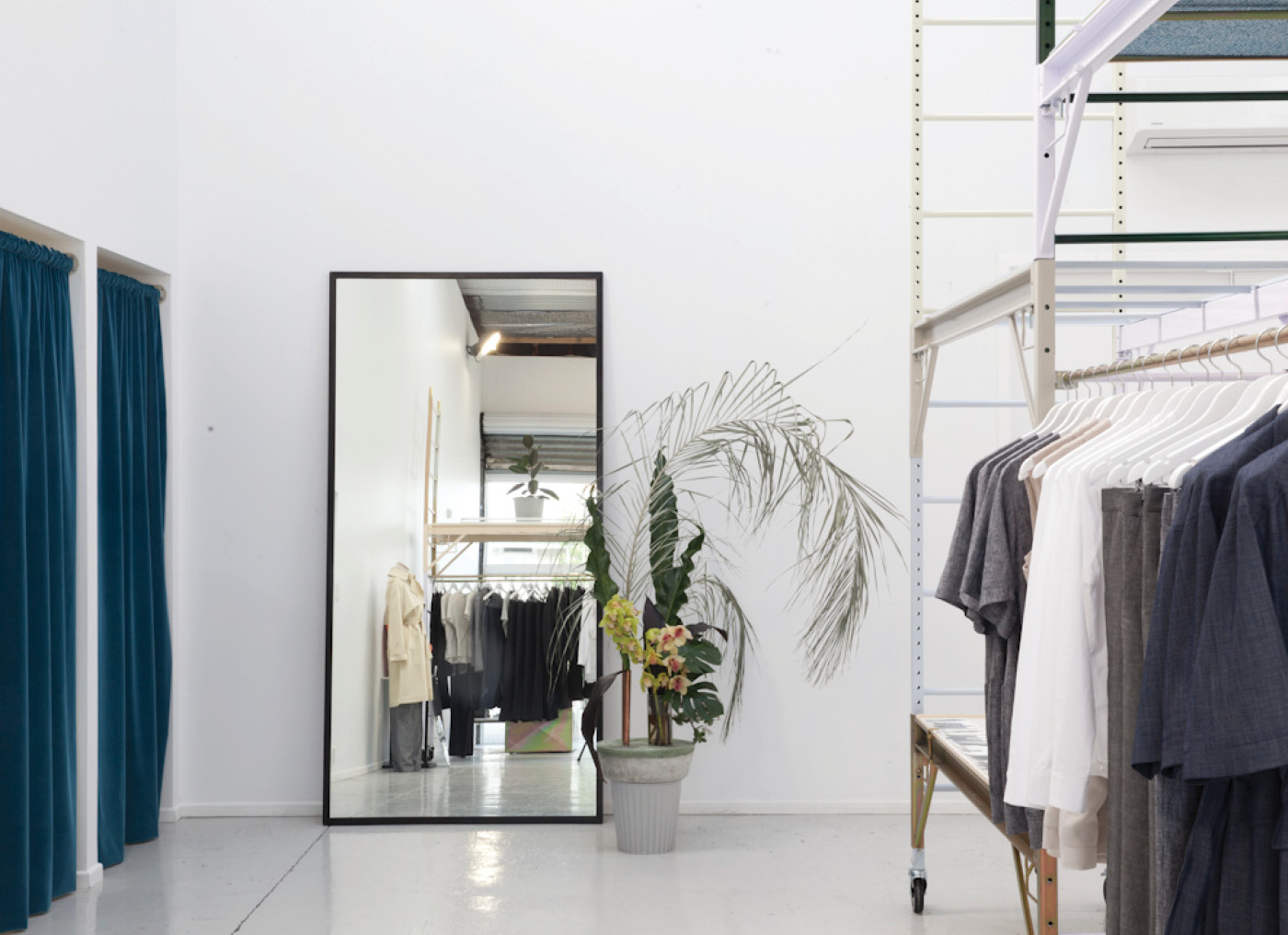
Eugénie - Auckland. Photograph by David Straight.
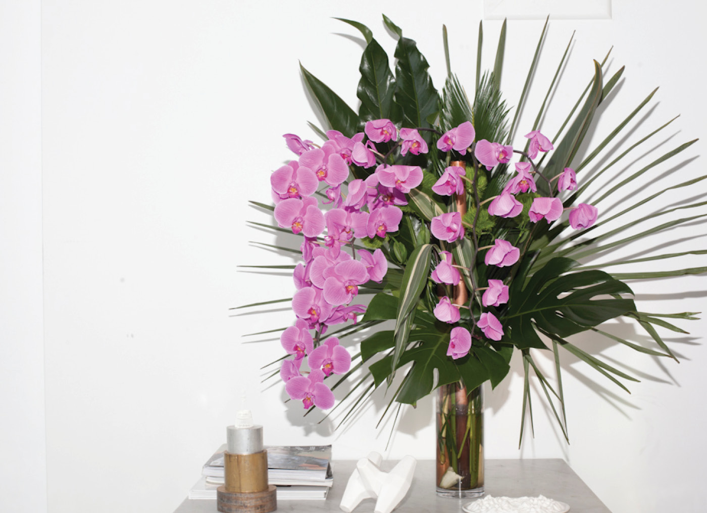
Bold flower arrangements ensure the shop is an inspiring and exciting place to be. Photograph by David Straight.
Eugénie – Auckland. Photograph by David Straight.
Eugénie’s current collection and the store interiors were influenced by a photographic series of office interiors by artist Lars Tunbjörk. Photograph by David Straight.


HOME Tell us a bit about Eugénie’s history, what you were doing before, and where the name came from.
Elizabeth Wilson Eugénie was my grandmother’s name and it’s my middle name. I originally trained as a product and graphic designer but after a few years in advertising I realised my interest in fashion was much stronger. After retraining I worked for Karen Walker and have since worked as a freelance textile designer, while designing collections and planning the store.
Eugénie – Auckland. Photograph by David Straight.
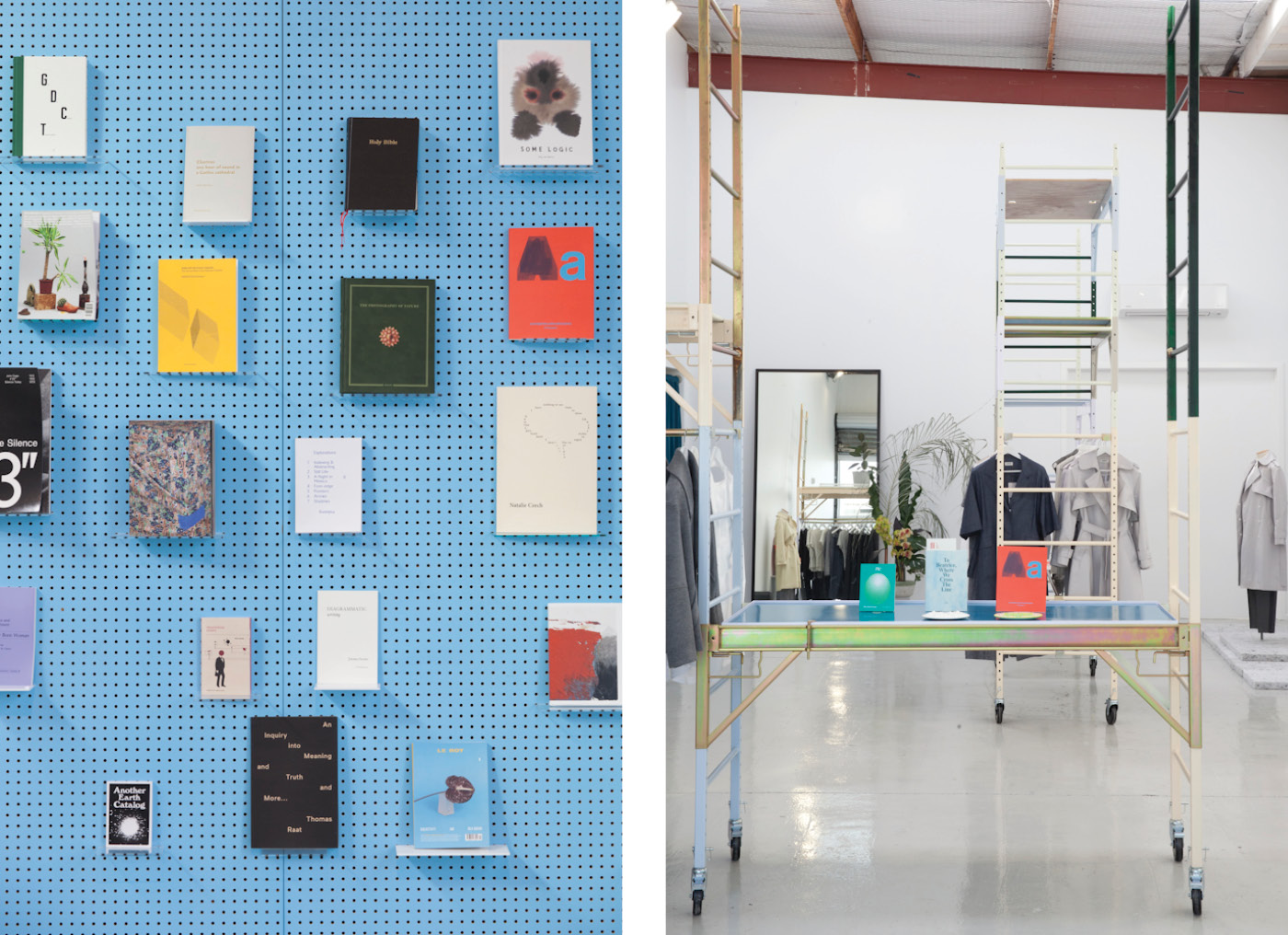
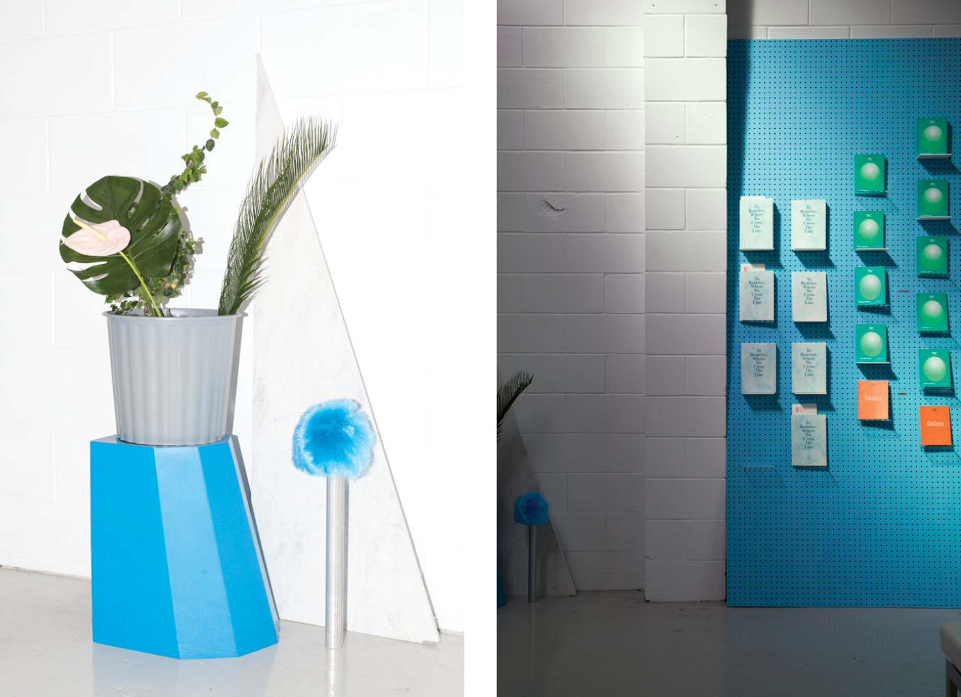
A showcase of books self-published on site, and a curated selection of local and international new writing and art publishing. Photographs by David Straight.
Eugénie – Auckland. Photograph by David Straight.
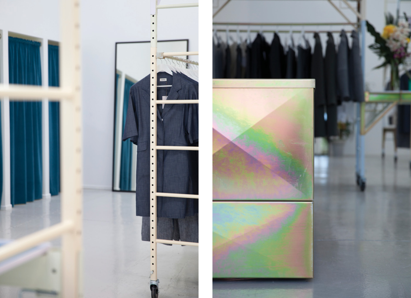
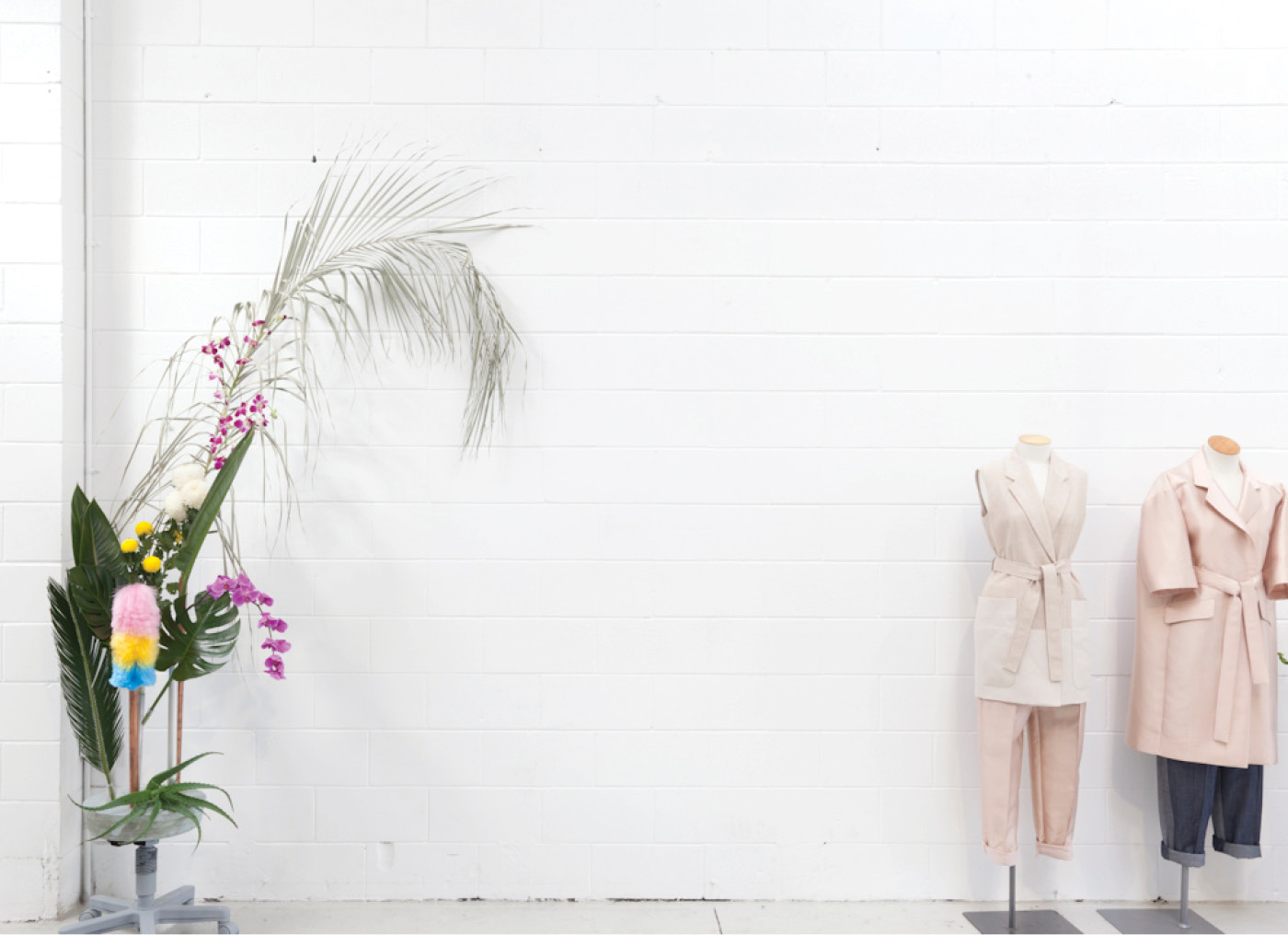
In her collection (left), Elizabeth Wilson focuses on texture, rather than colour, in a palette of office greys. At right: the iridescent steel-front desk. Photograph by David Straight.


HOME What’s the advantage in having a shop when you could sell online?
Elizabeth Wilson I care about the experience of people encountering the range and I wanted to create an environment that is an inspiring and exciting place to be. My customers care about fit and fabric – an online store can’t deliver on those fronts.
Eugénie - Auckland.
Assemblages of office furniture, flower arrangements and cast concrete are like installations at the store. Photograph by David Straight.
Eugénie – Auckland. Photograph by David Straight.
Another installation sits in contrast to the current collection. Photograph by David Straight.


HOME What themes does your second collection explore, and why?
Elizabeth Wilson The primary inspiration was a photographic series of office interiors by artist Lars Tunbjörk. He has a way of highlighting the strangeness of those ubiquitous spaces that I connect with. His influence is also found in our collection film we made, bringing through a little of the feeling of absurdity in the everyday that you find in his work.

Eugénie
51 Mackelvie Street,
Ponsonby, Auckland
eugenie.co.nz,
info@eugenie.co.nz
Latest video features

In the Coromandel, a home with a humble profile and a thoughtful design makes the most of a stunning location.

Built with awe-inspiring attention to detail, this Arrowtown home is a fresh interpretation of a familiar Otago rural vernacular.

This sculptural Northland bach is a perfect north arrow on a remote farm high above the sea.

With the sun on its bow and the community at its stern, this is a house in which the elements are always front of mind.

Trending articles

Homes

Pavilion in the clouds

Five simple elements and the well-placed delivery of a stunning view define this minimalist, Hawke’s Bay home by Dorrington Atcheson Architects.

Homes

Urban bach

When a client’s brief is to “come up with something you think looks good”, the parameters are so open and the trust so complete that

Homes

Corner villa

This clear insertion into the back of a century-old Wellington villa provides an extra 135 square metres and a myriad of spatial experiences for the

Design News

Heart of craft

Step into the Auckland headquarters of design and make studio, Fieldcraft, and you’re immediately immersed in a world of creativity that extends well beyond these