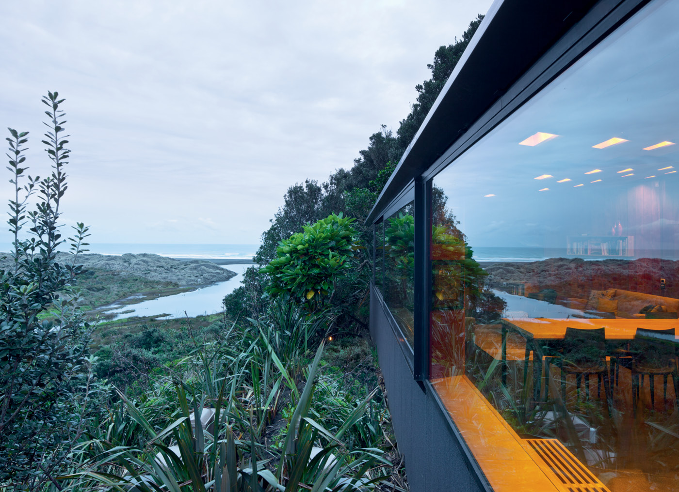
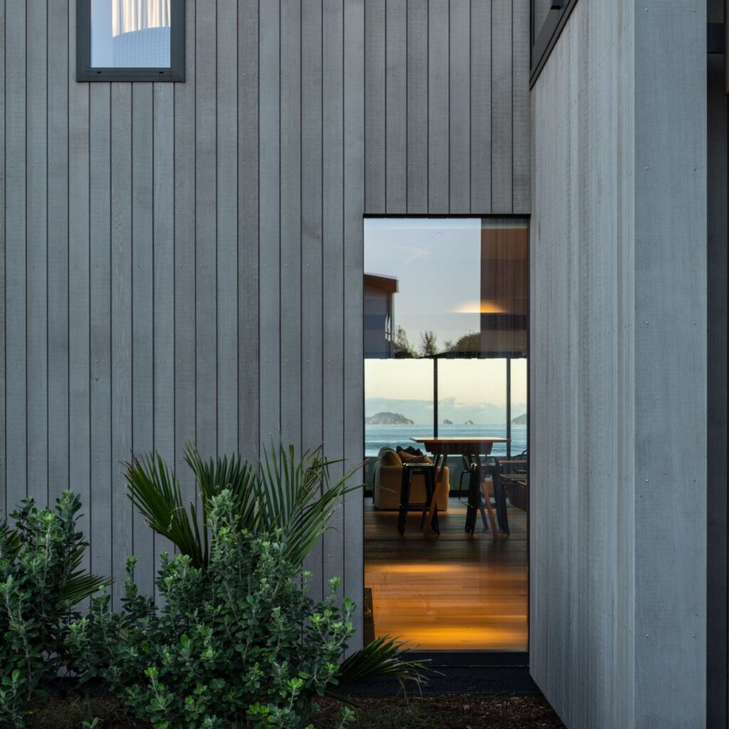
From Kare Kare beach, the Home of the Year 2011 is invisible but for a slot of sky reflected in the long horizontal windows of its living room
2011: Michael O’Sullivan goes wild on the west coast
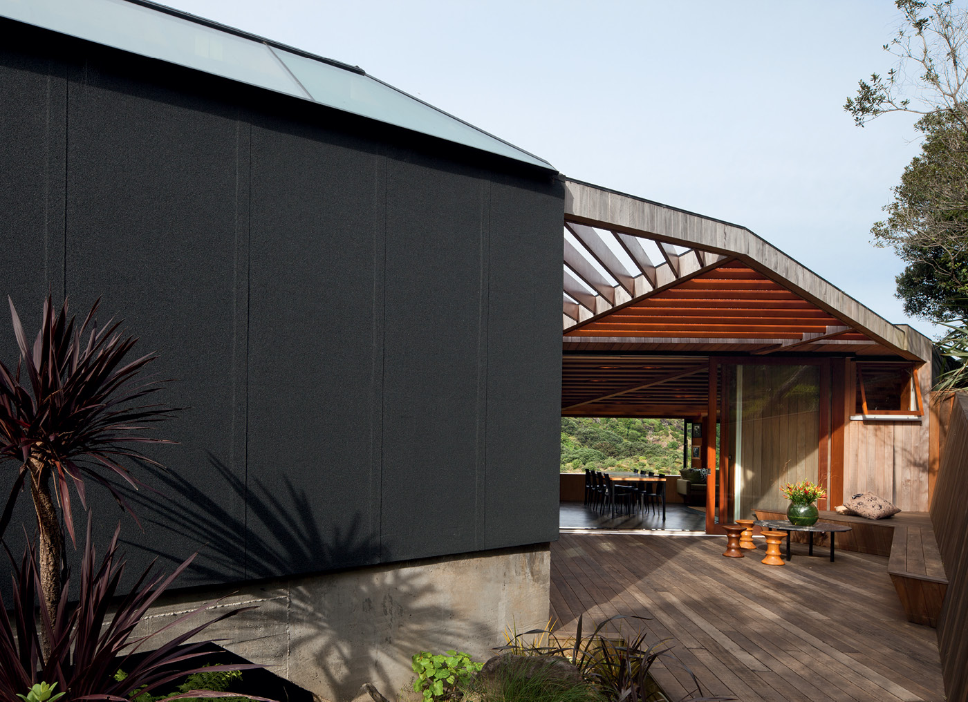
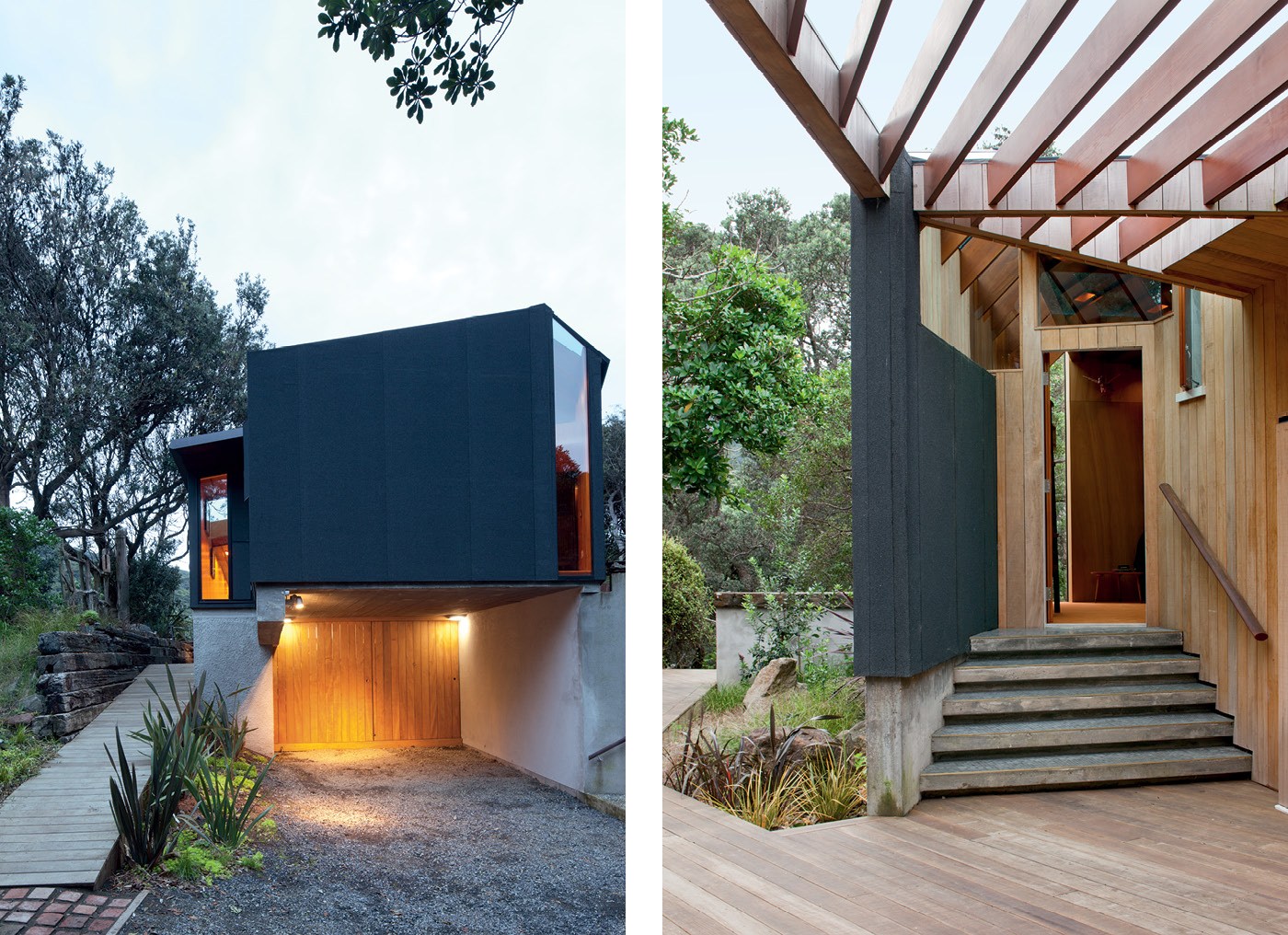
From down on the black sands of Kare Kare beach at dusk, the Home of the Year 2011 is invisible but for a slot of sky reflected in the long horizontal windows of its living room. So far, so predictable: there is nothing wrong with architecture designed to blend into its landscape, but there is nothing new about this idea either. What elevates this small home from standard-issue deference to a one-of-a-kind achievement is what lies behind its dark-skinned camouflage: a magical series of interior spaces coiled around an inviting courtyard, an arrangement as singular and muscular as the arresting vista outside.
It is a house designed not for looking at – in fact, it is so well-concealed in the bush that it is almost impossible to get a decent fix on it – but for looking from, a place that deftly executes a deep bow to the landscape while simultaneously daring to presume it can make a great view look even better. Somehow, the marvel that is this West Coast beach becomes even more marvellous when viewed from within.
Views are the blessing and the curse of many New Zealand homes. Our remarkable landscapes command attention, but many of our homes cower mute and inexpressive in response. In different hands this home, by Michael O’Sullivan of Auckland’s Bull O’Sullivan Architects, could have cowered in just this manner. Its owners, former Waitakere City mayor Bob Harvey and his wife Barbara, asked Michael for “a house that must not in any outward way be ostentatious”.
They went on to demonstrate the depth of their democratic instincts by not only consulting neighbours on the design, but asking Michael to change aspects of the house that elicited negative remarks (Michael’s original design featured a cantilever that allowed the living room to project a little off the edge of the hill; the cantilever was removed and the living area made smaller after a neighbour objected).
A lesser man might have walked away from such a consultative muddle or seen his original vision for the home slip from his grasp. But as well as possessing a determined streak, Michael knew that if he could successfully navigate the process, Bob and Barbara’s strong, warm personalities and deep attachment to Kare Kare offered him the opportunity to create a soulful, highly individual piece of architecture.
Besides, Michael had actively sought the job: he first happened to meet the couple on the site when he was going for a run at Kare Kare with a rugby club mate who knew Bob and Barbara and had dropped by the property to say hello. At that stage Bob and Barbara had only recently purchased the place, which was then occupied by a small, damp 1940s brick-and-timber home (the couple and their five kids had previously spent decades of weekends and holidays in a bach further up the valley). Michael marvelled at the site and later wrote the couple a letter offering his services.
“I told them that if they were interested in building a warm, nurturing home I would be honoured to do something for them,” he remembers. Two years later, despite knowing a host of other architects desperate to design something for them on a site like this, Barbara called and asked if they could talk to Michael about what they might build on the property. Why him? “We knew he got us, and he got the site,” Bob says simply.
The couple, who still own their family home in west Auckland, told Michael they wanted a retreat, a place to spend their impending retirement immersed in the landscape they love (Bob, who has been a member of the Kare Kare Surf Lifesaving Club for 55 years, is currently chairman of the council-controlled development agency Waterfront Auckland; Barbara, a former midwife, is now a celebrant). “[We wanted it to] be a private space in what has been a very public life,” Bob says, “a place to retreat and read and write and think. And for the chance for us to share the time we have with our children.”
They knew what they wanted the house to feel like, but how it would look was a completely different matter. To help them decide, Michael created three very different models that he presented simultaneously. The first, a rather conventional structure, was dismissed by Barbara as “looking too much like a house”; a larger, flashier proposal got binned because it looked like “something a wanker mayor in Auckland would own”; the third model – always Michael’s preference – was admired for its discretion and intimacy and given the go-ahead. The governing concept, Michael says, is that the house “is the residue of a found object in the sand dunes”.
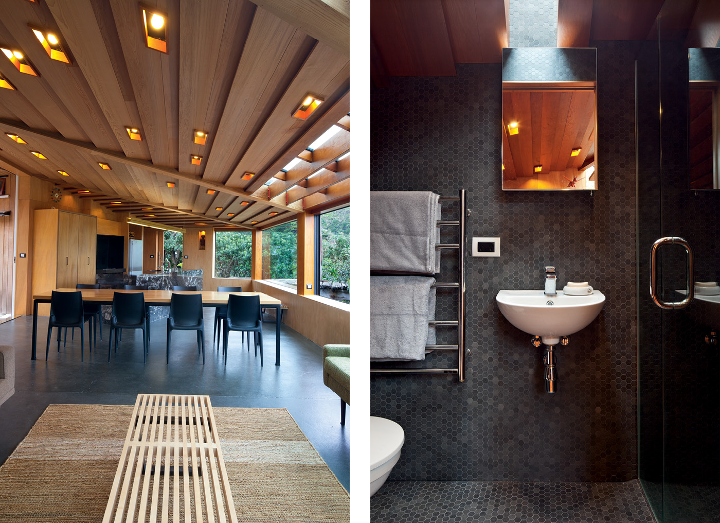
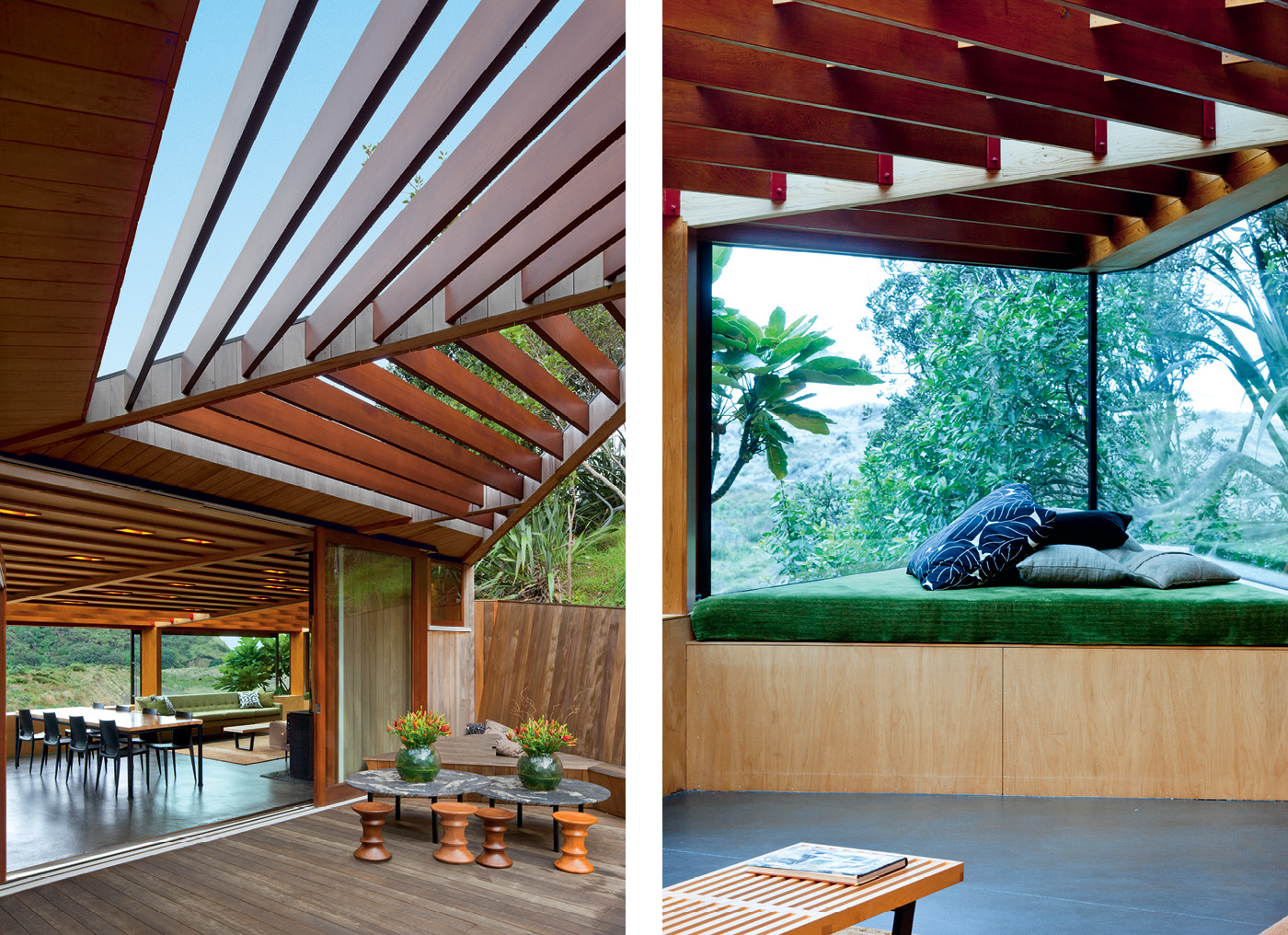
The great challenge of the design was getting light in: the outlook is towards the south, while the hill to the north meant the old home on the site got no sun at all in the coldest months of the year. Michael sited the courtyard of the new home to roughly occupy the footprint of the original dwelling, allowing the living areas to pull away from the shadow of the hill towards the beach. He designed the ceiling to rake steeply towards the north to pull winter sun as far inside as possible and make the courtyard feel like an integral part of the house, a gesture that forces the perspective of the view to the beach into a tight horizontal slot.
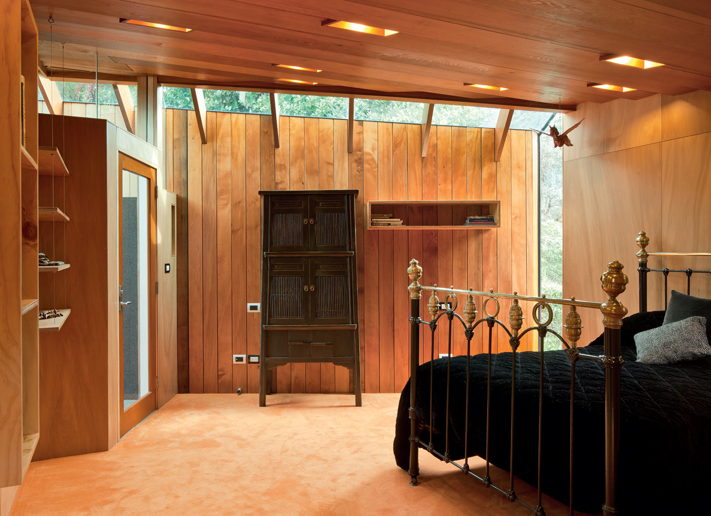
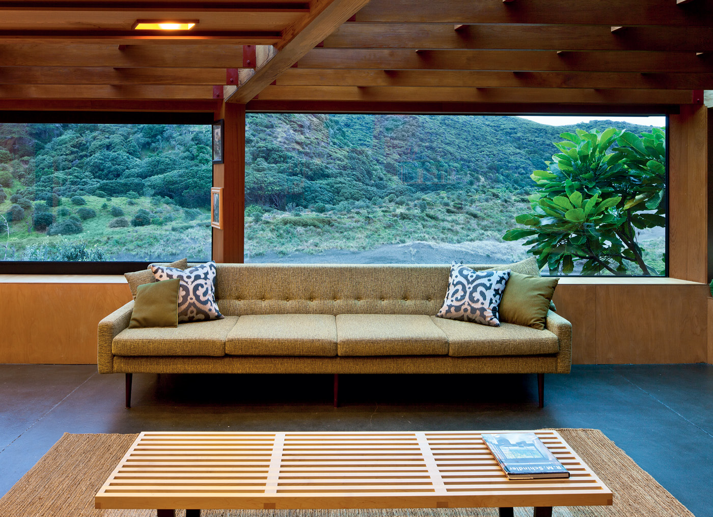
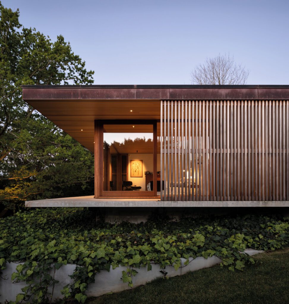
The ceiling’s cedar weatherboards are the dominant feature of the living space, but they avoid any sense of oppressiveness by appearing to fragment in places, with the boards giving way to double-glazed glass roof panels over the triangular daybed and the long, generous windowsill designed for sitting and gazing at the beach. A cosy secondary living room opens onto the courtyard and can function as a spare bedroom, while Bob and Barbara’s bunker-like bedroom offers shelter in a southerly storm.
Some of these features will seem familiar to the close observer. Around the time he was designing Bob and Barbara’s house, Michael was building his own family home in Mangere Bridge, a finalist in our Home of the Year award in 2009, and a kind of laboratory for the work he would later do on Bob and Barbara’s house. “As I was building Mangere, I was really just trying things for their place,” Michael says.
Bob and Barbara would come to observe Michael’s experiments with what the architect calls “the intimacy of the spaces” (at 129 square metres, Bob and Barbara’s two-bedroom house is just 12 square metres larger than Michael’s own compact home), as well as elements such as the weatherboard ceiling and the black bituminous roofing membrane that clads the rear walls of Michael’s house and the exterior of Bob and Barbara’s. Not that every experiment was resolved by the time Bob and Barbara’s house was designed: Michael responded to their desire for a floor that looked like Kare Kare beach’s black sand by wheeling barrowloads of it up from the beach and bonding thin layers to the concrete floor with an acrylic polymer.
Flashes of this DIY spirit enliven other parts of the house, creating loose moments in an otherwise tightly organised structure. Reclaimed piles from the old Cornwallis Wharf that Bob wanted incorporated in the building form a jetty that extends the pathway off the eastern side of the home into a makeshift viewing platform; the slot blade light that hangs over the black marble kitchen island was made by Michael for Bob and Barbara for their 40th anniversary.
When the house was completed, Bob and Barbara asked their friend Rewi Spraggon to create a two-panel wall carving representing the Harvey whanau. Elsewhere, they have hung historical photographs of their West Coast environs, while a carving near the door is a taonga given to Bob in 1993 by Te Kawerau a Maki, the tangata whenua of Waitakere. “[The house] is a very strong combination of past, present and future,” Bob says.
And while he was happy to embrace this sort of richness, he also confesses to “despising comfort – I like basic things in life and I wanted a house that was strictly functional, which I suppose goes back to my Socialist roots. It’s Spartan and stoic”. All that depends, of course, on how you define luxury. Out here on the coast on a wet winter’s day, the privilege of perching on that long windowsill and gazing out at the beach seems like all the luxury a person could ever need.
Photography by: Patrick Reynolds. Words By: Jeremy Hansen.
[related_articles post1=”1716″ post2=”2513″]
