Pac Studio deploys light and fun through materials for a bungalow extension
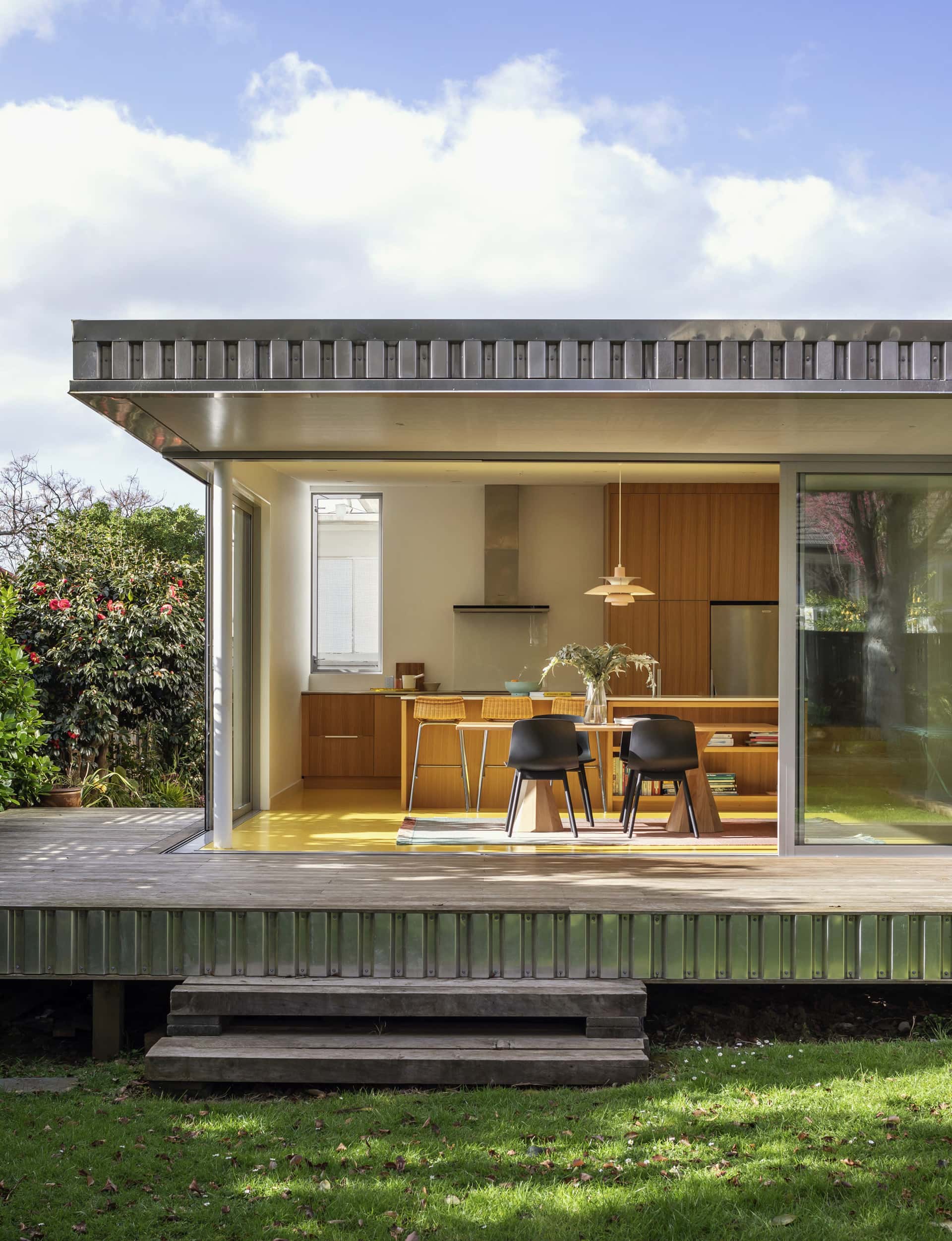
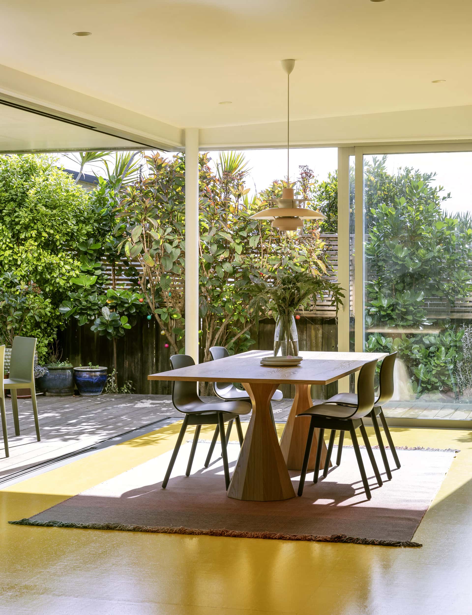
Some regard puns – especially egg puns – as the lowest form of wit. But the yolk’s on them, because this bungalow extension in Auckland’s Mount Albert, known as ‘Yolk’ house, features a bright yellow floor – a calculated whisk that shows off the occupants’ free-range thinking (and that’s all the egg gags omelettin’ you have).
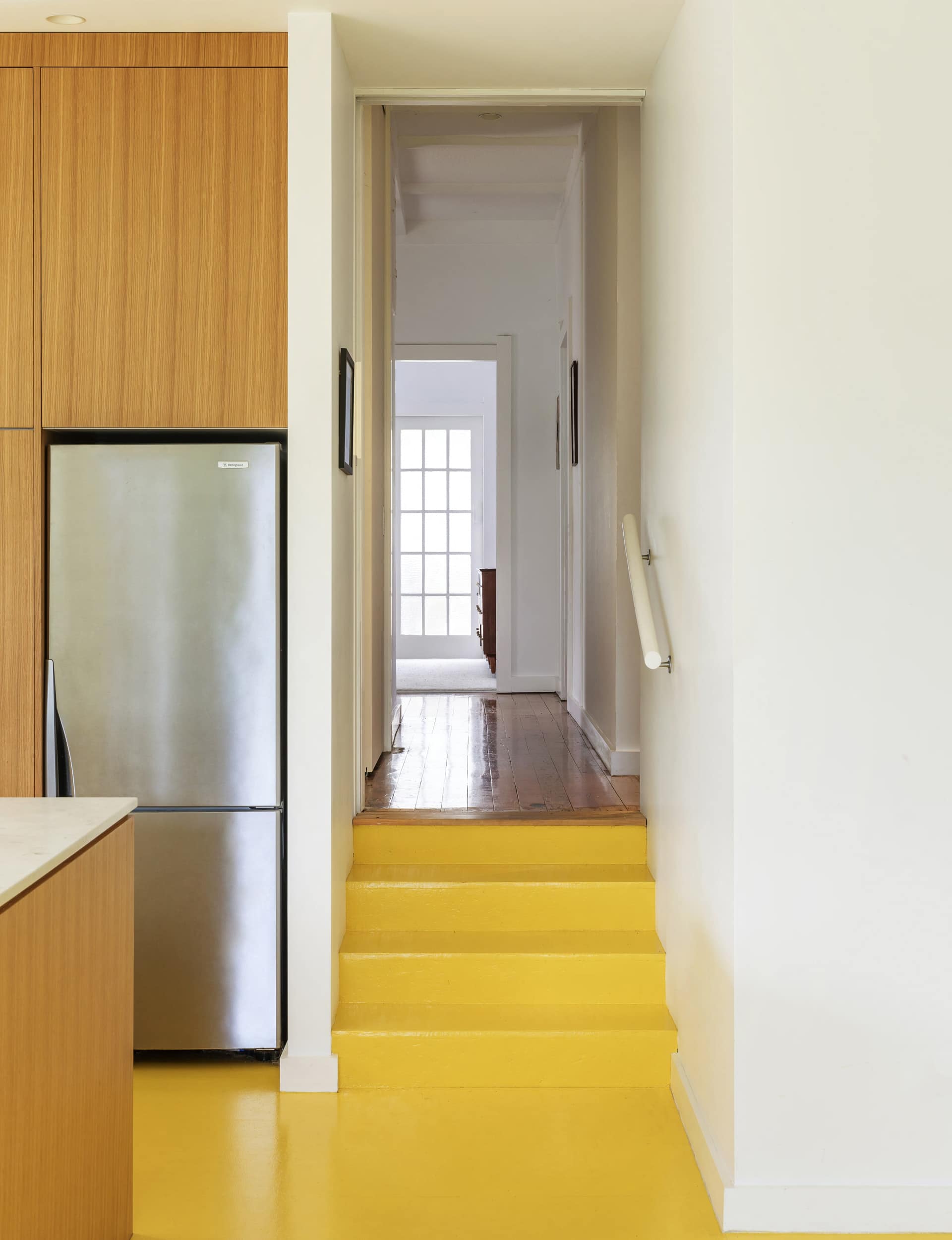
According to Pac Studio’s Sarosh Mulla, the sunny hue of the flooring matches the disposition of the owners, who work in media. “Whenever we design, we always try and fold in some aspect of the client’s personality, and they are just super happy, upbeat people,” says Mulla. Pac Studio had formerly been located in a white studio that had a yellow floor, “so we knew it had this effect of making the space feel sunny all the time. Even in winter, it still feels really good in there and in the summer, it just glows.”
From the front, the house is a classic 1940s bungalow on a quiet suburban street, but head out back and you’re in a different time-space continuum altogether. Facing a luscious garden of native plants that attract tui and piwakawaka, a generously proportioned, aluminium-clad verandah, seemingly plucked from the set of The Jetsons, sparkles in the sun, while inside, the golden floor radiates.
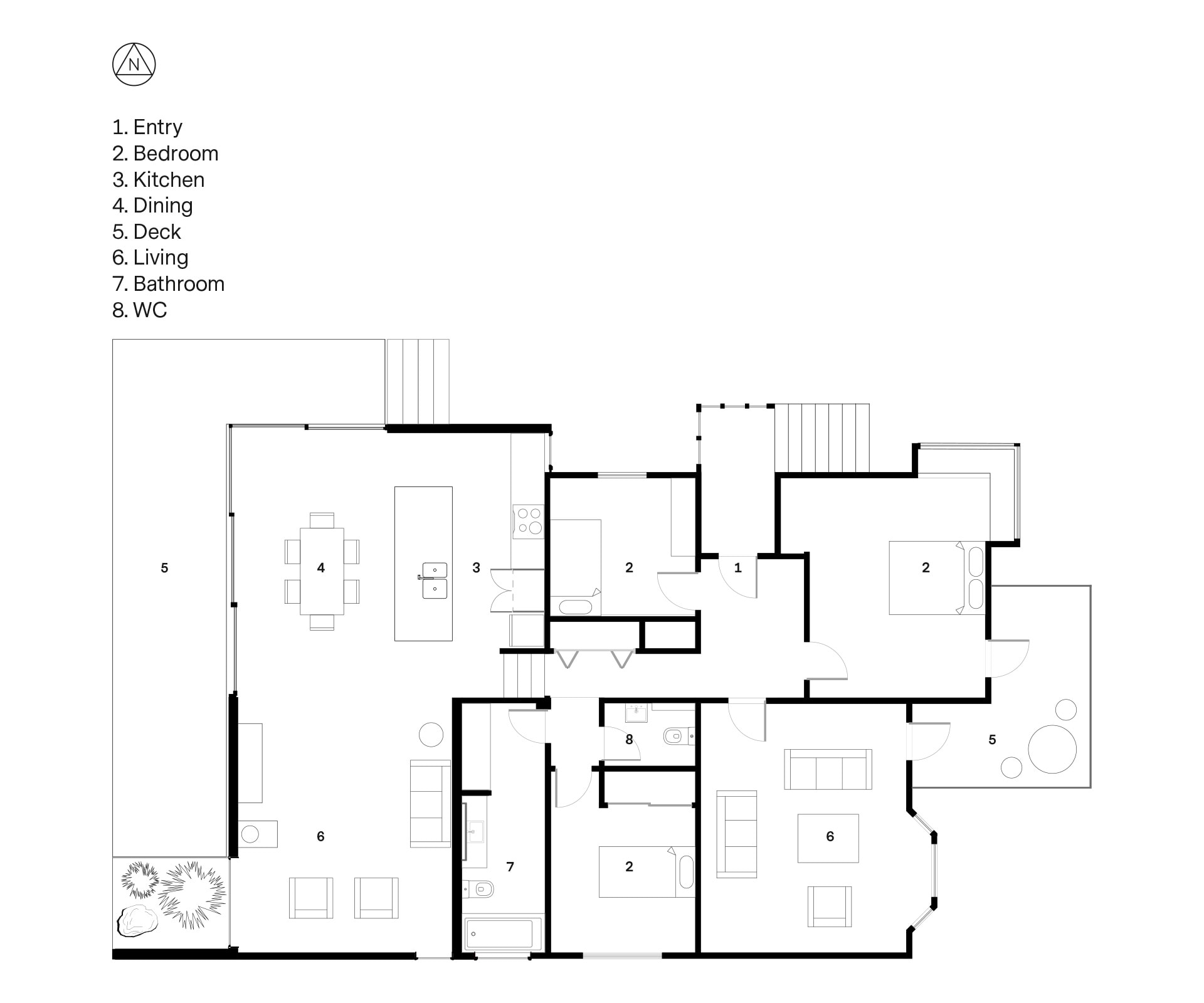
The owners have lived in the house for about six years. They have two daughters, one at intermediate school and one who has just started high school: in other words, at an age where they are beginning to appreciate their own space. Pac’s brief was to reshape the back end of the house to create a combined kitchen, dining and living space, plus bigger bedrooms for the girls and a bathroom.
An addition had already been made in the 1970s, which included a kitchen and very narrow deck, with a big bank of stairs leading down to the garden. “It was terrible,” says Mulla. “It was a strange layout and quite elevated off the back yard – so high up that there was no real connection to the outside. It was like falling off a cliff.”
[quote title=”Whenever we design, we always try and fold in some aspect” green=”true” text=”of the client’s personality.” marks=”true”]
The idea was to provide something that was cost-efficient, using readily available materials that would be fast to put down, “but still fun and a little bit more adventurous than a lot of people would be,” says Mulla. A deep deck provides cover from Auckland’s moodier weather, and the indoor-outdoor flow is much improved. “It’s so easy just to trot out onto the grass. It really is as low as we can get it.”
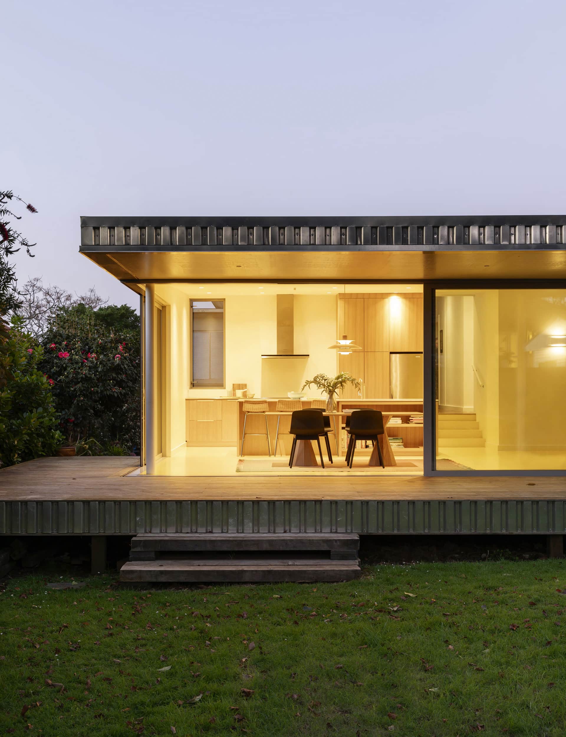
The aluminium cladding, which lends the house a Len-Lye-Centre-in-the-suburbs vibe, stems from a fascination with the way light works, says Mulla. “With every project, Aaron [Paterson, Pac Studio director] and I try and figure out a new way to manipulate light or shadow. The cladding gives the most incredible light effects through the day and seasons as well. In summer, when the sun goes down, you get this wonderful pink light across the western side of the house and you get it changing all the way through the day.”
[quote title=”The cladding gives the most incredible light effects” green=”true” text=”through the day and seasons.” marks=”true”]
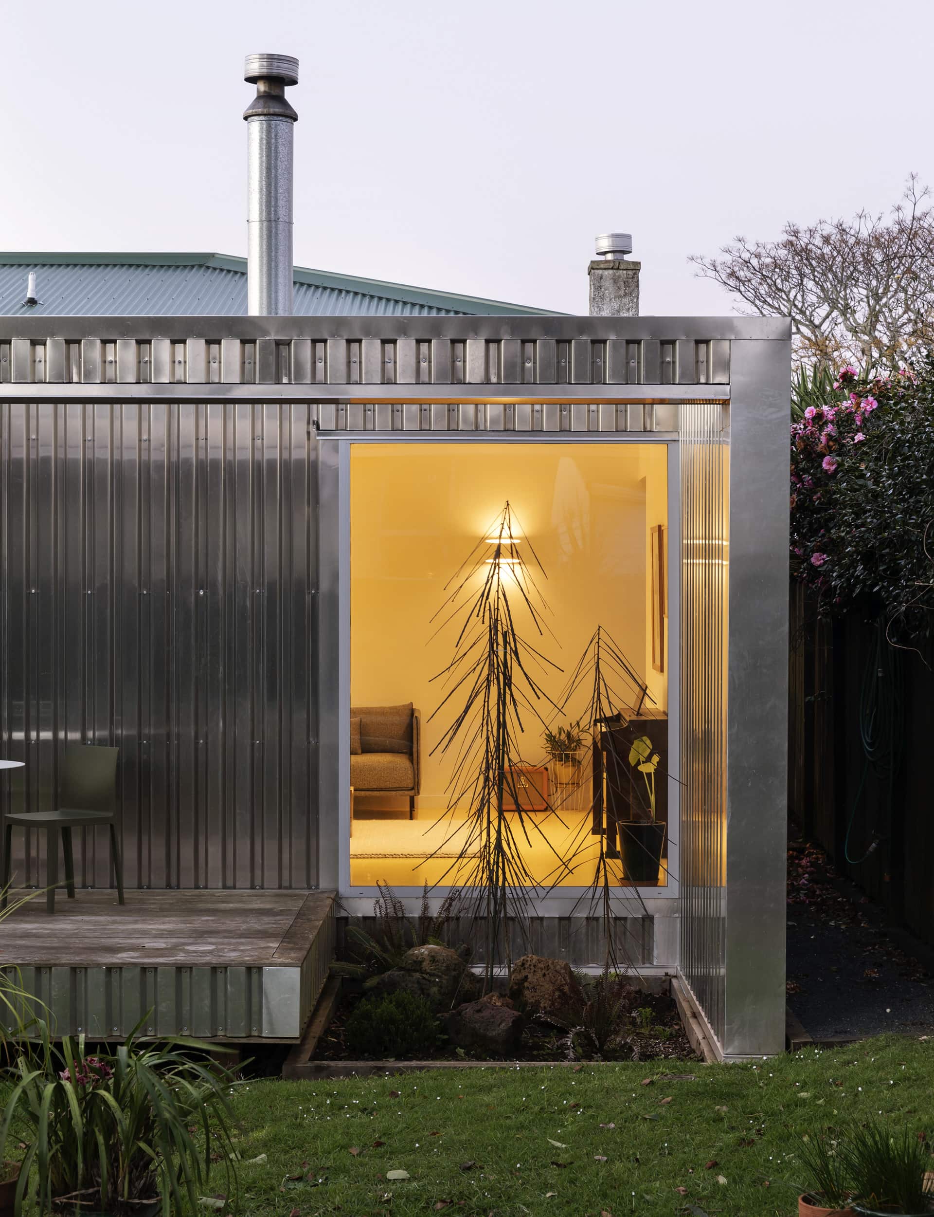
Variations in the form of the verandah add to the light display, reflecting rippled patterns back into the house. A slightly sunken garden at the right of the deck is planted with young lancewoods that will eventually grow through an opening in the roof. “Lancewoods are all spiky when they’re young and as they get to maturity, they bulk up and become much more frothy and soft-leaved,” says Mulla. “They’ll grow properly tall through that opening, which will be really fun.”
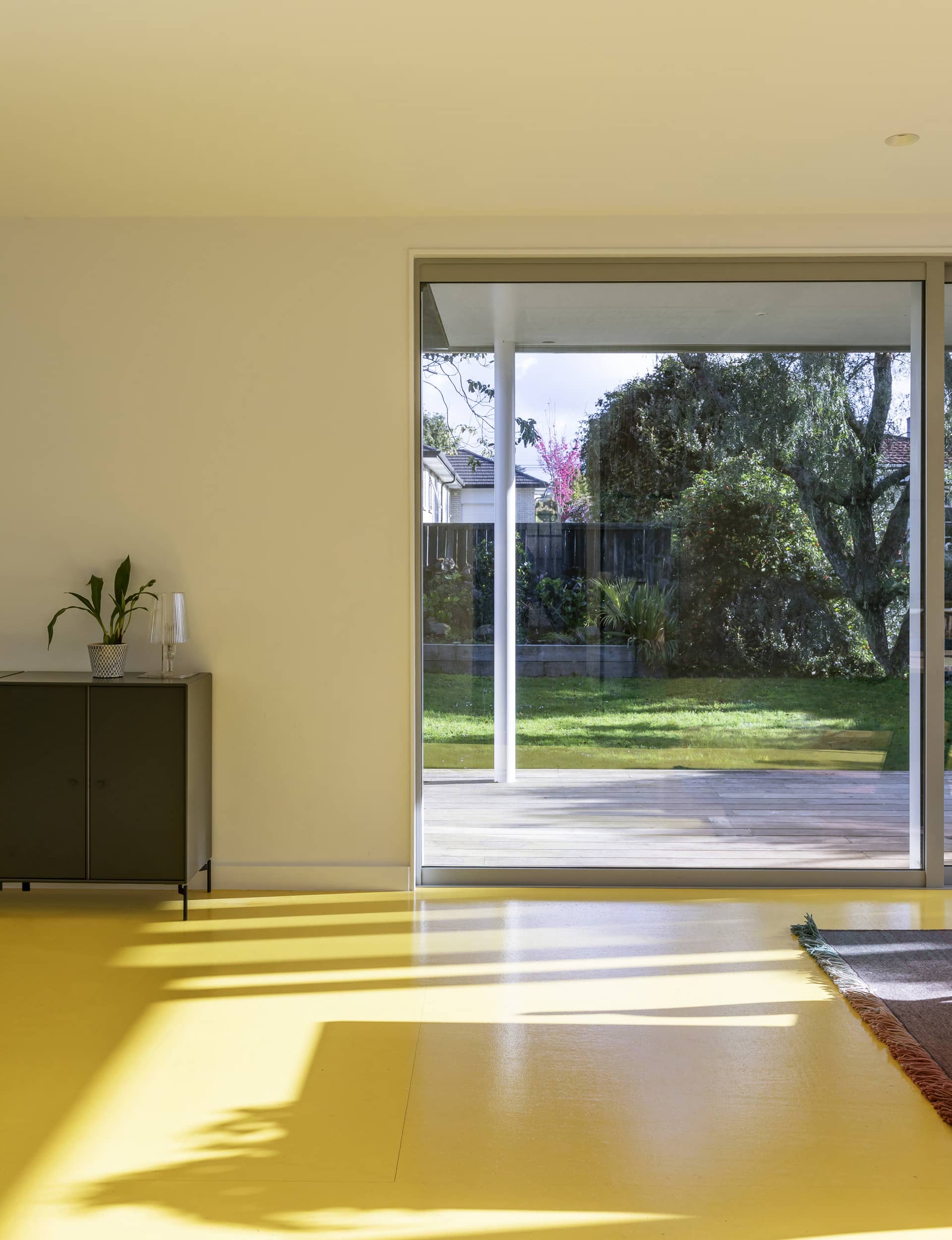
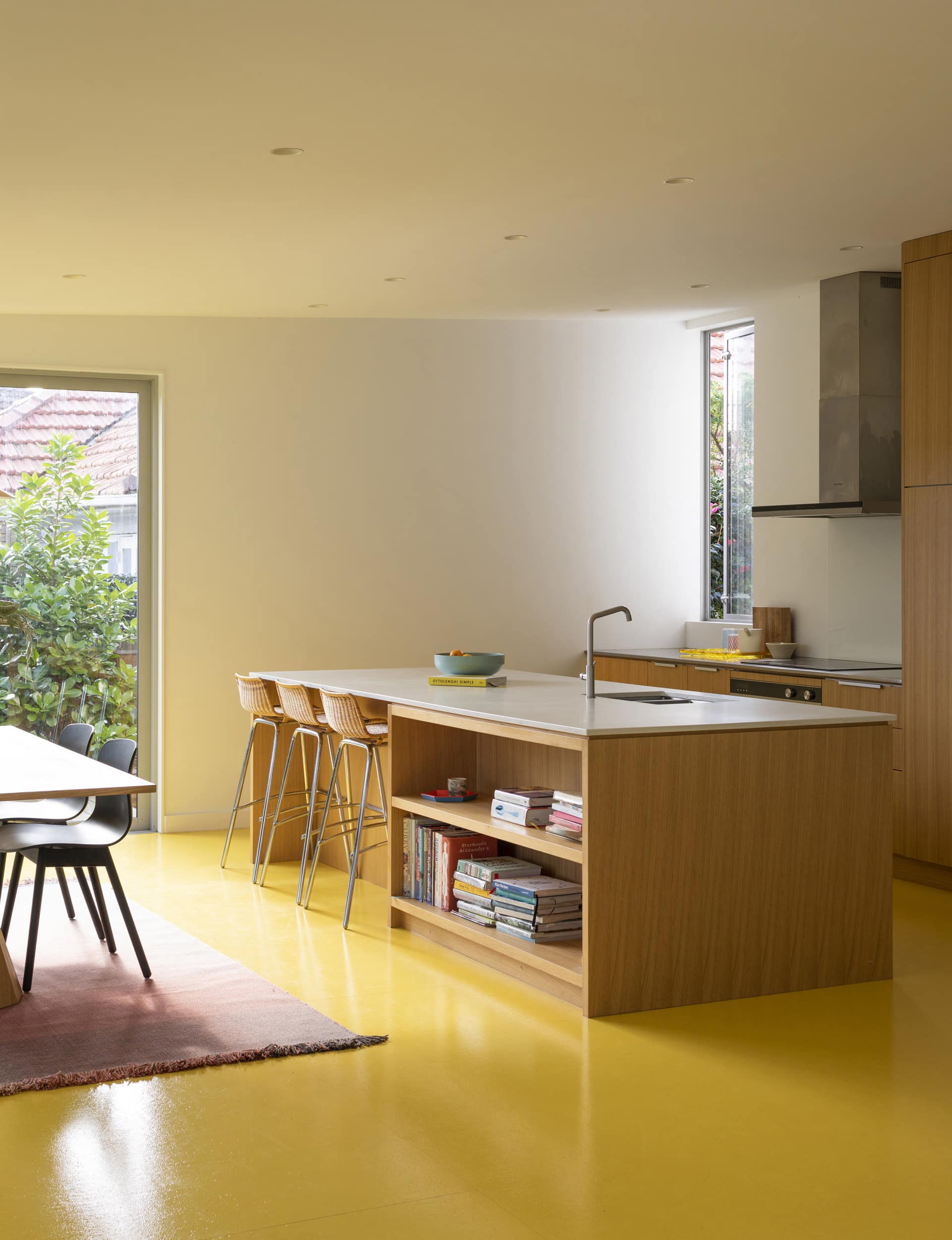
The materials, says Mulla, are all about bang for buck. “So plasterboard, and being precise about the way it goes together, and Strandboard – the material under the yellow paint – is about the most cost-effective way of making a floor. And then it’s just a couple of really good pieces of joinery so you get that nice connection from the outside to the inside.”
The sunshiney floor colour is complemented by a kitchen unit in American white oak. “We knew we were going to do the big punchy floor so every other surface has to be white where it’s painted, then we use the kitchen furniture and cabinetry as the textural elements to warm it even more.”
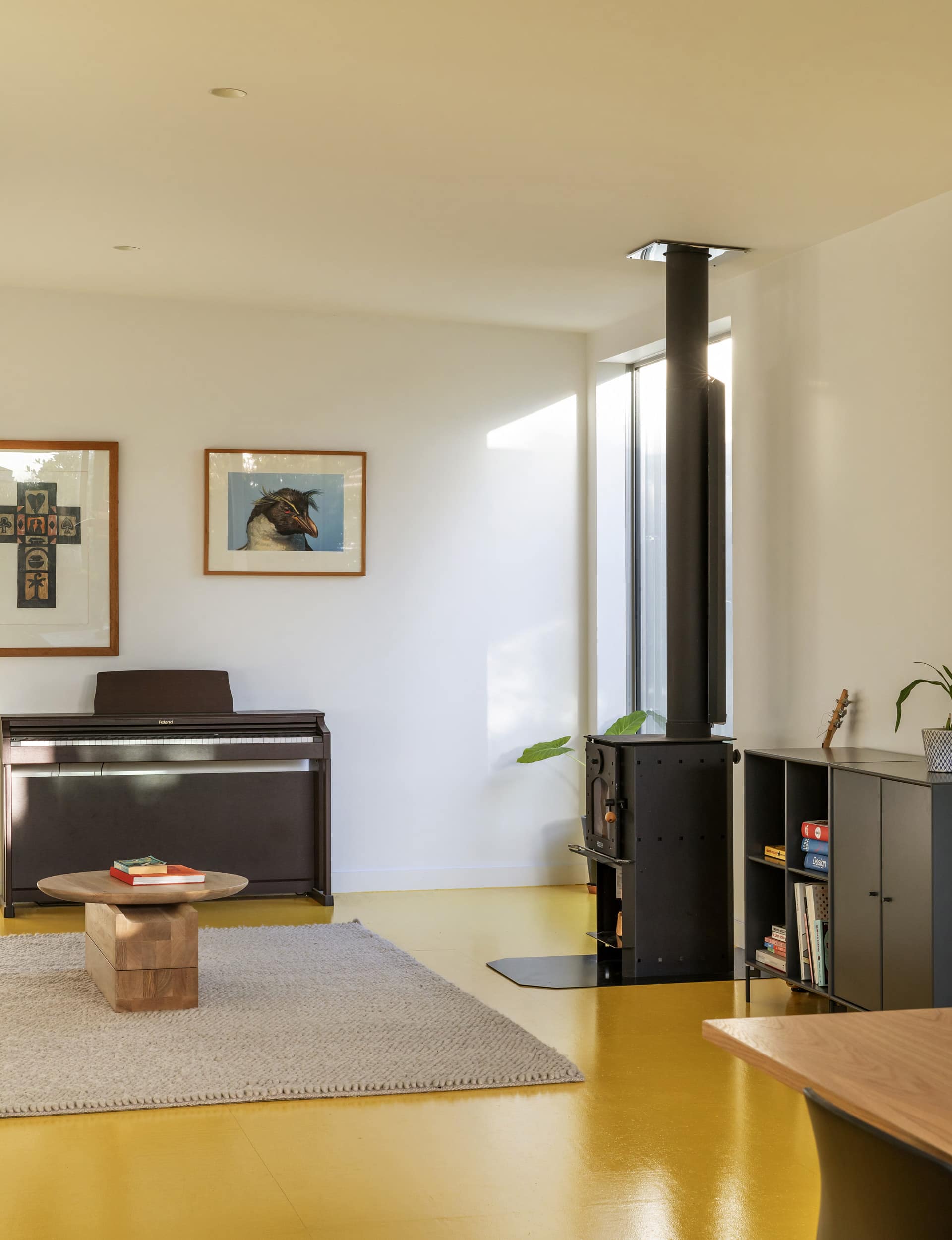
A marshmallow pink ‘PH 5’ pendant by Louis Poulson that hangs over the dining table not only matches the retro-futuristic feel of the deck but, by a happy accident, is the same shade of pink chosen for the bathroom. And the family has other unique art and objects they’ve collected on their travels. “We wanted a calm backdrop because we knew there were going to be good things to display.”
[gallery_link num_photos=”13″ media=”http://www.homestolove.co.nz/wp-content/uploads/2019/10/HOMEOct-Nov19_PACStudio_MtAlbertHouse_LivingRoom-750×625.jpg” link=”/real-homes/home-tours/inside-sunny-yellow-bungalow-extension” title=”See more of this home here”]
In summary, the eggstraordinary Yolk House is definitely not your average lean-to bunged onto the back of a bungalow, but more of a curious and delightful Kinder Surprise. “We liked the super-sized, slightly space-age lean-to. It’s a little bit tongue in cheek, which suits everyone’s sense of humour.”
Words by: Julie Hill. Photography by: David Straight. Styling by: Sara Black.
[related_articles post1=”104956″ post2=”104366″]
