Located down a densely populated driveway, this steep, small site didn’t have a lot of obvious benefits. What it did present was a number of questions, the answer to each offering a topical narrative on where to from here when designing stand-alone homes for family life in our cities.
For architect Rachael Piper, this project became an exercise in answering those questions and demonstrating what is possible as we move towards a new way of considering suburban living.
“Can infill housing provide a generous refuge from suburban life? The objective here was to demonstrate that it can, and show that it can also do much more. It can achieve privacy, generosity, and feel expansive despite a restricted footprint and budget,” Rachael explains.
The first drawcard of the Meadowbank site was the desire of Rachael and her husband, Matthew, to relocate to a suburb closer to the city with access to quality education for their children. “We wanted to build a home that allowed us to exercise control over the aspects that mattered to us; a home that was tailored to our specific family patterns and dynamics,” Rachael explains.
“What we also wanted to achieve here was a home that had a warm atmosphere for our children to grow up in and cherish memories of — as the memories of a family home last a lifetime.”
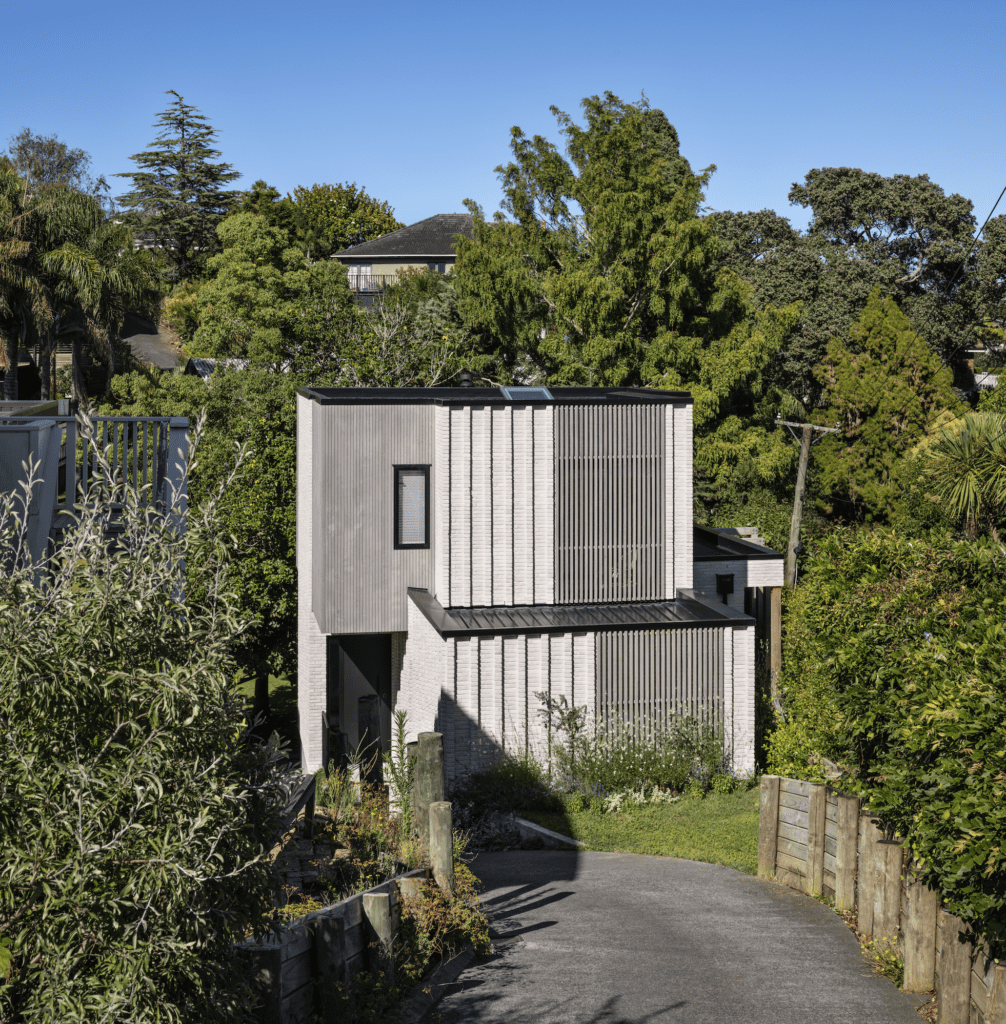
However, the initial response on viewing the site with a building platform of just 85 square metres was, as Rachael describes it, that it seemed too small to build even a boat, let alone a family home. It was a slice of the backyard of the property in front; a retained grassy platform that appeared to have little going for it.
After careful consideration of the options, Rachael came up with a plan that involved exploiting the verticality of the site with a building that would unfold over three levels, optimise sunlight and volume, turn its back on the neighbours, and use the existing mature trees to create a privacy screen and an immediate green outlook.
“The inherent verticality of the site required the design to proceed upwards to maximise space.” In doing so, there were compromises to be made — the most prominent of which is the lack of outdoor living space. To mitigate that, Rachael devised internal spatial experiences that evoke the sense of being outdoors.
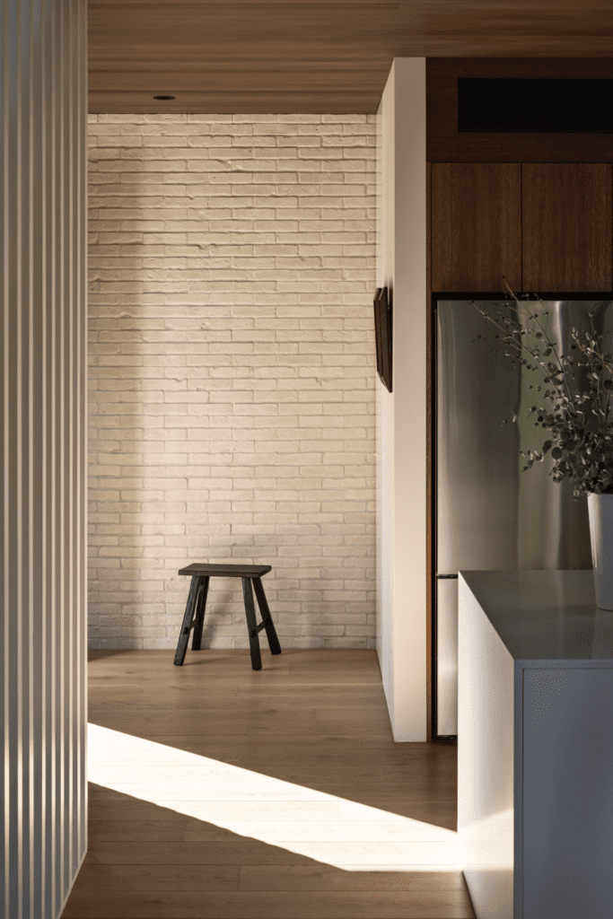
Utilising a restful palette of exterior materials, including brick and cedar, the home turns its back not only on the neighbours but also on the commonly engaged ‘throwaway’ approach to infill housing. Here, permanence and longevity are at play.
The form plays with both the verticality of the site and the colonnade of trees along the western perimeter, which reach to around 15 metres at their highest point.
“To break up that verticality, we’ve used different boxes. The top storey recedes back in on both sides, while the central storey is a heavy mass nestled within the hill to the east, and transitions through to a lighter cantilevered form to the west,” Rachael says.
Vertical cedar is juxtaposed with brick, which is given a dynamic sense of movement with vertical pilasters that enhance the interplay of light and shadow throughout the day.
“By breaking up the structure into various boxes and elements that recede and undulate, we were able to achieve a dynamic push-and-pull effect to create proportion and angulation.”
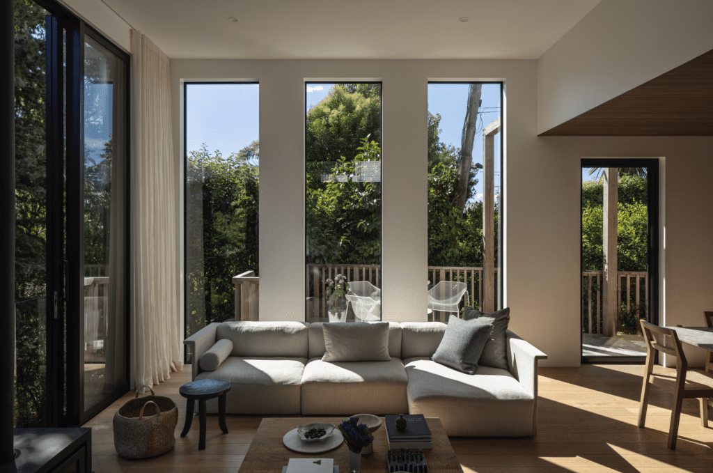
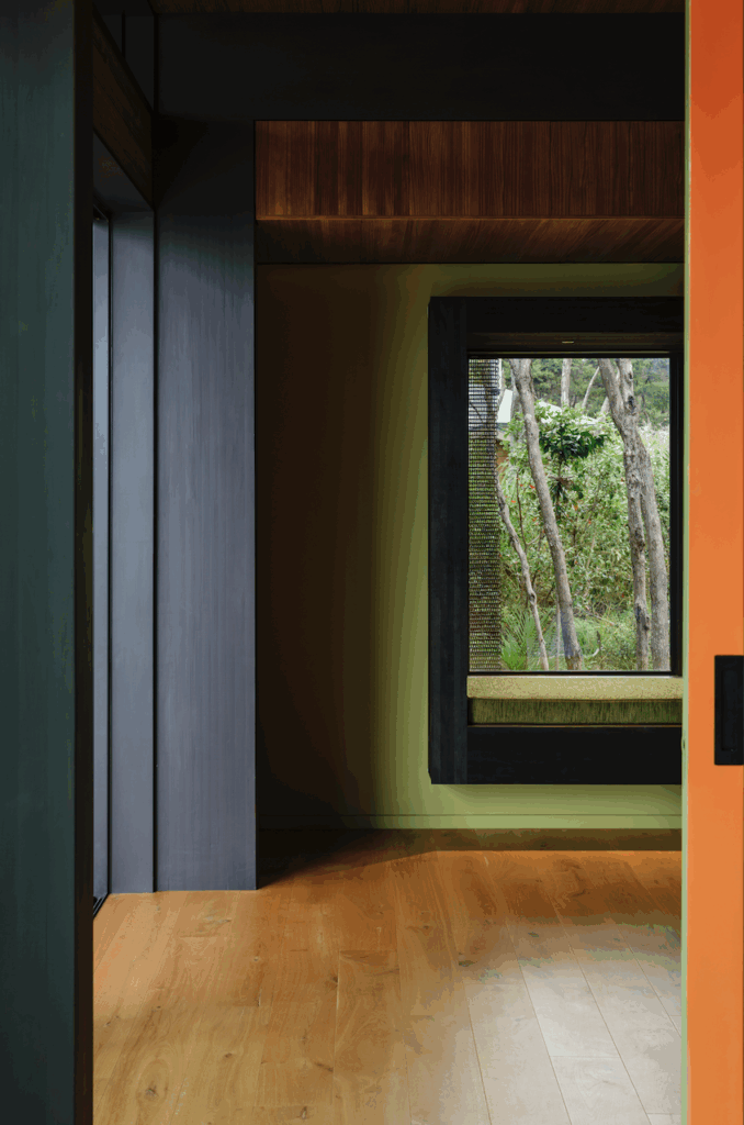
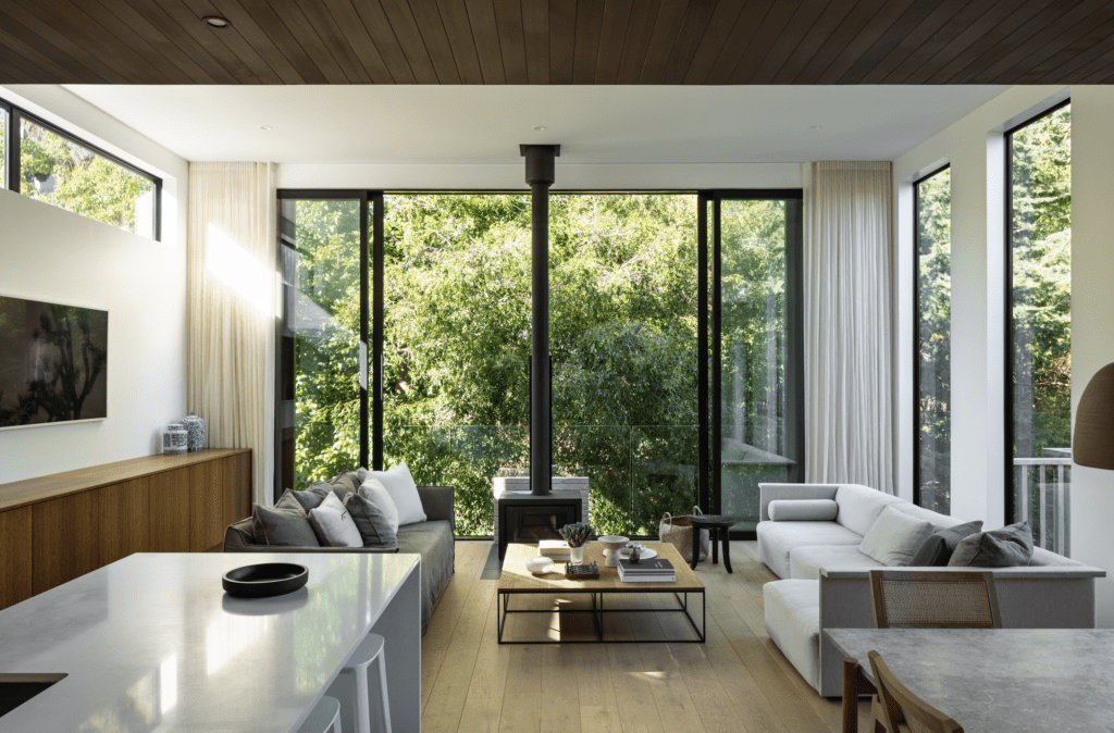
The arrival sequence plays on the building’s volumetric playfulness with an intimate soft brick entry space to welcome visitors. Inside, a warm, low timber ceiling offers a sense of compression in contrast with the substantial mass of the exterior, before opening into a sizeable, light-filled living and dining area. Here, floor-to-ceiling windows run the length of the western wall, capturing the immediacy of the leafy outlook. A colonnade of vertical windows runs along the northern wall, designed to mitigate solar gain while echoing the rhythm of the exterior brick pilasters.
“Given the limited site and usable outdoor space, this large lounge area was designed as a quasi-outdoor space. When the large doors open, it feels as though you are immersed in nature, with birds singing and light dancing through the trees. It has a tangible tranquillity.”
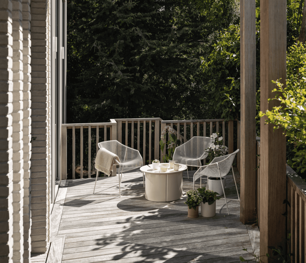
A small northern deck serves as an extension of the living area, inviting connection with a small but well-used garden area below. When Rachael’s friends refer to coming here, they often describe it as “visiting Titirangi” — a leafy suburb known for its bush-clad hills and hidden houses. It’s easy to see why.
This is a small suburban home surrounded on every side by close neighbours yet, as soon as you step inside, that context falls away and you’re drawn into a space that feels as voluminous as it does peaceful and secluded. It’s a hard place to just pass by; this is definitely a home for living that begs visitors to linger.
Did it answer the questions? Absolutely.

