Standing on the roof of an 80-year-old bungalow, Jon Smith caught a fleeting glimpse of the sea. That glimpse began a playful journey of exploration into light and height — both architect and client determined to frame the ocean view.
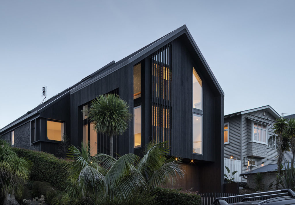
On a typical Westmere street, this black-clad double-gabled home stands tall — unrecognisable from the original bungalow whose bones were used to form the basis of an extensive renovation.
Loosening the belt on the unreinforced brick bungalow that had stood on the site since the 1940s was an important part of assessing where the opportunities lay, architect Jon Smith of Matter Architects says. There were many of those, but there were also inherent challenges in the constrained footprint, and, most predominantly, in a 2009 two-storey addition housing a garage and bedroom above that had leaked slowly but surely over the years.
“That needed gutting, and it felt as if it was tacked on — it was a bit of eclectic renovation that didn’t quite fit,” Jon explains.
Ultimately, the clients — a family of five — wanted more space but they also wanted to retain the amount of outdoor living they had at the rear, north-facing side of the section, which spans lawn, garden, and poolscape.
“When we did loosen the belt, there was a lot of opportunity and that lay primarily in the ability to add height based on the new Auckland Unitary Plan. Most of the other additions and renovations in the area had been done under the old rules so this was a chance to make the most of a new freedom.”
For Lucy and Paul Farrugia, this was of particular importance.
“This is our forever house. We will be here until our three girls leave home,” Lucy says. “We loved the outdoor space we had but the old house, where we had lived for eight years, didn’t have enough room for our growing family and we knew from the beginning that taking advantage of the ability to build up instead of out was what we wanted to do.”
The couple’s children, Sylvie, 10, Myla, 8, and Lexa, 6, are big swimmers, and the existing pool, while well used, was not ideal for the children — more lap than family pool, with the fencing running directly along the pool edge.
“We wanted to extend this, which meant losing a metre or so of grass but it was worth it so the children could play around the pool and jump in, rather than having spatial constraints.”
Other than that, light was a key issue — as much natural light as possible was a requirement from the outset.
To achieve this, the roof of the original bungalow — and the addition — was removed and old and new were cloaked in two slipped gabled forms, giving the house a new identity and, importantly, space, light, and height.
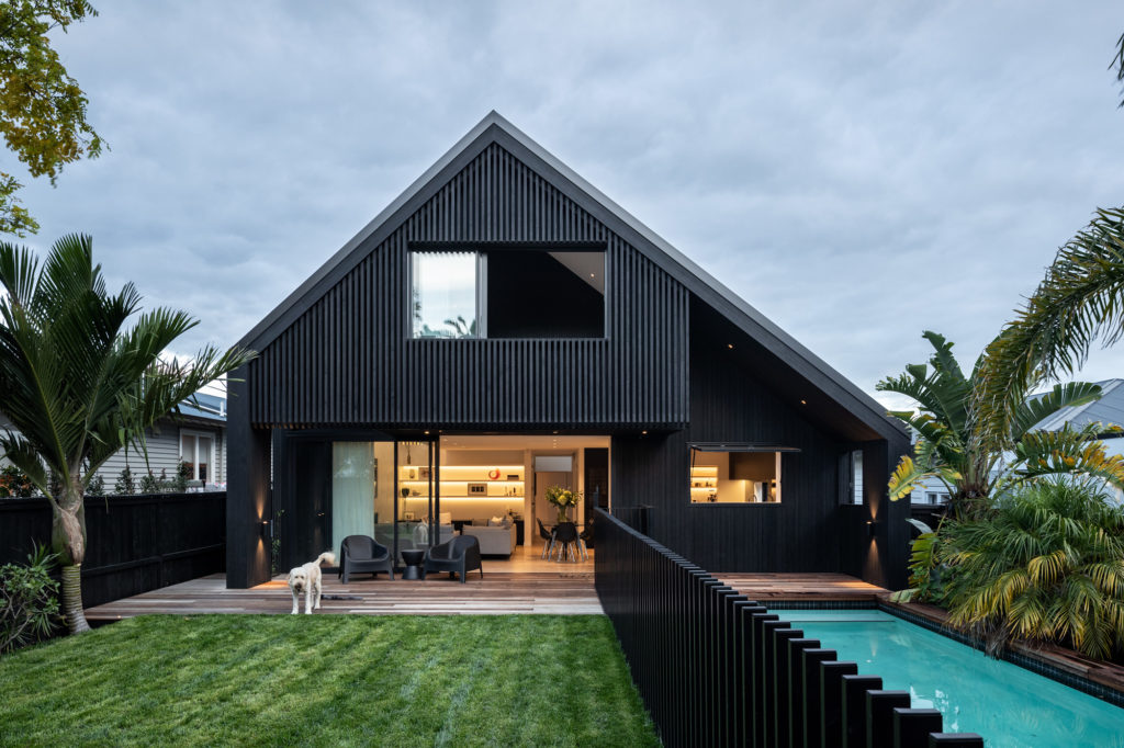
The last was a significant design decision as the street-facing elevation now covers three storeys, with a garage at ground level. Clad in vertical black Abodo wood, it’s a dramatic juxtaposition between the primarily white and brick original bungalows that still grace the street, but it’s one that Lucy and Paul enjoy.
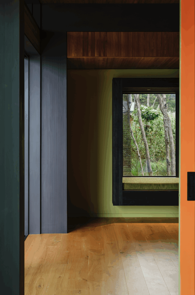
“I love black and white, and the ability to reduce maintenance on the exterior by using Abodo was a major for me. Inside, black and white make up the colour and material palette — it feels clean, timeless, and doesn’t date. Being neutral, it allows us to add pops of colour where we want to,” Lucy explains.
The entrance is at the juncture between old and new on the western elevation. Here, in a void cut from the cladding, a green wall is beginning to grow up wires to fill the space and linear screening introduces a key aesthetic.
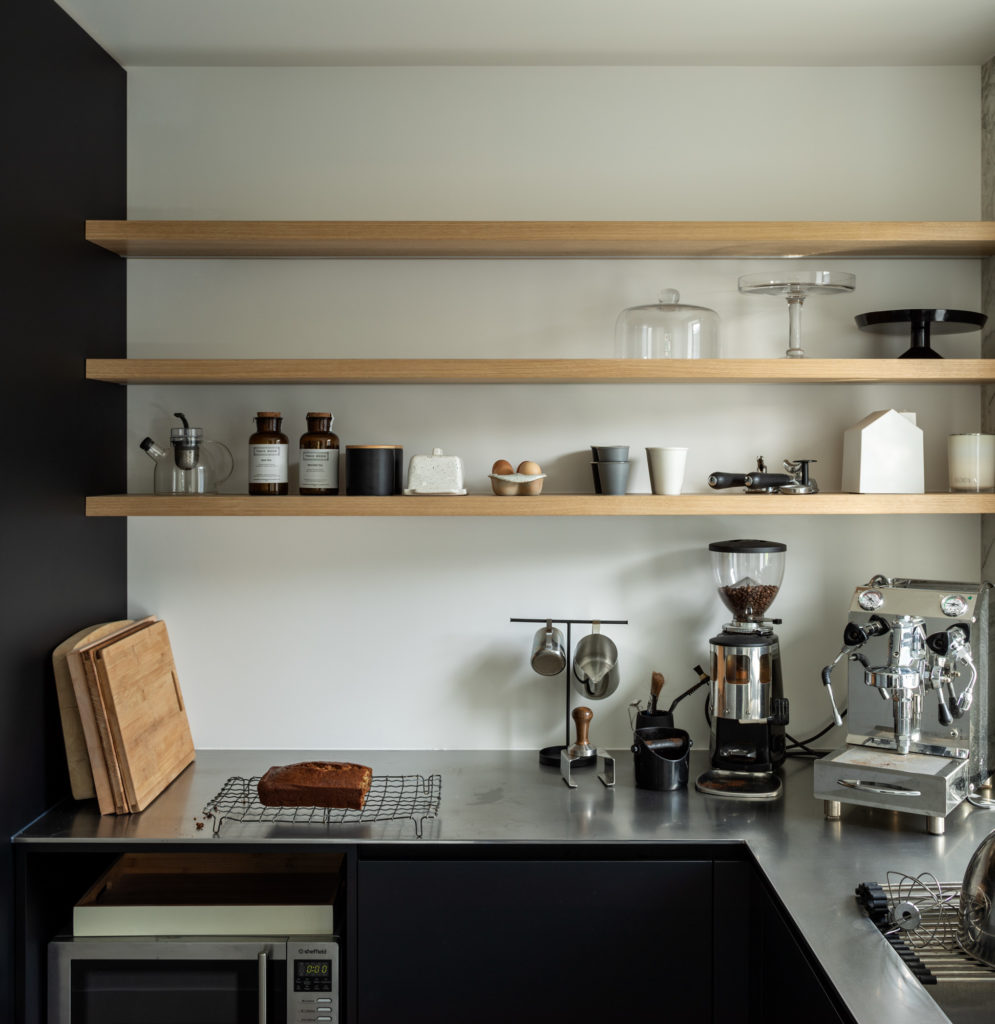
Jon mentions that one of the things they wanted to achieve was to make sure the renovation allowed for reinvigorated connections to the exterior and the greenery. Star jasmine will grow and cover the cut-out with flowering greenery that provides both tactility and scent — and a connection to the rear terrace where the same technique was used.
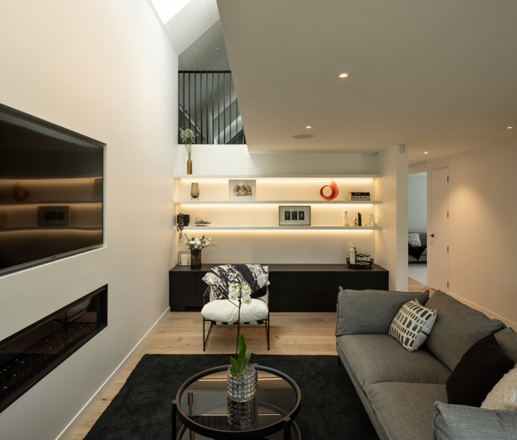
Immediately inside, the double height space created by the converging rooflines with a skylight above draws in natural light and gives the immediate impression of lofty, voluminous spaces. “It’s quite magic, like a light well that introduces the visitor to the interior. Here, the double height space and abundance of light also articulates the exposed sculptural steel stair that reinterprets the linear detailing of the exterior screening and leads to the upper storey, where a petite viewing platform looks down onto the entry void.”
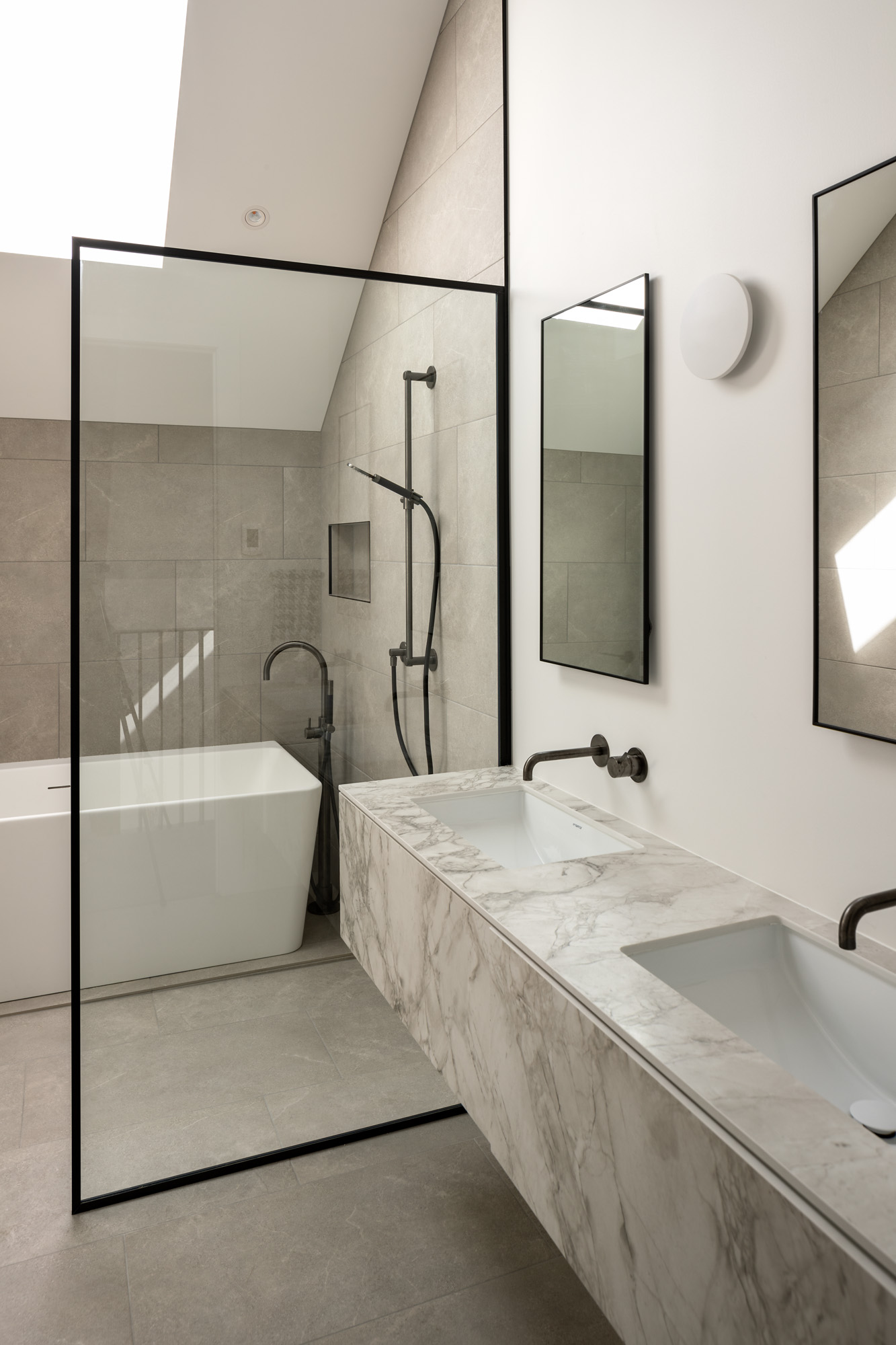
A further three skylights were placed along the roof to draw natural light into the other rooms and allow for all-day sun, privacy, and ventilation in the bathrooms.
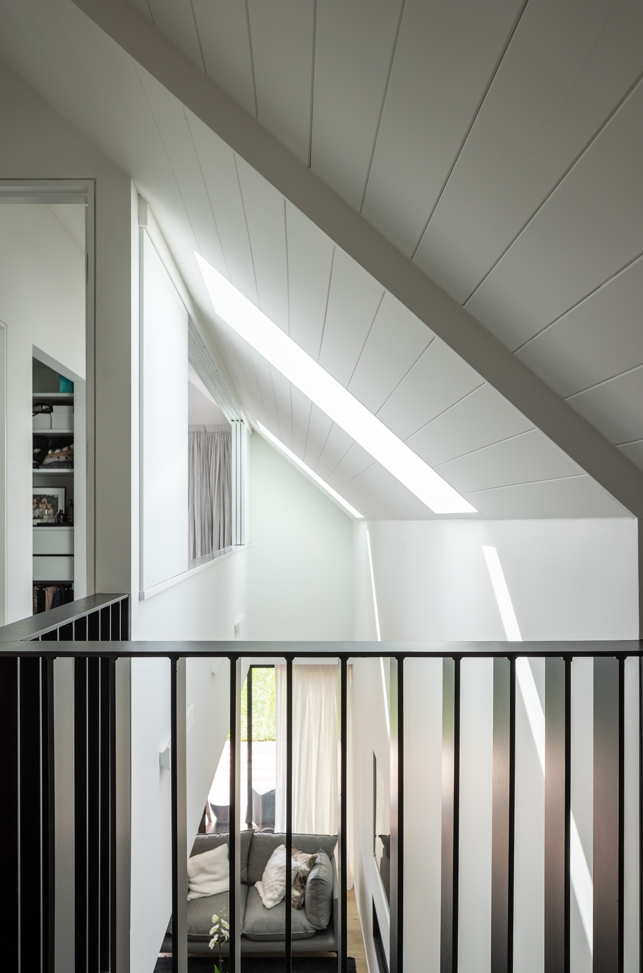
The master and children’s bedrooms all create a playfulness, with the master opening up to the double-height space over the living area by way of interior shutters.
“The children’s bedrooms also open into the void and communicate with each other,” Jon explains.
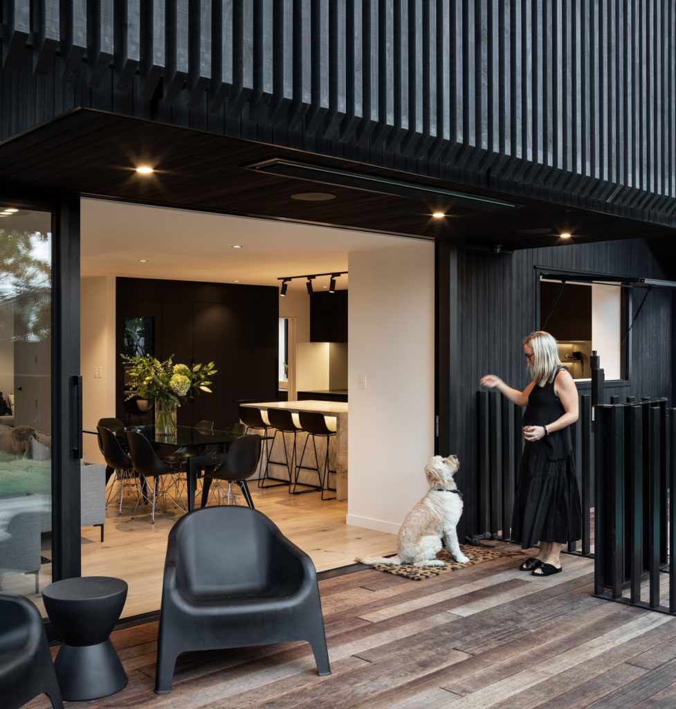
Downstairs, the living area removes the threshold between indoors and out with large sliding doors opening onto a deck and the lawn area, while a servery window allows for sight lines from the kitchen onto the pool area and deck.
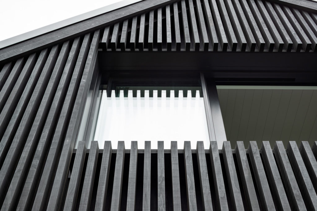
On the northern facade, the vertical screening is perhaps the most striking with the continuation of the linear detailing flowing from house to pool, where the fencing is also constructed in vertical black timber.
For Jon, this was a project that dealt with macro and micro in different ways: “It’s about family and playful spaces — at the macro level, a simple form, and at the micro, a collection of beautiful details.”
“Even though it really stands out on the street at the moment and it’s quite dominant because of the black and its height, it will soften over time as the greenery develops. When you see it driving up, it makes you smile every time,” Lucy reveals.
Like much of suburban Auckland, no doubt this streetscape will also slowly evolve in scale and form, as architects push the boundaries and almost certainly create additions that add height, one day rendering this home similar in scale to its surrounds.
Perhaps that future streetscape is closer than we think. Lucy expects her green walls to take just months to reach full height, and as they thrive they’re likely to do so within a visibly changing built environment.
Words: Clare Chapman
Photography: Simon Devitt
