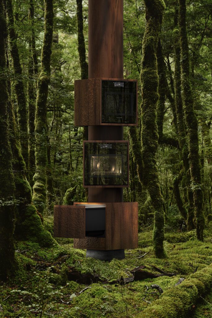
Paul and Sue Webber found the perfect furniture for their multi-generational Tauranga holiday home; in their son’s furniture showroom – Tim Webber Design
Paul Webber— There was originally a little red Fibrolite house on the site that my aunt bought in 1979. My wife Sue and I have been going there for holidays since about 1981 and our kids, Tim and Rachel, have grown up going there every year for holidays.
The brief to Paul was to create a relaxing beach home that could be enjoyed by the family for many generations to come. We have the greatest trust in Paul – he did a fantastic redesign of our Auckland home and has become a friend over the years.
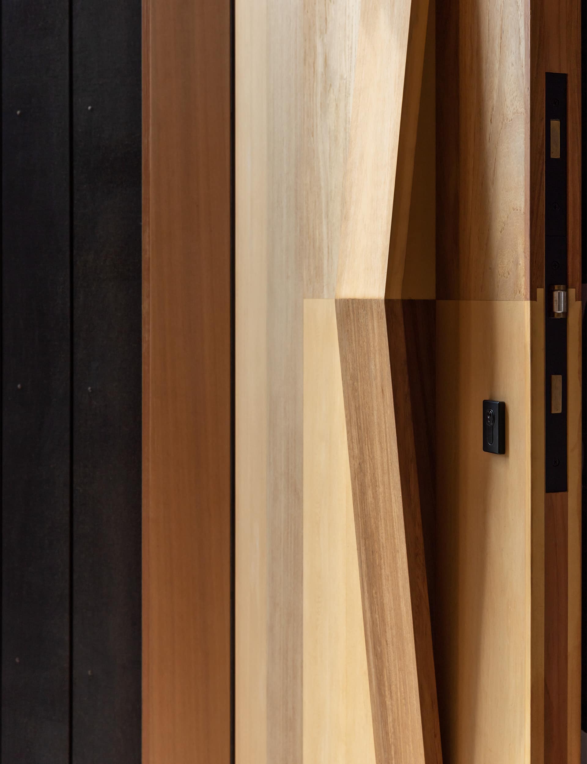
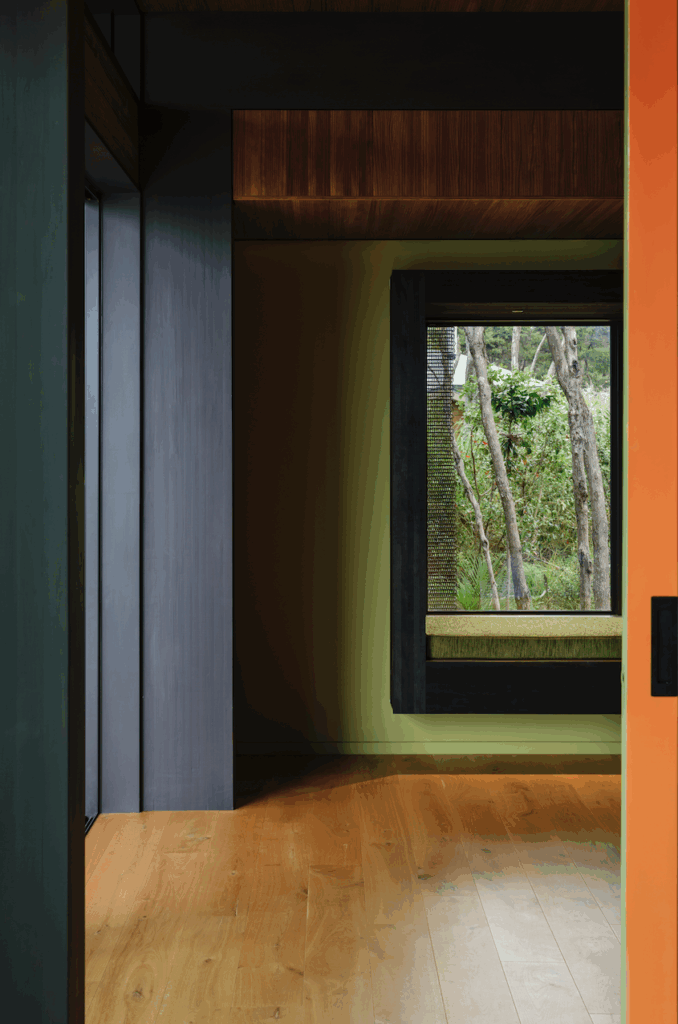
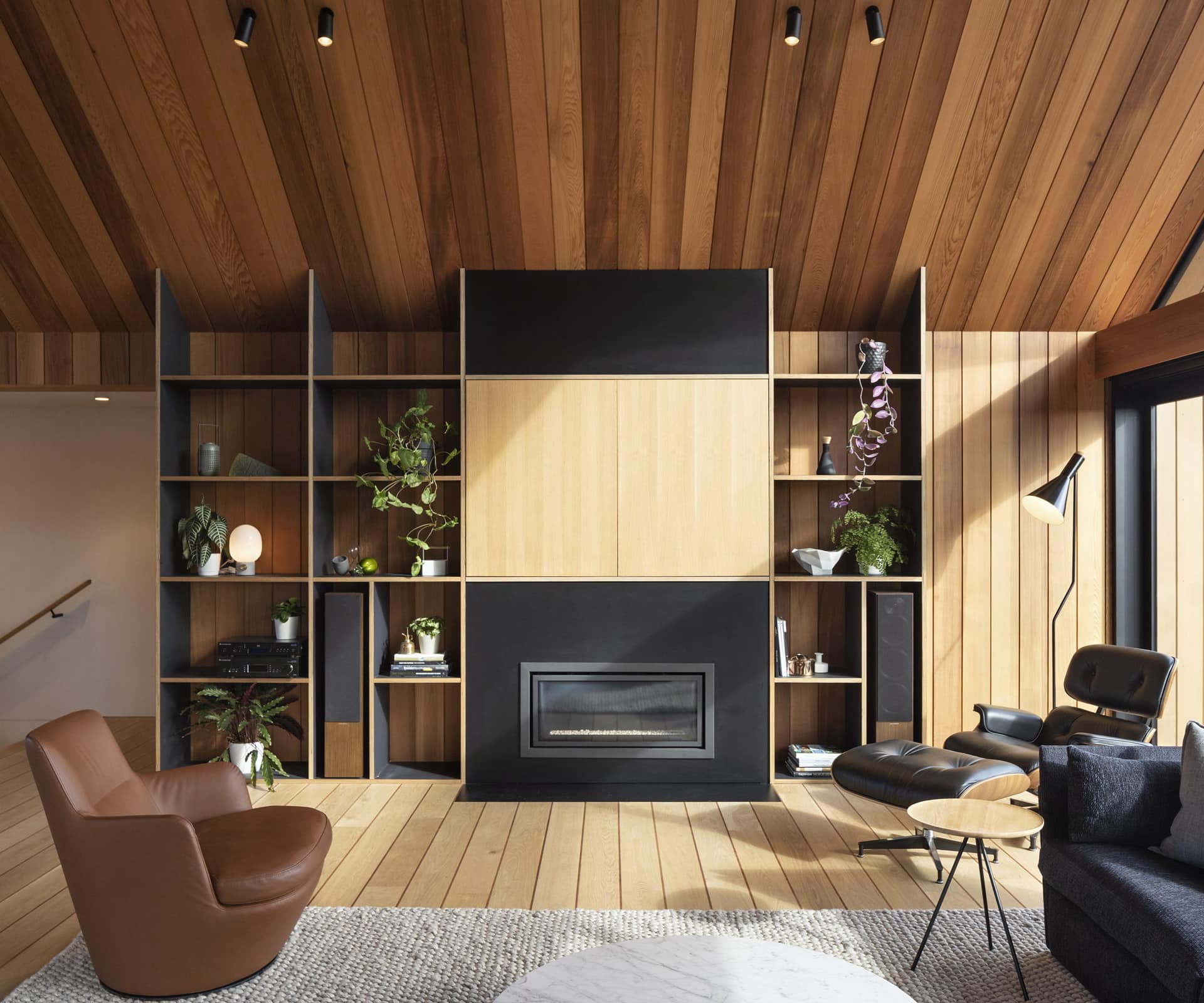
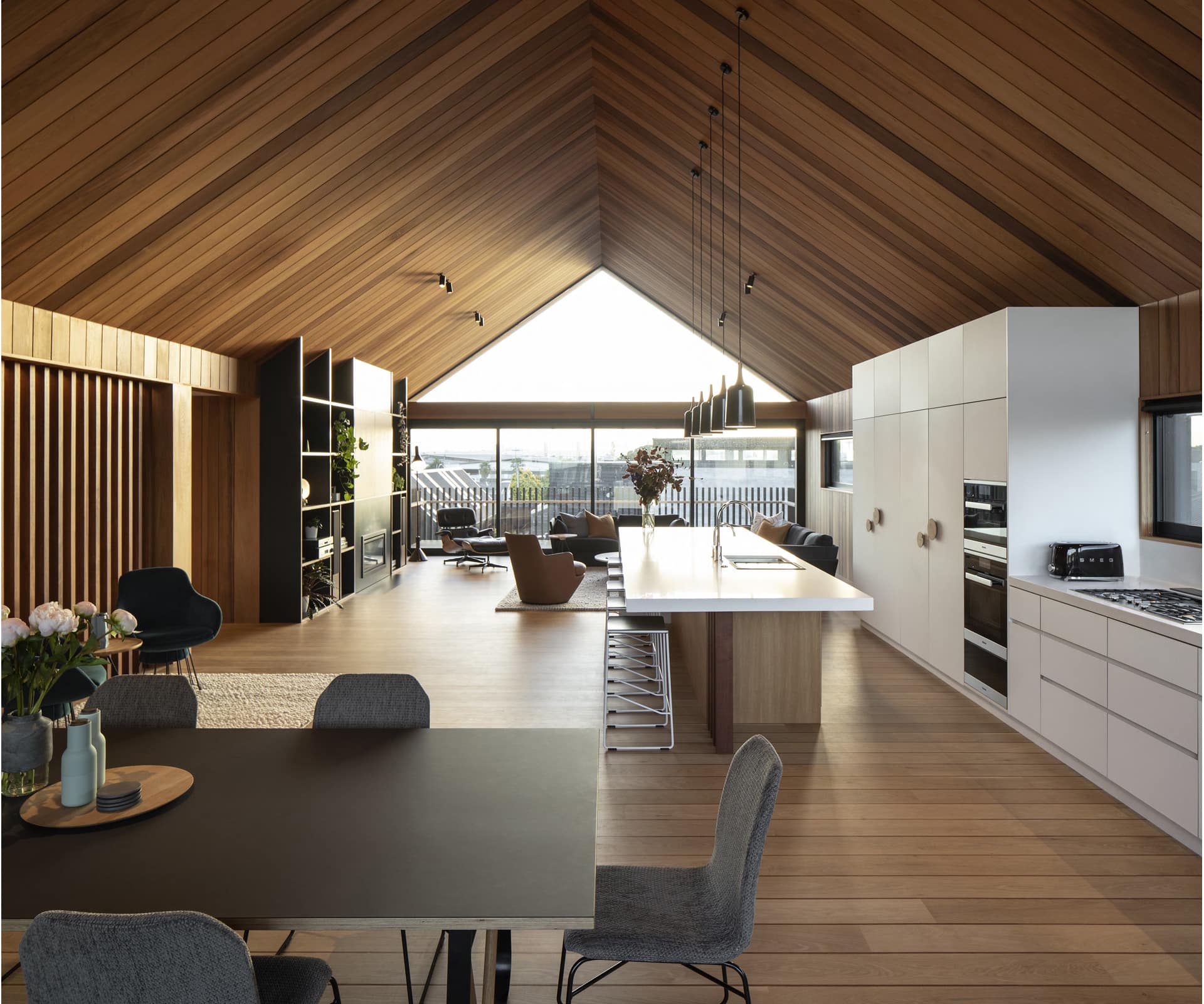
The house is 300 square metres, including the decks, on a 400 square-metre site. It’s walking distance to both the harbour and beach. We get there and we don’t want to leave. We love the attention to detail in the woodwork. It gives a constant, warm golden glow during the day, but especially at night, and it’s stunning from the outside. The oak floor has an alternating kwila insert, which exactly matches the negative detail in the walls and ceiling and wraps to meet on the other side of the room. The hidden garage door appears and disappears and I’ve had people walking past who have clapped when I open it. It’s one of those great little thrills.
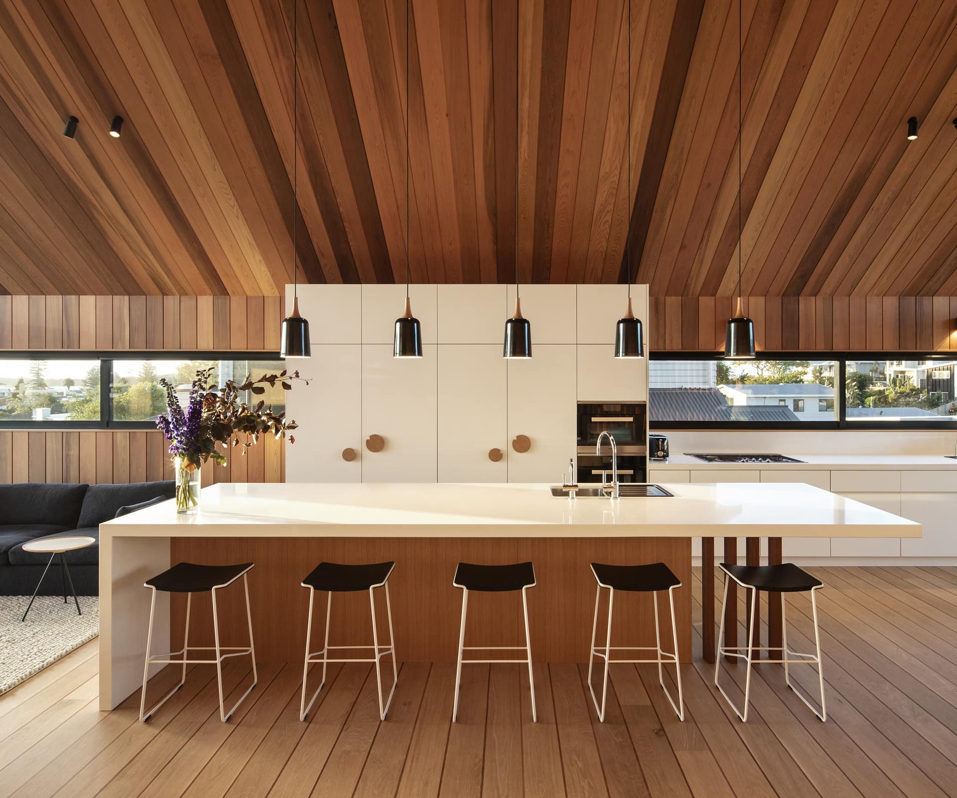
The large open living space has the kitchen as central focus, and the vaulted ceiling gives us a beautiful sense of space. The single piece of glass in the gable ends gives a wonderful view of the sky. The ceiling seamlessly carries out to the covered deck in an unbroken way. There are three bedrooms downstairs and we wanted a main suite with en suite and wardrobe, which gives us separation from the rest of the house.
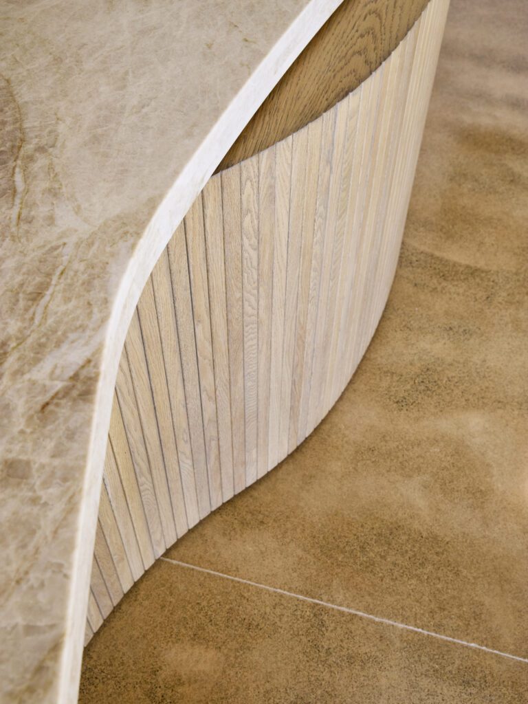
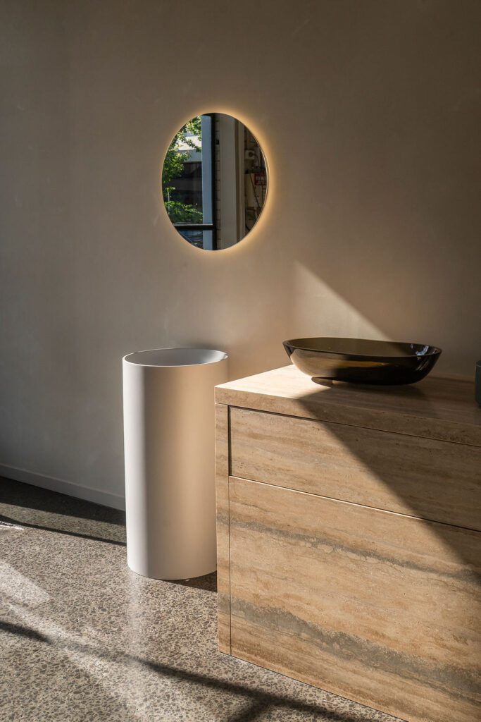
Our son Tim [furniture designer Tim Webber of Tim Webber Design] worked out what we should have and where. Every piece of furniture (except the Eames chair) and lighting is his. It’s a real TWD showroom and we love that.
Paul Clarke, Studio2 Architects— The crafting of this multi-generational retreat was a continuation of the journey we went on with the clients in their Auckland home. We wanted to do things uniquely for them and to reflect their involvement in the timber business [Paul Webber co-owned Plytech and Décortech] and incorporate Tim’s furniture.
The long-term connection has created a relationship and trust. You really want to be able to relate to clients and have informed critique with them so they are learning and you are learning what they want. It’s about them, it’s not about us, but at the same time, it’s about creating something that is the best it can be.
Housing at The Mount is high density, so from an architectural perspective, we wanted to maximise the outdoor connection to the views – the harbour in one direction and Mount in the other. And we needed to create privacy to the neighbouring properties, which are very close to the boundary. The gabled form allowed us to maximise internal volume and create elevation to the views. The covered terrace to the street has big sliding doors to the kitchen, which connects to an outdoor barbecue.
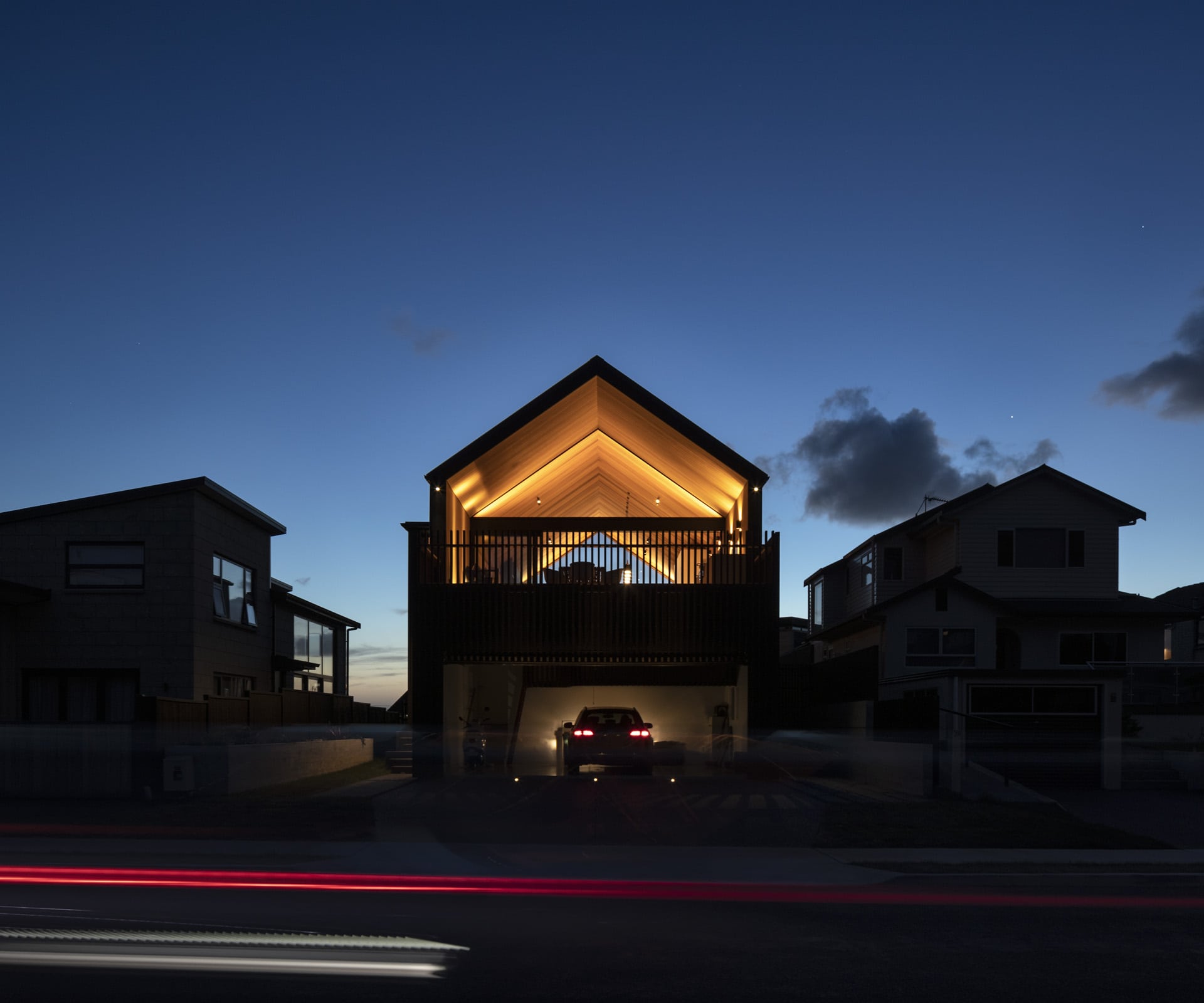
There are different moments of delight throughout and within each space. The entry sits to the side of the house and is quite crafted. There’s a sense of arrival – you are not taken past the bedrooms, the family and guests are only given that appreciation. You go up the stairs and through the beautiful kitchen and you look east to the loggia space and west to the harbour.
We pushed pretty hard with the detail and Kevin Garrity – an amazing builder – pulled it all together. The flooring detail relates to the negative detailing of the ceiling and walls. There’s always a bit of art in architecture if you want it to be there. I love there to be some joy in the way we craft our buildings.
There’s longevity in the design and material selection, which I would like to think would still be relevant in 10, 15 or 20 years’ time.
Photography by: Simon Devitt.
This article was first published in HOME New Zealand. Follow HOME on Instagram, Facebook and sign up to the monthly email for more great architecture.
