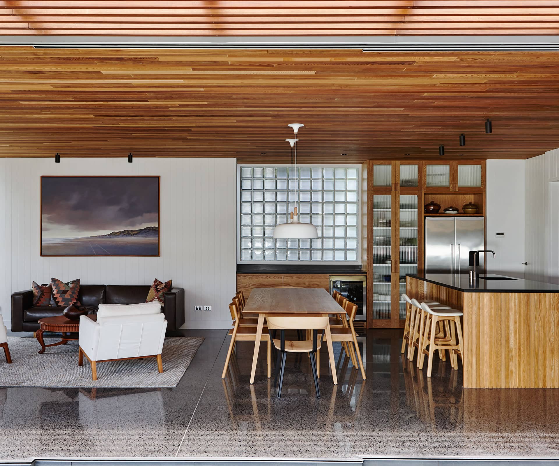
HOME Editor Simon Farrell-Green gives us personal account of the whirlwind Home of the Year 2018 judges’ journey. Find out what the judges thought of each of the finalists and winning homes
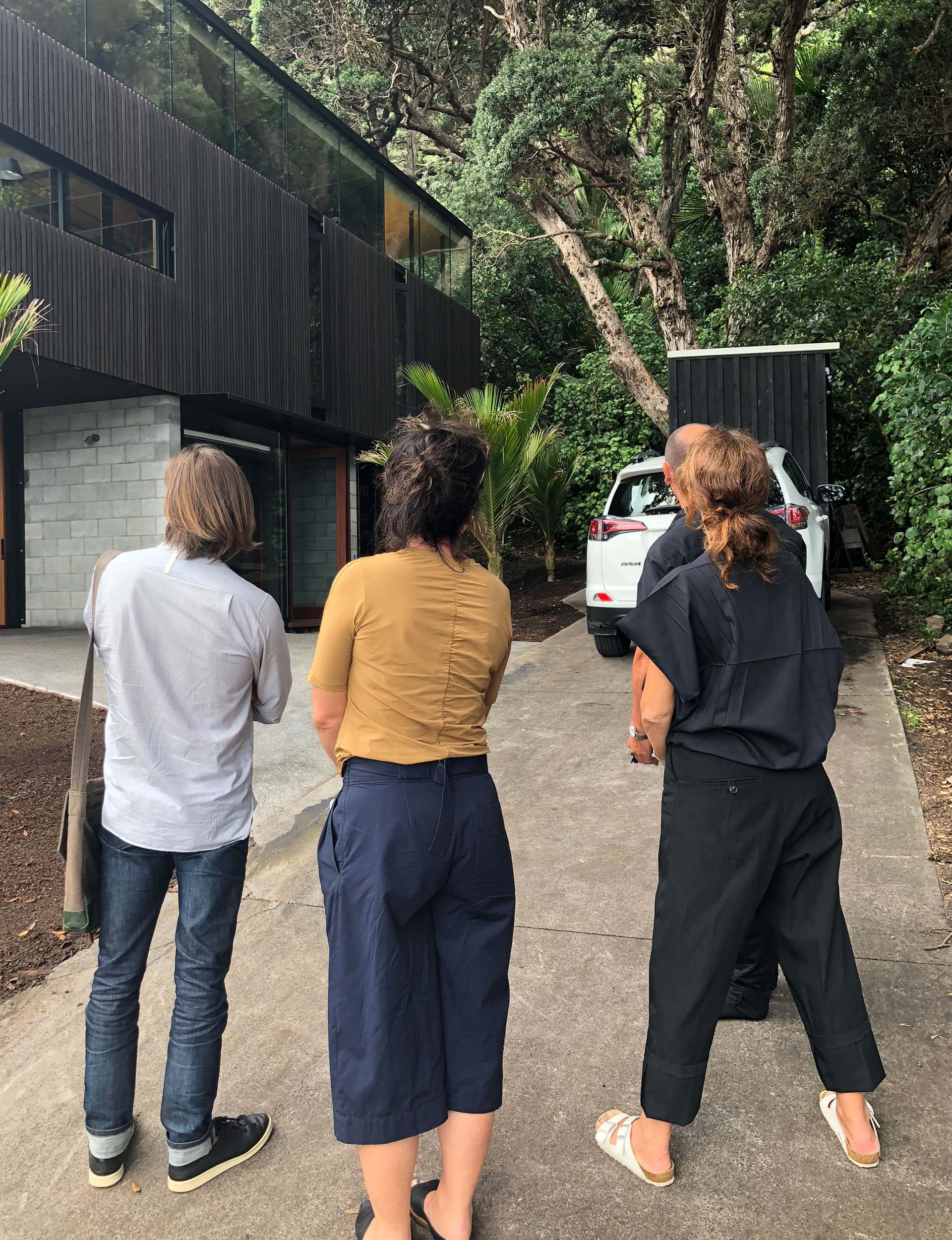
Home of the Year Winner – Piha, Auckland
Project: ‘Kawakawa House’
Practice: Herbst Architects
Location: Piha, West Auckland
After a mad dash around a few projects in central Auckland, we visited Piha at the end of our first day of judging. There was traffic on the North Western motorway at 4pm, which bemused Mel Bright of MAKE Architecture, our guest judge from Melbourne. When we headed over the Waitakere Ranges, she went quiet as she observed the view from the ridge overlooking Piha beach and Lion Rock.
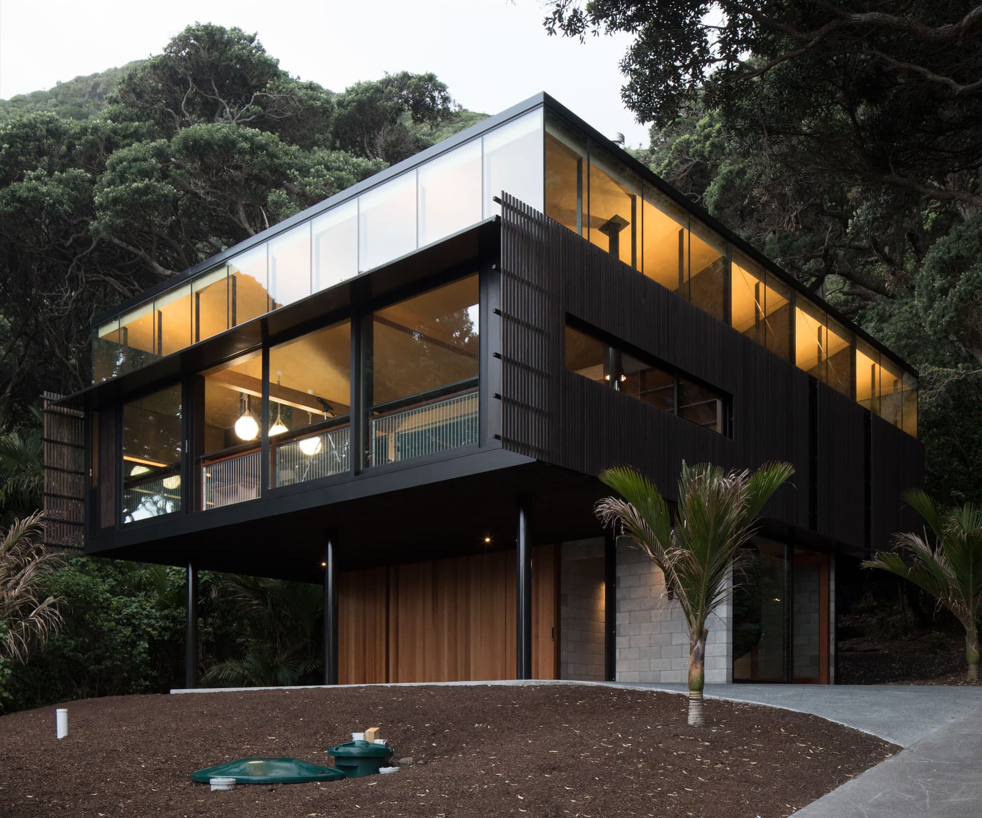
‘Kawakawa House’ by Lance and Nicola Herbst sits back from the beach in a glade of established pōhutukawa. Apart from cicadas in the trees, it’s a quiet and contemplative spot.
The house holds back the view as you climb the central spiral staircase and emerge into the living area, which feels like a covered deck slung up in the trees. When we arrived, it was 5pm, the sun was just starting to set and a golden glow washed through the house. Back in the private areas of the home, the light was filtered and dark in the bedrooms and bathrooms.
Judges’ comments
“A cross between a tree house and a machine for living, perhaps it’s a device for contemplating nature. It combines conceptual clarity and precise execution with the unusual quality of being autonomous, yet empathetic with its natural environment.”

Best Interior – Waiheke Island
Project: ‘Lantern House’
Practice: Herbst Architects
Location: Onetangi, Waiheke
On a perfect big-sky day we flew from Coromandel to Waiheke over the Hauraki Gulf, the fingers of Te Kouma Harbour spreading below, the prop on the four-seater plane in front of us. Waiheke floated in the distance, across the blue water, then we landed – uphill – on the grass airstrip.
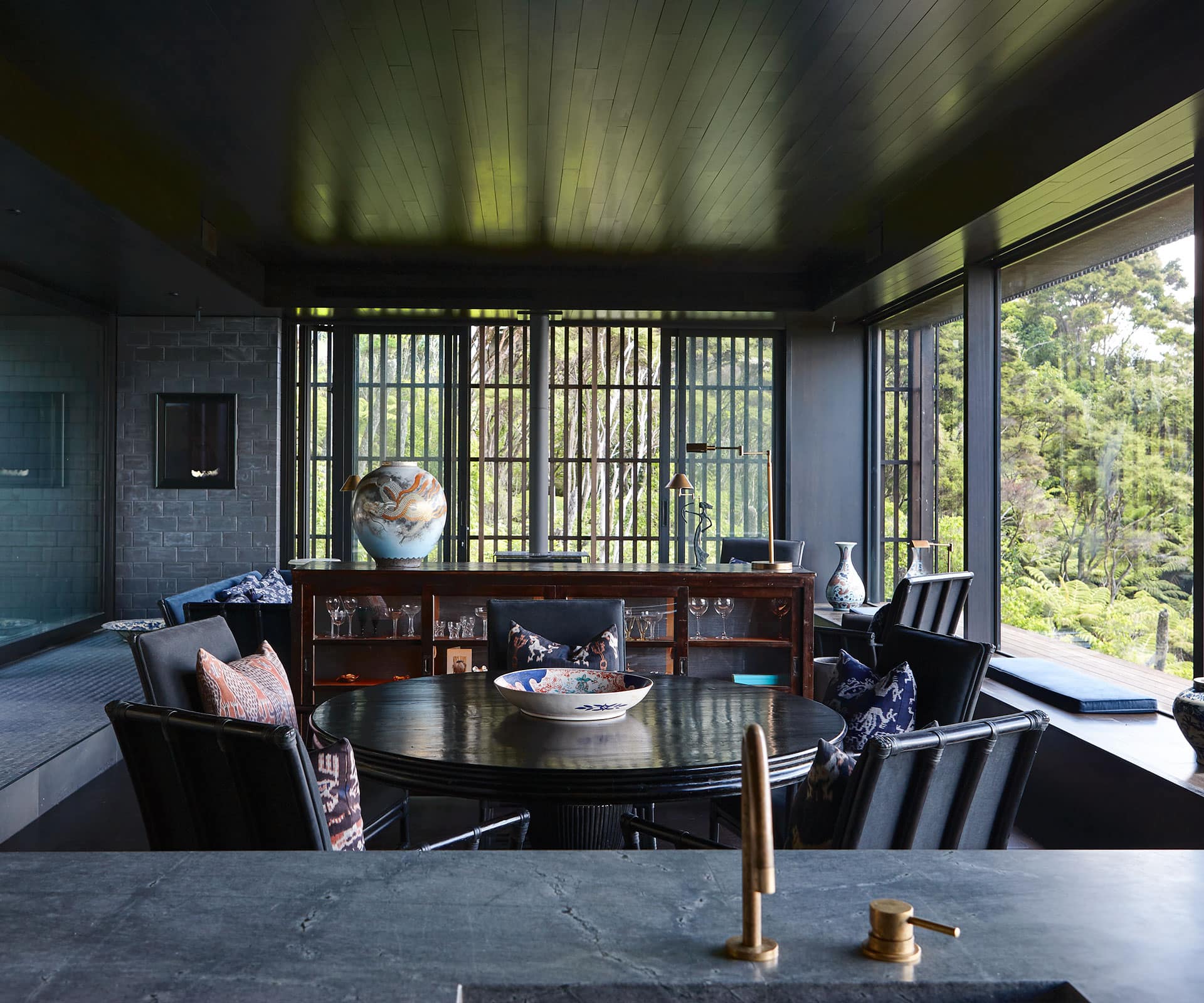
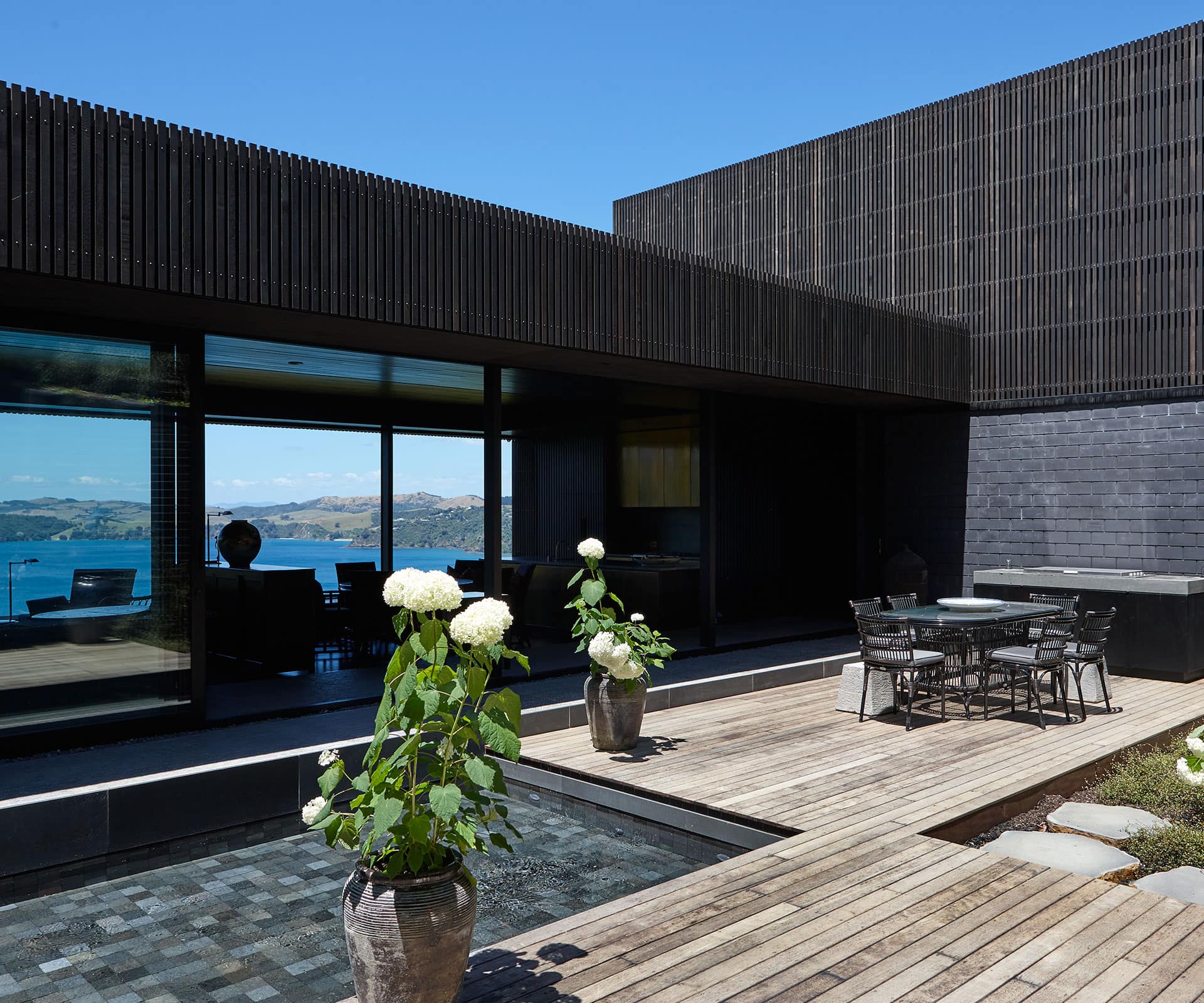
The experience at the home of Jonathan Rutherfurd Best and Andrew Glenn – Lance and Nicola Herbst’s second entry this year – echoed the journey. The living area has a fixed glass window that runs the length of the living room, your eye running down Onetangi beach to the bleached hills on the other side of the bay.
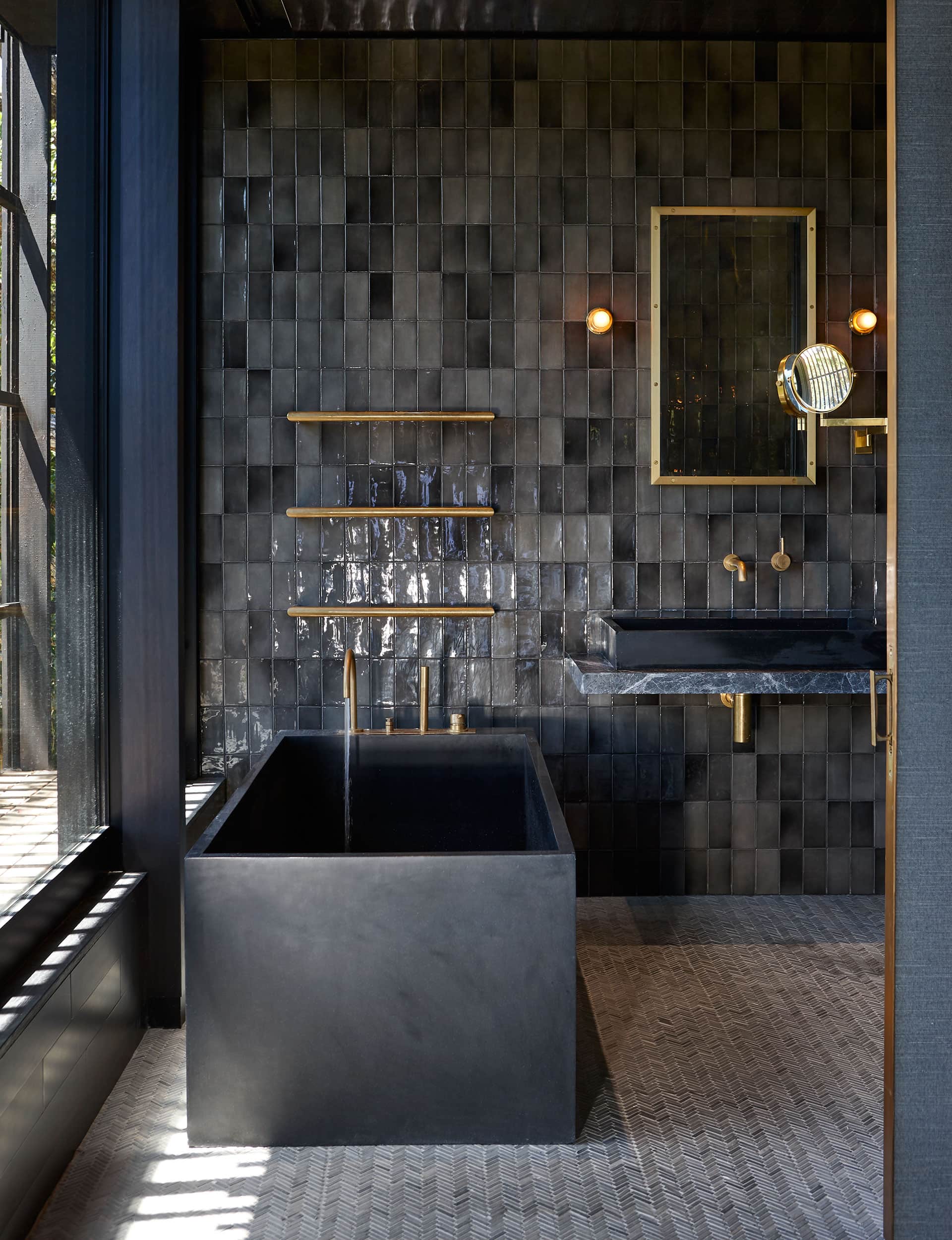
Here, there’s no front deck – instead, a courtyard on the sheltered land side – and the cantilever stands you in the view. The extraordinary interior is the result of a fruitful collaboration between owners and architect: tiny tiles underfoot, dark timber surrounding you, with brass accents, textured wallpaper and dark furniture.
Judges’ comments
“The house has a distinctive atmosphere – shadowy, textural and rich with association, which elicits a deep sense of calm and contemplation.”

Best City Home – Miramar, Wellington
Project: ‘Miramar House’
Practice: Andrew Sexton Architects
Location: Miramar, Wellington
We saw a lot of courtyards during our Home of the Year 2018 judging, though none was quite as delightful as the one in our Best City Home. We landed in Wellington from Rotorua, en route to Bright’s lecture at Prefab Hall. It was hot – what do they say about Wellington on a good day?
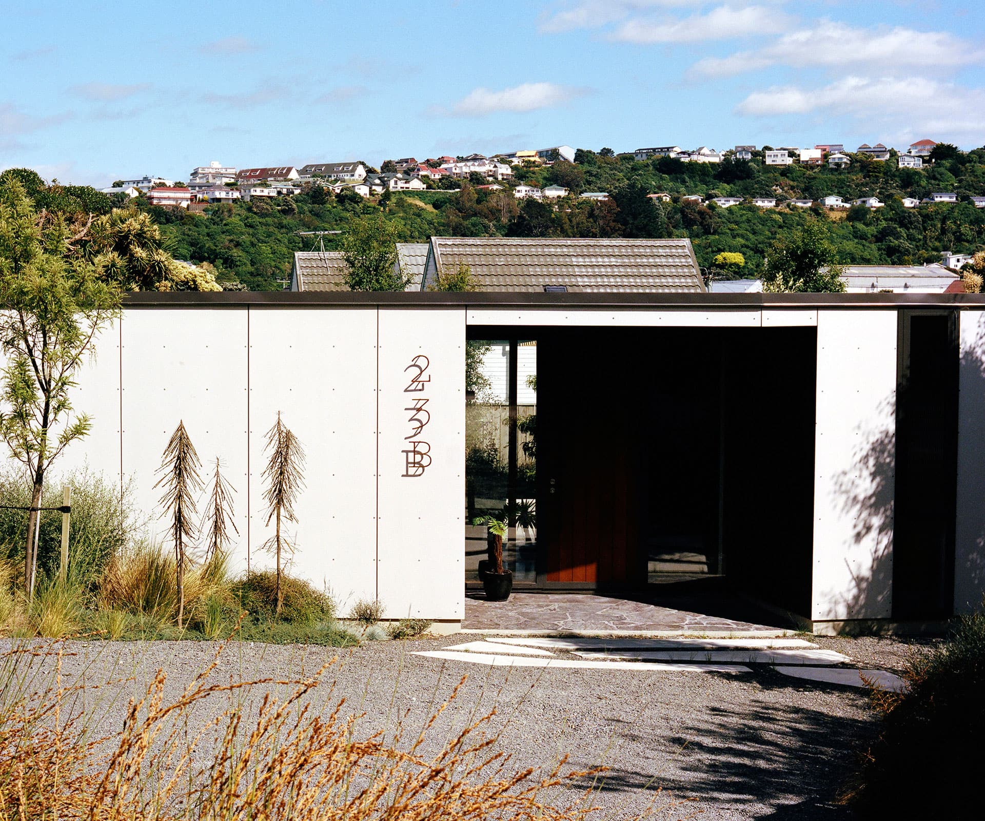
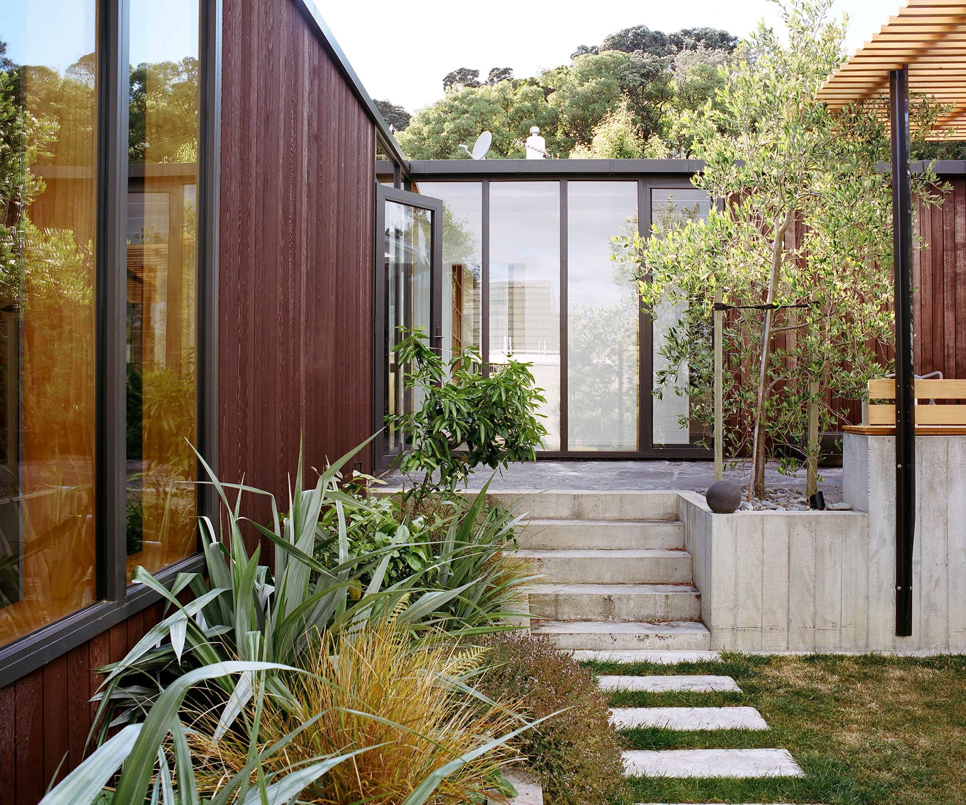
After parking on a narrow little street, we walked down the steep driveway. It’s not exactly a prepossessing site: there are houses all around, including a cute old bungalow, from which Kris and Jess Sowersby’s section was subdivided. The genius of Andrew Sexton’s design is that you arrive to a sort of gatehouse, a recessed portico of glass and timber. Once inside, the courtyard is revealed and the garden envelopes the house, seeming to come right inside.
This house is in its own little world, perfect for a young family – and a great example of what you can do on an infill section that seems, on the surface, to have nothing to recommend it.
Judges’ comments
“This simple courtyard house embodies the spirit of New Zealand’s regional modernism and offers an exemplar for how to build with modesty and style in the city today. A private world is created inside focused around a landscaped living court, a contemporary suburban utopia.”
Finalist – Mt Eden, Auckland
Project: ‘Mt Eden House’
Practice: Guy Tarrant Architects
Location: Mt Eden, Auckland
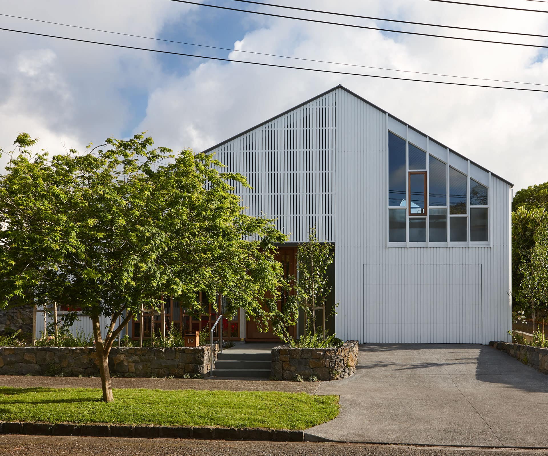
A week of judging started here, on a muggy Monday in February. Bright was supposed to arrive from Melbourne the night before but after a couple of flight cancellations, she landed in the middle of the day, so we drove straight from the airport to Mt Eden.
Turning into the heritage street, sitting very nicely at the end of a line of white timber houses – a jumble of bungalows, villas and cottages united only by their variety – was this house, by Guy Tarrant. It’s a lovely building, but what strikes you is how sympathetic it is to the street; perfectly in line with the other houses, playing off their form – pitched roof, white timber windows, white-painted cladding – but not copying them.
Despite being muggy as hell outside, it was cool inside the cedar front door, with living areas loosely unfolding around a courtyard and grassy lawn, at once private and light.
Judges’ comment
“This house sits gracefully in a street of historic villas and is both inventive and sympathetic to its context. The interior is a skillful orchestration of light, texture, materiality and craft.”
Finalist – Hanmer Springs
Project: ‘The Family Bach’
Practice: Cymon Allfrey Architects
Location: Hanmer, Canterbury
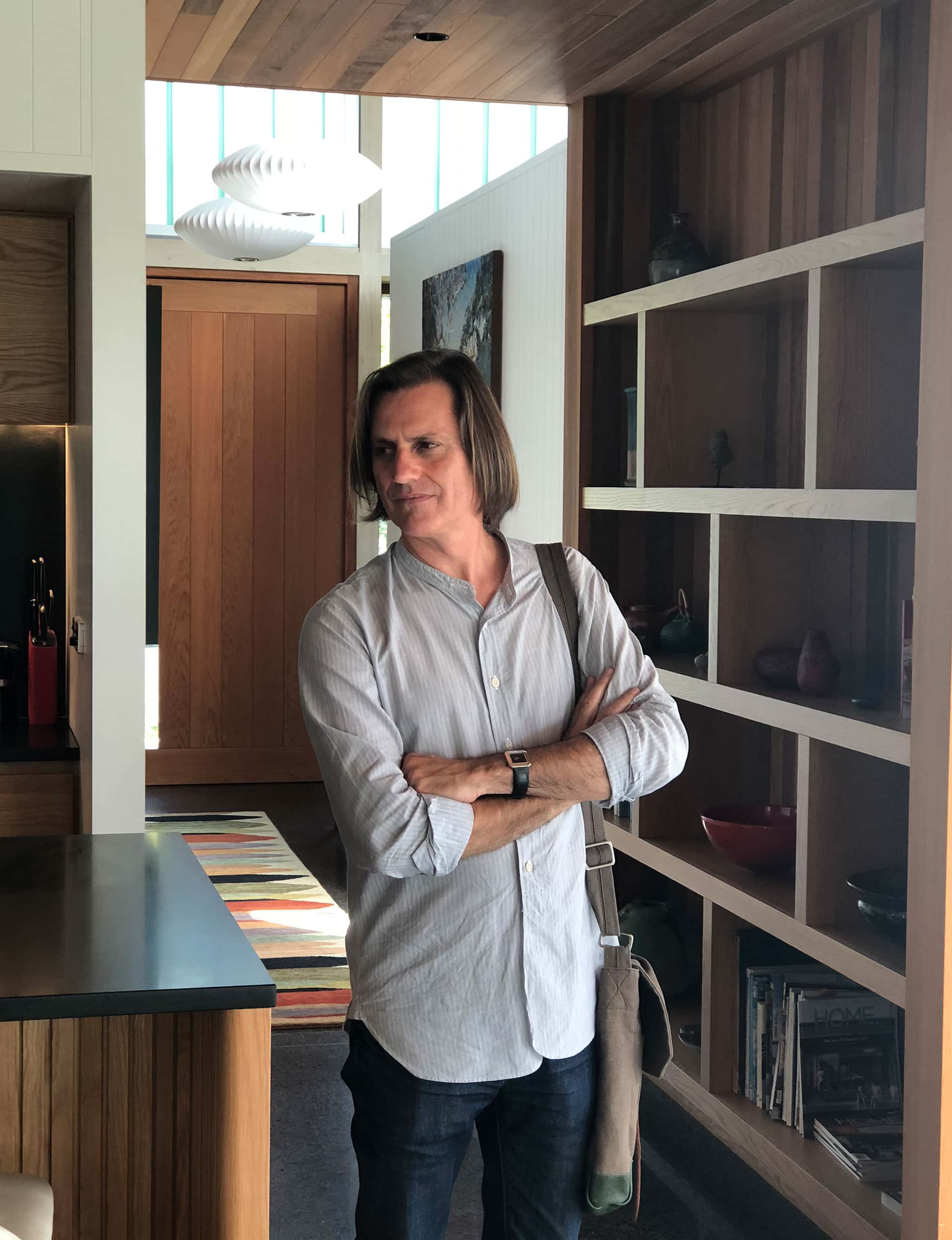
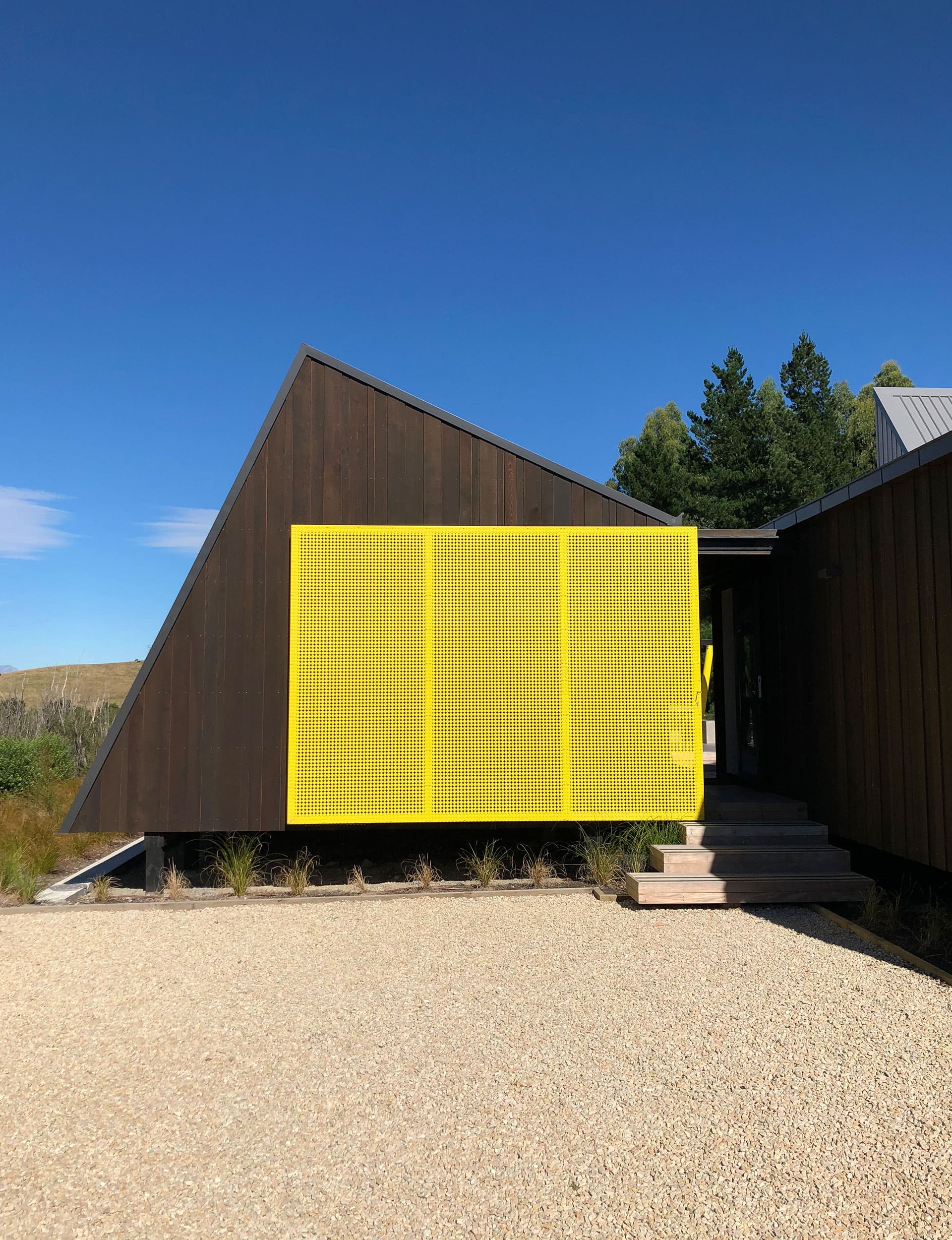
Architect Cymon Allfrey looked vaguely ill when I fell off his swing – preternatural clumsiness being one of my defining characteristics. We’d driven to Hanmer Springs that morning from Christchurch, through a spectacular high-country landscape, all bleached hills and rock. Allfrey’s family holiday house is just outside of town, and overcomes its suburban context with its pitched roofs and bright yellow accents.
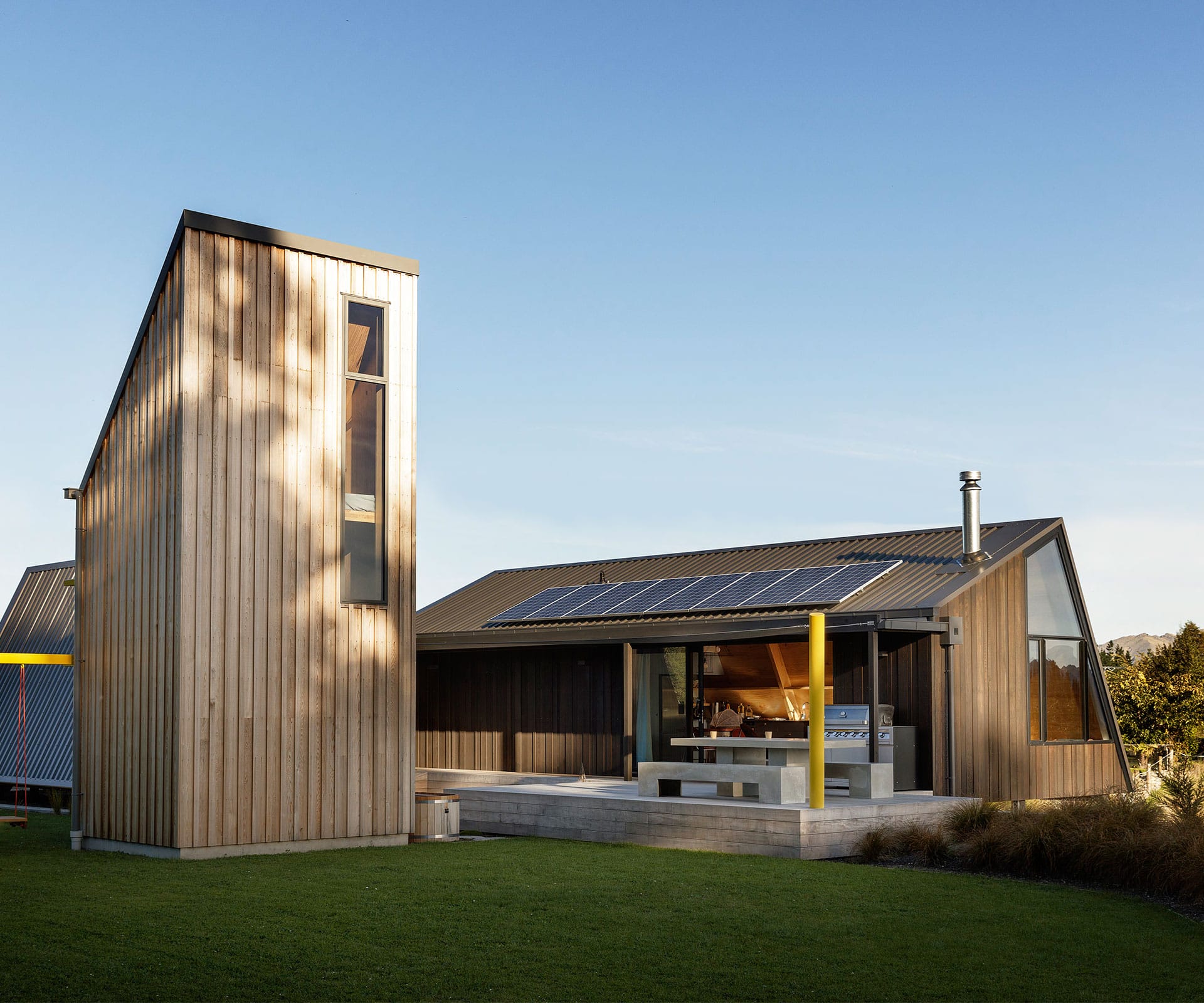
The design is a playful exercise in pulling a house apart and depositing its various parts around a courtyard, rather than making one large house. It’s a house that announces you’re on holiday, that life is different here – that space can be about the connections between buildings rather than the buildings themselves. It’s clever – and that yellow screen is simply terrific.
Judge’s comments
“A cluster of asymmetrical wooden huts enclose an outdoor courtyard, creating an architectural alpine camp site, perfectly pitched to the spirit of the place and the good life lived.”

Best Small Home – Cashmere, Christchurch
Project: ‘H01 House’
Practice: Maguire and Harford
Location: Cashmere, Christchurch
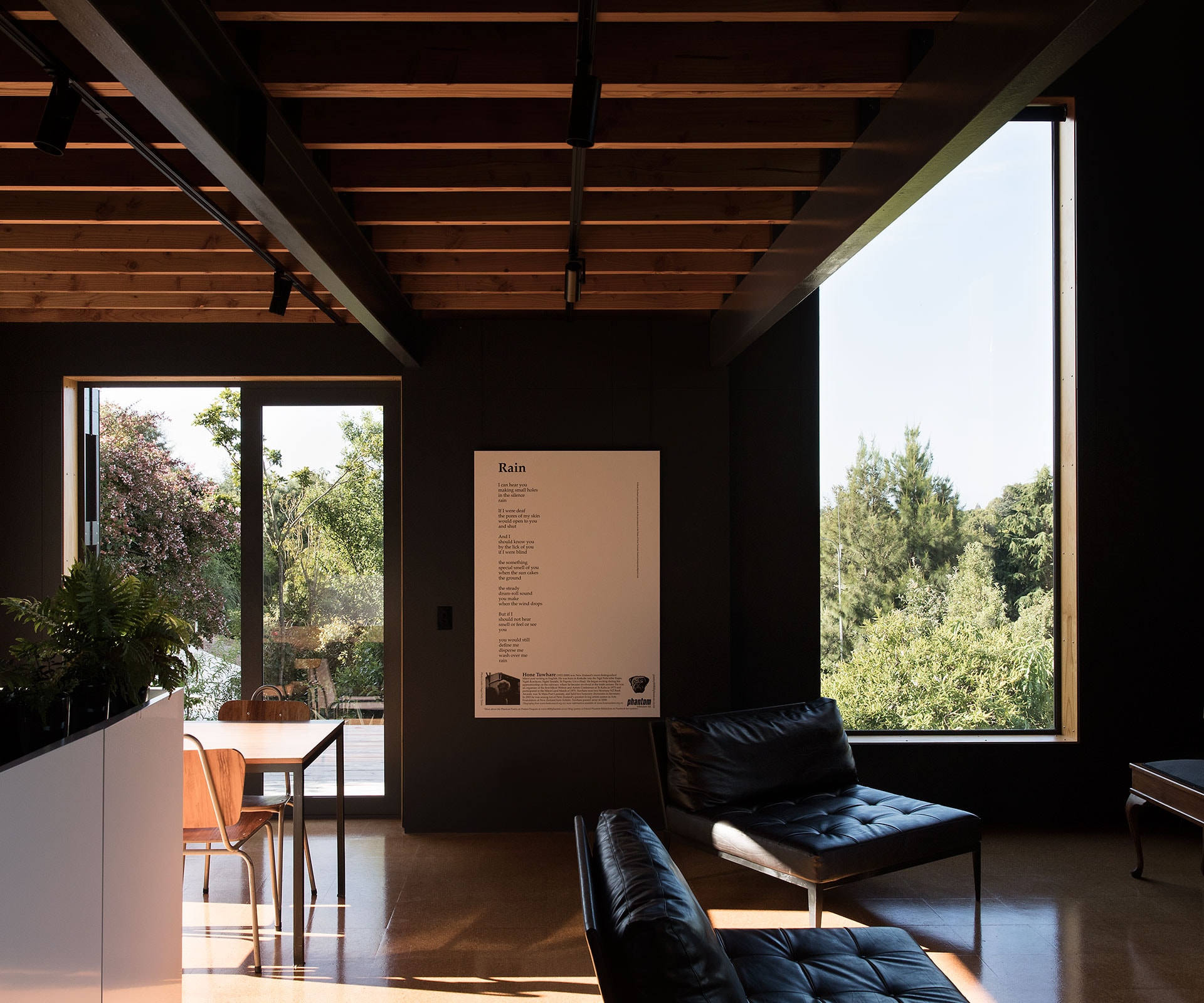
I won’t say that wine and cheese helps the judging process, but it’s appreciated. Architect Braden Harford served us an extraordinary bottle of natural wine and, after a long day on planes and in cars, it was very welcome; so were the apples off the trees at the bottom of his driveway. Harford’s house is small, built from concrete on the outside with an inky charcoal interior.
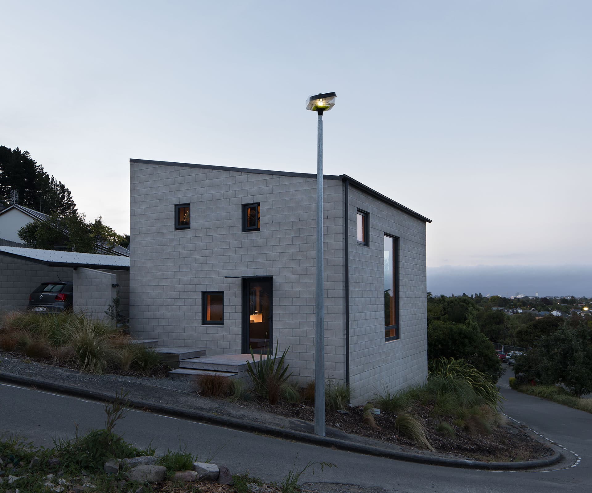
The architect has designed a house of respite, contemplation and memory – almost monastic, except that makes it sound Spartan when it’s not. What it does do is show what you can do when needs are pared down to exactly what you need, without second guessing what you might need down the track. (Harford has the section next door for that.)
Harford’s exacting thinking flows through into the interiors: cork floors, acoustic-fibre ceilings and dark-painted walls. It’s the essence of a small house. And we loved it.
Judge’s comments
“This concrete-block cube with its dark interior shows the power of simplicity, a reductive poetry, while thoughtfully evoking the spirit of the Christchurch style.”
[related_articles post1=”80080″ post2=”80078″]
