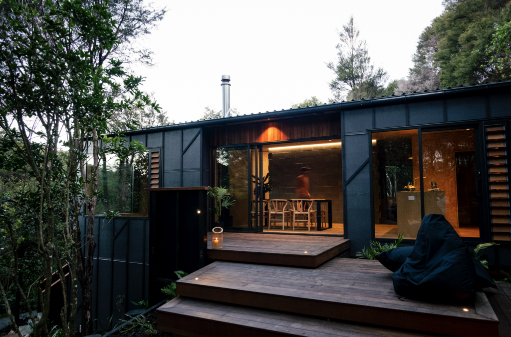
A rural retreat in the Wakatipu Basin by Bureaux combines modernity with rusticity and pays homage to farm-style buildings from around New Zealand
This home sought to echo the barn-style buildings of rural New Zealand
There is comfort in classicism, a sense of relief in not striving for the new. Here in the middle of the Wakatipu Basin, about 20 minutes’ drive from Queenstown, an Auckland-based product designer wanted to create a home to which he and his partner will eventually move full-time.
The world of design is always focused on the next new thing, but he wanted his southern getaway to be the antithesis: a place designed for nothing more than relaxation, a home that didn’t look as if it had anything to prove. “I was looking for a timeless piece,” he says. “As much as I admire the new thing, I wanted something that you couldn’t really date.”
There are many architects to whom the owner could have turned for timeless classicism, people who devised the perfect recipe of roof pitch and room volume decades ago and have been refining it ever since.
The owner knows many such veterans personally, but says, “I liked the fact Maggie and Jess were the new crowd coming through.” It was Carroll and Barter’s first completed commission for a stand-alone home.
The home’s owner grew up in rural Hawke’s Bay and wanted his new residence to be a romantic echo of the simple farm buildings of his youth. “He had a black cottage in his mind,” Barter says. “He’s very aesthetically sensitive and was aware of what would look appropriate in this environment. And it needed to be a sanctuary for him, a place of retreat.”
[quote title=”He didn’t want anything that was ostentatious” green=”true” text=”It doesn’t scream ‘look at me'” marks=”true”]
That partly explains why the home isn’t a gigantic Queenstown trophy pad: at 315 square metres (including the double garage), and with one straightforward living area and three bedrooms, it isn’t tiny, but is still relatively modest compared to many of the mansions in the area. “He didn’t want anything that was ostentatious,” Carroll says. “It doesn’t scream ‘look at me’.”
Without discipline and budget constraints, the owner says, “you could wind up with two people in their mid-60s with 500 square metres, and to me that’s ridiculous. I’m almost a bit embarrassed it’s this big.”
If this five-year-old home looks conventional on some levels, its design process was anything but. The client’s approach to the architects was: “I’m this annoying person, I think I know what I want, will you work with me?” he says. Carroll and Barter, who founded their firm “to be really receptive to what the client needs and wants”, happily agreed.
So the owner developed a ritual that involved booking the duo’s time for an afternoon, turning up with a bottle of Champagne, and spending the following hours around the office table working through the home’s design intricacies. “It came together really quickly,” he says.
This process revealed some of the owner’s other, slightly whimsical desires: he insisted the roof pitch be 45 degrees, “like a Monopoly house” (or as Carroll describes it, “a cottage out of a nursery rhyme”), which was a little steeper than the architects initially envisaged.
He asked for a concealed door leading to the main bedroom, so Carroll and Barter designed one that’s hidden in a section of the living room’s steel bookcase.
His other stipulations were more straightforward challenges to the predictable status quo. He wanted the home broken into separate elements to minimise its bulk, and wasn’t bothered by the short walk outside to reach the guest room or the garage, with its upstairs workshop where he creates beautiful radio-controlled model aeroplanes.
Rather than the conventional response of a row of enormous glass sliding doors facing the view from the living area, Carroll and Barter designed three pairs of timber-framed doors on the home’s northern elevation, a gesture that means the interior offers beautifully framed views of the landscape as well as a real sense of retreat from it.
The owner was also clear that nothing was to feel too precious. He and the architects even coined a word, “bocarty”, to describe the slightly scuffed feeling they wanted for the interior. He insisted that no downlights punctuate the lofty ceilings lined in whitewashed Oregon timber, while the French oak floorboards were literally beaten with chains before they were installed
[quote title=”I just can’t wait” green=”true” text=”to live here full time” marks=”true”]
Nor was there any agonising over the creation of indoor-outdoor space: you’re simply inside or you’re out. The building volumes are arranged to provide a sense of enclosure to the gravel courtyard, and a “telephone box” addition to the main pavilion allows for a more gradual entry to the home. But there is no front deck or complex pergola. One day, the owner says, the trees he’s planted will provide shade.
An equally simple binary applies to the way the owner and his partner regard their lives, currently divided between city and country, north and south. They may live in Auckland half the month, the owner says, but the house on these pages “is our home”.
He and his partner sold their Auckland residence to build this house, and now rent a “small and miserable” city apartment, a place that makes the pleasure of spending time down south even greater. “I just can’t wait to live here full time,” he says.
Words by: Jeremy Hansen; Photography by: Simon Devitt.
[related_articles post1=”46238″ post2=”45987″]


